“Is it legible? Is it readable?” These are questions creatives deal with every single day, and they often communicate the same query: “Is this message understandable by our audience?” Although legibility and readability are closely related, there are subtle differences between the two that help us better navigate the creative needs of our clients to deliver the more effective messaging that our audience will understand and remember.
To get to the bottom of legibility vs. readability, we caught up with one of our graphic designers – Jessie – to discuss the nuanced differences between the words that help her communicate more effectively.
The Problem:
Working in the healthcare vertical, it can be difficult to clearly communicate a message to older audiences who have imperfect eyesight. As a designer, it’s important to understand that certain typefaces are more legible or readable than others. When selecting a typeface, you have to choose one that the audience can easily read so that they understand the message. Otherwise, you risk losing the comprehension of the communication all together – and that’s a waste of time and resources.
Readability
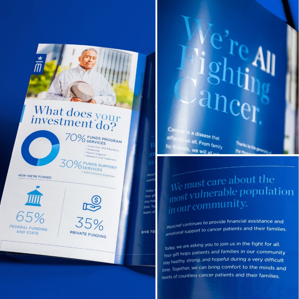
Moncrief Cancer Institute Report the Community
Readability is the rate and ease at which a person can get through a line of text. Readability most often applies to full lines of text and paragraphs. When we consider readability, we’re mostly thinking about the contrast between thick and thin strokes, and the amount of disparity between stroke weight. This can affect how quickly someone reads through a message, and how deeply they comprehend the message.
The typeface used in the headlines of the Moncrief Cancer Institute Report to the Community is Chronicle, a serif-style typeface characterized by its letterforms’ noticeable variation in stroke width, which helps guide the eye smoothly from one letter to the next. The typeface paired with just a few words per line makes the headlines more manageable to read quickly. Having fewer words prevents overwhelming the eye, which can cause our eyes to leap from one end of the page to the other, which hurts the overall messaging. Both characteristics contribute to making the headlines in this brochure highly readable.
Legibility
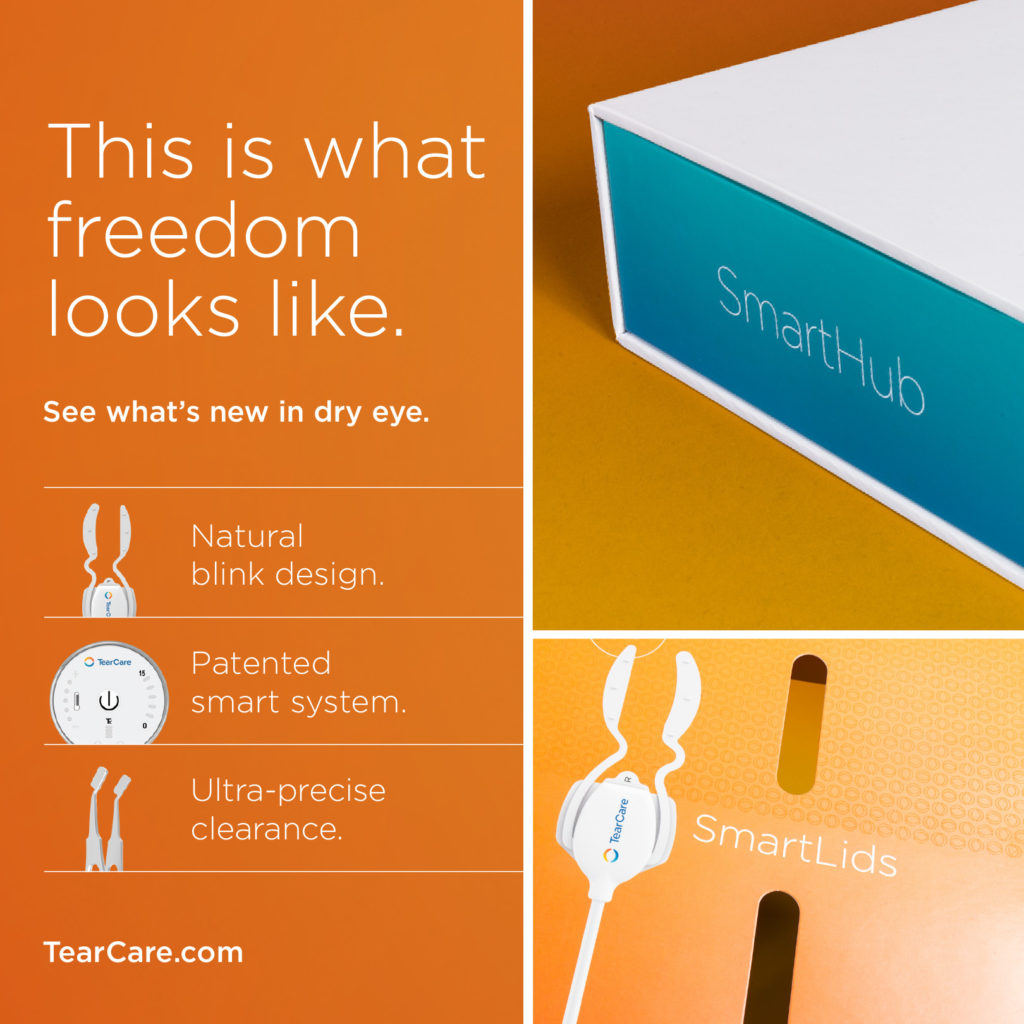
TearCare® Freedom campaign
Legibility is how easily a person can differentiate between individual letterforms. The concept of legibility is most important for early readers because they’re not reading through entire lines of text, but just beginning to comprehend the shapes and sounds of letters. Legibility effects overall readability – you can’t create a readable message with illegible letterforms – but readability has no effect on legibility.
The typeface used in our TearCare® Freedom campaign and product packaging is Gotham, which is characterized by its large x-height (measured by the distance between the baseline and the mean line of lower-case letters in a typeface) and large counters (open or closed inner spaces in letterforms). The open space makes this a highly legible typeface.
Understanding Our Audience
In advertising, it’s important to understand not only who our target audience is, but also how our message is reaching them. Are they viewing an advertisement from across a doctor’s office or at a glance as they’re driving by? Are they flipping through a magazine? If we can make our message more easily accessible by applying principles of readability and legibility, then we stand a better chance of connecting to the consumer and successfully delivering our message.
Learn More:
For more information about the topic of Readability Vs. Legibility, check out the book About Face: Reviving the Rules of Typography by David Jury