Situation
Cetaphil, a globally recognized skincare brand, underwent a major rebrand to modernize its identity and better connect with everyday consumers. However, this visually-driven evolution presented a unique challenge: how to translate a consumer-centric rebrand into meaningful, science-backed messaging for healthcare professionals (HCPs). Schaefer was tasked with bridging this gap—developing tools that maintained the integrity of the refreshed brand while reinforcing clinical credibility and driving engagement with an expert audience.
Goals
- Adapt consumer-driven brand elements to resonate with HCP expectations and standards.
- Preserve and emphasize Cetaphil’s clinical heritage and scientific validity.
- Create impactful sales tools that effectively communicate key claims without overwhelming.
- Enhance memorability and in-office usability of leave-behind and sales materials.
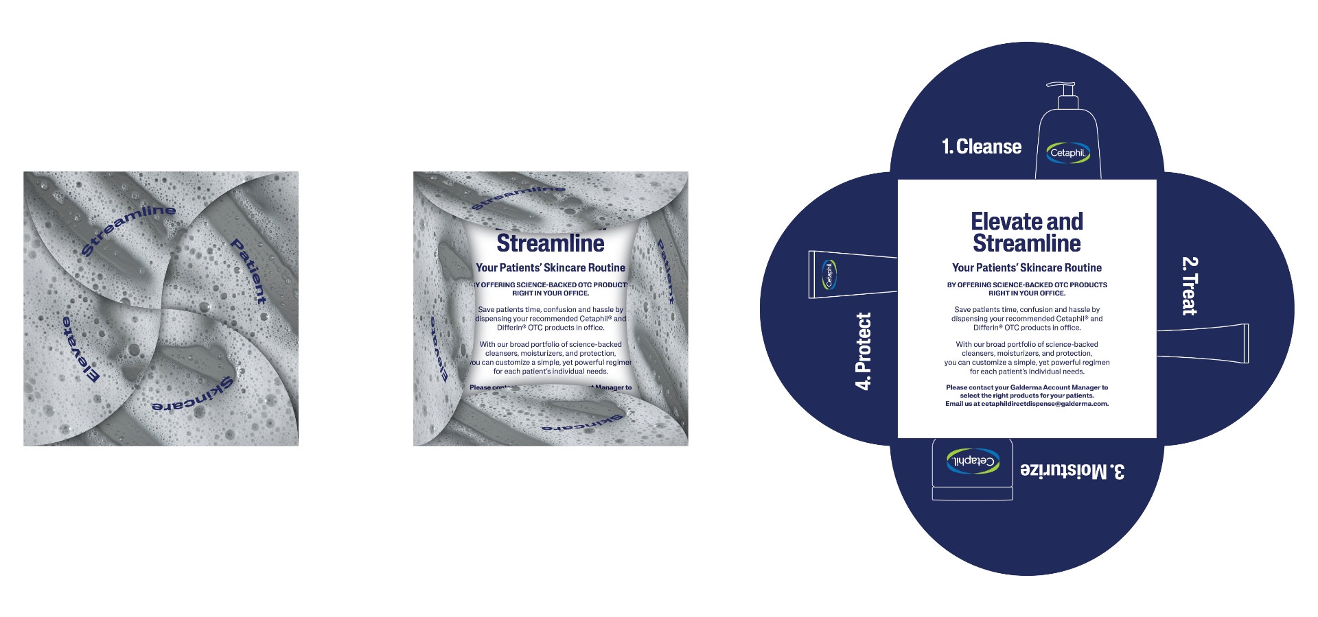
CTMP Provider Leave Behind
To replace a flat and forgettable 5×7 card, our team engineered an innovative fold-out piece modeled after a flower petal. Each fold highlights one element of Cetaphil’s core C-T-M-P regimen—Cleanse, Treat, Moisturize, Protect—offering providers a dynamic and educational interaction. This redesign not only aligned with the new aesthetic but also added dimension and memorability to in-office conversations.
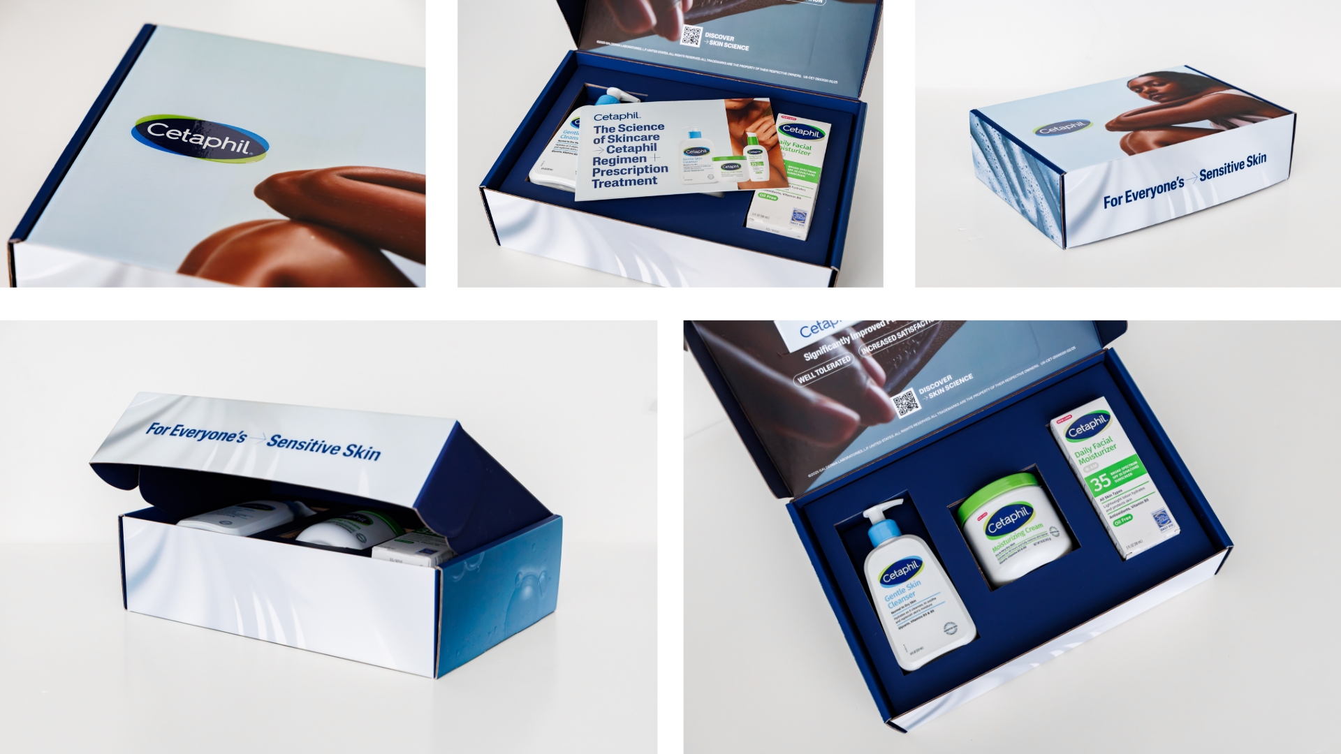
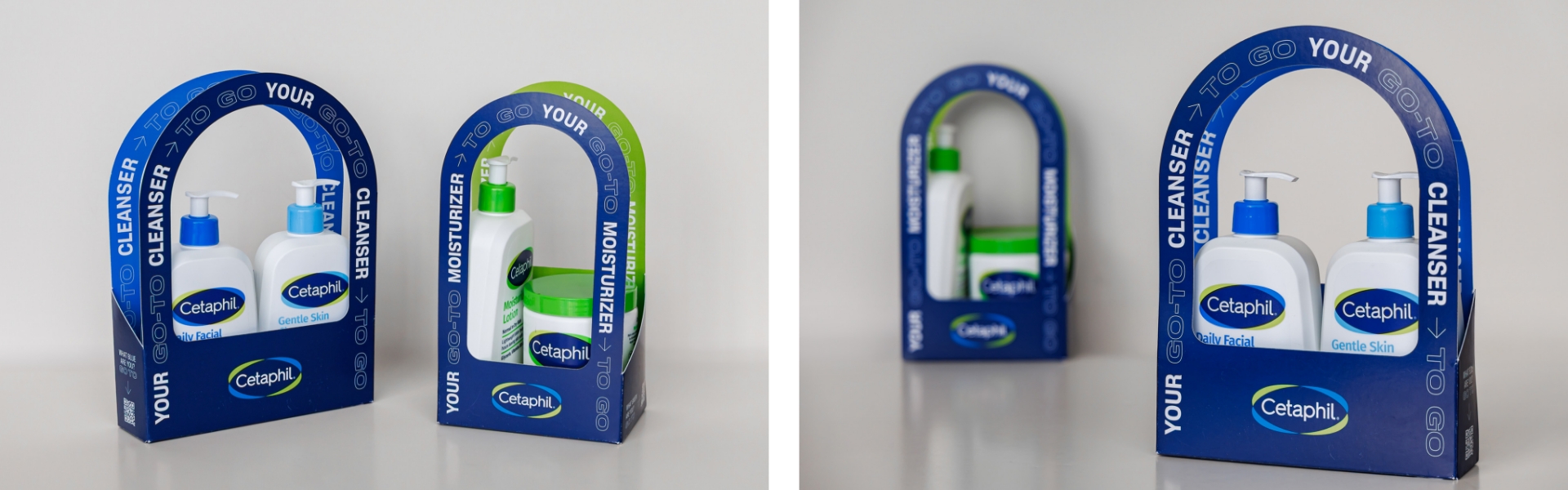
Core Product Line Surprise & Delight Boxes
We curated and distributed 3,500 premium mailers to key HCP influencers, each containing Cetaphil’s three core products. These boxes debuted the new visual identity while spotlighting recent clinical study data that reaffirmed product efficacy. The packaging and accompanying materials were crafted to elicit excitement, reinforce trust, and encourage in-office trials.
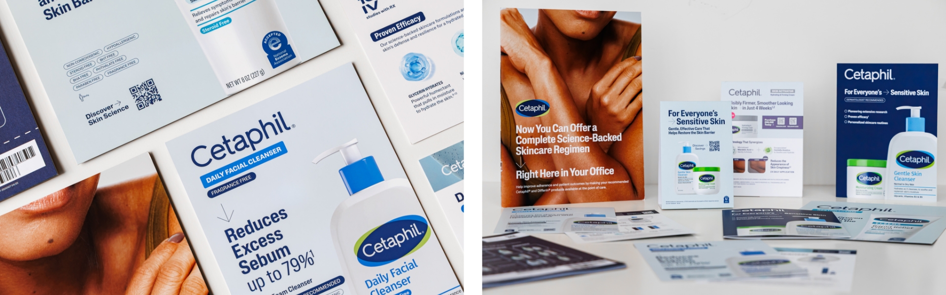
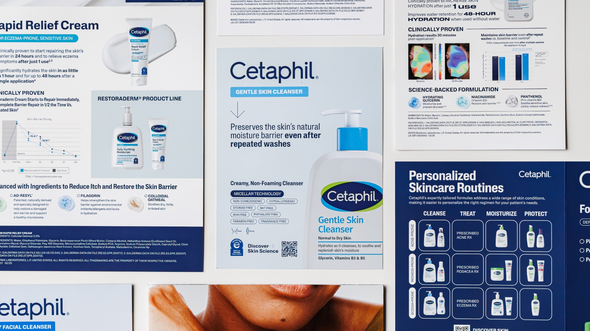
In-Field Sales Materials
The team diligently redesigned a full suite of in-field sales materials with a refined, unified visual language aligned to the consumer brand. Every piece was carefully rewritten to sharpen core messaging and elevate key claims—removing clutter while preserving clinical rigor. These tools now empower sales reps to deliver clear, confident, and compelling conversations with HCPs.
Results
- Reinvigorated provider brand perceptions through engaging designs, clear claims and impactful packaging.
- Successfully extended a consumer-facing rebrand into the professional healthcare space and created a model for client internal teams and partners to model.
- Delivered a cohesive HCP toolkit that balanced brand storytelling with clinical depth achieving positive in-field feedback for both clarity and quality.
- Equipped sales teams with tools that improved confidence and message retention.
- Enhanced HCP engagement with more interactive and visually compelling materials.
Summary
Cetaphil’s global rebrand provided an opportunity to reimagine its presence across all touchpoints—including those targeting healthcare professionals. Schaefer Advertising rose to the challenge by translating the refreshed brand identity into HCP-relevant communications that elevated both perception and performance. Through thoughtful design, clinical storytelling, and strategic delivery, we helped bridge the gap between style and science—ensuring Cetaphil continues to earn trust on both sides of the counter.