Northpointe is a new master-planned community by Lennar that offers young families an ideal place to call home. Before opening to homebuyers, we needed to build the Northpointe brand to engage a wide audience and drive home that master-planned communities provide a practical and enriching lifestyle for young families at an unmatched value.
Understanding Northpointe’s Local Competition
Before offering any strategic recommendations, our team performed an in-depth competitive analysis to better understand the local market and isolate any opportunities for competitive differentiation. One specific challenge was that some of Northpointe’s competitors used the word
“North” in their brand name, which required us to offer direction that differentiated the Northpointe brand through visuals and copy.
Finding Brand Differentiation
Since Northpointe was in the pre-construction phase, we had to develop the brand from the ground up, setting the tone for the community to offer potential homebuyers a sense of home and depict a reliable place where friends and family can gather and enjoy each other and the community. Furthermore, we needed to create a flexible set of brand assets that the Northpointe team could leverage internally and in future marketing campaigns.
Our discovery process revealed that Northpointe is incredibly accessible and cost-effective, and an excellent option for young families seeking to buy their first home. More than that, Northpointe offers residents fantastic amenities without compromising on an excellent price point. So, we leaned into creating an attainable, yet elevated brand that appealed to people who are ready to put down roots.
Building a Fluid Creative Platform
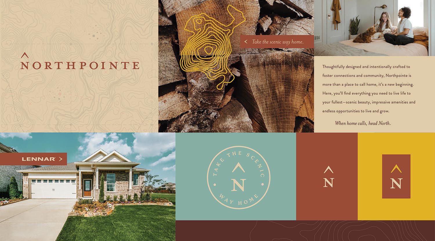
The landscape was an important part of how the community was planned, so we tethered the brand story to the scenic views and natural beauty surrounding the area. We positioned Northpointe as the attainable, unique option and highlighted the scenic nature surrounding the community to illustrate its natural beauty and striking topography that envelopes the community.
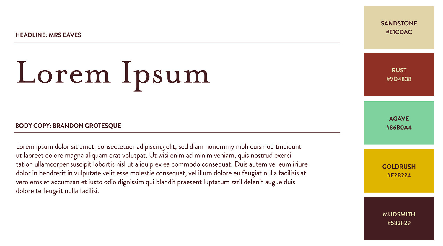
The brand mark is quiet and subtle and the arrow above the “N” signifies the true North where home lies. The color palette is natural, but vibrant and balances the reserved nature of the brand mark.

Our tagline “When home calls, head North” is emotive, aspirational and strong, which further elevates the subdued nature of the brand mark. It also illustrates the beauty of home and touches on the natural surroundings that make Northpointe such a valuable place to live.
The stylistic complements we developed for the brand helped create a sense of place that can be used throughout the community. These pieces will weave the community together and keep the feel built within the brand alive throughout.
Results
- Crafted a brand that will attract and engage new homebuyers
- Created a flexible brand that is simple and seamless for Northpointe’s internal team to utilize
- Extended the brand through community elements like trail-markers, landmarks and wayfinding solutions