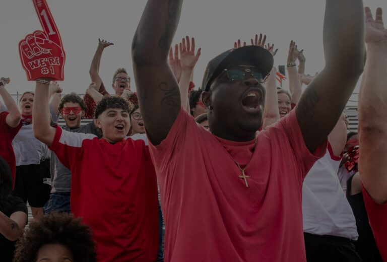
Places are defined by people, and the Near Southside is among the most vibrant and diverse communities in Fort Worth. So, when they approached Schaefer to help them rebrand their identity, we focused on the neighborhood they create and the people and ideas the Near Southside attracts.
We wanted to present that the Near Southside is first and foremost a community where people and business can thrive in an inclusive and supportive environment. The result is a design balanced in minimalism and boldness that allows the artistic soul of the Near Southside to come through, but also be functional enough to carry the brand across everything from way-finding signage to social. The new color pallet represents the diverse voices that stand up for and continue to create opportunities that cultivate community. The updated identity is malleable enough to work across mediums but enduring enough to be used over decades to come.
It is a pleasure to partner with local organizations that build up our community and help them identify their message and purpose, and carry that through to representing their brand. By creating a flexible mark that more accurately represents the community and culture of the Near Southside, we’re hopeful that their message will resonate more deeply with future community members and contributors. The Near Southside is an excellent ambassador and cultivator of the arts and culture that permeate our neighborhood and creating something that elicits that same level of passion is why we come to work every single day.
