More than 9 million Americans battle psoriasis every year, and many of them aren’t happy with their treatment options. Fort Worth-based biotech company Nuvothera recognized a market opportunity for a more effective over-the-counter (OTC) psoriasis treatment, so they created a powerful three-step solution that patients could purchase without a prescription. Schaefer was charged with branding the new product and encouraging patient adherence.
Goals:
- Drive brand awareness, interest and online purchases among the target audience
- Generate audience interest
- Establish trust and credibility of Prosoria
- Motivate consumers to buy Prosoria online
- Build customer loyalty and drive repeat purchases
The Situation
Most people that suffer from psoriasis share a general dissatisfaction and skepticism with their current treatments and their over-the-counter options. They are constantly seeking something to treat psoriasis effectively and help them stay clear by preventing flare ups. They’ve tried other solutions – both prescriptions and OTC – but they haven’t found the treatment that’s right for them.
Enter Prosoria.
Prosoria contains clinical-strength, natural ingredients that work to effectively relieve the symptoms of psoriasis. Prosoria gives people battling psoriasis the confidence they need to stick with their skincare regimen and reinforces their confidence with an effective treatment for managing their psoriasis that is safe to use every day. It is a safe, effective solution and stands out as a trusted OTC medication.
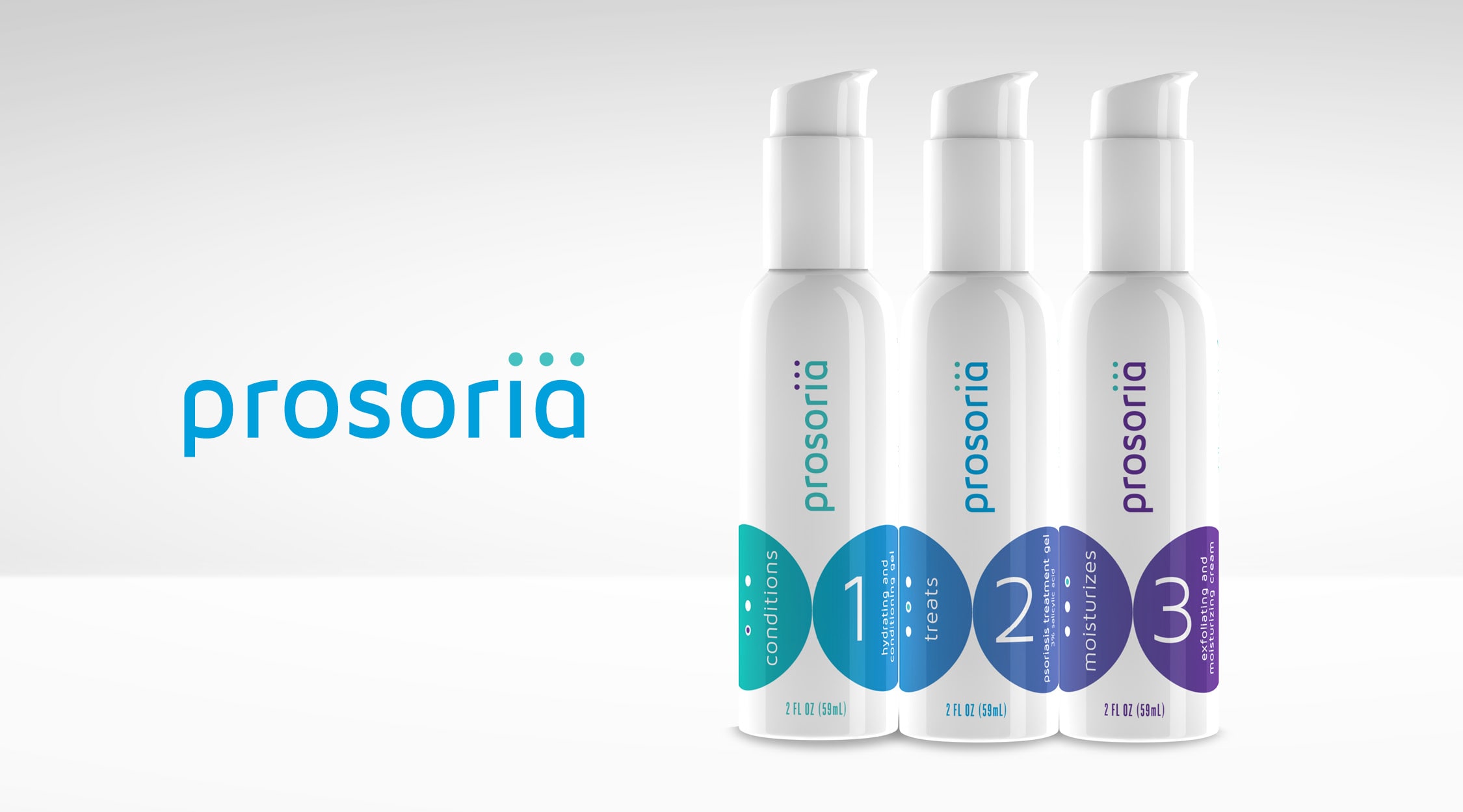
A Message that Reads as Easy as 1-2-3
We wanted to highlight that Prosoria was an easy-to-use, highly effective OTC product with the quality of prescription psoriasis treatment. When creating the brand, we developed a logo and brand that stands out in the OTC space, but still has the reliable look and feel of a prescription-strength brand. Our team also sought to create a package that stood out on the shelves and engaged consumers to pick it up and purchase Prosoria.
We created a logo that includes 3 dots on top of the “i” in “Prosoria” to symbolize the application process and the packaging links together to illustrate a clear sequence of order and use. Like so many products, adherence is key and we wanted consumers to clearly understand how to use this product to get the best results. The gradual, easy gradient of blue to purple nods to the ease of use and the friendly effects of psoriasis treatment by Prosoria.
Results:
- Created a compelling, friendly identity system and packaging that communicates the ease and effectiveness of a new product that will stand out in the over-the-counter space.