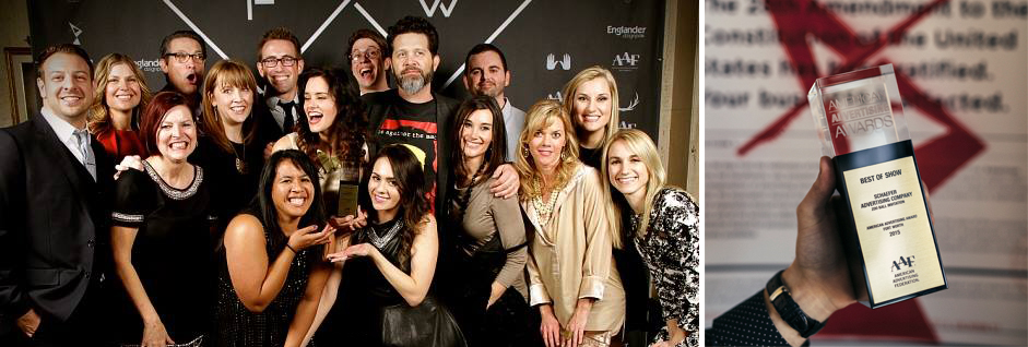
On Friday night, advertising professionals from all over Fort Worth gathered for the 2015 American Advertising Awards. As last year’s Best of Show winner, Schaefer was responsible for this year’s event theme, which was “Amendment 28,” a modern take on prohibition except that it was advertising and not booze that was illegal.
In typical Schaefer fashion, we had a lot of fun with it. From a fake theme to fake government agents to real posters taped on real agency doors, we used a wide range of media to keep the game going. It all culminated last Friday with “The Event” – a secret meeting of ad pros at the Fort Worth Masonic Temple to celebrate in secret another year’s worth of work.
Results are still coming in, but early returns suggest that the event was a success. Guests enjoyed hors d’oeuvres and drinks while sizing up with each other’s work and catching up with old acquaintances and coworkers. The awards presentation video, courtesy of our friends at Studios 121, maintained the underground theme with glitchy effects and the subversive statement that, “If advertising has been outlawed, then we are all outlaws.”
Fitting then, that we made off like bandits, coming away with 16 total awards including five golds and another Best of Show award for the 2015 Zoo Ball invitation we did for the Fort Worth Zoo. Designed by Blair Babineaux with art direction by Charlie Howlett and production by Maren Gibbs, this piece is a fitting jewel to crown a busy and productive 2014.
Of course, winning Best of Show again means we get to put on the show next year, but we’d rather not think about that for a few months. It was a lot of work.
Here’s to a great 2014 and to our three-peat next February!
The annual Fort Worth Zoo preschool is a great way for kids to learn all about their favorite animals from A to Z. So, industrious designer Jon Chapman set about illustrating a menagerie of animals – one for every letter of the alphabet. This series of animal flash cards was made available on the Fort Worth Zoo website so parents could print them out for their kids’ to enjoy. Which one’s your favorite?
Congratulations to client and Near Southside neighbor, Moncrief Cancer Institute, on their brand-new, state-of-the-art mobile clinic! We may have designed the outside, but the inside is the exciting part. Soon, services like cancer screenings, one-on-one exercise sessions, personalized nutrition planning, clinical support and more will be coming directly to the people of Tarrant County and surrounding areas.
This was the second year Schaefer got to produce the annual TCU Baseball video. The team was coming off a very successful year, yet they still felt the sting of coming up short in the College World Series. For 2015, both the coaches and players had an even greater resolve to take it all the way to the championship.
Based on the Boy Scout oath, “On Our Honor” is a promise to themselves, their teammates, coaches and fans to follow the path of selflessness, energy and excellence.
This was another fun shoot with N8 Visuals out at Heart of the Ranch in Clearfork, another Schaefer client. Even the non-Horned Frogs here at Schaefer are excited to see how far TCU Baseball can go this year. Go Frogs! #toadtoomaha
The Story
Clearfork is a new mixed-use development on what was the last undeveloped piece of the legendary Edwards Ranch. Many Fort Worth landmarks like Texas Christian University and the Fort Worth Zoo now sit on what once was Edwards Ranch property, but the Clearfork portion remained virtually untouched since 1848. Having just completed the Clearfork branding and positioning, the client asked us to produce some vinyl banners to announce the coming development.
“Sure, we can do that, but…”
The Work
With a newly completed road cutting through the property, this was the first time most people had seen this property since before Fort Worth (the actual fort) existed. We felt this called for something a little more unique than a vinyl banner.
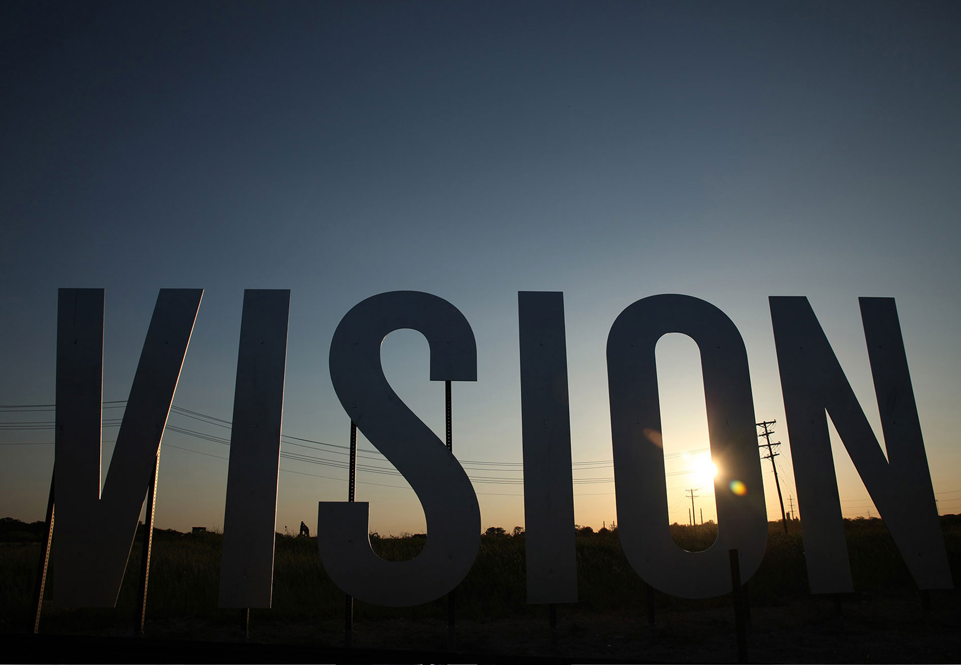
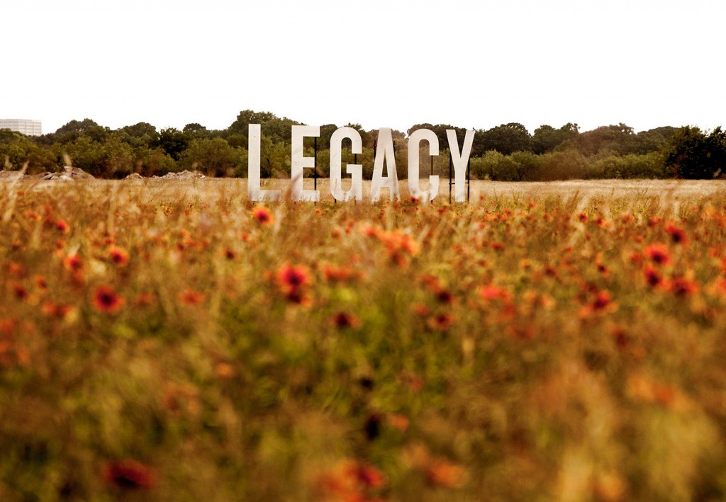
Pulling back from the assumed solution of banners and focusing instead on the goal of attracting passersby’s attention, our ideas included an iron ranch sign, cattle guards and a water tower. What won out in the end were what the team dubbed “word crops.” Three eight-foot-tall words were strategically placed around the property: discover, legacy and vision.
The road to the final product was a long one, since none of us had ever seen word crops before. We cut an “A” out of a sheet of plywood in the side yard of our office and hauled it out to Clearfork to see where the words should go. Our production manager then talked with a variety of vendors to see if anyone could do it on-budget (one could). We had a test letter made with three colors of paint to see which worked best (silver).

The Results
The word crops were a success in several ways. First, they captured people’s attention and made them curious about what was coming to the property. Second, they garnered some social shares as people took photos with the words and shared them on their networks. Thirdly, (shameless plug) they earned Schaefer the Best in Show American Advertising Award for 2014.
Best of all, they’re a perfect example of what we mean when we say, “Give us your goal, and we’ll seek what’s possible.”
Flash Global Logistics was in need of a new logo that more accurately reflected their brand identity – including the company’s global solutions, evolving culture and growing customer base of emerging companies. Considering the scope and implications of a change on this scale, we would like to prepare for a full rebranding initiative, beginning with the development of a new logo and associated identity style guide.
The new logo needed to convey a progressive look and reflect the company’s evolving culture and growing customer base of emerging companies.
Our solution introduced a shortened name, Flash Global and an iconic ‘F’ mark. Speed, efficiency and strength are at the root of what Flash Global promises their customers and the new mark embodies each of those. Moving into this new look has inspired their internal team and helped them elevate their own expectations for the company as a whole. Visually, the brand now matched the quality of the product they have been delivering for years.
Schaefer launched the new Flash Global brand with a new logo, business papers, website, presentation support and all kinds of new swag for the teams at Flash.
Schaeferites are inspired by all kinds of things. One look at our desks will tell you that: toys, baseballs, elephant figurines, mugs from places we’ve been, etc. The nature of explorers is that we go out into the world, gather inspiration and bring it back. However, sometimes that inspiration comes to us. Ladies and gentlemen, we give you Moondream, the paper that turns translucent when you emboss it.
“Oh. Hey. Christmas card.”
But what should we emboss? How about our building? Yeah, our building. From our home to yours? Yes. Christmas or holidays? Christmas. Candle to put inside? DO IT. Wait, too expensive. It’s okay, people have candles. What if they burn their houses down? Include instructions. Who’s going to fold and stuff and stamp them? We are.
And that’s the brief but accurate history of this year’s Christmas card. Hope it finds you well.
Pinnacle Healthcare Advisors, Inc., is focused exclusively on partnering with healthcare providers to improve clinical, operational and financial performance. Their consultants have an average of 20 years of experience in healthcare, which includes working for both healthcare providers and consulting firms. Additionally, their consultants have both clinical/operational and IT experience and are experts at fully leveraging system capabilities to meet end-user needs. It’s this unique breadth of knowledge and experience that sets them apart.
Schaefer was tasked with updating the Pinnacle brand to match their highly specialized offerings and vast experience in an ever-changing industry. We worked through branding and collateral materials to give them a solution that separated them from their competition and gave them an identity that could work hard for them with a bold, strong presence.
The new logo eliminates the separated icon of the original and instead incorporates an angular flag into the letter P. It’s a simple design detail that simplifies their logo and creates a clean, modern look. The bold color palette of red and electric yellow was selected to stand out from the ocean of ‘waiting room’ blues and grays found throughout any healthcare sector.
Like most of our clients, Pinnacle’s offerings were already the top of their industry, what hey needed was a consistent brand identity with a personality. Now, they have the proper brand foundation to build on as their company continues to grow.
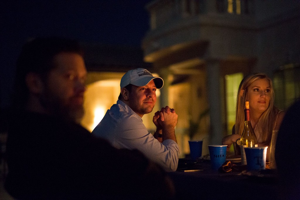
The annual Schaefer Christmas party is always preceded by several months of planning, intrigue and lies, resulting in something of a cat-and-mouse game between the party planning committee and those who get off on ruining surprises.

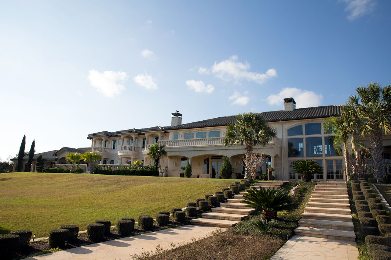
After a concerted effort to make us all think we were flying somewhere (convincing many), we loaded up on Thursday morning and drove to our destination: a 16,000 square foot mansion on Lake Travis near Austin.
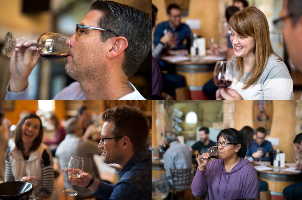
Arriving earlier than expected, the party planners called an audible – a wine tasting and tour at nearby Flat Creek Estate. Not a bad way to kill an hour.

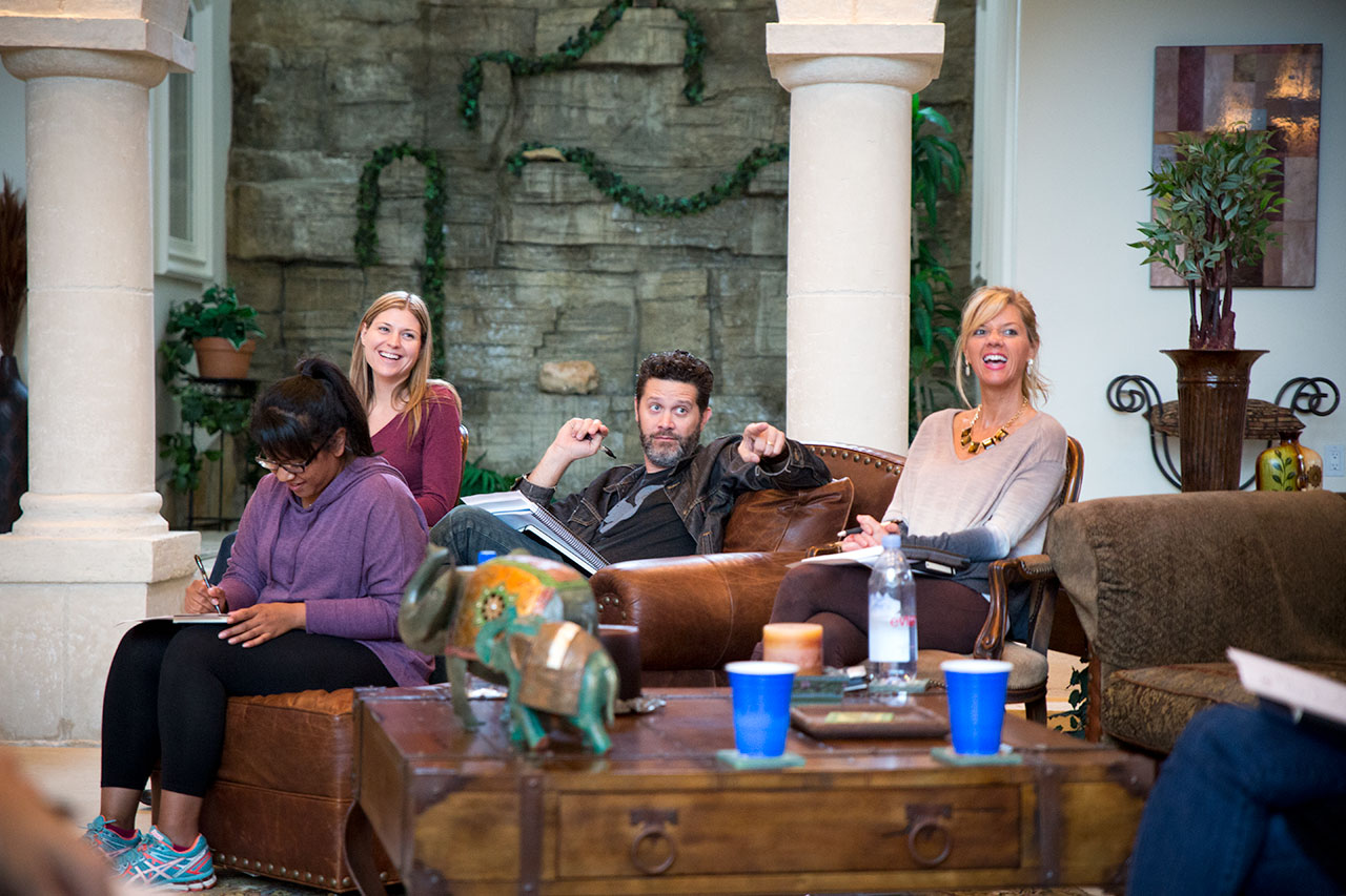
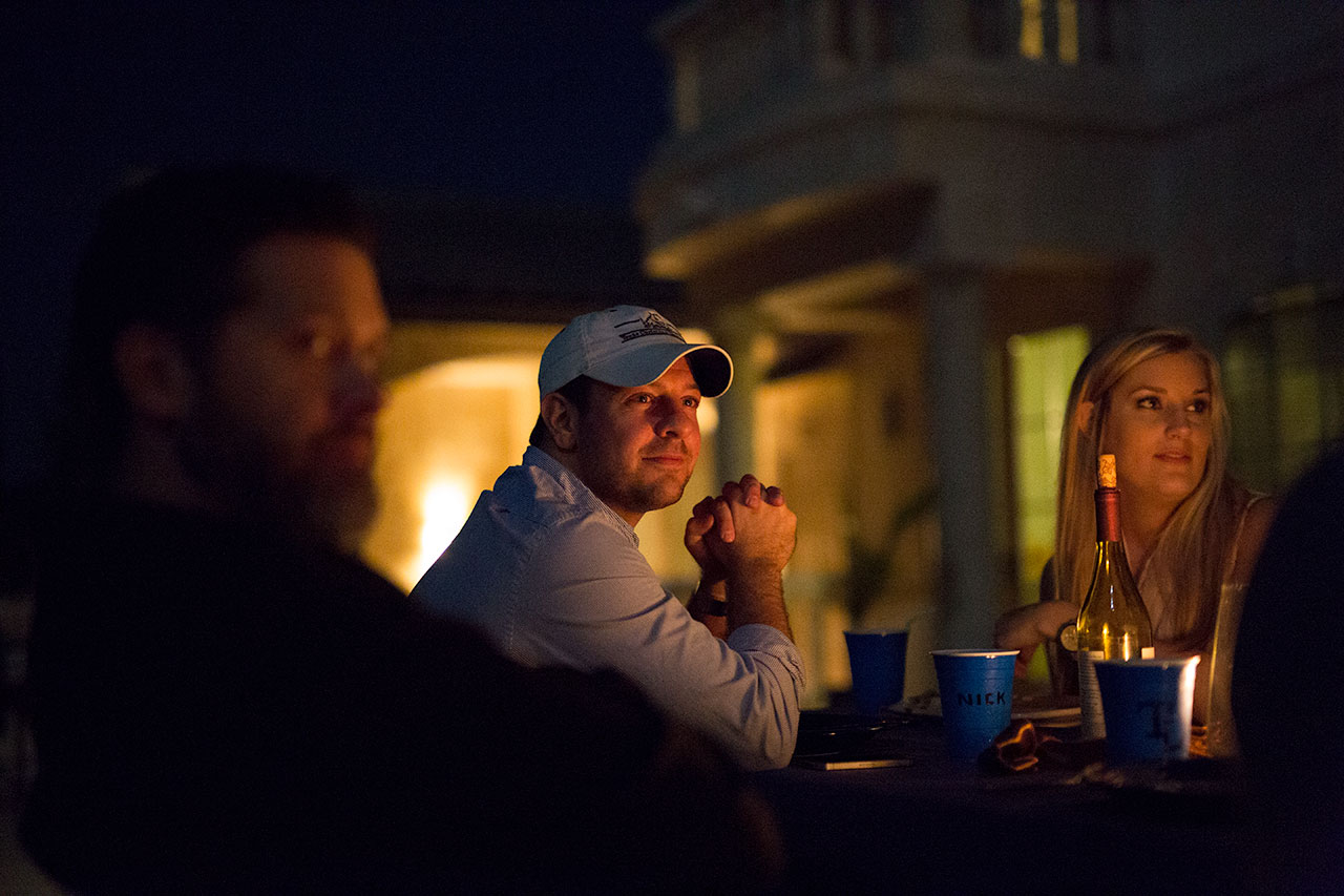
After unloading the trailer and exploring the enormous house and grounds, we began the business of the day. This trip was to be part year-in-review, part looking ahead and part Burning Man. That is, a tamer, fully-clothed Burning Man without all the costumes and glitter.
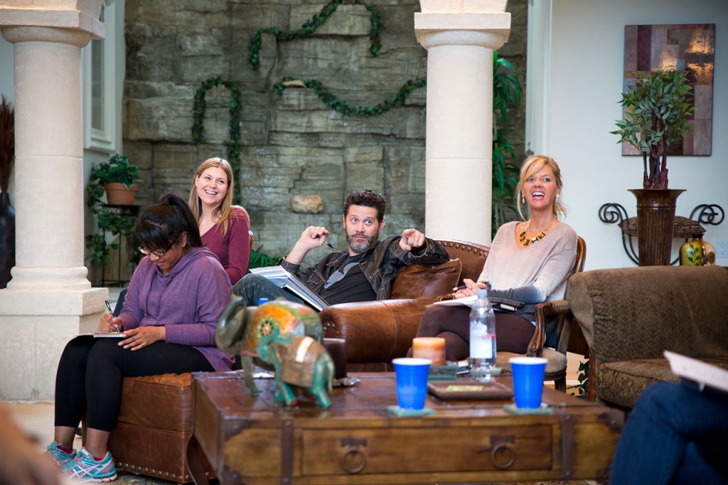
Nicknames were earned, lingo was added to the already expansive Schaefer lexicon and we all came away with a clear vision of our goals for 2015. Some people also left with a headache.
Stay tuned for big things next year. Thanks for being a part of this one, even if it was just by reading this blog. There are a lot more photos to look through on our Facebook page, so head on over there now, please.
Merry Christmas from all of us at Schaefer.