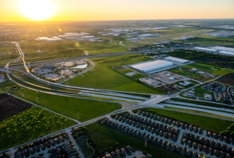
In real estate, a “sea of sameness” exists that engulfs the majority of brands. From real estate companies to master-planned communities to apartment complexes, there is a lot of branding overlap that makes it difficult for consumers to differentiate one brand from another. But, this industry-wide ubiquitous branding opens the opportunity for other brands to rise above the noise and connect with more consumers on a deeper level. For Hillwood Communities, that meant telling unique brand stories for multiple communities beneath one parent company.
Goals:
- Analyze each community individually, and define their brand’s differentiators
- Perform detailed market research to discover how each brand stands apart from the real estate market as a whole
- Develop branded material for each of Hillwood’s communities that can be used across mediums for various marketing goals
- Tell distinct stories for each development that will better resonate with target consumers
Navigating The Sea of Sameness
There’s a widespread marketing problem – the sea of sameness – that affects a variety of industries, but it is particularly prevalent in real estate. The sea of sameness occurs when marketers and brands capitalize on similar strategies and KPIs, resulting in identical tones, marketing approaches, and even branding aesthetics. This ultimately dilutes a brand’s market impact, and waters-down the effectiveness of marketing strategy. This market saturation makes it incredibly hard for brands to create real connections with the consumers they serve and hurts their ability to build long-term relationships with consumers.
Strategizing Brand Differentiators
The sea of sameness isn’t all bad, though, and gives willing brands a clear opportunity to use distinctive branding and different marketing tactics to overcome the ubiquity afflicting their competition. For Hillwood, we treated each individual community as its own entity and branded around what makes each community a unique and identifiable neighborhood.
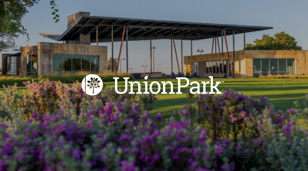
Union Park is an active community that features an onsite elementary school and expansive green spaces. We wanted the community’s energy to shine through, so we used bright, vibrant colors, and highlighted some of the young residents having fun at the park, which better connects to the young family demographics at Union Park. The energy pops off the page, and the brand lives up to the tagline “live a vibrant life.”
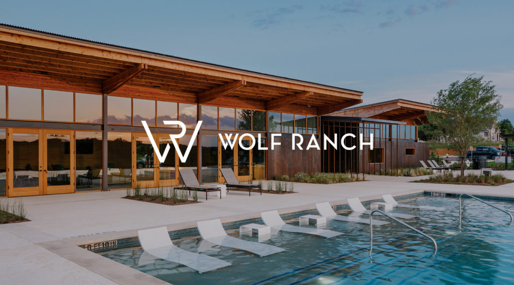
Wolf Ranch is situated in the Texas Hill Country and offers a scenic, relaxing way of life hidden along Georgetown’s San Gabriel River. The residents of Wolf Ranch seek escape and adventure, so the brand had the opportunity to really lean into that with messaging and creative. We chose “the hill country is calling” as a tagline, warm, natural colors, and stunning photography of the community and the surrounding Hill Country in the brochure to mimic the nature surrounding Wolf Ranch.
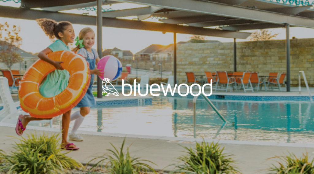
Bluewood is a community in every sense of the word, where residents come together to form real connections and friendships. The community offers an abundance of features such as a community pool, trails, and an on-site elementary, all within a very attainable price point that appeals to Millennial and first-time homebuyers. To brand Bluewood, we chose bright, bold colors that help communicate the community’s exuberant energy. We brought through some of the blue colors used throughout the development and chose the tagline, “a community without compromise” to better highlight all the offerings at an affordable price.
Each specific brand identity is built with identifiable marks that express the community’s individuality. That same individuality allows the brand marks to be fluid and flexible, and useful on a variety of mediums. From brochures to websites and outdoor signage, the brand is clearly communicated and identifiable. By making that connection, we’re able to help spread broader awareness of Hillwood Communities’ developments, and more meaningfully connect with a larger audience of potential home buyers.
Results:
- Created a full brand platform and messaging pillars for each community
- Full asset creation and ability to utilize assets across platforms
- Created a unified brand message, look and feel for each brand