TCU Football is back! In the 8th year of this project, we wanted to celebrate TCU’s tradition and history in a way that would unite all Frog fans. Last year, fans missed out on the game day experience because of COVID. This year is all about reuniting with the gridiron, tailgating traditions and most importantly, each other.
The theme for this year’s Riff Ram video, Gather, centers around a return to normal as it takes you on a game day journey through campus, tailgating at Amon Carter and into the stadium itself. Game days in the fall look different for each Horned Frog fan. Some fans enjoy the game day experience from their couch, while others spend all week planning for their perfect tailgate. Regardless of how we support the Frogs, we are stronger together. Gather celebrates the triumphant return of the Horned Frog Faithful by bringing us back to the beat of the drum, the rustle of pom-poms and the roar of the crowd.
See you at the Carter!
Credits:
Concept by: Schaefer Advertising Co. Produced by: Schaefer Advertising Co. and Make Something Beautiful
Every year, migratory birds travel through Texas to reach their destination. Many of them migrate at night, when street lamps and building lights shine bright. During peak migration months, artificial lights can pose a danger and often cause death for millions of migratory birds traveling at night. Inspired by our love of the Texas sky and all the wildlife in it, we developed a campaign to raise awareness and encourage Texans to turn off the lights.
The Challenge: Reduce Unnecessary Light Pollution
The Cornell Lab of Ornithology has dedicated itself to advancing its mission of understanding and conserving the natural world—with a specific focus on birds. According to research, light pollution emitted from Texas cities, especially DFW and Houston, attracts and disorients birds—causing millions of them to fatally collide with buildings and windows. To reduce non-essential light output during peak migration times, Cornell Labs partnered with Schaefer to create a PSA campaign to drive measurable change. The “Lights Out” initiative was designed to raise awareness around the issue and show Texans that saving millions of migratory birds is as easy as flipping a switch.
Protecting the Skies Over Texas
Our biggest challenge was utilizing data to create an emotional response, ultimately driving people to not only pay attention, but to act. We focused our attention on the two groups who could make the biggest difference—residents and commercial building owners/operators. With a nod toward Texas’ unofficial motto “Don’t Mess With Texas” and an appeal to Texan pride, we created the Protect the Skies Over Texas campaign.
Utilizing hard-hitting facts and direct language, we developed a message that spoke to our key audiences. The language paired with clean typography and bold visuals to make the campaign difficult to ignore. And easy to act on. To track the effectiveness of our planned media, we invited Texans to pledge to flip the switch on nonessentiallighting.
Meaningful change begins within our communities, so we connected with local leaders and business owners to ensure the campaign messaging we delivered inspired people to make a difference—in the air and on the ground.
Every year, the Fort Worth Zoo hosts an immersive educational experience called Summer Zoo Camp. This adventurous program offers campers—from kindergarten to high school—a variety of unique summer camp options. Coming off the heels of the pandemic, families in North Texas were thrilled to give their children a chance to learn, play and make new friends in a safe, outdoor environment. And the Fort Worth Zoo was ready to provide the perfect space to experience wildlife up close.
Proud to create a fresh and original concept once again for this annual event—we infused into it, the world’s collective excitement for getting back to normal with those we love most. Leaning into a familiar and revered summer tradition, we concepted an enticing summer blockbuster theme, successfully casting a wide net on a wide-ranging audience.
Coming To a Zoo Near You
Summer Zoo Camp is a truly one-of-a-kind program where campers of all ages can safely explore and expand their knowledge of wildlife conservation. All while discovering new friendships and finding ample opportunities to grow their imagination. We recognized the importance and the potential impact of this educational program for young explorers, so we set out to create messaging that would attract the true decision makers in the home—moms. Every year, the Zoo creates themes that drive the conceptual direction of the creative. Inspired by this year’s movie theme and the posters theaters use to promote films, we featured Summer Zoo Camp and a star-studded cast of camp experiences.
Choosing to incorporate bright, flying flamingos in our messaging allowed us to easily showcase one of the Zoo’s favorite characters to catch people’s attention immediately. Our digital advertisements performed exceptionally well—as this medium allowed the static flamingos to animate and fly across the screens of thousands of North Texans. By the time the credits rolled, Summer Zoo Camp had nearly sold out, successfully achieving summer blockbuster status.
Results:
2,586 registrations were made—achieving 98% of the target goal
More than $716k in revenue reported
Our flying flamingo stars made over 8.5 million media impressions while in the spotlight
Northpointe is a new master-planned community by Lennar that offers young families an ideal place to call home. Before opening to homebuyers, we needed to build the Northpointe brand to engage a wide audience and drive home that master-planned communities provide a practical and enriching lifestyle for young families at an unmatched value.
Understanding Northpointe’s Local Competition
Before offering any strategic recommendations, our team performed an in-depth competitive analysis to better understand the local market and isolate any opportunities for competitive differentiation. One specific challenge was that some of Northpointe’s competitors used the word
“North” in their brand name, which required us to offer direction that differentiated the Northpointe brand through visuals and copy.
Finding Brand Differentiation
Since Northpointe was in the pre-construction phase, we had to develop the brand from the ground up, setting the tone for the community to offer potential homebuyers a sense of home and depict a reliable place where friends and family can gather and enjoy each other and the community. Furthermore, we needed to create a flexible set of brand assets that the Northpointe team could leverage internally and in future marketing campaigns.
Our discovery process revealed that Northpointe is incredibly accessible and cost-effective, and an excellent option for young families seeking to buy their first home. More than that, Northpointe offers residents fantastic amenities without compromising on an excellent price point. So, we leaned into creating an attainable, yet elevated brand that appealed to people who are ready to put down roots.
Building a Fluid Creative Platform
The landscape was an important part of how the community was planned, so we tethered the brand story to the scenic views and natural beauty surrounding the area. We positioned Northpointe as the attainable, unique option and highlighted the scenic nature surrounding the community to illustrate its natural beauty and striking topography that envelopes the community.
The brand mark is quiet and subtle and the arrow above the “N” signifies the true North where home lies. The color palette is natural, but vibrant and balances the reserved nature of the brand mark.
Our tagline “When home calls, head North” is emotive, aspirational and strong, which further elevates the subdued nature of the brand mark. It also illustrates the beauty of home and touches on the natural surroundings that make Northpointe such a valuable place to live.
The stylistic complements we developed for the brand helped create a sense of place that can be used throughout the community. These pieces will weave the community together and keep the feel built within the brand alive throughout.
Results
Crafted a brand that will attract and engage new homebuyers
Created a flexible brand that is simple and seamless for Northpointe’s internal team to utilize
Extended the brand through community elements like trail-markers, landmarks and wayfinding solutions
The Fort Worth Zoo was looking for a way to refresh their Valentine’s Adoption campaign to reach a broader audience and encourage more adoptions. As a new year approached, we gathered audience data and used our longtime partnership with the Zoo to create a reenergized Valentine’s campaign that appealed to a broader audience and sold more adoption packages.
Refreshing a Valentine’s Day Tradition
The Fort Worth Zoo Valentine’s Adoption campaign gives animal lovers a chance to show some love while contributing to the cost of care and wellbeing for the Zoo’s wildlife. In previous years, the Zoo primarily focused on penguin adoption packages, which were highly successful, but audience demographics revealed that most people purchased penguin adoption packages for children, limiting the impact of the campaign to one primary audience. Schaefer recommended including a new animal to encourage more engagement and the Zoo ran with our idea and responded by adding four new animals to the campaign—foxes, skunks, flamingoes, and porcupines — to fit more buyers’ unique personalities and relationships.
A Broader Appeal
Love has many definitions. By offering a larger selection of animals to adopt, we were able to personalize campaign messaging to connect with a wider audience and celebrate an even broader spectrum of love. For each animal, we chose to highlight different kinds of love that people experience.
Our romantic, love-focused options included foxes representing fox-y significant others. Our fun, anti-valentine’s day options were represented by a skunk and a porcupine because love can stink and even be a bit prickly. Finally, we included a “Galentine’s” option focused on celebrating positive friendships between women. By expanding our animal options, we were able to create a “choose your own” Valentine’s Day celebration.
We recreated a digital version of the classic Valentine’s Day cards from grade school for use on social media and leverage nostalgia as a vehicle for success. This medium offered us a space to use humor and strategically placed puns to highlight the different animal adoptions being offered as well as communicate the different types of love that Valentine’s Day celebrates.
Results:
Nearly 50% increase in animal adoptions sold YoY
40% of all orders were foxes
Despite Covid-19 and being a virtual event, 125 dinners were sold netting more than $15k in revenue
With new leadership in place the Fort Worth Chamber sought to revitalize the market’s perception within the Fort Worth business community and beyond. Schaefer was selected as their agency partner to lead them in developing and communicating the Chamber’s renewed energy and focus. The primary strategic imperatives were to both sustain the support of local businesses, while also expanding the Chamber’s economic development efforts beyond Fort Worth.
A Refreshed Position focused on New Energy, New Business
Each of our brand initiatives begins with a critical analysis of an organization’s strengths, weaknesses, and differentiators. For the Fort Worth Chamber, we identified the opportunity to capitalize on the legacy of the organization while creating a more defined and contemporary position that was current with today’s business climate. For the refresh, we saw an opportunity to stay true to who we are as a city and people, and root the Chamber’s new identity in the trailblazing spirit that has always defined Fort Worth.
We needed to reposition the Fort Worth Chamber from the outdated organization many perceived it to be to the vibrant connector, advocate and driver of economic development they are today. Tapping into the exuberant energy of the Chamber’s new leadership, we focused on positioning the brand as an energetic organization that provides new business opportunities to trailblazers and entrepreneurs alike.
A Trailblazing Identity
Through our archetyping process, the agency established the organization as a Hero persona, defined by strength, courage, commitment, and a drive to move things forward. Using the Hero archetype as a foundation, our creative team explored a multitude of solutions for the new Chamber brand. In keeping with our process of immersion, the team explored other related and competitive organizational brands, the history of Fort Worth and the Chamber to inspire the recommended design solutions.
A key objective in creating the new brand identity was to build a flexible system that could be used across platforms and multiple team members. The new identity has been seamlessly incorporated into the marketing efforts of the Chamber’s internal team and provides a malleable brand kit that they can use for years to come.
Check out our case study to learn more about the refreshed Fort Worth Chamber of Commerce identity.
Introducing The New Frontier of Business in Fort Worth
To introduce the refreshed and refocused Fort Worth Chamber, we leveraged the creativity of the new brand identity and launched the “This is the New Frontier” campaign. The campaign was a fresh way to communicate the future of the Chamber and its role in Fort Worth’s economic development to existing members and new business prospects. We wanted to create a campaign that was uniquely Fort Worth and nodded to the legacy and history of the Chamber, while highlighting the exciting new opportunities that our city offers moving into the future.
To focus on the energy of the new Chamber, we captured authentic video footage and photography using real Chamber members. The tone of the assets are impactful, positive and motivational and highlights the frontier of the future on which the Chamber sits and actively cultivates. The final campaign is aspirational and confident and communicates that Fort Worth is a place where people roll up their sleeves and get to work. To launch the campaign, we used a targeted media strategy consisting of automated direct email, paid social, paid search and community influencers leveraging the rich assets we captured in the video production and photo shoot.
Results:
This campaign aimed at promoting the Fort Worth Chamber’s launch into the regional market and their renewed emphasis on driving and supporting business growth in the city. It led to an increase in lead generation, memberships and interest in partnerships with the Chamber.
1.9 Million Media Impressions
5.3K Paid Search
246.6K Paid Social
1.2M Display
396.5K External Email
Web Traffic Growth
46% Increase in Direct Traffic
64% Increase in User Engagement
19.5% CTR from Paid Search – 5x the industry average
230 Form Fills in 74 Days
66% Increase in Contact Us Submission
34% Increase in Membership Inquiries
Schaefer Advertising is a valued strategic partner of the Fort Worth Chamber of Commerce. When we embarked on a complete overhaul of our brand, they provided subject matter expertise, thought leadership, and made the process an enjoyable one – no small feat! I would highly recommend Ken, Sara and the entire Schaefer team for any organization whose stakeholders demand excellence and a legacy brand in the Fort Worth community.
Mobility and innovation districts are places where pioneers make critical advancements in logistics and supply chain modernization. It’s also a place where technology breakthroughs are developed that can affect billions of people. They are critical to advancing how consumer and commercial operations move forward to improve lives everywhere. The challenge with innovation districts is communicating a tangible concept that resonates with valuable audiences and encourages entrepreneurs, scientists and business leaders to utilize the district’s capability.
We partnered with the AllianceTexas Mobility Innovation Zone to create a flexible identity package that communicates all the intangible benefits this testing ecosystem can provide mobility visionaries and their teams.
Making Intangible Value Tangible
We partnered with the MIZ team and entered into extensive discovery sessions to better understand where MIZ stands in the market and how we can highlight their value proposition and boost awareness of the one-of-a-kind opportunity that the MIZ offers mobility innovators. In marketing the MIZ, our first charge was to articulate the opportunity that the MIZ offers to technology innovators by creating a vision for something that did not yet exist.
Through this discovery the Schaefer team identified that the AllianceTexas MIZ was a genuinely unique blend of people, places and things, structured in a manner unlike any other innovation zones. We leveraged this differentiation into a defining position and archetype to inform the subsequent brand identity and campaign creative development. This allowed us to tangibly define the value that the MIZ brings to entrepreneurs and innovators that elect to use their district and capabilities. Ultimately, this helps the MIZ advocate for new businesses and create long term partnerships with innovative companies that bring jobs to North Texas and innovation to the mobility industry.
Messaging Full-Scale Innovation
We crafted “Innovation from the Ground Up” as a key message to clearly position the opportunity of the innovation zone. It nods to the full-scale capabilities of the MIZ and communicates it as a place where mobility innovators can push the boundaries of now to discover what’s next and do it all—ideation to implementation—at the MIZ.
Deploying a Detailed Digital Activation
We launched the updated identity with the “Innovation from the Ground Up” campaign, which introduced the MIZ as the premier, pioneering testing, scaling and commercialization ecosystem. The campaign solved three key communications requirements: promoting the MIZ brand, communicating the surface capabilities, and promoting the airspace utility. This reflects the total MIZ ecosystem and communicates it as a flexible, utilitarian space that is open for business across the mobility industry.
We developed a multichannel digital marketing plan to launch the “Innovation from the Ground Up” campaign, utilizing paid media, native and sponsored content, email drip campaign and display banners. For paid ad placements, we strategically chose publications that resonated with our target audiences in the logistics, aviation and entrepreneurship industries. The campaign also engaged prospects directly through a targeted email campaign, which encouraged website form fills to contact the MIZ to use their testing ecosystem. Ultimately, the digital strategy is successfully creating extensive brand awareness and driving both engagement and conversions from high value prospects which has yielded new business partnerships for the MIZ.
Early Results:
300% increase in form fills MoM since beginning of campaign
82% increase in Contact Us form fills
Display impressions increased nearly 200% MoM resulting in 141% more clicks
Golf is a timeless sport that brings people together to enjoy camaraderie and pristine, cultivated greens. But, what happens when you add luxury travel and experiences into a premium golf membership? You get Icon Golf – an esteemed golf and travel membership that takes players around the world. Icon needed to revamp their brand to generate more memberships, so they partnered with the Schaefer team to refocus their sales efforts with a full-scale, multichannel digital campaign and a new website.
In 2020, Icon invested in increasing their sales from 250 memberships to 1000. So, they partnered with Schaefer to revamp their brand, generate more memberships, and focus their sales efforts with a full-scale, multichannel digital campaign and a new website to meet their very aggressive goal.
Goals
Grow Icon Golf membership database from 250 to 1,000 in 18 months.
Refresh the brand identity
Develop a content marketing strategy
Build a CRM to streamline lead generation and membership management
Improve online user experience
Prioritize sales efforts
Roles
Strategy
Creative
Digital
Branding
Positioning
Client Services
Partnering to Develop a Structured, Integrated Sales Process
We began our relationship with Icon Golf on the ground level as they were initiating the formal development of a structured sales team. This allowed Schaefer to partner directly with the Icon team to merge sales and marketing efforts. Icon’s previous marketing efforts were primarily functioning by word-of-mouth and leveraging connections with existing club members within their portfolio. While this approach was successful, there was an opportunity to expand their sales efforts through digital automation to reach a wider audience.
We started by evaluating each medium against our overall goals and the need to fill the funnel with awareness initiatives and convert interested prospects into members. We found that paid search and streaming audio and video proved successful for building awareness, and third party publication emails allowed us to hit a very targeted audience that was ready to convert.
A Refreshed Creative Platform
We recognized an opportunity to reinvigorate their creative platform to better communicate the unique benefits that an Icon membership provides. Icon Golf offers members full privileges with an expertly curated collection of private golf clubs as well as luxurious member experiences and fully planned quests to exotic locales. So, Icon Golf is much more than a golf membership – it’s a full-package of golf and travel – and communicating that was the central challenge of updating their creative.
When creating the updated creative platform, we focused on the luxury aesthetic and benefits of an Icon Golf membership. We wanted the design and language to reflect the elevated perks and nature of the membership, all while highlighting the relationship-focused aspect of joining Icon Golf. The camaraderie between Icon members is a key strategic imperative, so we had to make that central in the updated creative deck.
We created the concept “Legendary is Within Reach” as our primary branded language alluding to the potential for legendary moments with legendary people, on and off the course.
A New, Optimized Website
The central piece of Icon’s rebrand was optimizing their website to generate more qualified leads. Previous to our relationship,the Icon Golf website was split into two different URLs – Icon.Golf and IconGolf.com to satisfy internal marketing objectives. However, this split up their traffic and made consolidating valuable lead information more difficult. So, we combined their properties into one streamlined website. To increase the site’s performance, we implemented key SEO and content updates targeted at their primary audiences.
Our team also redeveloped the site with crucial user experience updates to improve site accessibility and usability aimed at generating form fills from qualified leads. To improve usability, we simply added header and footer navigations to improve the overall user experience. In addition, we employed site tagging to capture key user behavior metrics in order to continue to drive future data-driven site optimization opportunities. Finally, we placed CTAs throughout prominent areas of the website so that users could always and easily make direct contact with the reps at Icon Golf. The final result is a website that supports Icon’s strategic marketing goals by generating more engagement and qualified leads.
Creating a Centralized Lead Strategy
To continue to round out the lead generation strategy, we implemented a CRM strategy to accurately target lists of valuable, interested leads with compelling emails. We connected key data sources – the Icon website, MailChimp, and Salesforce as well as other lead collection points to ensure that our data automatically fed into the sales process and reduced the work the sales team needed to do to generate more memberships.
We created a variety of emails around the central message “Legendary is Within Reach” that ultimately guided leads to complete a form fill and capture valuable data for converting more leads.
To round out the digital strategy for Icon, we created a multi-channel paid media strategy that targeted valuable audiences in paid search, paid social media, display banners and email. In addition, we cultivated strategic partnerships with golf publications and outlets to secure high-value placements in front of the most highly qualified audience.
Results
In 2021, Icon Golf had their best year ever, setting a record month for membership sales in December.
Reached 85% of their new membership goal in under 9 months
Last Click Attribution:
31 new memberships driven directly by campaign paid media
$450k in revenue
Total annual revenue surpassed 1.7 Million, resulting in a strong ROAS of 7:1
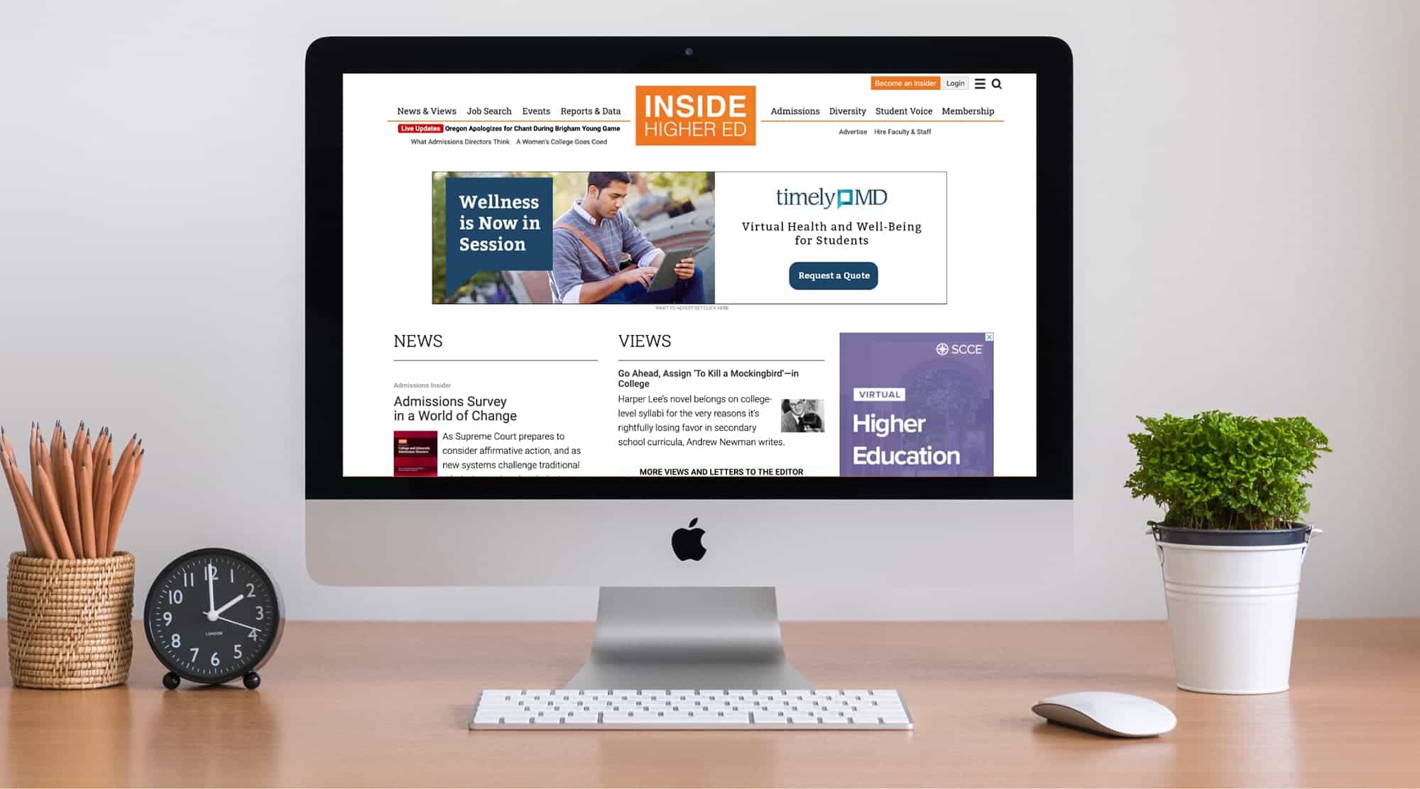
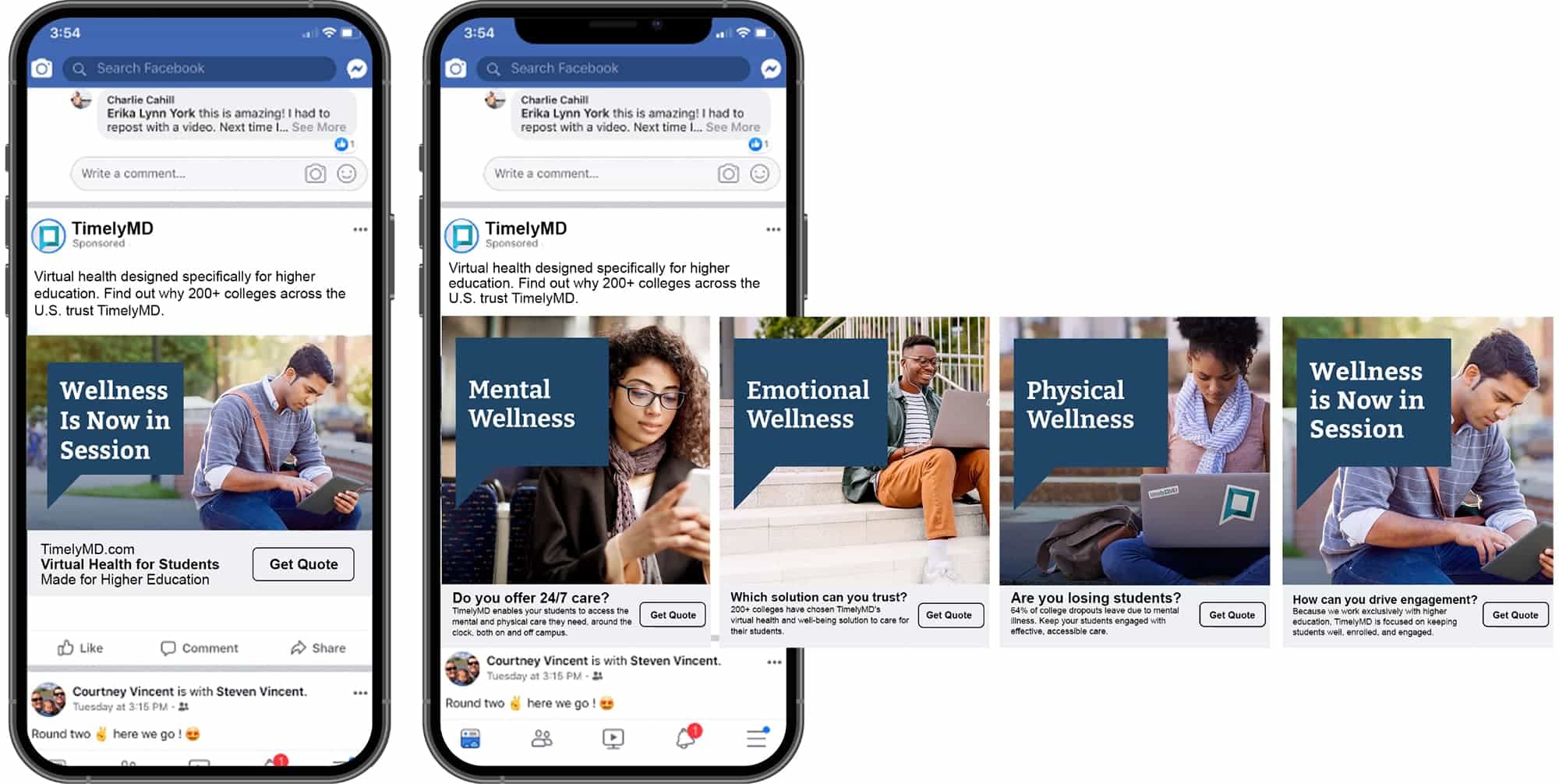
Our client TimelyMD approached Schaefer needing a new website that would help sell their telehealth services. After beginning the project, we discovered an opportunity to refine their market position to thrive and earn unimaginable results.
Goals:
Create a website with a modern look that performed better to aid in the sales process
Demonstrate to higher-ed clients how TimelyMD can aid in student retention
Appeal to decision-makers in higher education and attract students and providers
Taking a Clear Stance in Remote Healthcare
In the world of remote healthcare, most brands take a broad approach and treat general audiences. To help TimelyMD rise above their competition, we sought to differentiate the brand from the rest of their competitors. After intense discovery and research with the client, we discovered that no brand in the remote healthcare space is focused on treating the entire student – mentally and physically. TimelyMD offers mental healthcare in addition to their primary healthcare services, whereas most remote healthcare companies don’t provide comprehensive care that covers overall health.
To reinforce their commitment to student-focused telehealth, TimelyMD partnered with colleges and universities and worked with them on how best to serve their students during the Covid-19 pandemic. This willingness to partner with colleges and universities has been critical to their recent surge in growth and success and represents yet another key brand differentiator for TimelyMD.
Communicating a Focused Position
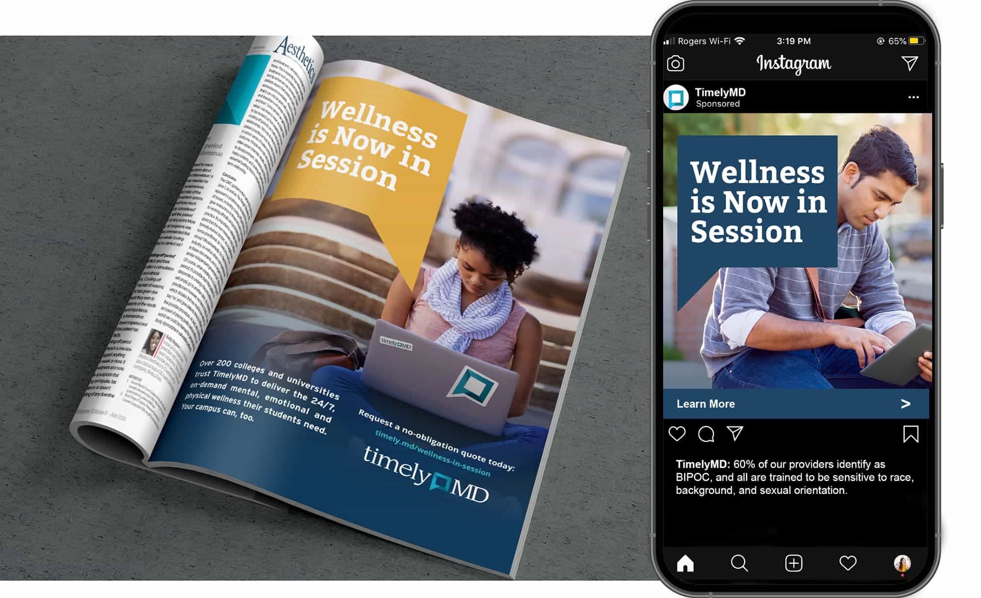
A refined position is only as good as the messaging that communicates it to the world. To illustrate the benefits of TimelyMD, we sought to amplify the brand name and their goal of supporting the health and wellness of students so they can focus on what matters—thriving.
Ultimately, we decided to pursue the concept “Time to Thrive” to demonstrate that TimelyMD helps students thrive in their physical and mental health while they’re at school. This represents a stark shift in the generic telehealth space, where most brands are marketing images of sickly students looking at their phones rather than enjoying their health. We wanted to reinforce that TimelyMD’s care leads to happier, healthier students, which creates thriving colleges and universities.
Building a Functional Multipurpose Platform
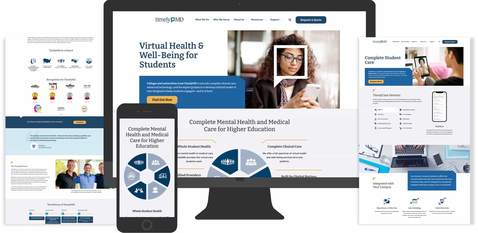
We began this project with the goal of building a functional website that performed better with an improved look and user experience. Before diving into web design, we sought first to understand who the primary audiences were and how they would use the site. Our research revealed that the primary users were school administrators, decision-makers, medical officers, and students. Each uses the TimelyMD site differently, so we had to balance their unique user experiences in the new website to satisfy strategic objectives for each. We designed different pages for each of the specific audiences that use the TimelyMD website to better connect with those users and satisfy their queries.
To improve the site’s functionality and user experience, we simplified the navigation and created more calls-to-action and displayed them prominently on each page. The simplified navigation and clear CTAs help focus the user’s journey into a desired action and made contacting the staff at TimelyMD far simpler. We also introduced better filtering capabilities to make it easier for any user to find the information they need more effectively. The final result is a website that is easy to navigate for different users and one that is more effective at delivering the right content and connecting users to the staff at TimelyMD.
Results
Created a new website
Created new messaging
Guided the client to successful, student-facing digital targeting
Established visual style
Organized their site so three distinct audiences could navigate with ease
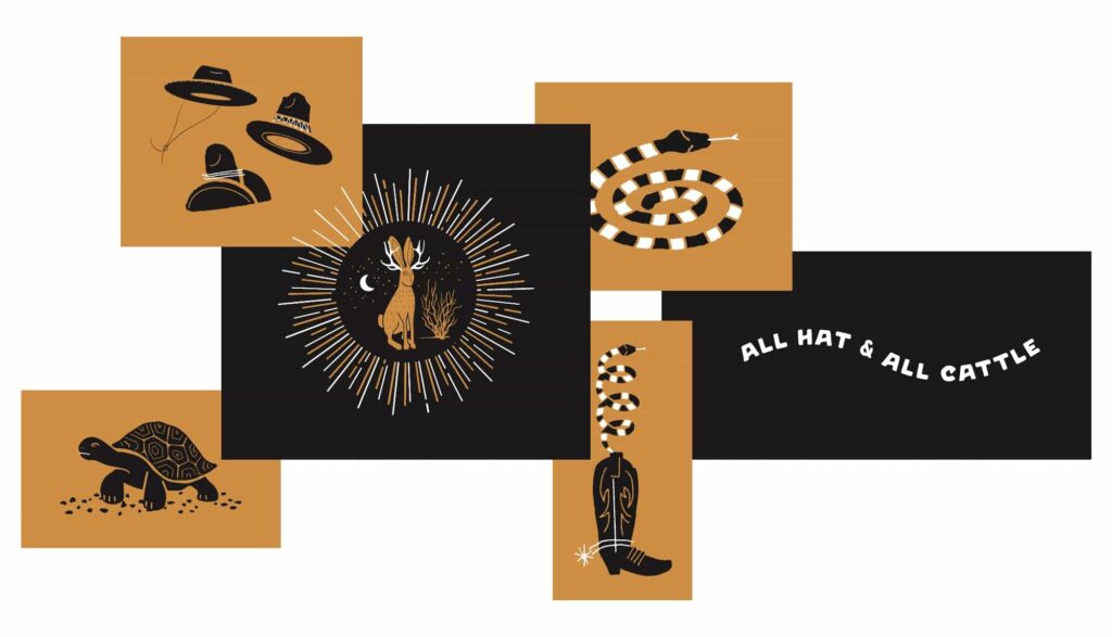
As a high-end, mixed-use development, Clearfork needed a naming structure for the five different multi-family projects. Through the brand positioning process, we uncovered the importance of the land to the Edwards family. Through in-depth interviews with family members, we heard stories that painted a vivid picture of how the family interacted with the ranch land for generations.
A Meaningful Name
One story in particular told how, as a young boy, one of the now elder statesman of the Edwards family would rest in the shade with the ranch hands when they would take a break from working the cattle. The ranch hands were surrogate fathers and big brothers to the Edwards boys and played a large role in shaping their young minds and teaching them a respect for the land. The idea was born to name the multi-family developments after these ranch hands. The first, is The Kelton.
Brand Mark and Creative Suite
The brand mark needed to match the sophistication of the Clearfork area, but remain as approachable and welcoming as the Kelton. We wanted to tie the mark back to the history of the land, and the symbol of an open gate was a universal and welcoming sign of hospitality. The resulting mark feels authentic to the family and their history, but is modern enough to attract the right people to these luxury condos.
Positioning the Kelton in Fort Worth
We also designed the website with the goal of giving people an idea of what surrounded this space. Up until its launch this was a largely unknown and unexplored area of Fort Worth, so we needed to connect people to the culture that surrounded it and the vision for what was being built up around it. To illustrate the soul of the Kelton, we photographed key parts of the city that helped paint a picture of the lifestyle they wanted to portray at Clearfork and The Kelton.
A Brand Rooted in Authenticity
Brought the Kelton brand to life with a new creative suite