Schaefer Advertising Co.

Web & Interactive

Icon Golf is a premier luxury golf and travel club that offers its members exclusive access to some of the world’s most prestigious courses and destinations. With a focus on camaraderie and unparalleled experiences, Icon Golf provides a white-glove touch that transcends traditional golf memberships. The organization prides itself on creating a community where members can enjoy the finest in golf, travel, and connect with like-minded individuals.

Despite its exceptional offerings, Icon Golf faced challenges in effectively communicating its unique value to potential members. The existing website needed an update that improved UX and better aligned with the luxury aesthetic the brand embodies. Additionally, the absence of a member portal created a segmented experience for both prospective and existing members. Icon Golf partnered with Schaefer to develop a comprehensive digital solution that would enhance membership sales and streamline internal operations.

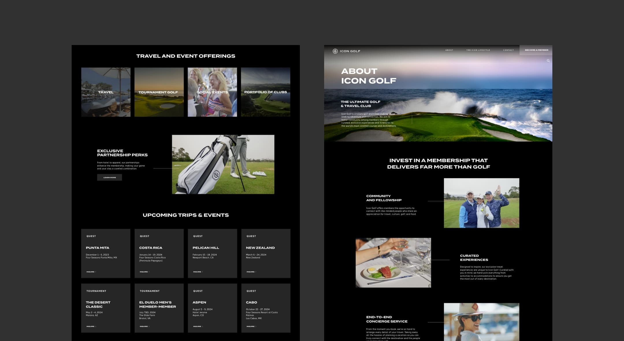
Icon Golf Interior Pages

Goals

  • Develop a clear positioning strategy 
  • Improve web navigation, responsiveness, and intuitiveness
  • Update the design to align with the luxury and sophistication of the brand
  • Unify the member experience through a member portal 
  • Streamline the conversion funnel by integrating CRM platforms and Hubspot

Approach

Schaefer designed a visually stunning website that instantly connects visitors with the brand’s lifestyle and identity. We began by formulating a clear positioning statement that emphasized Icon Golf’s unique selling proposition, highlighting the camaraderie and exclusive experiences offered. This foundational messaging was crafted to resonate with the target audience and integrated across all communications for a synergistic effect.

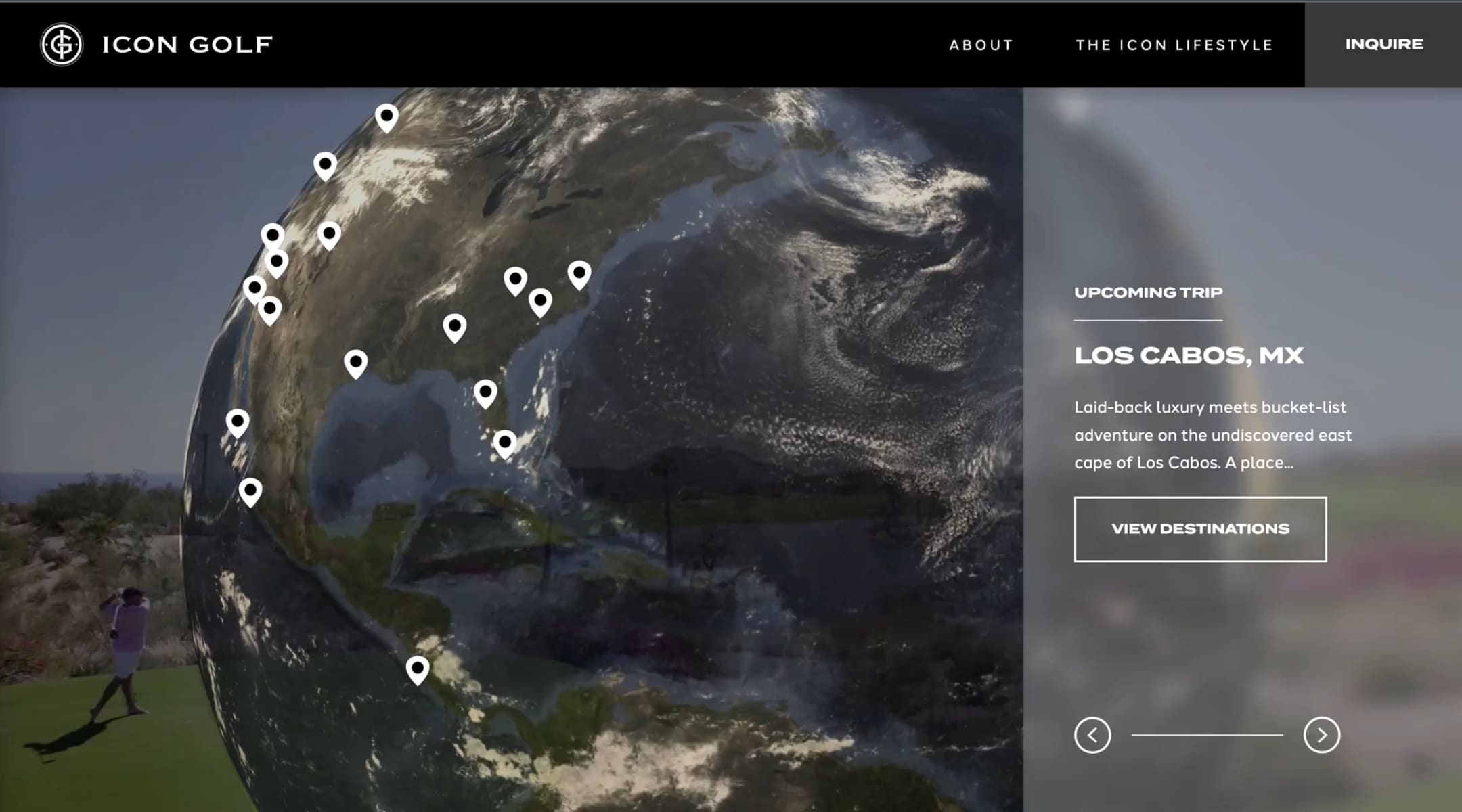
Global Travel for Icon Golf

As the primary gateway for potential members, the site was developed with intuitive navigation and responsiveness across all devices, ensuring shorter paths to essential information and a better user experience. The dark color palette and sleek typography elevate the brand’s luxe feel, while high-quality imagery showcases the more intangible benefits of membership, like adventure and connection. Engaging visuals further focus on Icon Golf’s four key offerings, piquing curiosity and encouraging deeper exploration.

To unify the user experience, we equipped the website with a robust member portal platform. This enhancement allows for seamless interaction, improved communication, and personalized content for members.

On the backend, we improved internal operations by integrating the website with Icon Golf’s CRM system, HubSpot. This update streamlined the sales funnel, automated prospecting efforts, and improved internal efficiencies.

Icon Golf Social

Results

The new website’s intuitive design and navigation led to longer visit durations and higher engagement rates, effectively communicating the brand’s value proposition to potential and current members. 

  • 66.9% increase in sessions
  • 68.3% increase in engaged sessions
  • 62.8% increase in new users

By integrating the website with HubSpot and the new member portal, we were able to streamline internal processes and reduce the time and cost spent on manual updates, allowing the Icon Golf team to focus on enhancing member experiences.

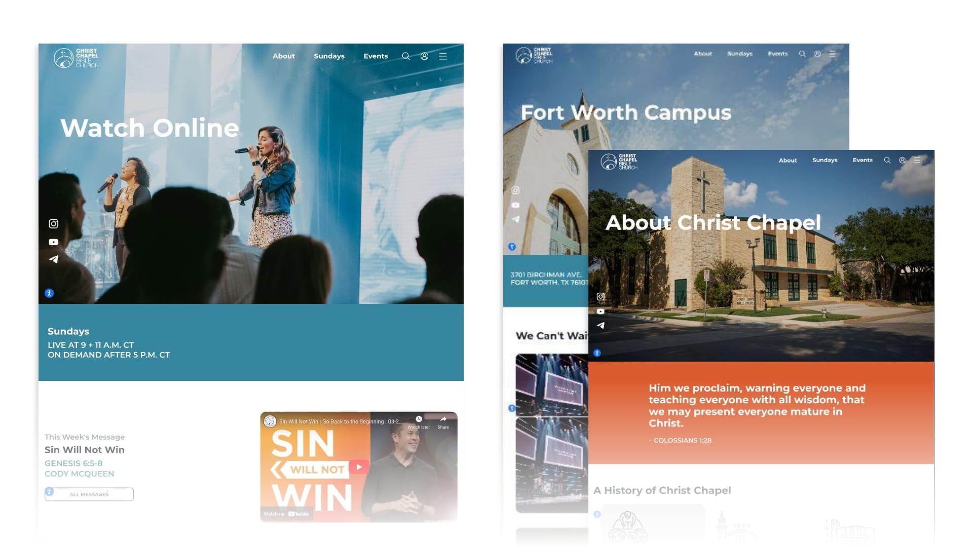
Christ Chapel Bible Church (CCBC) is one of Fort Worth’s largest communities, connecting members across four campuses, more than ten ministries, and an extensive list of programming and events throughout the week. Looking to strengthen its relationship with members and new visitors, CCBC wanted to update its website to manage its diverse set of offerings, improve usability and make it easier for everyone to find what they’re looking for and get involved. 

Goals

  • Improve UX to ensure a clear and seamless browsing experience
  • Organize website architecture to be inviting and informative
  • Cultivate a sense of community among visitors and across campuses
  • Simplify content to keep visitors engaged and exploring
  • Streamline backend usability to empower staff to easily add and edit content that updates dynamically throughout the site
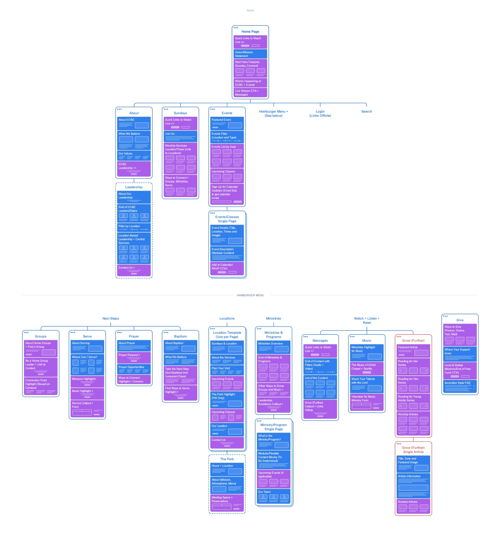
Planned Site Architecture

Approach

Schaefer architected a robust website with a strong emphasis on user experience that reflected the CCBC community and served as an open invitation to prospective members across DFW. 

Recognizing that community-driven content is at the center of their ministry, we elevated important information like service times, events and popular weekly content. By simplifying the structure of the site, visitors can more easily navigate to the information they’re seeking in fewer clicks. We also integrated Rock RMS, a CMS system that allows for real-time updates to weekly events that populate in multiple places across the site, which was crucial for keeping the community informed with accurate and reliable information. 

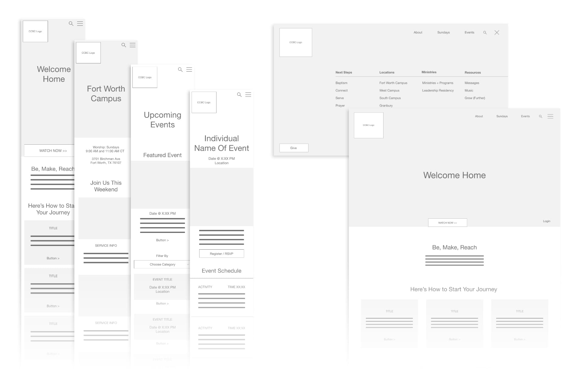
Content Wireframes

Beyond Sunday service, CCBC produces and publishes a library of content that speaks to members in every phase of life. From podcasts and videos to long-form articles, CCBC needed a way to simplify and streamline that process on the backend of the site. For existing content, we built a custom API to transfer approximately 550 videos from the legacy website to the church’s new content library. Equipped with an advanced filtering system, the API was able to organize content by subject during migration and allow visitors to find relevant content more quickly.

A smarter system was developed to auto-update content in multiple areas simultaneously, ensuring consistency and accuracy across all platforms. We also created standardized templates that improved team alignment between content contributors and backend developers to maintain clarity and uniformity across different types of content.

Results

Through strategic improvements to the digital experience, CCBC has enhanced its ability to serve its congregation, ensuring every visitor—whether online or in-person—receives a warm welcome and easy access to the resources and information they’re seeking. 

The new website led to significant improvements in both traffic and user experience, indicating higher community engagement and reach.

  • 23% increase in traffic
  • 95% increase in engagement

The improved backend significantly reduced the time and effort required by CCBC staff to update content, giving staff more time to focus on ministry and less on administrative tasks. The website has also become a definitive ‘source of truth’ for all church-related information, benefiting all campuses and ministries by providing a single, reliable point of reference.

June 12, 2024

Feast Your Eyes

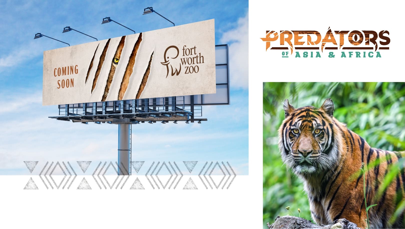
In the summer of 2023, the Fort Worth Zoo unveiled its highly anticipated Predators of Asia & Africa habitat, a stunning new home for lions, tigers and other apex predators. Partnering with the Zoo, we embarked on a mission to build excitement and drive attendance for this remarkable attraction in advance of the opening and throughout the following year.

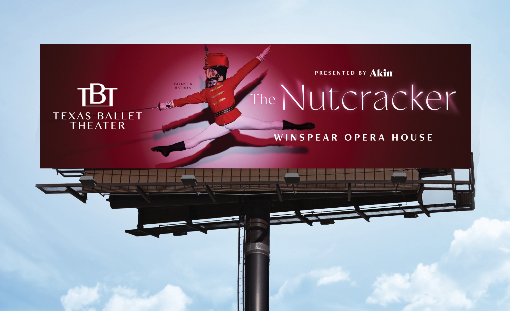
Out of Home Fort Worth Zoo Predators Exhibit

Situation

Schaefer recommended a comprehensive campaign to promote the Fort Worth Zoo’s new exhibit, aiming to re-engage guests and boost summer attendance. The lions and tigers, which are visitor favorites, had been off-exhibit during construction, and it was crucial to highlight their return alongside the introduction of new species.

Predators Exhibit from the Fort Worth Zoo with Schaefer Advertising

Our Approach

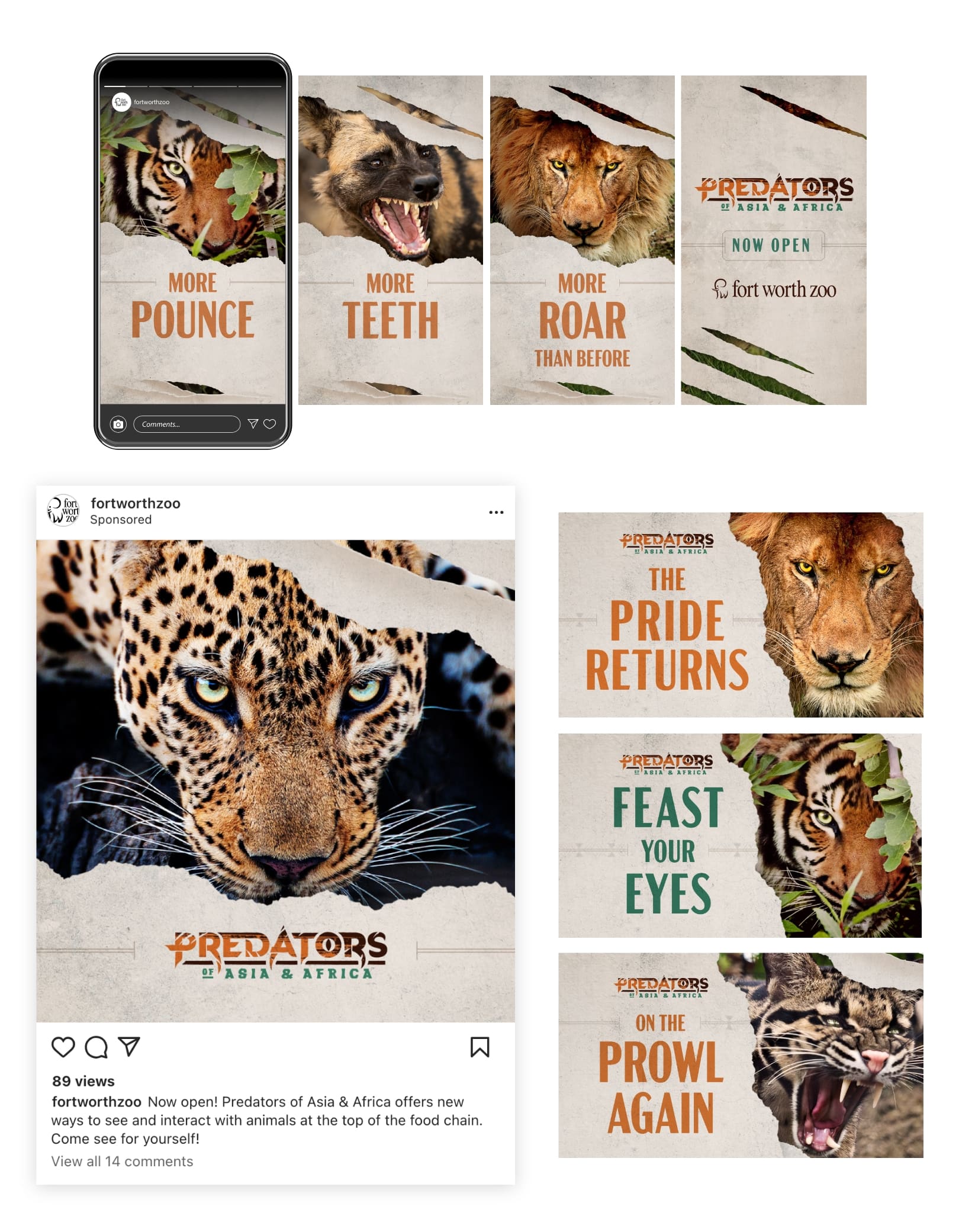
We began with a collaborative naming exercise, unifying the two distinct sections of the habitat under one name, Predators of Asia & Africa. This cohesive identity set the stage for our creative strategy. From there, our team developed bold visuals that captured the fierce essence of the animals. The campaign featured striking imagery of lions and tigers, with claw-mark graphics to grab attention and convey the powerful nature of the predators. 

Predators Social Media Work by Schaefer Advertising for Fort Worth Zoo

The “Feast Your Eyes” headline led the campaign, playing on both the predatory nature of the animals and newly enhanced visibility of the experience This was complemented by headlines such as “The Pride Has Returned” and “On the Prowl Again,” emphasizing the return of the big cats. Equal focus was given to lions and tigers based on years of visitor data showing their popularity. We highlighted these hero animals to capture attention and strategically showcased additional species to convey the habitat’s diversity and breadth. This approach used the hero animals to attract interest and the variety of animals to convince visitors to explore the new exhibit. 

Predators Exhibit Out of Home for the Fort Worth Zoo

We generated excitement with teaser billboards that featured the claw marks and a “Coming Soon” message, quickly followed by the launch of an omnichannel campaign designed to captivate and engage. The Schaefer team employed a full-funnel media strategy, ensuring broad awareness and driving conversions through a mix of paid search, social media, programmatic display and video ads, email, and SMS texts. This comprehensive approach maximized our reach and engagement.

Results

  • Over one million landing page sessions, indicating high engagement and interest.
  • 28% click-through rate on paid social, showcasing the effectiveness of our targeted ads.
  • 42% year-over-year attendance growth, a testament to the campaign’s success in attracting visitors.
Predators Exhibit at the Fort Worth Zoo Bus Wrap

Our campaign for the Fort Worth Zoo’s Predators of Asia & Africa was a resounding success. By combining strategic creativity with a targeted media approach, we effectively highlighted the return of the Zoo’s beloved big cats and introduced new species, driving significant increases in attendance and revenue, and elevating the Zoo’s profile within the DFW metroplex and beyond. This project not only celebrated the Zoo’s commitment to conservation and education but also reinforced its position as a premier destination for family fun and learning.

Using BigFoot to tease a big reveal. 

Situation 

Within the eyecare industry, the idea of interventional glaucoma treatment has been categorized as an elusive myth for years. ViaLase developed a game-changing system designed to leverage two proven technologies to create a new, non-invasive approach to glaucoma. When this new system is approved by regulatory agencies, the myth will finally become a reality. Therefore, our client needed a campaign that would create attention and support a successful launch of the new concept.

Goals

  • Develop materials needed for a successful brand launch
  • Develop a highly visible campaign that would cut through the clutter of a crowded market 
  • Rapidly generate brand awareness
  • Explain the fundamental technology behind the device
  • Solicit interest and inquiries from qualified leads
  • Provide meaningful measurements of the campaign results

Strategy

Schaefer Advertising responded with a showstopping, attention-grabbing campaign that used teaser imagery of a Sasquatch, or “BigFoot”, creature to convey that the “mythical creature” was finally here – and real. The sheer uniqueness of the concept was a huge and dramatic departure from the cold, clinical ads embraced by other players in the industry. 

Solution

An integrated campaign was launched that included paid search, organic social, email, and digital display on well-known industry publications and websites. Each medium enabled the client to tell its story and document the response rates as viewers clicked through for downloads, demos and landing-page visits. 

Vialase yeti display ads

Results

By leveraging paid search and strategically-chosen publication placements (such as newsletters, e-blasts, ROS banners, and sponsored social posts), the campaign achieved noteworthy results within the first three months of launch.

  • Website tracking identified 98% new site visits, with an impressive 53% engagement rate
  • High clickthrough rates 
  • And, most importantly, awareness started with a bang, with healthy responses from an elite and highly-qualified audience of eyecare and glaucoma specialists
Sessions

15,864

New Users

13,771

Pageviews

17,130

Engagement Rate

53.42%

Vialase yeti print ads

Summary 

The launch campaign accomplished its primary goal of driving brand awareness among surgeons for ViaLase and its innovative design.  And, in addition to gaining insights into paid search performance, the client began to forge strategic partnerships with leading industry publications. The geographic spread and engagement metrics highlight the campaign’s effectiveness in reaching a qualified audience, setting a strong foundation for future marketing efforts.

Overall, the campaign was another example of Schaefer’s ability to combine solid knowledge of healthcare markets and attention-grabbing creativity to tell a cohesive and relevant brand story.

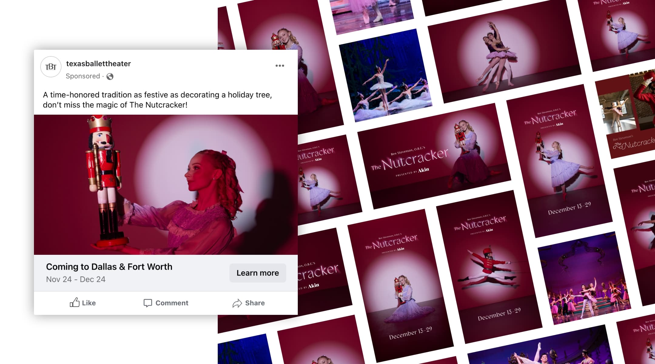
The Nutcracker ballet is a timeless performance that has delighted audiences for more than a century. Over time, it has cemented its place as a beloved holiday tradition and one of the most popular ballets of all time. Each holiday season, Texas Ballet Theater (TBT) stages 35 performances between Dallas and Fort Worth, which sets the tone for ticket sales throughout the season. For some ballet companies, sales from The Nutcracker make up more than 85% of a company’s ticket revenue for the season. While its popularity makes it easy to sell performance tickets, The Nutcracker also creates a unique opportunity to attract a broader audience to experience the art of ballet. 

As the agency of record for the past six years, Schaefer Advertising has helped TBT increase ticket sales year-over-year to make The Nutcracker a revenue powerhouse. Fresh off a record-setting year in 2022, TBT increased its goals for 2023. 

To meet the new goal, our team acted quickly to implement new optimizations that leveraged our current campaign assets, made strategic recommendations for TBT-owned channels, and proposed a few incremental options to get in front of new attendees. A peak-valley-peak approach to paid search led to higher revenue for lower costs, making paid search a key driver of conversion revenue. The coordinated email marketing campaign launched in late November ranked second in revenue generation. 

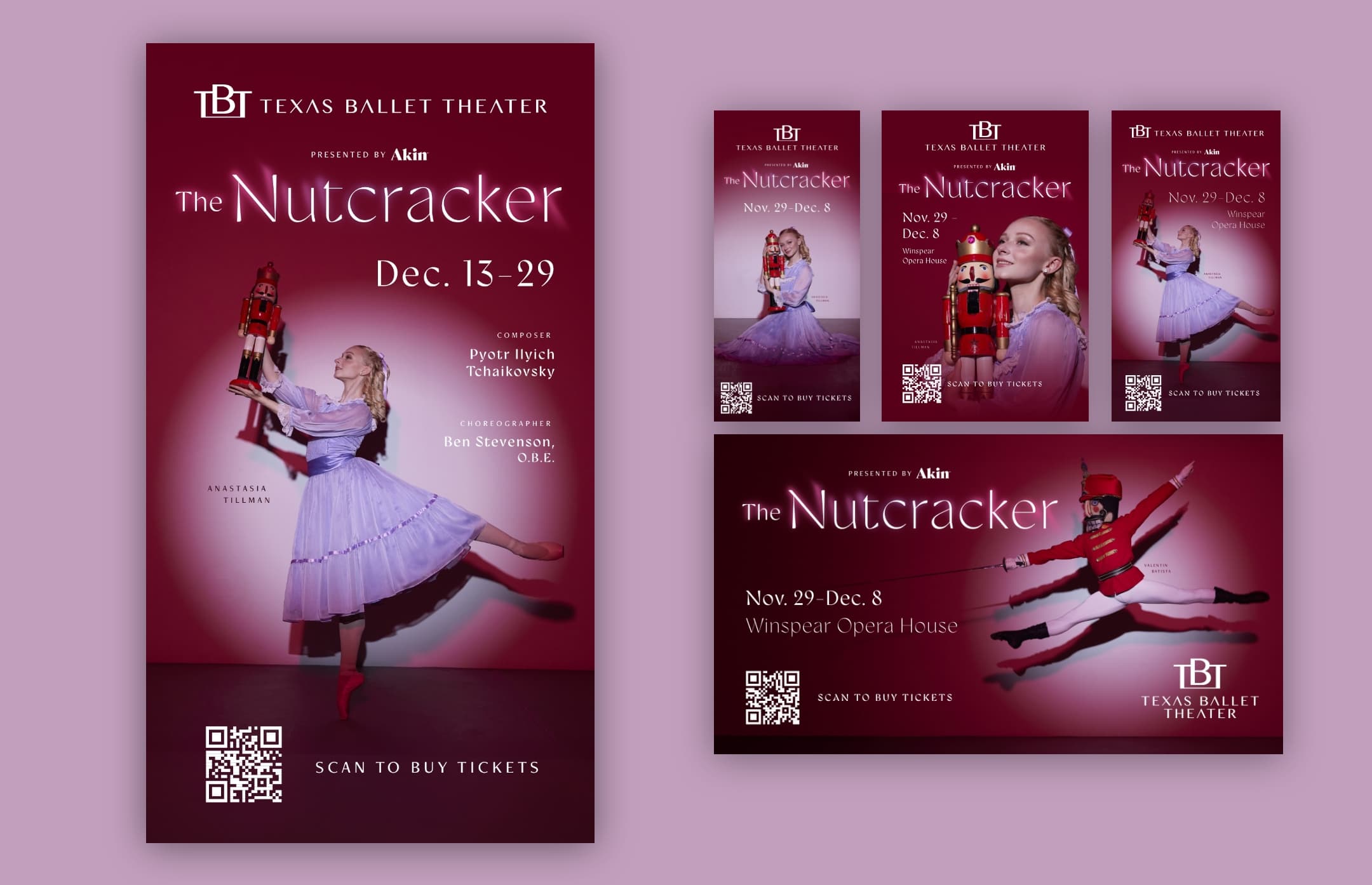
Texas Ballet Theater Nutcracker Assets

Results

The Nutcracker campaign concluded its 2023 run with record-breaking revenue and ticket sales, surpassing each previous year’s revenue and 2023 goals for both Dallas and Fort Worth. Total revenue closed at 120% to goal, with online sales specifically growing revenue by over 30% from last year.

2023 Goals

Revenue: $2,639,534
Ticket Sales: 36,080

2023 Actuals

Revenue: $3,237,384
Tickets Purchased: 47,056 

Campaign ROI

12:1

Texas Ballet Theater Social Media Assets
Texas Ballet Theater Display Posters
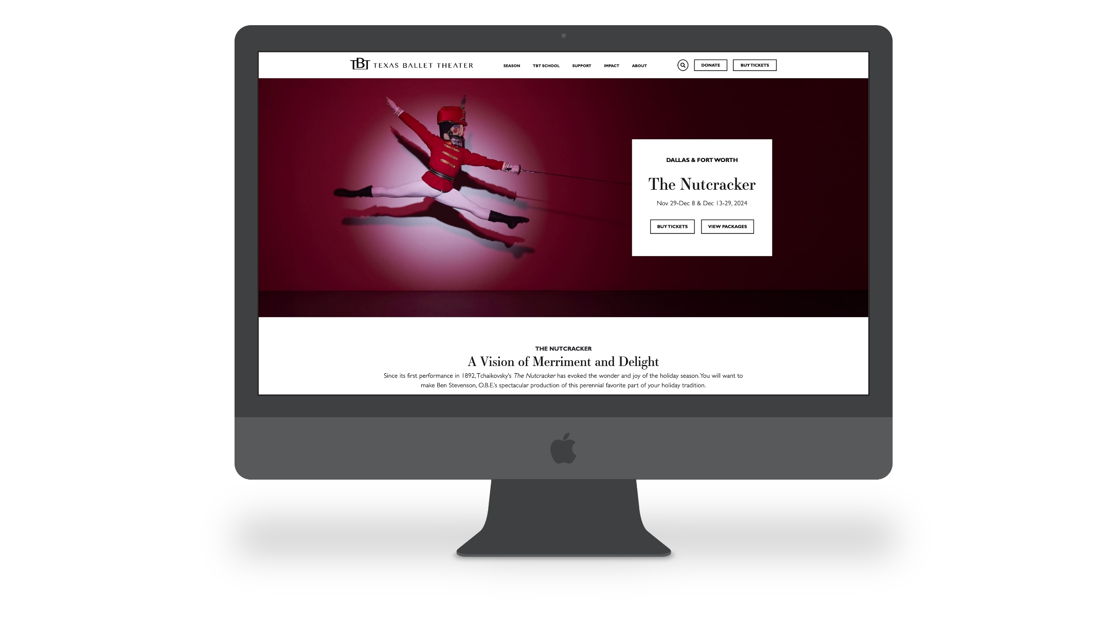
Texas Ballet Theater Nutcracker Website
Texas Ballet Theater Nutcracker Website Full Size
December 13, 2023

The Foundation for Good

The North Texas Community Foundation (NTCF) is a Fort Worth-based philanthropic organization committed to driving meaningful change through charitable investment in North Texas. With a strong reputation, deep community knowledge, and tailored services, NTCF helps high-net-worth individuals structure their philanthropic giving for immediate impact and long-term legacy.

Logotype

Challenge

As a central figure in the community with a wide range of audiences and causes, NTCF needed a way to articulate their offerings to specific audience sets with very different wants while positioning their own brand for growth. In addition, they needed to improve their user experience online to better meet the demands of visitors.

North Texas Community Foundation Website

Tailoring the message

NTCF is beholden to not one but three separate audiences – fundholders who support charitable giving, professional financial advisors whom NTCF partners with to manage donor funds, and nonprofit leaders who leverage grants and gifts to proactively respond to the needs within the community. While the driving purpose and service offering are the same across all partners and clients, it’s crucial to shape messaging around the intended audience. 

Brand Family for North Texas Community Foundation

We started the process by first establishing a brand archetype – NTCF is a Caregiver – and letting that lead to a clear and compelling brand position and purpose. This step helped cement NTCF’s mission to drive meaningful change, unify the internal team and motivate all partners to advance toward a shared future. Next, we tailored key messages to resonate with the distinct needs and priorities of each audience. From cross-functional partners to clients and community stakeholders, brand messaging is tailored to the unique perspectives of each audience. 

Flyer for NTCF

Design with a growth mindset

To further illustrate the Caregiver archetype, we evolved the brand identity to better mirror the trust, support and service NTCF is known to provide. From logo to photographic styling, we created a comprehensive design system that perfectly encapsulates the brand’s dynamic service offering. The vibrant yet strong color palette features navy, periwinkle and complementary shades of yellow, orange and blue to balance optimistic and approachable with the more intuitive and assertive sides of the NTCF brand. In addition, we expanded creative assets to offer more versatility and the ability to grow with the brand. 

NTCF Brochures

Creating a seamless experience

A website acts as a front door to your organization, and NTCF could benefit from a more inviting user experience.  The previous website structure was dense and the navigation was choppy, leading to confusion and cognitive overload for site visitors. On the back end, employees lacked the ability to easily create, modify and publish content. 

NTCF Website

To provide current and potential fundholders with an enhanced experience, we restructured the new site to reduce page count, minimize clicks and better guide visitors to the information they were seeking. We also developed a custom content management platform, empowering the internal team with the tools needed to edit and manage their site without extensive coding knowledge.

NTCF Website Pages

Results

Developing an impactful brand strategy and tailoring every message to suit the intended audience allowed NTCF to better communicate their purpose and address a multifaceted branding challenge from a foundational level. The new brand identity also aligns each audience with the overarching vision of NTCF and positions the brand for success and growth. 

A more intuitive website improved the user journey while empowering the internal team with the ability to easily develop and manage brand materials and content. When compared to the previous year, the new website saw outstanding results:

  • 28% increase in visitors 
  • 7% reduction in bounce rate, illustrating users found the site more relevant
  • 21.7% increase in page views, indicating stronger user engagement post site launch

Data measured from Feb 2021-Aug 2021 and Feb 2022-Aug 2022.

December 13, 2023

A Year of Triumphant Splendor

Direct Mail - Texas Ballet Theater

Setting the Stage for Success

Every year, Texas Ballet Theater (TBT) launches a season filled with a combination of performance styles, from mixed repertoires to storybook ballets to the beloved holiday tradition, The Nutcracker. And each year, the organization builds revenue goals based on factors such as previous success, attrition, new-to-file trends, name recognition and more. In the last few years, all performing arts organizations have been rebuilding after, for some, more than a year of no programming. It is more critical than ever that these goals be met, which is a challenge we do not take lightly.

Texas Ballet Theater Emails

Benefits of a Integrated Campaign

As TBT’s agency of record for over five years, we have the pleasure of guiding the organization strategically through a merriment of creative and media targeting each year. This level of integration is ideal, as it allows the team to work on one cohesive plan for success and be proactive with optimizations along the way. We cannot overstate the importance of messaging, design and ad placement all aligning to drive success.

With a robust overarching season revenue goal as well as individual performance goals, we knew this year needed to be on point. Pun intended.

Type Treatments - A Year of Splendor Texas Ballet Theater
Texas Ballet Theater Brochure - A Year of Splendor

A New Creative Solution

Each year we establish the creative concept for the season which reflects the individual performances, incorporates artistic direction from TBT and provides a consistent look for the entire season. This season, we created custom typography for each performance title to elevate the distinct nature of each performance and provide an additional asset that incorporated elements from the storyline or theme of each ballet. The titles were paired with a wash of color for each performance, and when viewed together created a vibrant kaleidoscope that reflected the varied nature of the range of performances. The ability to utilize a key color and title treatment to support individual performance campaigns beyond dancer imagery alone gave our team a broader range of assets to leverage across mediums.

Texas Ballet Theater - Alice in Wonderland Social Assets
The Nutcracker Performance for Texas Ballet Theater

What We’ve Learned

A benefit of the tenure of our relationship with TBT is that we are able to learn more and evolve every year. We always tell new clients that they are the experts in their field, and we are here to learn and assist. But as we learn more year over year, we build industry expertise that becomes invaluable.

What we continue to see is that video outperforms static ads, which is no surprise when you are promoting a moving art form. We also know that the more digital assets you have, the more opportunities you have to improve visibility, engagement and the overall effectiveness of each deliverable. Video content can be costly to produce, so we focused on creative solutions that maximized the available resources. By incorporating animation, we were able to support each performance with repeatable textures that expand our campaign assets.

Because of this, we were able to produce more formats and sizes to test against each other by incorporating animations and movement in post production. Additionally, we chose to sunset some static ad units in order to focus on video.

Enhancing Ticket Sales

From a media perspective, we adjusted flighting to focus on awareness tactics early and conversion tactics during peak ticket sales, which is traditionally within the final weeks of the promotion.

We also implemented an institutional campaign throughout the year to boost awareness and increase website sessions unrelated to ticket purchases, which in turn allowed our retargeting pools to grow and improve our ticket sale campaigns.

Texas Ballet Theater Season on the Website

Where We Landed

While we are delighted to see the success of last year come through, it was with intention that our team set out to achieve and surpass these revenue and new ticket buyer goals. The Year of Splendor proved to be successful all season long, seen most notably in The Nutcracker & Alice in Wonderland performances, where goals in both Dallas and Fort Worth were exceeded.

  • Final revenue exceeded annual goals by 24%
  • Final revenue increased from previous year by 25%
  • Opening the season with a new work (which is inherently more challenging to sell due to no name recognition), ROAS was 5:1
  • The Nutcracker in Dallas finished at over 140% to goal
  • The season closed with Alice in Wonderland which had almost 10,000 patrons attend clearing goals by over 30%

Promoting a new season each year has its fair share of challenges, and that’s what keeps us going. We’re proud to be a long-standing partner of Texas Ballet Theater and can’t wait to share in their continued success for years to come.

The Nutcracker Signage and Emails for Texas Ballet Theater
December 5, 2023

A Gift Above the Rest

Zoo Holiday 2022 Billboard

Driving Holiday Revenue for the Fort Worth Zoo

As the holiday season approached, Schaefer faced the familiar challenge of driving revenue for the Fort Worth Zoo through membership and adoption gift purchases. In a marketplace brimming with options, our task was to set the Zoo apart and exceed year-over-year revenue goals for an offering that had remained consistent for a long time. Our strategy focused on positioning the Zoo’s offerings as unique and meaningful gifts, highlighting the value of membership while also reiterating the experiential aspect of these presents.

Fort Worth Zoo Holiday Social Graphics

Positioning for Audience Impact

Emphasizing memberships over adoptions in both messaging and media was key to maximizing revenue. The campaign aimed to convey that the Fort Worth Zoo offers versatile gifting options, from a tangible present for under the tree to a membership for year-long experiences.

We know that the target audience, composed of Zoo-goers and potential members, already enjoy visiting the Zoo with their families. However, they might not have initially considered Zoo memberships or adoptions as compelling gift choices. The campaign’s goal was to shift the audience’s perception, portraying Fort Worth Zoo memberships as a perfect holiday gift due to their numerous benefits, including unlimited admission, free parking, discounts and access to special events. Zoo adoption packages, featuring plush animals, certificates, coloring kits, and more, not only make for delightful presents but also support animal care and conservation efforts. These offerings were positioned as experiential gifts that fostered a lasting connection to the Zoo, encouraging family enjoyment throughout the year.

Fort Worth Zoo Holiday Emails

Showcasing a Unique Gift Experience

Creatively, we met the challenge of maintaining freshness for a campaign that recurs annually as well as distinguishing the campaign in a crowded holiday market. Unconventional elements took the spotlight, with a memorable neck-bending giraffe as the hero visual and playful copywriting like “A Gift Above the Rest” as the primary headline. The campaign also tapped into the universal appeal of baby animals by featuring the recent giraffe births through secondary imagery and messaging to visit the Zoo often while the babies are still small.

Additional supporting imagery featured the immersive membership experience and the physical adoption package complete with plush animals. This comprehensive visual approach provided a well-rounded perspective of the gift options.

Fort Worth Zoo Social

Results

As a result of the strategy, creative concept, and media plan working in sync, the campaign was wildly successful. We succeeded in setting the Zoo apart in the bustling holiday market and surpassing revenue goals for both gift offerings. 

  • New and gifted memberships in 2022 were almost triple in quantity and revenue as compared to both goals and previous year sales.
  • Return on investment for the campaign as a whole was nearly 10:1.
  • Emails were the top-performing channel, driving a 69% increase in revenue over 2021, led predominately by a Black Friday sale.
  • Paid Media generated significant brand awareness, serving 9.6M impressions (37% YoY increase). Paid Social drove nearly 5.9M impressions (141% YoY increase).

In conclusion, Schaefer’s ability to break through the saturated holiday market with a creative and strategically aligned media plan led to an exceptional year-over-year increase in revenue. The campaign not only met, but exceeded goals, emphasizing the power of unique creative and effective media planning in achieving outstanding results.

December 4, 2023

In pursuit of excellence

Nestled in the heart of Fort Worth, Texas, Colonial Country Club stands as an iconic institution with an unwavering commitment to excellence and timeless traditions. Founded in 1936 by Marvin Leonard, the club offers a distinctive private club experience that fosters a strong sense of community. With a rich history in championship golf and a dedication to creating unforgettable moments, Colonial embodies unparalleled luxury and camaraderie.

Revitalizing tradition for Colonial Country Club

In 2023, the club found itself at a pivotal moment, embracing the desire to redefine excellence and embody a new era without forgetting their historic past. This ambitious journey began with an extraordinary renovation project, breathing new life into the esteemed championship course.

The transformation extended beyond the greens as Colonial invested in an array of exciting amenities, embarking on a revitalization journey to align their brand with the club’s updates. Recognizing this opportunity, Schaefer Advertising partnered with Colonial to refine and update their marketing and messaging, ensuring effective communication with a shared commitment to tradition and innovation.

Colonial Brand Imagery

The path to success is empowerment

Working closely with the internal staff at Colonial, we understood the significance of helping the team to define the authentic voice of the brand and building the necessary tools to support business objectives. Colonial’s strategic marketing initiatives focus on three primary goals:

  1. Increasing awareness and perception among targeted prospective members to generate a consistent waitlist of high-quality prospects,
  2. Enhancing member engagement to foster loyalty and advocacy, and
  3. Boosting club revenue through increased event sales. 

To achieve these objectives, Schaefer developed a comprehensive marketing strategy that presented findings from a digital platform audit and brand messaging exercise, as well as provided platform-specific optimizations, culminating in a holistic digital ecosystem approach for the internal team to utilize as a road map to support and elevate Colonial’s marketing endeavors. 

Uniting past, present, and future

To elevate the essence of Colonial’s brand, we embarked on an extensive brand refresh that began with a meticulous exploration of the club’s unique attributes and a thorough brand landscape assessment. This approach identified key differentiators and core values that set Colonial apart. Establishing the brand archetype and positioning recommendations, Schaefer recognized that Colonial’s messaging should center around the unwavering pursuit of greatness, beautifully capturing the club’s rich history and unyielding commitment to excellence. This masterful process of brand archetyping and positioning culminated in the development of the club’s brand story, a compelling narrative that artfully united the past, present, and future.

Colonial Country Club Messaging

Building upon this solid foundation, we crafted a cohesive visual system that seamlessly unified the brand while accommodating flexibility for its evolving identity. A comprehensive brand style guide was introduced, offering clear guidelines to the team and serving as a valuable tool for external communications, ensuring consistent brand alignment across all touchpoints. To capture the true essence of Colonial, Schaefer directed and produced photography and video shoots featuring real club members, thus curating an authentic content library that would enrich the future website and all brand materials, beautifully reflecting the genuine spirit of the club and its cherished traditions.

Elevating Colonial’s digital presence

Alongside the visual transformation, Schaefer undertook the crucial task of redesigning Colonial’s website to realign with the club’s prestigious history and standing. Our expertise came to the forefront as we crafted a visually stunning and user-friendly design that successfully communicated vital information while elevating the overall user experience. Through a development partnership with MembersFirst, the website became a powerful tool in supporting awareness, engagement, and lead-generation objectives, providing an app and private portal for members. Schaefer’s thoughtful approach, in tandem with Colonial’s rich heritage, gave rise to a website that now stands as a befitting window into the club.

Colonial Website Examples

Outcome

The collaboration between Schaefer and Colonial resulted in a stronger brand presence that honored the club’s legacy as well as their future. The consolidated brand provides a consistent experience for current and potential members, reinforcing Colonial’s position as a pillar in the community. The revitalized brand strategy and web presence articulate the Club’s forward-thinking nature, appealing to both a global audience in search of elite golf experiences and creating a home away from home for local members. By providing the internal team at Colonial with the necessary tools and support, Schaefer empowered them to effectively communicate the brand’s voice and usher in a new era of success.

How Argon Medical Devices merged multiple brands and hundreds of SKUs into a single, cohesive user experience (UX).

Argon on mobile phone

Situation

As a global company with multiple sub-brands and literally hundreds of products, Argon Medical Devices faced a major challenge in creating a simple and cohesive online presence. Argon tapped Schaefer to execute a complete overhaul of its website, from site architecture all the way through design and development.

Argon webpage image

Goals

  • Enhance and optimize the user experience
  • Accommodate international customizations and product offerings
  • Restructure multiple sub-brands and product lines into a single cohesive, centralized site
  • Modernize the design to align with Argon’s new corporate positioning and graphic standards
  • Allow room for growth as future products, capabilities and divisions emerge
Argon webpage image

Strategy

Having recently repositioned the company, Schaefer realized that updating the Argon website would require more than organizing products and accommodating multiple languages. To expedite the process, the creative and digital teams worked in tandem, collaborating closely to ensure that the design and function worked in unison.

While Schaefer’s creative team worked to update design and messaging to align with the new brand trajectory, the digital team examined ways to streamline customer ordering, overcome language barriers, simplify navigation, and create a better user experience across the site’s 70+ pages and thousands of potential product permutations.

Argon webpage image

Solution

The creative team united all business units under the new Argon brand positioning: The Pursuit of Better. This gave all visitors a consistent view of who Argon was, and the shared mission and values that united its multiple brands.

Meanwhile, the Schaefer development team navigated an ever-changing SKU list as the client consolidated product lines. We then performed a number of user experience exercises to build a more efficient user flow for searching and ordering product samples. The new site was able to leverage geolocation to customize content based on the user’s global region, and allowed text to be dynamically translated into multiple languages.

Argon webpage image

Results

The Schaefer team replaced complexity with clarity, and delivered a site that accomplished key goals for both new and existing customers. The improvements included:

  • Successfully consolidating multiple domains and destinations into one organized, easy-to-navigate site
  • Enabling the client to make revisions and updates easily with minimal training
  • Reorganizing and narrowing the featured products to allow an easier search and order experience
  • Automating processes to further improve UX and leveraging geolocation to only showcase products in regions where they are available
Argon mobile image

Summary

To deliver a site that met the client’s goals with a global audience, the Schaefer team leveraged Argon’s core strengths of effective brand messaging and in-depth knowledge of the healthcare space. The client now has a site that better serves its needs today — and will support the brand as it continues to grow and evolve in the years ahead.