From complexity to clarity
How Argon Medical Devices merged multiple brands and hundreds of SKUs into a single, cohesive user experience (UX).
Situation
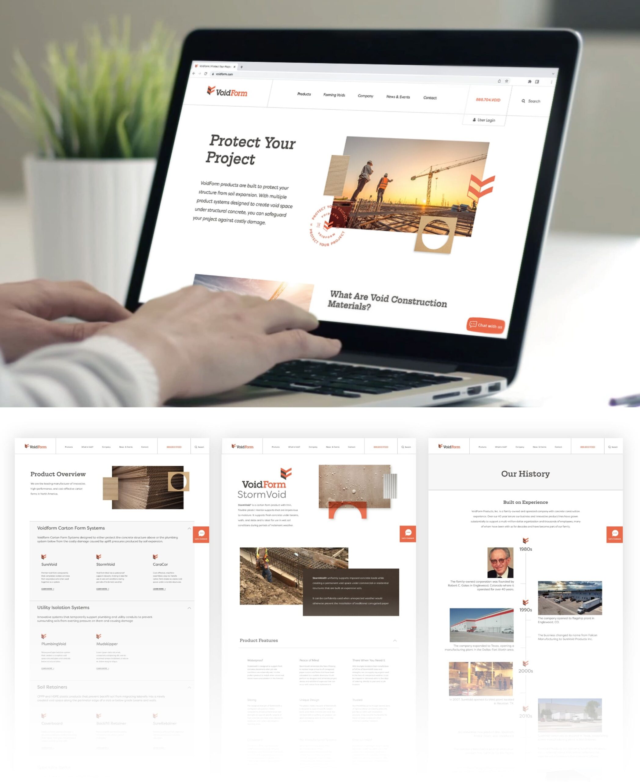
As a global company with multiple sub-brands and literally hundreds of products, Argon Medical Devices faced a major challenge in creating a simple and cohesive online presence. Argon tapped Schaefer to execute a complete overhaul of its website, from site architecture all the way through design and development.
Goals
- Enhance and optimize the user experience
- Accommodate international customizations and product offerings
- Restructure multiple sub-brands and product lines into a single cohesive, centralized site
- Modernize the design to align with Argon’s new corporate positioning and graphic standards
- Allow room for growth as future products, capabilities and divisions emerge
Strategy
Having recently repositioned the company, Schaefer realized that updating the Argon website would require more than organizing products and accommodating multiple languages. To expedite the process, the creative and digital teams worked in tandem, collaborating closely to ensure that the design and function worked in unison.
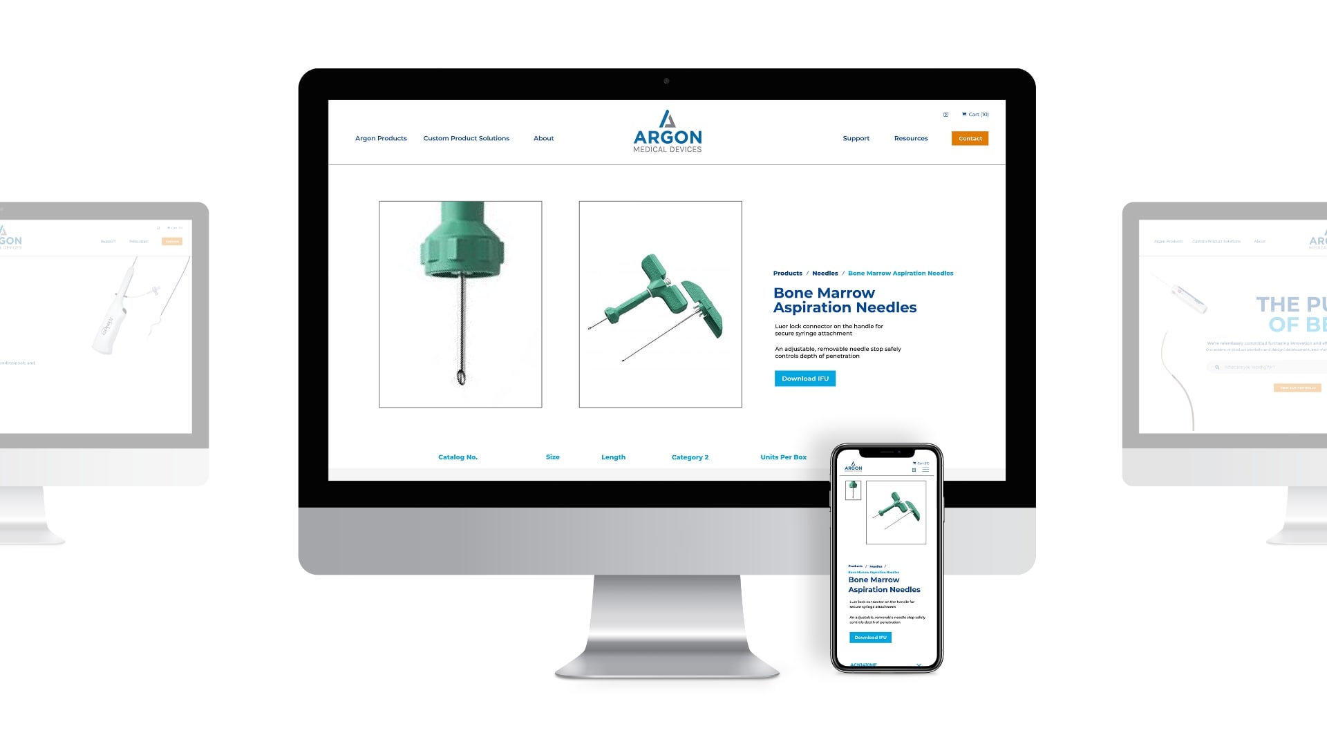
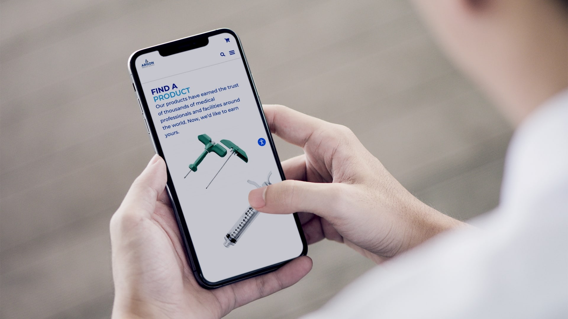
While Schaefer’s creative team worked to update design and messaging to align with the new brand trajectory, the digital team examined ways to streamline customer ordering, overcome language barriers, simplify navigation, and create a better user experience across the site’s 70+ pages and thousands of potential product permutations.
Solution
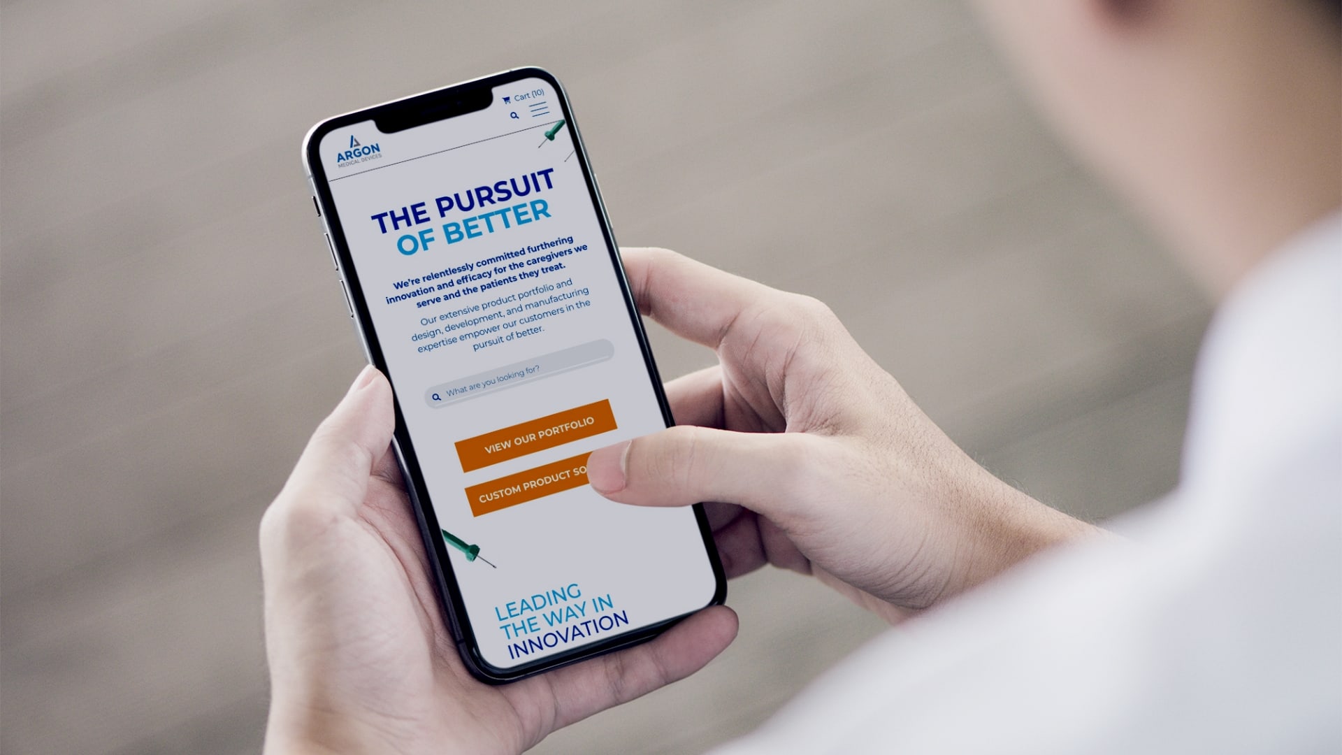
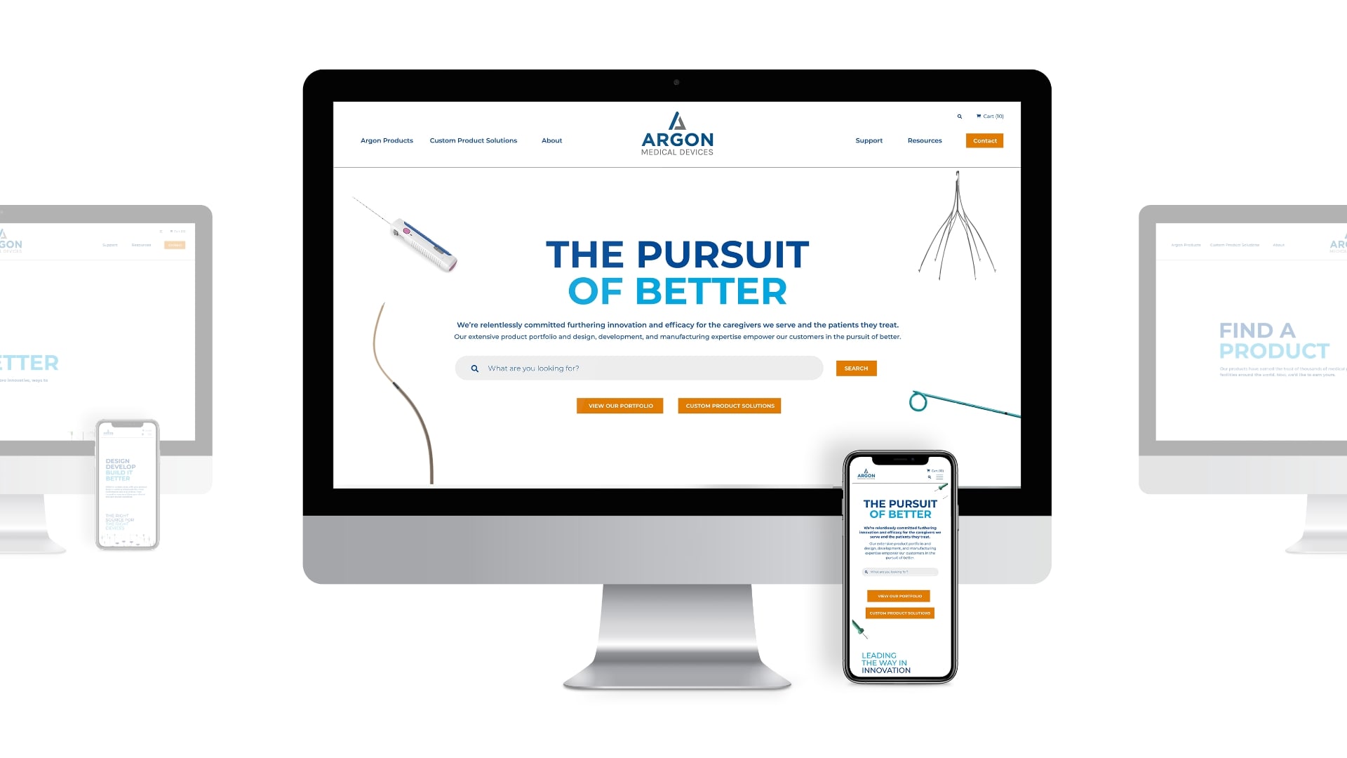
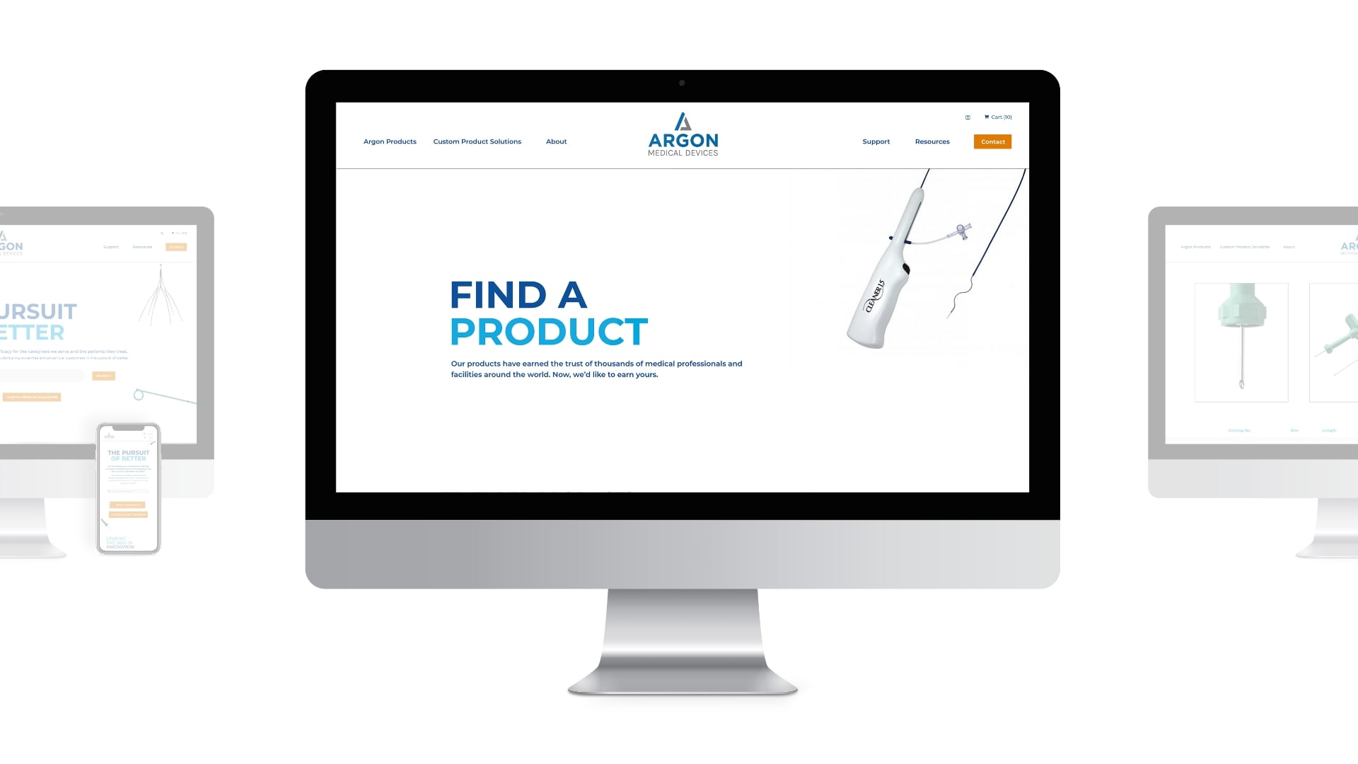
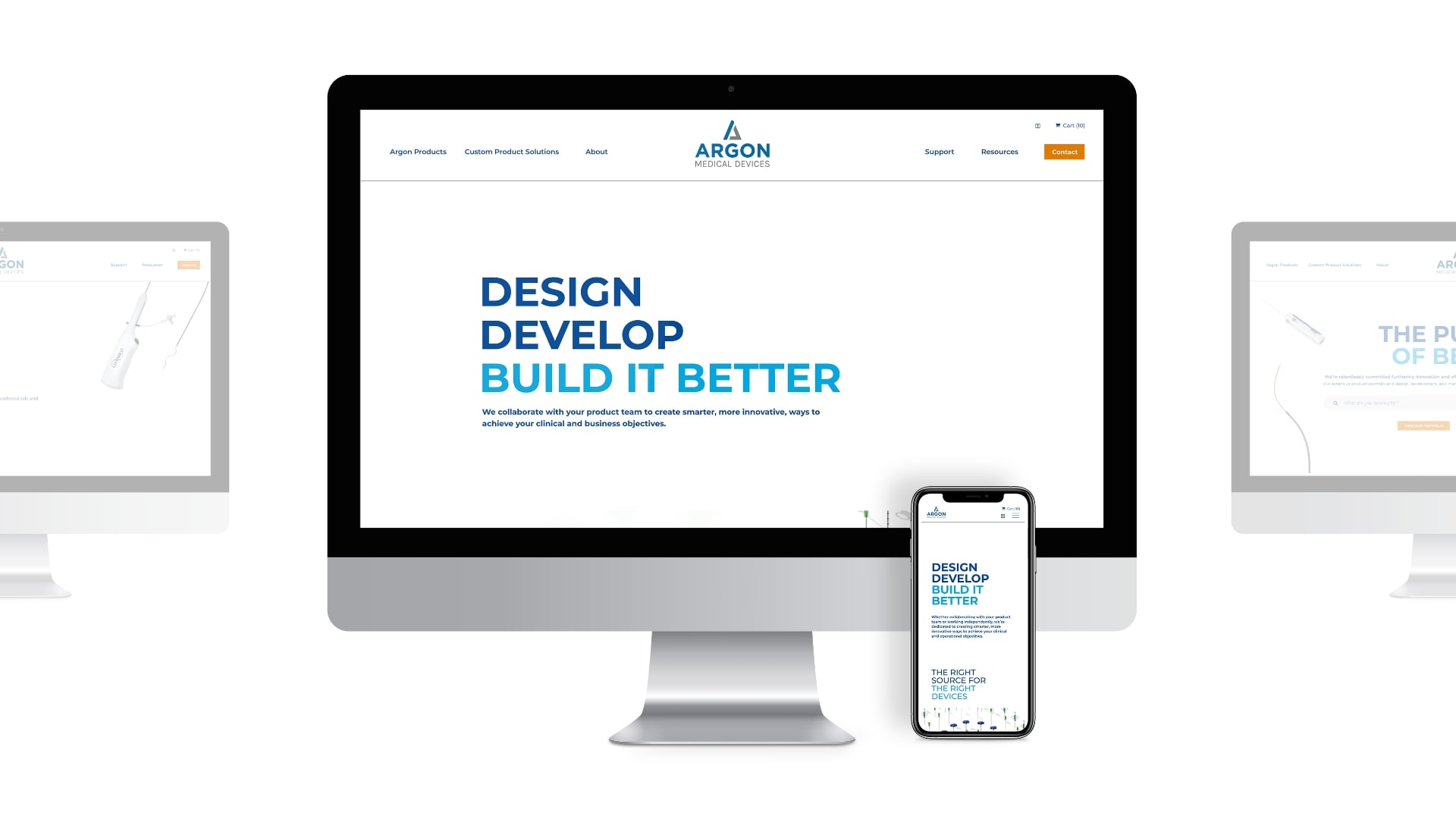
The creative team united all business units under the new Argon brand positioning: The Pursuit of Better. This gave all visitors a consistent view of who Argon was, and the shared mission and values that united its multiple brands.
Meanwhile, the Schaefer development team navigated an ever-changing SKU list as the client consolidated product lines. We then performed a number of user experience exercises to build a more efficient user flow for searching and ordering product samples. The new site was able to leverage geolocation to customize content based on the user’s global region, and allowed text to be dynamically translated into multiple languages.
Results
The Schaefer team replaced complexity with clarity, and delivered a site that accomplished key goals for both new and existing customers. The improvements included:
- Successfully consolidating multiple domains and destinations into one organized, easy-to-navigate site
- Enabling the client to make revisions and updates easily with minimal training
- Reorganizing and narrowing the featured products to allow an easier search and order experience
- Automating processes to further improve UX and leveraging geolocation to only showcase products in regions where they are available
Summary
To deliver a site that met the client’s goals with a global audience, the Schaefer team leveraged Argon’s core strengths of effective brand messaging and in-depth knowledge of the healthcare space. The client now has a site that better serves its needs today — and will support the brand as it continues to grow and evolve in the years ahead.