Texas’ wildest dance hall!
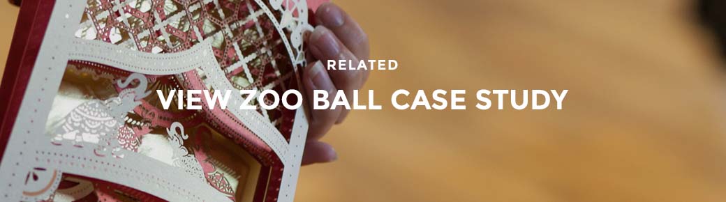
If you live in DFW, you’re most likely familiar with the Fort Worth Zoo and may be familiar with their largest annual fundraiser, Zoo Ball. Every year Zoo Ball attracts some of the biggest names in the area to support the Zoo’s local and international wildlife conservation and education efforts. The invitation for the event has always been closely tied to the theme; i.e. last year’s Zoo Ball at the Flamingo or the previous year’s Festival of the Elephants. The theme and focus of this year’s event was to celebrate the 15th anniversary of Texas Wild!, a portion of the Zoo that exhibits our great state’s different regional landscapes and wildlife.
Instead of the black tie formal-wear of years past—in the words of Alan Jackson–“We’re goin’ country!” And with a performance from Clint Black, Zoo Ball was set to be a cowboy cocktail-themed success. Our minds immediately went to the honky-tonk wood floors of Gruene Hall and Nashville-inspired Hatch Show Prints. So with the direction of “Big Hair, Boots, and Beers,” our team went on its westward way.
Process
To produce our limited edition set of prints, we sought out Minnesota-based premium letterpress studio, Studio On Fire. After following (and admiring) their work from afar, we were excited to partner with them for the project. With their help, our vision for the western-inspired prints came to life, complete with a blind emboss of the Fort Worth Zoo logo and hand-numbering of each print.
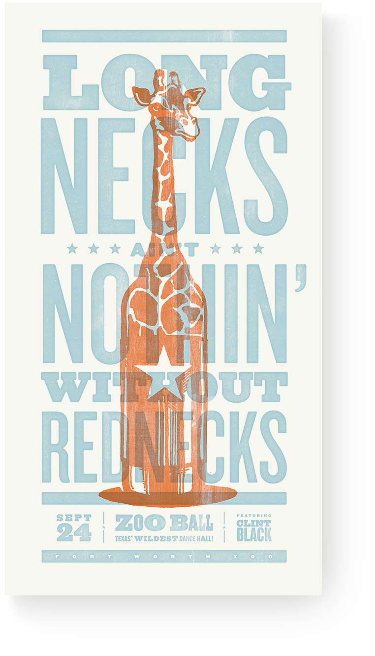
We created three custom illustrations that combined cowboy regalia with exotic wildlife found in the Fort Worth Zoo, bringing together the key elements of the event. These illustrations were paired with wood block-styled type, set to mimic posters of old. We created three “sayings” for the print set:
Deep in the Heart of Texas Wild!
Long Necks Ain’t Nothin’
Without Rednecks
Big Hair, Boots & Beer
Results
The final invitation is truly a complete package. An oversized envelope features a rustic Texas flag and warns ‘Don’t Bend or Fold or Mess with Texas’. Custom postage features animal illustrations and the Zoo logo. A hand-crafted pattern featuring Texas sayings, Clint Black lyrics, Fort Worth nods and custom animal illustrations floods the insert upon opening. And finally the prints are secured by a custom bellyband with event details and slip-sheeted for safety.
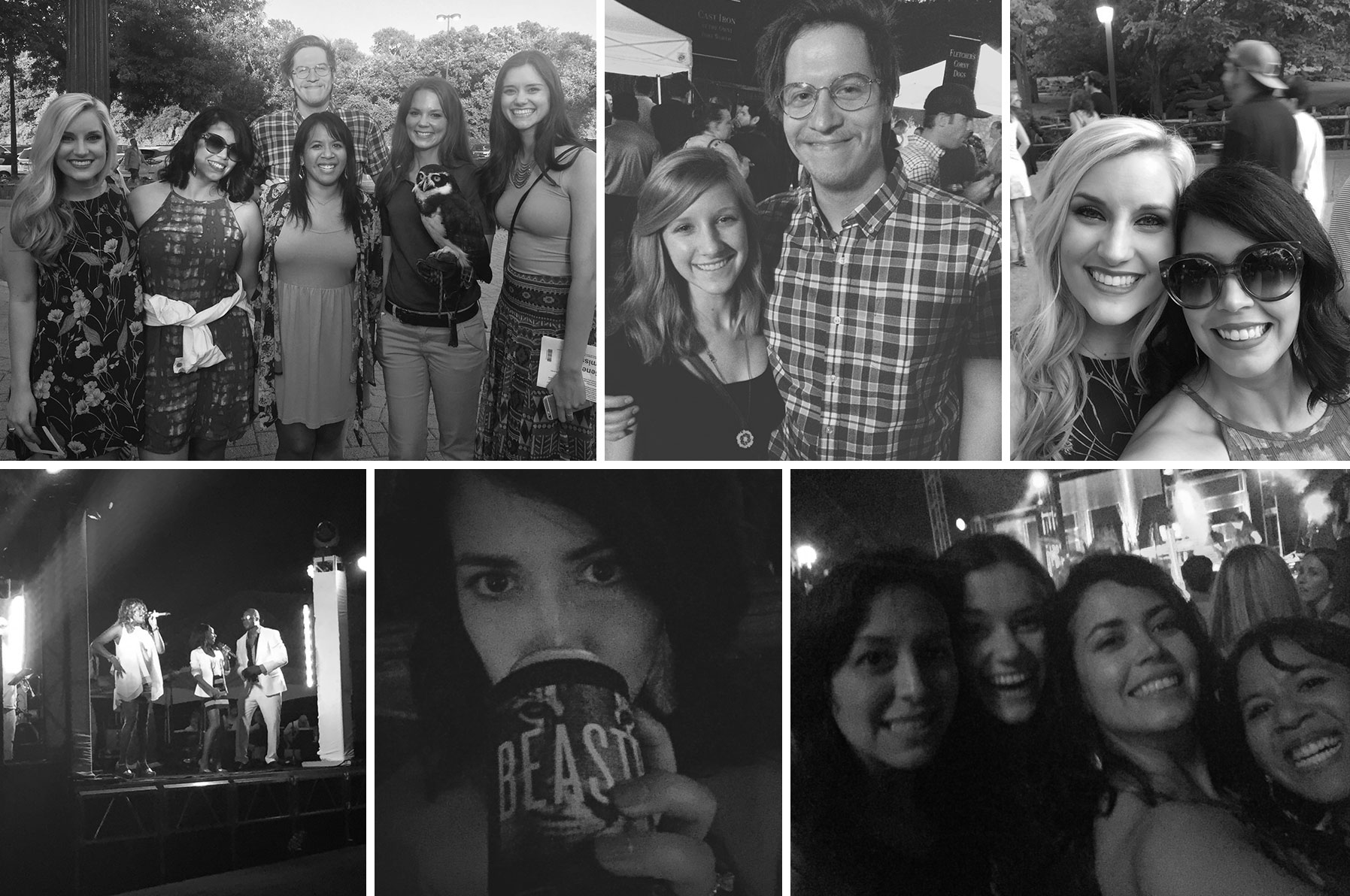
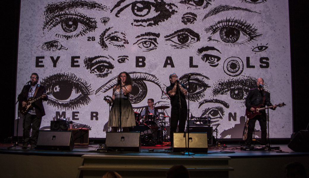
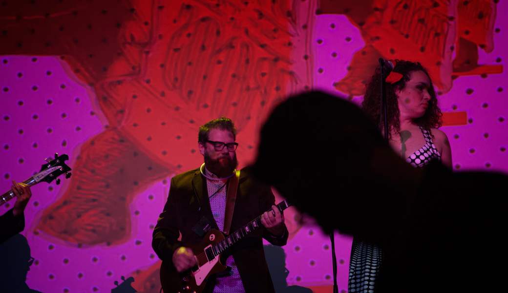
The event sold out of tickets and was both appropriately rowdy and respected. Even with fears of rain, the Zoo reassured its patrons: a little weather can’t stop our boot-scootin’ and tequila-shootin’.


