Schaefer Advertising Co.

Media

In Spring 2021, the Fort Worth Zoo was ramping up to unveil their new habitat, Elephant Springs. The habitat, which is home to the Zoo’s Asian elephant herd and a greater one-horned rhino, is part of the Zoo’s Wilder Vision initiative. With opening day on the horizon, the Zoo needed a way to generate excitement and communicate the truly immersive experience to new and returning Zoo goers. After all, Elephant Springs is more than a habitat. It’s a destination worth visiting.

Opportunity

After more than a year at home, people were ready to look forward to something big. And the grand opening of Elephant Springs was the perfect way to delight and excite animal lovers everywhere. Featuring wildlife and environmental details unique to the natural habitat that inspired it, we wanted to highlight this much-awaited encounter as more of an adventure than an exhibit.

Goals

  • Increase awareness and excitement for the opening of Elephant Springs 
  • Boost ticket sales from both new and returning customers 
  • Develop a campaign that extends beyond opening day
Elephant Springs Out of Home

Approach

Some of the best things in life aren’t things at all. They’re places. Filled with the sights, sounds and even splashes that make a place unique. Drawing inspiration from Elephant Springs’ authentic environment and immersive nature, we decided to focus the campaign around capturing the playful and engaging way both people and wildlife experience the habitat.

The only problem? We had to imagine it. To ensure the campaign was ready in time to promote the exhibit as soon as it opened to the public, we had to envision the experience based on renderings and small-scale models. The habitat has no shortage of water features — large pools and waterfalls designed to create new opportunities for animal enrichment and soakers that allow guests to interact with the herd directly. Alongside the Asian elephants that now call this habitat home, we decided to make water a main character in our campaign. 

Creative

Working with wildlife is tough. Patience, flexibility and creativity are essential to capturing key frames and moments that can be utilized in the campaign. We partnered with zookeepers to create fun enrichment opportunities that allowed us to photograph organic moments of the elephants getting acclimated and enjoying their new yard. In the end, we were able to provide the Fort Worth Zoo with a full stack of assets that could be used for years to come. 

To build excitement for the new exhibit, we created a delightful soundtrack made entirely of the splashes and features of Elephant Springs, composing a soundscape as adventurous as the environment.

Elephant Springs Magazine and Mobile Ads

Results

Opening a new exhibit attracts people from all over the state and beyond. To help meet the Zoo’s annual goals, we created a robust omnichannel campaign inclusive of traditional and digital media, including streaming audio, video and TV. Seeing an opportunity to expand awareness, we partnered with Visit Fort Worth to co-brand ads in Texas Monthly and on billboards across Texas. Additionally, we targeted travelers throughout DFW and Love Field. Because this was an awareness campaign, our success was measured in tickets sold (attendance), impressions served and reach across the state.

  • 200% increase in website sessions 
  • 242% increase in new users on the Elephant Springs webpage
    • 5.6 million website pageviews
    • 1 million website sessions 
  • 681.3k new users on the website (16% increase in sessions and 22% increase in new users) 
  • 600K general admission tickets purchased and over 23k memberships/renewals sold during the campaign run (April – July)
  • The Fort Worth Zoo met their annual attendance goal in three months early
  • 16% increase in organic search and direct channel traffic to the website 
  • 14.9K YouTube video clicks 

Every year, migratory birds travel through Texas to reach their destination. Many of them migrate at night, when street lamps and building lights shine bright. During peak migration months, artificial lights can pose a danger and often cause death for millions of migratory birds traveling at night. Inspired by our love of the Texas sky and all the wildlife in it, we developed a campaign to raise awareness and encourage Texans to turn off the lights. 

The Challenge: Reduce Unnecessary Light Pollution

The Cornell Lab of Ornithology has dedicated itself to advancing its mission of understanding and conserving the natural world—with a specific focus on birds. According to research, light pollution emitted from Texas cities, especially DFW and Houston, attracts and disorients birds—causing millions of them to fatally collide with buildings and windows. To reduce non-essential light output during peak migration times, Cornell Labs partnered with Schaefer to create a PSA campaign to drive measurable change. The “Lights Out” initiative was designed to raise awareness around the issue and show Texans that saving millions of migratory birds is as easy as flipping a switch.

Protecting the Skies Over Texas

Our biggest challenge was utilizing data to create an emotional response, ultimately driving people to not only pay attention, but to act. We focused our attention on the two groups who could make the biggest difference—residents and commercial building owners/operators. With a nod toward Texas’ unofficial motto “Don’t Mess With Texas” and an appeal to Texan pride, we created the Protect the Skies Over Texas campaign. 

Utilizing hard-hitting facts and direct language, we developed a message that spoke to our key audiences. The language paired with clean typography and bold visuals to make the campaign difficult to ignore. And easy to act on. To track the effectiveness of our planned media, we invited Texans to pledge to flip the switch on nonessential lighting.

Meaningful change begins within our communities, so we connected with local leaders and business owners to ensure the campaign messaging we delivered inspired people to make a difference—in the air and on the ground.

Summer Zoo Camp Paid Advertising

Every year, the Fort Worth Zoo hosts an immersive educational experience called Summer Zoo Camp. This adventurous program offers campers—from kindergarten to high school—a variety of unique summer camp options. Coming off the heels of the pandemic, families in North Texas were thrilled to give their children a chance to learn, play and make new friends in a safe, outdoor environment. And the Fort Worth Zoo was ready to provide the perfect space to experience wildlife up close.

Proud to create a fresh and original concept once again for this annual event—we infused into it, the world’s collective excitement for getting back to normal with those we love most. Leaning into a familiar and revered summer tradition, we concepted an enticing summer blockbuster theme, successfully casting a wide net on a wide-ranging audience.

Coming To a Zoo Near You

Fort Worth Zoo Camp Print Advertisment

Summer Zoo Camp is a truly one-of-a-kind program where campers of all ages can safely explore and expand their knowledge of wildlife conservation. All while discovering new friendships and finding ample opportunities to grow their imagination. We recognized the importance and the potential impact of this educational program for young explorers, so we set out to create messaging that would attract the true decision makers in the home—moms. Every year, the Zoo creates themes that drive the conceptual direction of the creative. Inspired by this year’s movie theme and the posters theaters use to promote films, we featured Summer Zoo Camp and a star-studded cast of camp experiences.

Paid Social for Summer Zoo Camp

Choosing to incorporate bright, flying flamingos in our messaging allowed us to easily showcase one of the Zoo’s favorite characters to catch people’s attention immediately. Our digital advertisements performed exceptionally well—as this medium allowed the static flamingos to animate and fly across the screens of thousands of North Texans. By the time the credits rolled, Summer Zoo Camp had nearly sold out, successfully achieving summer blockbuster status. 

Fort Worth Zoo Summer Zoo Camp Billboard

Results:

  • 2,586 registrations were made—achieving 98% of the target goal
  • More than $716k in revenue reported
  • Our flying flamingo stars made over 8.5 million media impressions while in the spotlight

The Situation

While the spring break season is consistently successful, Telluride Ski and Golf Resort needed ways to entice travelers to visit during off periods leading up to peak season. To do so, they developed a discounted lift ticket and partnered with Schaefer and local retail locations to get the word out. While similar campaigns had experienced previous success in markets within driving distance to the resort, Dallas Fort Worth, a flight-first market, needed a unique strategy and market push to get in front of the right audience and convince them to convert.

A Nimble, Focused Strategic Partnership

With spring break rapidly approaching, we moved quickly and efficiently to launch the campaign in market at the optimal time. Our team offered strategic direction to their in-house creative team to be most cost-effective and focus our efforts on media strategy and getting into market in a very quick time frame. Telluride offered the discounted tickets through ski shops throughout DFW, so our digital strategy focused on driving foot traffic into the retail stores to ultimately sell the lift tickets.

Creating a Digital Strategy Aimed at In-Person Conversions

Because there was no online portal for selling discounted lift tickets, our campaign focused on building awareness and driving audiences to local ski shop partners to purchase tickets. With minimal time available before launch, our team created a streamlined media strategy that pushed audiences to a landing page where they could learn more about the retailers offering discounted ski lift tickets. The strategy incorporated paid social and display ads targeted through strategic geofencing, contextual targeting and retargeting with content related to skiing, outdoors and travel. We determined that tourists are the primary market interested in and available to book last minute trips, and targeted users that had a propensity to travel and an interest in skiing and resorts. Ultimately, our team created an effective digital strategy that engaged leads and moved them to brick-and-mortar retailers to purchase their tickets.

Results:

  • Campaigns contributed to 181 total passes sold in-store and over $85,000 in total revenue for an overall ROI of 13:1.
  • Sold 181 tickets in 14 days.
  • Telluride sold 4X the number of ticket sales during our campaign compared to the previous period.
  • The Telluride “5 Day Special” landing page received over 6.9K pageviews over the course of the campaign. 
  • Almost 11% of landing sessions were “engaged sessions” (691), where users spent more time on the page or bought tickets. 

With new leadership in place the Fort Worth Chamber sought to revitalize the market’s perception within the Fort Worth business community and beyond. Schaefer was selected as their agency partner to lead them in developing and communicating the Chamber’s renewed energy and focus. The primary strategic imperatives were to both sustain the support of local businesses, while also expanding the Chamber’s economic development efforts beyond Fort Worth.

A Refreshed Position focused on New Energy, New Business

Each of our brand initiatives begins with a critical analysis of an organization’s strengths, weaknesses, and differentiators. For the Fort Worth Chamber, we identified the opportunity to capitalize on the legacy of the organization while creating a more defined and contemporary position that was current with today’s business climate. For the refresh, we saw an opportunity to stay true to who we are as a city and people, and root the Chamber’s new identity in the trailblazing spirit that has always defined Fort Worth. 

We needed to reposition the Fort Worth Chamber from the outdated organization many perceived it to be to the vibrant connector, advocate and driver of economic development they are today. Tapping into the exuberant energy of the Chamber’s new leadership, we focused on positioning the brand as an energetic organization that provides new business opportunities to trailblazers and entrepreneurs alike.

A Trailblazing Identity

Through our archetyping process, the agency established the organization as a Hero persona, defined by strength, courage, commitment, and a drive to move things forward. Using the Hero archetype as a foundation, our creative team explored a multitude of solutions for the new Chamber brand. In keeping with our process of immersion, the team explored other related and competitive organizational brands, the history of Fort Worth and the Chamber to inspire the recommended design solutions.

A key objective in creating the new brand identity was to build a flexible system that could be used across platforms and multiple team members. The new identity has been seamlessly incorporated into the marketing efforts of the Chamber’s internal team and provides a malleable brand kit that they can use for years to come.

Check out our case study to learn more about the refreshed Fort Worth Chamber of Commerce identity.

Introducing The New Frontier of Business in Fort Worth

To introduce the refreshed and refocused Fort Worth Chamber, we leveraged the creativity of the new brand identity and launched the “This is the New Frontier” campaign. The campaign was a fresh way to communicate the future of the Chamber and its role in Fort Worth’s economic development to existing members and new business prospects. We wanted to create a campaign that was uniquely Fort Worth and nodded to the legacy and history of the Chamber, while highlighting the exciting new opportunities that our city offers moving into the future.

To focus on the energy of the new Chamber, we captured authentic video footage and photography using real Chamber members. The tone of the assets are impactful, positive and motivational and highlights the frontier of the future on which the Chamber sits and actively cultivates. The final campaign is aspirational and confident and communicates that Fort Worth is a place where people roll up their sleeves and get to work. To launch the campaign, we used a targeted media strategy consisting of automated direct email, paid social, paid search and community influencers leveraging the rich assets we captured in the video production and photo shoot.

Results:

This campaign aimed at promoting the Fort Worth Chamber’s launch into the regional market and their renewed emphasis on driving and supporting business growth in the city. It led to an  increase in lead generation, memberships and interest in partnerships with the Chamber. 

  • 1.9 Million Media Impressions
    • 5.3K Paid Search
    • 246.6K Paid Social
    • 1.2M Display
    • 396.5K External Email 
  • Web Traffic Growth 
    • 46% Increase in Direct Traffic
    • 64% Increase in User Engagement 
    • 19.5% CTR from Paid Search – 5x the industry average 
  • 230 Form Fills in 74 Days
    • 66% Increase in Contact Us Submission 
    • 34% Increase in Membership Inquiries

Schaefer Advertising is a valued strategic partner of the Fort Worth Chamber of Commerce. When we embarked on a complete overhaul of our brand, they provided subject matter expertise, thought leadership, and made the process an enjoyable one – no small feat! I would highly recommend Ken, Sara and the entire Schaefer team for any organization whose stakeholders demand excellence and a legacy brand in the Fort Worth community.

– Katie Douglass, EVP, Marketing

Situation

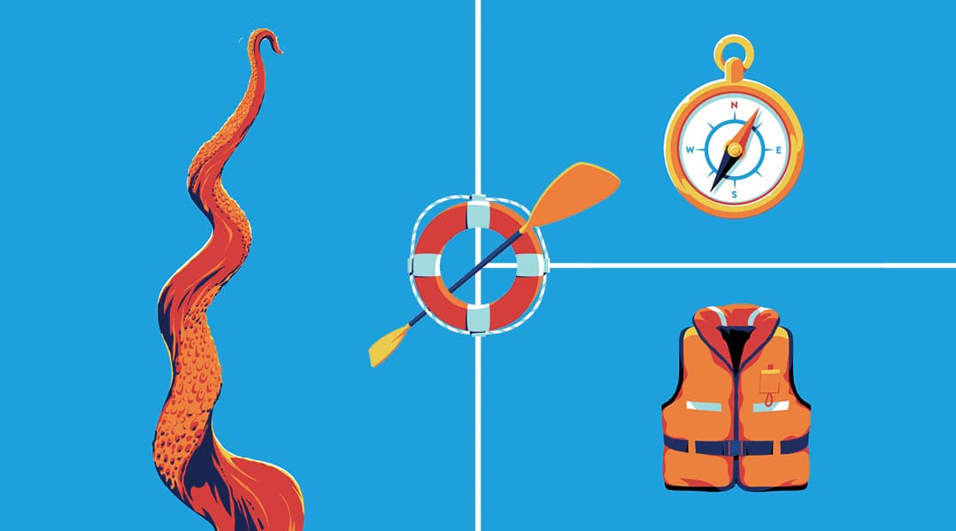
Mobility and innovation districts are places where pioneers make critical advancements in logistics and supply chain modernization. It’s also a place where technology breakthroughs are developed that can affect billions of people. They are critical to advancing how consumer and commercial operations move forward to improve lives everywhere. The challenge with innovation districts is communicating a tangible concept that resonates with valuable audiences and encourages entrepreneurs, scientists and business leaders to utilize the district’s capability.

We partnered with the AllianceTexas Mobility Innovation Zone to create a flexible identity package that communicates all the intangible benefits this testing ecosystem can provide mobility visionaries and their teams.

Making Intangible Value Tangible

We partnered with the MIZ team and entered into extensive discovery sessions to better understand where MIZ stands in the market and how we can highlight their value proposition and boost awareness of the one-of-a-kind opportunity that the MIZ offers mobility innovators. In marketing the MIZ, our first charge was to articulate the opportunity that the MIZ offers to technology innovators by creating a vision for something that did not yet exist.

MIZ Design System

Through this discovery the Schaefer team identified that the AllianceTexas MIZ was a genuinely unique blend of people, places and things, structured in a manner unlike any other innovation zones. We leveraged this differentiation into a defining position and archetype to inform the subsequent brand identity and campaign creative development. This allowed us to tangibly define the value that the MIZ brings to entrepreneurs and innovators that elect to use their district and capabilities. Ultimately, this helps the MIZ advocate for new businesses and create long term partnerships with innovative companies that bring jobs to North Texas and innovation to the mobility industry. 

Messaging Full-Scale Innovation

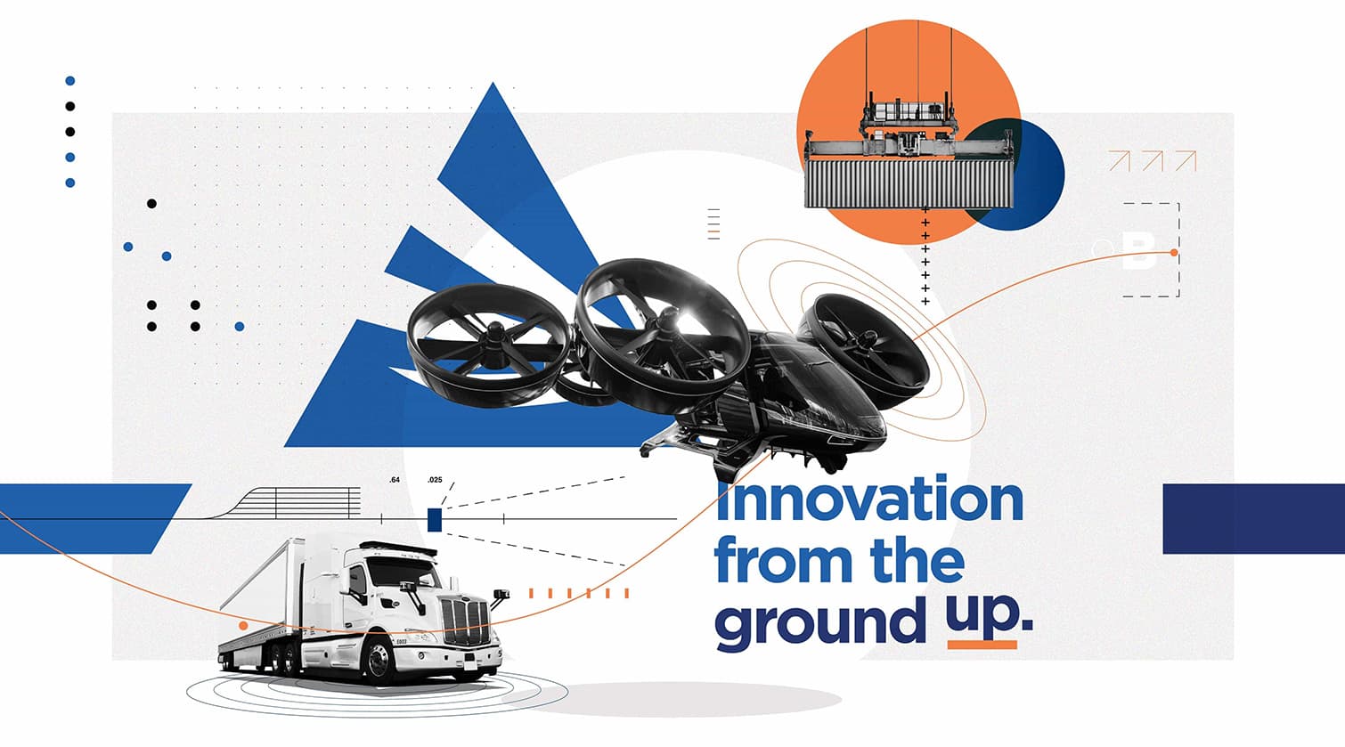
We crafted “Innovation from the Ground Up” as a key message to clearly position the opportunity of the innovation zone. It nods to the full-scale capabilities of the MIZ and communicates it as a place where mobility innovators can push the boundaries of now to discover what’s next and do it all—ideation to implementation—at the MIZ.
Deploying a Detailed Digital Activation

We launched the updated identity with the “Innovation from the Ground Up” campaign, which introduced the MIZ as the premier, pioneering testing, scaling and commercialization ecosystem. The campaign solved three key communications requirements: promoting the MIZ brand, communicating the surface capabilities, and promoting the airspace utility. This reflects the total MIZ ecosystem and communicates it as a flexible, utilitarian space that is open for business across the mobility industry. 

We developed a multichannel digital marketing plan to launch the “Innovation from the Ground Up” campaign, utilizing paid media, native and sponsored content, email drip campaign and display banners. For paid ad placements, we strategically chose publications that resonated with our target audiences in the logistics, aviation and entrepreneurship industries. The campaign also engaged prospects directly through a targeted email campaign, which encouraged website form fills to contact the MIZ to use their testing ecosystem.  Ultimately, the digital strategy is successfully creating extensive brand awareness and driving both engagement and conversions from high value prospects which has yielded new business partnerships for the MIZ.

Early Results:

  • 300% increase in form fills MoM since beginning of campaign
  • 82% increase in Contact Us form fills
  • Display impressions increased nearly 200% MoM resulting in 141% more clicks
  • 34% increase in new website users
  • Improved brand exposure and market saturation

Golf is a timeless sport that brings people together to enjoy camaraderie and pristine, cultivated greens. But, what happens when you add luxury travel and experiences into a premium golf membership? You get Icon Golf – an esteemed golf and travel membership that takes players around the world. Icon needed to revamp their brand to generate more memberships, so they partnered with the Schaefer team to refocus their sales efforts with a full-scale, multichannel digital campaign and a new website. 
In 2020, Icon invested in increasing their sales from 250 memberships to 1000. So, they partnered with Schaefer to revamp their brand, generate more memberships, and focus their sales efforts with a full-scale, multichannel digital campaign and a new website to meet their very aggressive goal.
Goals

Grow Icon Golf membership database from 250 to 1,000 in 18 months.

  • Refresh the brand identity
  • Develop a content marketing strategy 
  • Build a CRM to streamline lead generation and membership management
  • Improve online user experience 
  • Prioritize sales efforts

Roles

  • Strategy 
  • Creative
  • Digital 
  • Branding
  • Positioning
  • Client Services

Partnering to Develop a Structured, Integrated Sales Process

We began our relationship with Icon Golf on the ground level as they were initiating the formal development of a structured sales team. This allowed Schaefer to partner directly with the Icon team to merge sales and marketing efforts. Icon’s previous marketing efforts were primarily functioning by word-of-mouth and leveraging connections with existing club members within their portfolio. While this approach was successful, there was an opportunity to expand their sales efforts through digital automation to reach a wider audience.

We started by evaluating each medium against our overall goals and the need to fill the funnel with awareness initiatives and convert interested prospects into members. We found that paid search and streaming audio and video proved successful for building awareness, and third party publication emails allowed us to hit a very targeted audience that was ready to convert.

A Refreshed Creative Platform

We recognized an opportunity to reinvigorate their creative platform to better communicate the unique benefits that an Icon membership provides. Icon Golf offers members full privileges with an expertly curated collection of private golf clubs as well as luxurious member experiences and fully planned quests to exotic locales. So, Icon Golf is much more than a golf membership – it’s a full-package of golf and travel – and communicating that was the central challenge of updating their creative.

When creating the updated creative platform, we focused on the luxury aesthetic and benefits of an Icon Golf membership. We wanted the design and language to reflect the elevated perks and nature of the membership, all while highlighting the relationship-focused aspect of joining Icon Golf. The camaraderie between Icon members is a key strategic imperative, so we had to make that central in the updated creative deck.

We created the concept “Legendary is Within Reach” as our primary branded language alluding to the potential for legendary moments with legendary people, on and off the course.

A New, Optimized Website

The central piece of Icon’s rebrand was optimizing their website to generate more qualified leads. Previous to our relationship,the Icon Golf website was split into two different URLs – Icon.Golf and IconGolf.com to satisfy internal marketing objectives. However, this split up their traffic and made consolidating valuable lead information more difficult. So, we combined their properties into one streamlined website. To increase the site’s performance, we implemented key SEO and content updates targeted at their primary audiences.

Our team also redeveloped the site with crucial user experience updates to improve site accessibility and usability aimed at generating form fills from qualified leads. To improve usability, we simply added header and footer navigations to improve the overall user experience. In addition, we employed site tagging to capture key user behavior metrics in order to continue to drive future data-driven site optimization opportunities. Finally, we placed CTAs throughout prominent areas of the website so that users could always and easily make direct contact with the reps at Icon Golf. The final result is a website that supports Icon’s strategic marketing goals by generating more engagement and qualified leads.

Creating a Centralized Lead Strategy

To continue to round out the lead generation strategy, we implemented a CRM strategy to accurately target lists of valuable, interested leads with compelling emails. We connected key data sources – the Icon website, MailChimp, and Salesforce as well as other lead collection points to ensure that our data automatically fed into the sales process and reduced the work the sales team needed to do to generate more memberships.

We created a variety of emails around the central message “Legendary is Within Reach” that ultimately guided leads to complete a form fill and capture valuable data for converting more leads.

To round out the digital strategy for Icon, we created a multi-channel paid media strategy that targeted valuable audiences in paid search, paid social media, display banners and email. In addition, we cultivated strategic partnerships with golf publications and outlets to secure high-value placements in front of the most highly qualified audience.

Results

In 2021, Icon Golf had their best year ever, setting a record month for membership sales in December.

  • Reached 85% of their new membership goal in under 9 months
  • Last Click Attribution:
    • 31 new memberships driven directly by campaign paid media
    • $450k in revenue
  • Total annual revenue surpassed 1.7 Million, resulting in a strong ROAS of 7:1
  • Lead Gen Growth in 2021
    • 569% increase in form fills 
  • Web Traffic Growth in 2021
    • 453.4% increase in pageviews
    • 480.9% increase in sessions 
    • 485.1% increase in new users visiting the website

Marketing in-person events comes with its own set of challenges, but after the pandemic struck, we were presented with a new range of obstacles to activate the community and generate awareness, excitement, and attendance. For the Kimbell Art Museum, we were tasked with creating a community activation campaign that highlighted Queen Nefertari’s Egypt exhibition and encouraged people to safely enjoy the exhibition in person.

Goals

  • Create community activation and engagement
  • Connect the exhibition to people and encourage them to enjoy it in person
  • Encourage community awareness of the new exhibition
  • Utilize social media to educate the public and generate buzz for the exhibition
Nefertari Mural's

Encouraging Engagement During Uncertain Times

Getting in front of your audience physically during the pandemic can be challenging, but there are creative ways to target and engage the community in the digital space that still leads to conversions. The Kimbell needed a big idea that could break the mold of traditional marketing, and we were up for the challenge!

Instead of relying on traditional marketing methods to encourage in-person attendance, we specifically utilized the digital space to accomplish this, examining new trends, tools, and opportunities to engage our audience virtually. While digital analytics are incredibly valuable, this presented another challenge because the ultimate measurement of success is in-person attendance.

Nefertari QR Code Scan for Kimbell

Pivoting for Success

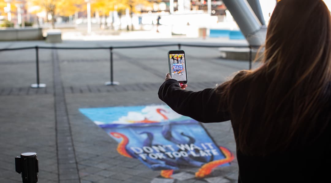
Rather than presenting a hard push to get people to the Nefertari exhibition in person, we decided to bring the exhibition experience to the community in a safe way. We created a series of outdoor installations that teased the exhibition and activated audiences in the safety of outdoor spaces. Our team created 3 different murals and 8 different ground clings that educated people about the Nefertari exhibition and encouraged them to experience it in person. For placement, we leveraged internal relationships to strategically set the murals and ground clings in areas that have high foot traffic and chose locations to help build the Kimbell’s network and local footprint. These installations allowed our audience the chance to walk in Queen Nefertari’s sandals and experience the magic of uncovering a hidden Egyptian ruin.

Scanning QR Codes for Kimbell Nefetari Exhibit

Leveraging a New Technology

To supplement the installations and ground clings, we sought a way to digitally engage our audience wherever they are and immerse them in Queen Nefertari’s Egypt. We worked with the Kimbell to come up with an engaging digital campaign to shift into the digital space. This was a big step for the Kimbell, since most of their previous campaign activations were created with traditional advertising methods. After careful market observation and extensive digital discovery, we found that more and more destination brands were incorporating augmented reality into their marketing plans.

Augmented reality takes many forms, but at the core of AR is the ability to partially immerse a user in an experience through a digital device like a phone or computer. For the Kimbell, we sought to create an AR campaign that brought Queen Nefertari to life and offered our audience a new way to engage with the exhibition. We created two AR filters that gave people two distinct ways to place them in Queen Nefertari’s Egypt.

3D Renders of Nefertari Crown

The first AR filter we created features Queen Nefertari’s crown – a three-dimensional depiction of a flat hieroglyphic crown that people could wear and enjoy on Instagram and Facebook. The second AR filter features a series of hieroglyphs etched into stone laid behind the user to make it appear as if they had just discovered the ruins.

It was a challenge to take a flat hieroglyphic crown and turn it into an accurate three-dimensional rendering. But, after hours of research, testing, and iteration, we were able to take a piece of Art and turn it into a relatable and engaging piece of technology that was accessible and relevant to audiences everywhere.

Results

  • Helped the Kimbell effectively reach max capacity of the Nefertari exhibition
  • More than 1.1M paid media impressions
  • More than 5 thousand tickets sold
  • The entire campaign resulted in more than $383k in revenue
  • AR filter earned 5.7K impressions and 3.6K opens
  • CTR of 1.71%, above the industry standard of .8%
  • 308 shares of the filter ads
  • Incorporated new technology into our client’s marketing strategy
  • Produced and installed wall murals and ground clings

The Challenge

In the face of the Covid-19 pandemic, the Fort Worth Zoo needed a way to sell holiday adoptions and memberships. More than that, they needed a campaign that cut through the clutter of holiday advertisements to connect with consumers and convince them that a Zoo membership is the perfect gift for anyone who enjoys a unique and rewarding experience. 

Goals

  • Promote Zoo memberships and holiday adoption packages
  • Communicate the new delayed activation component of Zoo membership
  • Boost membership sales by defining the target audience and tailoring messaging to that base
  • Recapture some of the membership sales lost due to the Covid-19 pandemic
  • Help the Zoo sell 200 adoptions and boost membership revenue

Identifying the Right Audience

Before launching the campaign, we needed to identify and target the right audiences that were likely to purchase a holiday membership or a holiday adoption package. Before determining audience demographics we isolated Tarrant County as the primary market in which membership conversions would be most attainable

It was a challenge to promote both adoptions and memberships in one campaign, since the target markets aren’t the same. So, we had to carefully design our target audience to maximize exposure and conversion. 

To define our audience sets, we identified parents with young children as a primary marketing target, and general audiences as a secondary target likely to buy holiday adoptions. We also incorporated strategic site retargeting to market to users that have visited the Fort Worth Zoo’s website, and targeted additional users searching for terms related to the Zoo and holiday gift ideas. We excluded current Zoo members from all marketing. 

Refining a Compelling Message

For the first time ever, the Zoo offered memberships that allow delayed activation for up to nine months, which allows consumers to select when they begin their membership. This was done to help quell fears about the coronavirus pandemic and give Zoo members a chance to begin their membership when they feel safer. We created campaign messaging that reflected the new membership activation and featured it prominently across digital banners and paid social ads. The central campaign line of “Give now, enjoy later” communicates the spirit of giving a gift for the holidays, and indicates that it can be enjoyed at the recipients’ leisure. We featured the additional line of “choose when your membership begins” prominently across mediums to further communicate that a Zoo membership can begin whenever the member is comfortable. 

Results

100
of Holiday packages Sold

180000
Profit Generated

318
Return On Investment

41
Total Revenue Increase (December 2019 vs 2020)

Thriving Under Challenging Circumstances

The Covid-19 pandemic has illustrated the need for brands to think outside the box and find new ways to make their products, services or experiences accessible and safe for consumers. For the Fort Worth Zoo, that meant creating a new delayed activation membership and connecting with people that are ready to experience the Zoo under different circumstances.

When we took ownership of Lilyana marketing, the community needed a brand that better connected homebuyers to the true joys of living in this community.

Honing in on Key Differentiators

This community is far from cookie-cutter, so it only made sense to highlight the factors that make it stand out in a cluttered and crowded market. For Lilyana, it’s the conveniences and lifestyle that make it a truly special place to call home. With more than 50-acres of green space, the community is packed with natural amenities, numerous parks and things for homeowners to do outdoors. All of which keep the community and people connected. 

A Refocused Brand Position

Lilyana is located in Celina, a peaceful, up-and-coming town remote enough to harbor tranquility and close enough to Frisco to take advantage of its entertainment, energy and everything it has to offer. When we began to evolve the brand position, we pulled the thread of accessible tranquility to show prospective homebuyers that it is possible to have it all when you live at Lilyana. 

Communicating Joy and Tranquility 

We needed a way to portray the very real, and often intangible, qualities that make this community so special. By incorporating bubbles as a visual element, we were able to communicate the true value of a Hillwood community—connection, comfort and an ethos rooted in community. All while positioning Lilyana as a place to pause and enjoy the moment.

In addition to visually refreshing the brand, we also revitalized the brand language to communicate joy in the Lilyana lifestyle. “A place to embrace life’s moments” communicates that Lilyana is a community for people to slow down and enjoy their lives – right here, right now.

Building a comprehensive brand story gives real estate brands more space to have meaningful conversations with home buyers. Developing Lilyana’s position in a cluttered and competitive space helped the brand stand out, and ultimately led to more home sales.