Schaefer Advertising Co.

Archives

The Challenge

In the face of the Covid-19 pandemic, the Fort Worth Zoo needed a way to sell holiday adoptions and memberships. More than that, they needed a campaign that cut through the clutter of holiday advertisements to connect with consumers and convince them that a Zoo membership is the perfect gift for anyone who enjoys a unique and rewarding experience. 

Goals

  • Promote Zoo memberships and holiday adoption packages
  • Communicate the new delayed activation component of Zoo membership
  • Boost membership sales by defining the target audience and tailoring messaging to that base
  • Recapture some of the membership sales lost due to the Covid-19 pandemic
  • Help the Zoo sell 200 adoptions and boost membership revenue

Identifying the Right Audience

Before launching the campaign, we needed to identify and target the right audiences that were likely to purchase a holiday membership or a holiday adoption package. Before determining audience demographics we isolated Tarrant County as the primary market in which membership conversions would be most attainable

It was a challenge to promote both adoptions and memberships in one campaign, since the target markets aren’t the same. So, we had to carefully design our target audience to maximize exposure and conversion. 

To define our audience sets, we identified parents with young children as a primary marketing target, and general audiences as a secondary target likely to buy holiday adoptions. We also incorporated strategic site retargeting to market to users that have visited the Fort Worth Zoo’s website, and targeted additional users searching for terms related to the Zoo and holiday gift ideas. We excluded current Zoo members from all marketing. 

Refining a Compelling Message

For the first time ever, the Zoo offered memberships that allow delayed activation for up to nine months, which allows consumers to select when they begin their membership. This was done to help quell fears about the coronavirus pandemic and give Zoo members a chance to begin their membership when they feel safer. We created campaign messaging that reflected the new membership activation and featured it prominently across digital banners and paid social ads. The central campaign line of “Give now, enjoy later” communicates the spirit of giving a gift for the holidays, and indicates that it can be enjoyed at the recipients’ leisure. We featured the additional line of “choose when your membership begins” prominently across mediums to further communicate that a Zoo membership can begin whenever the member is comfortable. 

Results

100
of Holiday packages Sold
180000
Profit Generated
318
Return On Investment
41
Total Revenue Increase (December 2019 vs 2020)

Thriving Under Challenging Circumstances

The Covid-19 pandemic has illustrated the need for brands to think outside the box and find new ways to make their products, services or experiences accessible and safe for consumers. For the Fort Worth Zoo, that meant creating a new delayed activation membership and connecting with people that are ready to experience the Zoo under different circumstances.

February 1, 2021

Big names, bigger impact

Challenge

The Gary Patterson Foundation raises thousands of dollars every year to benefit various education and children related entities. After experiencing Mack, Jack & McConaughey in Austin, the Gary Patterson Foundation was inspired by MCM’s efforts to empower kids through 2-days of fundraising and fun. After careful consideration, they decided to shift their traditional Joe T’s annual event into a weekend filled with fundraising activities from golf to galas. With a shift as big as this, they needed to create an impactful brand.

Goals

  • Develop brand name, narrative and messaging for the non-profit event series
  • Create a dynamic brand identity system that communicates the values of the non-profit

Finding the Way

We worked closely with the Gary Patterson and his team to better understand the audience and impact of the new events, and create a strategy that would speak to their target audience. The events needed to attract all generations of donors in North Texas, and be accessible to those that would like to donate for the first time. The new initiative also needed to be the core fundraising event for the Gary Patterson Foundation. So, we had to position it as an accessible, diverse non-profit open to those that aren’t passionate about sports, but also welcome those that are – it had to be inclusive and suitable for a diversity of mediums. From black ties to tailgates, the mark needed to be flexible enough to feel at home at any type of fundraising event.

Plenty of Good to Go Around

To communicate the breadth and impact of the fundraising efforts, we knew the brand and mark had to be big. With an emphasis on the good. 

The organization landed on the name, “The Big Good,” which is direct, yet powerful. Its strength is in its simplicity. A quick read with enough flexibility to cover more than one specific event or fundraiser. The Big Good indicates the diversity of events and their monumental impact on North Texas families and beyond. 

The typographic logo is purposefully simple to communicate the variety of events at the heart of the Big Good. Each of the letterforms is customized and unique which further emphasizes the diverse structure of the Big Good. The crossbars on the “H/E/B/G” are all different and intentionally illustrate the fun and engaging nature of the events that offer something substantial for everybody, and specific need in Dallas Fort Worth.  

A subtly simple mark, paired with a direct brand name can make an impactful and memorable impression. The Big Good branding illustrates the power of using simplicity to communicate and represent a brand. 

Results

  • Created a dynamic, flexible brand logo
  • Established an impactful brand and tone

Challenge:

M. Kangerga & Bro Management (MKB) is a commercial real estate investment company that focuses on self-storage opportunities. The family-owned business has been around for more than 100 years—historic, yet brandless in their industry. To strike the right note, Schaefer partnered with MKB to develop their brand identity and expand brand visibility and credibility as the company sought investment partners.

Working Forward

The purpose of the MKB rebrand was to modernize the brand tone and visual aesthetics to not just live on, but inspire confidence and empower decisions among investors and new business leads. As the company expanded relationships with third-party investors, they needed a brand identity that leveraged their heritage into an authentic look with a very updated, polished feeling. 

Goals:

  • Capture history and legacy in new brand identity
  • Create a presence online to establish credibility and appeal to new investors
  • Create new marketing materials for investor pitches 

A Nod to the Past, Present and Future

Stylistically, we wanted the new creative platform to pull through the heritage of the brand, but not feel old. We created a mark that nods to MKB’s roots, but also reflects where they are right now and where their company is heading. The primary logo has a quiet confidence, and the typeface’s nuanced letterforms illustrates the imperfections – but staying power – of carving into stone, which is a nod to the company’s impressive history.

The typography we chose is based on Jandus, which leverages strong architectural characters, friendly rounded corners and classic simplicity that can stand the test of time, just like MKB.

We selected a minimal color palette of dark charcoal and muted gold and cream, which represent the history and tradition that serve as the very foundation for MKB’s success, while also indicating their steadfastness and lasting nature. These colors work together to communicate that MKB is a trusted leader in commercial property investment and that their long history is full of decades of success.

Results

  • Cohesive brand development       
  • Logo recommendations and
  • Color palette, font solutions
  • Complementary stylistic assets
  • Brand standards
  • Web design
  • Narrative + messaging

When branding a company, it’s important to thoroughly understand the company’s principles and how they want to be known in the hearts and minds of their prospects. For MKB, we created a comprehensive brand identity that captures the history of over 100 years of successful business ventures and indicates that the brand will be around for many more fruitful years to come. 

January 20, 2021

Blazing the trail

Challenge

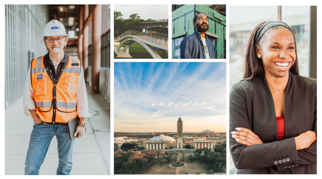
The Fort Worth Chamber of Commerce has served the business community within the Fort Worth area since the late 1800s, playing a pivotal role in nearly every major milestone that has occurred in the city. Moving into 2020, the Chamber’s CEO of over 30 years retired, opening the door for a new, visionary leadership team to continue the Chamber’s momentum in driving forward the success and growth of Fort Worth business.

Opportunity

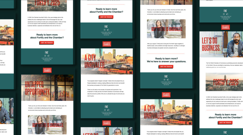
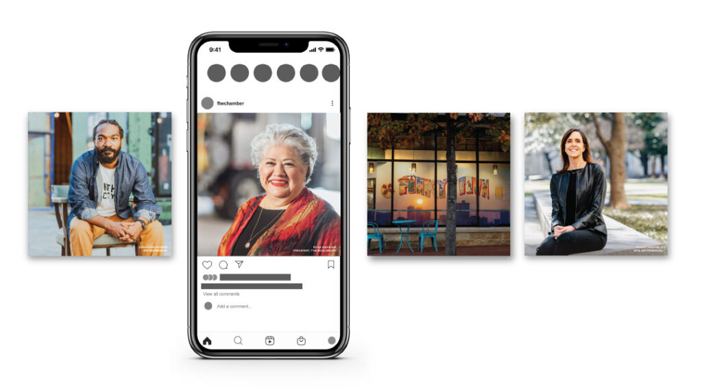
The emerging Chamber team developed a specific vision and strategic plan to capture and sustain growth for the City of Fort Worth, serving as both the champion for existing businesses while executing aggressive economic development efforts. Critical to the success of this plan was to reintroduce the Chamber to our business community, influencers, and new prospects in a manner that would enlighten them to the value of the city and engage them with the Chamber. To accomplish this successfully, the Chamber team partnered with Schaefer Advertising to refine the communications platform and brand identity.

Approach

Each of our brand initiatives begins with a critical analysis of an organization’s strengths, weaknesses, and differentiators. We immerse ourselves in the vision of the company, including all marketing and business objectives. With the FW Chamber, we identified the opportunity to capitalize on the legacy of the organization while creating a more defined and contemporary position that was current with today’s business climate. Through the development of a Brand Archetype, coupled with a defined brand position and targeted key messages, we created a communications platform that the Chamber can use in their marketing efforts moving forward. This platform also fully informed the creative development of a new brand identity.

A Heroic New Mark

Our exploration process revealed that the Chamber was defined as a Hero archetype, a persona defined by strength, courage, commitment, and a drive to move things forward. Taking direction from that archetype, our creative team explored a multitude of solutions for the new Chamber brand. In keeping with our process of immersion, the team explored other related and competitive organizational brands, the history of Fort Worth, and the Chamber to inspire the recommended design solutions.

The resulting mark is simple, bold, and includes a star as a subtle nod to a boot spur and a connection to the prior iteration of their logo. The new identity evolves their brand to better represent the community it serves and the institutions it champions.

Let’s start by getting to know you a little better. Tell us about yourself.

I’m Jessi, and I’m off to a good start with this interview. I got married in 2020 as a pandemic bride, and that was interesting. I really enjoy concerts, so 2020 was a huge letdown for me. I enjoy travel and advertising – I listen to advertising podcasts and learn about advertising in my spare time, so I’m happy to be at Schaefer! 

What’s something you love to do?

I’ve recently really gotten into houseplants – I can count (counts out loud) 8 in my living room right now. There’s a lady in our neighborhood who sell plants out of her garage, so we don’t go anywhere else. I’m not even sure she has a company name, she’s just a lady in a garage. 

What’s your favorite place?

Peru – I love Peru. I try to go back once a year, but it hasn’t happened in 2 years, so here we are – specifically, Paracas, in southern Peru. We go sand-boarding. It’s just a super fun place.

What do you love about the job?

It’s really nice to have a true community of people at work. I worked alone for so long that now I get to enjoy interacting with clients, co-workers, and everyone at Schaefer. I truly enjoy the people. I also like that this job forces me to be organized, because I’m not naturally organized; I like growing that skill. 

If you could do anything besides what you are doing now, what would you do professionally?

It would be cool to own a bakery – I don’t know how to bake, but that would be cool. Realistically, I’d probably be event-planning. I love everything about it – I love the stress and the energy. But I feel like it would be cool to own a bakery.

What is the last thing you binge-watched?

Bridgerton – I’m actually on the audiobook now, too. I’m really obsessed. Before that, Schitt’s Creek. 

If you could live in any sitcom, which would it be?

My favorite show ever is The Office, so I’d choose it. It would be a stressful place to live, but I love it enough that I think it would work out.

Are you a listener or a talker?

I’m a listener, I have too much anxiety to be a talker.

If you had to eat one thing for the rest of your life, what would it be?

Pasta – because you can put anything on pasta. 

What’s the scariest thing you’ve done for fun?

Sand-boarding in the sand dunes in Paracas – which are more like sand mountains because they’re so tall. I was pretty scared to go up at first because I’m afraid of heights, but once we got up there it was so much fun. 

If you had an extra hour of free time every day, what would you spend it doing?

I would probably take time every day to make sure I had a nice relaxing bath. I want an hour more of bath every day.

Why Schaefer?

At first, when I was looking for internships, I accidentally applied to Schaefer twice – mistakenly for the Summer program, which I wasn’t available for. The one thing that stuck out to me was that the community and culture was very strong – everyone here truly enjoys each other and naturally gets along. I think that it’s a really strong community.

When it comes to oncology, medicine has advanced in big ways. But the business side of running an oncology practice hasn’t kept up. In the age of automation, back-office operations are often tedious, siloed and completed manually. Factors that contribute to misused resources and the growing cost of cancer care. That’s where AC3 comes in. 

AC3 is a practice intelligence platform that harnesses the power of data to improve the quality and speed of back-office work. Allowing doctors and staff to trade paperwork and process for a more meaningful purpose—caring for patients. With care being core to their business, the real obstacle was creating an identity that lived up to AC3’s cutting-edge capabilities as well as their impact on patient care.

Bringing Care Into Focus

Cancer is humbling and, most importantly, human. So the branding had to communicate the function of a tech-driven product in a very human way. In addition to a visual identity, AC3 needed a way to talk about themselves to a more public audience. We developed positioning that helped define who they are. And rooted it in the real-world, analog benefits doctors and patients experience. Productivity, revenue, quality of care, this platform gives doctors the ability to do more. A lot more. 

For the mark, we took a nod from the company’s namesake—Advanced Cancer Care Centers—and aligned it with the platform’s ability to improve operations within a practice exponentially. We let positioning guide design and the result was meaningful. 

With any tech-based product, there’s a concern around sharing proprietary imagery—a challenge we faced when representing the product in a tangible way. Rather than showing the software itself, we focused on the moments AC3 makes possible.

When we took ownership of Lilyana marketing, the community needed a brand that better connected homebuyers to the true joys of living in this community.

Honing in on Key Differentiators

This community is far from cookie-cutter, so it only made sense to highlight the factors that make it stand out in a cluttered and crowded market. For Lilyana, it’s the conveniences and lifestyle that make it a truly special place to call home. With more than 50-acres of green space, the community is packed with natural amenities, numerous parks and things for homeowners to do outdoors. All of which keep the community and people connected. 

A Refocused Brand Position

Lilyana is located in Celina, a peaceful, up-and-coming town remote enough to harbor tranquility and close enough to Frisco to take advantage of its entertainment, energy and everything it has to offer. When we began to evolve the brand position, we pulled the thread of accessible tranquility to show prospective homebuyers that it is possible to have it all when you live at Lilyana. 

Communicating Joy and Tranquility 

We needed a way to portray the very real, and often intangible, qualities that make this community so special. By incorporating bubbles as a visual element, we were able to communicate the true value of a Hillwood community—connection, comfort and an ethos rooted in community. All while positioning Lilyana as a place to pause and enjoy the moment.

In addition to visually refreshing the brand, we also revitalized the brand language to communicate joy in the Lilyana lifestyle. “A place to embrace life’s moments” communicates that Lilyana is a community for people to slow down and enjoy their lives – right here, right now.

Building a comprehensive brand story gives real estate brands more space to have meaningful conversations with home buyers. Developing Lilyana’s position in a cluttered and competitive space helped the brand stand out, and ultimately led to more home sales.

Schaefer is proud to have been recognized by Medical Marketing and Media as “Best Place to Work” in 2020. In a tumultuous year marked with uncertainty, we are truly humbled and energized by the recognition. It is the result of tireless work done by the entire agency, lead by the vision and guidance of our Healthcare team. We couldn’t be more grateful for the recognition.


From the winners announcement article by MM+M.

In a year when the workplace has been upended, the prioritizing of company culture and staff matters to a greater extent than ever before. The results of our third annual review spotlight the best small, midsize and large agencies, along with life sciences support firms, as rated by those who know them best: the employees themselves.

Schaefer Advertising

Never before has Schaefer’s mission to “Make Life Better” been more important to its employees than right now. From vital healthcare assistance (the company waived testing and hospital fees related to COVID-19), to an emergency cash fund for bill pay in the case of a spouse or family member being laid off, staffers say they have felt “seen” and “supported” from the very start of the pandemic.

In an effort to increase communication and boost morale, the company instituted virtual work anniversary celebrations on Zoom with heartfelt tributes from colleagues, and a daily “silver lining” email thread where one team member shares a positive experience from their quarantine and then chooses which colleague goes next.

While almost all Schaefer staffers shared their immense appreciation for how “fully transparent” their company president has been, through his efforts to send daily update emails and to reassure the team no furloughs or layoffs would take place, it was his turn as ice cream man that really garnered accolades.

Despite the fact that many employees live between 40 and 150 miles from Schaefer’s offices in Fort Worth, Texas, the company’s owner personally delivered pints of ice cream from a local artisanal creamery to every employee to thank them for their hard work during these difficult times. A gesture welcomed by all as “an incredibly unexpected and much-appreciated surprise.”

Survey Stat

Schaefer Advertising had 31 responses — the most in its category — and was one of the highest-scoring agencies for the answer to “Responded quickly and decisively to ensure employee productivity was unaffected as much as possible.”

Surgeons have many procedural options when caring for patients, and treating glaucoma is no different. Despite the numerous procedures and tools available for ophthalmologists, they each have the same goal: to treat their patients most effectively.

So, when OMNI® launched their new 2.0 device, which has functional advantages over other similar products on the market, we had to communicate the benefits this new device had over its competition.

An Evolved Device Needs an Evolved Campaign

Efficacy is what uniquely sets OMNI apart from other glaucoma treatment options available to surgeons. Beyond efficacy, the new OMNI device provides patients with a more acceptable risk level, addressing all three points of the conventional outflow pathway. While other procedures and devices focus treatment on a single point of resistance. The OMNI Surgical System allows surgeons to treat all severities of open-angle glaucoma, empowers them to intervene in combination and standalone procedures, and provides surgeons with the ability to treat glaucoma with versatility. All of these product advancements ultimately empower surgeons to treat their patients with a more efficacious approach with confidence and provide patients with a higher level of ocular treatment. 

It’s All About Efficacy

OMNI’s brand awareness is strong and based on a functional message that resonates with ophthalmologists, cataract surgeons and glaucoma specialists. But we needed to evolve their position from function, that was established during the first generation of the device, and move into a more benefit-driven message that emotionally connects surgeons to their patients. To achieve that, efficacy had to be brought to the front and center of the campaign messaging. Additionally, we had to communicate that no other device addresses all three points of resistance in the conventional outflow pathway. 

The concept, “Go for Three,” alludes to taking a three-point shot in basketball. It puts the ball in the hand of the surgeon and empowers them to make the choice. This tagline nods to the new OMNI device being the highest-scoring option available on the market, and encourages surgeons to choose the option that is better than the rest. Why settle for a 2-point layup when you have a wide-open shot at a 3-pointer? This active metaphor was a way to invigorate and engage the target audience with something unique in a crowded device market and simply position OMNI as a shot worth taking. 

OMNI Go For Three campaign - Landing Page-Animation

Results

  • Reached an all-time high in sales
  • Accelerated the brand in a very successful direction
  • Made a huge splash in the industry, even amid the Covid-19 pandemic
  • Evolved campaign expanded into a sales aid, educational materials, website, and into more multi-media placements

Places are defined by people, and the Near Southside is among the most vibrant and diverse communities in Fort Worth. So, when they approached Schaefer to help them rebrand their identity, we focused on the neighborhood they create and the people and ideas the Near Southside attracts.

We wanted to present that the Near Southside is first and foremost a community where people and business can thrive in an inclusive and supportive environment. The result is a design balanced in minimalism and boldness that allows the artistic soul of the Near Southside to come through, but also be functional enough to carry the brand across everything from way-finding signage to social. The new color pallet represents the diverse voices that stand up for and continue to create opportunities that cultivate community.  The updated identity is malleable enough to work across mediums but enduring enough to be used over decades to come.

It is a pleasure to partner with local organizations that build up our community and help them identify their message and purpose, and carry that through to representing their brand. By creating a flexible mark that more accurately represents the community and culture of the Near Southside, we’re hopeful that their message will resonate more deeply with future community members and contributors. The Near Southside is an excellent ambassador and cultivator of the arts and culture that permeate our neighborhood and creating something that elicits that same level of passion is why we come to work every single day.