New condos built on family tradition
Luxury Living in the Heart of Fort Worth
As a high-end, mixed-use development, Clearfork needed a naming structure for the five different multi-family projects. Through the brand positioning process, we uncovered the importance of the land to the Edwards family. Through in-depth interviews with family members, we heard stories that painted a vivid picture of how the family interacted with the ranch land for generations.

A Meaningful Name
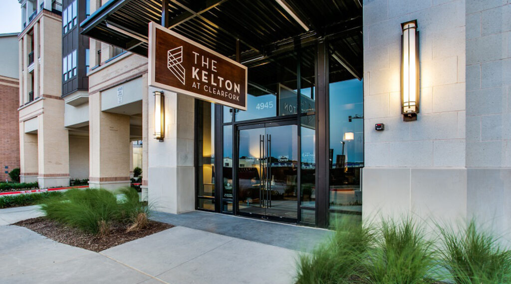
One story in particular told how, as a young boy, one of the now elder statesman of the Edwards family would rest in the shade with the ranch hands when they would take a break from working the cattle. The ranch hands were surrogate fathers and big brothers to the Edwards boys and played a large role in shaping their young minds and teaching them a respect for the land. The idea was born to name the multi-family developments after these ranch hands. The first, is The Kelton.
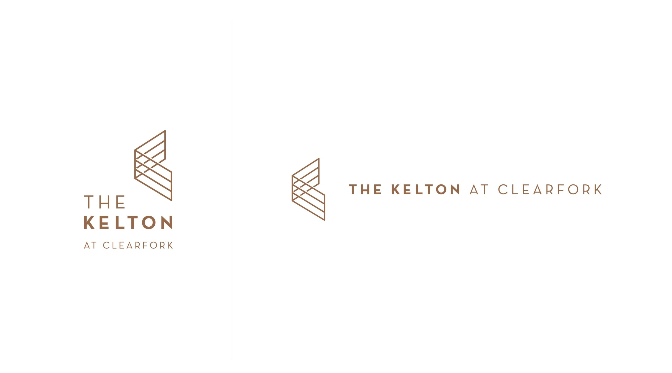
Brand Mark and Creative Suite
The brand mark needed to match the sophistication of the Clearfork area, but remain as approachable and welcoming as the Kelton. We wanted to tie the mark back to the history of the land, and the symbol of an open gate was a universal and welcoming sign of hospitality. The resulting mark feels authentic to the family and their history, but is modern enough to attract the right people to these luxury condos.

Positioning the Kelton in Fort Worth
We also designed the website with the goal of giving people an idea of what surrounded this space. Up until its launch this was a largely unknown and unexplored area of Fort Worth, so we needed to connect people to the culture that surrounded it and the vision for what was being built up around it. To illustrate the soul of the Kelton, we photographed key parts of the city that helped paint a picture of the lifestyle they wanted to portray at Clearfork and The Kelton.
A Brand Rooted in Authenticity
- Brought the Kelton brand to life with a new creative suite
- Created a brand that fits perfectly in the Clearfork family