Family-owned and operated since 1954, Air Comfort is an HVAC and Refrigeration company that provides customized solutions in the residential, commercial, industrial and marine sectors. Founded on the values of quality, integrity, commitment and safety, Air Comfort delivers excellence in everything from custom fabrication to service and installation. As the Southeast Texas based company began to grow into extended markets, the brand needed to reflect the level of professionalism and expertise of the business.
The brand refresh began, as most do, with the logo. Subtle adjustments to color, shape and typography brought the logo set up to date while maintaining the equity of the original mark. From there came brand extensions, most notably the van wraps. As a primary symbol of their service and residential sectors, the vans needed to communicate the brand’s new identity and serve as a moving advertisement while out on the job.
Originally relying on word-of-mouth and face-to-face business, Air Comfort had a need to speak to a larger audience. And when we say speak, we mean allow the Vice President to“Fabio-up”and lay it all on the line for his business. With years of growth and notoriety in the community, Air Comfort’s team was eager to let their hair down with a humorous TV spot, and we couldn’t have been more proud of the finished product:
Situation:
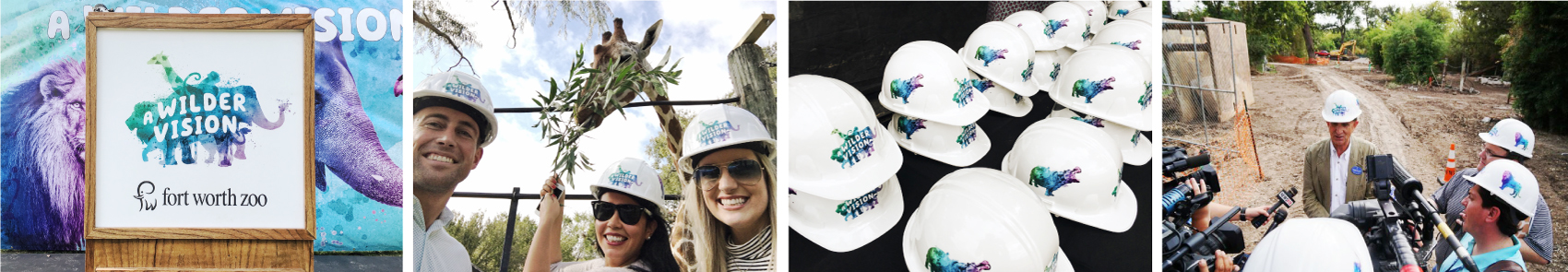
The Fort Worth Zoo, one of the top 5 zoos in the country, is undertaking a massive expansion campaign, with the goal of raising $100 million dollars to expand the park. The expansion will include new exhibit space, renovated habitats, special events space, multiple dining areas, and most importantly, new ways to observe, interact with and learn about animals. The expansion will guarantee for future generations the survival of many endangered species.
Opportunity:
The Zoo needed a clever solution to bring this capital initiative campaign to life to the Fort Worth and surrounding communities. Schaefer Advertising was tasked with developing an integrated media strategy and creative campaign to drive awareness, engagement, ambassadorship and donations.
Approach:
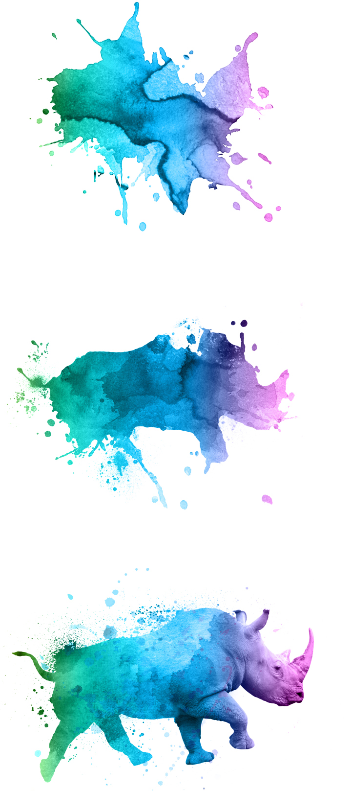
On September 12, Fort Worth got water-colored. The Fort Worth Zoo kicked off the public phase of its $100 million capital campaign by promoting splashes of color all over the city. For 5 weeks, the community chattered with speculation on what this “advertising as art” represented. The campaign evolved over the following weeks, with each phase revealing a little bit more of the campaign. Culminating with a launch event for community leaders, the campaign revealed the public-facing fundraising effort.
Campaign Goals:
Generate awareness of “A Wilder Vision,” the Fort Worth Zoo’s plans for significant expansion over the next 8 years.
Drive donations from the Dallas-Fort Worth Community.
Drive web traffic to the Zoo’s giving site in order to generate excitement and process donations.
Results:
Our reporting approach consisted of consolidating data from multiple sources such as social media platforms, display networks, and external and internal email platforms for a multi-phased campaign approach. By making continuous optimizations throughout the campaign, we were able to drive the below performance wins.
In the quiet phase, the Zoo raised approximately $90 million of the $100 million goal, with the public facing campaign focused on generating the remaining $10 million. The campaign continued until the end of November and will begin again in FY2017.
98
Display engagement rates above the industry benchmarks
164
Increase in traffic, from Phase 1 to Phase 2
84
Lift in impressions from Phase 1 to Phase 2
41
Increase in web sign-ups from Phase 1 to Phase 2
15
Above industry performance benchmark open rates for email
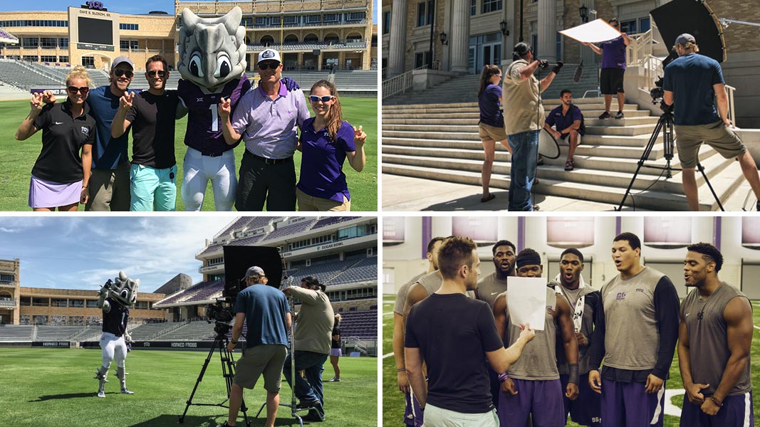
Two years ago we reintroduced a 100-year-old cheer back into popularity among the TCU faithful and the Fort Worth community alike.
This cheer has soaked into the collective TCU community and is now a highlight of the TCU fan experience. It’s a part of student orientation, a staple across social media and tailgate talk, and has spread wildly thoughout merchandise. With this strong endorsement building year after year, it is humbling to see the “fire” we started in partnership with TCU Athletics in 2014.
When TCU looked to us to bring a 3rd rendition of the in-game video to life, we looked no further than the fans themselves. This year we filmed the very fabric of this spirited, TCU fan base. 120 people to be exact. We weaved together 3 unique edits of the cheer and told a collective story for each and every home TCU football game.
We brought in TCU and Fort Worth heroes and kept the anticipation of the surprise ending in each game.
This year the video has been finished out by the likes of TCU Alumni Trevone Boykin, Bram Kolhausen, Aaron Green, Olympians and Bob Lilly. Each one delivering the final line, “Give ‘em Hell, TCU!”
With a few games left in this season, we know there is a whole lot of fight left in the Frogs. And after you watch this video, you’ll see the fans aren’t done yet either! Save
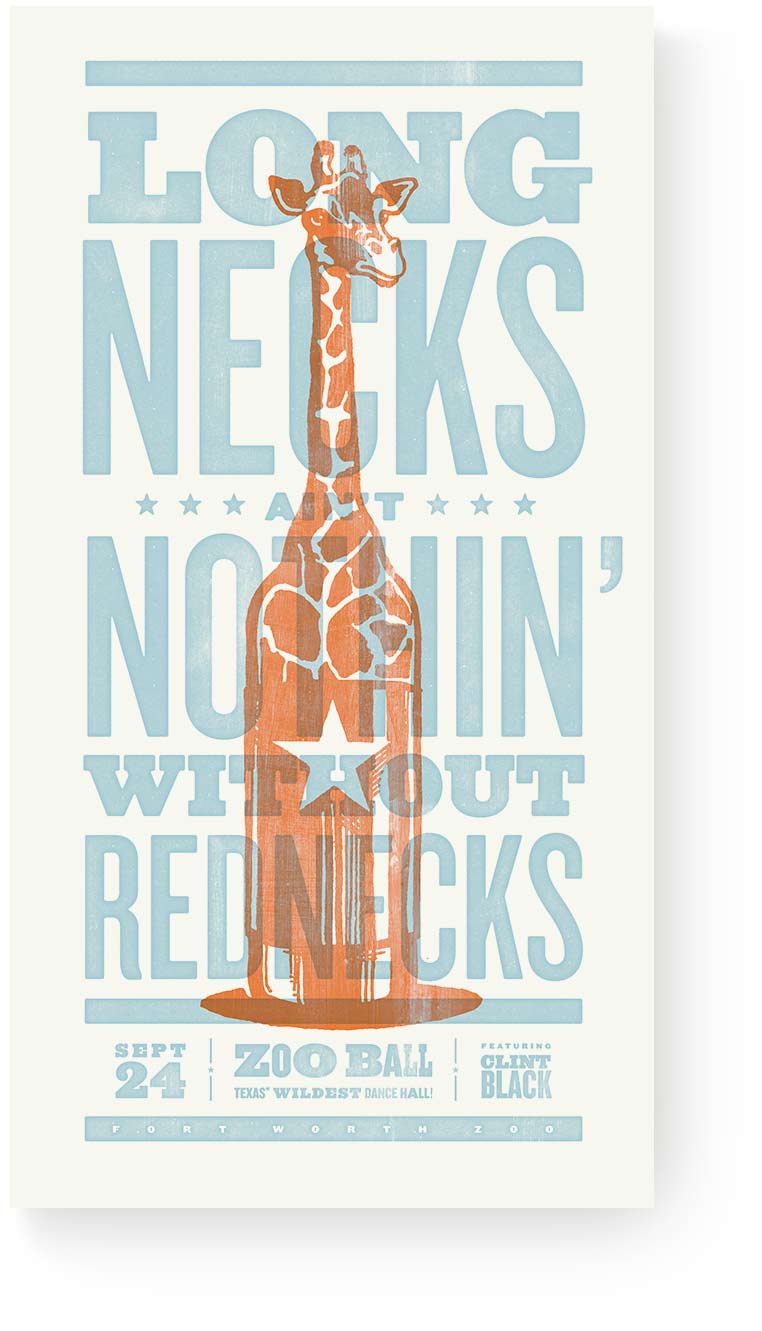
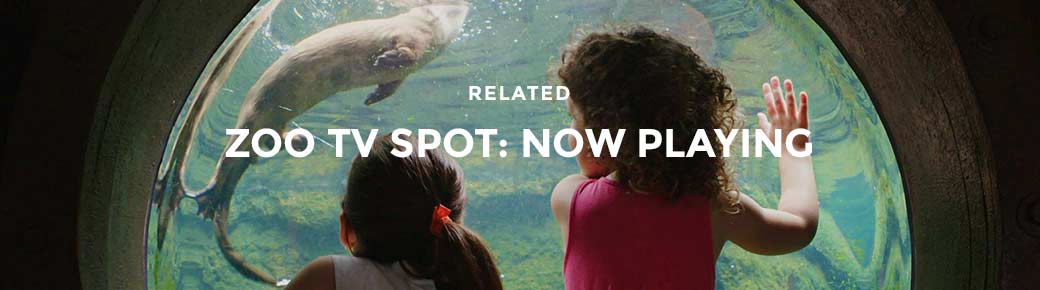
If you live in DFW, you’re most likely familiar with the Fort Worth Zoo and may be familiar with their largest annual fundraiser, Zoo Ball. Every year Zoo Ball attracts some of the biggest names in the area to support the Zoo’s local and international wildlife conservation and education efforts. The invitation for the event has always been closely tied to the theme; i.e. last year’s Zoo Ball at the Flamingo or the previous year’s Festival of the Elephants. The theme and focus of this year’s event was to celebrate the 15th anniversary of Texas Wild!, a portion of the Zoo that exhibits our great state’s different regional landscapes and wildlife.
Instead of the black tie formal-wear of years past—in the words of Alan Jackson–“We’re goin’ country!” And with a performance from Clint Black, Zoo Ball was set to be a cowboy cocktail-themed success. Our minds immediately went to the honky-tonk wood floors of Gruene Hall and Nashville-inspired Hatch Show Prints. So with the direction of “Big Hair, Boots, and Beers,” our team went on its westward way.
Process
Our hearts were set on creating a distinctly Zoo deliverable with the romance and heritage of wood block letterpress. Letterpress, simply explained, is pressing ink onto paper via wood, metal or hand carved letters and images. This process dominated commercial printing from the 1400’s to the mid-twentieth century. In today’s digital era, this process is celebrated for it’s unmatched nuance of color and texture.
To produce our limited edition set of prints, we sought out Minnesota-based premium letterpress studio, Studio On Fire. After following (and admiring) their work from afar, we were excited to partner with them for the project. With their help, our vision for the western-inspired prints came to life, complete with a blind emboss of the Fort Worth Zoo logo and hand-numbering of each print.
We created three custom illustrations that combined cowboy regalia with exotic wildlife found in the Fort Worth Zoo, bringing together the key elements of the event. These illustrations were paired with wood block-styled type, set to mimic posters of old. We created three “sayings” for the print set:
Deep in the Heart of Texas Wild! Long Necks Ain’t Nothin’
Without Rednecks Big Hair, Boots & Beer
Results
The final invitation is truly a complete package. An oversized envelope features a rustic Texas flag and warns ‘Don’t Bend or Fold or Mess with Texas’. Custom postage features animal illustrations and the Zoo logo. A hand-crafted pattern featuring Texas sayings, Clint Black lyrics, Fort Worth nods and custom animal illustrations floods the insert upon opening. And finally the prints are secured by a custom bellyband with event details and slip-sheeted for safety.
The event sold out of tickets and was both appropriately rowdy and respected. Even with fears of rain, the Zoo reassured its patrons: a little weather can’t stop our boot-scootin’ and tequila-shootin’.
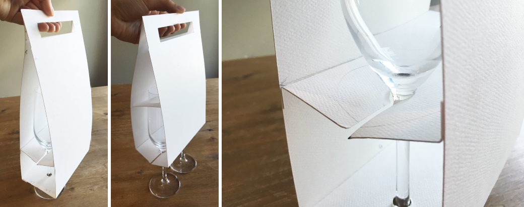
Remember when we developed a unique brand and identity for the Hurst Conference Center’s bridal market, Lumiere Ballroom? We’ve continued to promote this unique positioning to the local bridal market through both traditional and non-traditional means. The goal of our most recent campaign was simple: book more tours. We knew that by viewing the venue, with it’s simple elegance and central location, wedding and reception bookings would increase. Through a digital campaign, we geo-targeted brides with the message ‘Cheers to You!’ in celebration of their engagement and the excitement to come on the big day. By booking a tour with the Hurst Conference Center, couples would receive a complimentary champagne flute set.
Developing the custom packaging came with it’s own set of challenges. Functionally, it needed to be collapsible, easy to assemble and structurally sound. There may (or may not) have been a few flute casualties in the development phase, but through trial, error and a little paper engineering, we created a carrier that met all requirements.
The flute packaging was constructed with Neenah folding board and stamped with holographic foil. The silver-based, rainbow hue mimics the iconic fiber optic star-field chandelier, making it a perfect solution to bring the abstracted Lumiere Ballroom logo to life. Since holographic foil happened to be on our design bucket list, we killed two birds with one, err, rainbow. Upon receiving the first press sheets, giddy excitement and dancing in the sunlight ensued.
Since you may not be able to see it in person, check out the foil in action above.
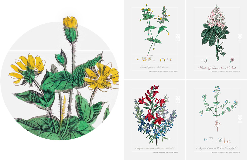
2015 was a year in which BRIT grew both inward and outward.The Botanical Research Institute of Texas deepened its roots by digging into its own resources. An eleven-month survey of the herbarium unlocked the secrets of their plant collection, uncovering the true size and scope of the herbarium while pointing to research opportunities under our own roof. At the same time, they brought on a new executive director, Ed Schneider, to lead the organization into the next chapter of its story within our community.
Schaefer developed the 2015 BRIT Annual Report as a modern field guide of sorts. The piece brings together the institution’s vast scientific knowledge, the beauty of its subject matter and the community of people who love BRIT. On the cover we used a natural, craft paper similar to sturdy field guides or journals, but used a gold foil illustration to contrast the more rustic look with something more modern and sophisticated.
We included four, nineteenth century etchings, printed on translucent vellum, to highlight the impressive collections housed within the walls of BRITs office. Not many people know that BRIT is home to one of the largest herbaria in the in the United States with over a million specimens. They also have an impressive collection of original etchings, paintings and books dating back to the 1700’s. We felt these collections presented a new side of BRIT and positioned them right alongside the incredible museum neighbors in Fort Worth’s cultural district.
We also worked with photographer Gary Logan to capture portraits of the individuals who played big roles in this past year’s success. The portraits brought faces to the institution and broke down any perception of BRIT being solely focused on plants. They are truly made up of great people with tremendous passion for what they do and the impact of their pursuit goes beyond what most of us know.
We are really pleased with the end result and proud to partner with BRIT for a second year in a row.
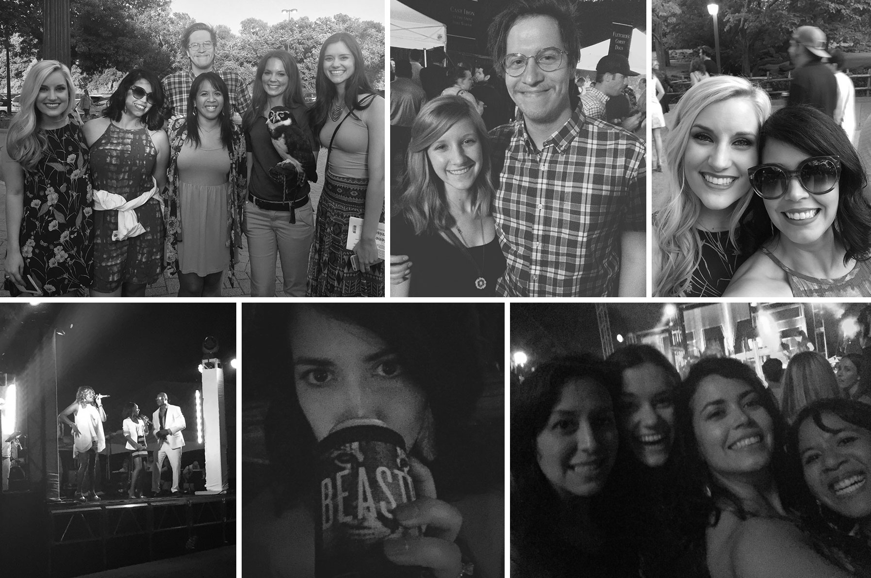
This year marks the 10th anniversary of Beastro, the Fort Worth Zoo’s annual music and tasting event that supports local and international wildlife conservation and education efforts. Within a few weeks of this year’s campaign going live, Fort Worth’s wild side responded with record breaking ticket sales and a fastest ever, sold out VIP offering.
The event features the finest area restaurants stationed throughout the Zoo, serving sample appetizers, entrees and desserts. In addition to the delectable cuisine, the event features open bars throughout the park and live music entertainment. Several animal exhibits remain open until sunset. This year’s entertainment features the local talents of: Emerald City, The Project and Live 80.
The event sold out, for the first time ever, and we had to stop the ad campaign early. The night was a success from ticket sales, but our team also successfully enjoyed the feast with the beasts.
Everyone loves babies. I mean, everyone with a soul loves babies. And that’s why when there is a new baby at the Fort Worth Zoo, we all get a little excited. So when the Fort Worth Zoo told us, months in advance, that they were expecting the birth of a western lowland gorilla, we began developing a launch plan to make the announcement. In our initial phases of planning, we identified key challenges that the campaign would need to overcome in order to be effective. The first was that baby gorillas basically mirror a human child in terms of growth and development. This means that for the first few months, the zoo’s newest star, Gus, was going to spend most of his time sleeping and never be more than a few inches from the arms of his mother, Gracie. And, like most moms, Gracie is a wee bit protective. In spite of the infant gorilla not being mobile or very active at all for that matter, we had to find a way to get people excited about coming to see Gus.
Which leads to the second challenge – how do you photograph a tiny black fur ball held closely in the clutches of his mom? Add in the fact that parents, Gracie and Elmo and new baby Gus, live in a secure designed area, plus wanting to minimize any disruptions to their normal activities, you don’t exactly have an Olan Mills photo studio in which to capture that “perfect” baby picture.
But usually, it’s the challenges that lead you to your solution. And this was no different. Think about it, what does every new parent do? Your Facebook feed is proof, that every new parent posts every single progress update. “Here’s junior sleeping in is blue onesie. Now, here’s junior sleeping in his yellow one that Aunt Marge from Des Moines bought him. Oh, wait, now his eyes are open, oh wait, never mind.” You get the idea. So we decided to build the campaign around the experiences that every parent wants to show their child doing. Eating. Playing. Sleeping. Riding.
Using the zoo’s photography documenting Gus and Gracie’s relationship, we created an “interactive” campaign that gives Zoo goers a reason to come back frequently over the coming months. Visit The Fort Worth Zoo today because as we all know, they only stay babies for just a little while.
Did you know that right here in Tarrant County we have one of the premier Fire Service Training Facilities in the Southwest, an elite culinary kitchen experience and a world class dance program? We do. Across 7 campus’, Tarrant County College offers these unbelievable programs and facilities to put success within reach for over 50,000 students.
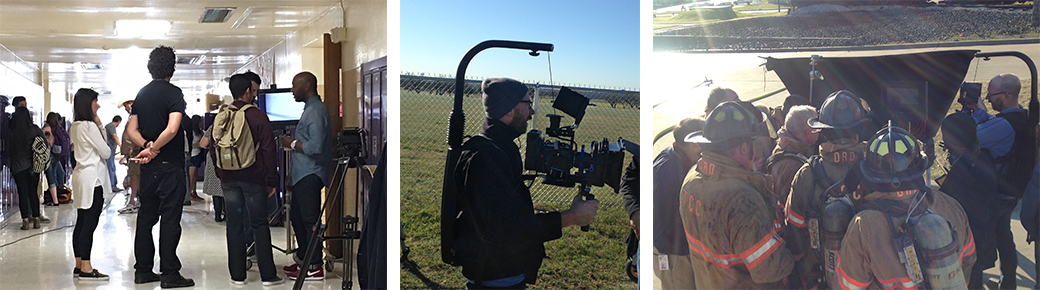
Shot on location, in TCC’s real “classrooms”, we paired actual TCC students with the obstacles they’ve faced on their journey to higher education and showcased how TCC’s diverse and unique programs are putting success within their reach. For the thousands of potential students facing their own obstacles; TCC has a path for you and one question to ask. What’s stopping you?
Chippewa Boots is an American legacy that dates back to 1901 and has been worn for generations by hardworking, passionate men and women who helped build and shape this country. Today, Chippewa Loyalists remain steadfast ambassadors for the brand, but a new breed of Chippewa customer – the young urban – is emerging and embracing the lifestyle that Chippewa represents. In 2016 Chippewa, a division of Justin Boots, a Berkshire Hathaway Co., sought Schaefer Advertising to create an elevated brand platform that would continue to reflect the legacy, quality and craftsmanship of their boots, but also bridge the brand’s appeal to this new target audience.
The new brand creative features sweeping imagery that captures the Chippewa lifestyle in its Americana roots. The platform features a custom trade show exhibit that launched at America’s largest outdoor trade show, Outdoor Retailer, along with new catalogs, look books, advertising, web and social elements. Outdoor Retailer was so impressed with the new platform, Chippewa was upgraded to a premier location within the “America” section of the show. Sit back and relax while you take in the new Chippewa.