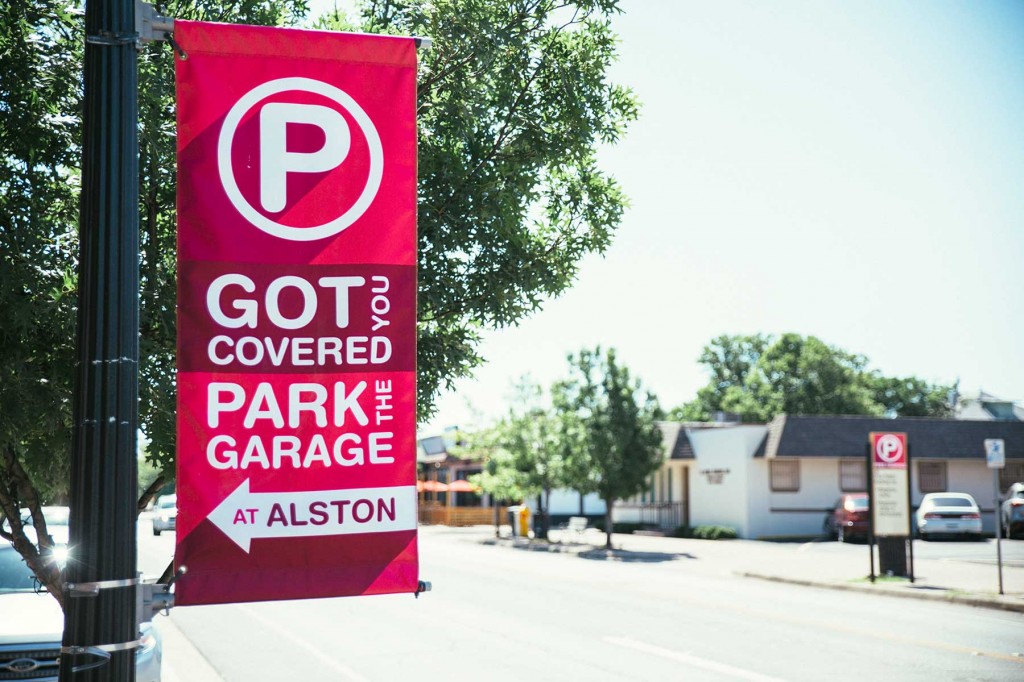
We love our neighborhood of Near Southside here in Fort Worth, and we try to be neighborly whenever possible. So when residents started complaining about business patrons parking in front of their houses, we were there to help. See, there’s this perfectly good parking garage just off Magnolia street, but a lot of people didn’t know about it. How do we remedy this? With advertising, of course!

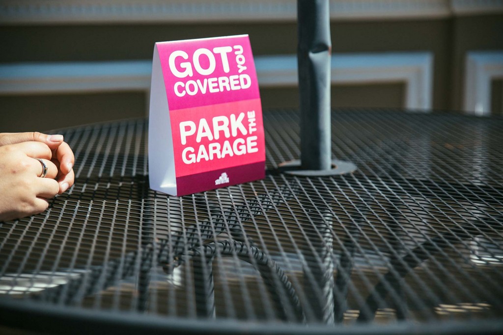
Schaefer created the “Park the Garage” campaign using eye-catching street banners to point people in the right direction. We also provided table tents, buck slips and coasters to local businesses to help reinforce the message. With all that hot pink, there was basically no way for upstanding gourmands to miss that great, big, juicy parking garage just waiting for their vehicles.
Today, the garage is in use, the neighbors are happy and there is peace and tranquility in Near Southside once again. All thanks to some well-placed, brightly colored information.

Four years ago, Schaefer was asked to create a spokesman character for TTI, Inc., a $2B electronic components distributer that had just been acquired by Berkshire Hathaway. Thus the Specialist was born, and since then he’s been fighting bad guys and saving production lines both in videos and a comic book series. Both have been very successful within the industry. “TTI – you’re the guys with the Specialist, right?”
Wanting to maintain our momentum but keep things fresh, Schaefer went back to the drawing board to think of a new way to capitalize on The Specialist character’s infinite knowledge of all things electronic.
Now, Schaefer is proud to introduce Ask the Specialist, a new video series that features our intrepid hero answering questions on a wide range of topics – everything from parts and components to relationship advice.
Click the link to see the first episode, and be sure to check back each month for more answers to life’s burning questions.
http://www.ttiinc.com/page/ask-the-specialist
This was the second year Schaefer got to produce the annual TCU Baseball video. The team was coming off a very successful year, yet they still felt the sting of coming up short in the College World Series. For 2015, both the coaches and players had an even greater resolve to take it all the way to the championship.
Based on the Boy Scout oath, “On Our Honor” is a promise to themselves, their teammates, coaches and fans to follow the path of selflessness, energy and excellence.
This was another fun shoot with N8 Visuals out at Heart of the Ranch in Clearfork, another Schaefer client. Even the non-Horned Frogs here at Schaefer are excited to see how far TCU Baseball can go this year. Go Frogs! #toadtoomaha

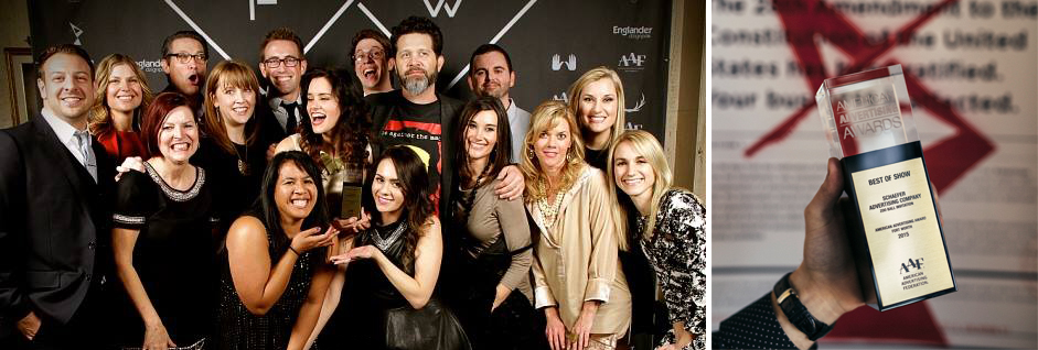
On Friday night, advertising professionals from all over Fort Worth gathered for the 2015 American Advertising Awards. As last year’s Best of Show winner, Schaefer was responsible for this year’s event theme, which was “Amendment 28,” a modern take on prohibition except that it was advertising and not booze that was illegal.
In typical Schaefer fashion, we had a lot of fun with it. From a fake theme to fake government agents to real posters taped on real agency doors, we used a wide range of media to keep the game going. It all culminated last Friday with “The Event” – a secret meeting of ad pros at the Fort Worth Masonic Temple to celebrate in secret another year’s worth of work.
Results are still coming in, but early returns suggest that the event was a success. Guests enjoyed hors d’oeuvres and drinks while sizing up with each other’s work and catching up with old acquaintances and coworkers. The awards presentation video, courtesy of our friends at Studios 121, maintained the underground theme with glitchy effects and the subversive statement that, “If advertising has been outlawed, then we are all outlaws.”
Fitting then, that we made off like bandits, coming away with 16 total awards including five golds and another Best of Show award for the 2015 Zoo Ball invitation we did for the Fort Worth Zoo. Designed by Blair Babineaux with art direction by Charlie Howlett and production by Maren Gibbs, this piece is a fitting jewel to crown a busy and productive 2014.
Of course, winning Best of Show again means we get to put on the show next year, but we’d rather not think about that for a few months. It was a lot of work.
Here’s to a great 2014 and to our three-peat next February!
The Story
Clearfork is a new mixed-use development on what was the last undeveloped piece of the legendary Edwards Ranch. Many Fort Worth landmarks like Texas Christian University and the Fort Worth Zoo now sit on what once was Edwards Ranch property, but the Clearfork portion remained virtually untouched since 1848. Having just completed the Clearfork branding and positioning, the client asked us to produce some vinyl banners to announce the coming development.
“Sure, we can do that, but…”

The Work
With a newly completed road cutting through the property, this was the first time most people had seen this property since before Fort Worth (the actual fort) existed. We felt this called for something a little more unique than a vinyl banner.
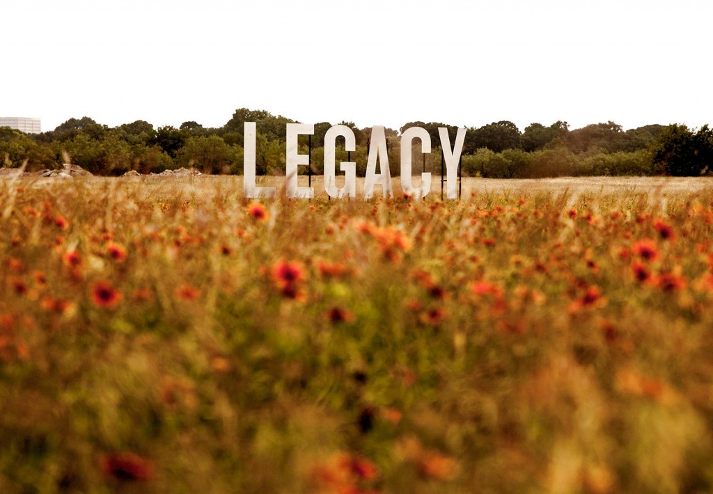
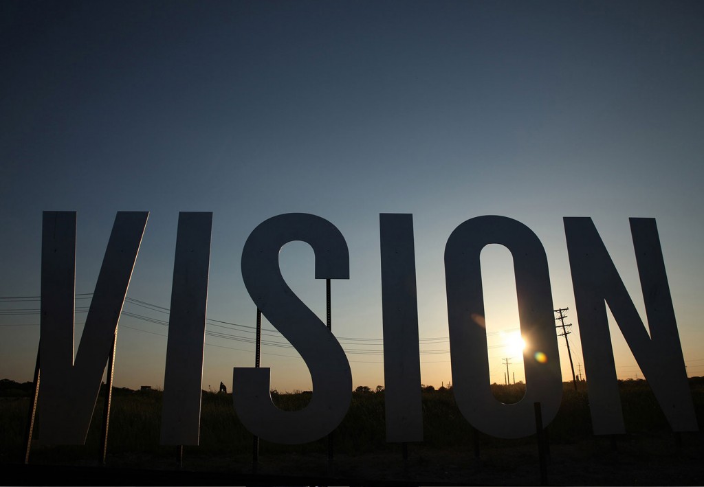
Pulling back from the assumed solution of banners and focusing instead on the goal of attracting passersby’s attention, our ideas included an iron ranch sign, cattle guards and a water tower. What won out in the end were what the team dubbed “word crops.” Three eight-foot-tall words were strategically placed around the property: discover, legacy and vision.
The road to the final product was a long one, since none of us had ever seen word crops before. We cut an “A” out of a sheet of plywood in the side yard of our office and hauled it out to Clearfork to see where the words should go. Our production manager then talked with a variety of vendors to see if anyone could do it on-budget (one could). We had a test letter made with three colors of paint to see which worked best (silver).

The Results
The word crops were a success in several ways. First, they captured people’s attention and made them curious about what was coming to the property. Second, they garnered some social shares as people took photos with the words and shared them on their networks. Thirdly, (shameless plug) they earned Schaefer the Best in Show American Advertising Award for 2014.
Best of all, they’re a perfect example of what we mean when we say, “Give us your goal, and we’ll seek what’s possible.”

The Story
TTI, Inc. is a $2B Berkshire-Hathaway company that supplies electronic components to practically every major electronics company in the world. A few years ago, Schaefer created TTI’s spokesman, the Specialist, whose ongoing adventures have been a successful video series for the company. Three seasons in, they asked us if there was a way to expand the Specialist into other media and broaden his reach.

The Work
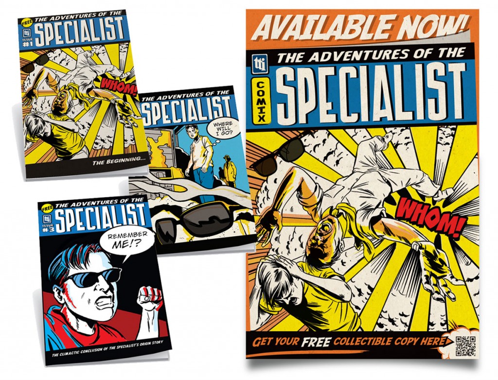
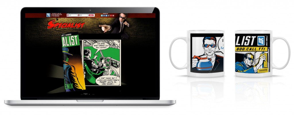
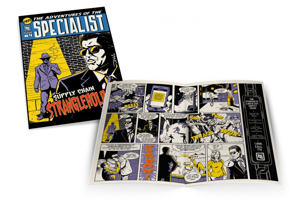
Comic book movies are coming out left and right, but our idea was to do the reverse. The Specialist had always been a live action video character. Why not got 2-D with it? We proposed comic book-style direct mail series that would take the Specialist and his adventure directly to the desks of our target audience. We sourced an illustrator who could do the old-school comic book style, and wrote a series of adventures involving everything from jetpacks to spaceships – two things we (so far, at least) haven’t been able to pull of in video.

The Results
In just a few months, TTI was able to grow their direct marketing database by 500 leads, and they have received overwhelmingly positive feedback from both clients and partners. To date, we’ve produced seven issues of The Adventures of The Specialist and have more issues in the works. What crazy jam will the Specialist find himself in next time? Schaefer only knows.
The Story
The annual Fort Worth Zoo Ball is their largest fundraising event of the year in support of the nonprofit, privately owned zoo. This is an elite affair put on by a committee of top Zoo donors who rely on Schaefer to help execute the annual theme. For 2014, the theme was inspired by the annual Festival of the Elephants in Jaipur, India. The central piece was to be a high-end invitation that would make Fort Worth’s elite excited about coming to the ball.
The Work
Our first step was immerse ourselves in Indian culture (via Google and World Market rather than the subcontinent itself, sadly). Through colors, textiles, patterns we began to get a good sense of direction for the piece. If only we had a designer who was really into elephants. Maybe one who has an elephant pen and mug and figurines all over her desk. Oh, right. Blair.
This theme was tailor-made for designer Blair Babineaux, whose love of elephants (and good design) made her the obvious one to take the lead. Both of these loves were apparent in the final result.
Describing the details of this piece would take approximately forever, but here are some highlights (or you could just look at the picture, right?). The six-panel invitation is printed on a thick pearlescent paper that was flooded with red on one side. Each unique panel was intricately laser cut by the folks at Artifacture in Dallas. Once folded, the invitation was secured with a die-cut bellyband featuring even more laser-cut elephants. The metallic gold envelopes were beautifully hand addressed by Lauren of Blue Eye Brown Eye calligraphy using a custom-mixed ink.
All told, we partnered with six different vendors to make our vision come to life (each of whom might lock the door when they see us coming next time).
The Results
The event was a big success, and the invitation was unanimously well received. Eight-foot replicas of the invitation panels were used as decorations at the Ball, and the chairwoman of the planning committee said, “This is my favorite invitation yet. I’m not sure how we’ll top it next year.”
We don’t know either, but, as always, we’ll seek what’s possible. Even if it does give us all gray hair.
UPDATE:
Schaefer was awarded a gold national Addy for the 2014 Zoo Ball invitation. This is our first national Addy award, and to give it some context, we were one of only 77 gold winners out of 40,000 entries. Needless to say, we’re proud and excited to represent Fort Worth among some of the top agencies in the country.
Check out the complete List of 2015 National Addy Winners.

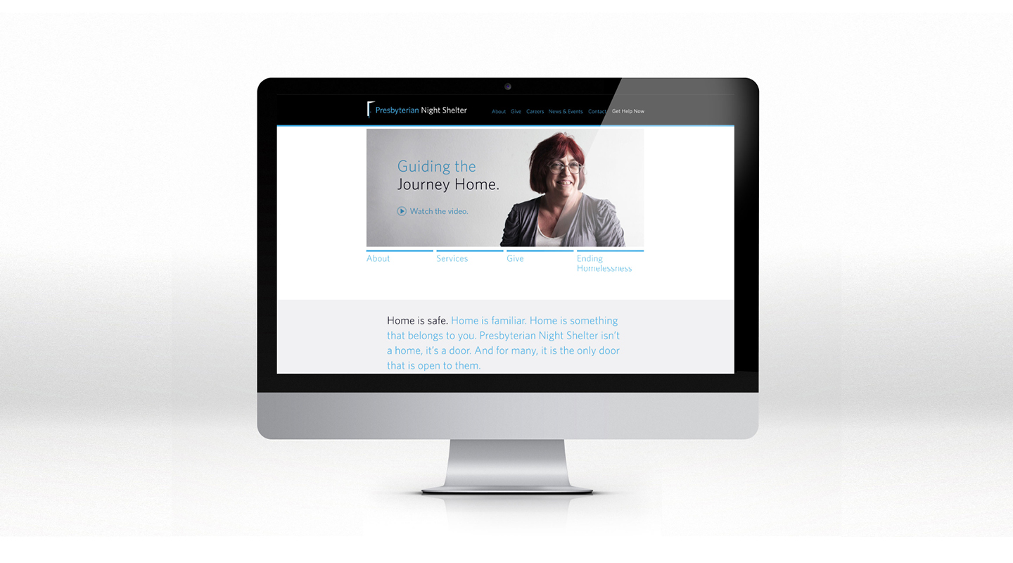
Founded in 1984, Presbyterian Night Shelter is a non-profit organization that does more than just provide a place to sleep. Through a variety of services, they help clients on the journey from homeless to home. With new services being added and new building projects underway, they came to Schaefer for rebranding and fundraising materials.
The open door logo was birthed out of a game of catch in the side yard. That probably had nothing to do with it, but it’s how we got the creative juices flowing. While the door is symbolic of the roof Presbyterian Night Shelter provides to the homeless, it’s also a symbol of permanent housing, which is the goal for everyone who stays there. For many, the Night Shelter is the only door open to them. But there’s hope on the other side.

Another aspect of the project was fundraising materials for a new women and children’s housing project on the Night Shelter property. While the original ask was for printed materials, we looked at the fundraising goals as well as the potential donor base and decided that a video would be the most effective way to go.

Filmed on a shoestring budget by our, at that time, brand-new friends at 1820 Productions, the video sought to convey a single, powerful idea: home isn’t a place, it’s a feeling. As you hear businessmen and women, professionals and even someone who is currently homeless talk about home, the specifics might be different, but the feeling is universal. Punctuating it all is the surprising statistic that 85% of homeless people don’t stay that way.

Homelessness is a curable condition. And we’re proud to help Presbyterian Night Shelter in their mission to end homelessness in Tarrant County.
For Moncrief Cancer Institute’s Future of Academic Medicine event, we used a silver foil on two types of paper to create an upscale invitation. The main imagery on the sleeve is a line rendering of their building, which stands out well from the blue background. The use of silver foil in the negative space of the invitation also created a striking effect.
The Story
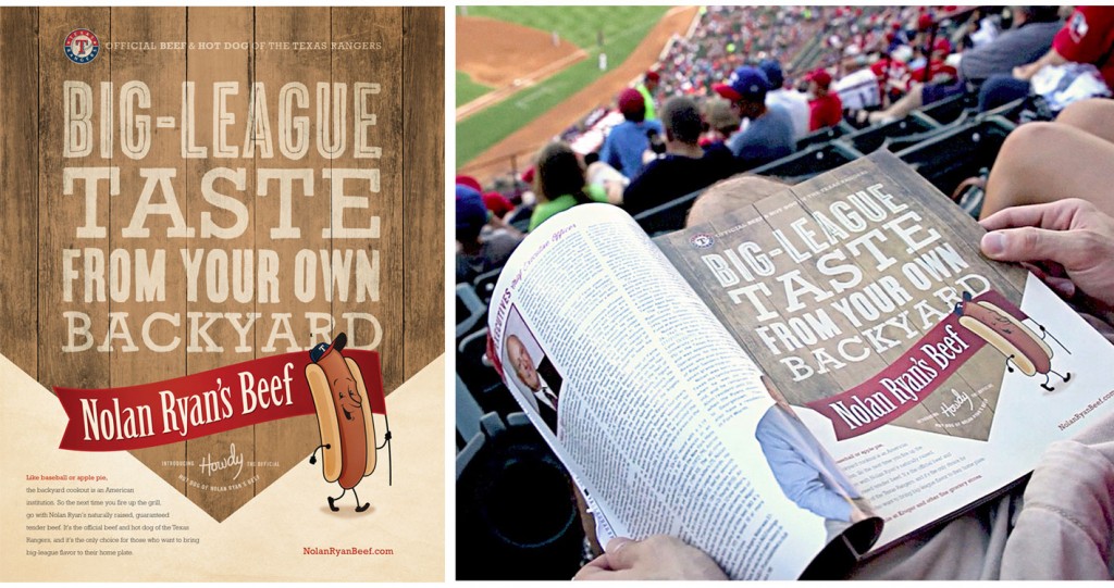
When Nolan Ryan Beef made Kroger their exclusive retailer, they asked us to help generate awareness for this partnership while driving customers to Kroger stores to buy beef. With a limited marketing budget, we had to get creative if we were going to make a splash in a market the size of the DFW Metroplex. Luckily, “getting creative” is kind of our thing.

The Work
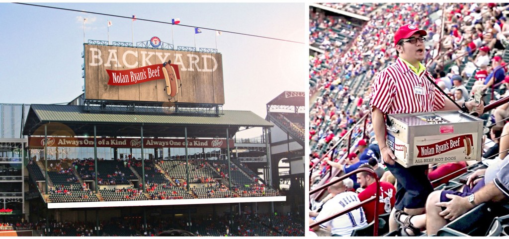
If there’s anything more creative than pairing up NOLAN RYAN Beef and the Texas Rangers, we don’t know what it is. So instead of sinking their marketing dollars into traditional advertising media, we recommended that they pursue a sponsorship with the Texas Rangers. They didn’t have the budget to be a top sponsor in the Ballpark, but we helped them make the most of what they could afford.

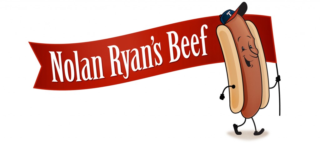
With Nolan Ryan Beef as the official beef sponsor of the Texas Rangers, we felt that someone needed to be the official spokesman of Nolan Ryan Beef. Enter Howdy the Hot Dog. Born from a dry erase marker and a window, this guy could be seen everywhere you looked in the Ballpark: concession stand signage, hawker boxes, Jumbotron and more. We even helped design an entire concession stand. We made it virtually impossible to miss Nolan Ryan Beef.


The Results
In the first year of the sponsorship, the Texas Rangers sold more hot dogs than any other ballpark in Major League Baseball. Nolan Ryan Beef doubled their sales with Kroger and even saw a spike in sales in their online direct sales. Answering the question, what’s more American than hot dogs and baseball? Cartoon hot dogs and baseball.
