Zoo Ball is the Fort Worth Zoo’s largest fundraiser, and every year Schaefer develops a creative concept for the theme that surprises and delights donors. This year marked the 40th anniversary—a milestone that needed to feel both celebratory of the Zoo Ball legacy and reflective of four decades of impact, while still delivering an unexpected creative twist.
A Concept Worth Celebrating
Schaefer spotlighted the anniversary itself—using the Roman numeral “XL” for 40, entwined with a snake illustration on a chartreuse background, that brought energy, excitement, and attention to the Zoo’s animals. The approach balanced commemoration with fresh, tactile design that stood apart from years prior.
Unfolding the Magic
This year, the Save the Date was an unfolded 8.5×11 piece, which made an immediate statement in the mail.
The Invitation elevated the milestone with foil, soft touch, and spot gloss finishes mimicking snake scales, creating a refined, tactile experience.
The microsite and auction guide carried the theme throughout, ensuring a cohesive journey for donors.
Impact in Every Detail
The 40th anniversary suite captured attention, celebrated “40 Wild Years,” and set a new creative benchmark. Guests were wowed by the intricate finishes and bold, celebratory design—proof of our ability to evolve Zoo Ball’s look and feel year after year.
When Texas Ballet Theater (TBT) opened its first true Dallas school location in the prestigious Preston Center area, the stakes were high. Schaefer was tasked with building awareness, driving pre-registration, and establishing the new location as the premier choice for ballet training in Dallas.
Changing Perceptions Through Storytelling
The challenge went beyond announcing a new school. Many local parents believed TBT was “too far” or “too advanced” for their children. Additionally, TBT wanted to expand its reach to include adult ballet and fitness classes, appealing to a broader demographic of dance enthusiasts in Dallas.
Schaefer developed messaging that emphasized accessibility, warmth, and opportunity—without losing the prestige of the TBT brand. We positioned TBT as:
Local and convenient to the Dallas-proper community.
A welcoming, growth-oriented environment for young dancers.
A unique destination for adults seeking high-quality dance and fitness training.
Executing a High-Impact, Integrated Campaign
Schaefer executed a full-funnel campaign designed to reach parents in a hyper-local radius of the new Dallas location. Media channels included:
Paid Search (Google) to capture high-intent parents searching for dance programs.
Paid Social (Facebook, Instagram & TikTok) with lookalike and interest-based targeting to reach dance moms where they spend their time.
Local Publication Partnerships (DFW Child, PaperCity, CultureMap) to build credibility and visibility in trusted community outlets.
Print Mailers & Window Signage to reinforce the message in the physical community.
The creative featured aspirational yet approachable visuals of young dancers, paired with clear calls to action to “Enroll Now” and messaging around TBT’s welcoming environment and professional training edge.
Capturing Attention and Driving Action
The results spoke volumes:
26,269 total sessions (+2,023.6%) and 20,501 new users (+6,621.6%).
10,632 engaged sessions (+1,056.9%).
1,232 “Enroll Now” clicks generated directly from campaign efforts.
1.6M impressions and 26.8K clicks with a 42.8% engagement rate.
Paid social (especially Facebook) drove over half of total website traffic, while search ads captured new audiences searching for non-brand dance terms.
Building Momentum, Expanding Reach
By strategically shifting perceptions and expanding programming to include adults, Schaefer transformed the launch of TBT’s Dallas school into a momentum-building success. The campaign didn’t just increase enrollment—it positioned TBT as a local leader in ballet education and adult fitness, building awareness of the school as a welcoming hub for dancers of all ages. The TBT Dallas launch proved that when insightful strategy meets powerful creative, the results go far beyond clicks—they reshape perceptions, drive action, and create lasting brand loyalty, turning a new location into a must-join destination for the community.
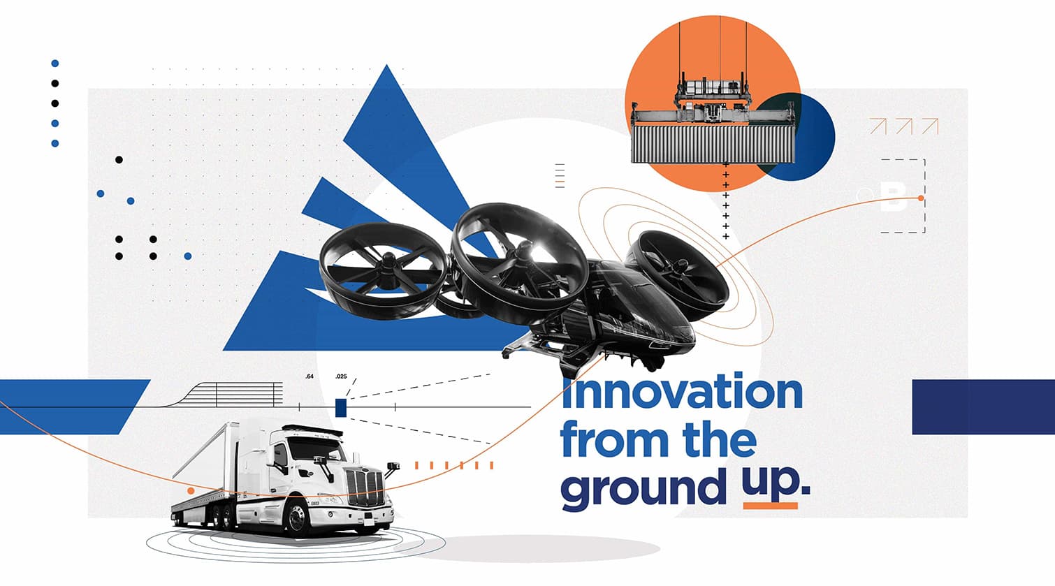
AllianceTexas is a 27,000-acre master-planned, mixed-use development in North Texas, developed by Hillwood, a Perot Company. Anchored by Perot Field Fort Worth Alliance Airport—the nation’s first industrial airport—the development stands as a global hub for logistics, real estate, and innovation.
This hub illustrates how Fort Worth’s central location, multimodal infrastructure, skilled workforce, and business-friendly climate attract and accelerate transformative industries. Within AllianceTexas, the Mobility Innovation Zone (MIZ) brings together infrastructure and technology to speed commercialization of next-generation mobility solutions.
Since 2020, Schaefer Advertising has partnered with AllianceTexas to advance marketing for both ATX Real Estate (ATX RE) and MIZ. Initially tasked with launching the MIZ brand, we developed the core positioning “Innovation from the Ground Up” to connect with executives, innovators, and investors.
As the MIZ’s profile grew, we recognized an opportunity: integrate the real estate and innovation narratives into a single story—one that positioned Fort Worth not just as a place to do business, but as a launchpad for the future.
Goals
Unify ATX RE and MIZ marketing under one brand platform while maintaining flexibility for industry-specific storytelling.
Support Fort Worth’s key target industries—advanced manufacturing, aerospace & defense, corporate & financial services, and mobility & logistics.
Elevate Fort Worth’s position as a national leader in mobility innovation with proven commercialization capability.
Increase engagement among brokers, site selectors, developers, and C-suite decision-makers.
Strengthen sales enablement with streamlined, brand-aligned tools.
Deliver robust reporting, actionable insights, and nimble optimization to ensure transparency and measurable results.
Strategy
Our approach recognized that AllianceTexas’ marketing didn’t require reinvention—it needed integration and amplification.
Building from a strong foundation, Schaefer Advertising designed a 2024 strategy that unified the ATX RE and MIZ narratives under a single core brand idea: Opportunity Thrives Here. This platform allowed AllianceTexas to speak to the full scope of its offering—real estate, logistics, infrastructure, and innovation—while still crafting sector-specific messaging where needed.
Key strategic initiatives included:
Integrated Brand Platform: Developed messaging and creative that could flex between broad brand-building and sector-targeted campaigns, allowing seamless support for industrial, office, retail, and innovation opportunities.
Website & CRM Alignment: Consolidated traffic-driving efforts to alliancetexas.com, using personalized landing pages, refined Salesforce/Pardot automation, and a more strategic content architecture to connect prospects with the right opportunities faster.
Paid & Organic Media Fusion: Unified media strategies across ATX RE and MIZ, optimizing campaigns to support both brand awareness and lead generation, while layering in site links and messaging for sector-specific discovery.
Innovation Emphasis: Amplified Smart Port and mobility innovation content to bridge the gap between thought leadership and tangible opportunity—helping the MIZ transition from theoretical promise to proven infrastructure.
Nimble Reporting & Optimization: Deepened performance reporting across paid media, web, email, and organic efforts to drive real-time optimizations, maximize ROI, and ensure full transparency with the AllianceTexas team.
At every step, the strategy was designed to balance two needs: maintain the distinct strengths of ATX RE and MIZ, while elevating the unified AllianceTexas brand story to meet its next phase of growth.
Solution: Delivering a Seamless, Impactful Experience
With the strategy in place, Schaefer moved quickly to operationalize and activate the plan. For prospects, the experience became frictionless: targeted campaigns funneled users to tailored landing pages with clear calls to action. For brokers, site selectors, and industry stakeholders, new sales materials and automated communications made it easier to stay engaged with AllianceTexas opportunities. Internally, automation replaced manual effort, providing the ATX and MIZ teams with more time, better insights, and stronger tools.
Above all, AllianceTexas was empowered with a marketing system built for scalability, performance, and growth.
Results: Driving Business, Fueling Innovation
Where vision meets real-world impact.
The unified marketing strategy helped elevate AllianceTexas not just as a place to build—but as a place to launch the future. From manufacturing and defense to rare earth magnets and autonomous mobility, companies are choosing AllianceTexas to commercialize at scale.
Real Estate Momentum: Jobs, Expansion, and National Recognition
Bell Textron Inc. broke ground on a $632 million manufacturing facility in AllianceTexas that will produce the U.S. Army’s next-generation V-280 Future Long-Range Assault Aircraft. The project is expected to create 520 full-time jobs and was the first investment in Texas through the new JETI state incentive program.
Southwire opened a 1.2 million-square-foot customer service center, bringing 250 new jobs to the development.
Henry Schein, a health care distributor, opened a new facility in Alliance that created 300 new jobs.
Aircraft Spruce & Specialty Co. launched a 38,000-square-foot distribution center, more than tripling its North Texas footprint and reinforcing AllianceTexas as an aviation hub.
Commercialization in Motion
MP Materials established the first fully integrated rare earth magnet manufacturing facility in the U.S. right in AllianceTexas. The site will supply magnets to General Motors EVs, supporting domestic supply chain restoration for a sector long dominated by China.
Torc Robotics, a subsidiary of Daimler Truck AG, selected Alliance as its North American autonomous trucking hub—a 17-acre site with 22,000 square feet of offices and a fleet ops center, representing a major step toward the commercialization of self-driving freight.
Aerolane, a next-gen cargo logistics company, established its flight operations HQ at Perot Field, using the MIZ as a testing ground for its autonomous cargo glider system.
AllianceTexas also attracted AVX Aviation, Embraer Aircraft Maintenance Services, and Clevon, solidifying its role as a magnet for transportation and aerospace innovation.
Talent Pipeline + Workforce Development
Tarrant County College’s Erma C. Johnson Hadley Center of Excellence for Aviation, Transportation, and Logistics has produced 1,200+ graduates and continues to grow, offering industry-ready training in aviation, aerospace, and supply chain fields—all located within AllianceTexas.
Digital Engagement & Campaign Performance
While the true ROI lies in tenant wins and infrastructure growth, the marketing program also delivered tangible digital results:
121,397 total pageviews and 70,436 sessions in 2024
54,825 new users, with a 51.08% engagement rate
Real estate-specific campaigns yielded a +115% increase in users and +112% session growth year-over-year
MIZ content drove a +47% increasein engaged sessions, even as media spend decreased by 78%
Big moves need more than awareness—they need alignment.
Schaefer helps brands like AllianceTexas turn complexity into clarity and strategy into measurable growth. If you’re ready to drive impact at scale, we’re ready to get to work.
Let’s build something that lasts.
Featured Case Study
Innovation from the ground up
Mobility and innovation districts are places where pioneers make critical advancements in logistics and supply chain modernization. It’s also a place where technology breakthroughs are developed that can affect billions of people. They are critical to advancing how consumer and…
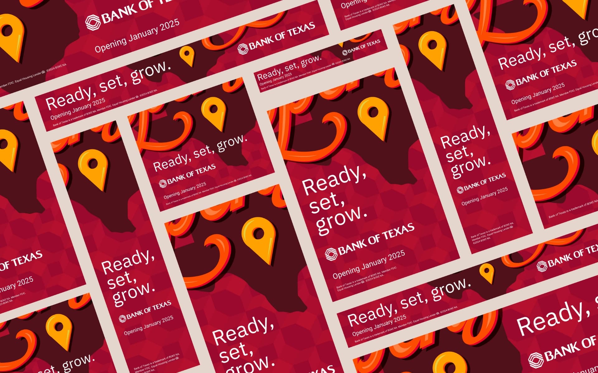
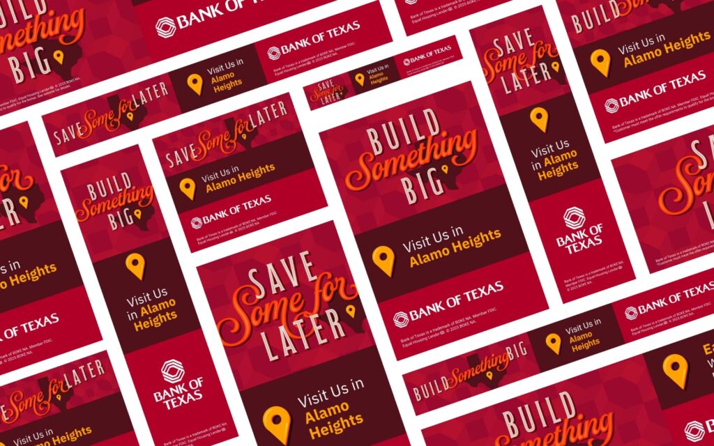
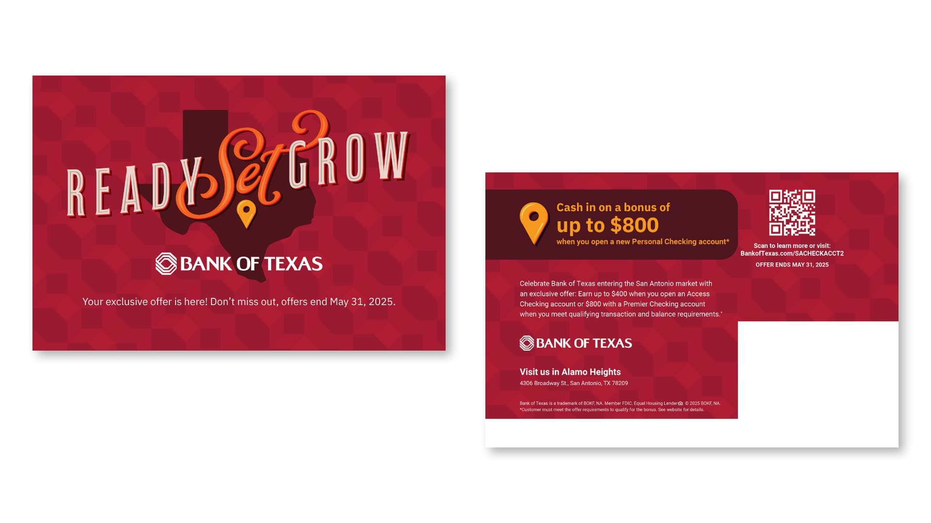
For the first time in over 20 years, Bank of Texas expanded into a completely new market: San Antonio. With a flagship location opening in an affluent neighborhood, the challenge was clear. How do you introduce an unknown bank to a loyal, established community and inspire them to switch?
Goals
Build brand awareness and establish trust and credibility
Drive consumer growth in checking/savings accounts, youth accounts, mortgage loans, and wealth management
Attract small business clients with competitive banking tools and personalized support
Win market share from competitors by promoting the benefits of switching to a more personalized, community-focused bank
Promote product offers to strengthen launch messaging and encourage customer acquisition
Strategy
The launch campaign focused on creating local relevance, building trust, and demonstrating the value of personalized banking services to different target segments. Schaefer’s strategy was to highlight Bank of Texas’s personalized approach, offering tailored banking solutions that go beyond transactional services—fostering long-term relationships. An integrated approach was planned with digital and traditional media and community partnerships to saturate the local market and build awareness across different touchpoints.
This strategy ensures Bank of Texas is perceived as both a community-centric and financially robust bank, capable of serving diverse customer needs.
Solution
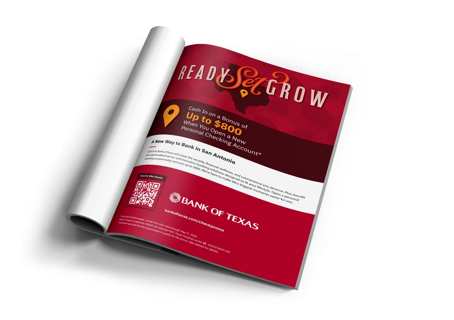
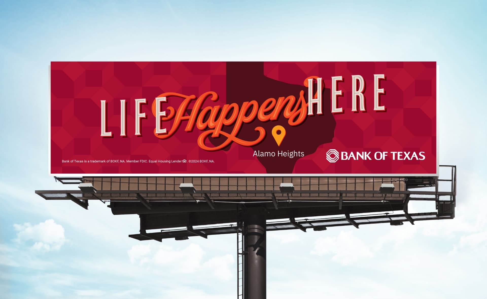
We developed a two-phase campaign strategy, beginning with a teaser phase to build anticipation, followed by a launch phase to drive awareness and encourage action. The campaign featured tailored creative for distinct audience segments, including adult consumers, Hispanic families, youth, and small businesses, highlighting Bank of Texas’s commitment to personalized services, financial stability, and strong community connections. The campaign utilized a diverse mix of media channels—OOH, digital (search, display, paid social), local publications, email, and direct mail—to ensure broad visibility and engagement with key offerings such as checking accounts, business banking, mortgages, and youth & college student accounts, with accompanying San Antonio market welcome offers. Strategic messaging, including slogans like “Ready, Set, Grow” and “Life Happens Here,” was crafted to resonate with varying consumer needs while reinforcing the brand’s commitment to relationship-driven, community-focused banking. This approach aimed to build brand awareness, establish trust, and inspire local consumers to consider Bank of Texas for both personal and business banking solutions.
Results:
$5.5MM in deposits generated within the first six months
281 new accounts opened
7.5 million impressions delivered across digital and print channels
50K+ ad clicks and 40K landing page visits with a 23.18% engagement rate
Paid Search achieved a 78.4% engagement rate and 29.6% CTR on branded keywords
Community Involvement
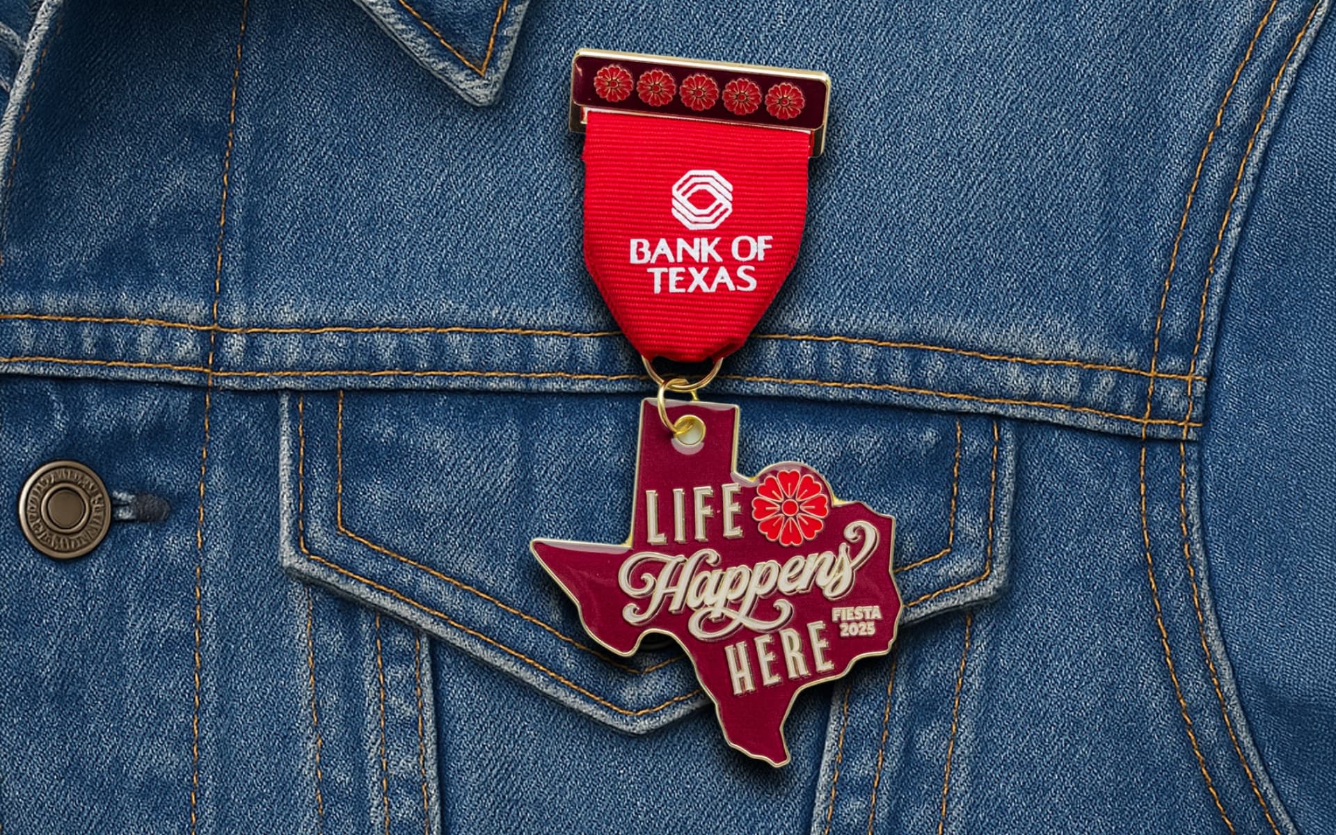
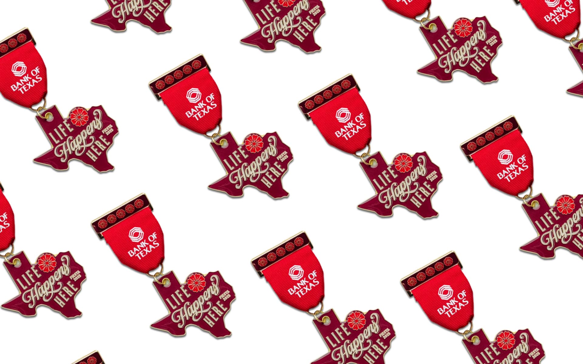
To celebrate our connection to the San Antonio community, we joined in on one of the city’s most beloved traditions—Fiesta. We designed a custom Bank of Texas Fiesta medal, honoring the colorful spirit of the festival and inviting locals to stop by, say hello, and add to their collection. It was a small token with a big impact, reinforcing the Bank of Texas commitment to showing up for the city in ways that matter—culturally and authentically.
Summary
By crafting a targeted, two-phase campaign, we successfully introduced Bank of Texas to the San Antonio market, building awareness and trust with key local audiences. Through tailored messaging and strategic media placements, the campaign emphasized the bank’s commitment to personalized services, financial stability, and strong community ties. This case study exemplifies Schaefer’s ability to create compelling, audience-centric marketing solutions that drive both brand recognition and consumer action. By engaging diverse segments—adults, Hispanic families, youth, and small businesses—we helped position Bank of Texas as a trusted, community-focused financial partner in San Antonio.
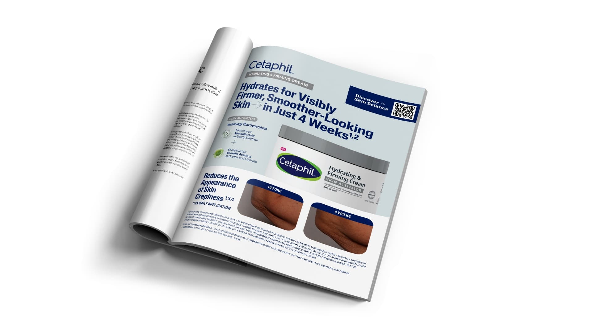
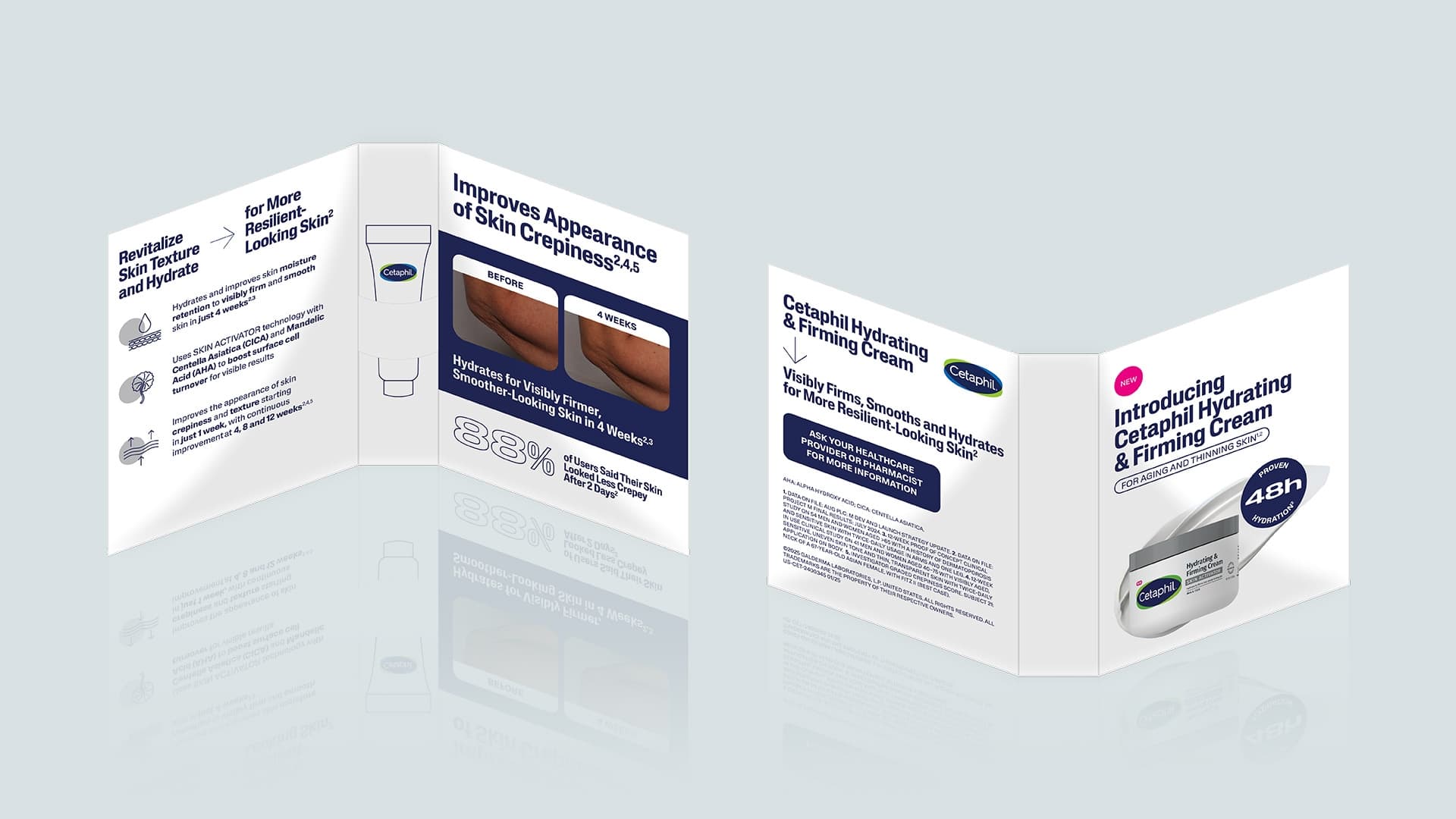
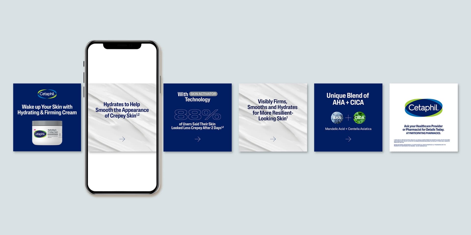
Cetaphil introduced a groundbreaking new product, SKIN ACTIVATOR Hydrating & Firming Cream, designed to address crepey skin with a proprietary blend of Centella Asiatica and Mandelic Acid. Our challenge was to create an engaging, educational campaign targeting healthcare providers (HCPs) to drive awareness and consideration of the product over alternative treatments like lasers or microneedling.
Goals
Educate HCPs and communicate the scientific benefits and mechanism of action of Cetaphil’s SKIN ACTIVATOR Hydrating & Firming Cream.
Position Cetaphil’s SKIN ACTIVATOR Hydrating & Firming Cream as a new technology in the market to emphasize its superiority over alternative treatments like lasers or microneedling.
Boost consideration and encourage HCPs to consider Cetaphil’s SKIN ACTIVATOR Hydrating & Firming Cream as a recommended treatment for crepey skin.
Strategy
Create a visually compelling and, where possible, sensory journey to educate HCPs on the benefits of Cetaphil’s new SKIN ACTIVATOR Hydrating & Firming cream for the treatment of crepey skin. This educational campaign was brought to life in a few key materials including a provider video, surprise and delight product drop and supporting in-office / sales materials. We focused on highlighting the science behind this new, innovative productive and its proven efficacy in visibly improving skin firmness and texture.
Solution
HCP Educational Video:
The hero of the campaign was a sleek, two-minute provider education video, incorporating a mix of 2D and 3D animations to visually illustrate the product’s dual-action formula. Through dynamic visuals, we showcased how Centella Asiatica and Mandelic Acid work together to activate the skin’s moisture barrier and stimulate surface cell turnover. A confident, informative voiceover guided HCPs through the product’s mechanism, positioning SKIN ACTIVATOR Technology as the superior differentiator in this topical solution for aging, thinning skin.
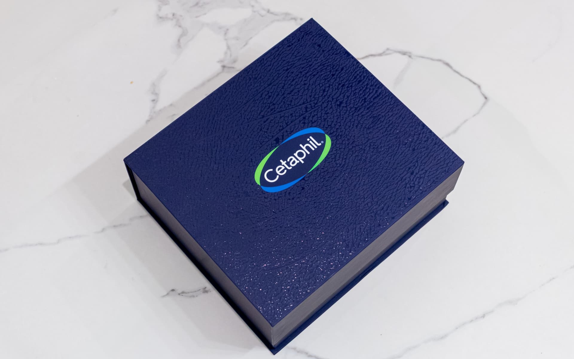
Surprise & Delight Provider Drop:
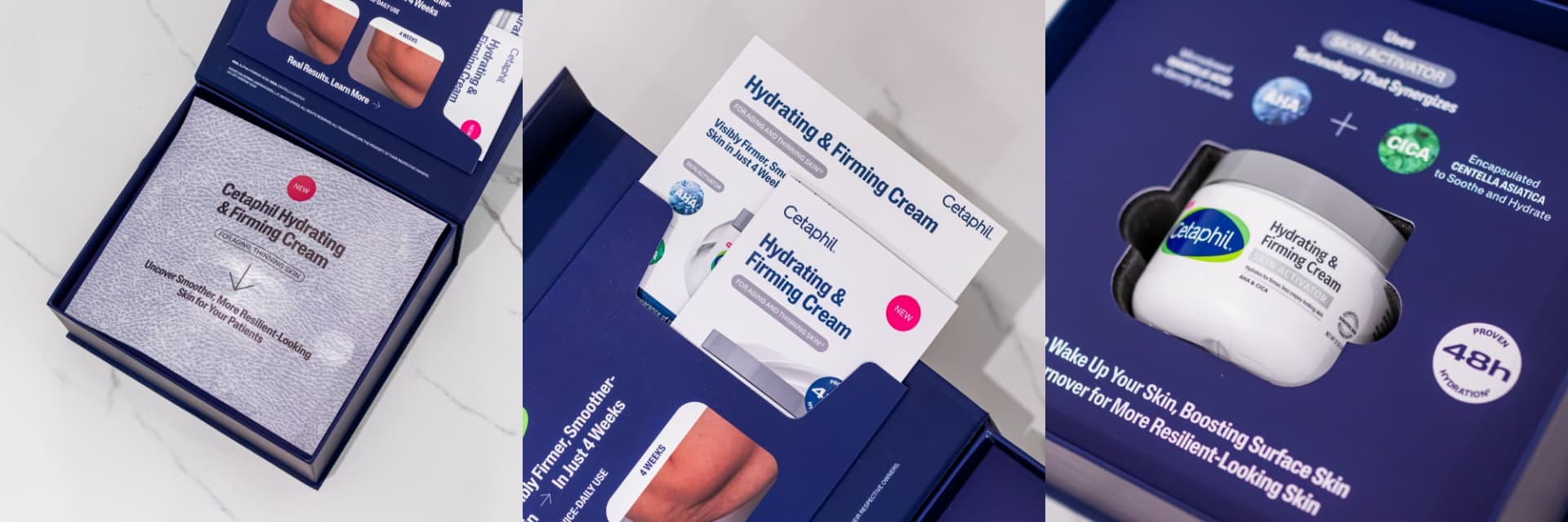
First impressions are paramount so to leave a strong impression with HCPs, we developed a surprise-and-delight box that not only introduced Cetaphil’s new product but also brought the disease state to life through texture. Simplicity was key, ensuring alignment with Cetaphil’s refined brand guidelines, which prioritize concise and impactful messaging. Since the box contained two additional educational pieces with ample content, our copy was strategically crafted to spark intrigue and excitement, encouraging deeper engagement.
To guide the user journey, we incorporated a functional yet elegant design element—a pocket on the lid—to house additional materials. Thoughtful prompts like “open pocket to learn more” provided clear navigation while maintaining a clean aesthetic. Most importantly, we embraced a sensorial approach, integrating textures that represented the experience of thinning skin. By inviting touch and interaction, the design reinforced both the product’s purpose and its transformative benefits, making the unboxing experience both educational and immersive.
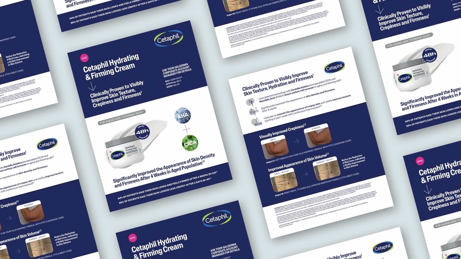
HCP Supporting Sales and In-Office Materials:
To complement these visually impactful elements, we designed a product sample card specifically tailored for direct dispense dermatologists, alongside a sales sheet and social graphics to bolster in-office educational efforts by the Cetaphil account team. These materials were crafted with a clear focus on the science behind the product, leveraging robust data and detailed clinical results to build credibility and trust. We showcased striking before-and-after images that highlighted the quick and effective outcomes of the product, helping to communicate its immediate impact on patients’ skin health.
We navigated the complexities of demonstrating product efficacy aligned to regulatory guidelines through a clear, yet creative, messaging strategy. The final materials provided a valuable resource for dermatologists and other healthcare providers, helping them make well-informed decisions about introducing this new product to their patients.
Results
Navigated complex compliance regulations to create a clear & compelling message that would resonate with providers
Implemented creative, yet cost efficient ways to demonstrate the product’s efficacy leveraging multiple senses
With open lines of communication, developed these launch assets within a short, 4-month time frame to ensure sales team readiness.
Summary
By developing a visually compelling and scientifically grounded narrative, we successfully positioned Cetaphil’s SKIN ACTIVATOR Hydrating & Firming Cream as the innovative choice for treating crepey skin. The campaign serves as a prime example of how creative storytelling can drive awareness and consideration within the healthcare market.
This case study highlights Schaefer’s commitment to transforming the healthcare experience by creating thoughtful, human-centered solutions that foster meaningful connections between providers and products. By blending education with engagement, we helped Cetaphil deliver a message that resonated on both a scientific and sensory level, encouraging healthcare professionals to consider the transformative potential of the SKIN ACTIVATOR Hydrating & Firming Cream for their patients.
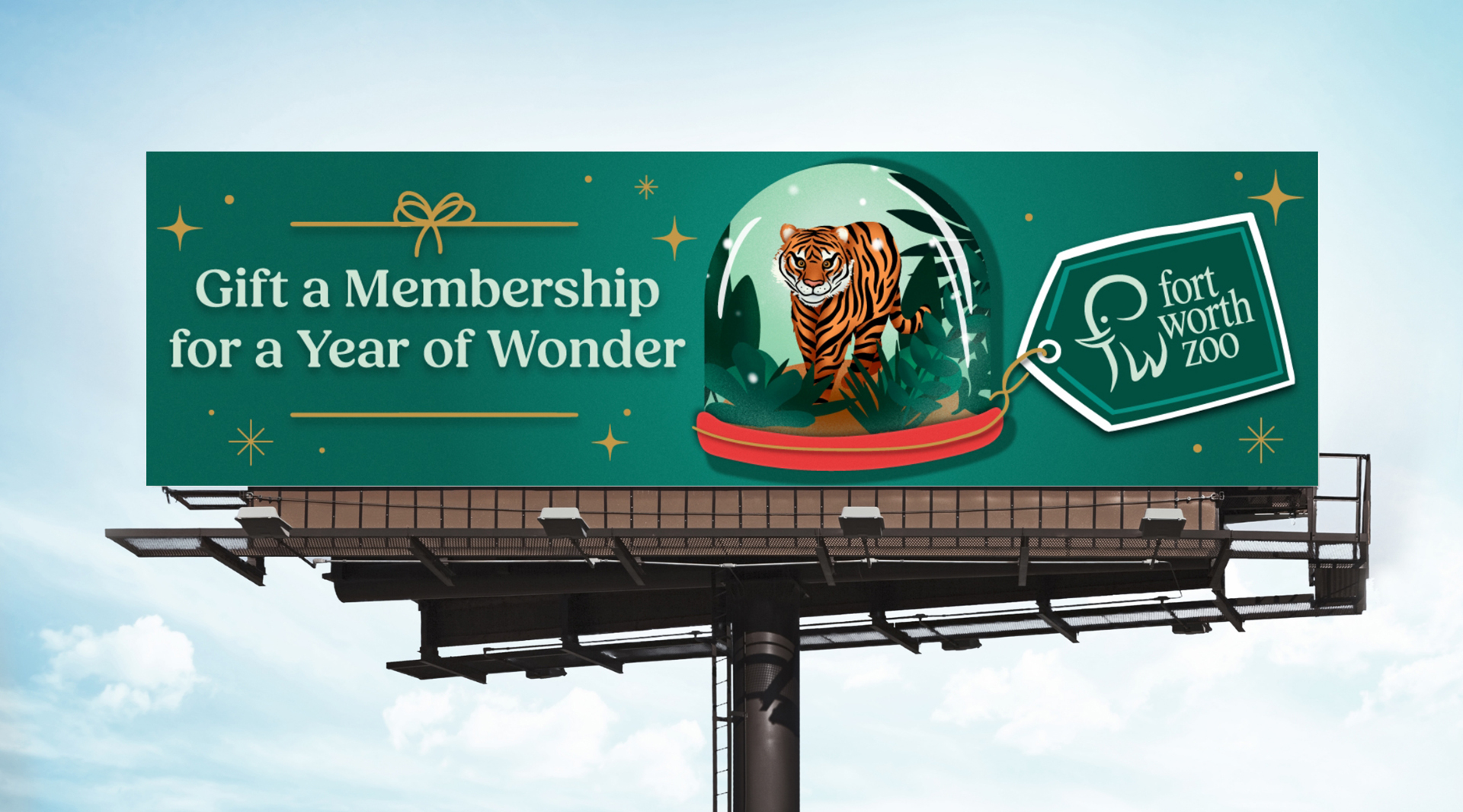
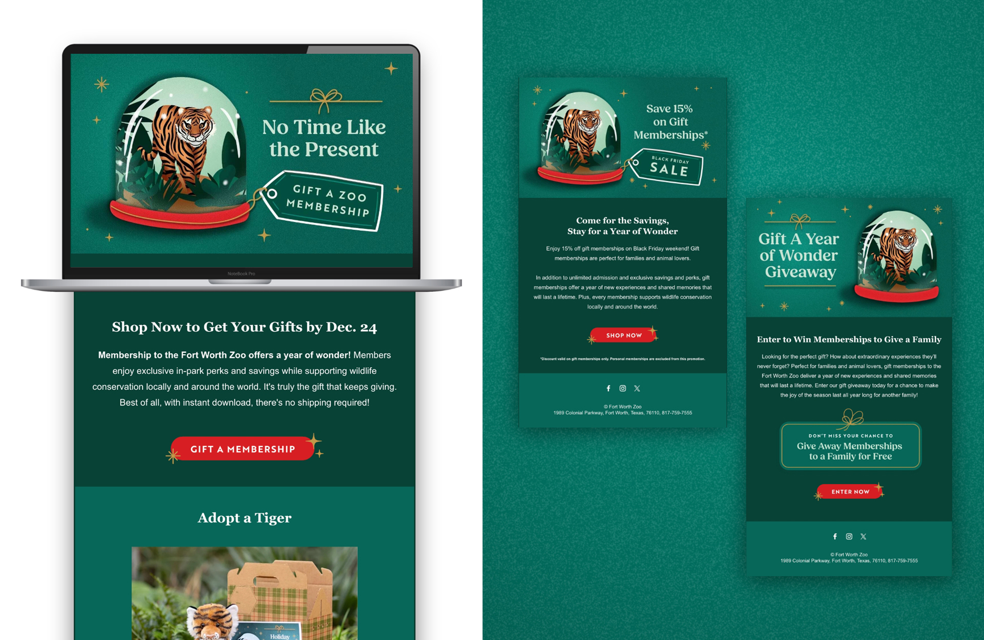
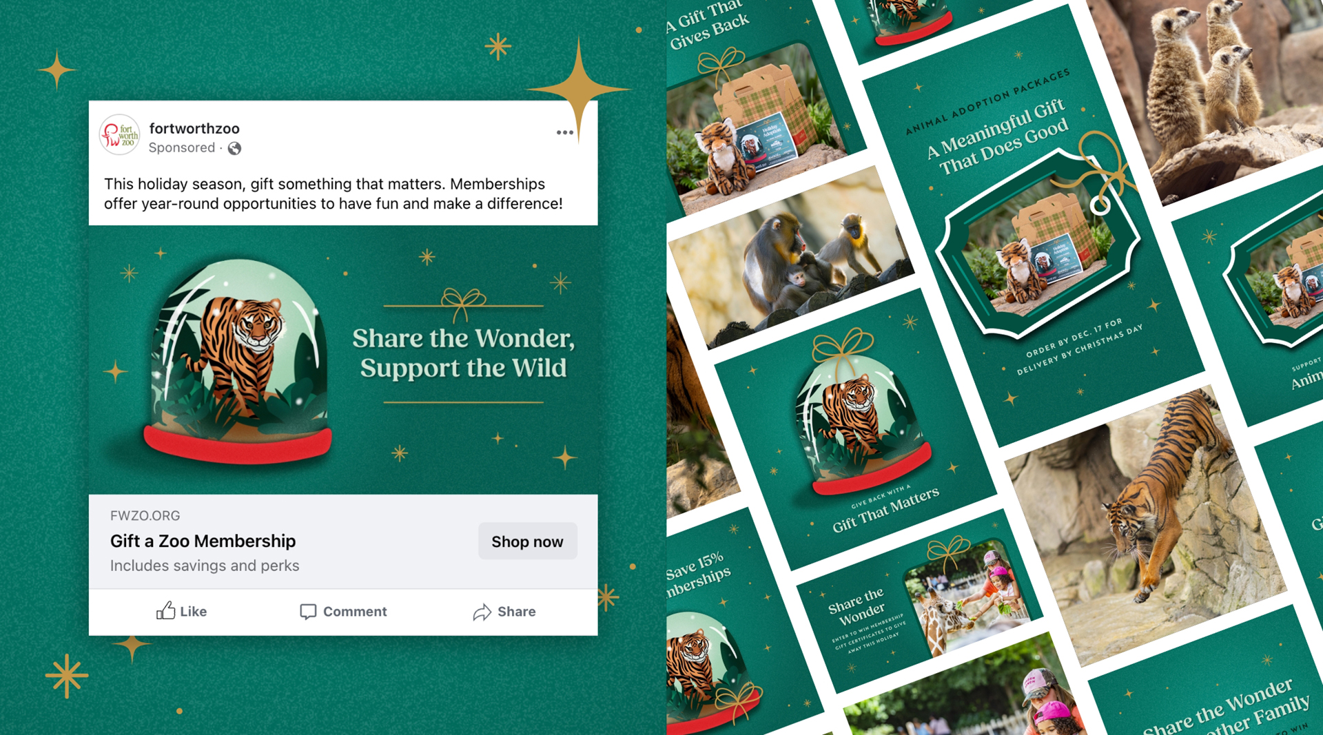
Every holiday season, the Fort Worth Zoo gives people two ways to give something more meaningful— 1) memberships that unlock a year of Zoo adventures and 2) adoption packages that support the care and feeding of Zoo animals. But keeping the campaign fresh, relevant, and exciting year after year—while still driving results—is no small feat. In 2024, the Zoo leaned on Schaefer once again to make that magic happen, and this time, we focused even more on the impact behind every gift.
Rooted in Purpose, Refined by Data
We took a more mission-driven approach, focusing on the deeper impact of each gift. With the campaign headline “Share the Wonder, Support the Wild,” we highlighted the joy of giving and the tangible support each purchase contributes to the Zoo’s conservation efforts.
To reach more high-intent gift-givers, we employed a full funnel media plan, including OOH, paid search, paid social, email, display, and publication placements, while layering in new strategy — including, but not limited to:
Addressable geofencing to target households based on census and demographic data
An extra Cyber Monday email to tap into deal-seeking holiday shoppers
Mid-campaign budget and media optimizations to boost performance
Making the Mission Tangible
We led with gifted memberships as the hero offer, positioning animal adoptions as the cherry on top — complete with an animal plush and coloring kit. Creative assets leaned into emotion and mission, from dynamic carousel ads to emails that reinforced the dual benefit of every gift.
Behind the scenes, we monitored performance daily and weren’t afraid to adjust in real-time. When we saw a dip mid-flight, we reallocated dollars, refreshed messaging, and fine-tuned our media approach to finish strong.
Impactful Messaging, Strong Results
Ultimately, the campaign rallied to deliver big:
Gift membership sales exceeded goal by 13%
4% YoY revenue increase
283K+ clicks and 9.7% CTR across all channels—well above industry benchmarks
Meta carousel ads drove 1.17M impressions, 14.5K clicks, and 14.7K engagements
At Schaefer, we like to stay nimble and take a hands-on approach to managing media campaigns. And with this Holiday campaign, our team made fast, strategic adjustments that pushed the campaign across the finish line—and then some.
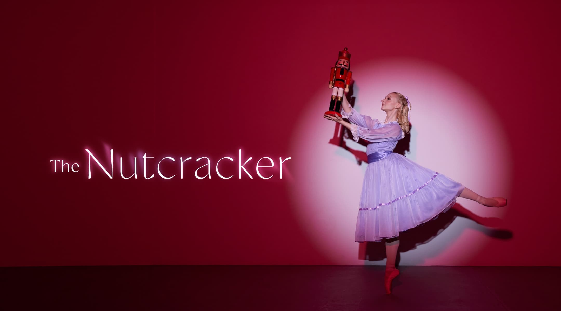
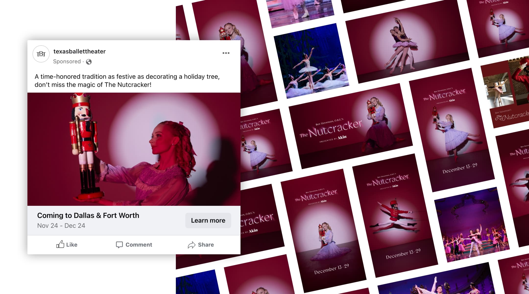
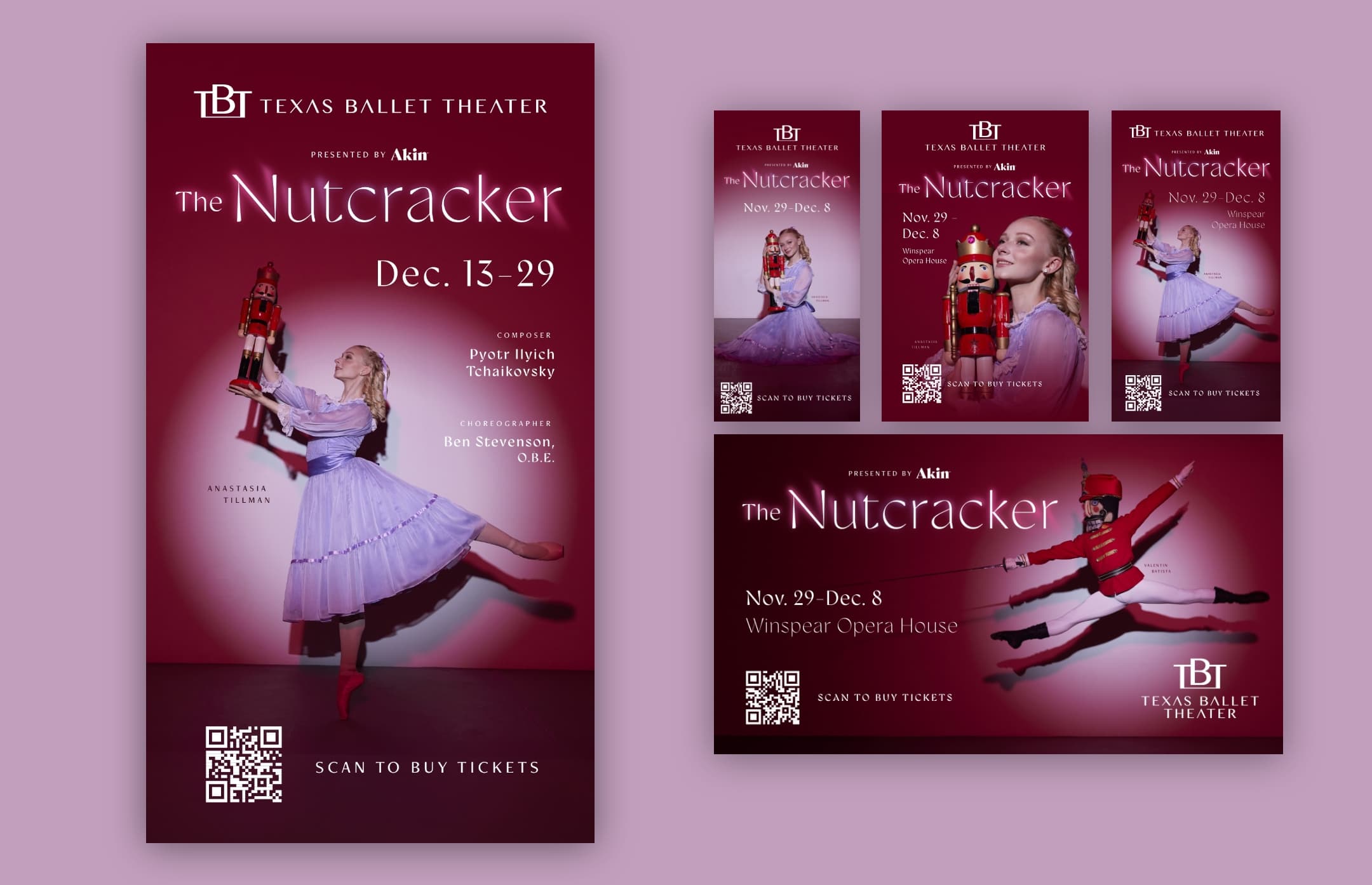
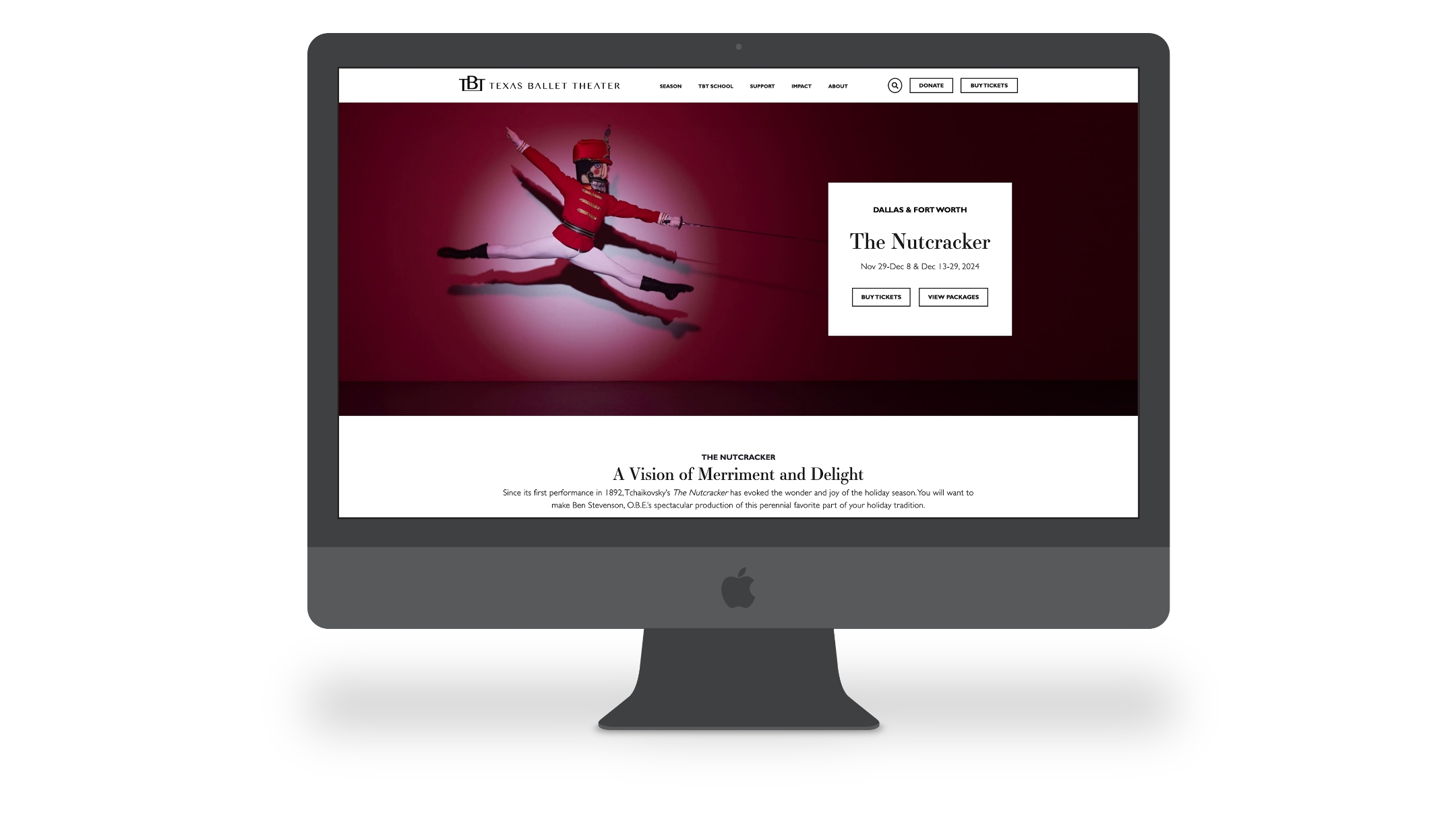
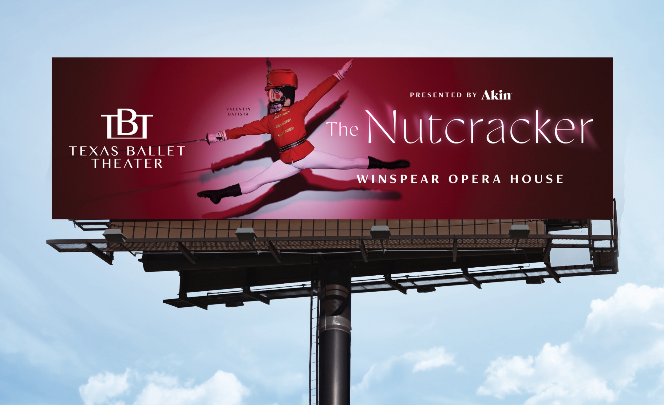
Rising to the Challenge: Exceeding Ambitious Goals for TBT’s The Nutcracker
Texas Ballet Theater set higher-than-ever ticket goals for their 2024 performance of The Nutcracker, creating an exciting challenge for us at Schaefer. With increased expectations compared to the prior year, our task was clear: exceed these ambitious targets. Adding to the complexity, fewer pre-Christmas performances were scheduled, making it more difficult to hit our goals during the critical early sales period. Despite these challenges, we knew that The Nutcracker ticket sales are vital for funding TBT’s year-round productions, and rose to the occasion.
Optimizing Strategy for Maximum Impact
We crafted a strategic plan that balanced tried-and-true tactics with new optimizations to drive results. By targeting the right audience through paid search, social media, display, TV, and email, we ensured that every marketing dollar worked harder. Our focus was on refining audience segmentation and utilizing retargeting strategies, especially with urgency-driven messaging designed to boost conversions. We also placed a strong emphasis on media optimization, ensuring that our tactics captured valuable prospects. With creative content across social media platforms like TikTok, Facebook, and Instagram, we aimed to maximize engagement and reach the right people at the right time.
Transforming Media Strategy into Unmatched Results
Our media strategy paid off in a big way. Paid search, the star of our campaign, generated an impressive $730K in revenue with a stellar return on ad spend (ROAS) of 13:1. Social media efforts made a significant impact as well, driving over 7.3 million impressions and 77,000 clicks with a 1.86% click-through rate. On TikTok and Facebook, ads resonated with the audience, while display and streaming video ads kept engagement high. Email and text campaigns also played a crucial role in pushing conversions, achieving a remarkable 18.28% CTR for text messages and a solid 13.94% for emails. Through strategic optimization and a combination of media channels, we created a seamless experience that kept sales momentum strong, even in the face of the slower start.
Delivering Historic Success: The Nutcracker Exceeds all Expectations
The results were nothing short of remarkable. We exceeded our revenue goals by 19%, with total tickets purchased near 52,000 (120% to goal). Not only did we surpass our original ticket sales targets for both Fort Worth and Dallas, but we also delivered the highest sales for The Nutcracker in TBT’s history. This campaign not only demonstrated our ability to rise to the challenge but also set a new benchmark for success. With our creative strategy, smart targeting, and optimized media plan, we helped TBT achieve its most successful Nutcracker season ever.
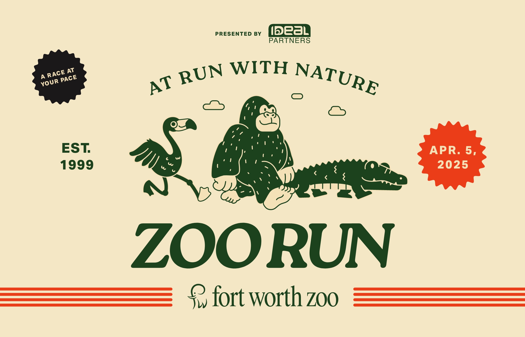
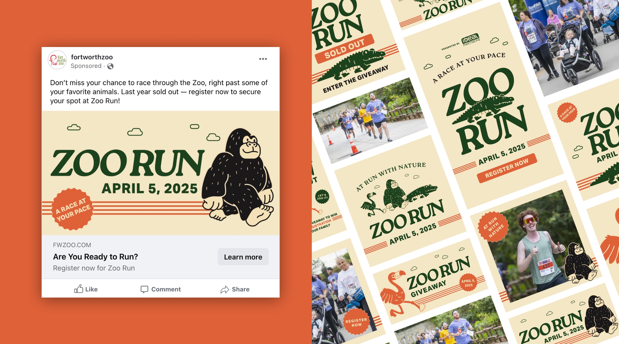
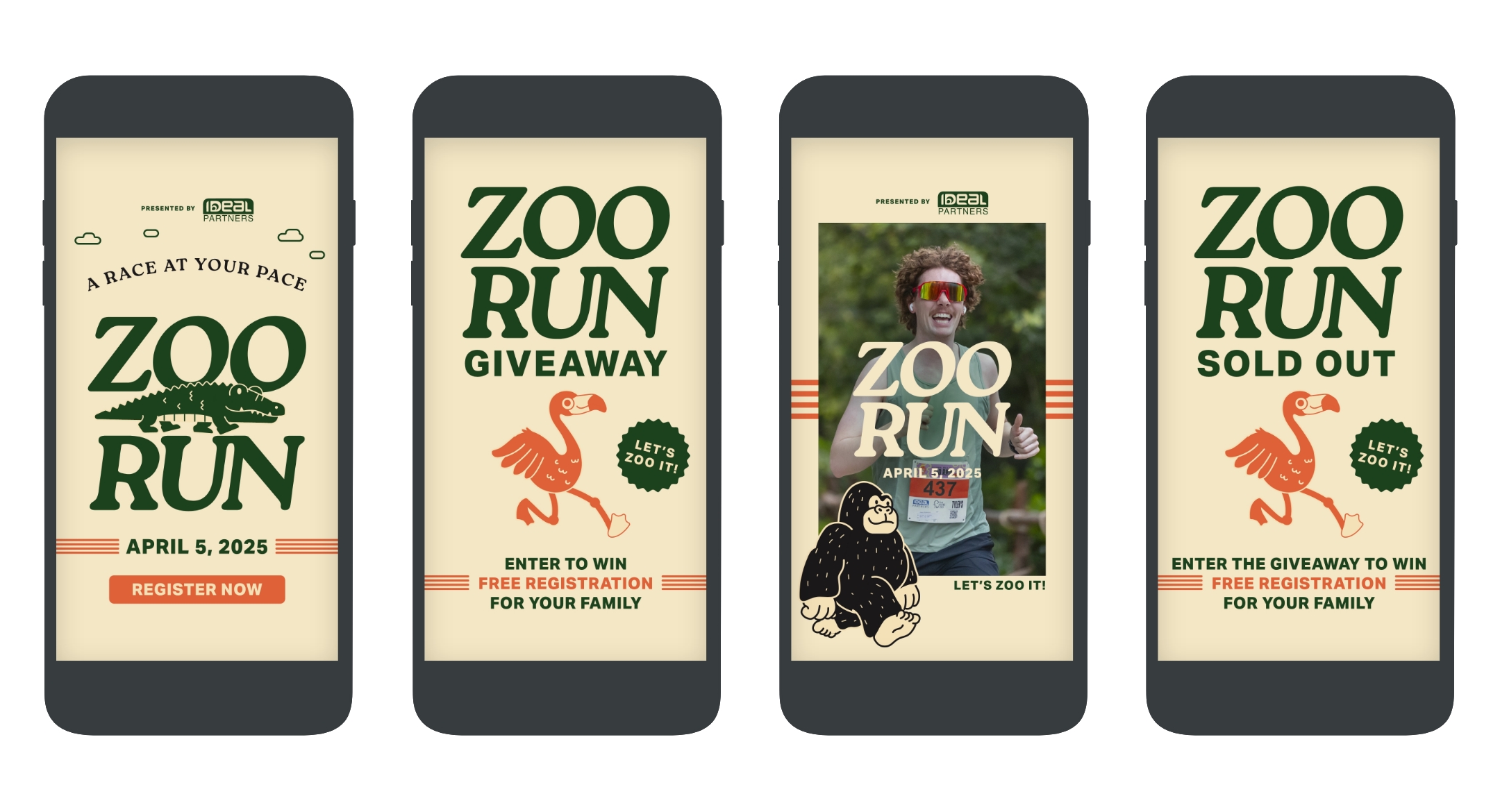
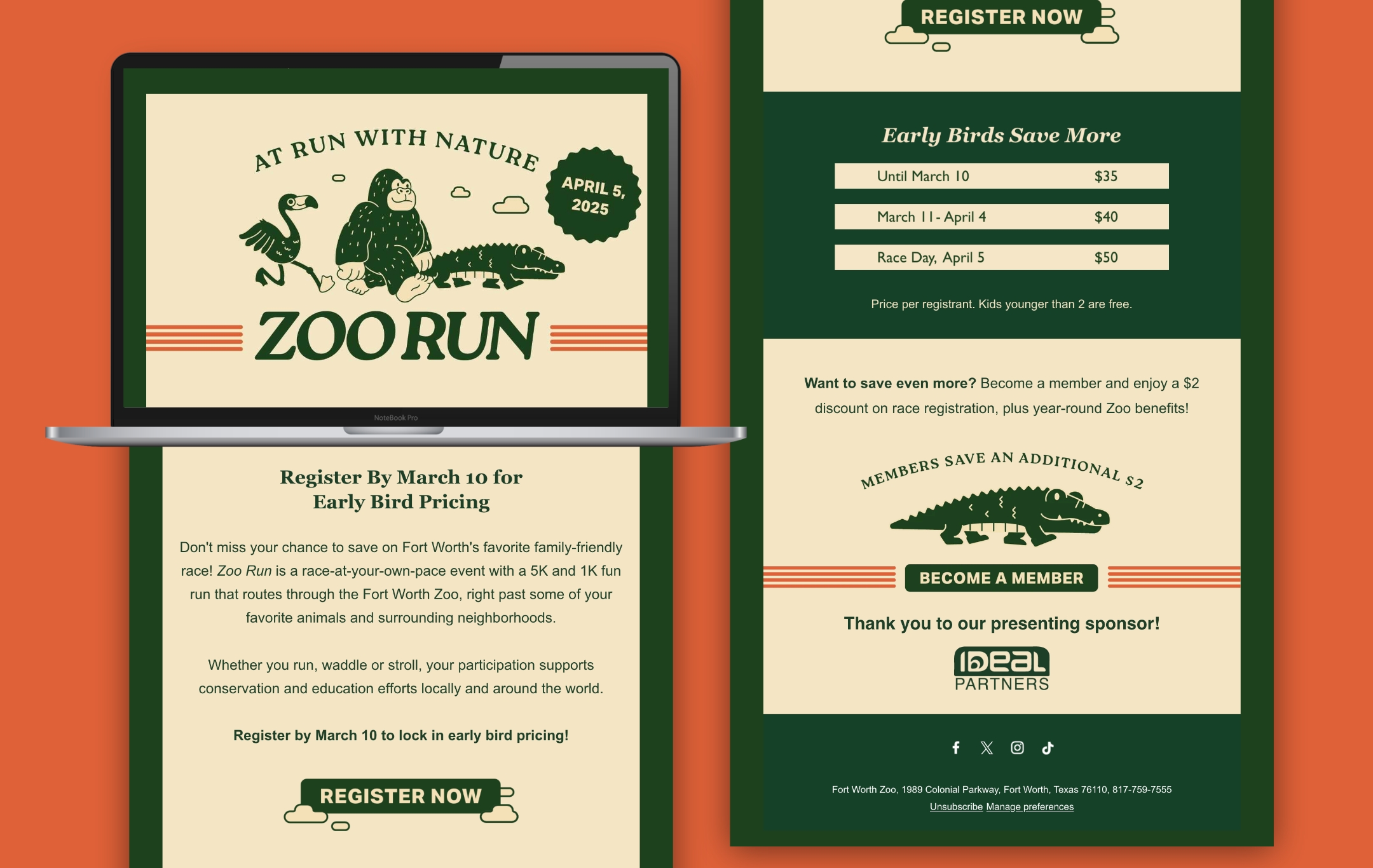
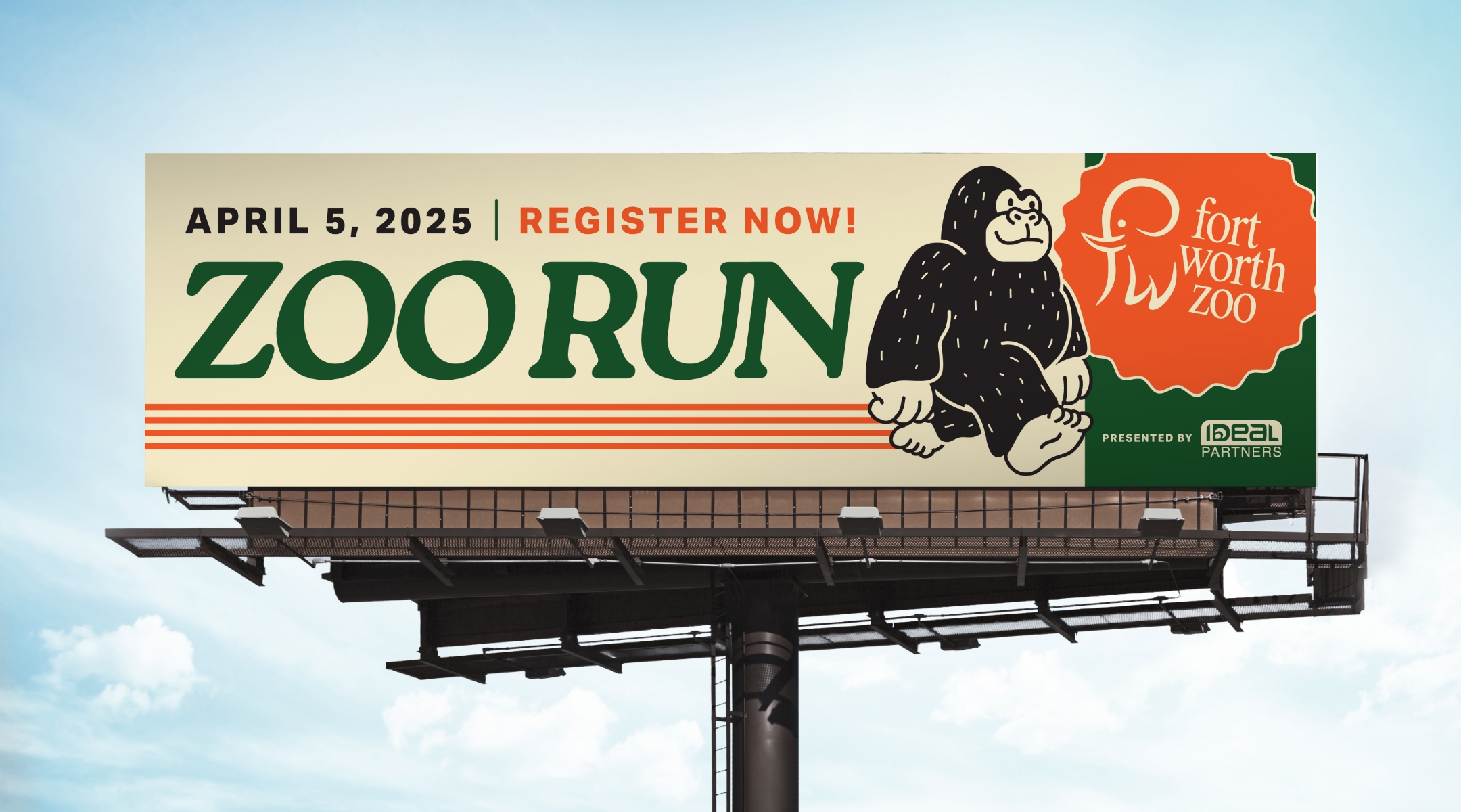
For the first time in Zoo Run history, the event sold out before the early bird deadline—an unprecedented achievement that highlighted the power of creative storytelling and strategic media execution. Zoo Run is a beloved annual event that brings families and the community together for a fun and unique experience, and this year, Schaefer was tasked with generating results that were bigger and better than ever. The challenge was to not only maintain strong engagement but to expand the event’s reach beyond typical Zoo attendees of families and children, drawing in audiences like millennials and Gen Z.
Blending Nostalgia with Modern Appeal
Schaefer developed creative that embraced a nostalgic, vintage-inspired look—featuring hand-drawn illustrations of iconic Zoo animals seen along the race path. The campaign’s warm color palette of cream, forest green, and pops of orange created a visually striking identity that stood out across all platforms. The tagline and pun, “At Run With Nature,” tied everything together, reinforcing the event’s unique charm and appeal.
Executing a Full-Funnel Media Approach
To ensure the message resonated with the right audiences, we executed a full-funnel media approach, leveraging out-of-home placements, paid search, paid social, email, text, streaming video, and local publication advertising. By starting the campaign earlier than in previous years, we maximized visibility and engagement right from the start.
Capturing Attention and Driving Engagement
The campaign struck a chord with families, fitness enthusiasts, and younger audiences alike. The nostalgic yet fresh creative direction resonated with attendees, while our precisely targeted media strategy guided users seamlessly from awareness to registration. The results? A historic sellout and an overwhelming response from the community. Even more, over 2,000 people indicated via a form on the website that they would have signed up if spots had still been available.
Unprecedented Demand and Community Excitement
Sold out before the early bird deadline—a first in Zoo Run history!
118% to goal for revenue
48% increase YOY in landing page visits
+13% increase YOY in Paid Search clicks, with a 43% CTR
3.24M impressions on Paid Social, with a +63% YoY increase in clicks
Pushing Boundaries Year After Year
Zoo Run 2025 wasn’t just another successful event—it was a record-breaking one. Year after year, Schaefer finds new ways to elevate the campaign, keeping it fresh, engaging, and more effective than ever. After selling out for the first time in 2024, we took it even further in 2025—proving that a bold creative vision and a smart, strategic media plan can drive unparalleled results.
Creative That Captivates, Strategy That Delivers
By blending a standout, retro-inspired creative approach with a meticulously executed media strategy, Schaefer helped Zoo Run achieve its most successful year in 26 years. The combination of visually compelling design and precision targeting didn’t just fill the race—it created excitement, expanded the audience, and set a new benchmark for future events.
Featured Case Study
Racing to New Heights: Historic First Time Sell-Out for Zoo Run 2024
Zoo Run 2024 marked the event’s 25th anniversary, and it was the perfect moment for a creative campaign to bring the excitement of this beloved event to life. The main goals included driving awareness and filling registration spots, with an…
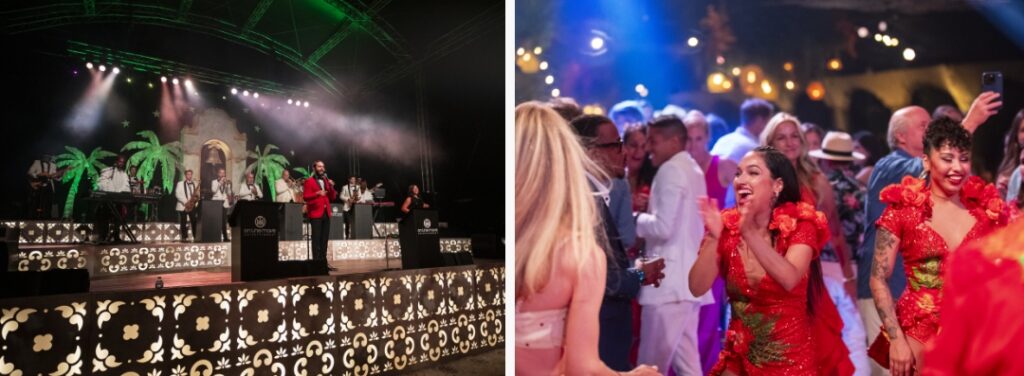
Zoo Ball is the Fort Worth Zoo’s premier fundraising event, bringing donors together for an unforgettable night in support of wildlife conservation. For over a decade, Schaefer has been entrusted with establishing the theme and creating an invitation suite that sets the tone for the event, which includes a save the date, invitation, and auction guide. Every year, Schaefer embraces the opportunity to push creative and production boundaries—ensuring that each year’s invitation surpasses the last.
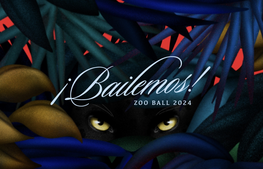
For 2024, Zoo Ball embraced the energy of Latin nightlife with the theme ¡Bailemos!, a celebration of rhythm, energy, and movement. The challenge was to craft an invitation that didn’t just inform, but immerse, recipients in the event’s vibrancy before they even arrived. The team set out to create a piece that would surprise, delight, and demand attention.
Bringing the Theme to Life Through Design
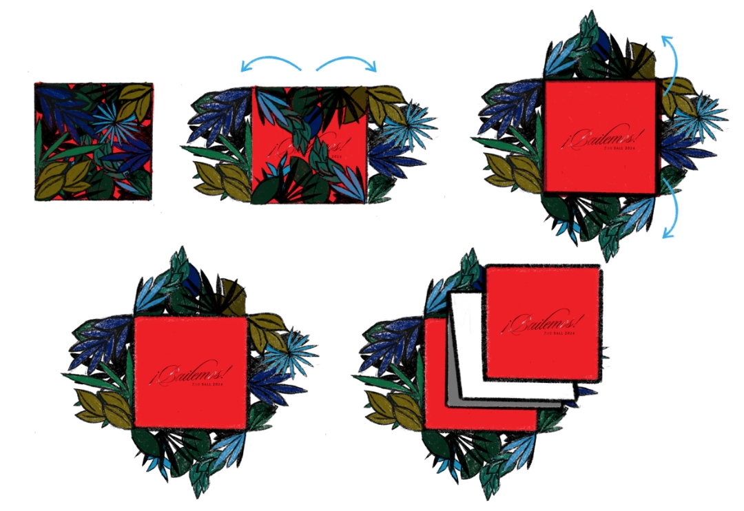
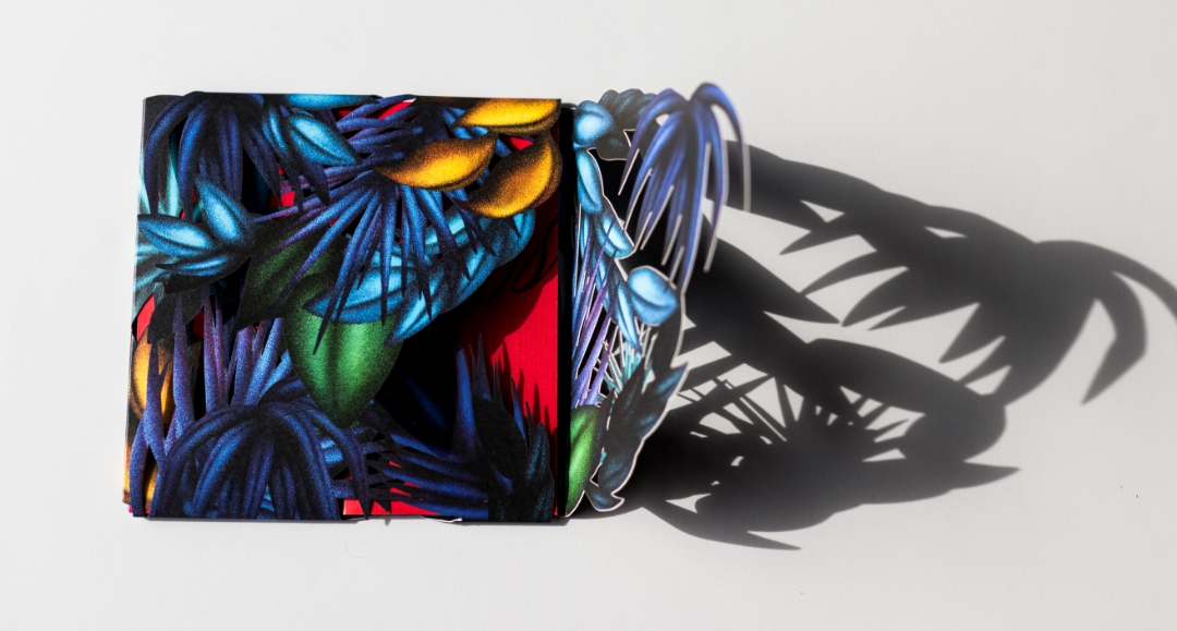
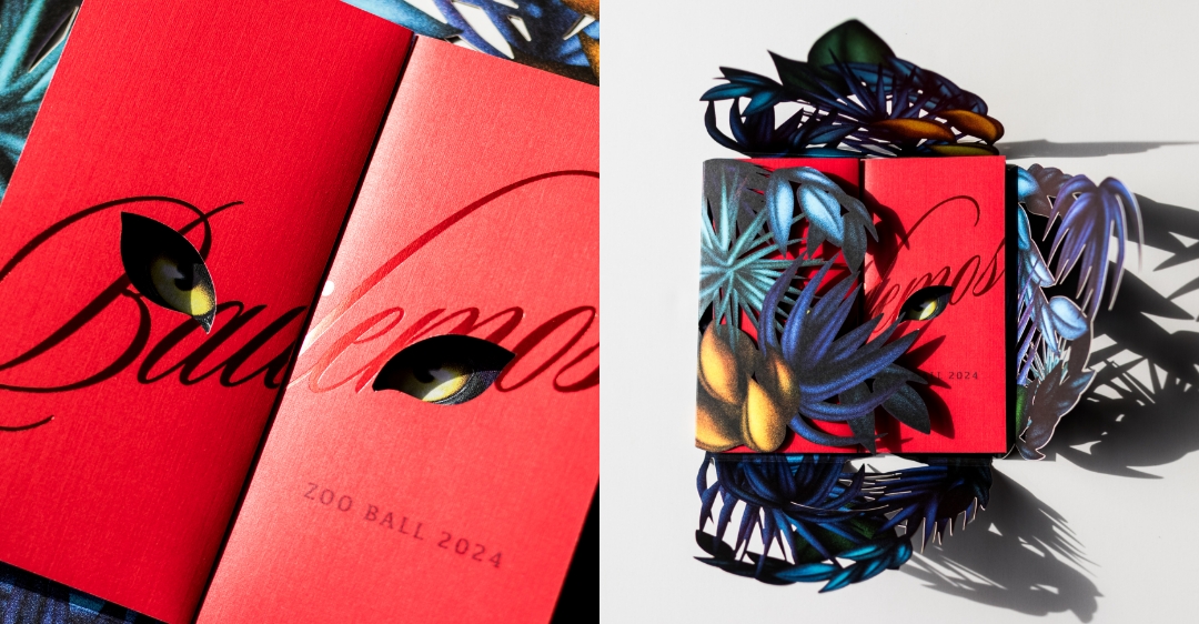
Rather than a standard invitation, Schaefer envisioned an interactive piece that unfolded like an experience, building intrigue with each layer—just like stepping into a dimly lit nightclub or walking through a forest at dusk. The design needed to be bold yet elegant, moody yet vibrant, immersive yet refined. The black jaguar—mysterious and powerful—became the focal point, symbolizing the intrigue of the night and connecting back to the Zoo’s animals.
To execute this vision, the team developed a multi-layered, tactile print piece using specialty production techniques, custom illustrations, and premium materials. This wasn’t an invitation to simply open—it was meant to be discovered, revealing hidden details as recipients engaged with each element.
A Bold Vision Brought to Life
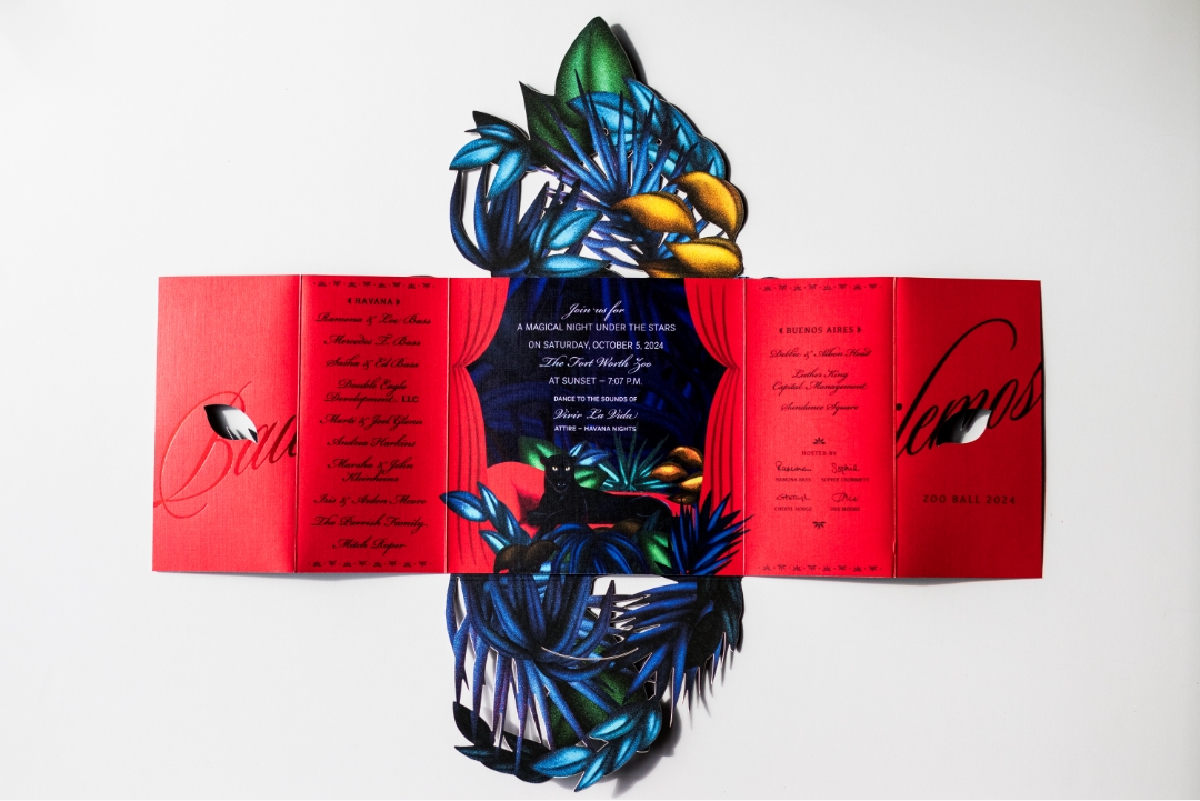
The final invitation was an experience in itself. A custom-converted envelope introduced the theme with rich illustrations and a soft-touch laminate finish, inviting engagement from the start. Inside, an intricate laser-cut outer shell framed the invitation, offering glimpses of the vivid red interior beneath.
Opening the gatefold invitation, the jaguar’s piercing eyes appeared first through die-cut typography, creating an air of mystery. As recipients unfolded the piece, the full jaguar emerged, surrounded by lush, hand-illustrated foliage in deep blues and greens. Clear foil detailing on the jaguar’s eyes enhanced the dramatic effect, reflecting light as if the animal itself was watching.
Meticulous attention to production ensured the invitation felt as premium as it looked. Schaefer collaborated with expert print partners to perfect paper stocks, die cuts, and layering techniques, using Neenah Classic Crest linen paper and laser die-cut detailing to create a high-end experience that was as stunning to hold as it was to see.
Beyond an Invitation—An Unforgettable Experience
From the moment recipients received it, the invitation sparked intrigue and excitement, mirroring the energy of ¡Bailemos!. The layered unfolding process and striking red interior left a lasting impact, making the invitation more than just an announcement, it became a keepsake. Schaefer’s dedication to precision, storytelling, and craftsmanship ensures that each year’s invitation is more ambitious than the last. Schaefer continues to push the limits of creativity and execution, proving that an invitation can be an experience in itself.
Bringing a Historic Fort Worth Attraction into the Future
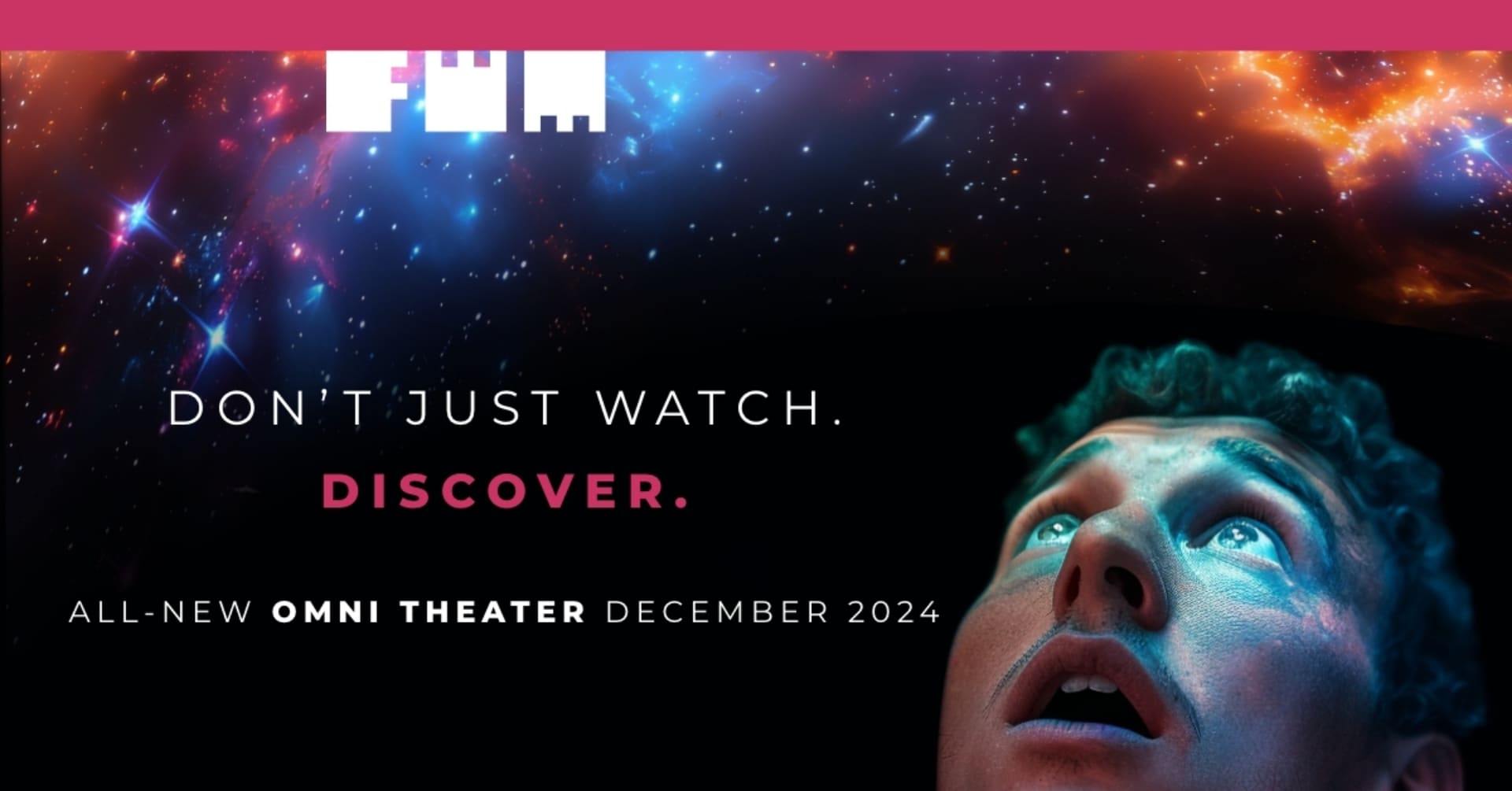
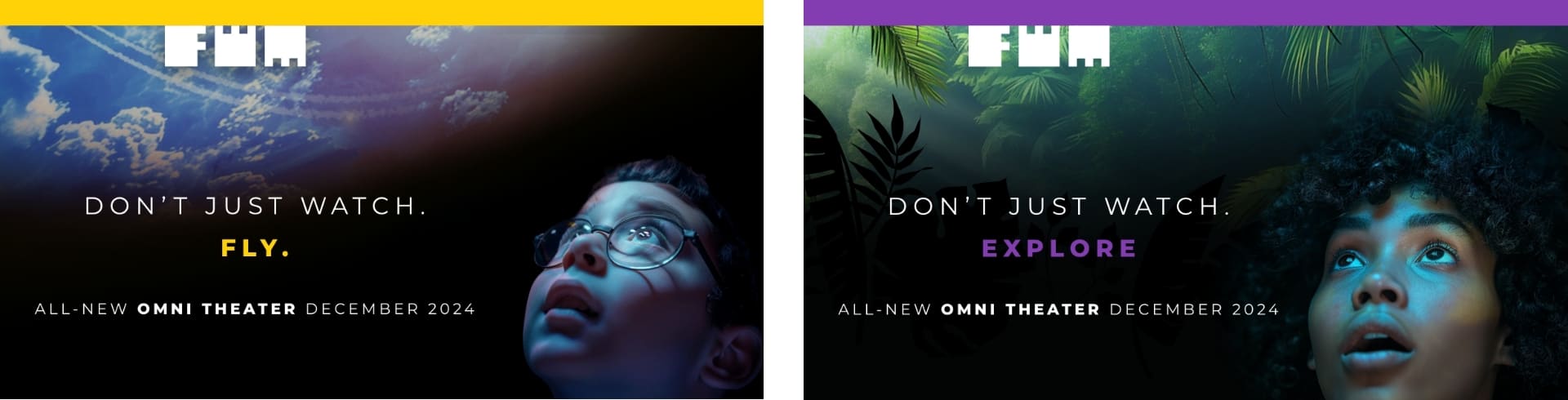
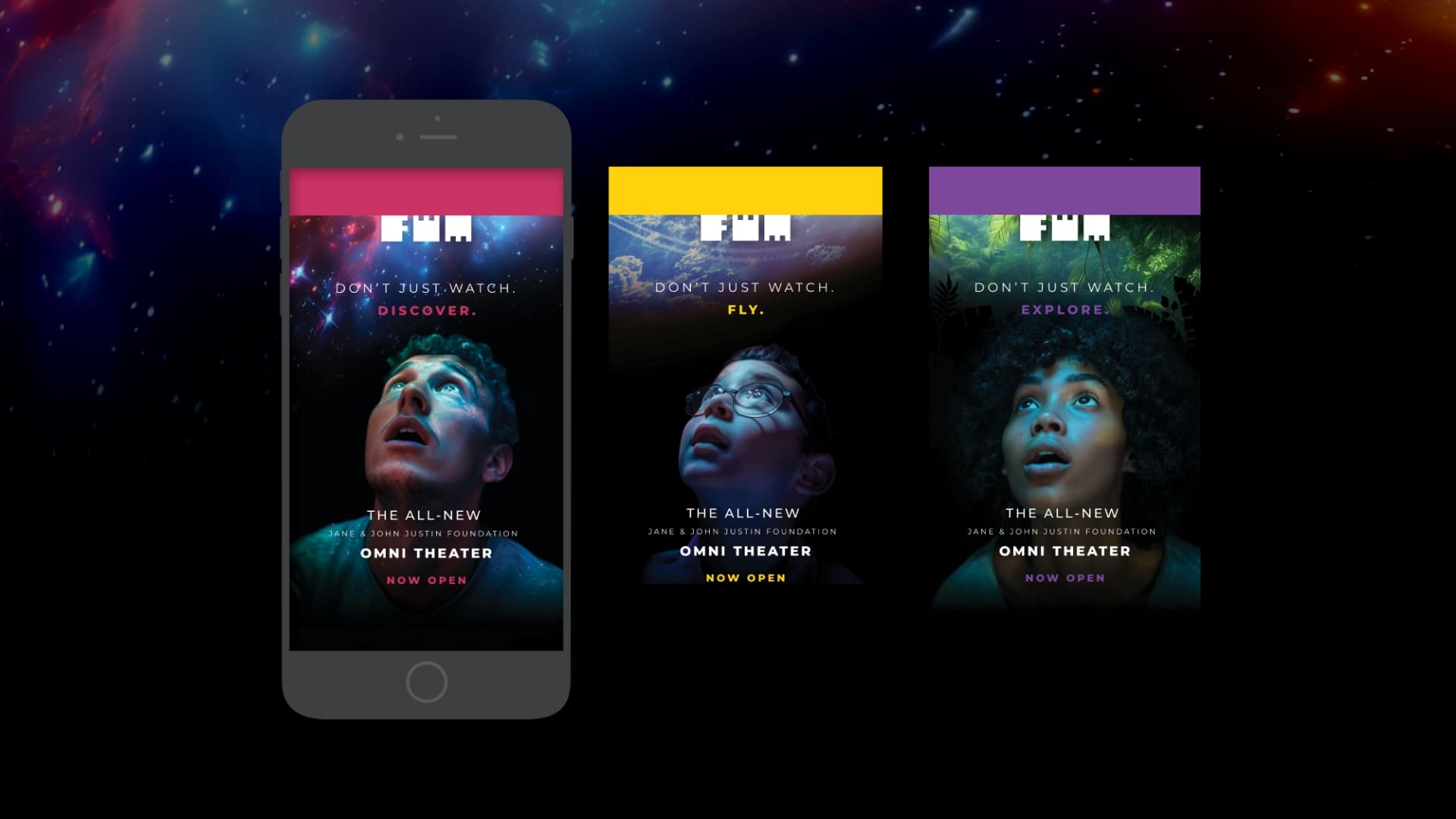
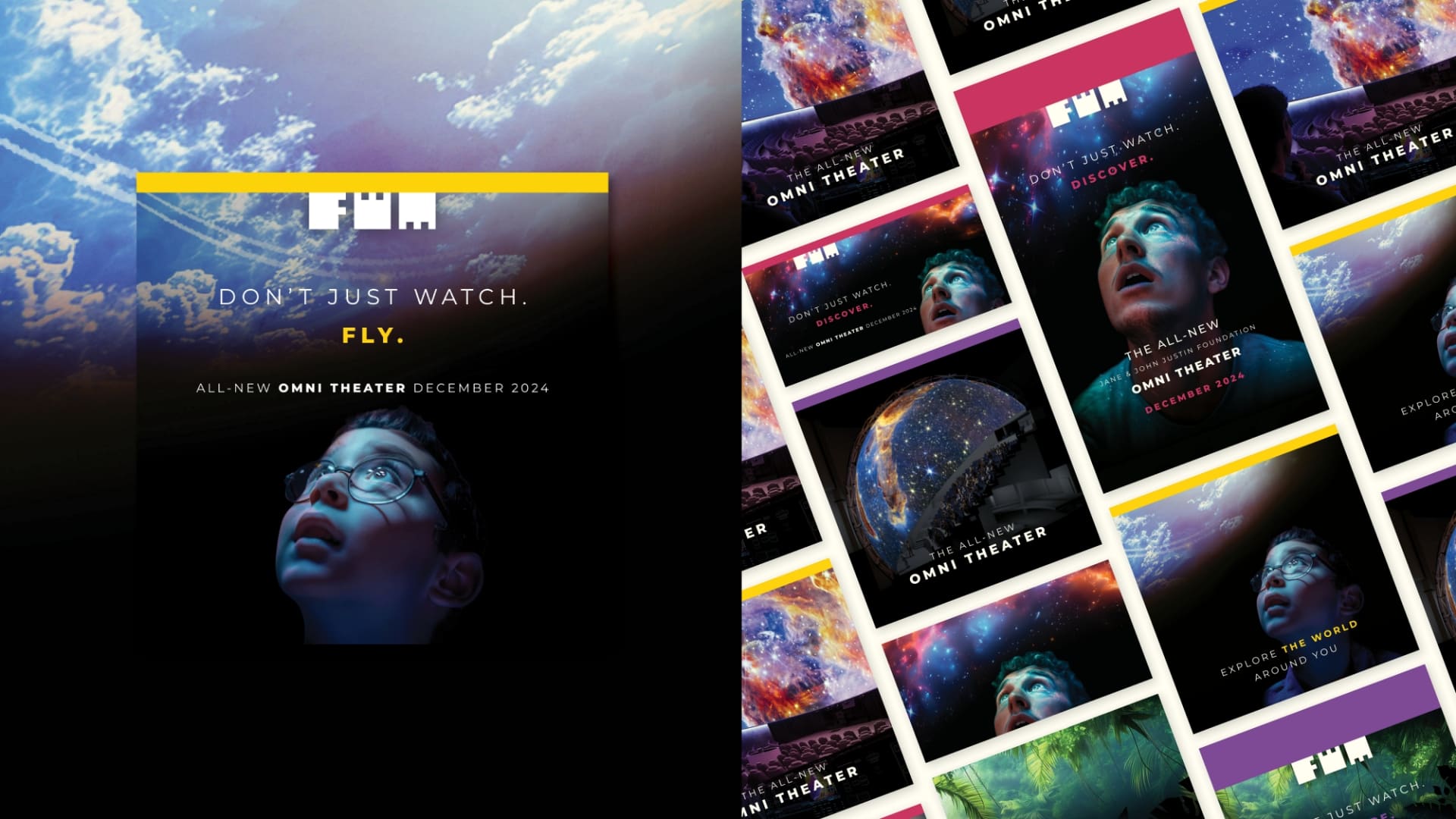
The Fort Worth Museum of Science and History unveiled its newly transformed Jane & John Justin Foundation Omni Theater in December 2024, featuring the world’s largest LED dome ever installed in a museum. This state-of-the-art theater boasts an 8K LED display, offering unparalleled visual clarity and a truly immersive experience. The challenge? Generating excitement and ticket sales for a venue that was still under construction, making it difficult to showcase its groundbreaking features to potential visitors. The Museum enlisted Schaefer’s expertise to craft a compelling campaign that would not only captivate audiences, but drive ticket sales ahead of the grand opening.
A Full-Service Approach to a Flawless Launch
From strategic vision to effective execution, Schaefer provided:
Strategy: Developing a go-to-market plan that ensured maximum awareness, engagement, and conversions.
Creative: Concept development, art direction, copywriting, and design to capture the Omni’s brand new, immersive experience.
Media: Media planning, buying, execution, and real-time analytics to optimize performance throughout the campaign.
Creating a Vision for an Unseen Experience
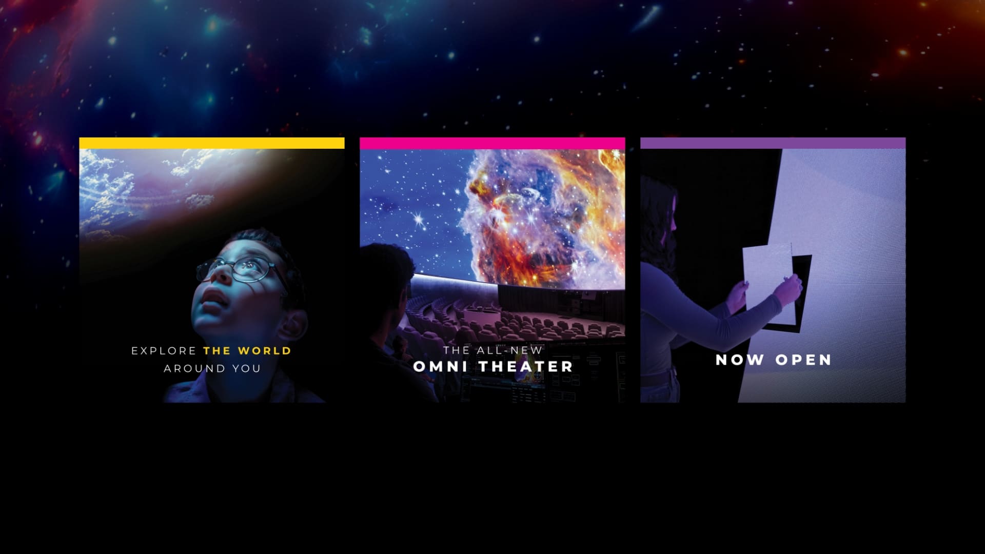
We were challenged with making viewers feel the thrill of the Omni Theater before they could experience it in person. Using AI-generated imagery, we crafted visuals that transported audiences into the other worlds. Paired with compelling headlines like “Don’t Just Watch. Discover.,” we built anticipation and excitement in the market.
Blending Digital Precision with Emotional Storytelling
Through a carefully orchestrated media mix, targeting DFW and outer drive-markets in Texas, we generated strong awareness before ticket sales launched in November. Our full funnel approach combined paid search, social, and targeted publication partnerships in the arts, culture, and family entertainment space to create excitement and drive ticket sales prior to the opening.
Big Impact, Bigger Results
In just over a month, we drove $168,249 in online ticket sales.
Of the total revenue, 39% was driven directly from paid media.
We surpassed Paid Search benchmarks, with 24% higher CTR and a $1.25 lower CPC than the industry standard.
Paid Social generated 4 million impressions, driving massive awareness for the duration of the 4-month campaign.
Publication e-blasts drove open rates as high as 62%, click-through rates up to 20%, and 26K+ clicks across media placements.
More Than Marketing—Creating a Movement
At Schaefer, we don’t just market attractions—we create anticipation, showcase experiences, and drive results. The success of the Jane & John Justin Omni Theater launch proves that a strong blend of storytelling, media strategy, and bold creative can turn any challenge into a success.