Spring is in the air, and sleepy animals are emerging from their caves to venture out into the sunlight once more. Sorry, I meant people. Emerging from their homes. After another typically unpredictable winter, spring is back, which means a lot of moms and dads are ready to get their kids out of the house before they all go crazy.
Thankfully, there’s a ton of stuff to do at the Fort Worth Zoo – animal shows, keeper chats and all kinds of new baby animals being all cute. For this year’s spring campaign, we focused not only on the variety of experiences, but also on the memories those experiences create for families. Check out what we put together, then go out there and see it for yourself – it’s a beautiful day!
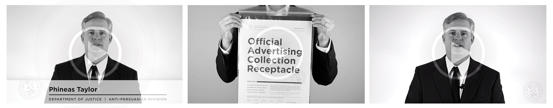
The old axiom says: You don’t know what you have until it’s gone. So we thought there was no better way to put on the 2015 American Advertising Awards, than to take it away.
In late 2014, with the help of the People’s League for the Abolition of Advertising (plAAd), the United States government passed Amendment 28 to end the practice of Advertising as it was rampant with persuasion and coercion. Local agencies were canvassed with official cease and desist notices and instructions on how to package and submit their, now illegal, advertising materials.
To keep advertising and our livelihoods alive, AAF Fort Worth swept into action and the AAFFXFW underground advertising movement was born. The group intercepted the government submissions and threw an Addy Awards celebration under the cover of “bingo night” at the local Masonic Temple. Our craft was celebrated, awards were won and Amendment 28 was repealed by night’s end.
Long Live Advertising.
Our friends at Fort Worth South Inc. asked us to create the collateral for their twentieth anniversary celebration earlier this year. FWSI began as a small coalition of Near Southside businesses and community leaders and has grown dramatically over the last two decades. The redevelopment of Fort Worth’s Near Southside was the story we wanted to showcase. Schaefer worked with them to find headlines from the past 20 years that helped to tell the story of how this community has become a vibrant, urban, mixed-use neighborhood.
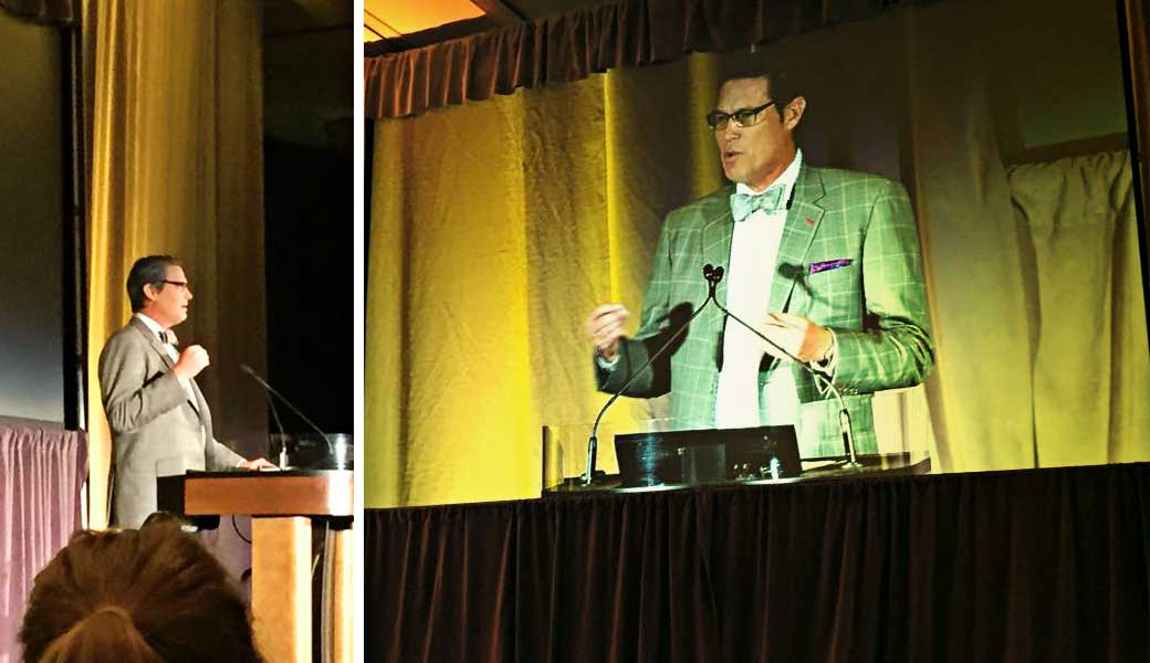
Our very own Ken Schaefer was one of the speakers, talking about the growing creative scene in the Southside. He rocked a bow tie and shared some great insights about the unique opportunities that are available in this culturally rich community. His message focused on how important creative organizations are to helping this area flourish.
This was the second year Schaefer got to produce the annual TCU Baseball video. The team was coming off a very successful year, yet they still felt the sting of coming up short in the College World Series. For 2015, both the coaches and players had an even greater resolve to take it all the way to the championship.
Based on the Boy Scout oath, “On Our Honor” is a promise to themselves, their teammates, coaches and fans to follow the path of selflessness, energy and excellence.
This was another fun shoot with N8 Visuals out at Heart of the Ranch in Clearfork, another Schaefer client. Even the non-Horned Frogs here at Schaefer are excited to see how far TCU Baseball can go this year. Go Frogs! #toadtoomaha
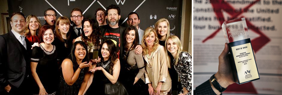
On Friday night, advertising professionals from all over Fort Worth gathered for the 2015 American Advertising Awards. As last year’s Best of Show winner, Schaefer was responsible for this year’s event theme, which was “Amendment 28,” a modern take on prohibition except that it was advertising and not booze that was illegal.
In typical Schaefer fashion, we had a lot of fun with it. From a fake theme to fake government agents to real posters taped on real agency doors, we used a wide range of media to keep the game going. It all culminated last Friday with “The Event” – a secret meeting of ad pros at the Fort Worth Masonic Temple to celebrate in secret another year’s worth of work.
Results are still coming in, but early returns suggest that the event was a success. Guests enjoyed hors d’oeuvres and drinks while sizing up with each other’s work and catching up with old acquaintances and coworkers. The awards presentation video, courtesy of our friends at Studios 121, maintained the underground theme with glitchy effects and the subversive statement that, “If advertising has been outlawed, then we are all outlaws.”
Fitting then, that we made off like bandits, coming away with 16 total awards including five golds and another Best of Show award for the 2015 Zoo Ball invitation we did for the Fort Worth Zoo. Designed by Blair Babineaux with art direction by Charlie Howlett and production by Maren Gibbs, this piece is a fitting jewel to crown a busy and productive 2014.
Of course, winning Best of Show again means we get to put on the show next year, but we’d rather not think about that for a few months. It was a lot of work.
Here’s to a great 2014 and to our three-peat next February!
The annual Fort Worth Zoo preschool is a great way for kids to learn all about their favorite animals from A to Z. So, industrious designer Jon Chapman set about illustrating a menagerie of animals – one for every letter of the alphabet. This series of animal flash cards was made available on the Fort Worth Zoo website so parents could print them out for their kids’ to enjoy. Which one’s your favorite?
This was the second year Schaefer got to produce the annual TCU Baseball video. The team was coming off a very successful year, yet they still felt the sting of coming up short in the College World Series. For 2015, both the coaches and players had an even greater resolve to take it all the way to the championship.
Based on the Boy Scout oath, “On Our Honor” is a promise to themselves, their teammates, coaches and fans to follow the path of selflessness, energy and excellence.
This was another fun shoot with N8 Visuals out at Heart of the Ranch in Clearfork, another Schaefer client. Even the non-Horned Frogs here at Schaefer are excited to see how far TCU Baseball can go this year. Go Frogs! #toadtoomaha
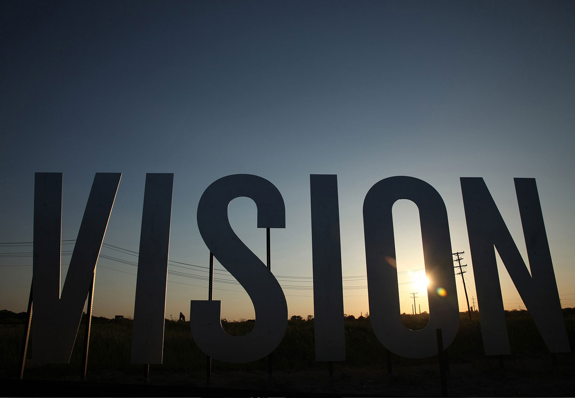
The Story
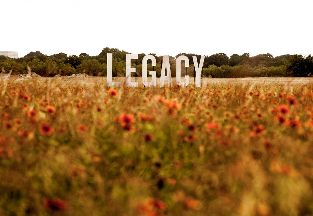
Clearfork is a new mixed-use development on what was the last undeveloped piece of the legendary Edwards Ranch. Many Fort Worth landmarks like Texas Christian University and the Fort Worth Zoo now sit on what once was Edwards Ranch property, but the Clearfork portion remained virtually untouched since 1848. Having just completed the Clearfork branding and positioning, the client asked us to produce some vinyl banners to announce the coming development.
“Sure, we can do that, but…”
The Work
With a newly completed road cutting through the property, this was the first time most people had seen this property since before Fort Worth (the actual fort) existed. We felt this called for something a little more unique than a vinyl banner.
Pulling back from the assumed solution of banners and focusing instead on the goal of attracting passersby’s attention, our ideas included an iron ranch sign, cattle guards and a water tower. What won out in the end were what the team dubbed “word crops.” Three eight-foot-tall words were strategically placed around the property: discover, legacy and vision.
The road to the final product was a long one, since none of us had ever seen word crops before. We cut an “A” out of a sheet of plywood in the side yard of our office and hauled it out to Clearfork to see where the words should go. Our production manager then talked with a variety of vendors to see if anyone could do it on-budget (one could). We had a test letter made with three colors of paint to see which worked best (silver).

The Results
The word crops were a success in several ways. First, they captured people’s attention and made them curious about what was coming to the property. Second, they garnered some social shares as people took photos with the words and shared them on their networks. Thirdly, (shameless plug) they earned Schaefer the Best in Show American Advertising Award for 2014.
Best of all, they’re a perfect example of what we mean when we say, “Give us your goal, and we’ll seek what’s possible.”
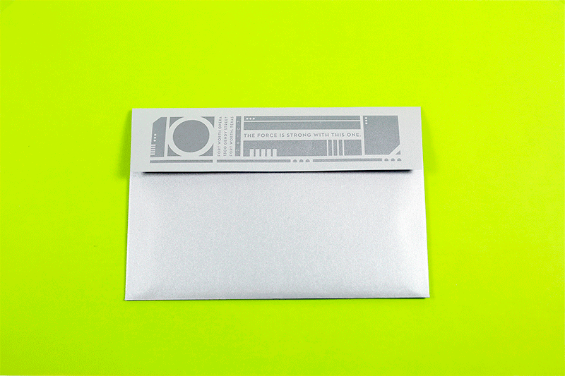
For the third year in a row, we partnered with the Fort Worth Opera to develop the invitation design for their largest and most impactful fundraising event of the year – the Opera Ball. Proceeds from this event go toward programming, community outreach and the annual FW Opera Festival. The Opera Ball committee had chosen a sci-fi theme for this year’s ball. Not saying we’re nerds or anything, but our minds quickly went into hyperdrive upon hearing this. Get it? Of course you do. The Fort Worth Opera Ball competes with several high-end donor events within the city, and it was imperative that our materials grab people’s attention and get them excited to attend.
We ultimately named this year’s ball the Galactic Gala and included references to Star Wars, Star Trek, Battlestar Galactica and other stellar movies. See? We can’t help ourselves. With a minimal print budget, we were still able to create a printed invitation that people could interact with. When you pulled the invitation from the sleeve it looked as if the light saber was turning on. Many people felt compelled to make their own sound effects. Some were better than others, and we may or may not have looked it up on Youtube to see who was closest.
At this year’s Spice World expo in Austin, Texas, Schaefer client McAfee Security was there in force to help all those IT professionals keep both their I and their T safe. The concept, Malware Apocalypse, likened all the computer-eating monsters roaming the internet to our favorite brain-eating monsters roaming various movies and TV shows.
We helped deck out the booth (and the humans) in all sorts of zombie hunting gear. We had zombie themed props and giveaways – we even had makeup artists at the booth to give people the undead makeunders they always wanted. No surprise, it was a hit. The client agreed it was one of the most successful Spiceworld showings yet, and there’s no doubt that our concept left a lasting impression on attendees.