Most prescription savings cards cover a narrow scope of treatments, which overcomplicates the savings process. As a result, patients are often left confused about how to redeem savings and may end up actually paying more for their prescriptions. Discounts change frequently and branded products are not always covered, leading to patients and providers losing confidence in the cards and programs themselves.
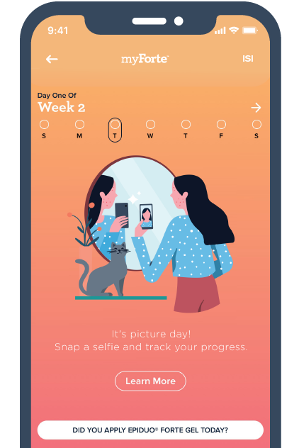
Galderma CareConnect is a patient savings program that consolidates Galderma’s prescriptions into one savings portal that’s accessible for patients and “Remarkably Simple” to use.
Goals:
- Build awareness of the savings program among qualified patients.
- Make the program easier to access for patients.
- Inform more potential patients about their eligibility for the program.
Strategy & Execution
Schaefer led the Galderma CareConnect launch with a few key strategic imperatives: communicate the scope of Galderma prescriptions covered under the program and quickly build awareness of the program among patients, healthcare providers, and pharmacists. We developed a comprehensive, multi-channel campaign around the tagline “Remarkably Simple.” This included traditional advertising, digital ads, video, paid digital media, display targeting, customized email marketing as well as personal and non-personal sales support.
Connecting Patients with Care
At the core of this comprehensive campaign was GaldermaCC.com, a centralized location for information about the savings program. The site was strategically developed to communicate key information to each of our core audiences:
- Patients – Information about savings, ease of use and a great opportunity to quickly download a GCC card.
- Healthcare Professionals – Key points to share with their patients when prescribing Galderma products, information about pharmacy access and a portfolio of products on the card.
- Pharmacists – Information about patient eligibility.
The website follows a clean design and user-friendly navigation to make the user experience just as “Remarkably Simple” as the Galderma CareConnect program itself. In addition, the website utilizes a seamless API to connect directly with the card provider, so that a unique card can be generated in just seconds when the user chooses to download.
By making this direct connection, we are able to utilize technology and data to measure card redemption rates at pharmacies across the country and measure the success of marketing campaigns in market.
Results
- In less than two years, Galderma Care Connect site metrics have steadily climbed month after month.
- To date, Galderma Care Connect has reached more than one million unique patients.
- As of June 2019, more than 3 million prescriptions have been processed through the Galderma Care Connect portal, saving patients, healthcare providers, and pharmacists valuable time and money.
- MM&M Gold Award for Best Payer Marketing.
Make Life Better
Navigating healthcare can be a confusing process for patients and even some healthcare providers. By creating the Galderma CareConnect website, we were able to help more people download a patients’ savings card and connect them with more affordable care.