Schaefer Advertising Co.

Archives

Situation

Mobility and innovation districts are places where pioneers make critical advancements in logistics and supply chain modernization. It’s also a place where technology breakthroughs are developed that can affect billions of people. They are critical to advancing how consumer and commercial operations move forward to improve lives everywhere. The challenge with innovation districts is communicating a tangible concept that resonates with valuable audiences and encourages entrepreneurs, scientists and business leaders to utilize the district’s capability.

We partnered with the AllianceTexas Mobility Innovation Zone to create a flexible identity package that communicates all the intangible benefits this testing ecosystem can provide mobility visionaries and their teams.

Making Intangible Value Tangible

We partnered with the MIZ team and entered into extensive discovery sessions to better understand where MIZ stands in the market and how we can highlight their value proposition and boost awareness of the one-of-a-kind opportunity that the MIZ offers mobility innovators. In marketing the MIZ, our first charge was to articulate the opportunity that the MIZ offers to technology innovators by creating a vision for something that did not yet exist.

MIZ Design System

Through this discovery the Schaefer team identified that the AllianceTexas MIZ was a genuinely unique blend of people, places and things, structured in a manner unlike any other innovation zones. We leveraged this differentiation into a defining position and archetype to inform the subsequent brand identity and campaign creative development. This allowed us to tangibly define the value that the MIZ brings to entrepreneurs and innovators that elect to use their district and capabilities. Ultimately, this helps the MIZ advocate for new businesses and create long term partnerships with innovative companies that bring jobs to North Texas and innovation to the mobility industry. 

Messaging Full-Scale Innovation

We crafted “Innovation from the Ground Up” as a key message to clearly position the opportunity of the innovation zone. It nods to the full-scale capabilities of the MIZ and communicates it as a place where mobility innovators can push the boundaries of now to discover what’s next and do it all—ideation to implementation—at the MIZ.

Deploying a Detailed Digital Activation

We launched the updated identity with the “Innovation from the Ground Up” campaign, which introduced the MIZ as the premier, pioneering testing, scaling and commercialization ecosystem. The campaign solved three key communications requirements: promoting the MIZ brand, communicating the surface capabilities, and promoting the airspace utility. This reflects the total MIZ ecosystem and communicates it as a flexible, utilitarian space that is open for business across the mobility industry. 

We developed a multichannel digital marketing plan to launch the “Innovation from the Ground Up” campaign, utilizing paid media, native and sponsored content, email drip campaign and display banners. For paid ad placements, we strategically chose publications that resonated with our target audiences in the logistics, aviation and entrepreneurship industries. The campaign also engaged prospects directly through a targeted email campaign, which encouraged website form fills to contact the MIZ to use their testing ecosystem.  Ultimately, the digital strategy is successfully creating extensive brand awareness and driving both engagement and conversions from high value prospects which has yielded new business partnerships for the MIZ.

Early Results:

  • 300% increase in form fills MoM since beginning of campaign
  • 82% increase in Contact Us form fills
  • Display impressions increased nearly 200% MoM resulting in 141% more clicks
  • 34% increase in new website users
  • Improved brand exposure and market saturation

Golf is a timeless sport that brings people together to enjoy camaraderie and pristine, cultivated greens. But, what happens when you add luxury travel and experiences into a premium golf membership? You get Icon Golf – an esteemed golf and travel membership that takes players around the world. Icon needed to revamp their brand to generate more memberships, so they partnered with the Schaefer team to refocus their sales efforts with a full-scale, multichannel digital campaign and a new website. 

In 2020, Icon invested in increasing their sales from 250 memberships to 1000. So, they partnered with Schaefer to revamp their brand, generate more memberships, and focus their sales efforts with a full-scale, multichannel digital campaign and a new website to meet their very aggressive goal.

Goals

Grow Icon Golf membership database from 250 to 1,000 in 18 months.

  • Refresh the brand identity
  • Develop a content marketing strategy 
  • Build a CRM to streamline lead generation and membership management
  • Improve online user experience 
  • Prioritize sales efforts

Roles

  • Strategy 
  • Creative
  • Digital 
  • Branding
  • Positioning
  • Client Services

Partnering to Develop a Structured, Integrated Sales Process

We began our relationship with Icon Golf on the ground level as they were initiating the formal development of a structured sales team. This allowed Schaefer to partner directly with the Icon team to merge sales and marketing efforts. Icon’s previous marketing efforts were primarily functioning by word-of-mouth and leveraging connections with existing club members within their portfolio. While this approach was successful, there was an opportunity to expand their sales efforts through digital automation to reach a wider audience.

We started by evaluating each medium against our overall goals and the need to fill the funnel with awareness initiatives and convert interested prospects into members. We found that paid search and streaming audio and video proved successful for building awareness, and third party publication emails allowed us to hit a very targeted audience that was ready to convert.

A Refreshed Creative Platform

We recognized an opportunity to reinvigorate their creative platform to better communicate the unique benefits that an Icon membership provides. Icon Golf offers members full privileges with an expertly curated collection of private golf clubs as well as luxurious member experiences and fully planned quests to exotic locales. So, Icon Golf is much more than a golf membership – it’s a full-package of golf and travel – and communicating that was the central challenge of updating their creative.

When creating the updated creative platform, we focused on the luxury aesthetic and benefits of an Icon Golf membership. We wanted the design and language to reflect the elevated perks and nature of the membership, all while highlighting the relationship-focused aspect of joining Icon Golf. The camaraderie between Icon members is a key strategic imperative, so we had to make that central in the updated creative deck.

We created the concept “Legendary is Within Reach” as our primary branded language alluding to the potential for legendary moments with legendary people, on and off the course.

A New, Optimized Website

The central piece of Icon’s rebrand was optimizing their website to generate more qualified leads. Previous to our relationship,the Icon Golf website was split into two different URLs – Icon.Golf and IconGolf.com to satisfy internal marketing objectives. However, this split up their traffic and made consolidating valuable lead information more difficult. So, we combined their properties into one streamlined website. To increase the site’s performance, we implemented key SEO and content updates targeted at their primary audiences.

Our team also redeveloped the site with crucial user experience updates to improve site accessibility and usability aimed at generating form fills from qualified leads. To improve usability, we simply added header and footer navigations to improve the overall user experience. In addition, we employed site tagging to capture key user behavior metrics in order to continue to drive future data-driven site optimization opportunities. Finally, we placed CTAs throughout prominent areas of the website so that users could always and easily make direct contact with the reps at Icon Golf. The final result is a website that supports Icon’s strategic marketing goals by generating more engagement and qualified leads.

Creating a Centralized Lead Strategy

To continue to round out the lead generation strategy, we implemented a CRM strategy to accurately target lists of valuable, interested leads with compelling emails. We connected key data sources – the Icon website, MailChimp, and Salesforce as well as other lead collection points to ensure that our data automatically fed into the sales process and reduced the work the sales team needed to do to generate more memberships.

We created a variety of emails around the central message “Legendary is Within Reach” that ultimately guided leads to complete a form fill and capture valuable data for converting more leads.

To round out the digital strategy for Icon, we created a multi-channel paid media strategy that targeted valuable audiences in paid search, paid social media, display banners and email. In addition, we cultivated strategic partnerships with golf publications and outlets to secure high-value placements in front of the most highly qualified audience.

Results

In 2021, Icon Golf had their best year ever, setting a record month for membership sales in December.

  • Reached 85% of their new membership goal in under 9 months
  • Last Click Attribution:
    • 31 new memberships driven directly by campaign paid media
    • $450k in revenue
  • Total annual revenue surpassed 1.7 Million, resulting in a strong ROAS of 7:1
  • Lead Gen Growth in 2021
    • 569% increase in form fills 
  • Web Traffic Growth in 2021
    • 453.4% increase in pageviews
    • 480.9% increase in sessions 
    • 485.1% increase in new users visiting the website

Our client TimelyMD approached Schaefer needing a new website that would help sell their telehealth services. After beginning the project, we discovered an opportunity to refine their market position to thrive and earn unimaginable results.

Goals:

  • Create a website with a modern look that performed better to aid in the sales process
  • Demonstrate to higher-ed clients how TimelyMD can aid in student retention
  • Appeal to decision-makers in higher education and attract students and providers

Taking a Clear Stance in Remote Healthcare

In the world of remote healthcare, most brands take a broad approach and treat general audiences. To help TimelyMD rise above their competition, we sought to differentiate the brand from the rest of their competitors. After intense discovery and research with the client, we discovered that no brand in the remote healthcare space is focused on treating the entire student – mentally and physically. TimelyMD offers mental healthcare in addition to their primary healthcare services, whereas most remote healthcare companies don’t provide comprehensive care that covers overall health.

Timely MD COVID Response

To reinforce their commitment to student-focused telehealth, TimelyMD partnered with colleges and universities and worked with them on how best to serve their students during the Covid-19 pandemic. This willingness to partner with colleges and universities has been critical to their recent surge in growth and success and represents yet another key brand differentiator for TimelyMD.

Communicating a Focused Position

A refined position is only as good as the messaging that communicates it to the world. To illustrate the benefits of TimelyMD, we sought to amplify the brand name and their goal of supporting the health and wellness of students so they can focus on what matters—thriving.

Timely MD Homepage by Schaefer Advertising

Ultimately, we decided to pursue the concept “Time to Thrive” to demonstrate that TimelyMD helps students thrive in their physical and mental health while they’re at school. This represents a stark shift in the generic telehealth space, where most brands are marketing images of sickly students looking at their phones rather than enjoying their health. We wanted to reinforce that TimelyMD’s care leads to happier, healthier students, which creates thriving colleges and universities.

Building a Functional Multipurpose Platform

We began this project with the goal of building a functional website that performed better with an improved look and user experience. Before diving into web design, we sought first to understand who the primary audiences were and how they would use the site. Our research revealed that the primary users were school administrators, decision-makers, medical officers, and students. Each uses the TimelyMD site differently, so we had to balance their unique user experiences in the new website to satisfy strategic objectives for each. We designed different pages for each of the specific audiences that use the TimelyMD website to better connect with those users and satisfy their queries.

Timely MD Verticals

To improve the site’s functionality and user experience, we simplified the navigation and created more calls-to-action and displayed them prominently on each page. The simplified navigation and clear CTAs help focus the user’s journey into a desired action and made contacting the staff at TimelyMD far simpler. We also introduced better filtering capabilities to make it easier for any user to find the information they need more effectively. The final result is a website that is easy to navigate for different users and one that is more effective at delivering the right content and connecting users to the staff at TimelyMD.

Timely MD Newsroom Filtering

Results

  • Created a new website
  • Created new messaging
  • Guided the client to successful, student-facing digital targeting 
  • Established visual style
  • Organized their site so three distinct audiences could navigate with ease
  • Increased conversion opportunities

Luxury Living in the Heart of Fort Worth

As a high-end, mixed-use development, Clearfork needed a naming structure for the five different multi-family projects. Through the brand positioning process, we uncovered the importance of the land to the Edwards family. Through in-depth interviews with family members, we heard stories that painted a vivid picture of how the family interacted with the ranch land for generations.

A Meaningful Name

One story in particular told how, as a young boy, one of the now elder statesman of the Edwards family would rest in the shade with the ranch hands when they would take a break from working the cattle. The ranch hands were surrogate fathers and big brothers to the Edwards boys and played a large role in shaping their young minds and teaching them a respect for the land. The idea was born to name the multi-family developments after these ranch hands. The first, is The Kelton.

The Kelton Case Study Logo Comparison

Brand Mark and Creative Suite

The brand mark needed to match the sophistication of the Clearfork area, but remain as approachable and welcoming as the Kelton. We wanted to tie the mark back to the history of the land, and the symbol of an open gate was a universal and welcoming sign of hospitality. The resulting mark feels authentic to the family and their history, but is modern enough to attract the right people to these luxury condos. 

The Kelton Stationary Set

Positioning the Kelton in Fort Worth

We also designed the website with the goal of giving people an idea of what surrounded this space. Up until its launch this was a largely unknown and unexplored area of Fort Worth, so we needed to connect people to the culture that surrounded it and the vision for what was being built up around it. To illustrate the soul of the Kelton, we photographed key parts of the city that helped paint a picture of the lifestyle they wanted to portray at Clearfork and The Kelton.

A Brand Rooted in Authenticity

  • Brought the Kelton brand to life with a new creative suite
  • Created a brand that fits perfectly in the Clearfork family

Let’s start by getting to know you a little better. Tell us about yourself.

I moved around a lot growing up, so I was always around different people and environments. It was tough having to leave my friends and make new ones in school, but I think that has somehow contributed to me being a bit more open-minded and forced me to seek to understand people.

What’s something you love to do?

In a nutshell, I enjoy learning new things and immersing myself in different challenges in the things that I do. Things like researching and deconstructing a skateboard trick so I can learn it quickly, trying a trick over a different obstacle, finding new tools to make working on my car easier, learning new guitar chords, the list goes on and on.

What’s your favorite place?

Denver – I love the scenery, the people and the atmosphere.

What do you love about the job?
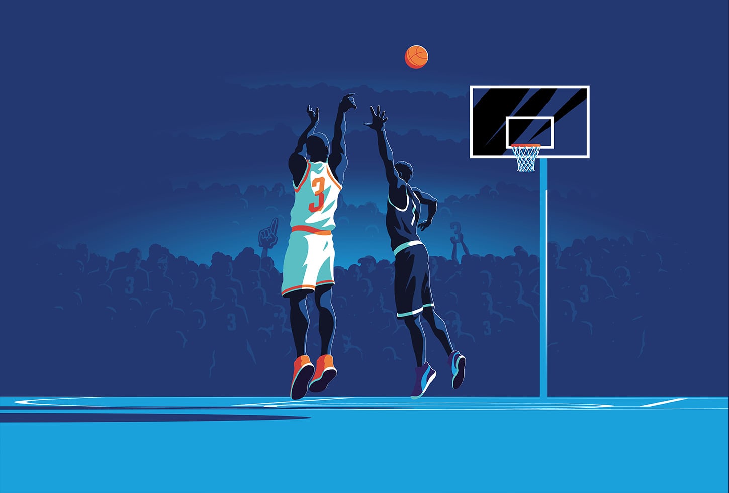
I love that you get challenged in many different aspects throughout the day.

If you could do anything besides what you are doing now, what would you do professionally?

If I can’t design, then I’d go back to shooting photography full-time.

What is the last thing you binge-watched?

Stranger Things 3 – it’s been a while since I’ve watched TV though.

What’s your favorite book?

“Feck Perfunction” by James Victore. It touches on many topics, but embracing your peculiar traits and getting rid of your inner perfectionist as a creative were the two that really resonated with me. I also enjoy Victore’s writing style—very raw, direct and concise.

If you could live in any sitcom, which would it be?

Parks & Rec because of the many hilarious personalities.

Are you a listener or a talker?

I’m a textbook introvert, so definitely a listener in most situations. However, I’m often mistaken as an extrovert since I’ve learned to break the mold over the years, but I still need time to recharge.

If you had to eat one thing for the rest of your life, what would it be?

Burgers 4 life.

If you had an extra hour of free time every day, what would you spend it doing?

I’ve been meaning to make more time to read, so I’d dedicate it to that.

Why Schaefer?

There’s a great balance here of camaraderie and quality work.

Any words of advice?

Always seek to venture outside of your comfort zone, and view obstacles as opportunities in disguise.

Marketing in-person events comes with its own set of challenges, but after the pandemic struck, we were presented with a new range of obstacles to activate the community and generate awareness, excitement, and attendance. For the Kimbell Art Museum, we were tasked with creating a community activation campaign that highlighted Queen Nefertari’s Egypt exhibition and encouraged people to safely enjoy the exhibition in person.

Goals

  • Create community activation and engagement
  • Connect the exhibition to people and encourage them to enjoy it in person
  • Encourage community awareness of the new exhibition
  • Utilize social media to educate the public and generate buzz for the exhibition
Nefertari Mural's

Encouraging Engagement During Uncertain Times

Getting in front of your audience physically during the pandemic can be challenging, but there are creative ways to target and engage the community in the digital space that still leads to conversions. The Kimbell needed a big idea that could break the mold of traditional marketing, and we were up for the challenge!

Instead of relying on traditional marketing methods to encourage in-person attendance, we specifically utilized the digital space to accomplish this, examining new trends, tools, and opportunities to engage our audience virtually. While digital analytics are incredibly valuable, this presented another challenge because the ultimate measurement of success is in-person attendance.

Nefertari QR Code Scan for Kimbell

Pivoting for Success

Rather than presenting a hard push to get people to the Nefertari exhibition in person, we decided to bring the exhibition experience to the community in a safe way. We created a series of outdoor installations that teased the exhibition and activated audiences in the safety of outdoor spaces. Our team created 3 different murals and 8 different ground clings that educated people about the Nefertari exhibition and encouraged them to experience it in person. For placement, we leveraged internal relationships to strategically set the murals and ground clings in areas that have high foot traffic and chose locations to help build the Kimbell’s network and local footprint. These installations allowed our audience the chance to walk in Queen Nefertari’s sandals and experience the magic of uncovering a hidden Egyptian ruin.

Scanning QR Codes for Kimbell Nefetari Exhibit

Leveraging a New Technology

To supplement the installations and ground clings, we sought a way to digitally engage our audience wherever they are and immerse them in Queen Nefertari’s Egypt. We worked with the Kimbell to come up with an engaging digital campaign to shift into the digital space. This was a big step for the Kimbell, since most of their previous campaign activations were created with traditional advertising methods. After careful market observation and extensive digital discovery, we found that more and more destination brands were incorporating augmented reality into their marketing plans.

Augmented reality takes many forms, but at the core of AR is the ability to partially immerse a user in an experience through a digital device like a phone or computer. For the Kimbell, we sought to create an AR campaign that brought Queen Nefertari to life and offered our audience a new way to engage with the exhibition. We created two AR filters that gave people two distinct ways to place them in Queen Nefertari’s Egypt.

3D Renders of Nefertari Crown

The first AR filter we created features Queen Nefertari’s crown – a three-dimensional depiction of a flat hieroglyphic crown that people could wear and enjoy on Instagram and Facebook. The second AR filter features a series of hieroglyphs etched into stone laid behind the user to make it appear as if they had just discovered the ruins.

It was a challenge to take a flat hieroglyphic crown and turn it into an accurate three-dimensional rendering. But, after hours of research, testing, and iteration, we were able to take a piece of Art and turn it into a relatable and engaging piece of technology that was accessible and relevant to audiences everywhere.

Results

  • Helped the Kimbell effectively reach max capacity of the Nefertari exhibition
  • More than 1.1M paid media impressions
  • More than 5 thousand tickets sold
  • The entire campaign resulted in more than $383k in revenue
  • AR filter earned 5.7K impressions and 3.6K opens
  • CTR of 1.71%, above the industry standard of .8%
  • 308 shares of the filter ads
  • Incorporated new technology into our client’s marketing strategy
  • Produced and installed wall murals and ground clings

Building a website is an opportunity to hone in on specific marketing objectives and create a powerful digital space to engage consumers. We partnered with the Texas Ballet Theater to build a website focused on improving ticket sales through an improved user experience, and design it to share the exuberant spirit and artistry of ballet in its structure.  

Goals

  • Develop a new website, and shift the focus to ticket sales
  • Develop content specifically to help visitors relate to the professional dancers
  • Highlight the ballet company and their role in the community
  • Create a website that is easy for the organization to update and change season to season through use of internal marketing resources
Before and After TBT Website

Defining a Clearer User Journey

When building a new website, understanding how people use it is key to pair functionality with supporting key marketing objectives. For Texas Ballet Theater, we took a deep dive into the popular user paths people take to purchase tickets and sought to understand the user experience. One critical point that we discovered was that there were far too many clicks and exit points between users and purchasing tickets. With that in mind, we defined clearer user paths and designed the structure of the new site to make it easier and quicker for users to purchase tickets.

Strategic Content Migration

As we shifted the new website to focus on e-commerce, we reduced the number of actions it takes to purchase a ticket down to two simple clicks and made the ticket sales portal readily available and visible on each page. To minimize the bounce rate and encourage more time on site, we improved the user flow by reducing duplicate pages and dead ends on the site. We also instituted analytics to track revenue data and connect e-commerce data to the ticketing system to monitor our progress.

The result of the strategic content migration is a streamlined site that is focused on guiding users to purchase tickets and learn more about the Texas Ballet Theater.

Texas Ballet Theater Wireframe

Site Architecture Aimed at e-Commerce

Through discovery and internal research we determined the key objectives were to restructure the site navigation to improve ticket sales, but also educate the public about Texas Ballet Theater beyond their on-stage product. The website needed to promote special events, highlight donation opportunities, and showcase the work that TBT is doing for local schools and young dancer education, as well as their many community outreach initiatives. So, we consolidated the number of pages to make it easier for users to navigate from the homepage to any section they needed and reduced the friction in navigating between pages outside of the homepage. 

We carefully considered the different types of people visiting the website and used those personas to help create smoother user paths and a richer user experience for a wider audience. 

Season Performances with TBT

An Improved Mobile Experience

As with any website redesign, a website needs to offer a seamless experience on desktop and mobile devices. When we designed the mobile site, we wanted to ensure that it served the same primary goal as the desktop version: sell tickets. So, we simplified the website to offer users the primary information through shorter users paths. We also improved the navigational elements to make the site easier to click through on mobile devices.

A Website that Communicates the Energy of Ballet

Our team sought to emphasize the spirit of the TBT brand in the final website design so that it was as beautiful as it was functional. Furthermore, we wanted to elevate the performances and dancers so that they took center stage as the visual standouts. We also sought to create a flexible framework for the web design so that each season of ballet felt fresh and exciting without having to undergo significant site construction to update it. The site can easily be updated by the TBT marketing staff, and it’s flexibility allowed for quicker performance updates during the pandemic.

The Difference in the Seasons

Visually, the new website is driven by photography and highlighting the dancers. We elevated the typography choices and color palette to reflect the modern aspects of TBT so that the pages moved beyond the season and established TBT’s brand. To communicate the dynamic movement and energy of ballet, we used a non-traditional structure that fluidly moves users down the page. The final website design is one that balances form and function while standing as a testament to the fundamental motion of ballet.

TBT on the Tablet

Results

The total volume of site traffic was impacted heavily in 2020 as a result of COVID-19, which also led to multiple performance cancellations. However, 2020 metrics still indicate significant increases in overall website performance.

  • More users clicked to purchase tickets to The Nutcracker 2020 compared to The Nutcracker 2019. 
  • In December 2020, more than double the number of users clicked from The Nutcracker 2020 page to purchase tickets compared to the same page in December 2019.
  • Behavior flow to purchase tickets improved, with users entering the ticketing platform within just 2 clicks, as compared to 3+ clicks on the previous site.
  • Improved time efficiencies for updating the website, saving on future and ongoing web development
  • Incorporated pages where TBT can share about their artistic direction, where they’re going as a company, add their personality

The 2021 ADDYs are in the books! It may have looked a bit different this year, but the entire Schaefer team was so grateful to get together outside and celebrate a year of hard work under unique circumstances.

When the final votes were tallied, Schaefer walked away with 19 awards out of our 22 entries, and we earned two Special Judges Awards! We’re proud to say that we won more awards than any other agency in Fort Worth and that each our of verticals brought home the hardware. Our team earned recognition in multiple mediums, including video, branding, illustration, print, social media, website, out of home and integrated campaigns. Of the awards, three of our wins were for Covid-related campaigns.

It’s been an interesting year, to say the least. Celebrating a year of hard work with our team was a breath of fresh air and a reminder of how fortunate we are to work together every single day and compete against such fantastic and talented friends and neighbors in the Fort Worth advertising community.

Congratulations to everyone that competed this year. We can’t wait to see you next year – hopefully in person – for the 2022 ADDYs.

2020 Zoo Membership Campaign

Gold ADDY Award and Special Judges’ Award: Most Popular | Client: Fort Worth Zoo

In the face of the Covid-19 pandemic, the Fort Worth Zoo needed a way to sell holiday adoptions and memberships. More than that, they needed a campaign that cut through the clutter of holiday advertisements to connect with consumers.

TCU Baseball Video – Day in. Day out.

Gold ADDY Award | Client: TCU Baseball
TCU Baseball Video

Telling the story of an elite collegiate baseball program is a large task – and it’s one we help TCU Baseball accomplish every year. But, like every task that our team tackles, it’s best to take it one small step at a time, day in, and day out.

Behind the Scenes Filming the TCU Gold Addy Award Video
VIEW WORK

UNTHSC – Day x Day Campaign

Gold ADDY Award | Client: UNTHSC

When COVID-19 first struck the United States, people weren’t sure what to think or how to appropriately respond. This left a void of reliable information, and The University of North Texas Health Science Center at Fort Worth – a medical research center and university – saw an opportunity to step forward as a reliable source of scientific information that people could trust.

UNTHSC Covid DayxDay Social Posts
VIEW WORK

OMNI Go For Three Campaign Illustrations

Gold ADDY Award | Client: OMNI

When OMNI® launched their new 2.0 device, which has functional advantages over other similar products on the market, we had to communicate the benefits this new device had over its competition.

Omni Icongraphy

Near Southside Rebrand

Gold ADDY Award | Client: Near Southside
Near Southside Branding

Places are defined by people, and the Near Southside is among the most vibrant and diverse communities in Fort Worth. So, when they approached Schaefer to help them rebrand their identity, we drew inspiration from the neighborhood they create and the people and ideas the Near Southside attracts.

Before and After Near Southside Logo
VIEW WORK

River & Blues Brand Campaign

Gold ADDY Award | Client: River & Blues Festival
River and Blues Campaign Branding

River & Blues Fest is a new kind of music festival, featuring a uniquely American lineup of longtime favorites and soulful up-and-comers in country and blues. Launching its inaugural year right here in the heart of Fort Worth, the River & Blues Festival needed a dynamic identity system to engage and attract music lovers and artists alike across a primarily digital landscape.

Posters for River and Blues Festival
VIEW WORK

Special Judges’ Award: Best of Print

Schaefer Christmas Card

March 3, 2021

From Texas with love

Every year the Texas Parks & Wildlife Foundation (TPWF) hosts an event to honor and induct some of its biggest friends and supporters to the Conservation Hall of Fame. The event is one of the most prestigious conservation award dinners, attracting partners, ambassadors and donors from across the state to benefit the TPWF and amplify its mission. 

The 2019 inductees strongly believe in the responsibility every Texan has to maintain our land and the life on it. The primary theme for the event focused on connection, more specifically on the flora and fauna that grow wildly across the Lone Star state, each native species playing a vital role in our ecosystem. To raise awareness and excite attendees, we set out to design an invitation suite befitting Texas’ most precious resource—all the wild things and wild places that make our state great.  

The state of Texas is not only vast. It’s diverse. From the panhandle to the pines, every inch is famed for its beauty and defined by the iconic landscapes. And there’s no better way to appreciate those views than from the open road. 

Seeking to capture that feeling of nostalgia for long drives and wide-open spaces, we built a conceptual theme centered around the classic American road-trip—Texas-style. A limited-edition postcard series served as the invitation, each featuring a hand-drawn illustration of true Texas moments from five distinct regions. 

The event helped raise private dollars for public funding. And the invite provided guests with a tangible piece of Texas they could collect or share with others to inspire conservation. A tribute to the landscape and a call to experience the wild, Texas Road Trip won awards at the local and regional American Advertising Awards in 2019.

February 9, 2021

Let’s chat about adherence

The changing global landscape is driving more and more patients to seek options for remote care. For Epiduo® Forte Gel, the changing healthcare environment opened up an opportunity to create a compelling, digital way for them to understand their acne treatment options. In order to strategically position Epiduo Forte Gel ahead of its competitors, a chatbot was implemented on the brand’s website that encourages patient engagement and prescription adherence through medically and legally compliant content.

Goals

  • Motivate patients to ask their doctor for a first-time Epiduo Forte Gel prescription
  • Encourage prescription adherence
  • Cultivate increased web audience engagement with the target audience: teens that suffer from acne
  • Differentiate Epiduo Forte Gel in the competitive acne market

Chatbots in Healthcare

Chatbots present an excellent opportunity for healthcare brands to maintain healthy communication with patients. Market-wide, there are just over 1 billion searches for health information performed on Google daily, and 20 million patient and HCP digital conversation sessions per day, according to Google Health. Put simply, there is a growing market to provide patients a digital avenue for quick text conversations to understand vital information about their options. Furthermore, chatbots allow patients to quickly get the information they need and greatly reduces the time needed for a human to handle any given query, saving countless hours and thousands of dollars year over year. 

Our Role

Beyond implementing the new chatbot, we also provide ongoing chatbot metrics (or measurement) to gain better patient insights that help us better communicate with patients. By monitoring chatbot engagement, we are able to personalize the patient experience, improve the conversation streams and identify more opportunities to increase patient engagement.

The Conversation Tree of Conversion

When we began developing the Epiduo Forte Gel chatbot, we knew that it had to maintain compliance before it would ever get off the ground. So, we partnered with Conversation Health, a conversational AI platform that is purpose-built for the life sciences industry and sets the standard in terms of accuracy and compliance with medically-trained taxonomies, data sets, NLP and technical stack. Together, we worked to create a button-driven chatbot that adhered to appropriate parameters, a challenge many free text-based bots face when it’s time for legal/compliance review. 

We designed the in-bot conversation around two key paths of the prospect funnel. At the top, general acne education and awareness. At the bottom, Epiduo Forte Gel education and follow-up consultation with a healthcare provider. This allowed us to gently move a prospect down the funnel from awareness to action regardless of their stage in the lead nurturing process.

Results

  • 5,000+ engagements in Q4
  • More than 1,100+ unique sessions in Q4
  • A majority of users opted in to provide feedback via a survey following bot usage
  • Most users rated the app usefulness as 5 out of 5 
  • More than 72% of users indicated they would speak with their doctor about Epiduo Forte Gel

Looking Ahead

Chatbots are here to stay – in healthcare, entertainment and countless other industries. As utilization continues to grow, they will play a vital role in lead generation. This mechanism will also facilitate important doctor-patient conversations and shift valuable time that would otherwise be spent in patient care. The Epiduo Forte Gel chatbot continues to engage more patients with acne education and encourages prescription compliance and adherence every single day.