Schaefer Advertising Co.

Archives

The Fourth of July is all about tradition. Fireworks, hotdogs, cold beer, and in Texas, live country music and square-dancing. Beyond baseball and apple pie, there’s nothing more traditionally American than a good old fashioned picnic on Independence Day.
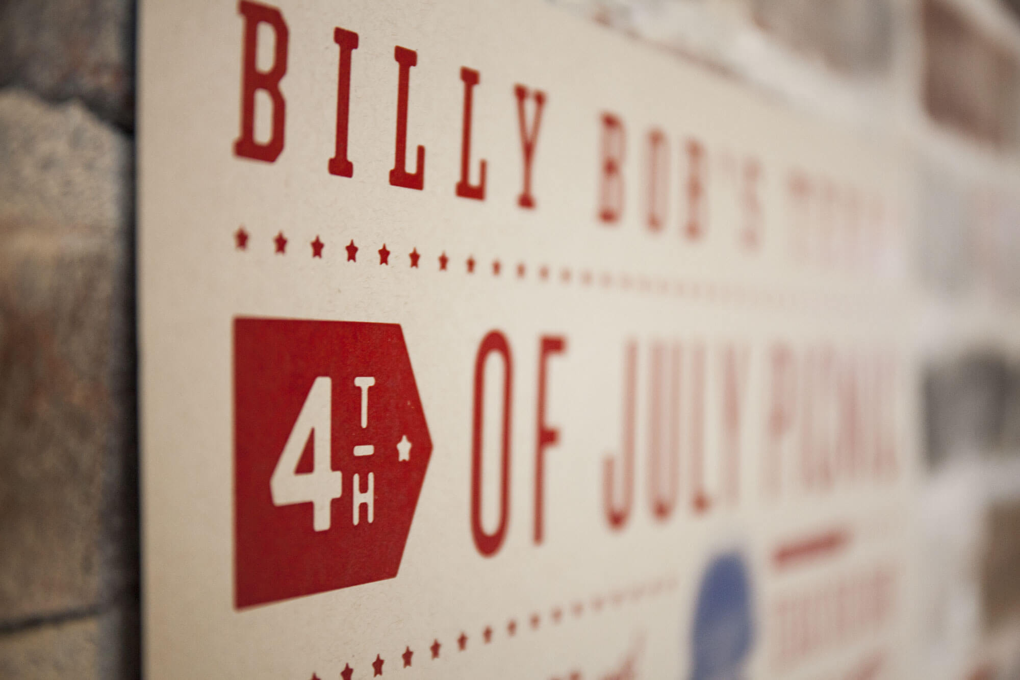
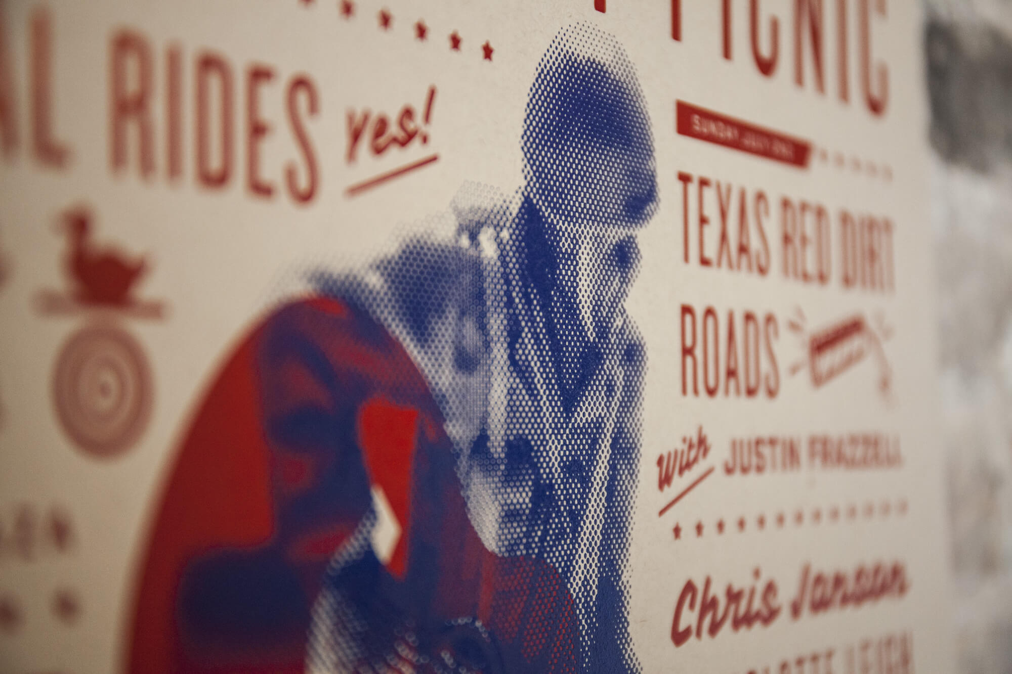
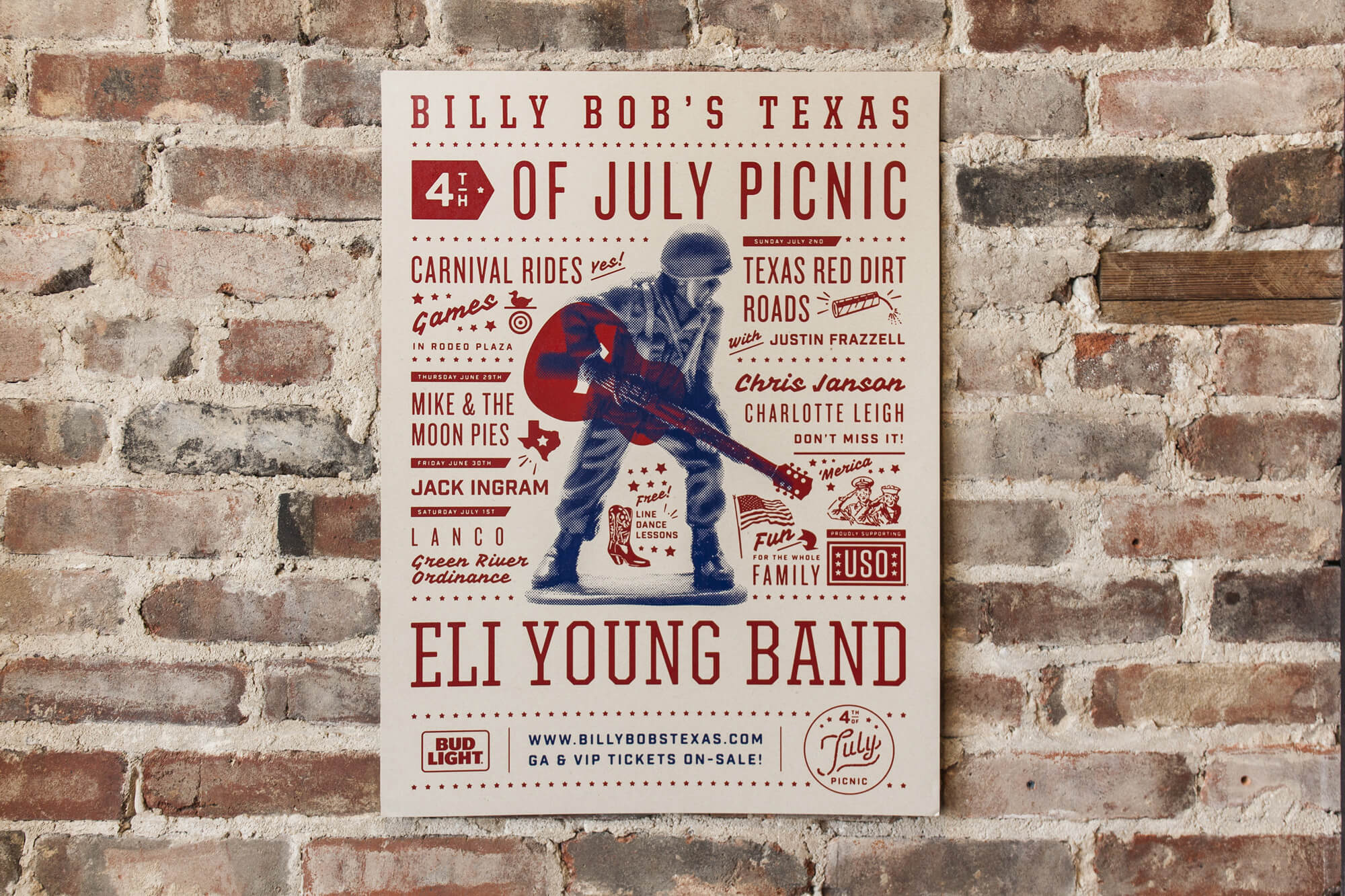
For Billy Bob’s annual 4th of July Picnic, we wanted to celebrate America’s birthday by creating a concert poster steeped in Americana convention. So, with an eye on tradition, and an ear on red-dirt country music, we began exploring the aesthetics of classic rock n’ roll posters for inspiration.


When rock n’ roll hit the scene, musicians needed a way to churn up local attendance to their shows without the help of the Internet, social media, or even a mature broadcast medium. Most musicians relied upon an artist to create concert posters that they could then pin up all over town to get eyes on their showtime. Early concert posters were illustrated by hand in two colors or less, and that’s the well from which we drew a lot of our inspiration. A lot of our influence came from the old Hatch Show Print style, which has been around since the late 19th century.
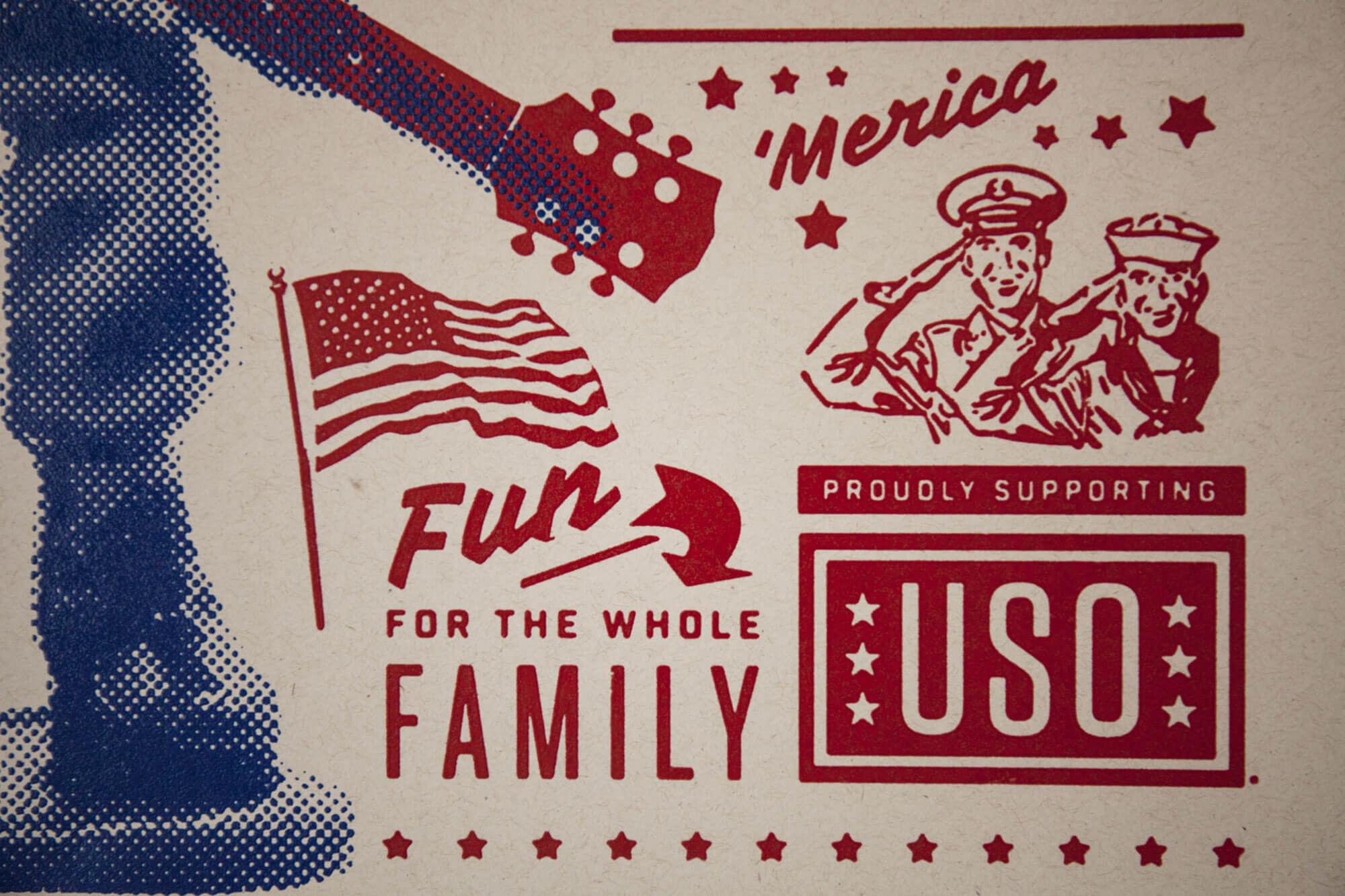
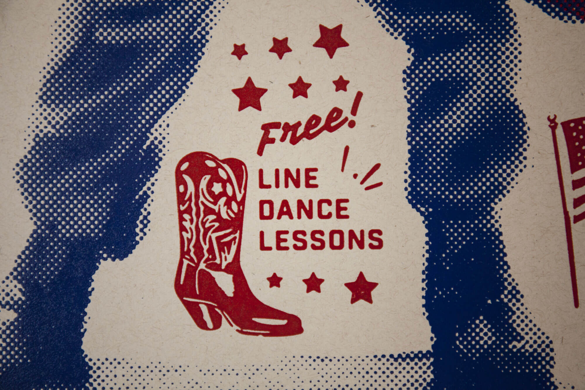
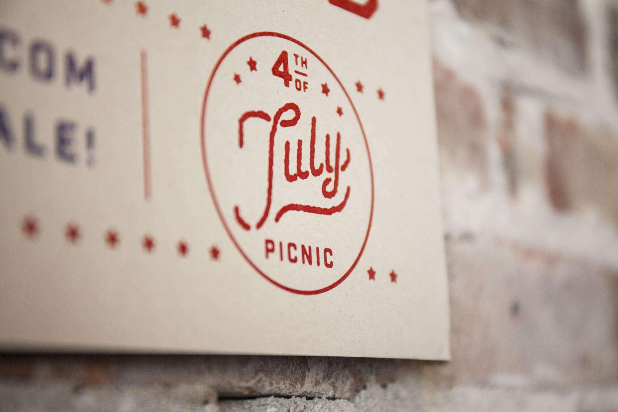
We chose to screen print the poster to honor the tradition of concert posters from the early 20th century, when screen printing was the most efficient and popular way of creating awareness for a touring rock n’ roll band. The poster was printed by Texas Graphic Resources, and done in two simple colors: red and blue. We printed a half-tone photo in blue on top of the solid red, which gives the poster more depth and dimension. Before photoshop, old-school screen printers used to practice this method to combine existing ideas without having to create completely new pieces of art.
We printed the poster on Neenah Environment Desert Storm 80# C – created by Neenah Paper. The heavier paper gives the poster a more substantial feeling, and the desert-craft color makes it look as if it could’ve been pulled from a collector’s library of classic concert posters, sandwiched somewhere between Buddy Holly and Bob Dylan.
The final result is a vibrant poster that features a blue soldier juxtaposed against a red guitar right in the center. The solider holding the guitar acts as the intersection between two American icons: celebrating Independence Day with music and joyous tradition, while also honoring the soldiers that made the ultimate sacrifice for our American freedoms.
As explorers, we often look forward to find the newest tools to help us accomplish a creative task. But, sometimes the nature of a project urges us to look back in time to find the right solution. For Billy Bob’s 4th of July Picnic, we journeyed back in time to create a memorable poster that celebrates the occasion with a rockin’ salute to the soldiers, music, and American traditions.

Every blank slate needs a splash of color.

As part of a new capital initiative by the Fort Worth Zoo to enhance and expand current exhibit space, create new amenities, and further bridge the gap between visitors and their wildlife friends, our team was tasked to gradually get the word out. And we mean gradually.

The Fort Worth Zoo’s capital campaign aims to increase exhibition space and enhance entertainment for its guests. Throughout the next eight years, in four separate phases, the zoo’s efforts will help fill the gaps from the original 1985 Master Plan.

Over the last century, the Fort Worth Zoo has continued to invest in this plan by optimizing an authentic, wildlife experience for its guests. So much, that it’s held a firm seat among the nation’s Top 5 zoos.
So where do we come in? Our team has had the privilege of leaving our mark on this fresh, new phase for our neighbor down the road.

It turns out, the Fort Worth community wasn’t the only one taking notice of our efforts.

Our team is proud to announce A Wilder Vision capital initiative campaign was recognized last month as a Finalist in the 2017 OBIE Awards. Each year, the best out-of home creative campaigns are chosen and recognized by the Outdoor Advertising Association of America. Google, Apple, Hershey’s and Nike were among the 2017 winning line-up.

A Wilder Vision was created to spur discussion over the 8-year plan that will introduce new amenities and build on current attractions at the Fort Worth Zoo. Each step in the process is aimed at guaranteeing a more engaging experience for visitors and animals alike. With an extensive list of improvements to come, our team took on the challenge to captivate and engage the community in the discussion as they were traveling from Point A to Point B.

And to that, our team can take a victory jump.


June 16, 2017

Work Wins

On June 11, TCU Baseball punched a ticket to their 4th consecutive College World Series. To break it down for you, they have finished their season on the field in Omaha in 2014, 2015, 2016 and now 2017. We are beyond proud of our client’s achievements but also honored to work with such and elite program with tremendous character.

Since 2014 (notice a theme?), we have partnered with TCU Baseball and head coach, Jim Schlossnagle, to create a video that embodies the brand of the program and establishes a tone for the upcoming season. We bring to life the vision that the coaching staff establishes each day, on and off the field.

They started the 2017 campaign with a pre-season No. 1 national ranking and Coach Schloss challenged his team to rise to the ranking. This year’s video, Work Wins, illustrates the truth that working hard is how you set yourself up to win games. Each player must physically and objectively work out a win each day. No superstitions. No momentum. Victory is found in the details, the routine, the compounding choices and the mindset.
Our job doesn’t stop with the finished product. Just like anything we create, we fight to make sure it performs. And this video has really caught hold. Over the course of the season (February – May) here’s a few stats:

689277
Total Views

2458478
Total Impressions

8283
Total Shares

Best of luck to the Horned Frogs! Toad to Omaha!

June 15, 2017

Portraits of Motherhood

Justin’s Place, a local non-profit organization, exists to enhance the life of a child trapped in generational poverty. Unfortunately, statistics show that a child’s life typically can’t be fully restored until the life of the family is restored. Justin’s Place comes alongside families in need, and helps establish balance by restoring hope and building a foundation that will provide the strength and resources needed to move out of generational poverty and toward a crisis free life of self-sufficiency.
Justin’s Place came to us during a point of growth and transition. Having been appointed the lead benefactor of the Women Empowering Women 2017 Inaugural Luncheon, they were in need of a video for the event that articulated their mission and the real people involved. With that in mind, the goal of the video was to secure funding as well as community backing for their cause.
In the spirit of being true explorers, we first had to evaluate the brand and elevate it. Their original logo was very dated and didn’t reflect the level of professionalism and mission behind Justin’s place. It wasn’t part of what they were asking for, but we felt the need to improve it. The client was extremely receptive to the new design and felt it better embodied the look and feel they are wanting to share with others.


Bird Nest
We come alongside families in need and establish balance by restoring hope and building a foundation.
Crown of Thorns
We begin with the heart issues. Our programs are rooted in biblical principles and grounded in the love of God.
Sun
Everything we do is to enhance the life of a child.

With the new logo established, we moved immediately into video development. The concept for the video centered around portraits of motherhood. These moving portraits show the many faces of motherhood and allow for a collective narrative that tells the story of what Justin’s Place does and why it matters. Capturing the significance of the need, while preserving the dignity of those in need was an extremely important balancing act.
We only had three weeks to concept, shoot and edit the video, and we were trying to complete the entire project at no cost to Justin’s Place. To accomplish that, we needed a true partner. So we turned to 1820 Productions. When we shared the story, they immediately agreed to participate and donate their services. 1820 Productions went above and beyond all expectations and shot an amazing video. They only had 2 days to make the edits and they put together the vision perfectly.

The fundraiser the video was developed for raised more than $82,000 with 252 people in attendance. The video was posted on Instagram and Facebook with 3,407 views and 240 views on Youtube. Justin’s Place now has a video they can use at fundraisers, on their website, and on different social media platforms that embodies their values and further conveys their mission to a wider audience. The video turned out remarkable and helped the fundraiser become even more of a success and have a larger impact on the community. We helped spread the word and share the message of what Justin’s Place is doing, and what they will continually do for others.

The Story
Beastro has a way of bringing out your wild side. The Fort Worth Zoo continues to give adults (over the age of 21) the chance to experiment with different flavors from various food and beverage booths, and live music entertainment for the 11th year in a row.
The Work
Last year, Beastro sold out for the first time ever. The goal this year was to draw newcomers into the excitement the event has to offer, and also encourage those who have attended before to come back!
This year, the event tailored itself to a Rock and Roll theme. The team used a black and white image of a roaring lion as the event icon and paired a tagline of “Sink your teeth into…Beastro!” The intensity between the loud, bold colors of the script and tagline set over the black and white image, lended itself to an intense, high-energy environment.

April 20, 2017

Look Ma, No Hands!

Schaefer audience, meet: Katherine Garner. We huddled up with our accident-prone Account Manager to introduce her formally, given that she’s sat in our office un-introduced for a few weeks. So, for our formal introduction, here’s our interview:
Schaefer: Katherine, tell us about yourself.
KG: That is a vague question. Well, to start, I’m from Arlington, Texas. I studied at Abilene Christian University, where I earned a degree in marketing and a minor in advertising. I’ve played soccer most of my life, and had the opportunity to play on the collegiate level.  I’m currently going through a huge transition, where I just bought a house in Aledo, Texas, and am about to get married in October. I have two older brothers – both local – and we are two years apart in age. I’m known mostly for putting Cholula on everything, and tripping over my own two feet.
Schaefer: Can you tell us a hometown story?
KG: I’m not from a small hometown – Arlington is a city! I guess, in this case, I’ll call it a “city town” story.
One day, when my brother and I were younger, we were wrestling like siblings do. Actually, I was only a junior in high school at the time, so we were way too old to be fake wrestling. Anyway, I remember my mom was yelling at us from downstairs to stop messing around. Of course to spite her, my brother and I continued and laughed about it. But at one point, my brother slammed me into the ground so hard that I knew something wasn’t right. My immediate inclination was to laugh – since that’s what I do when I’m embarrassed. I remember saying, “Something’s wrong. I think I broke my rib.” Being a brother, he didn’t believe me. I remember laughing and insisting that something was broken. We found out later – much later – that he did break my rib.
Schaefer: [laughing] How did you find out later as opposed to right away?
KG: It turned out I had to play in a soccer game the following day. I remember being in so much pain, but continually telling myself during the match, “there’s nothing you can do, and absolutely nothing.” I had mentioned to my coach and teammates that I was positive I had broken my rib, but no one believed me. I’m known for getting injured a lot, so I was shocked they didn’t believe me. A month later, I ended up going to the hospital for a different soccer injury, and the doctors told me I had a broken rib that was undergoing the healing process. You can imagine how relieved I felt, and how dumb my brother felt, after that.
Schaefer: So, are you really accident-prone? And, is that really your favorite story?
KG: Like I said, I will trip over my own two feet. It happens. I also realize I need a better story to kick-off with. I guess when I talk about home, I’m reminded of my injuries. [laughs].
Here’s another one: During my senior year of high school, I broke my right wrist in a soccer game and had to wear a cast. The same year, I tore my ACL on my right side, so I was also wearing a leg cast. After my surgery, I ended up going back to school too soon, because my mom insisted I would be fine. One of the first days back, I remember feeling nauseous because of all the pain medication I was on. I knew I needed to see the nurse. So as I was walking to her office, everyone was returning from lunch. At that moment, in the middle of the school hallway, I threw up all over myself in front of everybody. At that point, all I wanted to do was drop my crutches and try to find the nurse. But instead, I just stood in my own vomit as people walked by.
Yeah, I really need to find a better story.
Schaefer: Do you still play soccer?
KG: I went back to Abilene, Texas, and played in a 7 on 7 tournament this past April. I honestly can’t remember the last time I was that sore. Luckily, I survived without any injuries. It would be my luck to break or tear something six months before my own wedding.
Schaefer: Your nickname and where did it come from?
KG: Kat. My name is Katherine. I’m an animal lover, so my guess is the nickname stemmed from my love for cats. Growing up, my friends would call me “Kitty” and meow at me. It was kind of weird.
Schaefer: What’s your favorite soccer memory?
KG: We made it to the Elite-8 in California, during my junior year of college – that was huge. We ended up losing to Chico in a swampy, rainy game. It was a total mud pit and incredibly tough to play in. But we had a private plane fly us out, which was a big perk.
I’m also proud to say eight of my fourteen bridesmaids came from us all playing soccer together. When planning my wedding, I chose to do a lot of bridesmaids. I have two maids of honor and two matrons of honor. You can tell I’m reinventing the wheel on weddings.
Schaefer: What is your interest in healthcare marketing?
KG: It’s a huge market and you’re constantly learning about new products and methods that help people. I would’ve never known how many options are available for people looking for procedures and products, if I didn’t enter into this field. It’s an ever-changing industry and new things are constantly getting approved by the FDA. There’s always opportunities to research something new.
Schaefer: How did you hear about Schaefer?
KG: I’ve always known about Schaefer. Jan Blanchard was a really close family friend– still a really close family friend. We used to do ski trips with her and her family. They also attended our church before they moved to Oklahoma. I would ask her a lot about her experience at Schaefer. When I was in the market for a job in Fort Worth, I immediately reached out to her in hopes she would connect me with someone at Schaefer. At the time, they weren’t hiring, so I pursued another opportunity in Dallas. I was kicking to get back to Fort Worth, and luckily a position opened up here within two years. I jumped on the opportunity right away, and it all fell into place. It felt right at the time, and it still feels right.
 

April 7, 2017

A lasting impression

The Hurst Conference Center website redesign brings an air of elegance to the venue. Currently catering to corporate meeting planners, social event coordinators and brides-to-be, the website needed to provide specific information that was relevant to each target audience. This was achieved through intuitive navigation and individualized content.

The website leads with beautiful photography of the venue and, most notably, their fiber-optic chandelier. The refreshed design reflects high-end clientele and more aptly represents the quality of service the Hurst Conference Center offers.

Utilizing grid structures for organizational clarity, every aspect of the redesign provides a hassle-free planning process for potential clients. Each interior page has responsive menus that display room capacities, technical offerings and floor plans. With all the details carefully thought out, the quality of online service now mirrors the level of customer service the Hurst Conference Center provides.

February 20, 2017

A zoo with a sweet tooth

Ghouls, Goblins… Gorillas? For many Halloween events, the goal is to frighten the audience enough to draw them to see the main course. But the Fort Worth Zoo has a 20-year tradition of tickling the terror out of Halloween, with Boo at the Zoo.
Boo at the Zoo is a kid-centric Halloween event where you can trick-or-treat for candy among animal friends. This year’s event had: carnival games, treat stations, stage shows, Wild Encounters (the zoo’s ongoing animal handlers with friendly critters) and a pumpkin patch .
The campaign features a fun play on the classic Halloween candy. Its unique visual solution highlights the Zoo event that entertains sugar-crazed kids every year. We created a direct mail, outdoor billboard, bus bench, email, print and radio ads, and display campaign.
Our Boo at the Zoo efforts led to an:


89
excess in the revenue goal


24
excess in the sponsor goal

February 20, 2017

Keeping it cool

Family-owned and operated since 1954, Air Comfort is an HVAC and Refrigeration company that provides customized solutions in the residential, commercial, industrial and marine sectors. Founded on the values of quality, integrity, commitment and safety, Air Comfort delivers excellence in everything from custom fabrication to service and installation. As the Southeast Texas based company began to grow into extended markets, the brand needed to reflect the level of professionalism and expertise of the business.

The brand refresh began, as most do, with the logo. Subtle adjustments to color, shape and typography brought the logo set up to date while maintaining the equity of the original mark. From there came brand extensions, most notably the van wraps. As a primary symbol of their service and residential sectors, the vans needed to communicate the brand’s new identity and serve as a moving advertisement while out on the job.

Originally relying on word-of-mouth and face-to-face business, Air Comfort had a need to speak to a larger audience. And when we say speak, we mean allow the Vice President to “Fabio-up” and lay it all on the line for his business. With years of growth and notoriety in the community, Air Comfort’s team was eager to let their hair down with a humorous TV spot, and we couldn’t have been more proud of the finished product:


February 17, 2017

Pages of Schaefer – Blair

Harry Potter and the Deathly Hallows


J.K. ROWLING

 
This is definitely one of the first series I fell in love with. I don’t have a favorite book in the series, but I chose Deathly Hallows because it’s the only one I could find. I’ve definitely read all of them – a little too much.
When I first started reading Harry Potter, I was the same age as the characters, so I grew up with them. I’m a huge sci-fi or fun book fan, so I have re-read them many times. My mom and I used to go to the midnight book releases, so we could pre-order copies of the books. I’d get to Barnes and Noble at 10 o’clock, wait for the midnight release, get them and read them right away. My mom would generally read all of the books that I read. Not in a sense of like, helicopter parent. More that she wanted to experience what I as experiencing. We continued to do that with all different sci-fi series, and she continued to do it with my brothers. She’ll read all the same books that they do, if she finds them interesting. It gives kind of a common ground. She enjoys books just as much as we do. She’s a teacher, so it’s all kind of wrapped into that. There’s definitely the love of reading and escaping into those kinds of worlds.


The Handmaid’s Tale


MARGARET ATWOOD

 
This is an interesting one, because this is one that my fiancé recommended. We both really like to read, but we generally read very different things. I like fun, sci-fi, definitely a lot of escapism and mainly fiction, but Handmaid’s Tale is a little bit darker and deals with some literary themes. It is an interesting book, with some feminist themes and subtle sci-fi elements. For someone who reads a lot of Harry Potter, this is a different kind of thing. I like when people give me recommendations, because I think what people choose to read says a lot about them.
My fiancé got a writing degree from TCU so while we read different books, we also read differently; he marks up his books – he’ll highlight and underline and make notes. I am not that way. I have a hard time dog-earing a page, so we’re very different in how we handle books.
Overall, I enjoyed the book, but I got a little mad at the end. It’s a book that just ends without resolution, which is part of why it’s very raw and very real. It’s not a happy ending; you don’t know what happens and it kind of sucks. It’s just a very interesting one.


The Art of Looking Sideways


ALAN FLETCHER

 
This is a design book that I got in college. It’s not a book I needed for college, but I definitely was the girl who kept all of her books from college. I hoard them. The general point of the book is to look and think about things differently. It’s very visual and it has a fun layout. The cover has an unnamable font, and it’s actually difficult to open. You can open it however you want to and you can work with it however you want to.
There’s an element of the book that’s unlike normal routine, and the book teaches about unconventional approaches. Sometimes, we forget to play around with the way we think about things and the way we do things from a creative perspective. While I have not read the whole thing, I’ll pick it up, and read a part of it as a reminder to look at things a little bit differently.


Ender’s Game


ORSON SCOTT CARD

 
This is definitely sci-fi and I love it. I grabbed the first of the series, but I’ve read the next four or five. It gets a lot more sci-fi crazy as you move through the books. It blends technology, aliens and religion. This is one where they made the movie and I don’t think the movie gave it justice. It’s a classic sci-fi, breeze through it and read it again. It’s really enjoyable and a fun read.


Creativity Inc.: Overcoming the Unseen Forces That Stand in the Way of True Inspiration


ED CATMULL

 
This one was on Charlie’s list, but it’s on my list because he let me borrow it as a recommendation. I haven’t started it yet, but I’m looking forward to reading it. He told us about different excerpts, but now I’ll be able to read it myself.


The Vegetable Garden


WERNER DRESSENDÖRFER

 
This one’s more of a pretty book, that’s why I chose it: to look at the pictures from a design perspective. This book kind of serves as art. We change the décor in our house a lot – we move paintings and pictures around, and we use things, like books, as décor. Between my fiancé and I, we have way too many books; multiple bookshelves, books piled in corners, but any that are really nice like this, we want to display for fun. They’re so nice to look through.


Save
Save
Save
Save
Save
Save
Save
Save
Save
Save
Save
Save