Podimetrics had a strong story to tell
— and a new brand to build
Situation
Diabetes is one of the top health issues in the United States. In fact, costs for diabetes care are more than 400% higher than cancer. One of the leading drivers of that cost is amputation resulting from Diabetic Foot Ulcers (DFUs), which results in a limb being amputated every four minutes due to diabetes.
To combat this, Podimetrics developed a web-enabled, remote temperature monitoring system designed to identify the risk of DFUs before symptoms are visibly present — and drive significant cost savings by avoiding costly amputations.
Schaefer took the reins on translating this innovative system into a compelling narrative that would reach key audiences and encourage payor adoption.
Goals:
- Support the market launch of a new, breakthrough product
- Differentiate Podimetrics from competing solutions
- Explain the system and its benefits to payors and HCPs
- Support rollout to a low-tech patient base with clear, user-friendly materials
Strategy
Our team was tasked with creating a new brand and executing multi-channel communications to differentiate Podimetrics and drive sales conversations.
To reach the various audiences, we decided that two specific objectives must be achieved: First, the brand story must be humanized and brought to life in a manner that would resonate with payors, physicians and patients. Second, communications and user pathways should be simplified, to ensure that the relevant messages were reaching each audience and business objectives were being reached.
Solution
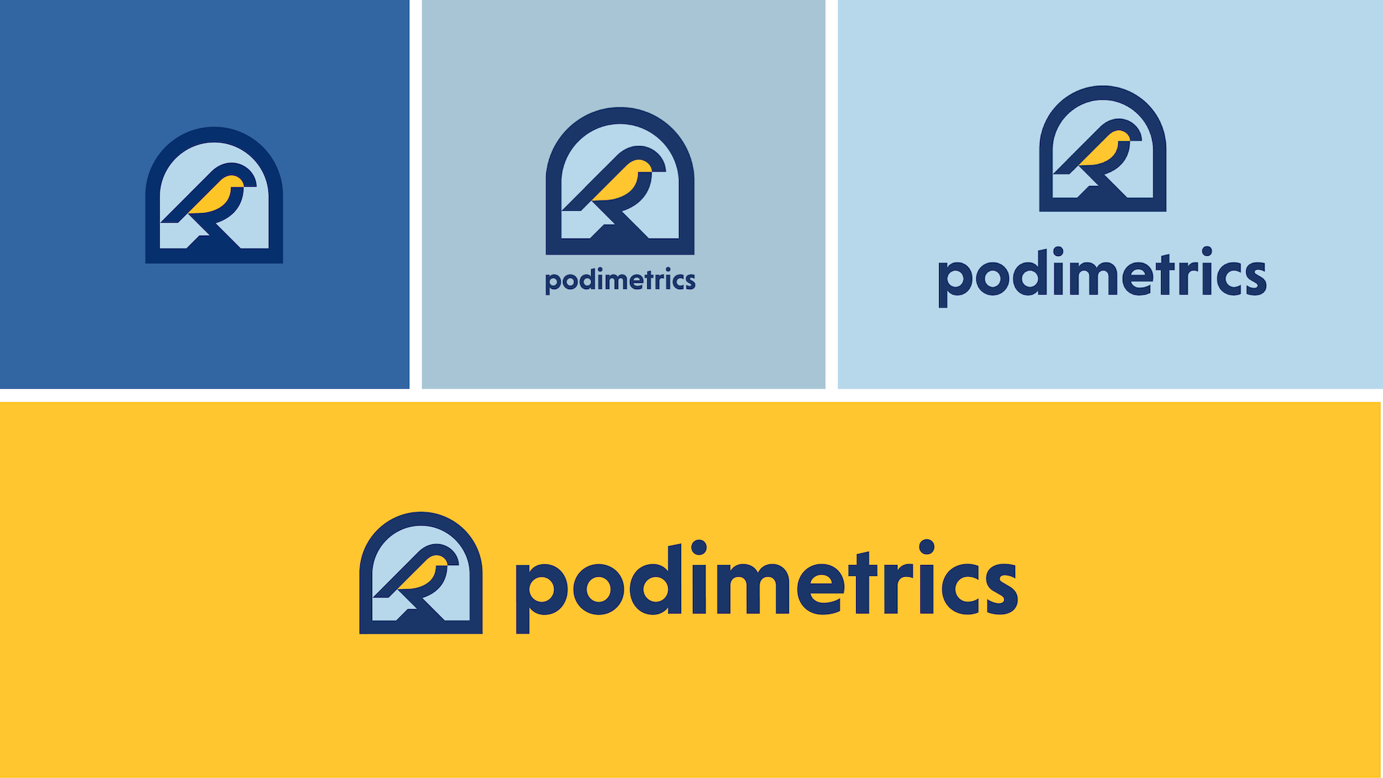
Viewing Podimetrics’ system as something akin to a “canary in the coalmine,” Schaefer used this metaphor to create a consistent brand story that clearly conveyed the benefits of early detection — including the estimate that more than 70% of diabetic foot amputations could be prevented through early detection.
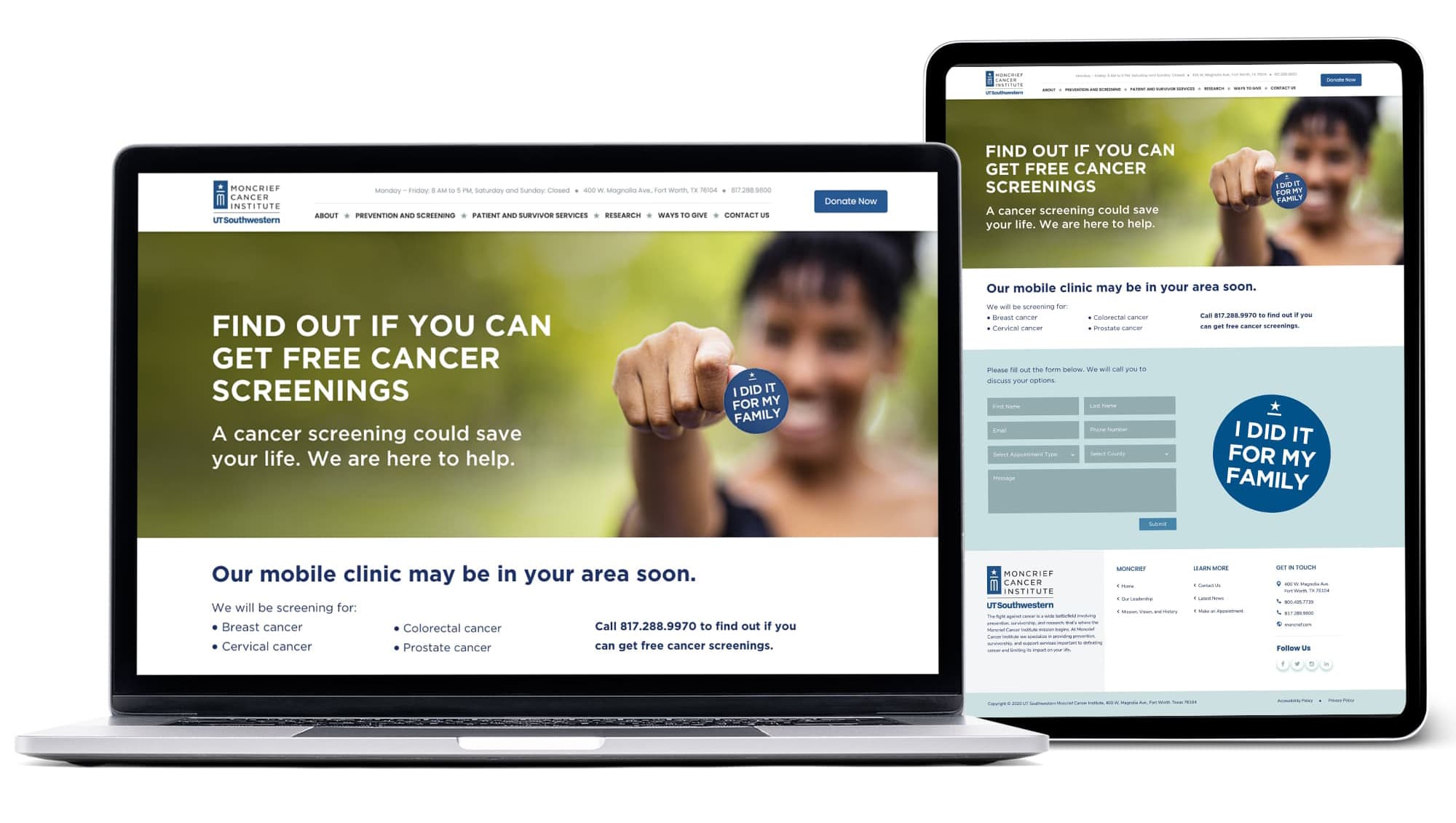
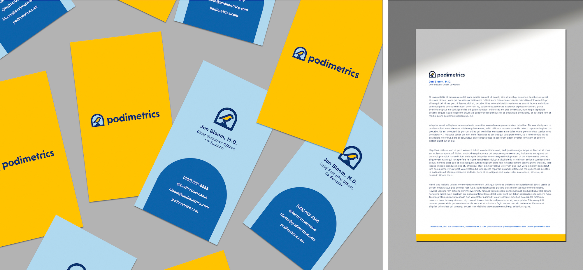
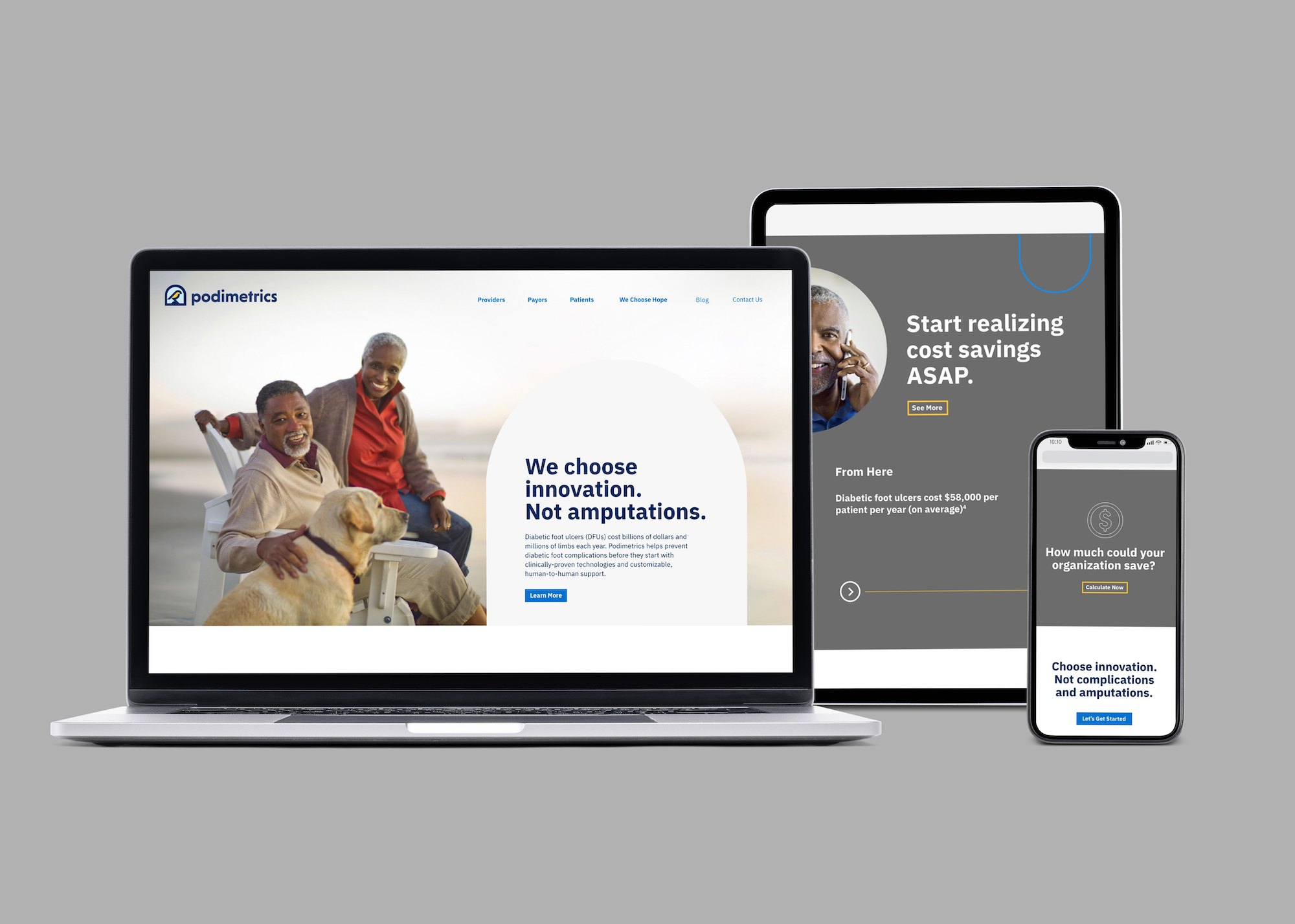
From there, Schaefer conducted a User Experience audit to find opportunities to improve communication throughout the customer journey. We then launched a full suite of materials to support the sales team, including an updated website, product videos, stationary package, and other sales support materials.
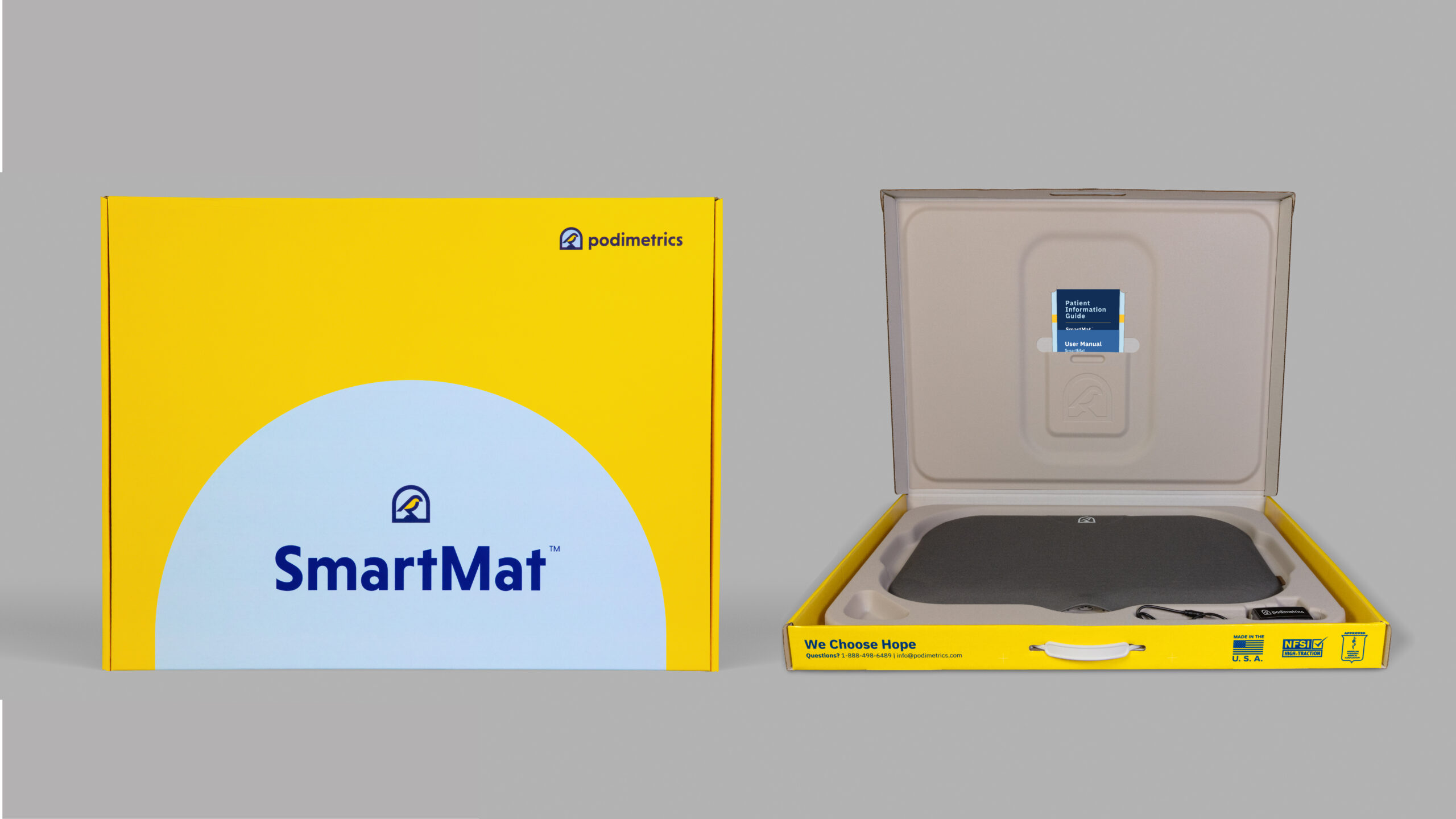
For end users, Schaefer also created product packaging that was as user-friendly as the device itself. Knowing the patient profile was less tech-savvy, we scrutinized every aspect of packaging and product setup to ensure everything remained simple, intuitive and frictionless.
Results
Schaefer effectively positioned Podimetrics as a new, holistic system that uncovers and prevents extremity complications from diabetes. This differentiation is allowing Podimetrics to compete for significant national payor contracts, as well as establish notable partnerships with strategic allies such as the American Diabetes Association.
Summary
For diabetic foot wounds, early detection is essential for avoiding amputation and reducing costs. The “canary in a coalmine” solution helped humanize and simplify a complex technology and gave both internal and external audiences a better understanding of its purpose and its benefit. Today, a growing number of payors, physicians and patients are becoming aware of the potential benefit of the Podimetrics system.