Teeing up a new kind of golf membership
Golf is a timeless sport that brings people together to enjoy camaraderie and pristine, cultivated greens. But, what happens when you add luxury travel and experiences into a premium golf membership? You get Icon Golf – an esteemed golf and travel membership that takes players around the world. Icon needed to revamp their brand to generate more memberships, so they partnered with the Schaefer team to refocus their sales efforts with a full-scale, multichannel digital campaign and a new website.
In 2020, Icon invested in increasing their sales from 250 memberships to 1000. So, they partnered with Schaefer to revamp their brand, generate more memberships, and focus their sales efforts with a full-scale, multichannel digital campaign and a new website to meet their very aggressive goal.
Goals
Grow Icon Golf membership database from 250 to 1,000 in 18 months.
- Refresh the brand identity
- Develop a content marketing strategy
- Build a CRM to streamline lead generation and membership management
- Improve online user experience
- Prioritize sales efforts
Roles
- Strategy
- Creative
- Digital
- Branding
- Positioning
- Client Services
Partnering to Develop a Structured, Integrated Sales Process
We began our relationship with Icon Golf on the ground level as they were initiating the formal development of a structured sales team. This allowed Schaefer to partner directly with the Icon team to merge sales and marketing efforts. Icon’s previous marketing efforts were primarily functioning by word-of-mouth and leveraging connections with existing club members within their portfolio. While this approach was successful, there was an opportunity to expand their sales efforts through digital automation to reach a wider audience.
We started by evaluating each medium against our overall goals and the need to fill the funnel with awareness initiatives and convert interested prospects into members. We found that paid search and streaming audio and video proved successful for building awareness, and third party publication emails allowed us to hit a very targeted audience that was ready to convert.
A Refreshed Creative Platform
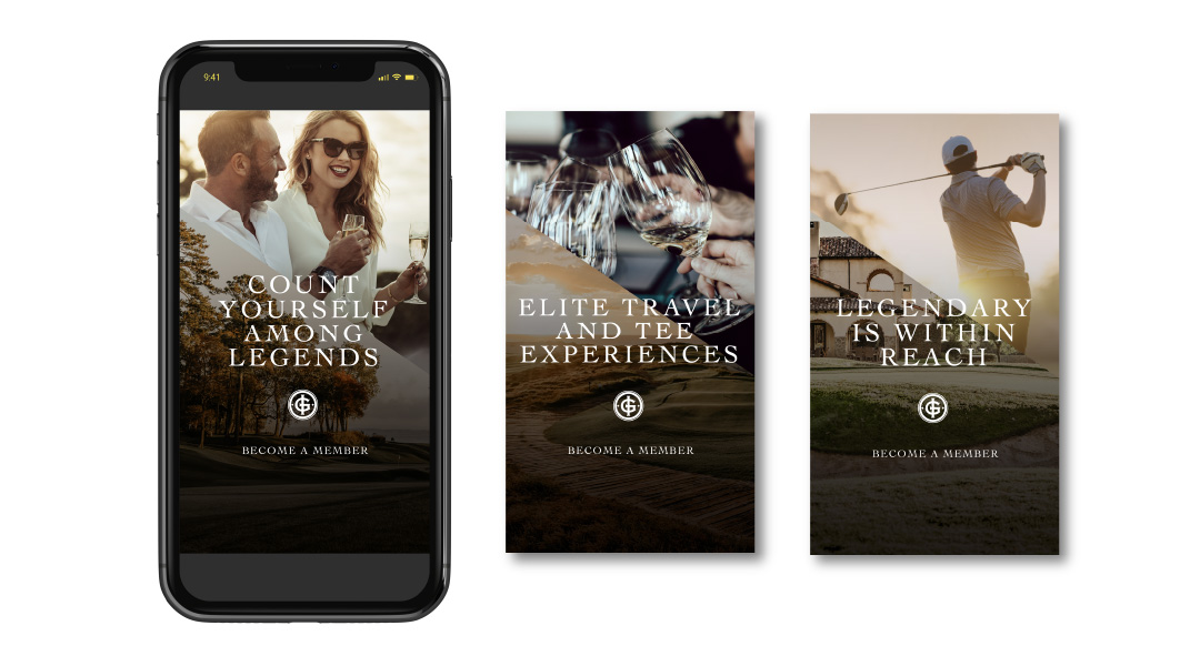
We recognized an opportunity to reinvigorate their creative platform to better communicate the unique benefits that an Icon membership provides. Icon Golf offers members full privileges with an expertly curated collection of private golf clubs as well as luxurious member experiences and fully planned quests to exotic locales. So, Icon Golf is much more than a golf membership – it’s a full-package of golf and travel – and communicating that was the central challenge of updating their creative.
When creating the updated creative platform, we focused on the luxury aesthetic and benefits of an Icon Golf membership. We wanted the design and language to reflect the elevated perks and nature of the membership, all while highlighting the relationship-focused aspect of joining Icon Golf. The camaraderie between Icon members is a key strategic imperative, so we had to make that central in the updated creative deck.
We created the concept “Legendary is Within Reach” as our primary branded language alluding to the potential for legendary moments with legendary people, on and off the course.
A New, Optimized Website
The central piece of Icon’s rebrand was optimizing their website to generate more qualified leads. Previous to our relationship,the Icon Golf website was split into two different URLs – Icon.Golf and IconGolf.com to satisfy internal marketing objectives. However, this split up their traffic and made consolidating valuable lead information more difficult. So, we combined their properties into one streamlined website. To increase the site’s performance, we implemented key SEO and content updates targeted at their primary audiences.
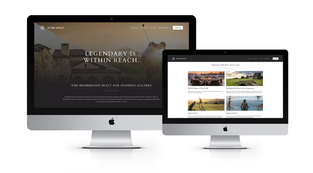
Our team also redeveloped the site with crucial user experience updates to improve site accessibility and usability aimed at generating form fills from qualified leads. To improve usability, we simply added header and footer navigations to improve the overall user experience. In addition, we employed site tagging to capture key user behavior metrics in order to continue to drive future data-driven site optimization opportunities. Finally, we placed CTAs throughout prominent areas of the website so that users could always and easily make direct contact with the reps at Icon Golf. The final result is a website that supports Icon’s strategic marketing goals by generating more engagement and qualified leads.
Creating a Centralized Lead Strategy
To continue to round out the lead generation strategy, we implemented a CRM strategy to accurately target lists of valuable, interested leads with compelling emails. We connected key data sources – the Icon website, MailChimp, and Salesforce as well as other lead collection points to ensure that our data automatically fed into the sales process and reduced the work the sales team needed to do to generate more memberships.

We created a variety of emails around the central message “Legendary is Within Reach” that ultimately guided leads to complete a form fill and capture valuable data for converting more leads.
To round out the digital strategy for Icon, we created a multi-channel paid media strategy that targeted valuable audiences in paid search, paid social media, display banners and email. In addition, we cultivated strategic partnerships with golf publications and outlets to secure high-value placements in front of the most highly qualified audience.
Results
In 2021, Icon Golf had their best year ever, setting a record month for membership sales in December.
- Reached 85% of their new membership goal in under 9 months
- Last Click Attribution:
- 31 new memberships driven directly by campaign paid media
- $450k in revenue
- Total annual revenue surpassed 1.7 Million, resulting in a strong ROAS of 7:1
- Lead Gen Growth in 2021
- 569% increase in form fills
- Web Traffic Growth in 2021
- 453.4% increase in pageviews
- 480.9% increase in sessions
- 485.1% increase in new users visiting the website