Channeling fluid design to improve website ticket sales
Building a website is an opportunity to hone in on specific marketing objectives and create a powerful digital space to engage consumers. We partnered with the Texas Ballet Theater to build a website focused on improving ticket sales through an improved user experience, and design it to share the exuberant spirit and artistry of ballet in its structure.
Goals
- Develop a new website, and shift the focus to ticket sales
- Develop content specifically to help visitors relate to the professional dancers
- Highlight the ballet company and their role in the community
- Create a website that is easy for the organization to update and change season to season through use of internal marketing resources
Defining a Clearer User Journey
When building a new website, understanding how people use it is key to pair functionality with supporting key marketing objectives. For Texas Ballet Theater, we took a deep dive into the popular user paths people take to purchase tickets and sought to understand the user experience. One critical point that we discovered was that there were far too many clicks and exit points between users and purchasing tickets. With that in mind, we defined clearer user paths and designed the structure of the new site to make it easier and quicker for users to purchase tickets.
Strategic Content Migration
As we shifted the new website to focus on e-commerce, we reduced the number of actions it takes to purchase a ticket down to two simple clicks and made the ticket sales portal readily available and visible on each page. To minimize the bounce rate and encourage more time on site, we improved the user flow by reducing duplicate pages and dead ends on the site. We also instituted analytics to track revenue data and connect e-commerce data to the ticketing system to monitor our progress.
The result of the strategic content migration is a streamlined site that is focused on guiding users to purchase tickets and learn more about the Texas Ballet Theater.
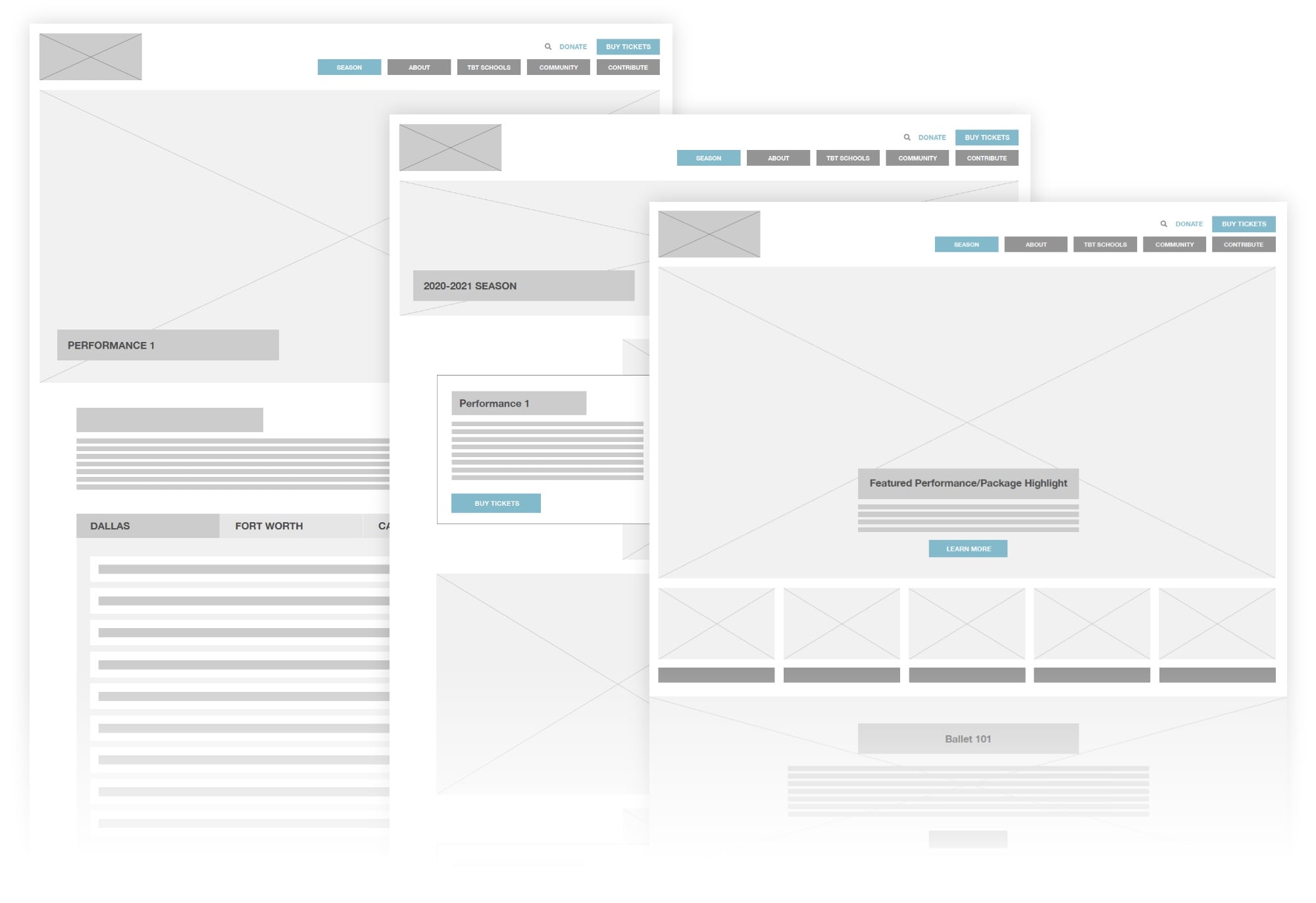
Site Architecture Aimed at e-Commerce
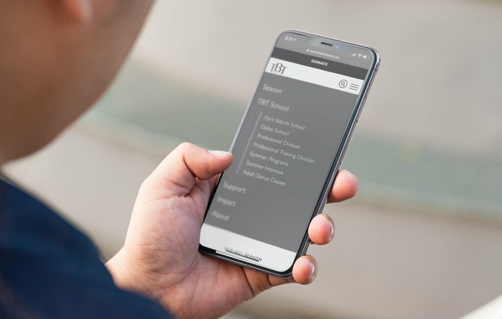
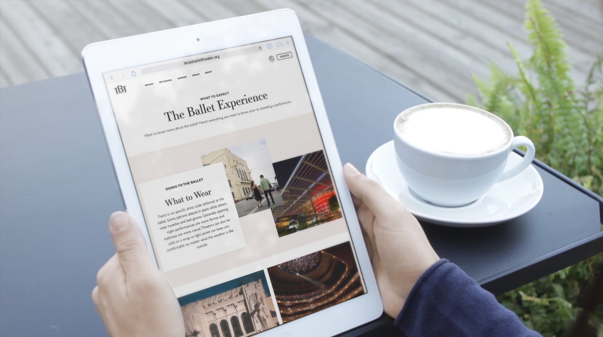
Through discovery and internal research we determined the key objectives were to restructure the site navigation to improve ticket sales, but also educate the public about Texas Ballet Theater beyond their on-stage product. The website needed to promote special events, highlight donation opportunities, and showcase the work that TBT is doing for local schools and young dancer education, as well as their many community outreach initiatives. So, we consolidated the number of pages to make it easier for users to navigate from the homepage to any section they needed and reduced the friction in navigating between pages outside of the homepage.
We carefully considered the different types of people visiting the website and used those personas to help create smoother user paths and a richer user experience for a wider audience.
An Improved Mobile Experience
As with any website redesign, a website needs to offer a seamless experience on desktop and mobile devices. When we designed the mobile site, we wanted to ensure that it served the same primary goal as the desktop version: sell tickets. So, we simplified the website to offer users the primary information through shorter users paths. We also improved the navigational elements to make the site easier to click through on mobile devices.
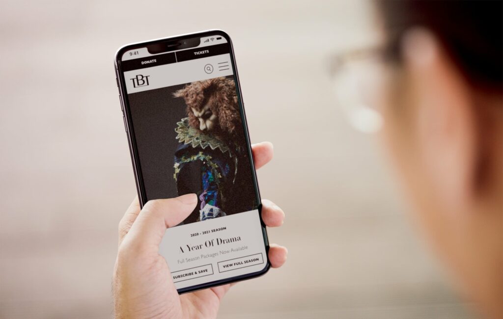
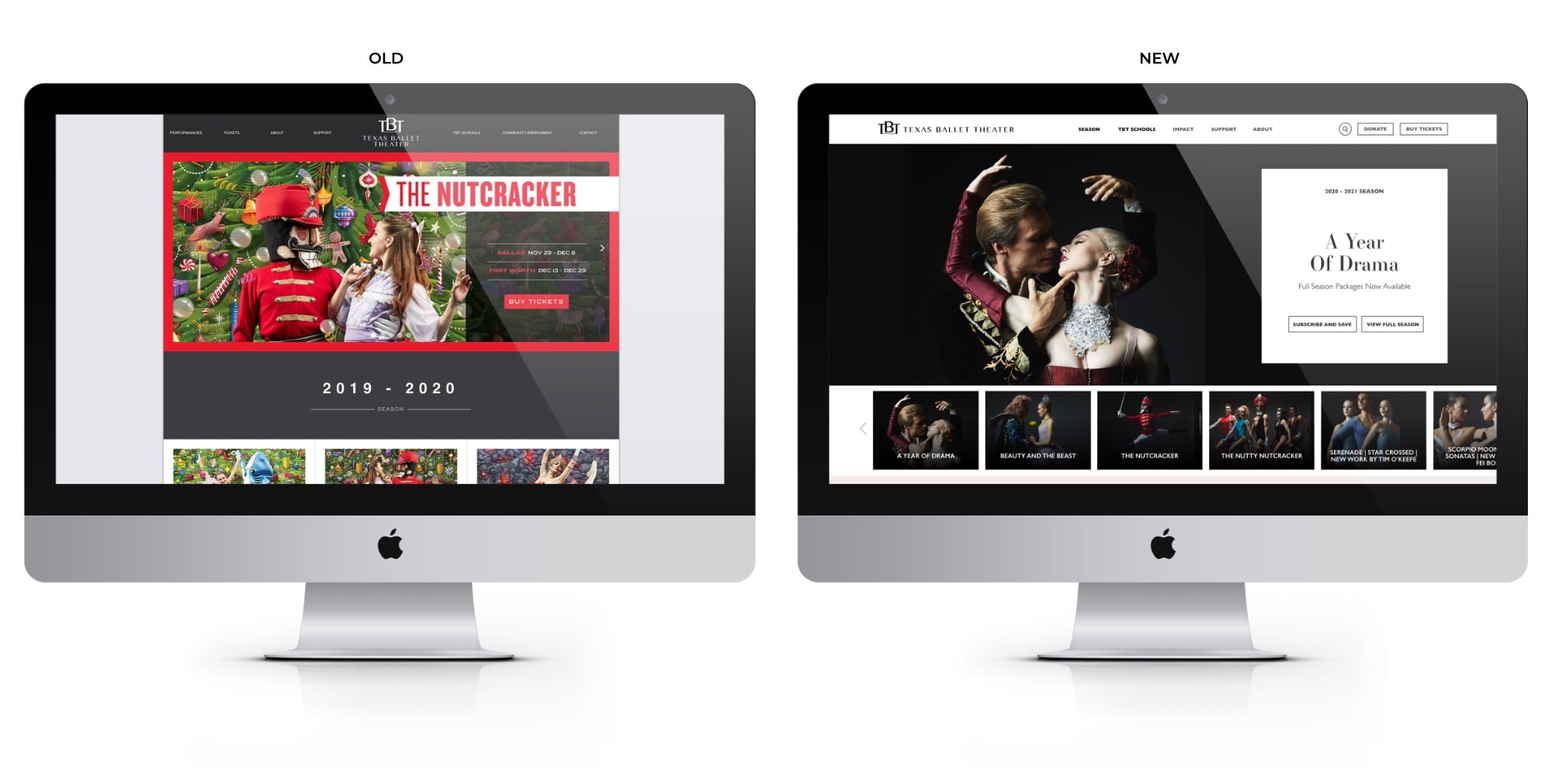
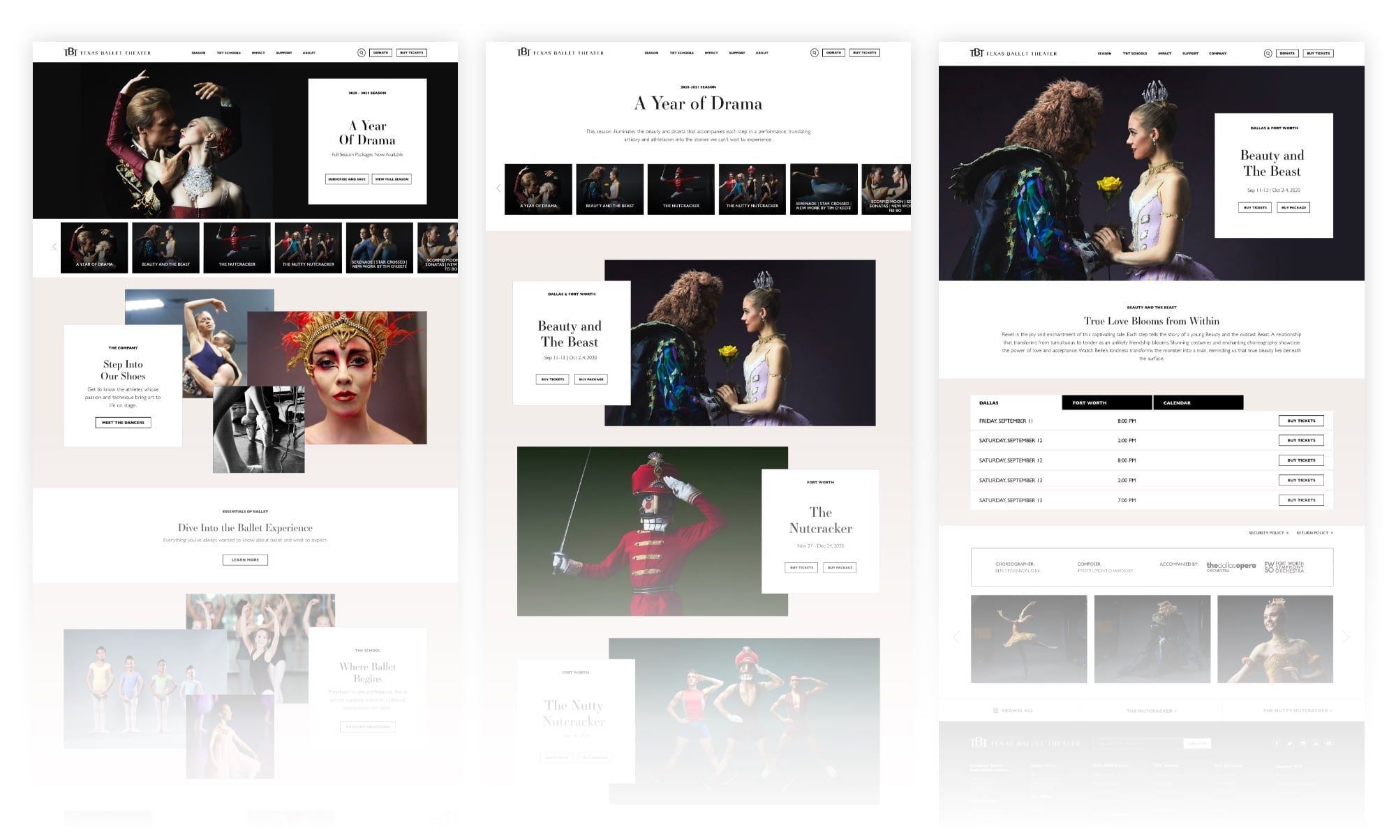
A Website that Communicates the Energy of Ballet
Our team sought to emphasize the spirit of the TBT brand in the final website design so that it was as beautiful as it was functional. Furthermore, we wanted to elevate the performances and dancers so that they took center stage as the visual standouts. We also sought to create a flexible framework for the web design so that each season of ballet felt fresh and exciting without having to undergo significant site construction to update it. The site can easily be updated by the TBT marketing staff, and it’s flexibility allowed for quicker performance updates during the pandemic.
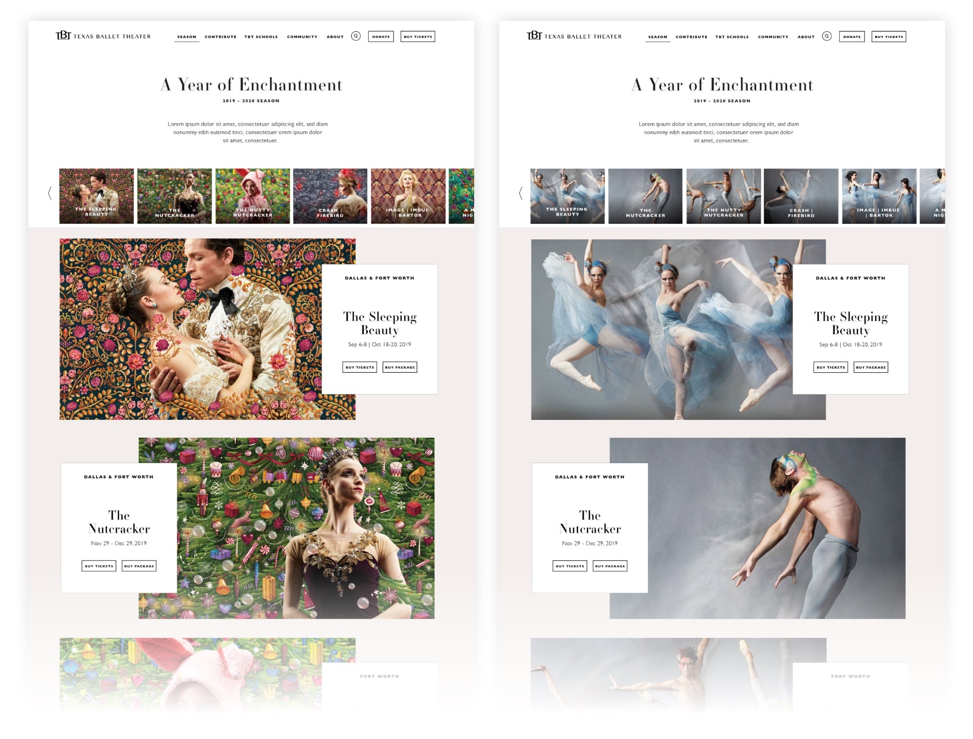
Visually, the new website is driven by photography and highlighting the dancers. We elevated the typography choices and color palette to reflect the modern aspects of TBT so that the pages moved beyond the season and established TBT’s brand. To communicate the dynamic movement and energy of ballet, we used a non-traditional structure that fluidly moves users down the page. The final website design is one that balances form and function while standing as a testament to the fundamental motion of ballet.
Results
The total volume of site traffic was impacted heavily in 2020 as a result of COVID-19, which also led to multiple performance cancellations. However, 2020 metrics still indicate significant increases in overall website performance.
- More users clicked to purchase tickets to The Nutcracker 2020 compared to The Nutcracker 2019.
- In December 2020, more than double the number of users clicked from The Nutcracker 2020 page to purchase tickets compared to the same page in December 2019.
- Behavior flow to purchase tickets improved, with users entering the ticketing platform within just 2 clicks, as compared to 3+ clicks on the previous site.
- Improved time efficiencies for updating the website, saving on future and ongoing web development
- Incorporated pages where TBT can share about their artistic direction, where they’re going as a company, add their personality