Transforming Tradition into a New Experience
Zoo Ball is the Fort Worth Zoo’s premier fundraising event, bringing donors together for an unforgettable night in support of wildlife conservation. For over a decade, Schaefer has been entrusted with establishing the theme and creating an invitation suite that sets the tone for the event, which includes a save the date, invitation, and auction guide. Every year, Schaefer embraces the opportunity to push creative and production boundaries—ensuring that each year’s invitation surpasses the last.
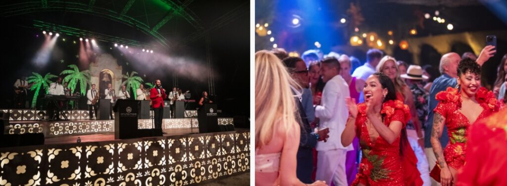
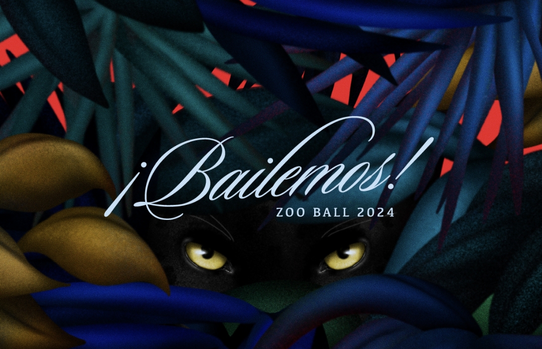
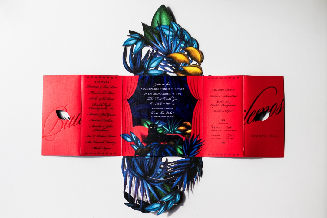
For 2024, Zoo Ball embraced the energy of Latin nightlife with the theme ¡Bailemos!, a celebration of rhythm, energy, and movement. The challenge was to craft an invitation that didn’t just inform, but immerse, recipients in the event’s vibrancy before they even arrived. The team set out to create a piece that would surprise, delight, and demand attention.
Bringing the Theme to Life Through Design
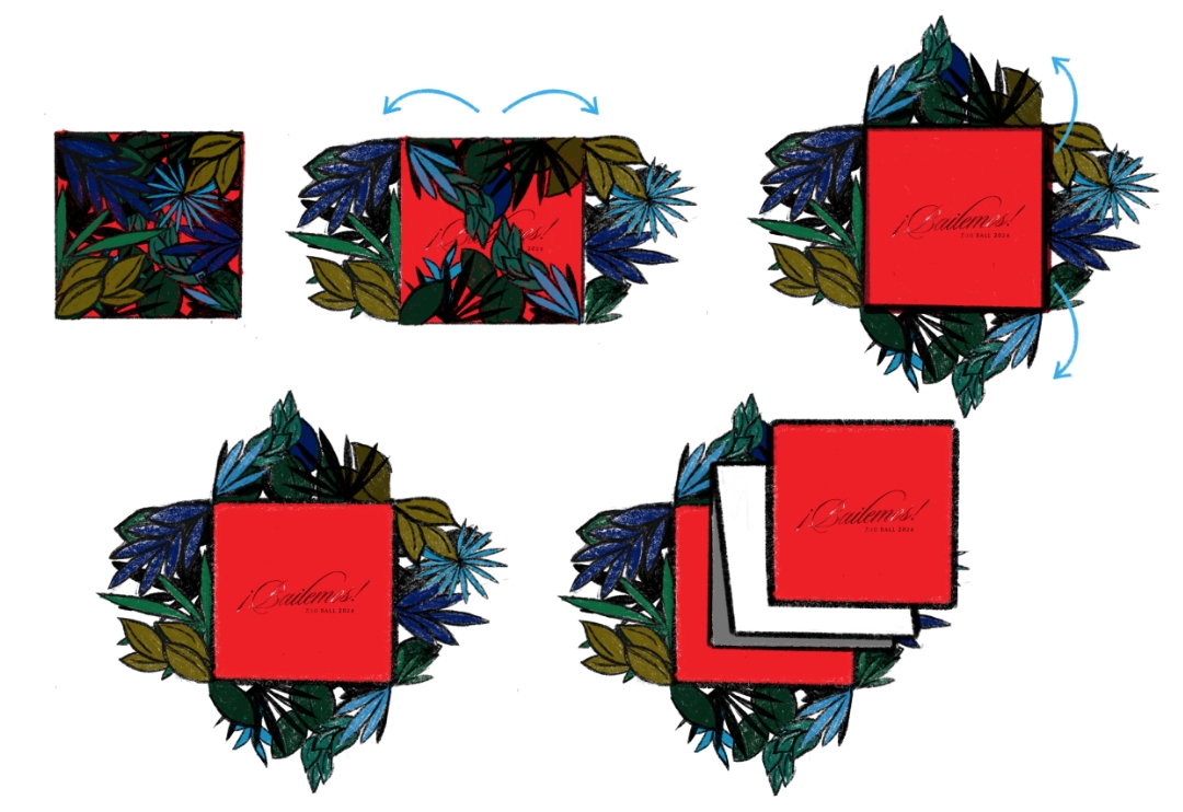
Rather than a standard invitation, Schaefer envisioned an interactive piece that unfolded like an experience, building intrigue with each layer—just like stepping into a dimly lit nightclub or walking through a forest at dusk. The design needed to be bold yet elegant, moody yet vibrant, immersive yet refined. The black jaguar—mysterious and powerful—became the focal point, symbolizing the intrigue of the night and connecting back to the Zoo’s animals.
To execute this vision, the team developed a multi-layered, tactile print piece using specialty production techniques, custom illustrations, and premium materials. This wasn’t an invitation to simply open—it was meant to be discovered, revealing hidden details as recipients engaged with each element.
A Bold Vision Brought to Life
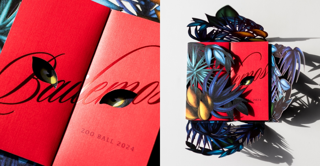
The final invitation was an experience in itself. A custom-converted envelope introduced the theme with rich illustrations and a soft-touch laminate finish, inviting engagement from the start. Inside, an intricate laser-cut outer shell framed the invitation, offering glimpses of the vivid red interior beneath.

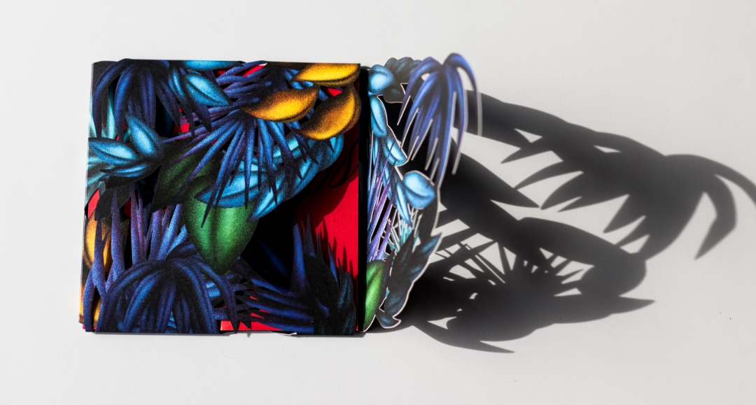
Opening the gatefold invitation, the jaguar’s piercing eyes appeared first through die-cut typography, creating an air of mystery. As recipients unfolded the piece, the full jaguar emerged, surrounded by lush, hand-illustrated foliage in deep blues and greens. Clear foil detailing on the jaguar’s eyes enhanced the dramatic effect, reflecting light as if the animal itself was watching.
Meticulous attention to production ensured the invitation felt as premium as it looked. Schaefer collaborated with expert print partners to perfect paper stocks, die cuts, and layering techniques, using Neenah Classic Crest linen paper and laser die-cut detailing to create a high-end experience that was as stunning to hold as it was to see.
Beyond an Invitation—An Unforgettable Experience
From the moment recipients received it, the invitation sparked intrigue and excitement, mirroring the energy of ¡Bailemos!. The layered unfolding process and striking red interior left a lasting impact, making the invitation more than just an announcement, it became a keepsake. Schaefer’s dedication to precision, storytelling, and craftsmanship ensures that each year’s invitation is more ambitious than the last. Schaefer continues to push the limits of creativity and execution, proving that an invitation can be an experience in itself.