Schaefer Advertising Co.

Healthcare

When COVID-19 first struck the United States, people weren’t sure what to think or how to appropriately respond. This left a void of reliable information, and The University of North Texas Health Science Center at Fort Worth – a medical research center and university – saw an opportunity to step forward as a reliable source of scientific information that people could trust. Since the Health Science Center had recently unveiled its rebranding efforts, the timing was perfect to build awareness and positively impact the community.

Avoiding Fear and Promoting Optimism

The public is saturated with dire warnings and doomsday scenarios about COVID-19. While the health and safety intent is noble, many of the messages cause stress, anxiety, and fear, and the emotional effects of these campaigns can muddy the facts and leave the community confused about the realities of COVID-19. The situation required someone to step up, take the lead and empower the people of North Texas with reliable messages and accurate information about COVID-19. Instead of creating something that leads to confusion and fear, why not urge optimism through clear information and encourage preparation?

Producing Against a Deadline and Beneath Quarantine

The seriousness of the coronavirus required truly timely messaging. With that urgency in place, our team had to be nimble and responsive and put together a comprehensive campaign that would inspire community-wide participation in safer lifestyle changes. To complicate matters further, we earned this new business opportunity while our entire team was in the first stages of working remotely and adjusting to the new normal of professional life under quarantine. These circumstances challenged us to strategize quickly, and the nature of creating accurate messages about COVID-19 implored us to execute with extreme accuracy.

Goals:

  • Change attitudes about living during a pandemic from fear to resilience.
  • Educate and empower cautious optimism and offer practical and informative guidance and resources.
  • Leverage the credibility of HSC as the messenger and aggregator of content.
  • Expand HSC’s influence on North Texas by positioning them as dependable sources of reliable information about COVID, and healthcare at large.
  • Improve HSC’s brand awareness and impact in North Texas.

The Solution

COVID-19 is a serious disease that requires people’s earnest respect. Unfortunately, that has created an atmosphere of negativity, and disempowerment that makes people feel like they’re being told what they can and cannot do every single day. People are worried about their jobs, concerned for their family and friends, and lack a clear direction and information about where the situation is heading.

The pervasiveness of negativity and the ultimate feeling of powerlessness led to the creation of the COVID DAYxDAY campaign, which empowers people to be optimistic and pragmatic during these uncertain times. When we created this campaign, we wanted to change the public’s general attitude from fear to resilience. We understand that people feel down, powerless, and pessimistic about the future, so our challenge is to help our community get through this one day at a time – and that’s where DAYxDAY was born. Our ultimate goal is to meet our audience where they are emotionally, and encourage a positive attitude shift with hope, optimism, and science-based guidance that can protect the individual – and our community – from the coronavirus. We needed to do all of this while under a brief, three-month campaign period. 

A Comprehensive Educational Campaign Tailored for North Texas

We built the DAYxDAY campaign with the guidance and partnership of the Health Science Center team. DAYxDAY provides north Texans with reliable information about how to safely navigate the world during the pandemic and offers important community updates to the people of North Texas. In fact, education is at the heart of the DAYxDAY campaign, and one of the core objectives is to encourage healthy lifestyle changes to help prevent the spread of COVID-19. To centralize this information, we created coviddayxday.com – a microsite under the Health Science Center umbrella purely focused on sharing COVID-19 content.

We formed strategic partnerships with Texas news leaders like The Dallas Morning News, Fort Worth Star-Telegram, and local organizational partnerships with the City of Fort Worth, Visit Fort Worth, the Fort Worth Chamber of Commerce, United Way of Tarrant County and Camp Fire First Texas to tap into relevant supporting content and leverage our partners’ audience for improved campaign exposure. To ensure that we shared a wide breadth of valuable information, we carefully selected the type of content we shared from each partner so that we could create a comprehensive informational hub tailored to the needs of North Texans.

Our campaign content matrix uses a blend of organic content, partnership content, paid and organic social media, and earned media to make certain that our message reached the widest local audience possible. Furthermore, the microsite exists in English and Spanish to better communicate with a third of North Texas, which is Spanish speaking.

Tactical Activation:

  • Developed a fully integrated digital campaign to build awareness and drive traffic to the Health Science Center’s COVID-19 resource page.
  • Built a new microsite to consolidate and share relevant COVID-19 content.
  • Encouraged opt-ins and built an integrated CRM and text audience.
  • Developed new content and repurposed existing content through the new microsite.
  • Continued awareness-building and built opt-ins through multiple digital platforms.
  • Expanded geographic targeting to cultivate a larger audience for UNTHSC and make a larger impact on the community.

Results: In just 3 months, the DAYxDAY campaign generated:

  • Nearly 10 million media impressions served
  • Over 1 million people reached through social channels
  • Over 100,000 pageviews on the COVID DAYxDAY website
  • Over 70,000 unique website visitors
  • Email, display advertising and paid social media performance each greatly exceeded industry benchmarks

An Ongoing Battle

The coronavirus pandemic is far from over, and we’re still working to encourage people to take the necessary preventative measures to protect themselves and our community. It’s an honor to be part of a creative campaign that educates and empowers our North Texas home, and we feel fortunate to play a role in helping to keep our community safe and healthy. As a result of our shared success, we’ve expanded the initial campaign agreement into a broader, long-term initiative for the UNT Health Science Center at Fort Worth.

One of the most thrilling challenges is helping a client launch a new product, which is exactly what we did for the TearCare® system by Sight Sciences.

Goals

  • To introduce a new brand to a growing market
  • Capitalize on a market opportunity with disruptive technology
  • Improve the lives of patients by getting a new product that targets the underlying cause of dry eye into the hands of eye care professionals

Analyzing a New Market

Before launching any new product, it’s critical to have a deep understanding of the landscape and the potential competitors or challenges within the market. For TearCare®, we performed a thorough analysis, through both primary and secondary research, of the overall healthcare environment, the eye care submarket, the competitive set and TearCare® ’s differentiating attributes. We came away with some incredibly useful data.

There are 40 million dry-eye sufferers in the United States, and of those, 86% have some component of Meibomian Gland Dysfunction (MGD). We discovered that most of the existing dry-eye devices are cumbersome to administer to patients, take the precise control out of the doctors’ hands and are expensive for a practice to adopt.

Because of the way TearCare® was designed, and its philosophy to address the root cause of dry eye with a combination of leading-edge technology and doctor skill, we saw this is a huge position of value for TearCare® – and that’s where we began crafting our strategy.

A Different Kind of Healthcare Product

Traditionally, the treatment of dry eye disease has been done with large pieces of stationary equipment that requires the patient to keep their eyes closed and doesn’t fully allow the eye care provider (ECP) to fine-tune the procedure to their specific needs.

Even newer entrants into the market addressed the condition in impersonal or intimidating ways, potentially leaving the patient and the ECP with a sub-optimal approach. In addition, the market leader is incredibly capital intensive and presents a challenge to eye care practices to meet their business goals. These conditions created a perfect combination for a company and a new device to address dry eye differently.

Enter TearCare® – the most unconstrained way to target the underlying cause of dry eye – and make real headway – in evaporative dry eye disease.

TearCare® is the world’s first blink-assisted device that applies heat to the eyelids to remove blockage associated with Meibomian Gland Dysfunction. It’s a wearable, blink-assisted design that offers a universal fit across various patient lid anatomies and delivers consistent thermal energy to prepare meibum for clearance by an ECP. It does so in a system that doesn’t require a steep financial investment in a large piece of equipment. All of this informed the final positioning of giving healthcare providers and patients freedom.

Launching a Product to Disrupt the Market

Launching a brand-new product is incredibly exciting but introducing one that will make the entire market take notice can be exhilarating.

We helped take TearCare® to market with a fully integrated marketing and advertising strategy that focused on the freedom TearCare® gives patients and ECPs, differentiating the device from others in the space.

We utilized a blend of paid, owned and earned media channels to deliver the primary campaign messaging. We designed a new website to act as the central hub of information about TearCare® and helped educate healthcare professionals about the new device with trade show activation, sales support materials, and practice-building resources.

This entire campaign was aimed at educating ECPs, introducing them to a new way to treat MGD, and helping them get the device and training needed to begin helping patients. As the campaign began to rollout, the results were astounding.

Results

  • Brought brand new, disruptive product to market
  • The number of new accounts opened in year 1 was 3 times that of the nearest competitor

Make Life Better

Healthcare work is always incredibly rewarding because it allows our team to help connect healthcare professionals to patients in need. For Sight Sciences’ TearCare® device, we were able to help connect healthcare professionals to a new device that targets the underlying cause of dry eye and make life better for those suffering from a chronic degenerative disease.

Most prescription savings cards cover a narrow scope of treatments, which overcomplicates the savings process. As a result, patients are often left confused about how to redeem savings and may end up actually paying more for their prescriptions. Discounts change frequently and branded products are not always covered, leading to patients and providers losing confidence in the cards and programs themselves.

Galderma CareConnect is a patient savings program that consolidates Galderma’s prescriptions into one savings portal that’s accessible for patients and “Remarkably Simple” to use.

Goals:

  • Build awareness of the savings program among qualified patients.
  • Make the program easier to access for patients.
  • Inform more potential patients about their eligibility for the program.

Strategy & Execution

Schaefer led the Galderma CareConnect launch with a few key strategic imperatives: communicate the scope of Galderma prescriptions covered under the program and quickly build awareness of the program among patients, healthcare providers, and pharmacists. We developed a comprehensive, multi-channel campaign around the tagline “Remarkably Simple.” This included traditional advertising, digital ads, video, paid digital media, display targeting, customized email marketing as well as personal and non-personal sales support.

Connecting Patients with Care

At the core of this comprehensive campaign was GaldermaCC.com, a centralized location for information about the savings program. The site was strategically developed to communicate key information to each of our core audiences:

  • Patients – Information about savings, ease of use and a great opportunity to quickly download a GCC card.
  • Healthcare Professionals – Key points to share with their patients when prescribing Galderma products, information about pharmacy access and a portfolio of products on the card.
  • Pharmacists – Information about patient eligibility.

The website follows a clean design and user-friendly navigation to make the user experience just as “Remarkably Simple” as the Galderma CareConnect program itself. In addition, the website utilizes a seamless API to connect directly with the card provider, so that a unique card can be generated in just seconds when the user chooses to download.

By making this direct connection, we are able to utilize technology and data to measure card redemption rates at pharmacies across the country and measure the success of marketing campaigns in market.

Results

  • In less than two years, Galderma Care Connect site metrics have steadily climbed month after month.
  • To date, Galderma Care Connect has reached more than one million unique patients.
  • As of June 2019, more than 3 million prescriptions have been processed through the Galderma Care Connect portal, saving patients, healthcare providers, and pharmacists valuable time and money.
  • MM&M Gold Award for Best Payer Marketing.

Make Life Better

Navigating healthcare can be a confusing process for patients and even some healthcare providers. By creating the Galderma CareConnect website, we were able to help more people download a patients’ savings card and connect them with more affordable care.

The Situation

Apps are everywhere and ever-reaching into the little nooks of our lives to improve some aspect of our experience. Want to plan your meals by the cycles of the moon? There’s an app for that. Want to order delivery Thai food without having to speak with someone or exchange cold hard cash? There’s an app for that. Want to have a group light-saber battle with your friends and family and divide the group among Jedi and Sith? You get the idea: from fun to food delivery, apps are diverse and serve a variety of functions. But, there’s a decided lack of apps on the market that support someone in their struggle against acne – until now.

Epiduo® Forte Gel Helps Teens and Their Dermatologists Manage Acne Treatment

Epiduo® Forte Gel (adapalene and benzoyl peroxide), 0.3%/2.5% is a once-a-day prescription topical acne medication with two active ingredients—adapalene and benzoyl peroxide. The powerful combination works together to treat tough acne and help prevent recurring acne from forming by unclogging pores and killing bacteria. Epiduo® Forte Gel had an existing app on the market called “epi-tracker,” but they were in need of a new set of eyes and a complete application refresh that really engaged users and retained their attention to the app. They wanted something that was user-friendly, and an app that partnered with healthcare providers to bring about better products and services.

When acne patients visit their healthcare providers, there is rarely enough time for the patients to become educated on their acne, or how best to treat it. In addition, it is crucial for acne patients to use products as directed to see a change in their condition. So, our app needed to continue to educate patients about their acne and encourage them to maintain their Epiduo Forte treatment plan to best manage their skincare.

Goals

  • Drive new myForte app downloads.
  • Drive consistent user engagement.
  • Educate acne patients about best practices for their skin care.
  • Encourage people to use the app daily to achieve desired results.
  • Make myForte a valuable, reliable resource for acne patients that use Epiduo® Forte Gel.

Approach

Going into the project, we knew that the patients using the myForte app were in a vulnerable state. Living with acne is a very personal battle that can have a powerful, negative impact on those suffering from it. So, we wanted to build an app that supported patients in their pursuit to treat their acne and gave them confidence to take control of their acne.


The Creative

Before kicking off the app, we needed a name. To quote Shakespeare (sorry), “What’s in a name? That which we call a rose by any other name would smell as sweet.” While we agree with big Bill, naming a healthcare app can be tricky, mostly because healthcare nomenclature can sometimes be incredibly sterilized and devoid of emotion, but treating acne is not an emotionless battle. We wanted a name that reflected the user’s personal stake in their health and one that empowered them to treat their acne. We ultimately chose “myForte,” which gives the user ownership of their acne and its treatment. It also plays on the word “forte,” which denotes a person’s strength or positive abilities. When added together, “myForte” gives the user confidence that they can treat their acne, and that they’re going to do a great job in the process.


One of the biggest hurdles for those battling acne is staying consistent in their treatment, and regularly applying their medication. So, we built an app that gave patients the resources and reminders they need to stay on track to achieve the best results. We developed daily motivational messages that send users motivational messages to keep them engaged with their acne treatment.

All of the positive reminders and tips are paired with illustrations that take place in natural settings for the teen or young adult patient. The illustrations are inclusive of everyone facing acne. It was important to us that we didn’t bombard users with real acne imagery, which can be discouraging to see all the time.

Additionally, we felt that it was important to give users the ability to track their progress, which helps them see their improvement and gives their dermatologist the ability to observe their journey during follow up visits. We built in a calendar function that helps users track when they applied Epiduo® Forte Gel, but also asks them to record how they feel about their skin each time they interact with app. This way, we’re encouraging users to stay engaged with the app and to take time to reflect on their progress.

The split view function of myForte allows users – and their healthcare providers – the ability to measure the patient’s progress against any picture they’ve taken in the app. This small function is incredibly powerful for helping people track their progress and gives their dermatologist a larger view of their total improvement.

The Results

  • Over 87,000 downloads
  • Over 250% increase in app downloads each month
  • 40% User return rate
  • Over 15,000 progress photos captured
  • Over 16,000 feelings recorded
  • Over 100,000 profile attributes collected

Making Life Better

It’s easy for patients dealing with acne to feel downtrodden and made helpless by their skin condition. Often, these people have struggled with acne for years and feel like they’re out of options. When we created this app, we wanted to help patients suffering from acne take ownership and control of their acne treatment. With the myForte app, patients have the education and encouragement they need to confidently tackle their acne with a smile.


October 22, 2019

Succeeding in simplicity

When Sight Sciences approached Schaefer to help launch their new OMNI® Surgical System , we set our eyes on the prize and got to work.

The OMNI Surgical System Breakthrough

The OMNI Surgical System by Sight Sciences is a ground-breaking solution for ophthalmologists that allows them to perform two different procedures on patients who need intervention in the conventional outflow pathway. It also allows surgeons to treat patients who had prior cataract surgery where they couldn’t before. That’s a long way to say, OMNI does something no other device on the market can. Clearly, we were looking forward to the challenge of launching the new OMNI Surgical System.

The Campaign

Devising core brand messaging takes hours of research, strategy, discussion, and countless iterations to finalize a succinct message that cuts through the noise of a competitive space. Ultimately, we selected the core brand message of “Intelligent design meets the proven pathway,” which is a powerful message to ophthalmologists. It speaks to OMNI’s ability to impact 360-degrees of the conventional outflow pathway with one device, which was impossible in prior devices, making the procedure much more convenient.

New Identity

Since OMNI is the next generation of two previous devices, it required a new identity and logo that represented the innovation and elegance of the new and improved OMNI Surgical System.

We created a mark that conveys the functionality of the device and nods to the shape of the eye. The single circle represents the unity of the OMNI device, while the two circles contained within point to the two procedures it empowers surgeons to perform. When added together, the three complete circles illustrate the three points of resistance in the conventional outflow pathway which can be navigated by the new OMNI device.

The Results

Launching a new ophthalmic product is no easy feat, and the Sight Sciences team was looking to make a splash in an extremely competitive landscape. The new OMNI device launched in September of 2018, and because of its quality and utility, quickly gained traction from surgeons.

OMNI released their new device with incredibly lofty sales goals for the first quarter of 2019. We’re proud to have helped them meet their goals sooner than expected, and place the new OMNI device among the top tier of surgical devices for ophthalmologists in record time. Now, the industry is taking notice and key industry thought leaders are singing the praises of the OMNI device, which only solidifies its place as one of the leaders in the market.

Making Life Better

Schaefer Advertising is always searching for ways to use our work to make life better, and it’s clear that the new OMNI surgical system can have a large, positive effect on many people.

Before OMNI, ophthalmologists would have to use multiple devices to achieve the same end goal. OMNI provides an elegant solution for ophthalmologists and its dual-purpose design makes it an excellent option for treating a wider range of patients. OMNI gives surgeons a powerful way to help people address a sight-threatening condition.

The Latin rule of three “omne trium perfectum” is the principle that good, often great things, occur in threes. The Three Amigos, tricycles, and three-piece suits are just a few examples of great trios, but three’s excellence can extend into the advertising world and shape how brands communicate their key messaging.

The Goal – Engage Sales Team Around Core Brand Messaging

Soolantra Cream is a prescription skin care product for the treatment of rosacea. To improve overall sales, it was important for Soolantra’s sales team to understand the three key benefits Soolantra had over its direct competitor.

The Three Benefits:

1 – Soolantra is dual-purpose and can treat both inflammation and symptoms of rosacea.

2 – Soolantra is superior to direct competitor MetroCream, and proven so by multiple studies.

3 – Soolantra is non-irritating, and highly tolerable.

By memorizing these three benefits, the sales team would be able to better communicate with dermatologists and help get Soolantra to more patients.

Fun is Perfectly Acceptable

We set out with a tall task – creating something memorable that swaths of salespeople could use in their everyday sales routine. We wanted to grab their full attention, and reinforce the three benefits Soolantra has over its direct competitors. So, how do you break through the calamity of the day-to-day, and stand out among numerous notifications and piles of paper? By creating something fun.

The Work

We stretched the idea of fun into three distinct ideas and were expecting Soolantra to select one concept. But sometimes life unfolds in surprising ways, and that’s what happened when the client decided to choose all three concepts.

Tr!o Tr!v!a

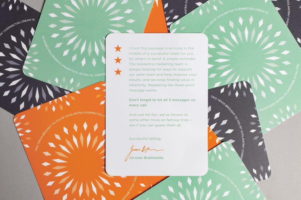
Can you name the three types of ice cream used in a sundae? Can you recall the famous, fictional French trio that stood guard for Paris in the 19th century? Tr!0 Tr!v!a encourages the mailer recipients to play along in a fun trivia game that covers famous trios in pop culture. The card game engages people in a light-hearted manner, and asks them to dig into their cultural grey matter to uncover the right answers.

Go For Three

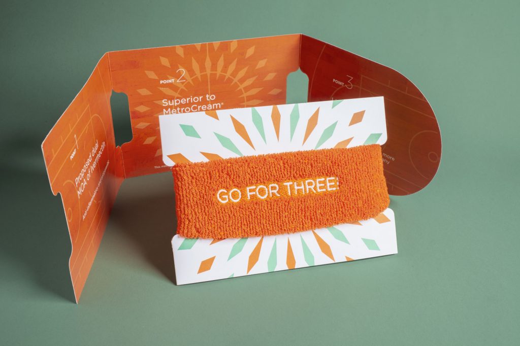
In basketball, there’s no greater glory than hitting a perfect three-point shot from the top of the arc. For the Soolantra sales team, that glory is re-created when they close a sale using the three key sales points in the core messaging. We wanted to play on “going-for-three,” and used the headband as a fun reminder of the core messaging. The tri-fold insert unfolds to display the messages on a paper basketball court. The whole piece is a testament to threes and reminds the team to hit all three sales points.

Soolantra Cream Three-Ring Circus

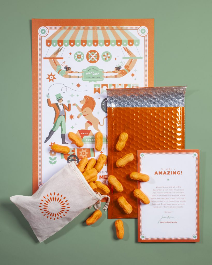
Just as Soolantra has three key sales points, our three-ring circus has three acts to remind the sales team about its benefits. The dual-purpose action of Soolantra is embodied by twin trapeze-artists, and its highly tolerable nature is represented by a tamed lion. The fact that Soolantra is superior to MetroCream is displayed as a strong man easily lifting a barbell, visually pointing to Soolantra’s strength. The poster was accompanied by Circus Peanuts, which just so happen to fall into Soolantra’s brand colors.

The Soolantra Three-Ring Circus mailer is concise and clearly communicates the core messaging in a light, and engaging way. We were proud when it earned a Gold Addy in 2018.

Celebrating the Brand

Since the target of our mailer were employees of Soolantra, we wanted to find pride in the brand.

Each mailer is sealed in a bright orange, padded envelope. This proclaims to each recipient that the enclosed items are anything but ordinary. The contents of the individual mailers are all branded with Soolantra colors, and each piece reaffirms the core messaging with ease. All of this is a reminder to the person opening the mailer that Soolantra is an exciting brand that is willing to have some fun.

Making Life Better

By incorporating some fun into healthcare messaging, we were able to capture the attention of the Soolantra sales team, and helped them improve on communicating key brand messaging. This allowed them to reach more patients by convincing dermatologists that Soolantra was the superior rosacea treatment.

It’s important that those suffering from the symptoms of rosacea can get therapeutic treatment that is pain-free, and helps them combat the chronic skin disease. We were proud to create a mail campaign that could help our client share their products with more patients, and ultimately help more people to feel confident in their own skin.

More than 9 million Americans battle psoriasis every year, and many of them aren’t happy with their treatment options. Fort Worth-based biotech company Nuvothera recognized a market opportunity for a more effective over-the-counter (OTC) psoriasis treatment, so they created a powerful three-step solution that patients could purchase without a prescription. Schaefer was charged with branding the new product and encouraging patient adherence. 

Goals:

  • Drive brand awareness, interest and online purchases among the target audience
  • Generate audience interest
  • Establish trust and credibility of Prosoria
  • Motivate consumers to buy Prosoria online
  • Build customer loyalty and drive repeat purchases

The Situation

Most people that suffer from psoriasis share a general dissatisfaction and skepticism with their current treatments and their over-the-counter options. They are constantly seeking something to treat psoriasis effectively and help them stay clear by preventing flare ups. They’ve tried other solutions – both prescriptions and OTC – but they haven’t found the treatment that’s right for them. 

Enter Prosoria. 

Prosoria contains clinical-strength, natural ingredients that work to effectively relieve the symptoms of psoriasis. Prosoria gives people battling psoriasis the confidence they need to stick with their skincare regimen and reinforces their confidence with an effective treatment for managing their psoriasis that is safe to use every day. It is a safe, effective solution and stands out as a trusted OTC medication.

A Message that Reads as Easy as 1-2-3

We wanted to highlight that Prosoria was an easy-to-use, highly effective OTC product with the quality of prescription psoriasis treatment. When creating the brand, we developed a logo and brand that stands out in the OTC space, but still has the reliable look and feel of a prescription-strength brand. Our team also sought to create a package that stood out on the shelves and engaged consumers to pick it up and purchase Prosoria.

We created a logo that includes 3 dots on top of the “i” in “Prosoria” to symbolize the application process and the packaging links together to illustrate a clear sequence of order and use. Like so many products, adherence is key and we wanted consumers to clearly understand how to use this product to get the best results. The gradual, easy gradient of blue to purple nods to the ease of use and the friendly effects of psoriasis treatment by Prosoria. 

Results:

  • Created a compelling, friendly identity system and packaging that communicates the ease and effectiveness of a new product that will stand out in the over-the-counter space.

March 2, 2016

Who do you fight for?

It’s been 4 years since Moncrief Cancer Institute, part of UT Southwestern’s world-renowned NCI designated cancer program, last presented an annual report, and since then there has been tremendous growth in outreach activities and services provided. Consequently, Moncrief came to Schaefer looking for a way to update the community on news, growth, and upcoming plans in a way that was engaging and went beyond the standard annual report.

Instead of simply presenting the information in a passive way, we wanted to ask something of the reader while at the same time introducing Moncrief’s brand essence and subsequently creating an umbrella under which future materials could be produced.

The central theme of the report acknowledged that no one is for cancer; therefore everyone’s against it. Or in other words, everyone is fighting cancer. Not just those directly affected by the pervasive disease, but each of us in our own way is in the fight. That’s a concept that not everyone grasps. So we took the opportunity to position Moncrief as a leader in the fight against cancer.

Moncrief has taken on the role of informing and empowering the entire community to rally around the fight against cancer. With this idea in mind, the report specifically dove into how Moncrief is helping reduce the threat of cancer in our community through education and putting the right resources in the right places to make superlative cancer care and treatment available to those in need. And coming full circle, through the Moncrief Cancer Institute programs we are providing a platform for the community to engage in the fight, whether for themselves or for others.


Photography by Dennis Murphy

February 6, 2015

Mobilizing Cancer Care

Congratulations to client and Near Southside neighbor, Moncrief Cancer Institute, on their brand-new, state-of-the-art mobile clinic! We may have designed the outside, but the inside is the exciting part. Soon, services like cancer screenings, one-on-one exercise sessions, personalized nutrition planning, clinical support and more will be coming directly to the people of Tarrant County and surrounding areas.

Pinnacle Healthcare Advisors, Inc., is focused exclusively on partnering with healthcare providers to improve clinical, operational and financial performance. Their consultants have an average of 20 years of experience in healthcare, which includes working for both healthcare providers and consulting firms. Additionally, their consultants have both clinical/operational and IT experience and are experts at fully leveraging system capabilities to meet end-user needs. It’s this unique breadth of knowledge and experience that sets them apart.

Schaefer was tasked with updating the Pinnacle brand to match their highly specialized offerings and vast experience in an ever-changing industry. We worked through branding and collateral materials to give them a solution that separated them from their competition and gave them an identity that could work hard for them with a bold, strong presence.

The new logo eliminates the separated icon of the original and instead incorporates an angular flag into the letter P. It’s a simple design detail that simplifies their logo and creates a clean, modern look. The bold color palette of red and electric yellow was selected to stand out from the ocean of ‘waiting room’ blues and grays found throughout any healthcare sector.

Like most of our clients, Pinnacle’s offerings were already the top of their industry, what hey needed was a consistent brand identity with a personality. Now, they have the proper brand foundation to build on as their company continues to grow.