On the heels of back-to-back Best of Show Awards, the Schaefer Team was honored with 29 awards, including 11 Golds and two Special Judges Awards at the local 2016 American Advertising Awards – proving that great creative and great results for clients is not mutually exclusive. The winning work demonstrates a broad range of creative depth across a wide range of clients including: Fort Worth Zoo, Mouser Electronics, City of Hurst, TTI Electronics, Botanical Research Institute of Texas, Fort Worth Creative Cooperative, TCU Athletics, Cassco Development Company. Additionally, Schaefer was recognized for several self-promotion pieces as well as work done for the 2015 American Advertising Awards.
UPDATE: Regional results are in! Schaefer won big taking home 2 Gold, 2 Silver and 2 Bronze. Now on to Nationals, our fingers are crossed for another win. (Remember our National win for Zoo Ball last year?)
Gold ADDY Award &
Regional Gold ADDY Award
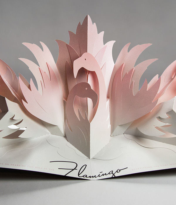
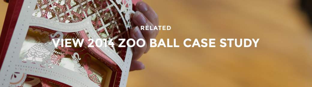
Project: Zoo Ball
Client: Fort Worth Zoo
A pop-up invitation for the Fort Worth Zoo’s annual gala event, Zoo Ball, to raise money in support of the zoo’s ongoing mission of conservation.
View Work
Gold ADDY Award &
Regional Silver ADDY Award
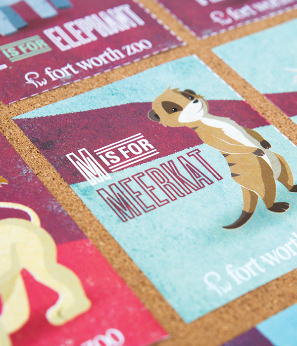
Project: Zoo Preschool
Client: Fort Worth Zoo
An illustrated campaign and series of animal flash cards for the preschool program at the Fort Worth Zoo.
View Work
Gold ADDY Award &
Regional Bronze ADDY Award
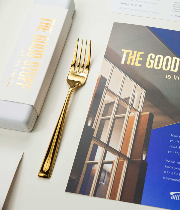
Project: The Good Stuff
Client: Hurst Conference Center
A direct mail campaign and invitation to the Hurst Conference Center’s tasting event for local planners.
View Work
Gold ADDY Award
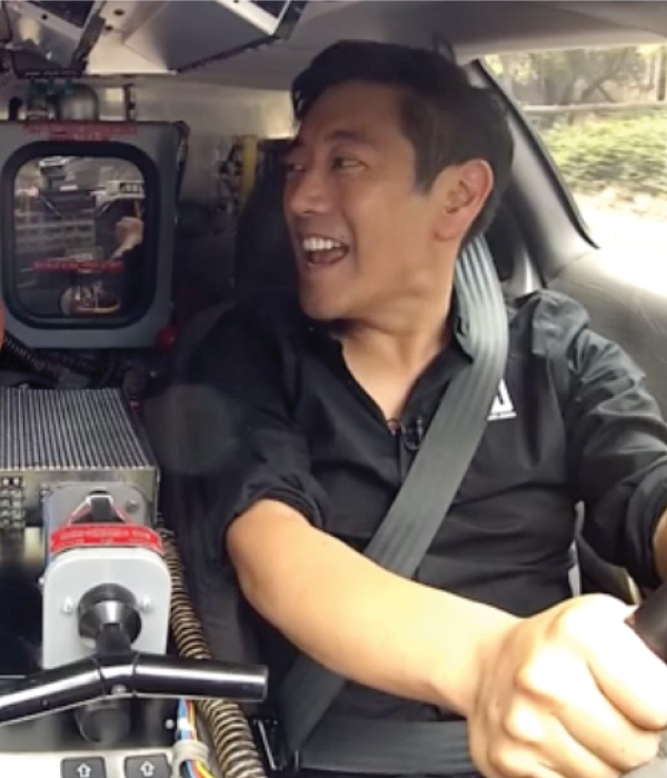
Project: Empowering Innovation Campaign
Client: Mouser Electronics
A campaign for Mouser Electronics centered around engineering and ingenuity through a partnership with spokesman Grant Imahara.
View Work
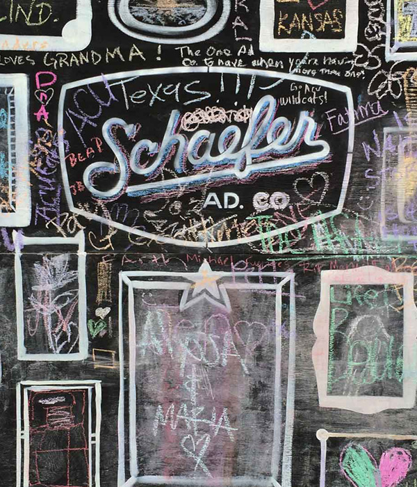
Gold ADDY Award
Project: Arts Goggle 2015
Client: Schaefer Advertising Co.
Created a 10ft x 40ft chalkboard and encouraged community participation for the annual Arts Goggle event on Magnolia.
View Work
Special Judges’ Award: Design
Zoo Preschool
Gold ADDY Award
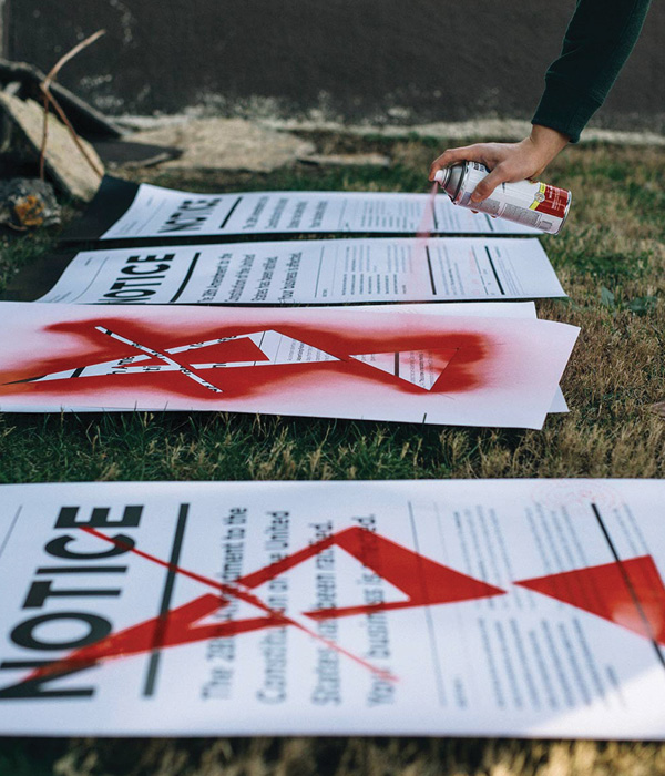
Project: Amendment 28 Campaign
Client: AAF Fort Worth
A campaign centered around the passage of Amendment 28, which outlawed advertising and promote entries to the local ADDY Awards.
View Work
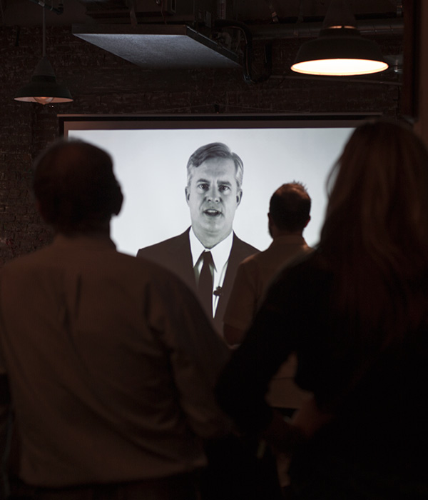
Gold ADDY Award
Project: Submission Protocol Video Campaign
Client: AAF Fort Worth
Video campaign showing proper protocol for the disposal of advertising and entry into the local ADDY Awards.
View Work
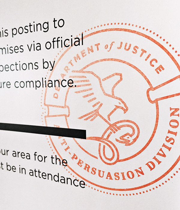
Gold ADDY Award
Project: Amendment 28 Logo
Client: AAF Fort Worth
Logo for the Department of Justice Anti Persuasion Division, the agency responsible for the enforcement of Amendment 28.
View Work
Gold ADDY Award &
Regional Bronze ADDY Award
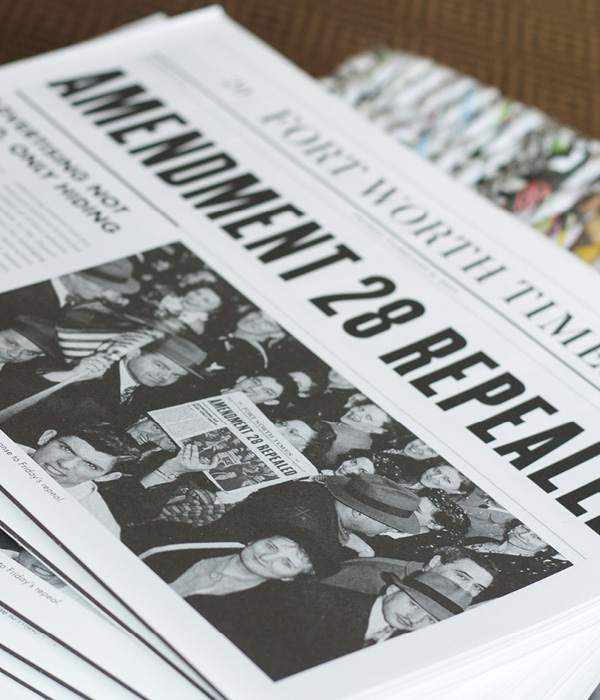
Project: Winners Book
Client: AAF Fort Worth
Newspaper style book announcing the repeal of Amendment 28 and showcasing the 2015 Fort Worth ADDY winners.
View Work
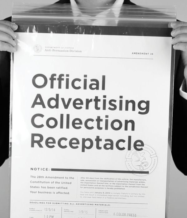
Gold ADDY Award
Project: Official Advertising Collection Receptacle
Client: AAF Fort Worth
Government packaging for the collection of illegal advertising and ADDY entries.
View Work
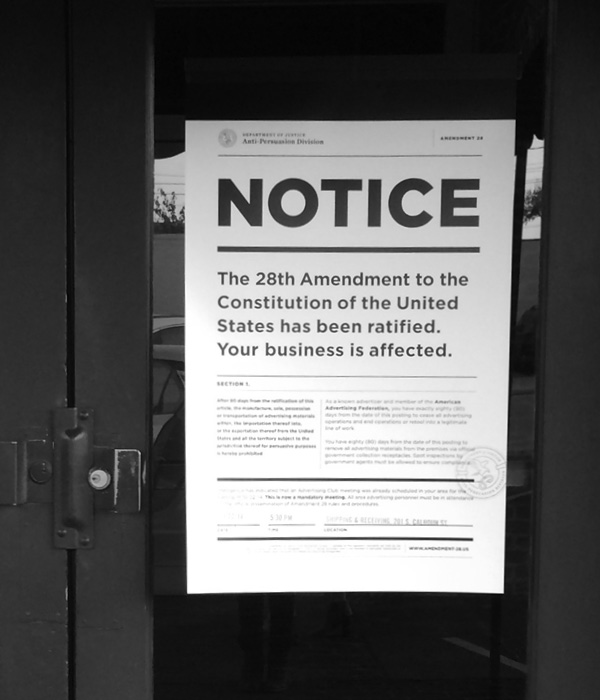
Gold ADDY Award
Project: Amendment 28 Poster
Client: AAF Fort Worth
Large format poster to announce the outlawing of advertising with the passage of Amendment 28.
View Work
Special Judges’ Award: Concept
Amendment 28 Campaign
The Story
Each year the Fort Worth Zoo hosts an annual gala event, Zoo Ball, to raise money in support of the zoo’s ongoing mission of conservation. In a city as large and philanthropically minded as Fort Worth, it’s absolutely vital to break through the noise of other worthy charity events. This year being the 30th anniversary, the planning committee held high expectations for all aspects of the party. Dubbed 1940’s Las Vegas nightclub themed, we set on the path to creating a high-end invitation the encompassed the elegant event.
The Work
To define the tone of the event, our first step was to create inspiration boards. Focusing on high end elements, animal details and historic landmarks, we created the visual foundation for the invitation and ultimately the event. During our research, we discovered that Bugsy Siegel’s legendary Flamingo was one of the first nightclubs in Las Vegas. Leveraging the iconic venue, we titled the event Zoo Ball at the Flamingo. Just like that, the perfect animal pairing for our period event was born.
Harnessing the juxtaposition of larger-than-life Vegas shows within dark, unassuming nightclubs, we developed the concept for an elaborate three dimensional pop-up invitation. Though we may not be paper engineers per se, we always aim to seek what’s possible. Concept turned into reality through partnership with Cockrell Enovation and Structural Graphics, good ‘ole trial and error and more than one paper cut.
The end result is a structural masterpiece. The custom envelope was built to ensure the piece would not get damaged in mailing. The guests were presented with what appears to be a flat “standard” invitation. But upon opening, two pink flamingos emerge from the pages of the invitation, unfolding into an incredible display of creativity and paper construction.
The Results
This year’s event sold out in record time and successfully raised a record-setting amount for the Zoo. Invitees began posting videos of the invitation on social media. And yet again, the bar was raised a little higher for next year.
UPDATE:
Schaefer was awarded a gold national Addy for the 2015 Zoo Ball invitation, for the second year in a row! To give it some context, we were one of only 83 gold winners out of 40,000 entries. We’re incredibly proud of our back-to-back wins and excited to represent Fort Worth among some of the top agencies in the country.
Check out the complete List of 2016 National Gold Addy Winners.
Each year, the Fort Worth Zoo brings together some of the best restaurants and music acts in town for a tasting and music event called Beastro. For this year’s campaign, we boiled it down to the essentials.
Todd Lancaster – VP, Creative Director
Actually, there are three things that, for some reason, have inspired me throughout my career. I’ve never been one to keep up with industry news or other agencies. I don’t want to be influenced by other people’s take on advertising. I’d rather be inspired by books and movies and music, which can lead to unique advertising concepts.
One thing that’s always inspired me is skateboarding. I was super big into it back when I was a teenager, when the Bones Brigade and all those guys were big. And it’s not really the design surrounding skateboarding so much as the motion of it. It’s hard to explain, but I feel like the fluidity of motion inspires the way I think and design, even now.
Another inspiring thing for me is kind of strange. I love black and white movies, and I watch On the Waterfront pretty much every time it comes on TV. I recently found out that the buffalo plaid jacket Marlon Brando wears throughout most of the movie was actually green and not red. I can’t explain how this inspires me, but I actually found myself thinking about it while I was working through some design concepts the other day.
The third thing that’s been inspiring to me is an interview with Dave Grohl I saw online. One of the things he talked about was resisting the urge to self-edit. You don’t like it when other people mess with your stuff, so why do it to yourself? The imperfections that go along with spontaneity are sometimes the most interesting parts. I try to remember that with design.
The theme for this year’s Zoo Preschool is animal markings and habitats. And because the whole point of the preschool is to teach young kids about animals, we decided to make the direct mail piece interactive and educational. The piece featured a soft, natural color palate and a fun illustrated style, which was carried out across all media including the campers’ t-shirts. Any day we get to to create cartoon animals is a good day. And from the photos, it would appear these preschoolers found their favorite spot at the Fort Worth Zoo.
This year, the Hurst Conference Center came to us with a problem. As always, we came back with a solution.
Problem: How can we increase our wedding and reception bookings and overcome the negative perceptions that engaged couples have of a conference center as a wedding venue?
Solution: Develop a unique brand and identity for the Hurst Conference Center’s bridal market that sets it apart from competitors.
Our first step was to evaluate the local bridal market, the competitors and the unique attributes of the conference center. We then crafted the venue’s unique positioning, which guided us through the naming and identity development process. Our strategy was to develop an identity that conveyed simple elegance while highlighting the unique attributes of the grand ballroom while giving it a name that would sound good on wedding invitations. We developed several different names and designs and, in partnership with the client, landed on a name that highlighted the iconic fiber optic star-field chandelier located in the grand ballroom – Lumiere Ballroom at the Hurst Conference Center.
With the bridal identity developed, we executed the new brand in several collateral pieces to introduce it into the marketplace. Our goal was to differentiate the bridal marketing elements from the rest of the Hurst corporate/meeting planner marketing pieces. This meant pulling away from the traditional red and orange colors.
The bridal identity is set apart from the corporate HCC brand through the photography style and limited use of colors. De-saturated photography added an element of refined elegance to the space, while the use of black allowed the chandelier to stand out as a focal point within the venue. However, the corporate/meeting HCC brand and the bridal identity are tied together through the use of photography and the type family (Helvetica).
Flu season is once again upon us. And without knowing it, a lot of extra germs could be as well.
The CDC requires healthcare providers to post visual alerts instructing patients to practice respiratory hygiene or cough etiquette. Most of the time, this manifests itself as cheesy cartoon illustrations, which are printed and laminated in-house. In other words, another flyer in a hospital or clinic that you don’t care to read. When JPS brought this challenge to Schaefer, we found a way to get the message noticed.
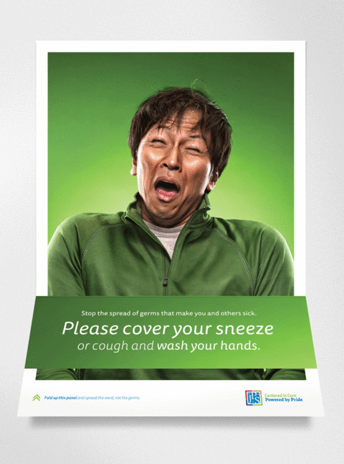
Photography by Robie Capps
Schaefer Advertising recently rebranded Tallulah & Company, a Fort Worth interior design company led by Ally Arlington. She’s the very talented designer who is responsible for the beautiful environment we work in every day. She tasked our team with developing an identity that could exude a timeless style with a flair for the unexpected. It needed to be strong yet comfortable. Beautiful yet functional. Just like her work.
We enlisted the help of calligrapher Lauren Essl, of Blue Eye Brown Eye, to craft the handwritten logo treatment.
Our poster for the 2013 Zoo Ball features custom illustration by creative director Todd Lancaster. In keeping with the event’s psychedelic theme, we printed this poster in the style of blacklight posters from the ’70s using UV inks and purple flocking for a textural element. Posters were delivered in a tube that included a blacklight bulb, so the recipient could get the full effect. Other printed materials for the event were illustrated in the same style to further the theme.