A Year of Triumphant Splendor
Setting the Stage for Success
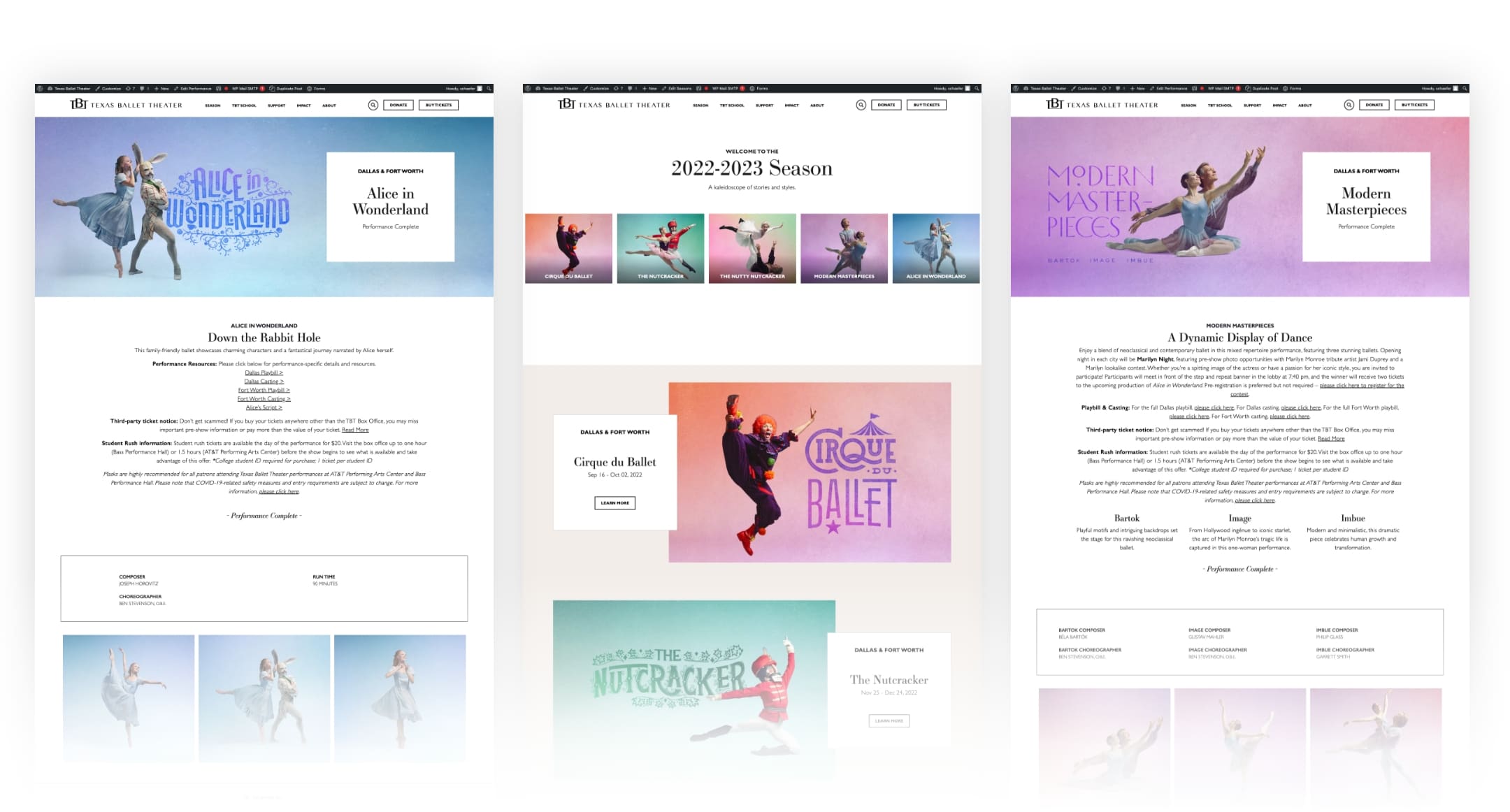
Every year, Texas Ballet Theater (TBT) launches a season filled with a combination of performance styles, from mixed repertoires to storybook ballets to the beloved holiday tradition, The Nutcracker. And each year, the organization builds revenue goals based on factors such as previous success, attrition, new-to-file trends, name recognition and more. In the last few years, all performing arts organizations have been rebuilding after, for some, more than a year of no programming. It is more critical than ever that these goals be met, which is a challenge we do not take lightly.
Benefits of a Integrated Campaign
As TBT’s agency of record for over five years, we have the pleasure of guiding the organization strategically through a merriment of creative and media targeting each year. This level of integration is ideal, as it allows the team to work on one cohesive plan for success and be proactive with optimizations along the way. We cannot overstate the importance of messaging, design and ad placement all aligning to drive success.
With a robust overarching season revenue goal as well as individual performance goals, we knew this year needed to be on point. Pun intended.
A New Creative Solution
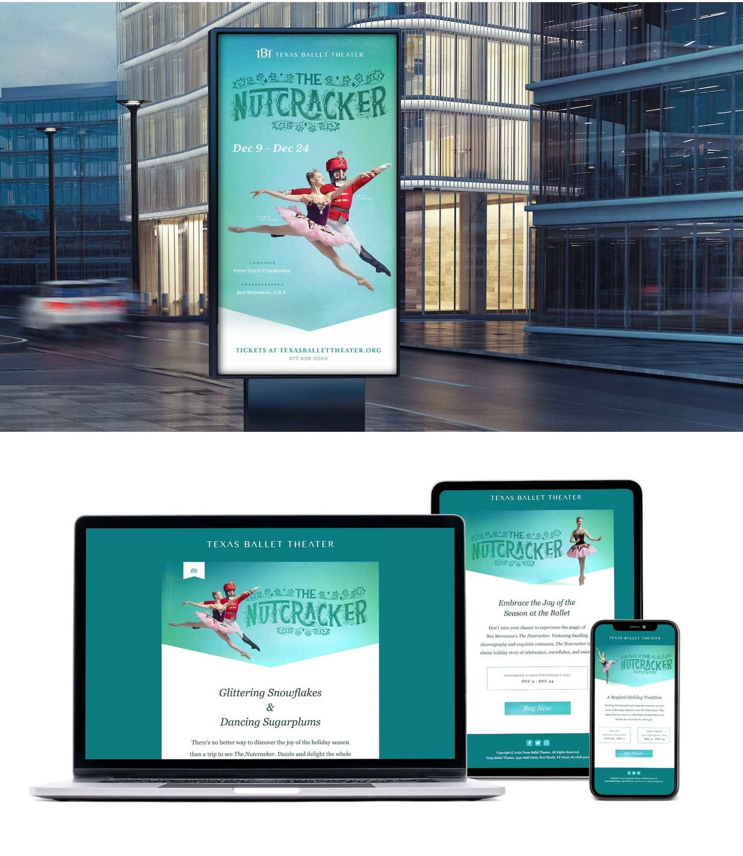
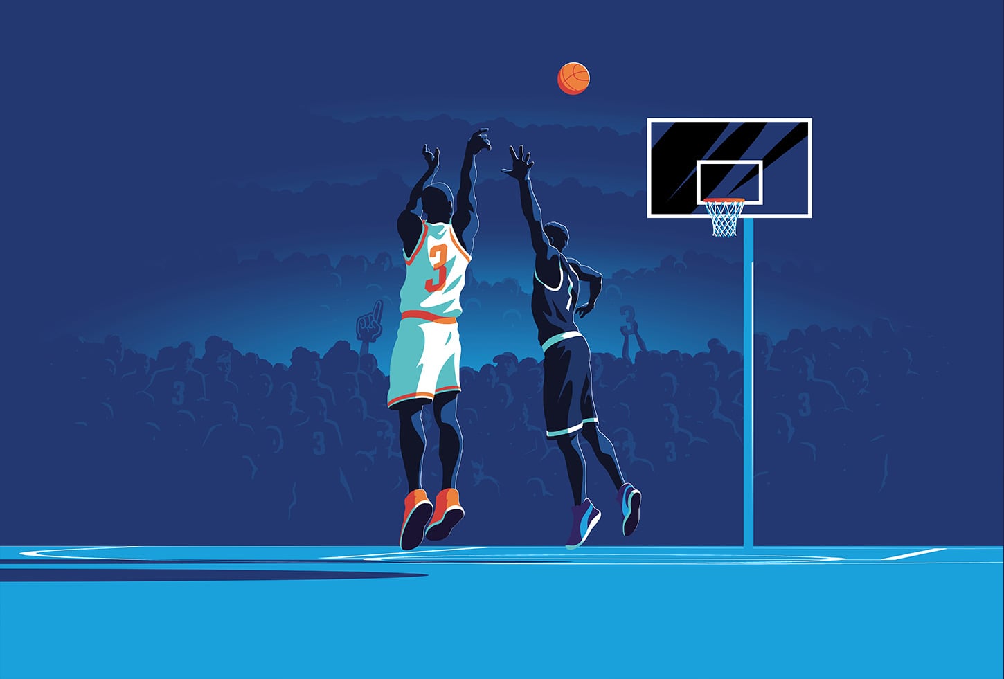
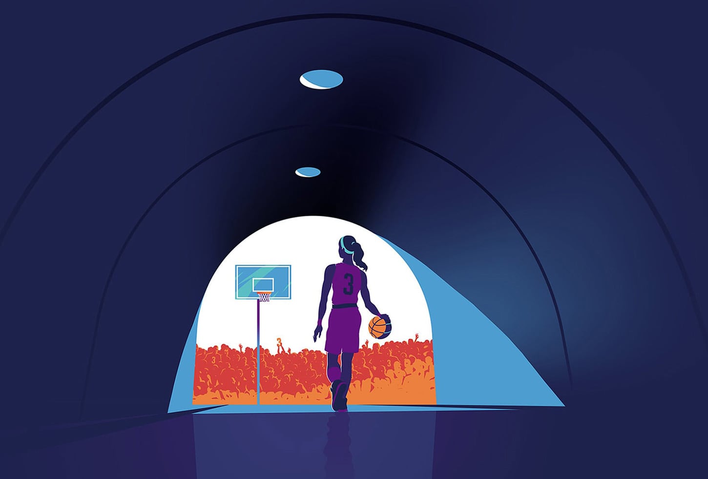
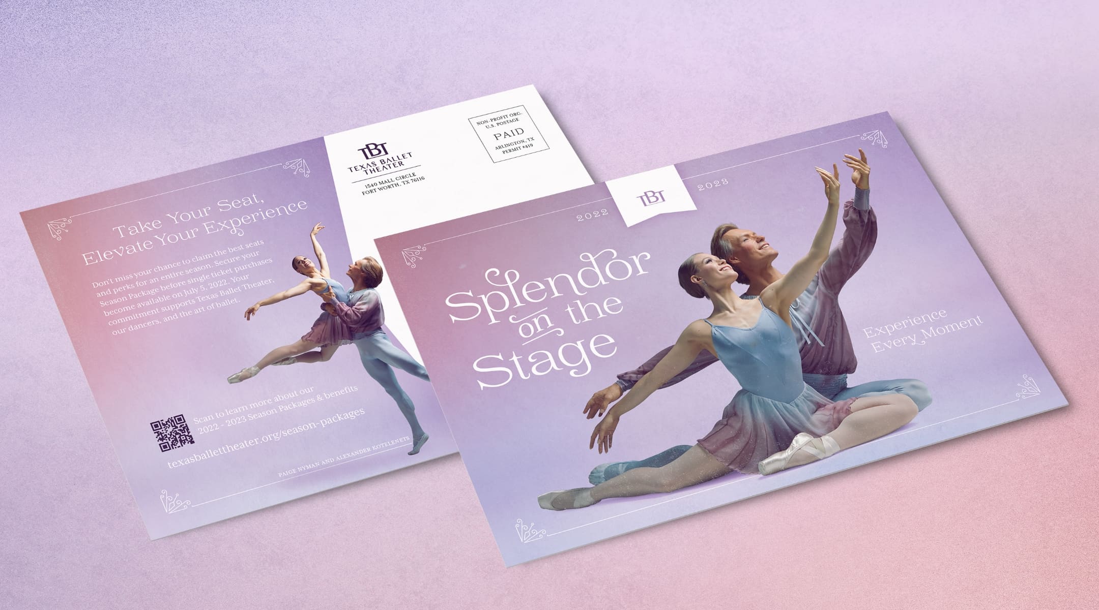
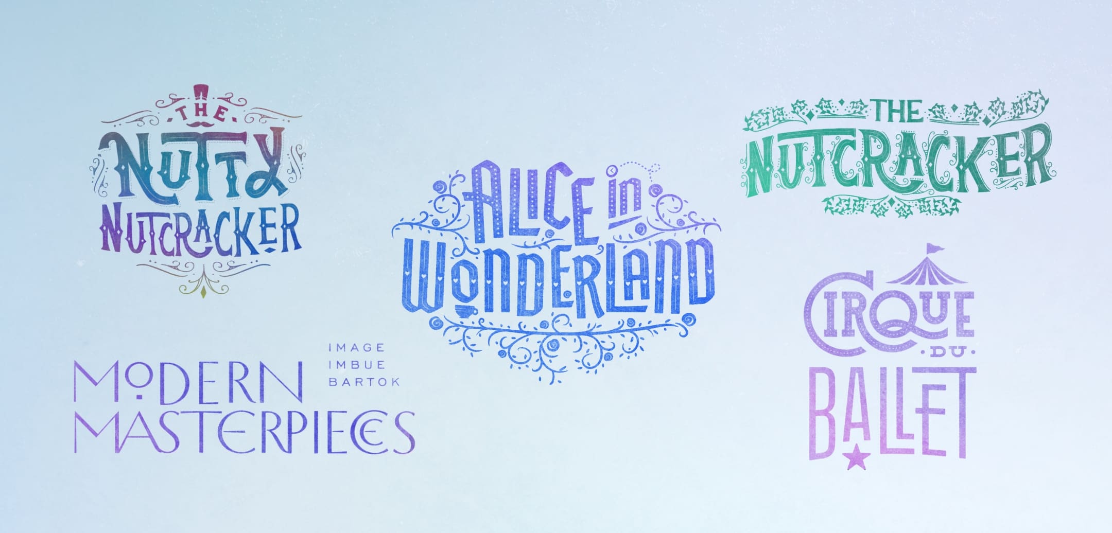
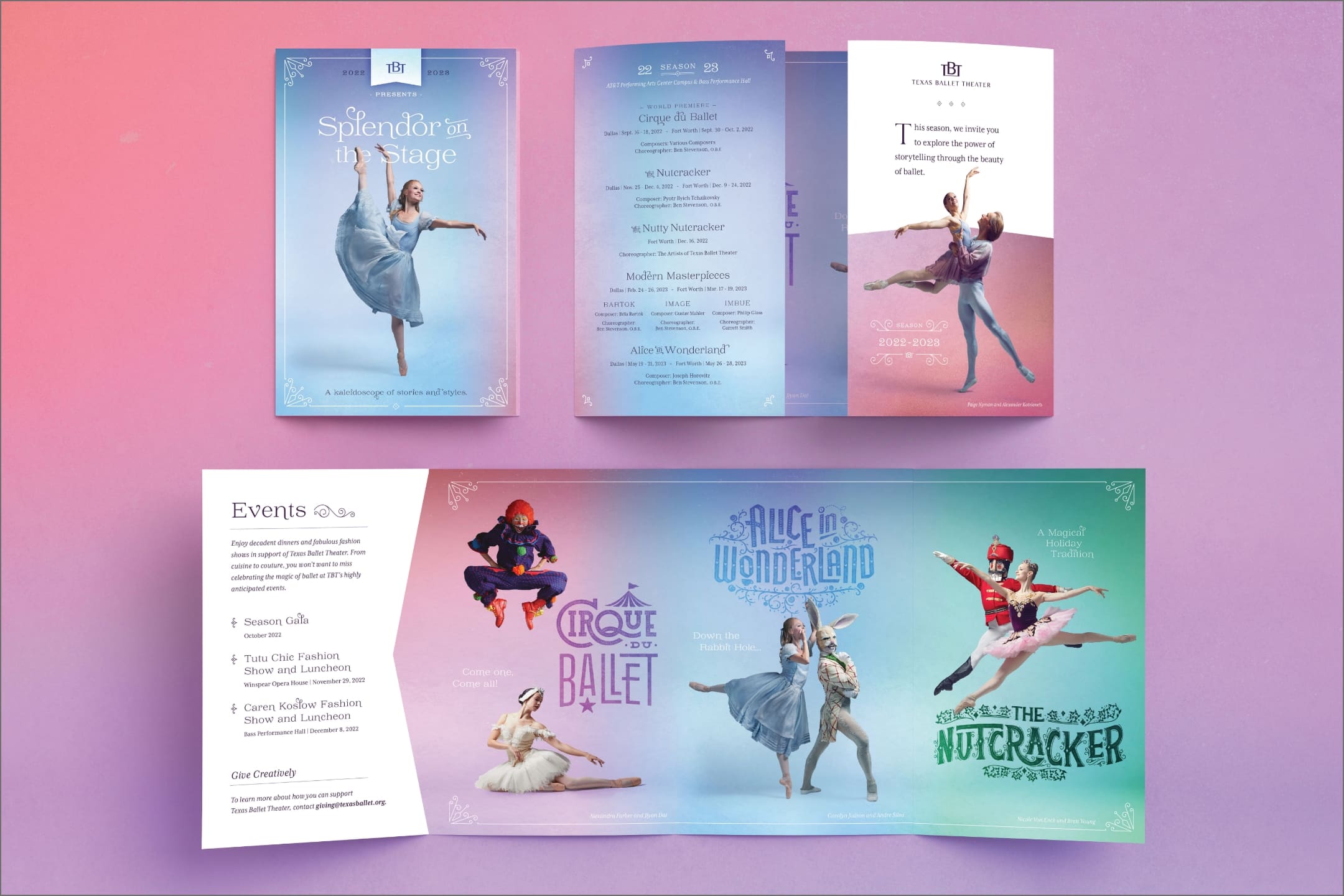
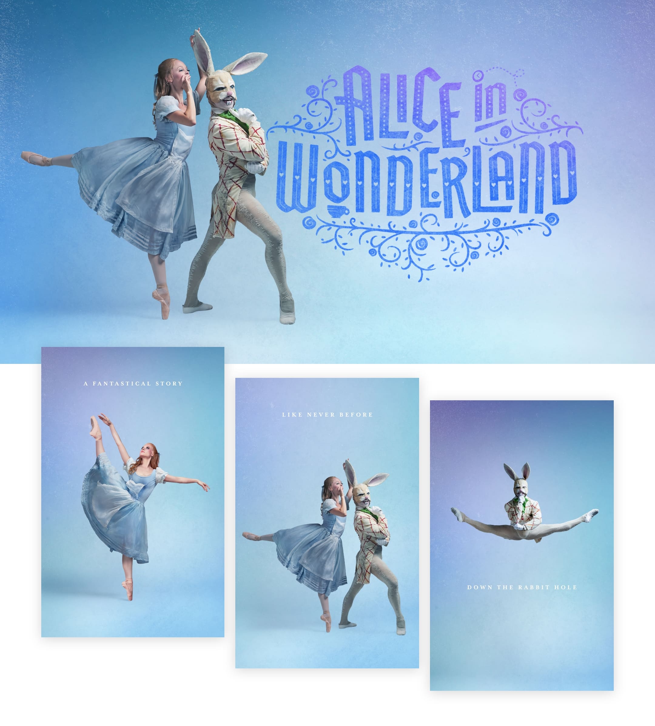
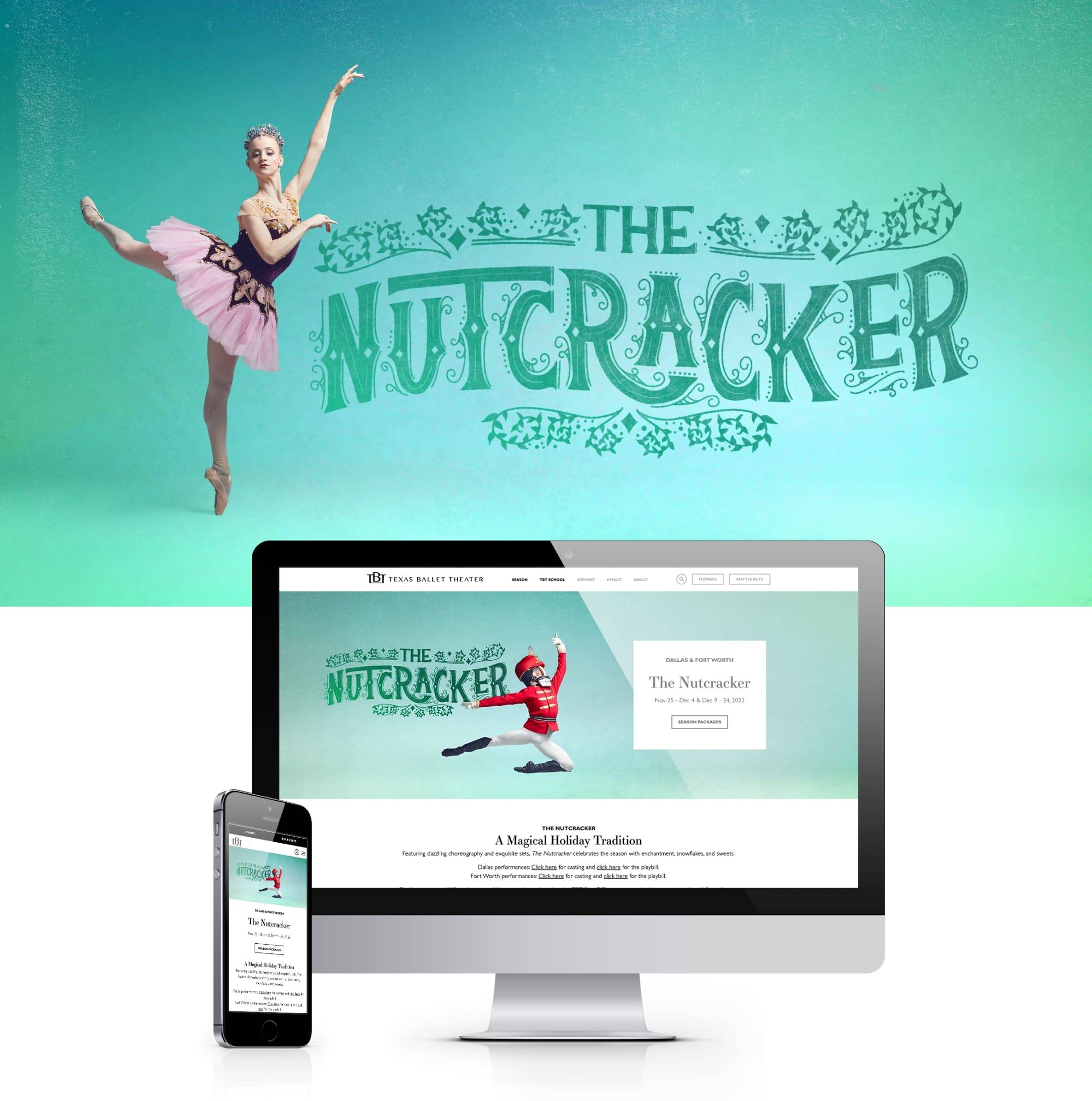
Each year we establish the creative concept for the season which reflects the individual performances, incorporates artistic direction from TBT and provides a consistent look for the entire season. This season, we created custom typography for each performance title to elevate the distinct nature of each performance and provide an additional asset that incorporated elements from the storyline or theme of each ballet. The titles were paired with a wash of color for each performance, and when viewed together created a vibrant kaleidoscope that reflected the varied nature of the range of performances. The ability to utilize a key color and title treatment to support individual performance campaigns beyond dancer imagery alone gave our team a broader range of assets to leverage across mediums.
What We’ve Learned
A benefit of the tenure of our relationship with TBT is that we are able to learn more and evolve every year. We always tell new clients that they are the experts in their field, and we are here to learn and assist. But as we learn more year over year, we build industry expertise that becomes invaluable.
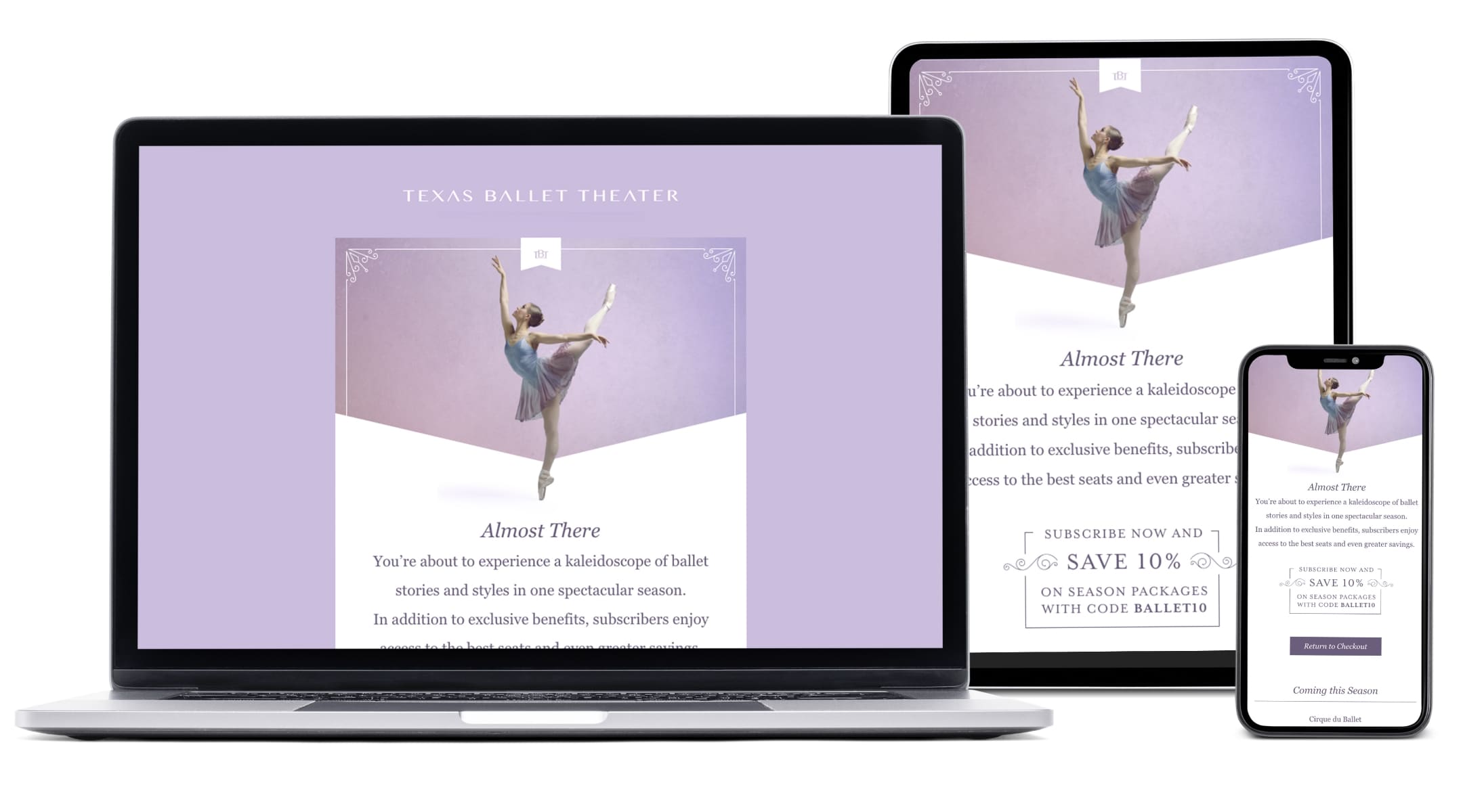
What we continue to see is that video outperforms static ads, which is no surprise when you are promoting a moving art form. We also know that the more digital assets you have, the more opportunities you have to improve visibility, engagement and the overall effectiveness of each deliverable. Video content can be costly to produce, so we focused on creative solutions that maximized the available resources. By incorporating animation, we were able to support each performance with repeatable textures that expand our campaign assets.
Because of this, we were able to produce more formats and sizes to test against each other by incorporating animations and movement in post production. Additionally, we chose to sunset some static ad units in order to focus on video.
Enhancing Ticket Sales
From a media perspective, we adjusted flighting to focus on awareness tactics early and conversion tactics during peak ticket sales, which is traditionally within the final weeks of the promotion.
We also implemented an institutional campaign throughout the year to boost awareness and increase website sessions unrelated to ticket purchases, which in turn allowed our retargeting pools to grow and improve our ticket sale campaigns.
Where We Landed
While we are delighted to see the success of last year come through, it was with intention that our team set out to achieve and surpass these revenue and new ticket buyer goals. The Year of Splendor proved to be successful all season long, seen most notably in The Nutcracker & Alice in Wonderland performances, where goals in both Dallas and Fort Worth were exceeded.
- Final revenue exceeded annual goals by 24%
- Final revenue increased from previous year by 25%
- Opening the season with a new work (which is inherently more challenging to sell due to no name recognition), ROAS was 5:1
- The Nutcracker in Dallas finished at over 140% to goal
- The season closed with Alice in Wonderland which had almost 10,000 patrons attend clearing goals by over 30%
Promoting a new season each year has its fair share of challenges, and that’s what keeps us going. We’re proud to be a long-standing partner of Texas Ballet Theater and can’t wait to share in their continued success for years to come.