Texas Burger Billboards for Nolan Ryan Beef
Billboard creative for Nolan Ryan Beef and Texas Burger.

Billboard creative for Nolan Ryan Beef and Texas Burger.
Recently, photographer Victoria Will took a bunch of tintype photos of celebrities at this year’s Sundance Film Festival. In case you didn’t see them, here’s the link.
As the de facto in-house photographer for Schaefer, I thought it’d be fun to see if I could fake the tintype look in Photoshop. The internet being what it is, there are probably some good tutorials out there. But I’m a guy, and I don’t like asking for directions, so I just went for it.
-Scott
This year, the Hurst Conference Center came to us with a problem. As always, we came back with a solution.
Problem: How can we increase our wedding and reception bookings and overcome the negative perceptions that engaged couples have of a conference center as a wedding venue?
Solution: Develop a unique brand and identity for the Hurst Conference Center’s bridal market that sets it apart from competitors.
Our first step was to evaluate the local bridal market, the competitors and the unique attributes of the conference center. We then crafted the venue’s unique positioning, which guided us through the naming and identity development process. Our strategy was to develop an identity that conveyed simple elegance while highlighting the unique attributes of the grand ballroom while giving it a name that would sound good on wedding invitations. We developed several different names and designs and, in partnership with the client, landed on a name that highlighted the iconic fiber optic star-field chandelier located in the grand ballroom – Lumiere Ballroom at the Hurst Conference Center.
With the bridal identity developed, we executed the new brand in several collateral pieces to introduce it into the marketplace. Our goal was to differentiate the bridal marketing elements from the rest of the Hurst corporate/meeting planner marketing pieces. This meant pulling away from the traditional red and orange colors.
The bridal identity is set apart from the corporate HCC brand through the photography style and limited use of colors. De-saturated photography added an element of refined elegance to the space, while the use of black allowed the chandelier to stand out as a focal point within the venue. However, the corporate/meeting HCC brand and the bridal identity are tied together through the use of photography and the type family (Helvetica).
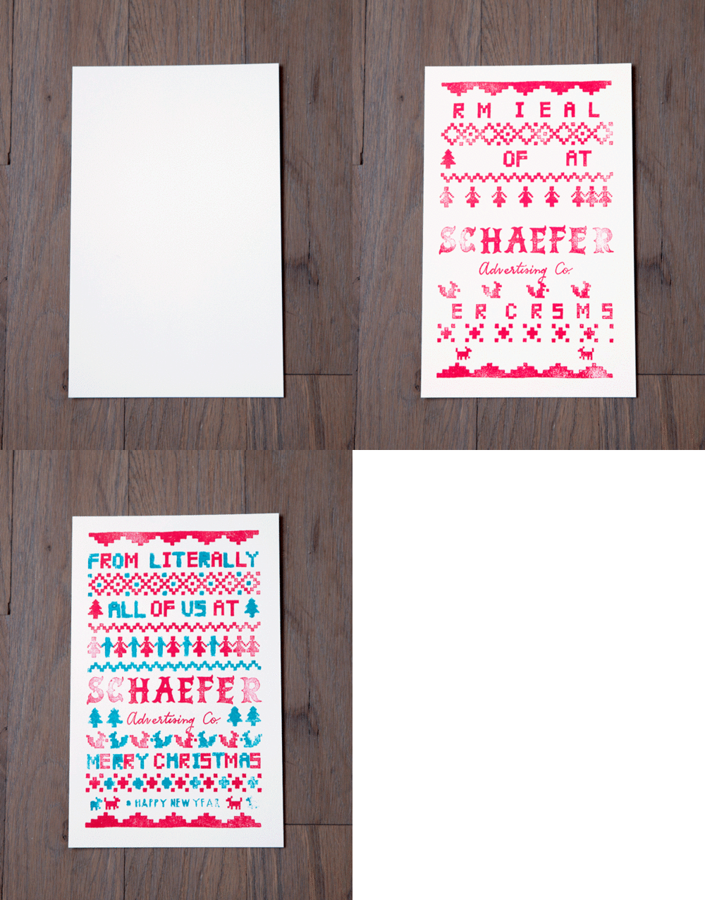
This year, every single Schaefer employee had a hand in creating our Christmas card. 400-plus hand-stamped cards later, and this didn’t seem like such a great idea anymore. Take a look at how it all came together, and don’t be surprised if next year’s card is store-bought.
Merry Christmas from all of us at Schaefer!

When the Fort Worth Zoo decided to update their brand messaging for 2013, Schaefer decided to pick up where our last campaign left off – clean, uncluttered imagery that kept the animals as the stars of the show.
We saw this new campaign as an opportunity to communicate the experiential and entertainment value the Zoo offers by reminding the people of Fort Worth and surrounding areas of their wilder neighbors. We did this by trying to keep animals as close to actual size as possible throughout the varying media.
We kept backgrounds simple to further call attention to the animals as they cropped up around their “natural habitat” of Fort Worth.
Our approach led us to the headline: Real. Fun. On the one hand, it’s self explanatory, but it’s also a subtle comparison to movies, video games and other virtual forms of entertainment.
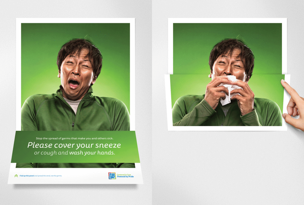
Flu season is once again upon us. And without knowing it, a lot of extra germs could be as well.
The CDC requires healthcare providers to post visual alerts instructing patients to practice respiratory hygiene or cough etiquette. Most of the time, this manifests itself as cheesy cartoon illustrations, which are printed and laminated in-house. In other words, another flyer in a hospital or clinic that you don’t care to read. When JPS brought this challenge to Schaefer, we found a way to get the message noticed.

Photography by Robie Capps
Schaefer Advertising recently rebranded Tallulah & Company, a Fort Worth interior design company led by Ally Arlington. She’s the very talented designer who is responsible for the beautiful environment we work in every day. She tasked our team with developing an identity that could exude a timeless style with a flair for the unexpected. It needed to be strong yet comfortable. Beautiful yet functional. Just like her work.
We enlisted the help of calligrapher Lauren Essl, of Blue Eye Brown Eye, to craft the handwritten logo treatment.
JPS Foundation is a non-profit arm of John Peter Smith Hospital that helps raise money for things the hospital budget doesn’t cover such as baby supplies for low-income women, clothes for the homeless and medicines for those who can’t afford them.
When it came time for their annual employee giving campaign, they came to us with a challenge. Donations had been in decline for several years, as well as the number of employees who were donating. Employee involvement is an important metric when applying for funding, so it was up to us to bring the numbers up.
When you think of fundraisers for non-profits, you might think about the poster board thermometer that is gradually filled in with red sharpie. When the goal is a large sum of money, it can easily feel like the dollar or two you have to spare won’t make much of a dent. Since we needed as many people to participate as possible, we had to overcome this perception.
Our idea was to show that a small donation—even as little as a dollar—could actually have a real impact. That’s because many of the things JPS Foundation provides, such as a pair of socks or a pedometer, cost very little. We called the campaign Small Change, Big Impact and used a series of four videos to show how even inexpensive items could make a big difference in a person’s life.
It’s clear that JPS employees took the message to heart. JPS Foundation raised over $200,000 as a result of this campaign, up from $95,000 the previous year. The number of employees who participated also rose from 685 to 1019 in one year. And while it’s always great to see that a campaign worked, we’re most proud of the real, life-changing impact those stats represent.
Our poster for the 2013 Zoo Ball features custom illustration by creative director Todd Lancaster. In keeping with the event’s psychedelic theme, we printed this poster in the style of blacklight posters from the ’70s using UV inks and purple flocking for a textural element. Posters were delivered in a tube that included a blacklight bulb, so the recipient could get the full effect. Other printed materials for the event were illustrated in the same style to further the theme.