Schaefer Advertising Co.

Archives

Crafting a distinctive brand and web presence for Bennett Partners

At Schaefer, we embarked on a meaningful partnership with Bennett Partners, an esteemed architecture, interiors, and planning firm based in Fort Worth, Texas. Guided by their unwavering dedication to responsible preservation and urban design, Bennett Partners strives to create sustainable spaces that enhance and sustain communities. What began as an initiative to enhance their website and showcase their award-winning work evolved into a comprehensive brand refresh, a testament to our shared commitment.

Bennet Partners logo

Navigating transitions and embracing a thoughtful ethos

Recognizing Bennett Partners’ esteemed reputation and shared mission to improve lives within the Fort Worth community, we embarked on a collaborative journey with their team of award-winning designers. This partnership provided a unique opportunity to collaborate with like-minded creatives who valued a strategic approach. Following the departure of a former partner, our goal was to develop a new brand identity that authentically reflected Bennett Partners’ thoughtful ethos, starting with a strategic renaming process.

Bennett Partners logo

Our recommendation was to preserve the equity of the original name, Bennett Benner Partners, by preserving the namesake Bennett as a prominent element. Thus, the name Bennett Partners was chosen, capturing the essence of a collective of passionate partners united by their mission and dedication to thoughtful design.

Benner Partners mobile

From typography to tone: crafting an approachable identity

We meticulously crafted a comprehensive system of logos and a versatile color palette, offering both flexibility and consistency. Our brand design centered around sophistication, simplicity, and purpose, harmonizing seamlessly with Bennett Partners’ core values. The logo showcases a modern, customized typeface that enhances the letterforms, set in lowercase to reflect the brand’s friendly and approachable nature. The secondary logo variation was refined to include “architecture, interiors, planning,” providing clarity about the services offered. Our expanded color palette embraces softer, thoughtful, and intricate color variations, featuring shades of blue and orange that distinguish Bennett Partners within the industry. These colors effortlessly integrate into diverse project plans and graphics. Additionally, we established a comprehensive brand toolkit, empowering Bennett Partners to effectively convey their unique identity.

website before and after

Elevating the user experience and showcasing excellence

Following the brand refresh, Bennett Partners sought a website redesign that would seamlessly showcase their exceptional work, engage users, and mirror their commitment to responsible architecture and community impact. Frustrated by their previous website’s inability to communicate their core values and meet their business needs, the objective of the new website was clear: effectively communicate their mission, prioritize their team members, and empower them to effortlessly showcase new projects. The final website encompasses key elements such as a visually striking portfolio, improved organization and categorization, seamless content management, responsive design, and personalized employee pages. Our team at Schaefer delivered a fully customized website with a clean and flexible modular system, enhancing navigation and user interaction to improve their online presence and reinforce their position as an industry leader.

Bennett Partners web images

Results

The partnership between Schaefer and Bennett Partners led to a successful transformation of their brand and website, capturing their expertise and unwavering commitment to responsible architecture. Through the reimagined brand identity, Bennett Partners’ captivating story resonates, attracting new business opportunities within their region. By collaborating closely with our team, Bennett Partners achieved a brand and website presence that authentically reflects their excellence in architecture and design, solidifying their position as a leading firm within the industry.

Amplifying Perot Jain’s impact with the perfect balance of strategy, design, and technology

Perot Jain, a venture capital firm specializing in early-stage capital funding, is intentional about investing in innovative companies that are developing disruptive, best-in-class solutions. Founded by the collaboration of Ross Perot, Jr. and Anurag Jain, Perot Jain focuses on funding leading-edge companies in the mobility innovation, healthcare, and real estate sectors. With a long history of entrepreneurial success and a strong infrastructure in place, Perot Jain sought to convey their unique approach to venture capital. Unlike other firms, their investment support goes beyond capital and extends to mentorship, access, and alliances within the Perot and Jain family of companies, including Access Healthcare, Hillwood, and the Mobility Innovation Zone. It became evident they needed to enhance their brand identity, create a distinct positioning, and develop a new website that would effectively communicate their unique value proposition.

Through their relationship with Hillwood and the AllianceTexas Mobility Innovation Zone, Perot Jain had already established a rapport with Schaefer, leading them to choose the agency for this significant brand transformation initiative. With a shared vision, Perot Jain and Schaefer embarked on a journey to redefine the venture capital firm’s brand strategy, positioning, and visual identity, ultimately showcasing their commitment to investing in and mentoring disruptive companies that have the potential to shape the future.

Featured Case Study

Innovation from the ground up

Mobility and innovation districts are places where pioneers make critical advancements in logistics and supply chain modernization. It’s also a place where technology breakthroughs are developed that can affect billions of people. They are critical to advancing how consumer and…

From mission to position: uncovering Perot Jain’s unique differentiators

Schaefer initiated a full brand strategy initiative, delving into Perot Jain’s organizational mission and identifying their unique positioning compared to other VC firms. Collaboratively, the team identified the key values and advantages that set Perot Jain apart: collaboration, authenticity, a straightforward approach, leadership, entrepreneurial success, strong infrastructure, and partnerships/alliances. This thorough understanding formed the basis for a strategy that would effectively communicate Perot Jain’s strengths and resonate with their target audience. The strategy aimed to convey success stories and the current portfolio, positioning Perot Jain as an organization focused on investing in innovative companies aligned with their parent organizations’ business goals.

Building on the strategic foundation, Schaefer developed a brand archetype recommendation, selecting the Hero archetype. This choice aligned with Perot Jain’s commitment to investing in and mentoring innovative companies that aim to improve their industries and the world. This archetype dovetailed seamlessly into the positioning recommendation, Transformational, and a powerful positioning statement that highlighted the art and science of experienced entrepreneurialism, emphasizing Perot Jain’s role in driving transformative change.

Uniting Perot Jain’s positioning with a captivating brand identity and website

To visually represent the brand, Schaefer designed a logo and brand identity that perfectly balanced the Perot and Jain family names. The logo mark, a harmonious integration of ‘P’ and ‘J,’ symbolized the partnership between Perot Jain and the companies they support. The customized letterforms, with their subtly rounded edges, reinforced the logo mark and evoked a sense of balance and synergy. The animated version of the logo added dynamism and represented movement within the brand. 

Perot Jain logos

With the positioning and brand identity as a solid foundation, the website was crafted to build the brand’s presence online. The website’s information architecture (IA) was thoughtfully developed to feature Perot Jain’s portfolio of companies, leveraging the legacy of Perot and Jain ventures and driving a holistic conversation. The modular page structure empowered Perot Jain to easily expand and update content, ensuring long-term scalability and independence. The comprehensive portfolio system showcased Perot Jain’s wide-ranging investments, offering a clear demonstration of their expertise. The visually captivating website, with its compelling imagery, videos, and clean typography, wowed potential clients and instilled trust and credibility. The website’s design, catering to both desktop and mobile experiences seamlessly, ultimately provided a modern and future-ready platform.

Investing that Transforms - Perot Jain

Results: driving success and solidifying market presence

The results of this brand transformation were significant. Perot Jain’s new brand identity positioned them as a global competitor, attracting potential customers and garnering increased visibility among relevant venture capital partners. Perot Jain now has a solid foundation for all future communications, driving continued success in attracting high-quality deals and fostering partnerships that align with their growth goals. In essence, Schaefer’s partnership with Perot Jain exemplifies the transformative power of strategic brand positioning and creative excellence. By combining insights, innovative design, and a client-centric approach, Schaefer has enabled Perot Jain to elevate their brand to new heights, solidifying their position as a trailblazing force within the venture capital landscape.

Perot Jain on cell phone

Reinventing VoidForm’s brand for the future

With over 40 years of experience, VoidForm Products is a trusted business specializing in customized, innovative carton void forms that protect structures from the damaging impact of expansive soils. Their extensive range of products is designed to provide added fortification during concrete foundation pouring, offering a cost-effective and reliable solution for both residential and large-scale commercial projects. Though sales were strong, VoidForm faced the challenge of an outdated and disjointed brand ecosystem encompassing the parent brand and over 20 sub-brands. Recognizing the need for a modern, scalable, and cohesive brand strategy to support their increased business goals, VoidForm partnered with Schaefer Advertising to position themselves as an industry thought-leader and support the expansion of their products and services.

VoidForm Logo

Embracing VoidForm’s unique circumstances as a long-standing enterprise, Schaefer recognized the challenge of working with a brand ecosystem that was built over time. VoidForm had yet to take a comprehensive top-down view of their branding and marketing approach and how it could support the future of the business. Schaefer served as a pivotal partner for this rapidly growing company, providing support during leadership changes, aligning their history and success with a modern approach, and creating a future-focused brand strategy and web presence for sustained growth.

VoidForm Design Assets

Elevating protection and stability: uncovering VoidForm’s key differentiators and core values

Schaefer embarked on a comprehensive brand refresh, starting with an assessment of the brand positioning and hierarchy. This strategic approach began with a deep dive into VoidForm’s brand landscape, including identifying key differentiators for the company and each product, reflecting on the company’s core values, and understanding key target audiences and what compels them.

VoidForm on Mobile

As a result, the Hero archetype was selected as the perfect fit for VoidForm. This archetype captured VoidForm’s commitment to delivering best-in-class solutions and leading the industry with products that outperformed the competition. To complement this, Schaefer introduced the powerful positioning of “Safeguard” into VoidForm’s brand language, embodying the essence of their products which provide an invaluable measure of protection and stability in expansive or complex soil structures with customizable, easy-to-install, quality forms.

Building upon this foundation, brand language was enhanced to include the main line “Protect Your Project,” which positioned the product appropriately and served as a strong call to action. The brand voice was defined as determined, confident, innovative, dependable, trustworthy and approachable, which served to influence the way the brand is expressed in writing.

VoidForm Expanded Logo

Unifying identity and differentiation: the cohesive visual system for VoidForm

Schaefer implemented a cohesive visual system that combined the branded house and sub-brands strategies, enabling VoidForm to effectively showcase their individual product offerings while maintaining brand recognition. The brand system was built to support the seamless integration of new products, allowing VoidForm the ability to easily launch new, innovative solutions and meet the needs of their customers. The logos were designed to be simple, functional, and easily recognizable, with the updated mark serving as a monogram of their initials where the negative space creates a void – a key feature behind the strength of each product. The vibrant orange color, an integral part of their original palette, honored their history while presenting a modern and impactful identity. A comprehensive guideline was created to ensure long-term internal alignment and consistent brand usage across all products.

Embracing creativity, enhancing user experience: the transformative website redesign

To complete the brand transformation, Schaefer tackled the challenge of creating a visually stunning and user-friendly website for VoidForm. Despite the initial lack of strong image assets, the team embraced creativity and ingenuity by utilizing stock imagery to develop custom brand assets inspired by VoidForm’s products. The website redesign resulted in an appealing and intuitive interface that catered to both laypersons and experienced engineers, effectively conveying information and specifications while providing an engaging user experience. Integration with Google Analytics supported awareness, engagement, and lead generation objectives, while the addition of a gated content section facilitated the seamless migration of existing coursework and offerings. The implementation of a content management system empowered VoidForm’s internal team to easily update and maintain the website for long-term adaptability.

VoidForm Website

Results

The collaboration between Schaefer and VoidForm during a pivotal time yielded remarkable outcomes. Overall, Schaefer’s partnership with VoidForm Products supported their growth by aligning their history and success with a modernized brand strategy and web presence. The new brand system and website positioned VoidForm as an industry leader, and the comprehensive implementation and widespread adoption of the brand by the internal team demonstrated the empowering strength and impact of the brand refresh initiative.

We all see and feel the challenges facing companies of all sizes in today’s business landscape. We see it across all of our business verticals and within our own walls. As an agency with 27 years in the business we have also seen that challenges like this often beget opportunity IF you can embrace it with the right mindset. 

Make Life Better Workshop

In order to grow our agency and navigate this ever-evolving industry, we believe being proactive and investing in our leadership is essential to our success. We launched a new program called the Make Life Better Leadership Series and though this inaugural workshop may be the first in a new series, it’s really the embodiment of a larger initiative at Schaefer called Schaefer University. It started with a need to gather training documents for onboarding and best practices and has grown into a philosophy of continued learning and exploration for the whole agency. We strive to be experts in our field, and in that effort, we have to be open and curious about the “what” and “how” we pursue knowledge.

Doug Austin at Make Life Better Workshop

Schaefer University acts as a platform for exploration, training and teaching. It keeps each of us focused on the pursuit of better instead of simply complacent with what’s been done. It’s a reminder for each of us to look for ways to learn and step into challenges with curiosity and humility. If we want to provide a dynamic environment for people to work, we have to embrace this mindset of pursuing knowledge and sharing experiences.

This workshop was created with the goal of making our purpose as an agency – to Make Life Better – tangible, and we set out to empower and equip our leaders, partners and a few clients to step into some of the shared challenges of this industry with a shared goal. We saw it as an incredible way to create opportunities to collaborate from a space of shared experience.

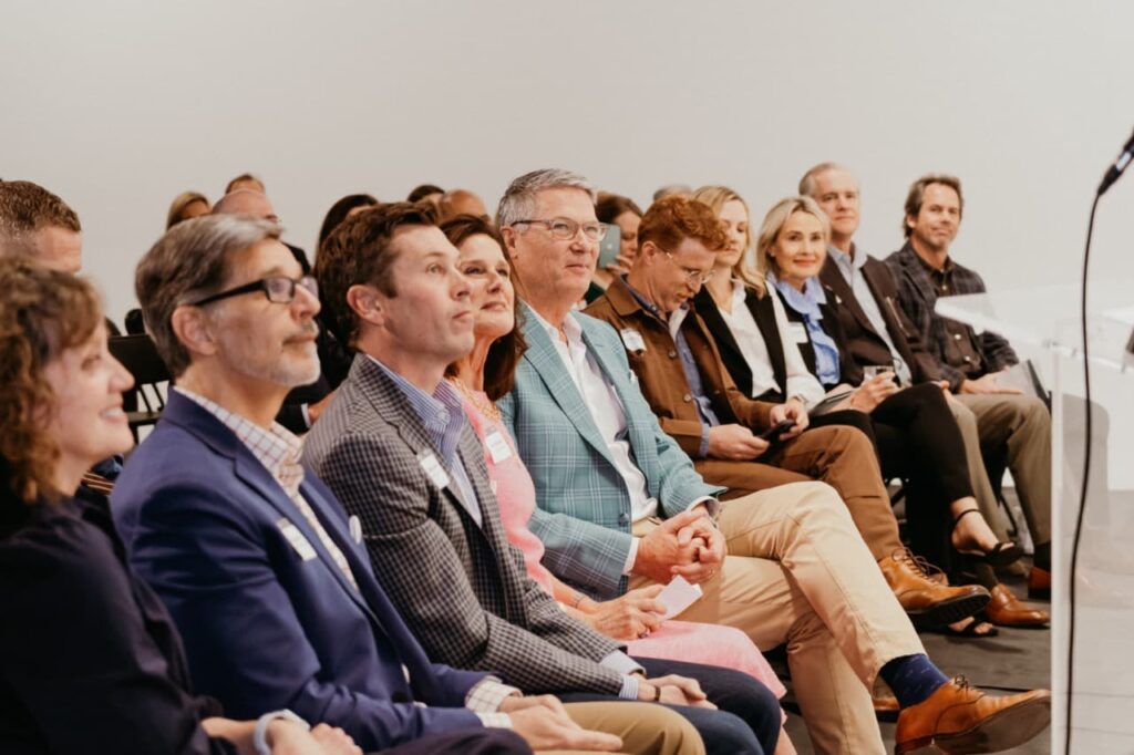
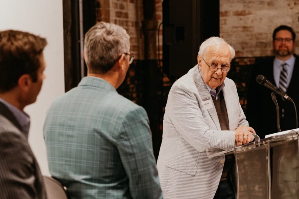
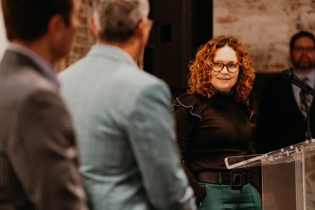
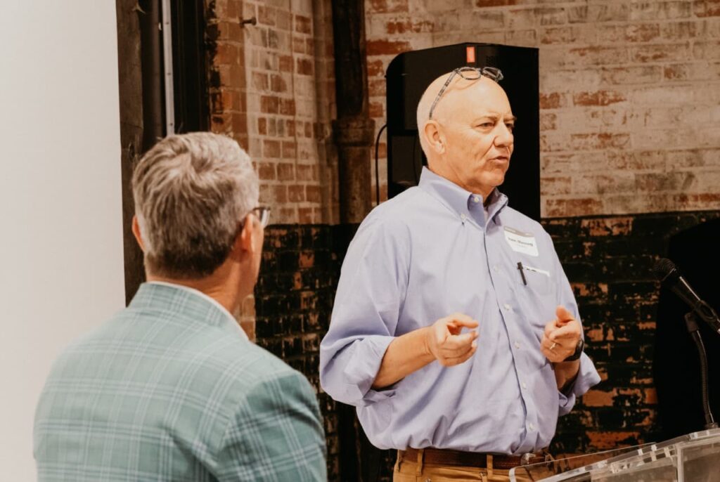
We had the pleasure of hosting Kristen Hadeed, author of Permission to Screw Up, and hearing her vision for the future of work. Our team unpacked these ideas with our very own Doug Austin, who facilitated a discussion around how these ideas are relevant to our business.

The workshop brought new ideas to the table, affirmed some of our current efforts and opened our thinking to how we can improve and refine our processes for developing talent.

We partnered with the TCU Department of Design, holding the workshop in the heart of the Fine Arts Building and Red Productions to capture video and photography from the event.

“Career Cushioning, Quiet Quitting, Conscious Quitting, Quiet Promotion, and the impending Silver Tsunami are contributing to a very interesting workforce landscape, especially as it relates to tomorrow’s leadership formation.”

Kristen Hadeed
Ken Schaefer speaking at workshop

Kristen’s book, Permission to Screw Up: How I Learned to Lead by Doing Almost Everything Wrong, is a memoir that details her journey as a young entrepreneur who started her own cleaning company while still in college. In the book, Hadeed candidly shares her many mistakes and failures as a leader, and how she learned and grew from them.

Through her personal anecdotes, Hadeed provides valuable insights on leadership, including the importance of building a strong company culture, giving employees the freedom to make mistakes, and learning to lead by example. She also emphasizes the value of persistence and resilience, and the importance of taking risks and embracing failure as part of the learning process.

Schaefer Advertising Staff and Client Photo

Permission to Screw Up is a refreshing and honest take on leadership, presented in an engaging and relatable way. It serves as a source of inspiration for anyone looking to become a more effective leader, and highlights the power of learning from one’s mistakes and embracing failure as a necessary step toward success.

Schaefer staff at workshop

Kristen’s live message centered on 4 key areas that lead to employee engagement: passion, growth, freedom and belonging. We explored finding the sweet spot where your motivations and talents combine, talked about career growth and the difference between rock stars and superstars, investigated what it means to have freedom at work and renewed our call to maintain our authentic culture of belonging at Schaefer.

This time with Kristen was an experience like no other and was incredibly valuable time spent focusing on leading as our most authentic, human selves.

Watch the Full Workshop

Enter your name and email below and we’ll send you the full workshop recording from Kristen Hadeed at no cost! Learn how to apply these tactics to your business today.

This field is for validation purposes and should be left unchanged.
Kristen Hadeed

For the TearCare® System, a crucial step in promoting their solution was to become an advocate for change.

Situation

At first glance, dry eye disease (DED) sounds like a mere inconvenience. However, left untreated, this chronic, progressive condition can impact the vision, surgical outcomes and quality of life of millions of patients. Even though meibomian gland dysfunction (MGD) is the most prevalent form of dry eye, in-office procedures to address it are relatively new — and none are reimbursed by insurers. As a result, only patients who can cover the out-of-pocket expense receive treatment.

The TearCare® System is designed to address MGD by evacuating obstructed glands using therapeutic heat and natural blink responses. However, to gain wider adoption, fair reimbursement was needed. The company sought to change reimbursement policies and broaden access to care by raising awareness of the situation. TearCare® tapped Schaefer to lead this effort.

Tearcare magazine ad and staff holding signs

Goals

  • Reiterate the threats associated with MGD
  • Raise broad, industry-wide awareness of current compensation and reimbursement limitations
  • Reach an array of stakeholders with a message of “Fair Access”
  • Rally the market to support reimbursement and accessibility for the benefit of patients, practices and payors
  • Increase awareness of the TearCare® System
Tearcare magazine ad and staff holding megaphones

Strategy

The client was ready to promote the need for change and had allocated resources to do it. However, to truly influence the market, the brand also needed to demonstrate the growing support of this movement from eye care professionals (ECPs), patients, employers and other key constituents.

Solution

To convey this message, Schaefer created a campaign that captured the feel of a public protest or political rally. In each execution, a real ECP, patient or eye care industry figure appeared with a sign that read “MGD Care Is Not Fair For All.”

Using precise targeting, Schaefer reached optometrists, administrators, payors and other audiences with a “protester/spokesperson” relevant to them. Using faces and names that are known throughout the industry helped build momentum over time, and, ultimately, drove awareness over the top. 

Tearcare ads

Results

By cutting through the clutter of standard medical device advertising, the campaign achieved a high degree of visibility and effectiveness. Within the first few months, the brand realized noticeable results, including:

  • 31K new users to the mytearcare.com site
  • 228 new requests for information on the TearCare® System from qualified users

More importantly, the industry is becoming aware of the need to recognize MGD as a reimbursable procedure — which is a crucial first step to change.

Summary

In this campaign, we effectively humanized a client’s treatment. Rather than promoting features and benefits of a specific solution, we showed the basic need for access to care — and the simple lack of fairness of not covering a widespread condition. We made the cause personal by featuring people our audiences knew — and who unquestionably held the best interests of patients and ECPs as a top priority.

How we helped NCODA translate membership benefits into an actionable message —
and surpass goals by 3X.

trade show

Situation

NCODA is an organization that provides resources, events and educational opportunities that enable oncologists, oncology pharmacists, healthcare professionals, pharmaceutical companies and healthcare students to connect and collaborate for optimal cancer patient outcomes. However, low awareness was keeping the organization from realizing its full potential as an information hub for HCPs seeking unbiased information on innovative oral and IV cancer treatments, as well as career-building tips to keep them engaged in this vital specialty.

Initially, Schaefer Advertising was enlisted to help drive awareness of the organization and its full suite of benefits. As the campaign progressed, internal business priorities shifted from awareness to membership growth. Schaefer partnered with NCODA to determine how to best adapt the current in-market campaign to aligning with the goal of growing the organization’s base through new member sign ups.

doctors

Goals

  • Expand awareness of the organization, its mission and its extensive array of
    member benefits
  • Distill an extensive and complex array of member benefits into a succinct,
    motivating message
  • Adapt to changing priorities by shifting the campaign focus from brand awareness
    to new memberships
  • Drive new memberships through paid media

Strategy

To drive awareness, Schaefer initially developed a strategy that helped humanize the organization by speaking directly to the membership about the difference that interaction and collaboration can make. The aim was to communicate that by joining NCODA, you’re collaborating and connecting with the best minds in the industry – and helping further advances in cancer care. The message was delivered through an omni-channel campaign — a first for the client.

name tags

Solution

Schaefer delivered a campaign and helped control creative costs by photographing actual NCODA members who were attending a scheduled conference. By using actual members, we were able to communicate in a realistic and convincing manner how NCODA helped members benefit by staying connected and tuned in to the latest developments in oncology.

When the business priorities changed the focus of the campaign from awareness to membership enrollment, our media efforts easily adapted to the new direction; it was a matter of moving an already interested audience toward signing up. The Schaefer team responded with speed and agility, making seamless changes to the existing digital assets. We then quickly set a tangible new member goal using estimates based on our experience with average costs per acquisition (CPA).

The revised media strategy was launched — and quickly surpassed expectations.

doctors

Results

All clients have finite resources. For NCODA, the limitations of total media dollars were more pronounced than usual. This challenge was something Schaefer was ready and able to overcome. As a result, building a symbiotic creative and media strategy was key to expanding the brand’s awareness and significantly exceed membership goals in record time.

  • Exceeded paid media membership projections by 3X
  • Surpassed assisted conversion goal
  • Attracted new users to the NCODA website through paid media
  • 74% of all member enrollment page views were generated from paid media

Summary

Schaefer met the initial task of distilling a very robust array of benefits into an easy-to-digest creative and media strategy. But when the strategy shifted to membership, we illustrated our ability to provide significant real bottom-line value. Our agility and flexibility enabled us to quickly re-tool our approach, then develop a media strategy that exceeded all projections. Working within a limited budget, the agency was able to leverage the client’s marketing dollars as effectively as possible. In the end, we clearly illustrated the type of ROI that could be generated by a smart, results-oriented campaign.

May 16, 2023

Texas’ best weekend

Texas' Best Experience Advertising

The Charles Schwab Challenge is one of the longest-running PGA TOUR invitational tournaments. The highly-anticipated event brings together top golfers from around the world to compete at Colonial Country Club in Fort Worth, Texas. The historic course and club has hosted the event every Memorial Day Weekend since 1946, making the Charles Schwab Challenge one of the premier events on the PGA TOUR year after year.

cell phone with ad

Rising to the challenge

Coming off a global pandemic, 2022 was a year of transition for the Charles Schwab Challenge. People were still embracing intimate gatherings and with the tournament being played without fans one year and with limited attendance the next, the tradition of attending the Charles Schwab Challenge wasn’t top of mind for many fans. Additionally, 2022 ushered in a new pricing model for the tournament and increased revenue goals that required a shifted approach to marketing from awareness-based to conversion-focused.

Charlees Schwab Challenge Pole Banner Ad

An integrated campaign that drives conversion

Before partnering with Schaefer, the tournament utilized more traditional mediums to promote the event to a general North Texas audience. But as we prepared for the 2022 tournament, Schaefer recommended a more granular approach to targeting individual ticket buyers by splitting the audience to focus on two primary markets — avid golfers and social attendees. The goal was to create a more integrated campaign that not only got people excited about the tournament, but spoke directly to each audience’s particular area of interest wherever and whenever their needs arise. By leveraging a more individualized approach to messaging and targeting across tactics such as paid search, retargeting, geofencing, and paid social, we were able to capitalize on the buying period leading up to the event and increase opportunities for conversion.

Email marketing for charles schwab challenge

Creative that can adapt to audience needs

If we had to achieve one thing to make this campaign successful, it was adaptability. A robust media strategy meant the creative needed to scale across a wide variety of mediums, from high-level awareness spaces like streaming TV to high-intent micro moments in the customer journey. That meant keeping design elements functional. So we opted for an abstract reference to course topography. The organic shapes allowed us to create compelling composites that featured the most important textures of the experience — environment, competition, and up-close views of the PGA TOUR’s best players. 

Since we were targeting two audience sets, it was important that the messaging be specific yet modular. The line, Texas’ Best, extended across both target audiences while communicating the notoriety and pride North Texans have for the Colonial tournament. It also worked well with new player announcements. 

Collage of Charles Schwab Challenge Advertising

The tournament field greatly impacts ticket sales. Top-ranked players and fan favorites draw big crowds, but player commitments can finalize weeks and sometimes days before the tournament. To improve performance, we build every concept to accommodate on-demand optimizations and leveraged that flexibility to announce new player commitments, some finalizing in the eleventh hour of the campaign. In the final weeks leading up to the event, we saw a big uptick in action, selling 80% of tickets in the last 30 days.

Results

Moving the tournament from more traditional mediums to a digital-first, multi-audience campaign allowed us to reach people at every touch point – connecting the dots across channels to guide consumers from I-want-to-go to I-want-to-buy. Overall, our campaign strategy outperformed industry paid media standards in Sports and Recreation to produce nearly 14K  in daily ticket sales and $1.2M in revenue. 

Charles Schwab Classic tickets banners

A few top channel results include:

  • Paid Search: 16% CTR, 31% CVR and $3.72 cost-per-conversion
    Industry Average: 8.8% CTR, 5.9% CVR and $31.50 cost-per-conversion
  • Email: 39% open rate out of 575K+ emails delivered to a qualified audience
    Industry Average: 20.5% open rate
  • Display: 0.11% CTR on location-relevant geofencing campaign
    Industry Average: 0.08% CTR

Generation Z, also known as the Digital Generation, consists of those born between 1997 and 2012. This generation is skeptical about taking the leap into first-time home ownership, and they are discouraged by the challenging feeling of figuring out how to buy their first home. In fact, the percentage of Gen Z that feel they will never be able to purchase a home on their own has increased from 27% in 2019 to over 33% of the generation’s population today

Has the American Dream become a Pipe Dream? Are the roadblocks to home ownership real or perceived? Are they weighing all the long-term benefits of home ownership? Let’s take a look at this conundrum, including where we can be proactive from a marketing perspective to help this generation see the opportunity to embark on this rite of passage into adulthood.

Perceived obstacles Gen Z faces

Right now, the dream of home ownership is clouded by so many factors that the future seems dismal for this digital generation. Everything from crushing student loans to rising interest rates and job insecurity all play a role in this recoil from a first-time home purchase. According to the National Association of Realtors (NAR), the average age of first-time home buyers is now 36 years old, up from 33 years old just last year, adding even more time before Gen Z is in the average home buying years. According to a Freddie Mac survey in November of 2022, Gen Z adults identified the following as the top five hurdles to homeownership:

chart

Another obstacle in the way of home-buying decisions for Gen Z is their anxiety about making large purchases. They remember what happened during the recession and the pain felt by so many families as they lost their jobs and homes. Although this is a lasting image, there is a silver lining to this recollection.  While some were affected directly by the recession, they did learn from those whose parents were prepared for the downturn and were good financial stewards, capable of navigating through it. Keeping the hope alive that even though tough times might come again, there is a way to pass through them.

For Gen Z, who were in college or graduated during the COVID-19 pandemic, there is a prolonged period of living at home. The extension of living under their parent’s roofs delayed this significant milestone even further, making it more difficult to achieve. This had an impact on their readiness and timing to purchase their first home.

The competitiveness of home buying in the past 18 months has caused a lot of Gen Z to rethink their first-time purchase. High prices, all-cash offers, over-bidding, and “as-is/no inspection” purchases all played a role in the downturn of homebuying activity.

These roadblocks have real stopping power which led to the market responding in ways to help this generation, and others bridge the gap between first-time home buying and first-time home feeling. As a result, we are seeing an increase in build-to-rent options from developers, providing a gap fill between true ownership and the feeling of ownership. We also see first-time buyers investing in smaller, outer market homes, and keeping them for rental properties or second homes.

This perspective would not be complete without the recognition that technology has changed the home-buying game for Gen Z in a material way. This digital generation looks to technology first for solutions and options, which is no different when buying a home. The ability to search, identify, walk, and purchase a home without ever having set foot inside the door is here and Gen Z has embraced it. YouTube and other social platforms have demystified the home-buying process to a large degree.  This includes step-by-step instructions available on our smartphones, with links to the tools to make it happen. Ironically, however, with all this technology at their disposal, one area of hands-on, in-person interaction which remains important includes the use of a realtor to help with the final execution of the purchase.

Of course, technology includes AI applications and other capabilities. We’ve highlighted a few AI tools here real estate marketers  should all be aware of.

  1. Zillow 3D Home: Allows realtors to create virtual tours of properties using Ai-generated 3D models. This tool allows you to create a 3D model of the property and make it available for the clients to walk through the property virtually.
  1. Homie: An Ai-powered virtual home-buying assistant. This tool uses natural language processing and machine learning to communicate with buyers, answer their questions, and assist them through the home-buying process.
  2. Hyro: Conversational AI that provides an around-the-clock agent to step in whenever your agents can’t, capturing every lead from call centers, SMS and web-based inquiries.

For a more comprehensive dive into AI in Real Estate, check out this article from Maverick: Unlock the Power of AI Tools to Boost Real Estate Marketing.

It is clear, the market has met Gen Z where they are with a variety of options to help usher this digital generation calmly into first-time home ownership. Home builders will continue to include affordable housing in their portfolios, Zillow and Redfin are making it easy for Gen Z to browse homes from their couches, and we, as marketers, can help too. Here are a few strategies to consider when marketing real estate to Gen Z.

Leveraging technology

  • AI
  • Virtual tours

Educational and empathetic communication

  • Trustworthy messaging
  • Emotional aspects of homeownership

Demystifying homeownership

  • Industry is cyclical
  • First home isn’t forever home

In the end, Gen Z will continue to age, and as they do, we will be right alongside them to understand how they are feeling about their first-time home purchase to ensure we are prepared to intersect with them along their future buying journey. At Schaefer, our focus on the Real Estate development market means we stay up to the minute on not only the realities of the market but importantly the mindset of the home buyer. We understand how to best develop your brand, tell your story, and, most importantly, how, and where to intersect with homebuyers of all ages to drive action.

TCU approached Schaefer to develop branding for their Sesquicentennial, or as it is more commonly referred to, their 150th anniversary celebration. Though 2023 was the big year to promote this monumental achievement, we started this project in 2019. We were charged with creating a logo and graphic system that would celebrate one of the university’s most significant milestones in their history and promote their vision for the future.

Schaefer was specifically selected based on our creative capabilities, connection to the TCU and Fort Worth communities and our ability to deftly navigate a committee-led initiative that would have a high-profile position among many audiences.

TCU photos for 150th anniversary celebration

Approach

We dove into this challenge head first, conducting extensive research, including comparative landscape research, archival research, and interviews with key trustees, former Chancellor Bill Tucker, alumni, administration, students and committee members. Through this exploration, several key themes and values clearly stood out across generations of TCU students and alumni. A commitment to academic excellence, a strong sense of community, and a focus on service and leadership remained constant in spite of all the changes in the world over 15 decades. 

“Our history is incomplete. Our speaking and our learning are incomplete. We will not demand vows or enjoin commitment to truth that we are still discovering. We will fill the next century by seeking, by entering gladly its maze of marvels, whose patterns will emerge, surprising us with joy. We light this torch to mark our hopes and expectations; its warmth and light tell our best intention.”

1973’s Centennial presentation by former Chancellor J.M. Moudy 
TCU 150 Sketches

In the archives of the TCU Library, we reviewed yearbooks, invitations, speeches, photographs, posters and other relics from the past. It provided consistent and humbling reminders of the responsibility we held in our hands to carry on an amazing legacy of intention in the pursuit of our best.

Solution

At its core, this logo had to connect. It had to compliment the existing arched TCU mark. Though it could leverage the equity of TCU’s logo, it had to balance alongside it and add specific meaning to this special occasion. It had to be clearly recognizable to our alumni base and students in a way that evoked pride built on meaning. It had to bridge 150 years of history and lean into its bold vision for the future. It had to support a broader ad campaign with a wide range of uses from video to merchandise, signage, athletic uniforms and fields of play, graduation gowns, lapel pins and even a drone show.
The final mark leverages the iconic symbol of Frog Fountain. Located in the heart of the TCU campus, Frog Fountain has four stylized flutes representing each class of students, and the water flowing between them symbolizing the passing of knowledge from class to class. This was the visual icon we felt could link generations in meaning, memory and pride.

TCU 150th anniversary logos

Outcome

The branding campaign for TCU’s 150th anniversary launched in the fall of 2022 and has marked the celebration with great consistency and clarity. Our small but mighty mark has lit up the sky above campus, stood behind the bell on Wall Street, found its way to the National College Football Championship, been painted on murals across the US and used almost everywhere in between. “To say we are proud of this little mark is an understatement. Our team is honored to be a part of this monumental milestone for a university that is leading us all into the future,” Charlie Howlett, VP, Creative Director (TCU Class of 2006). 

Go Frogs!

photo of TCU 150th anniversary mural

Podimetrics had a strong story to tell
— and a new brand to build

Podimetrics Brand Logos

Situation

Diabetes is one of the top health issues in the United States. In fact, costs for diabetes care are more than 400% higher than cancer. One of the leading drivers of that cost is amputation resulting from Diabetic Foot Ulcers (DFUs), which results in a limb being amputated every four minutes due to diabetes.

To combat this, Podimetrics developed a web-enabled, remote temperature monitoring system designed to identify the risk of DFUs before symptoms are visibly present — and drive significant cost savings by avoiding costly amputations.

Schaefer took the reins on translating this innovative system into a compelling narrative that would reach key audiences and encourage payor adoption.

Goals: 

  • Support the market launch of a new, breakthrough product
  • Differentiate Podimetrics from competing solutions
  • Explain the system and its benefits to payors and HCPs
  • Support rollout to a low-tech patient base with clear, user-friendly materials
Podimetrics Materials

Strategy

Our team was tasked with creating a new brand and executing multi-channel communications to differentiate Podimetrics and drive sales conversations.

To reach the various audiences, we decided that two specific objectives must be achieved: First, the brand story must be humanized and brought to life in a manner that would resonate with payors, physicians and patients. Second, communications and user pathways should be simplified, to ensure that the relevant messages were reaching each audience and business objectives were being reached.

Podimetrics Website Mockup

Solution

Viewing Podimetrics’ system as something akin to a “canary in the coalmine,” Schaefer used this metaphor to create a consistent brand story that clearly conveyed the benefits of early detection — including the estimate that more than 70% of diabetic foot amputations could be prevented through early detection.

From there, Schaefer conducted a User Experience audit to find opportunities to improve communication throughout the customer journey. We then launched a full suite of materials to support the sales team, including an updated website, product videos, stationary package, and other sales support materials.

For end users, Schaefer also created product packaging that was as user-friendly as the device itself. Knowing the patient profile was less tech-savvy, we scrutinized every aspect of packaging and product setup to ensure everything remained simple, intuitive and frictionless.

Podimetrics Device

Results

Schaefer effectively positioned Podimetrics as a new, holistic system that uncovers and prevents extremity complications from diabetes. This differentiation is allowing Podimetrics to compete for significant national payor contracts, as well as establish notable partnerships with strategic allies such as the American Diabetes Association.

Summary

For diabetic foot wounds, early detection is essential for avoiding amputation and reducing costs. The “canary in a coalmine” solution helped humanize and simplify a complex technology and gave both internal and external audiences a better understanding of its purpose and its benefit. Today, a growing number of payors, physicians and patients are becoming aware of the potential benefit of the Podimetrics system.