Schaefer Advertising Co.

Archives

November 21, 2013

Nethery Eye Associates

An opthamology practice with five physicians, Nethery Eye Associates tasked the Schaefer team to develop an integrated marketing plan to increase patient traffic in light of a more competitive marketplace. We evaluated and refreshed their current branding to support these marketing efforts and executed the refreshed brand in a website, collateral and other patient education tools, and an online media campaign.

Educational Video Series
for Nethery Eye Associates

When the Fort Worth Opera asked Schaefer to help them create fundraising collateral for a new opera they were commissioning based on the life of JFK, we were interested. When they needed it in a week, we started sweating. But c’est la vie in the ad world.
Fortuitously, the Amon Carter Museum in Fort Worth was running an exhibit of the artwork that had been put in his hotel room the night before he died. The new opera was to be set during the course of that one day in Fort Worth in 1963, so it proved an invaluable field trip for the creative team.
One of the pieces in the exhibit that caught our attention wasn’t a piece of fine art, per se, but a paper sign with welcoming the president and first lady in red letters and red glitter. This ultimately became the front cover of our collateral piece.
Not only did it harken back to that period of time, it was the perfect symbol of what the Fort Worth Opera’s new production—and those donating to it—were doing: welcoming Jack and Jackie back to Fort Worth.
We were able to produce the materials in time for a kickoff event held on the anniversary of his death. Previously named the Hotel Texas, what’s now the Fort Worth Hilton is where JFK spent his last night. It was the perfect time and place to announce the new opera, which is set to open in the 2016 opera season.

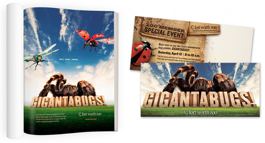
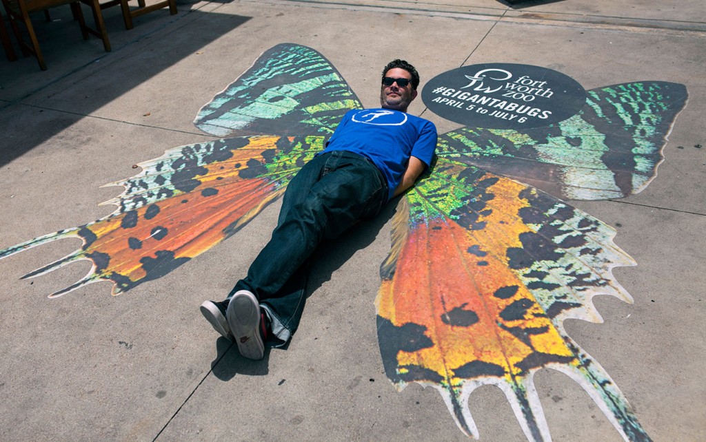
When the Fort Worth Zoo decided to update their brand messaging for 2013, Schaefer decided to pick up where our last campaign left off – clean, uncluttered imagery that kept the animals as the stars of the show.
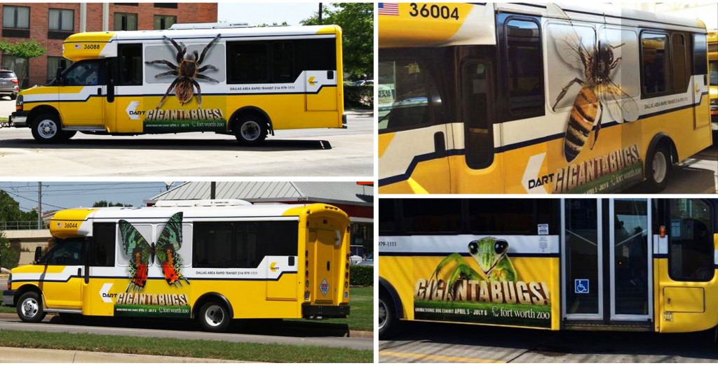
We saw this new campaign as an opportunity to communicate the experiential and entertainment value the Zoo offers by reminding the people of Fort Worth and surrounding areas of their wilder neighbors. We did this by trying to keep animals as close to actual size as possible throughout the varying media.
We kept backgrounds simple to further call attention to the animals as they cropped up around their “natural habitat” of Fort Worth.
Our approach led us to the headline: Real. Fun. On the one hand, it’s self explanatory, but it’s also a subtle comparison to movies, video games and other virtual forms of entertainment.

October 29, 2013

Cover Your Sneeze

Flu season is once again upon us. And without knowing it, a lot of extra germs could be as well.
The CDC requires healthcare providers to post visual alerts instructing patients to practice respiratory hygiene or cough etiquette. Most of the time, this manifests itself as cheesy cartoon illustrations, which are printed and laminated in-house. In other words, another flyer in a hospital or clinic that you don’t care to read. When JPS brought this challenge to Schaefer, we found a way to get the message noticed.

Photography by Robie Capps
 

Schaefer Advertising recently rebranded Tallulah & Company, a Fort Worth interior design company led by Ally Arlington. She’s the very talented designer who is responsible for the beautiful environment we work in every day. She tasked our team with developing an identity that could exude a timeless style with a flair for the unexpected. It needed to be strong yet comfortable. Beautiful yet functional. Just like her work.

We enlisted the help of calligrapher Lauren Essl, of Blue Eye Brown Eye, to craft the handwritten logo treatment.


Schaefer Advertising recently rebranded Tallulah & Company, a Fort Worth interior design company led by Ally Arlington. She’s the very talented designer who is responsible for the beautiful environment we work in every day. She tasked our team with developing an identity that could exude a timeless style with a flair for the unexpected. It needed to be strong yet comfortable. Beautiful yet functional. Just like her work.
We enlisted the help of calligrapher Lauren Essl, of Blue Eye Brown Eye, to craft the handwritten logo treatment.
 

October 20, 2013

WayPoint Healthcare Advisors

WayPoint Healthcare Advisors is a healthcare consulting firm in Fort Worth, Texas led by two senior level executives, each with 20+ years of experience in healthcare consulting. Faced with a rapidly changing healthcare environment, WayPoint Healthcare Advisors needed to evaluate their marketing initiatives. We worked with the WayPoint leadership to develop new branding and marketing materials to support public relation initiatives. This logo was initially launched through email marketing and a new website.

October 19, 2013

Small change. Big Impact.

The Story

JPS Foundation is a non-profit arm of John Peter Smith Hospital that helps raise money for things the hospital budget doesn’t cover such as baby supplies for low-income women, clothes for the homeless and medicines for those who can’t afford them.

When it came time for their annual employee giving campaign, they came to us with a challenge. Donations had been in decline for several years, as well as the number of employees who were donating. Employee involvement is an important metric when applying for funding, so it was up to us to bring the numbers up.

The Work

When you think of fundraisers for non-profits, you might think about the poster board thermometer that is gradually filled in with red sharpie. When the goal is a large sum of money, it can easily feel like the dollar or two you have to spare won’t make much of a dent. Since we needed as many people to participate as possible, we had to overcome this perception.

Our idea was to show that a small donation—even as little as a dollar—could actually have a real impact. That’s because many of the things JPS Foundation provides, such as a pair of socks or a pedometer, cost very little. We called the campaign Small Change, Big Impact and used a series of four videos to show how even inexpensive items could make a big difference in a person’s life.

The Results

It’s clear that JPS employees took the message to heart. JPS Foundation raised over $200,000 as a result of this campaign, up from $95,000 the previous year. The number of employees who participated also rose from 685 to 1019 in one year. And while it’s always great to see that a campaign worked, we’re most proud of the real, life-changing impact those stats represent.

September 13, 2013

Zoo Ball 2013

Our poster for the 2013 Zoo Ball features custom illustration by creative director Todd Lancaster. In keeping with the event’s psychedelic theme, we printed this poster in the style of blacklight posters from the ’70s using UV inks and purple flocking for a textural element. Posters were delivered in a tube that included a blacklight bulb, so the recipient could get the full effect. Other printed materials for the event were illustrated in the same style to further the theme.

September 10, 2013

JPS Health Network Rebrand

Last year, JPS Health Network charged us with reinvigorating their brand and changing the perception that this county hospital was dated, distant and becoming irrelevant in the community. By doing so, we could inspire the employees within the network to have greater pride in their organization and in the quality care they provide for their patients.

The new JPS Health Network logo consists of the JPS icon and the tagline “Centered in Care, Powered by Pride.” The tagline is given new prominence to clearly define the JPS commitment to excellent patient care. It’s necessary to evolve logos over time to keep them relevant as the assumptions made when the initial logo was established may no longer hold true. The color-enhanced JPS logo reflects the vibrancy, diversity and energy of their staff today while maintaining the core blue icon that is so well recognized in the community.

We found that almost 80% of their printing used four or five colors. With this discovery, we saw an opportunity to introduce more color to the logo that would not impact the budget for printing and would deliver greater impact in digital mediums.

Visually, this is not a drastic overhaul of an identity but a very specific and strategic evolution that focuses on opportunities to better JPS as a network. This can be seen in the improvements to legibility within the icon and typography. Our design styles and approach to all communication materials moving forward must provide clarity because it reflects the quality of care that is provided.

We selected the Tisa typeface family to bring a more contemporary look to the JPS brand. By contrasting a sans serif and slab serif typefaces, we are able to provide variety to the various extensions of the brand without sacrificing consistency or legibility. When paired with the updated icon, this typeface maintains brand recognition within the community and displays a more approachable image.

– Charlie Howlett