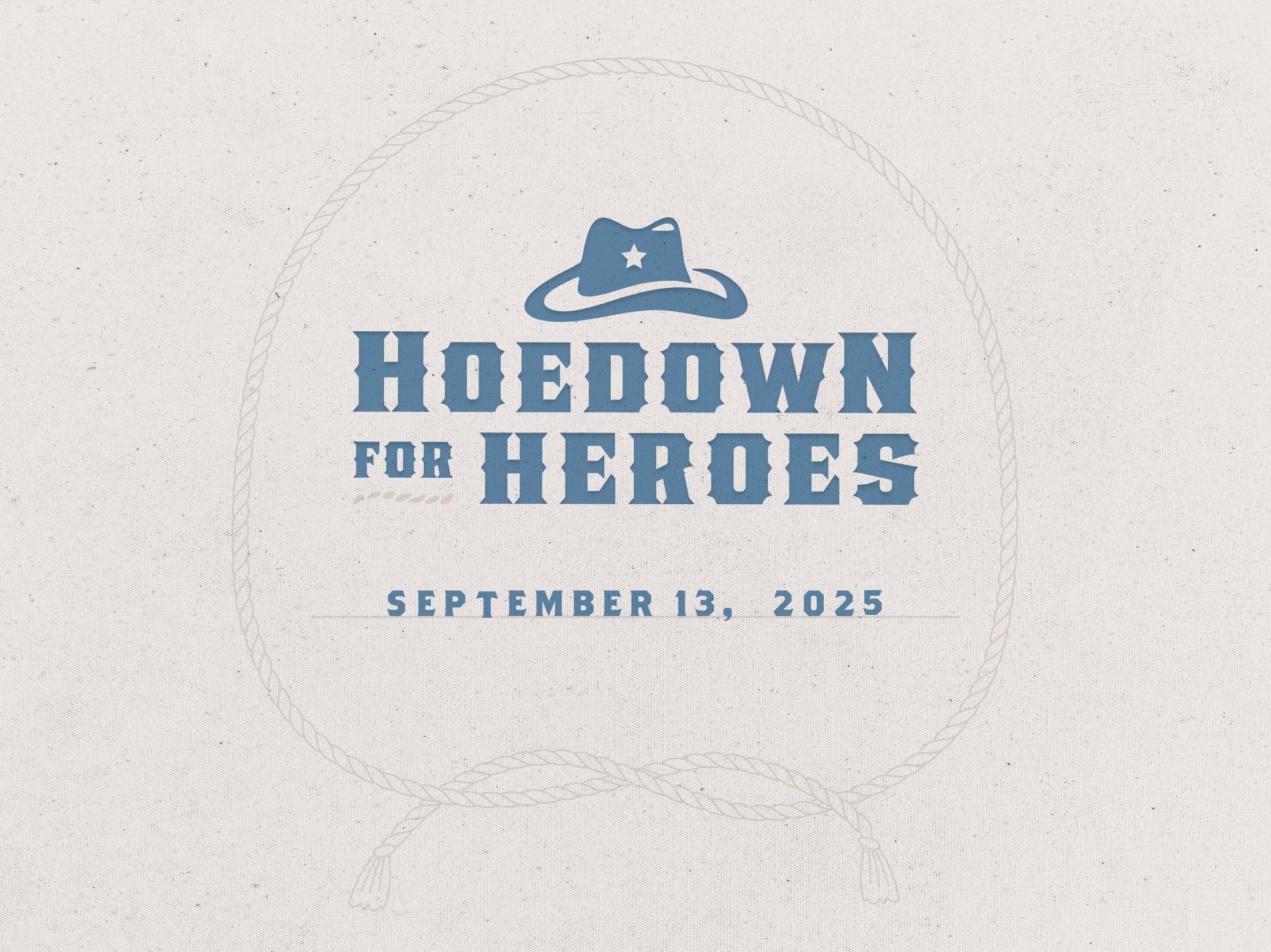
Game On: Branding Premier’s Leadership Conference
20 Years in Motion
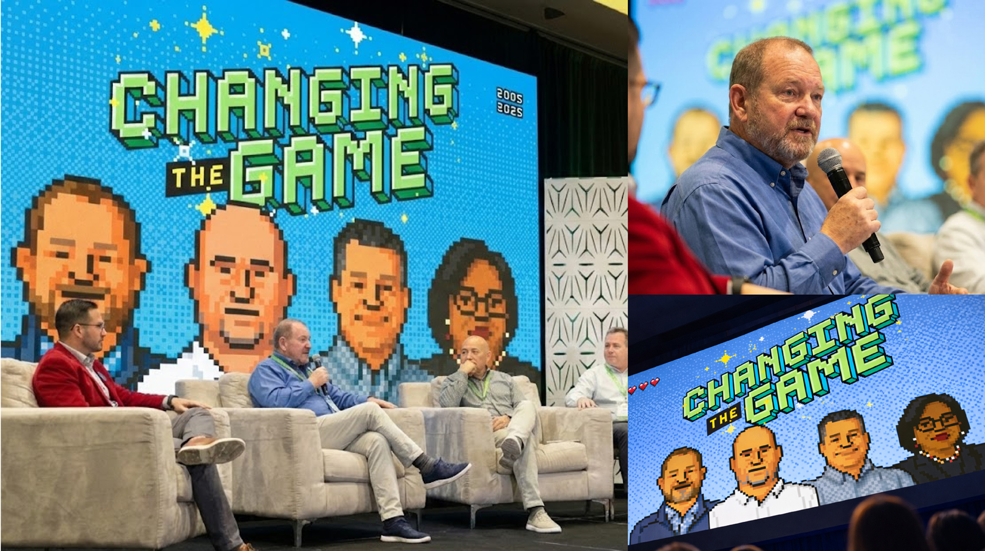
Premier Trailer Leasing, one of the nation’s leading trailer leasing providers, celebrated its 20th anniversary in 2025 with an internal leadership conference centered around the theme Changing the Game.
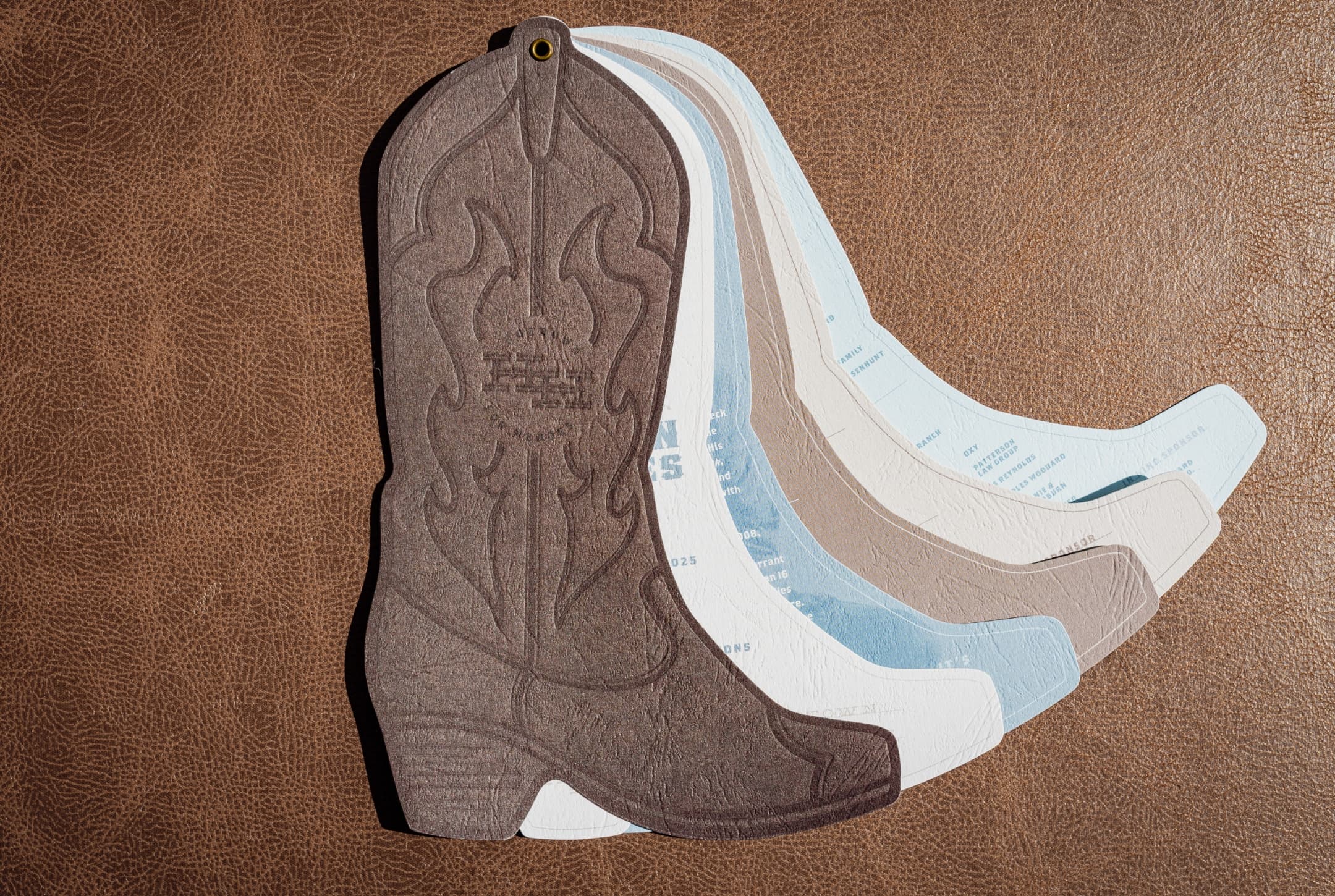
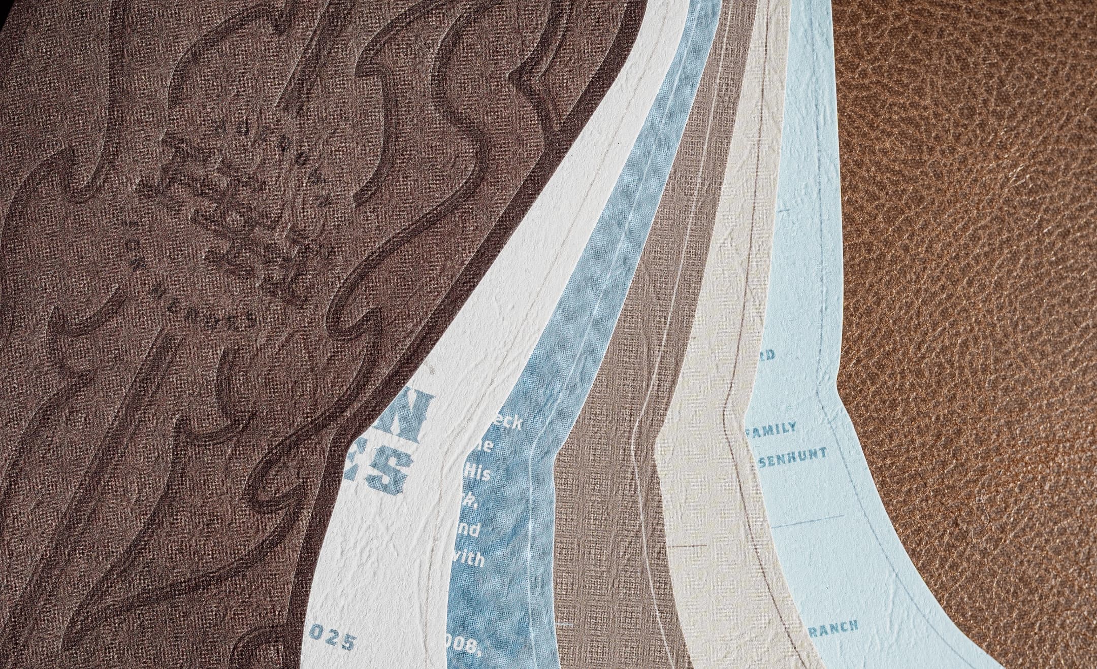
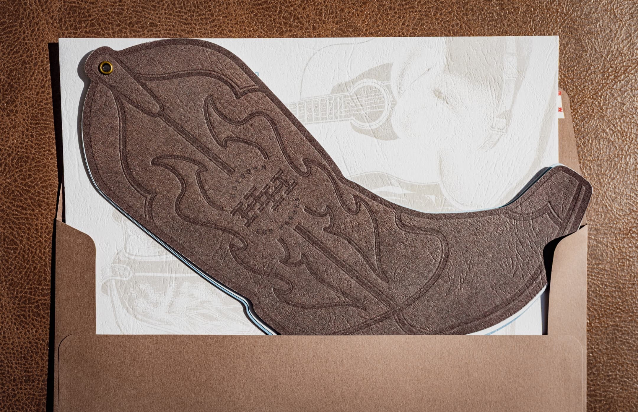
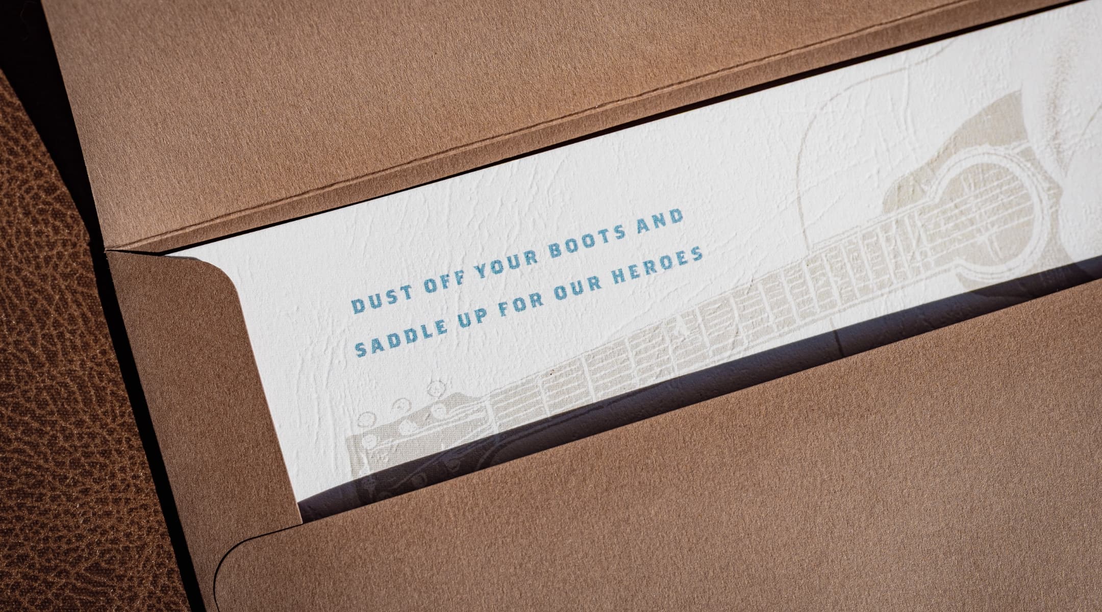
Designed to celebrate two decades of growth, innovation, and service while reinforcing Premier’s culture of integrity and care, the conference became an opportunity to create a more engaging internal brand experience for employees across the organization. Schaefer partnered with Premier to develop the event logo and visual direction, which expanded into a broader creative system used throughout the conference to build excitement, consistency, and participation among attendees.
Bringing the Theme to Life
The objective was to translate the Changing the Game theme into a creative direction that felt memorable, intentional, and unmistakably Premier. The challenge was not simply to make the conference “look like a video game,” but to create an experience that reinforced Premier’s momentum as a company while celebrating the people who helped shape its first 20 years.
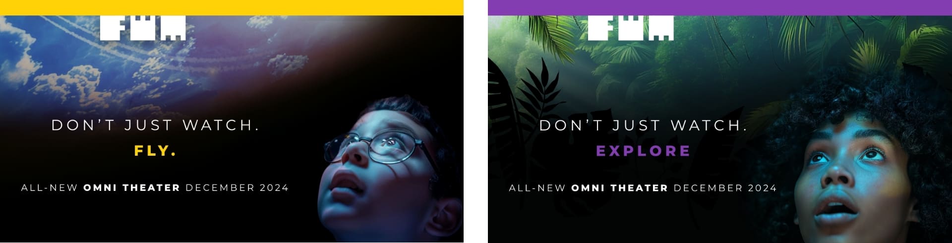
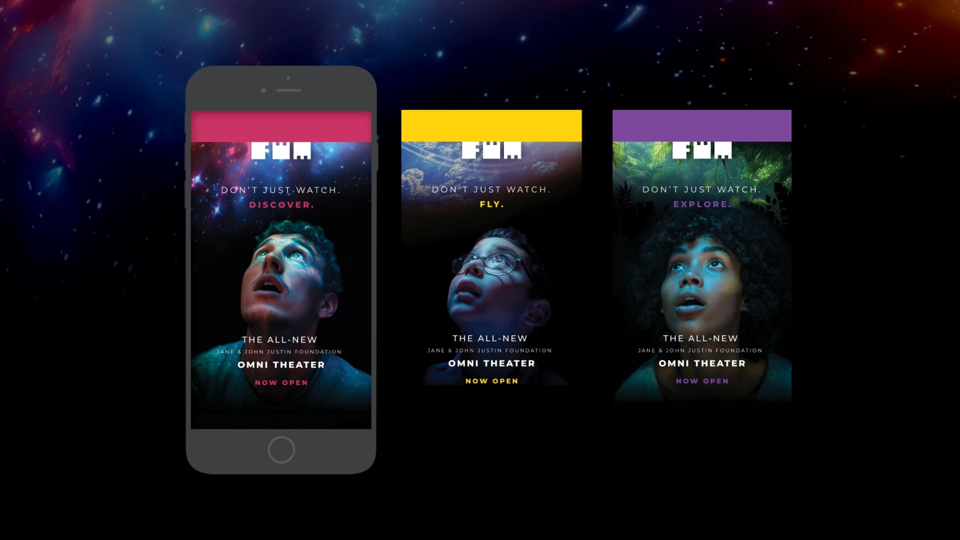
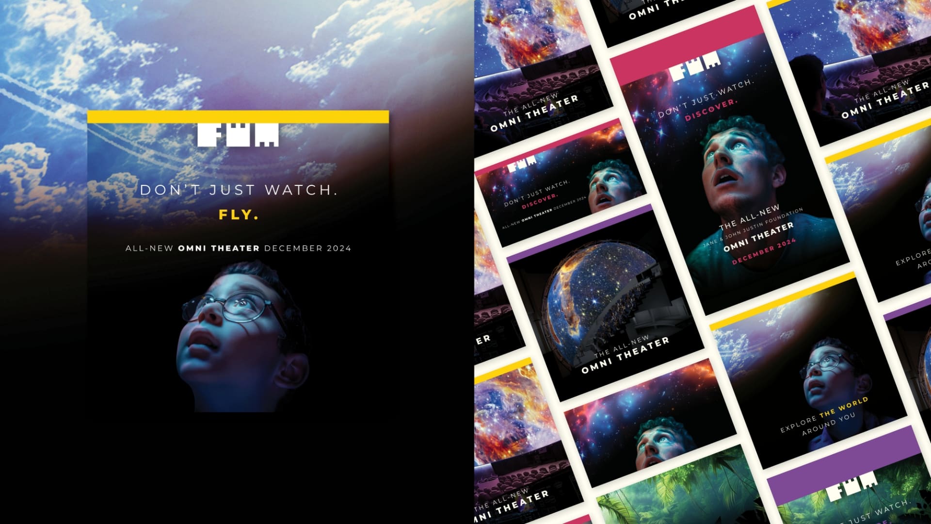
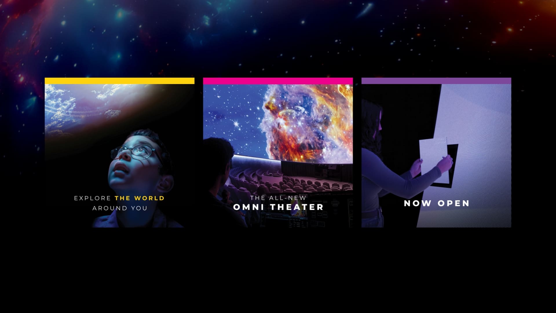
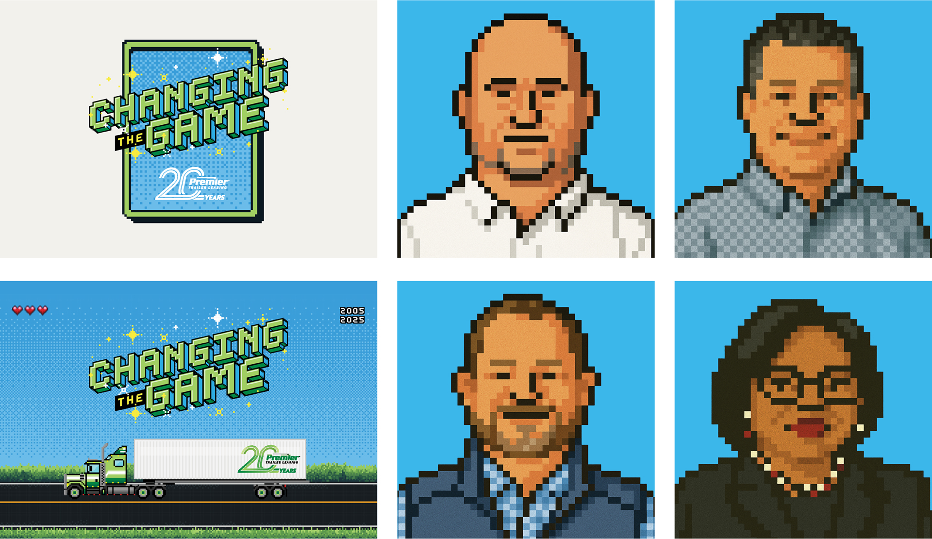
Schaefer anchored the creative in a nostalgic ‘90s gaming aesthetic, using pixel-inspired typography, arcade-style visuals, and retro references to communicate energy, leadership, and forward movement. The nostalgic cues created an immediate sense of familiarity and fun, helping employees connect with the conference theme in a way that felt approachable rather than overly corporate.
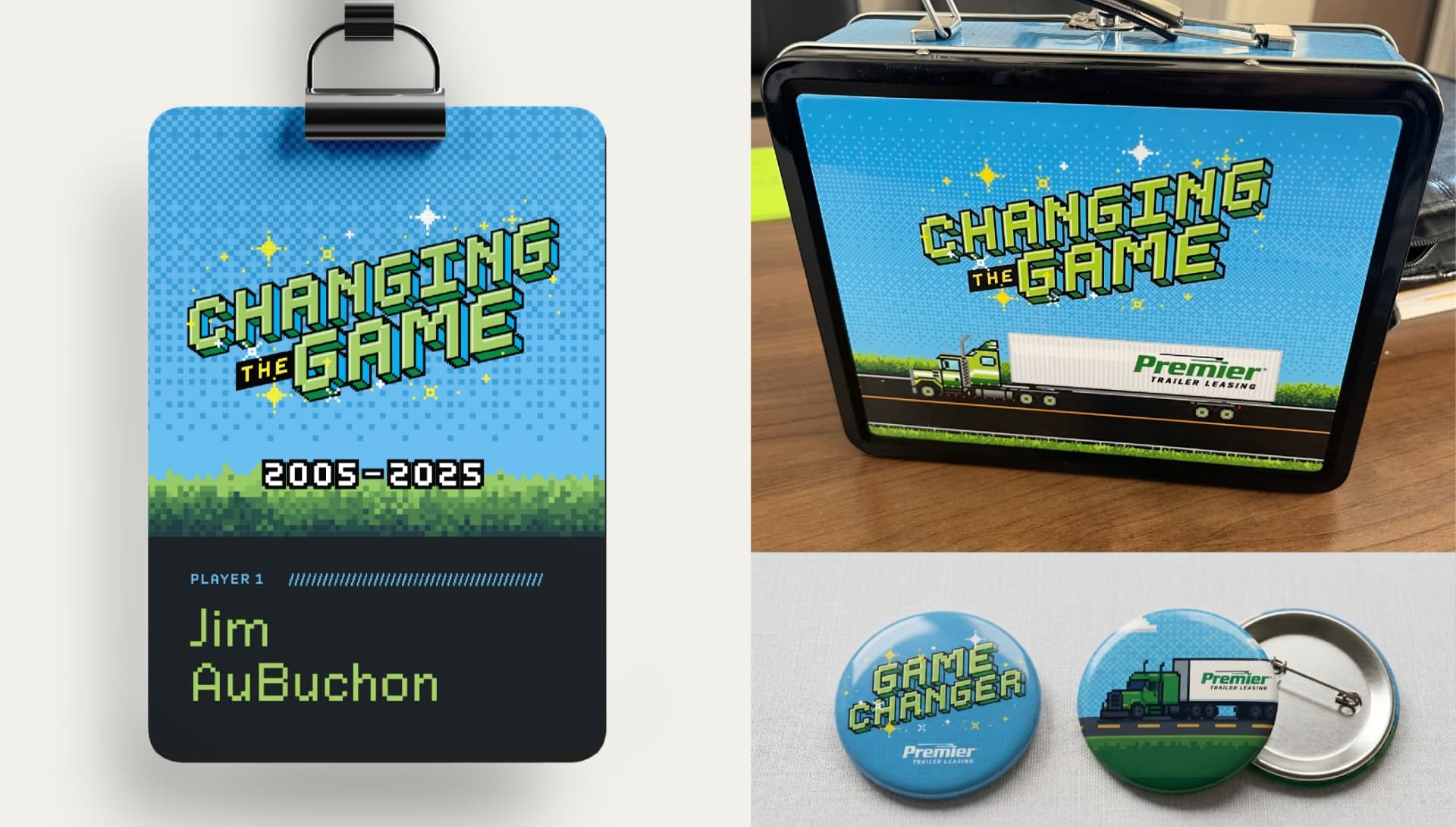
The concept extended beyond the logo into a scalable identity system that included a defined headline typeface, color palette, and flexible design assets for presentations, signage, badges, and event materials. The system also expanded into custom pixel-style speaker portraits and motion-inspired visuals that added personality and consistency across conference touchpoints.

Game-Changing Results
The final conference branding gave Premier a creative system that felt fresh, engaging, and deeply connected to the company’s culture and values. More than a collection of event graphics, the work created a shared visual language that employees could interact with throughout the conference experience.
By combining strategic messaging with a playful but intentional creative approach, Schaefer helped Premier celebrate an important milestone while reinforcing the mindset behind the Changing the Game theme: leadership requires stepping up, making decisions, and continuing to move the organization forward.
The project also demonstrated how thoughtful conference branding can extend beyond decoration to create meaningful moments of engagement — giving brands permission to show up in new ways while still feeling authentic to who they are.