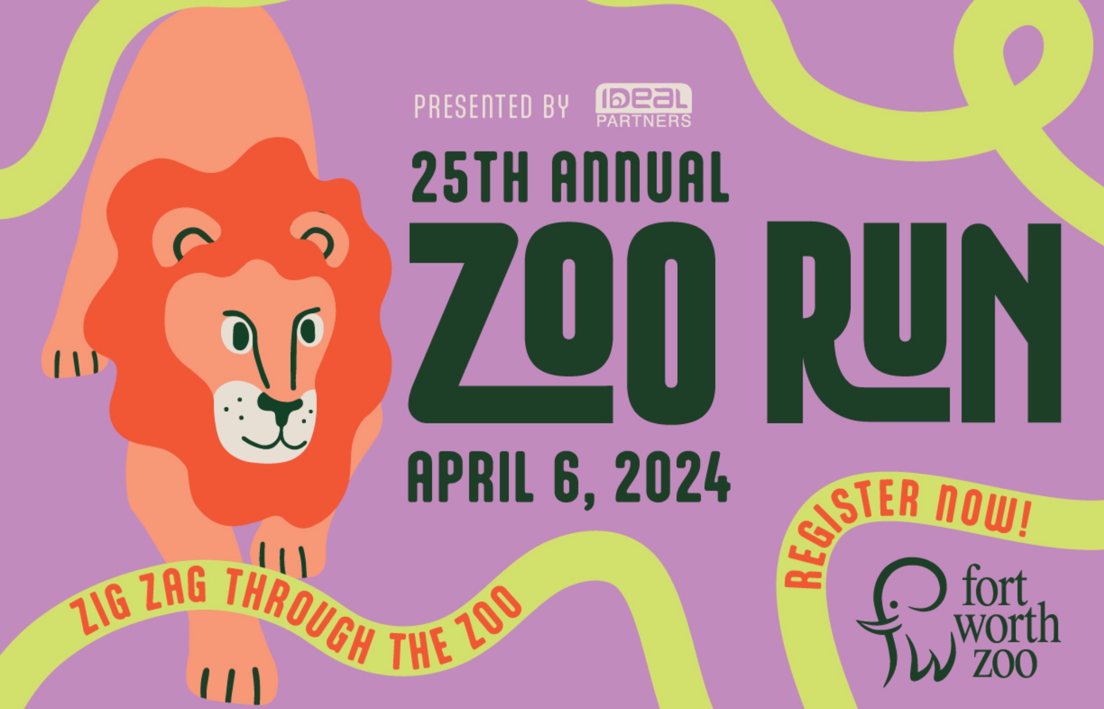
Zoo Run 2024 marked the event’s 25th anniversary, and it was the perfect moment for a creative campaign to bring the excitement of this beloved event to life. The main goals included driving awareness and filling registration spots, with an underlying objective of surpassing the prior year’s results.
Engaging Audiences with Vibrant Creative and Strategic Media
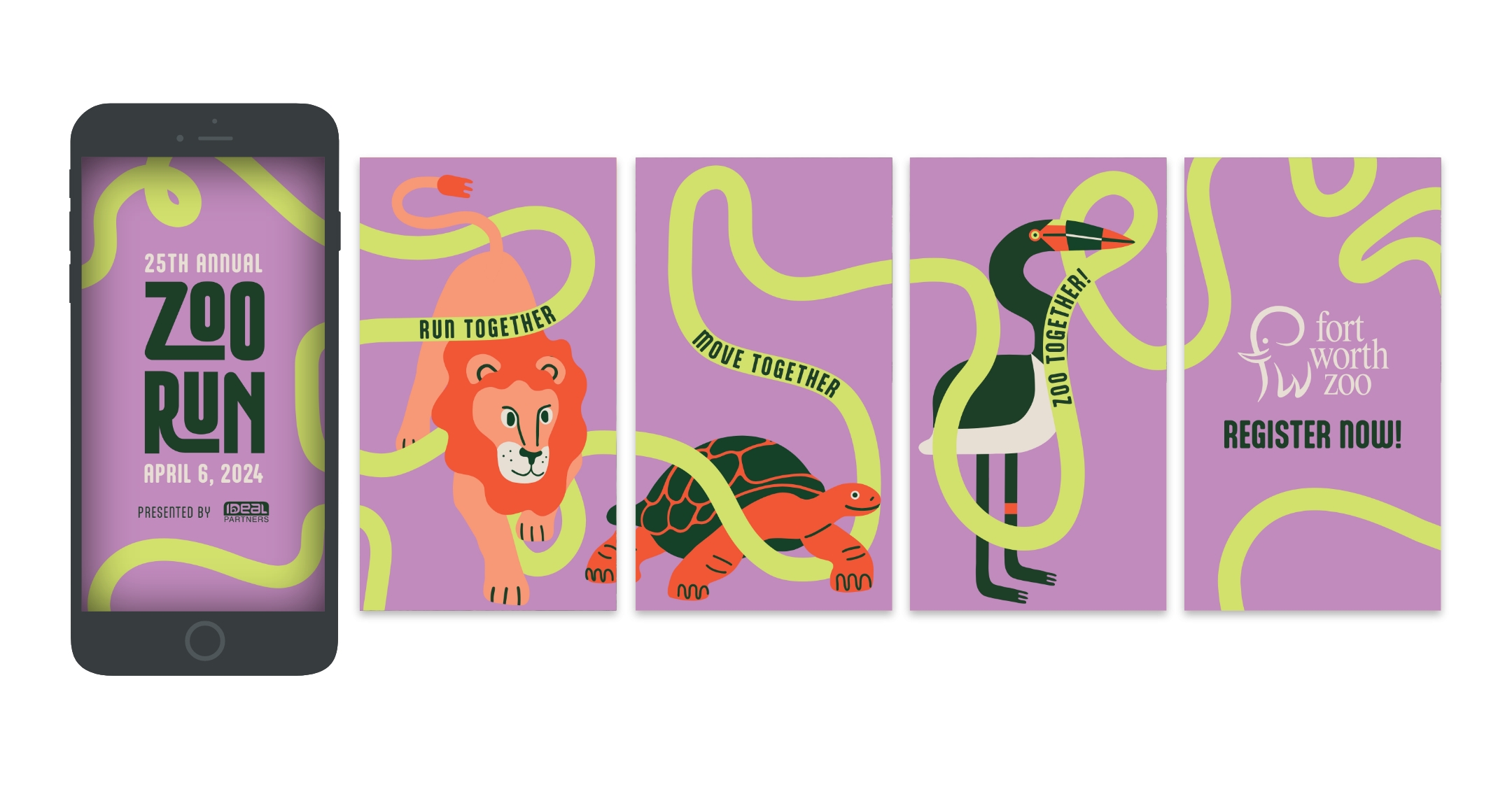
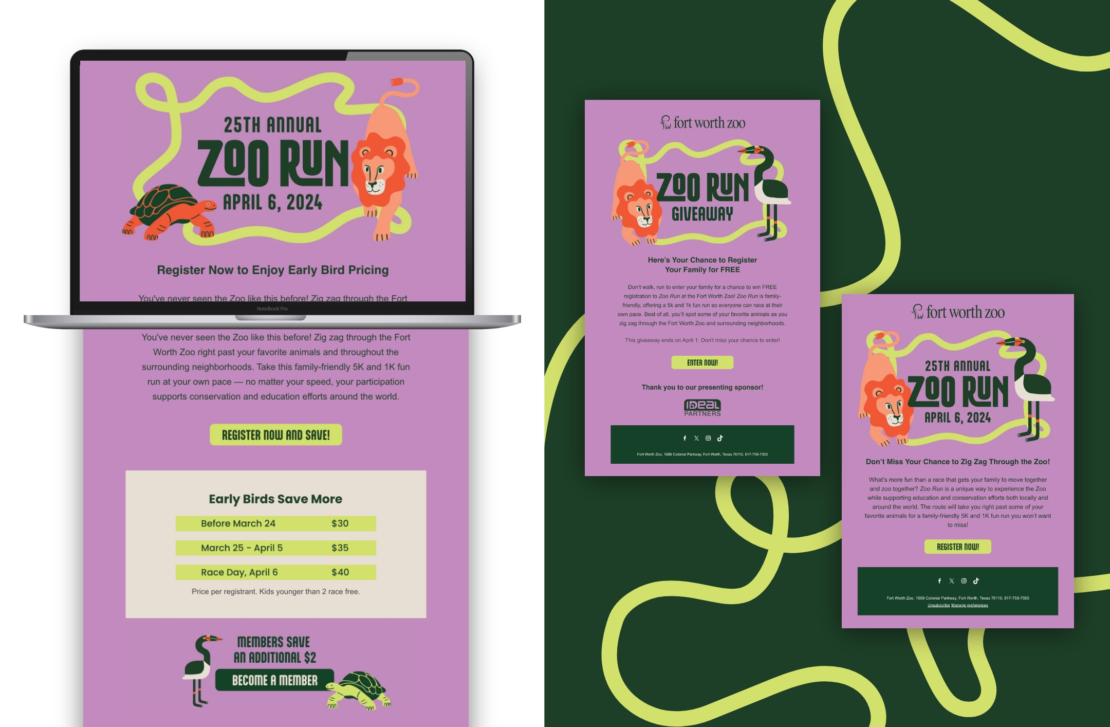
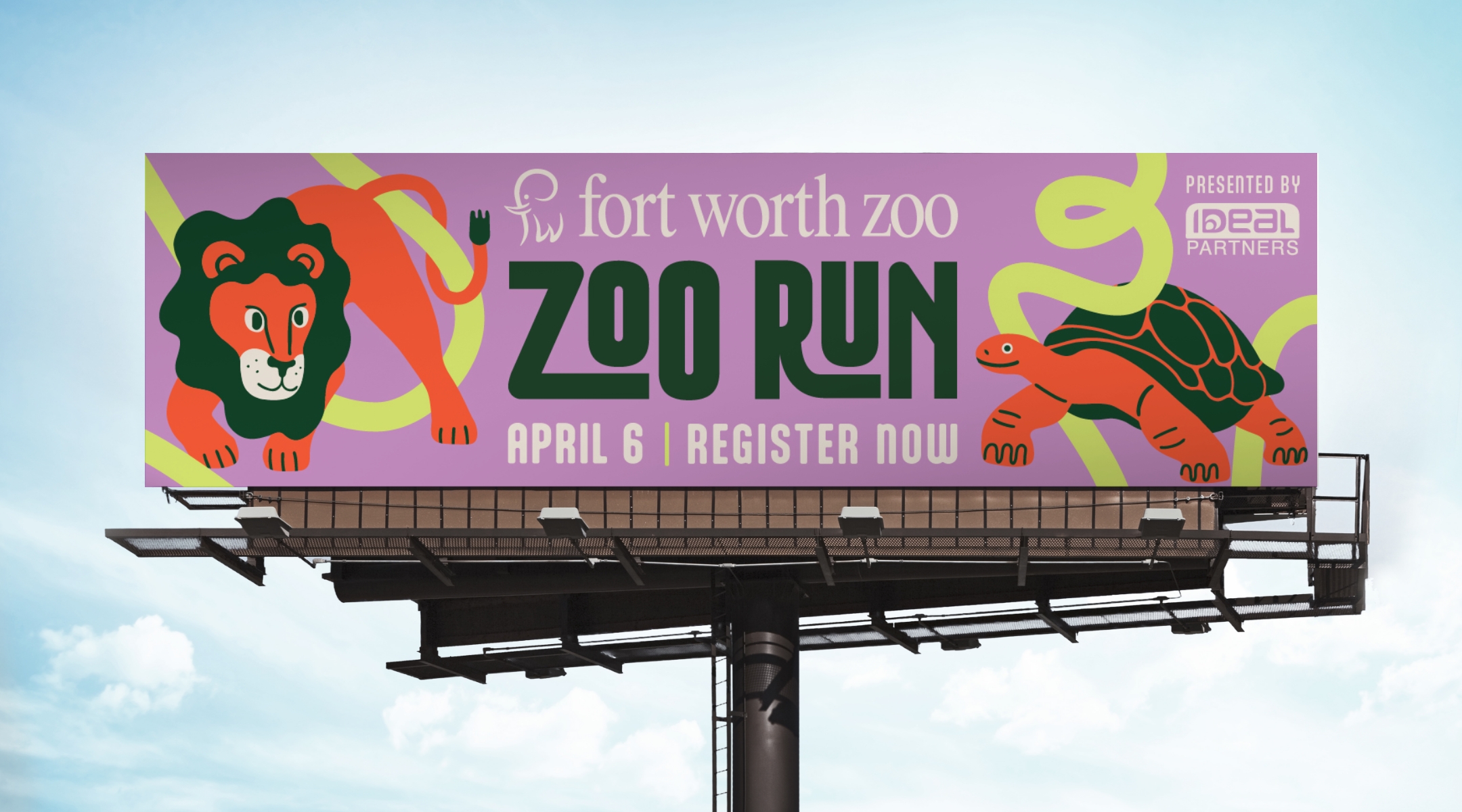
Schaefer crafted an upbeat and eye-catching campaign with the headline “Zig-Zag Through the Zoo.” The creative design used playful, illustrated animals and neon yellow lines to add a sense of movement and energy. Even more, the creative highlighted the Zoo’s newly returned lions, which were a key feature of the race route. Our media strategy included a full-funnel approach to guide users from learning about the event to signing up. We engaged audiences through a mix of paid search, paid social, email, text messages, streaming video, OOH, and display ads—ensuring we reached them at every stage of their journey.
Record-Breaking Success: A Sell-Out Event and Impressive Growth
Zoo Run SOLD OUT for the first time in its 25-year history!
Registration quantity was 152% to goal, and revenue reached 141% of the goal.
Paid search traffic skyrocketed, driving 5x more clicks than the prior year, with an impressive 44% CTR—a 41% increase.
Social media engagement soared with 3.8 million impressions and more than 142K total post engagements.
Email strategy helped boost engagement with the highest click-through rates seen in years.
Turning a Tradition into a Historic Achievement
Schaefer’s creative vision and strategic approach helped make Zoo Run 2024 a resounding success, not only meeting but exceeding all expectations. By blending bold, fun visuals with highly targeted media, we helped make the 25th anniversary a celebration to remember—turning this beloved event into a sell-out success and solidifying it as one of Fort Worth’s favorite family traditions.
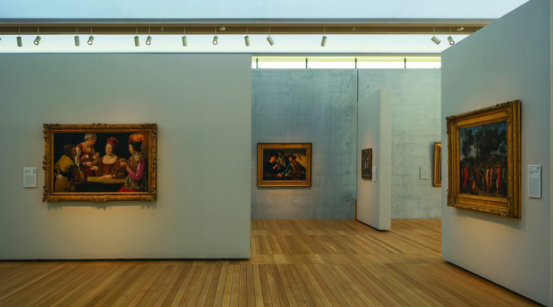
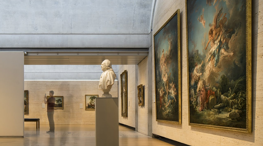
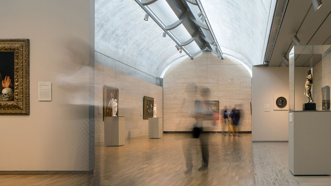
Schaefer is a proud partner of the Kimbell Art Museum, having supported the museum in individual ticket sales and museum memberships for five years. Throughout our time together, we have led project-based initiatives like premiering the exhibitions to the community through unique, hands-on activations. We also support all digital media strategy and management throughout the year.
A benefit to a long-term partner includes the compounded learnings that come from each year and every test. As we all know, the digital landscape is ever-evolving, and it is crucial for your campaigns to grow alongside it.
Photo by Nic Lehoux
What’s Different?
As we closed out 2023, we reflected on what worked and what didn’t. The Kimbell offers museum-goers new exhibitions each year, and while each exhibition differs from one another, the timing stays somewhat regular. This allows us to test media strategies that overlap campaigns, such as brand or membership, with the peak season featuring new exhibitions. In 2023, we tested the use of higher awareness mediums combined with campaign overlap and tactic flighting to compare against 2022’s results.
We found that due to the name recognition of both the Kimbell and the renowned artists featured in the special exhibitions, awareness was less important in our target market. Therefore, we shifted our focus to conversion-based tactics for 2024. However, we also found that having our brand and membership campaigns ‘always on’ allowed for just the right amount of awareness to boost sales year over year. We applied these learnings to our 2024 plan and are eager to track performance as the year progresses.
Photo by Nic Lehoux
What Worked?
Another benefit of a partner like Schaefer is that we are always optimizing mid-campaign. We’re not waiting for end-of-year to review the campaigns, but constantly applying best practices and learnings to our live campaigns. Because of this, we saw significant growth and positive results in 2023:
180% website revenue growth YoY
247% increase in revenue directly attributed to paid media
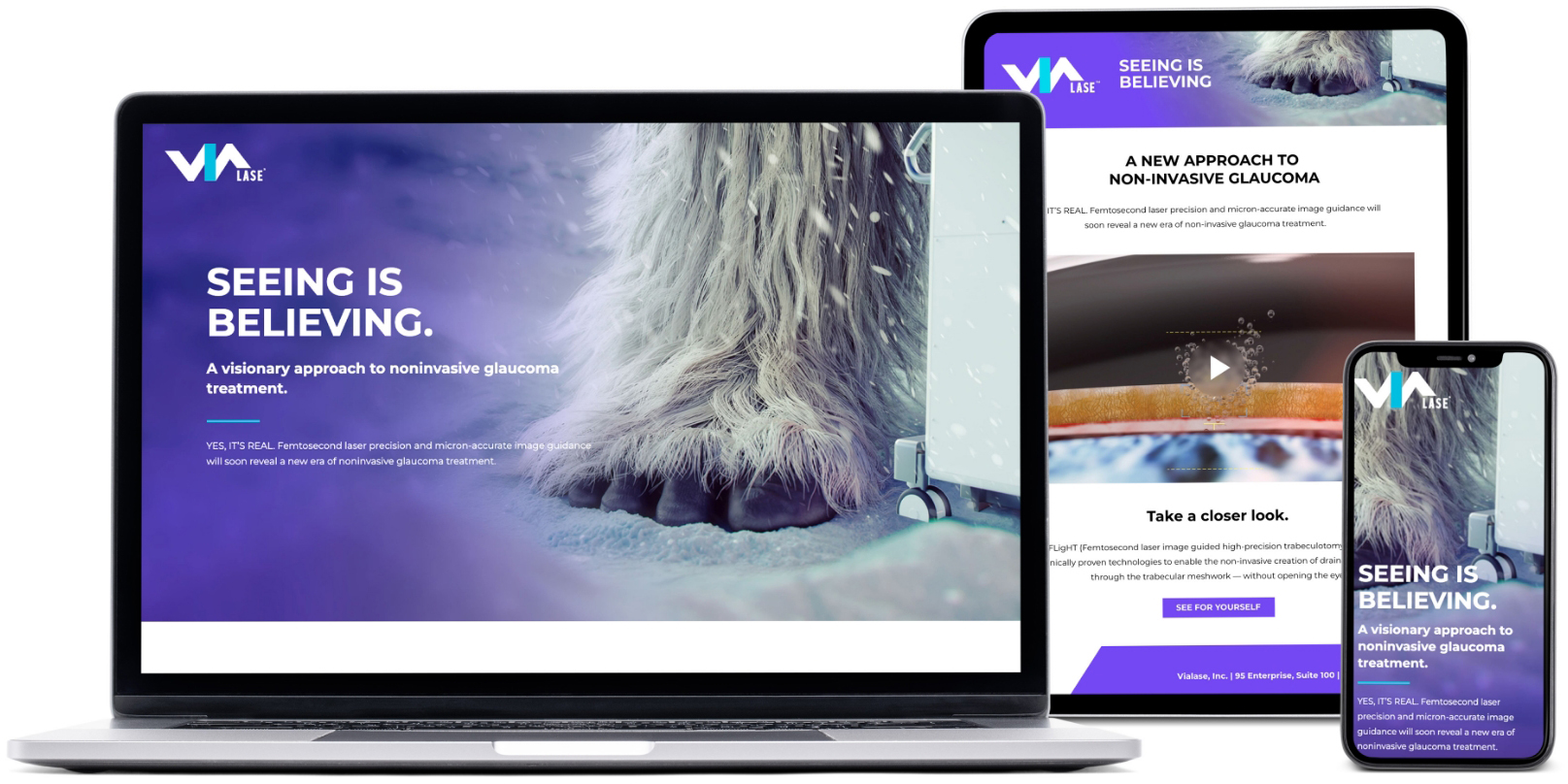
Within the eyecare industry, the idea of interventional glaucoma treatment has been categorized as an elusive myth for years. ViaLase developed a game-changing system designed to leverage two proven technologies to create a new, non-invasive approach to glaucoma. When this new system is approved by regulatory agencies, the myth will finally become a reality. Therefore, our client needed a campaign that would create attention and support a successful launch of the new concept.
Goals
Develop materials needed for a successful brand launch
Develop a highly visible campaign that would cut through the clutter of a crowded market
Rapidly generate brand awareness
Explain the fundamental technology behind the device
Solicit interest and inquiries from qualified leads
Provide meaningful measurements of the campaign results
Strategy
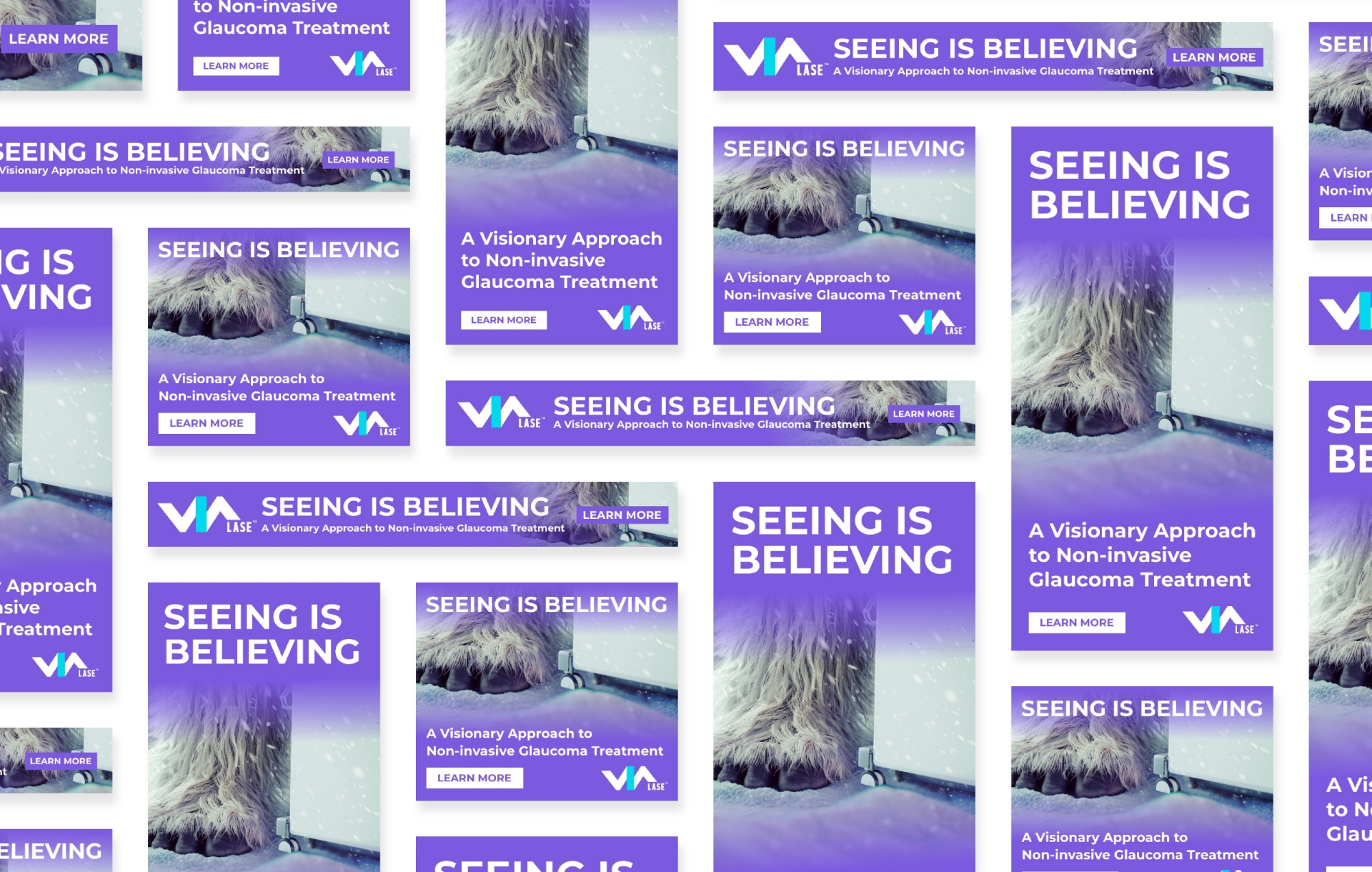
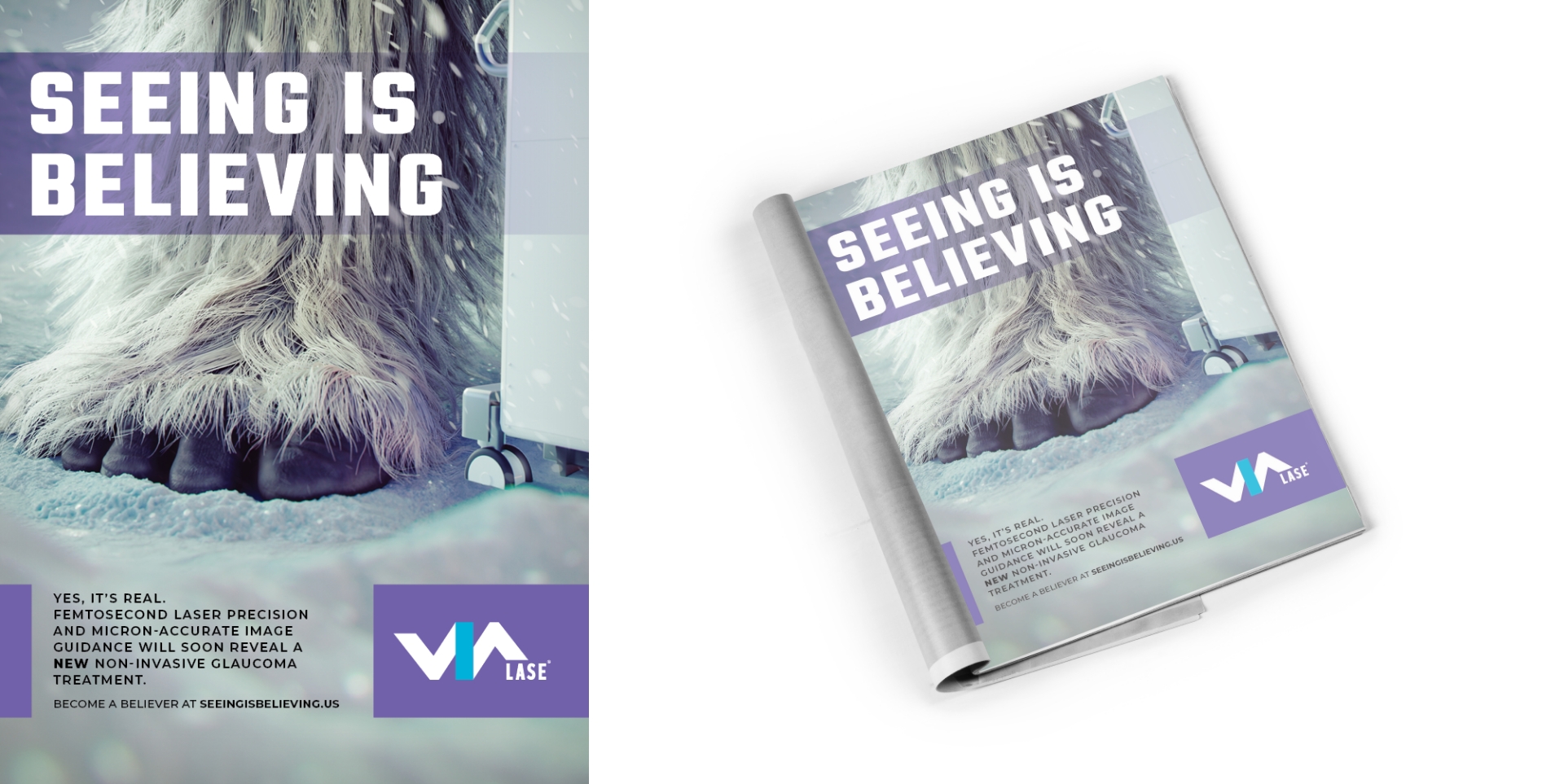
Schaefer Advertising responded with a showstopping, attention-grabbing campaign that used teaser imagery of a Sasquatch, or “BigFoot”, creature to convey that the “mythical creature” was finally here – and real. The sheer uniqueness of the concept was a huge and dramatic departure from the cold, clinical ads embraced by other players in the industry.
Solution
An integrated campaign was launched that included paid search, organic social, email, and digital display on well-known industry publications and websites. Each medium enabled the client to tell its story and document the response rates as viewers clicked through for downloads, demos and landing-page visits.
Results
By leveraging paid search and strategically-chosen publication placements (such as newsletters, e-blasts, ROS banners, and sponsored social posts), the campaign achieved noteworthy results within the first three months of launch.
Website tracking identified 98% new site visits, with an impressive 53% engagement rate
High clickthrough rates
And, most importantly, awareness started with a bang, with healthy responses from an elite and highly-qualified audience of eyecare and glaucoma specialists
Sessions
15,864
New Users
13,771
Pageviews
17,130
Engagement Rate
53.42%
Summary
The launch campaign accomplished its primary goal of driving brand awareness among surgeons for ViaLase and its innovative design. And, in addition to gaining insights into paid search performance, the client began to forge strategic partnerships with leading industry publications. The geographic spread and engagement metrics highlight the campaign’s effectiveness in reaching a qualified audience, setting a strong foundation for future marketing efforts.
Overall, the campaign was another example of Schaefer’s ability to combine solid knowledge of healthcare markets and attention-grabbing creativity to tell a cohesive and relevant brand story.
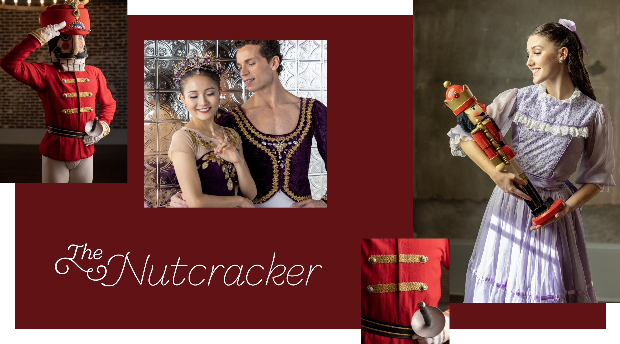
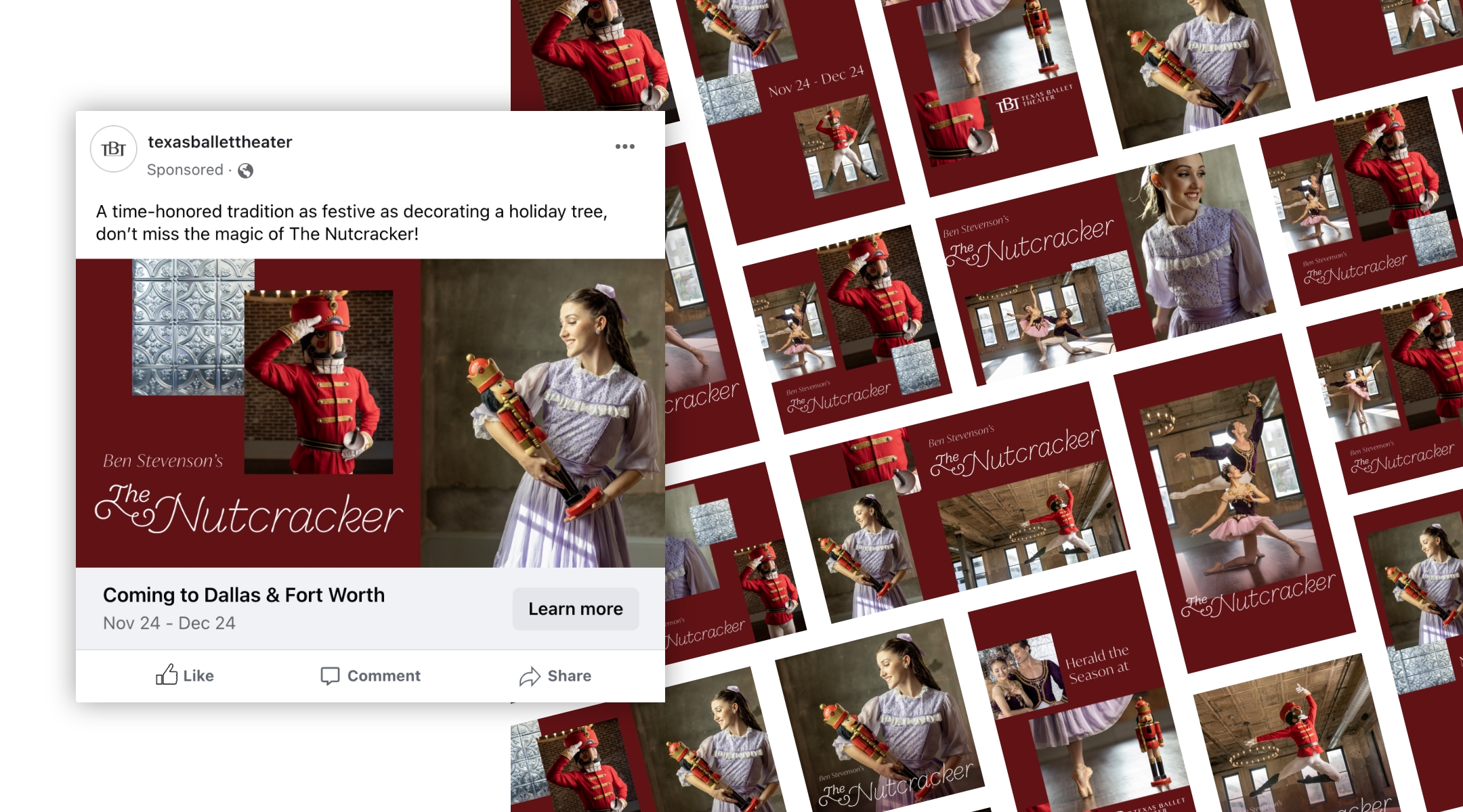
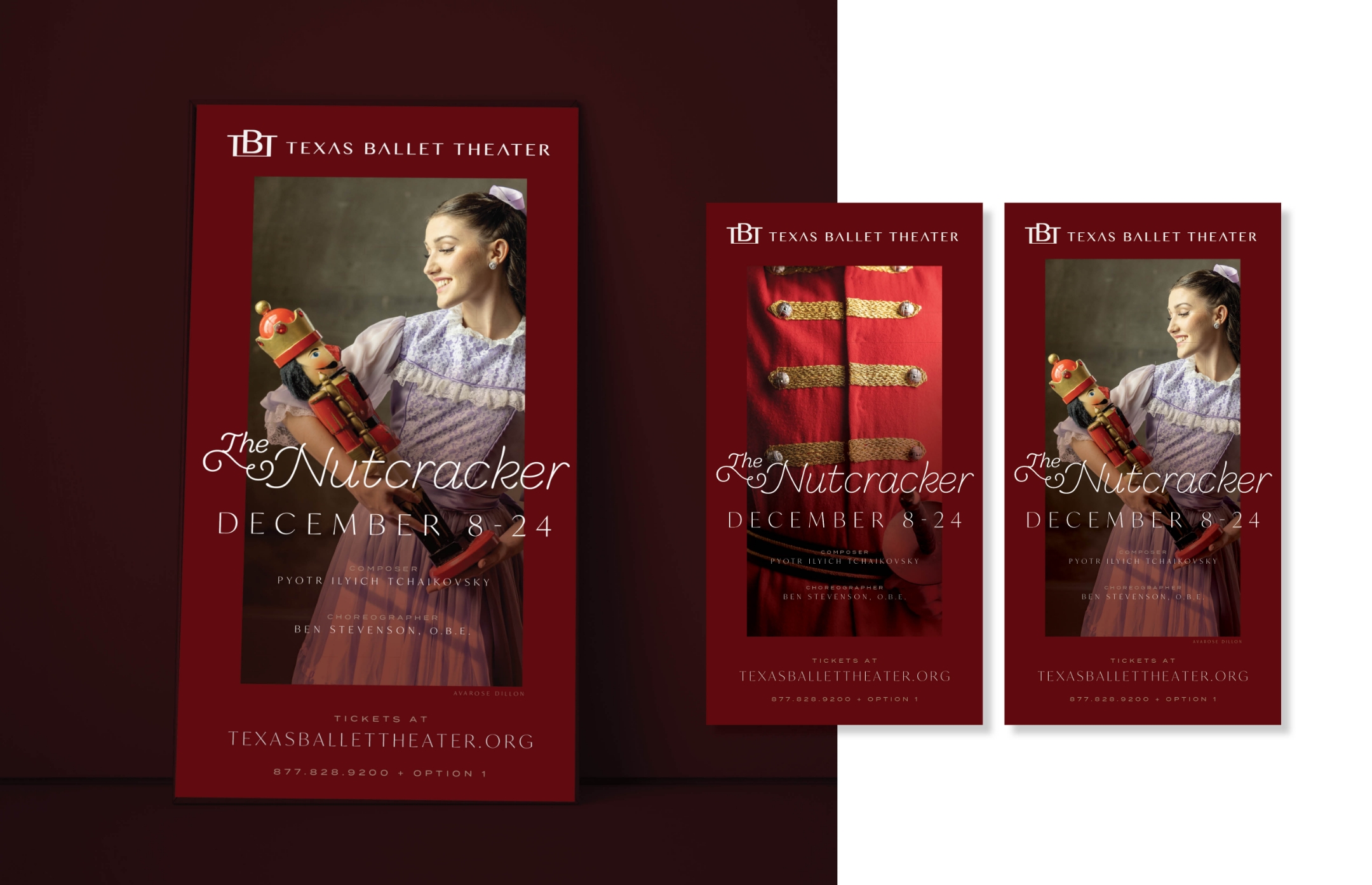
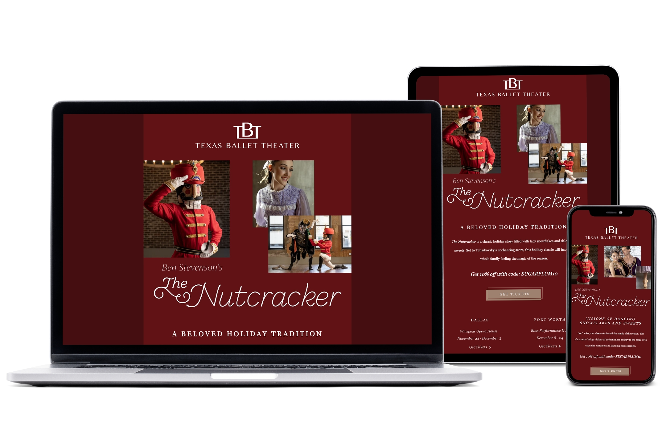
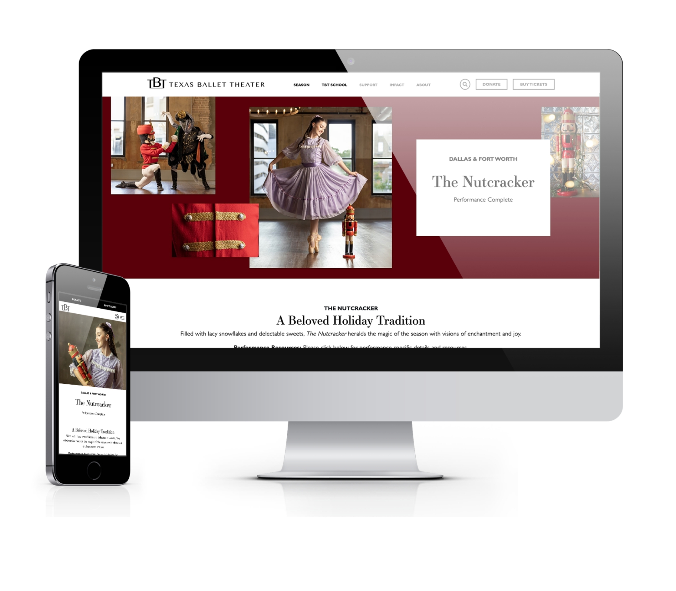
The Nutcracker ballet is a timeless performance that has delighted audiences for more than a century. Over time, it has cemented its place as a beloved holiday tradition and one of the most popular ballets of all time. Each holiday season, Texas Ballet Theater (TBT) stages 35 performances between Dallas and Fort Worth, which sets the tone for ticket sales throughout the season. For some ballet companies, sales from The Nutcracker make up more than 85% of a company’s ticket revenue for the season. While its popularity makes it easy to sell performance tickets, The Nutcracker also creates a unique opportunity to attract a broader audience to experience the art of ballet.
As the agency of record for the past six years, Schaefer Advertising has helped TBT increase ticket sales year-over-year to make The Nutcracker a revenue powerhouse. Fresh off a record-setting year in 2022, TBT increased its goals for 2023.
To meet the new goal, our team acted quickly to implement new optimizations that leveraged our current campaign assets, made strategic recommendations for TBT-owned channels, and proposed a few incremental options to get in front of new attendees. A peak-valley-peak approach to paid search led to higher revenue for lower costs, making paid search a key driver of conversion revenue. The coordinated email marketing campaign launched in late November ranked second in revenue generation.
Results
The Nutcracker campaign concluded its 2023 run with record-breaking revenue and ticket sales, surpassing each previous year’s revenue and 2023 goals for both Dallas and Fort Worth. Total revenue closed at 120% to goal, with online sales specifically growing revenue by over 30% from last year.
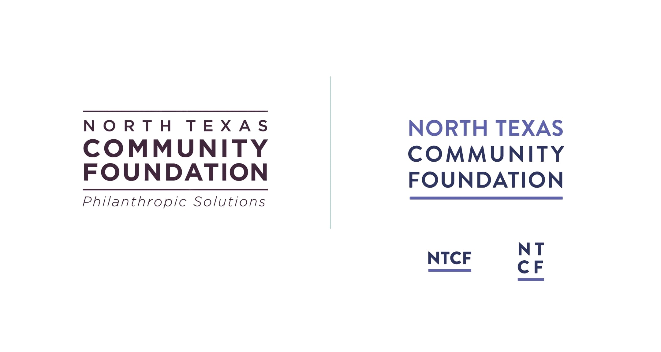
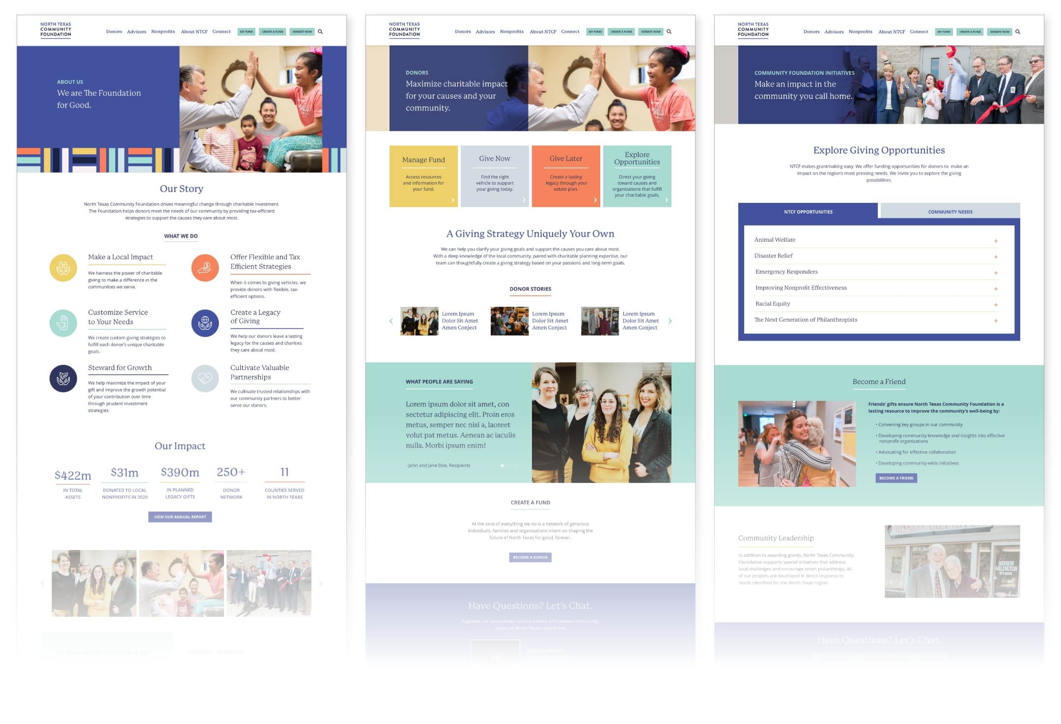
The North Texas Community Foundation (NTCF) is a Fort Worth-based philanthropic organization committed to driving meaningful change through charitable investment in North Texas. With a strong reputation, deep community knowledge, and tailored services, NTCF helps high-net-worth individuals structure their philanthropic giving for immediate impact and long-term legacy.
Challenge
As a central figure in the community with a wide range of audiences and causes, NTCF needed a way to articulate their offerings to specific audience sets with very different wants while positioning their own brand for growth. In addition, they needed to improve their user experience online to better meet the demands of visitors.
Tailoring the message
NTCF is beholden to not one but three separate audiences – fundholders who support charitable giving, professional financial advisors whom NTCF partners with to manage donor funds, and nonprofit leaders who leverage grants and gifts to proactively respond to the needs within the community. While the driving purpose and service offering are the same across all partners and clients, it’s crucial to shape messaging around the intended audience.
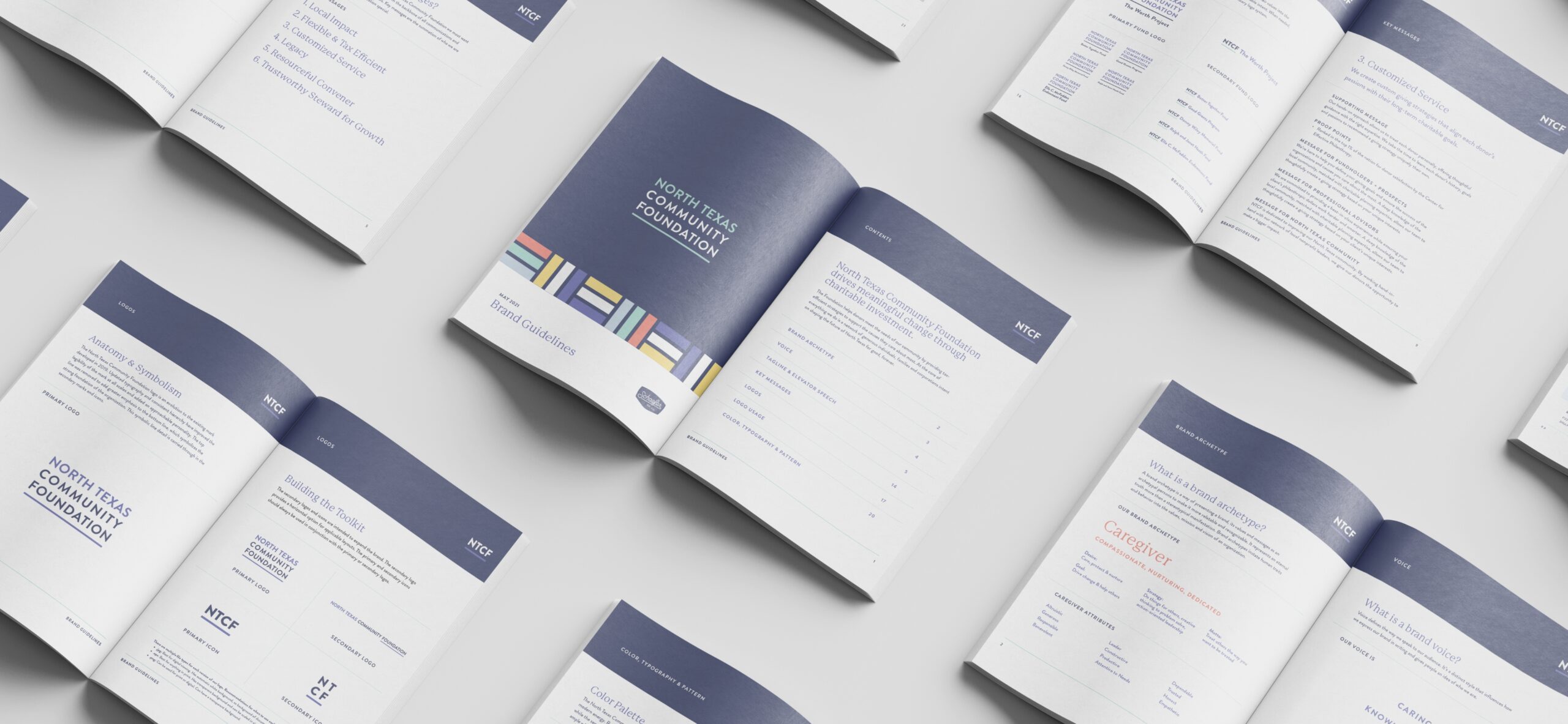
We started the process by first establishing a brand archetype – NTCF is a Caregiver – and letting that lead to a clear and compelling brand position and purpose. This step helped cement NTCF’s mission to drive meaningful change, unify the internal team and motivate all partners to advance toward a shared future. Next, we tailored key messages to resonate with the distinct needs and priorities of each audience. From cross-functional partners to clients and community stakeholders, brand messaging is tailored to the unique perspectives of each audience.
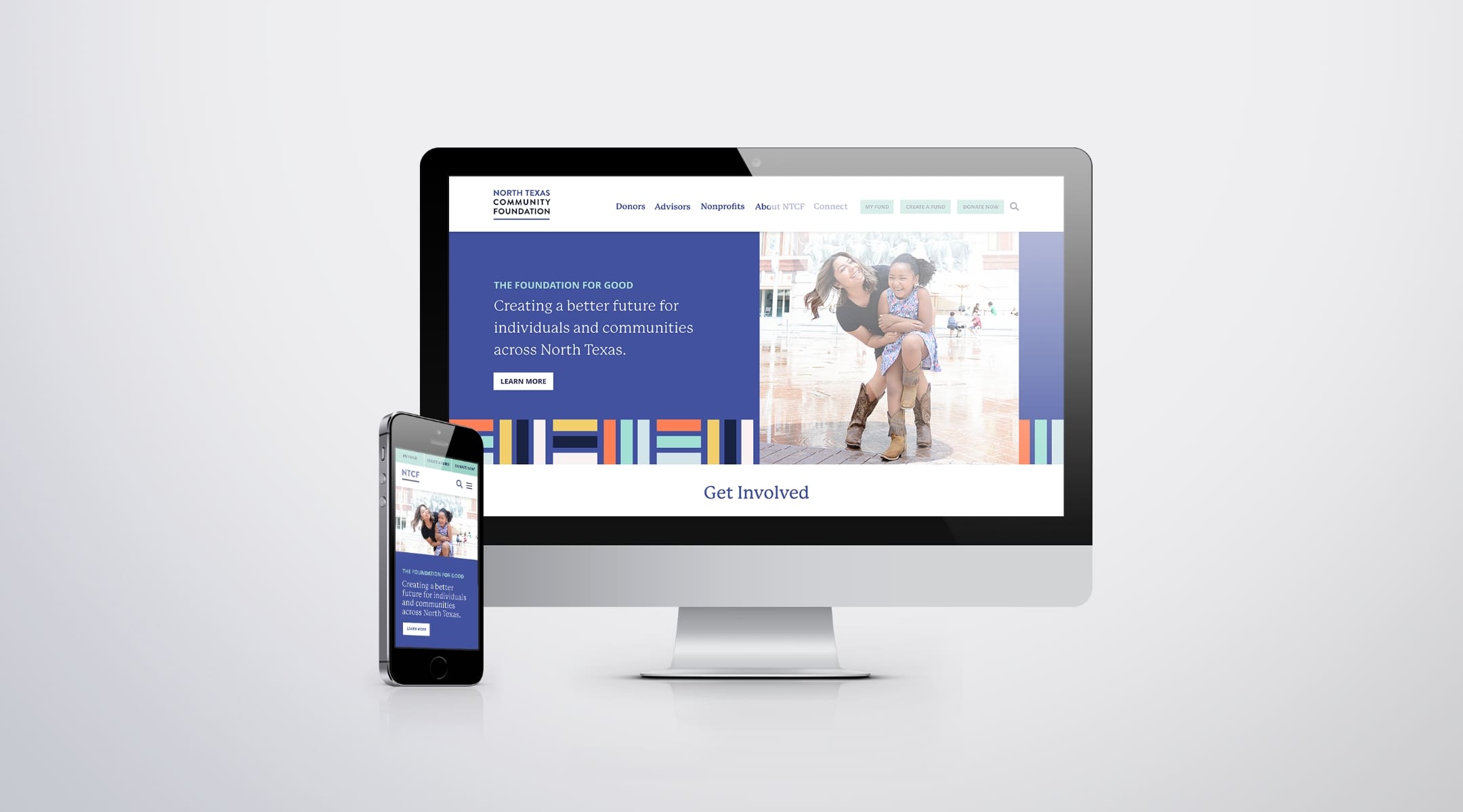
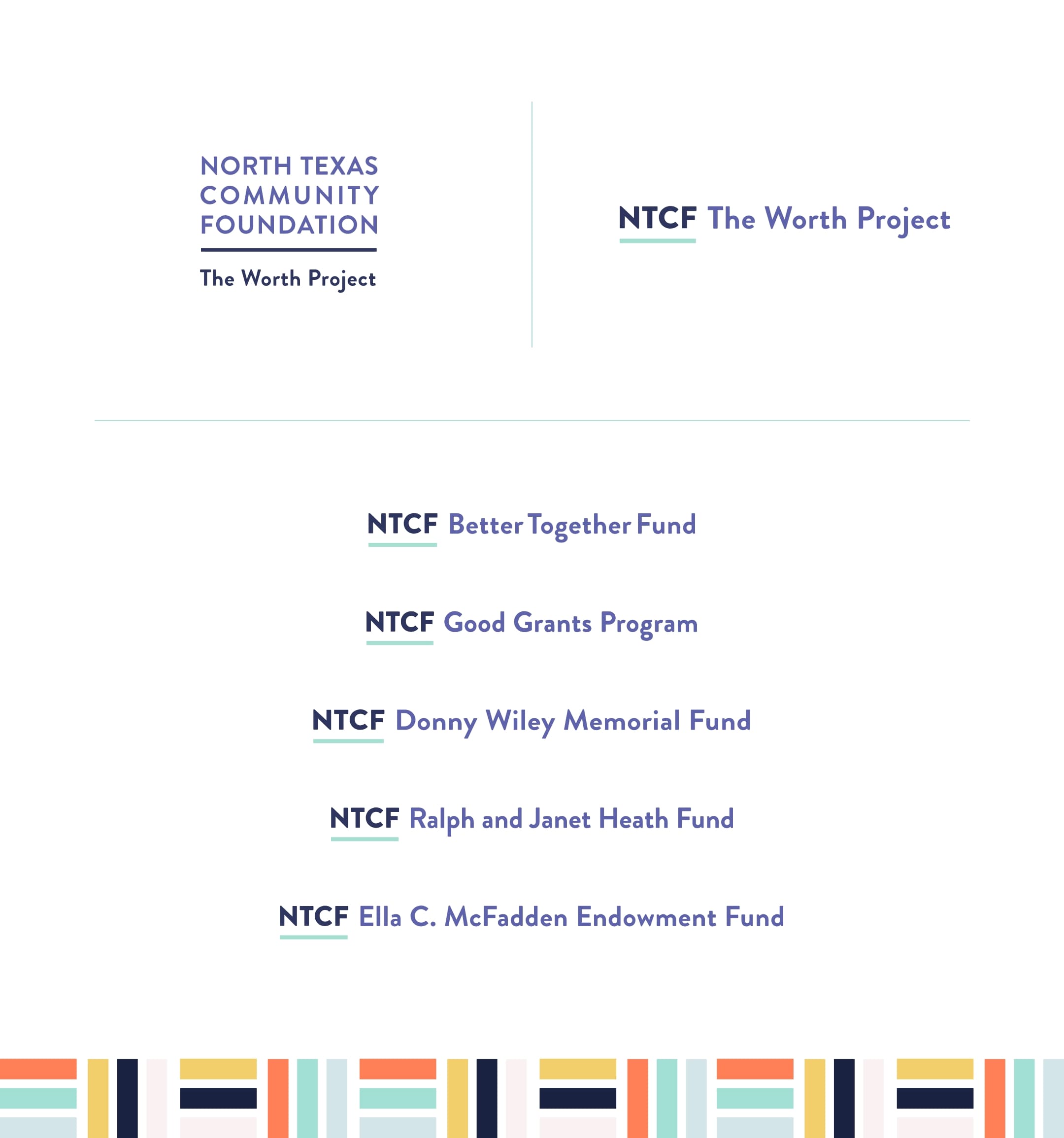
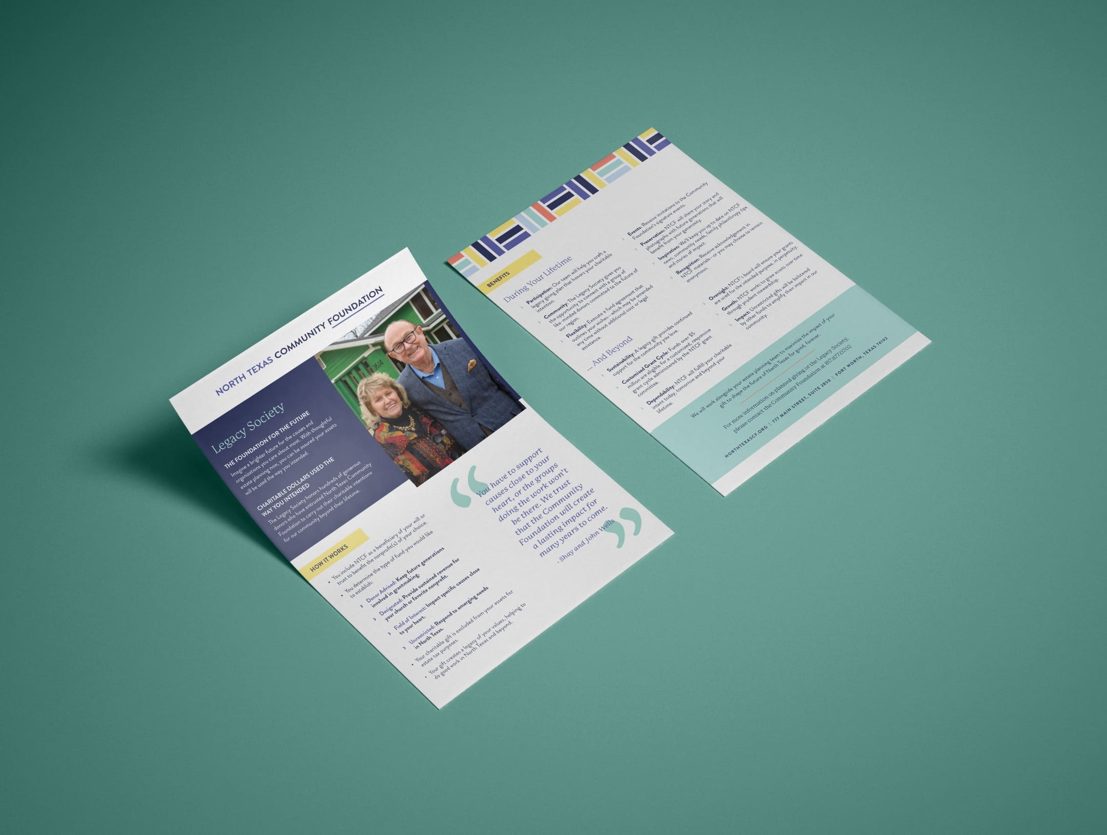
Design with a growth mindset
To further illustrate the Caregiver archetype, we evolved the brand identity to better mirror the trust, support and service NTCF is known to provide. From logo to photographic styling, we created a comprehensive design system that perfectly encapsulates the brand’s dynamic service offering. The vibrant yet strong color palette features navy, periwinkle and complementary shades of yellow, orange and blue to balance optimistic and approachable with the more intuitive and assertive sides of the NTCF brand. In addition, we expanded creative assets to offer more versatility and the ability to grow with the brand.
Creating a seamless experience
A website acts as a front door to your organization, and NTCF could benefit from a more inviting user experience. The previous website structure was dense and the navigation was choppy, leading to confusion and cognitive overload for site visitors. On the back end, employees lacked the ability to easily create, modify and publish content.
To provide current and potential fundholders with an enhanced experience, we restructured the new site to reduce page count, minimize clicks and better guide visitors to the information they were seeking. We also developed a custom content management platform, empowering the internal team with the tools needed to edit and manage their site without extensive coding knowledge.
Results
Developing an impactful brand strategy and tailoring every message to suit the intended audience allowed NTCF to better communicate their purpose and address a multifaceted branding challenge from a foundational level. The new brand identity also aligns each audience with the overarching vision of NTCF and positions the brand for success and growth.
A more intuitive website improved the user journey while empowering the internal team with the ability to easily develop and manage brand materials and content. When compared to the previous year, the new website saw outstanding results:
28% increase in visitors
7% reduction in bounce rate, illustrating users found the site more relevant
21.7% increase in page views, indicating stronger user engagement post site launch
Data measured from Feb 2021-Aug 2021 and Feb 2022-Aug 2022.
Developing sales support materials that are on time, on budget — and on the mark.
Situation
Galderma, a leading manufacturer of OTC and prescription skin care products, had developed a new formula aimed at helping teenagers fight acne. The new product’s launch faced two challenges: First, it had a new and unique Mechanism of Action (MOA) that needed to be communicated to dermatologists and other healthcare professionals (HCPs). Second, a limited budget restricted the options that their large global brand agency was able to provide.
Goals
Support the new brand launch of Twyneo
Distill key product information and prepare highly memorable assets
Expand the reach of launch budget by providing better value than larger global agencies
Encourage HCPs to write Twyneo for teen acne patients by clearly differentiating the product
Strategy
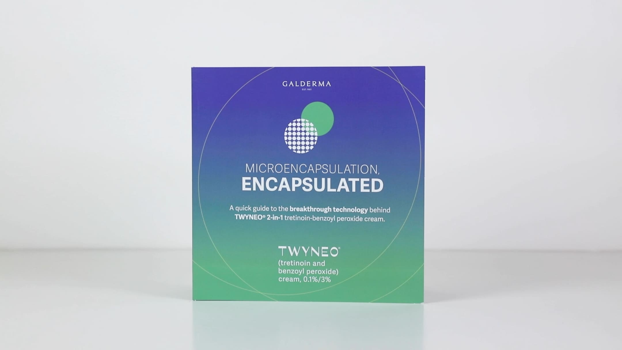
At the core of the product’s efficacy was a microencapsulation technology that combines tretinoin and benzoyl peroxide (BPO). Both molecules have proven efficacy for the treatment of acne but had never before been combined into one formulation. The goal of the initiative was to equip the sales reps with materials that could simply outline and educate how microencapsulation works on the skin, to an audience of HCPs.
Solution
Healthcare professionals tend to be busy people, and the solution needed to communicate quickly and effectively. Schaefer designed a compelling sales aid that used custom die-cut and pop-up images to clearly show how encapsulation worked, and how it set Twyneo apart from other products on the market.
A complementary animated video brought the MOA to life and used Key Opinion Leaders for narration. Schaefer created a visual tool that did the heavy lifting of differentiating the product, while working within the brand’s existing graphic standards.
These effective, engaging sales tools enabled the reps to make a visually compelling case for how this never-before-seen combination of molecules provided HCPs — and their teen patients — with a new solution for moderate to severe acne.
Results
Working on a tight timeline and narrow budget, Schaefer:
Developed a suite of sales resources (innovative sales aid and MOA video) that equipped the sales team for a successful product launch.
Highlighted the unique and innovative nature of the new product
Supported successful first-year adoption through in-person sales
Summary
By working within the client’s budget and timeline, Schaefer provided a level of value and quality that extended the client’s budget far beyond the capabilities of a large, global agency. Our “right size” agility and flexibility enabled us to mobilize quickly, and develop distinctive, memorable launch assets that led to a successful adoption curve with HCPs.
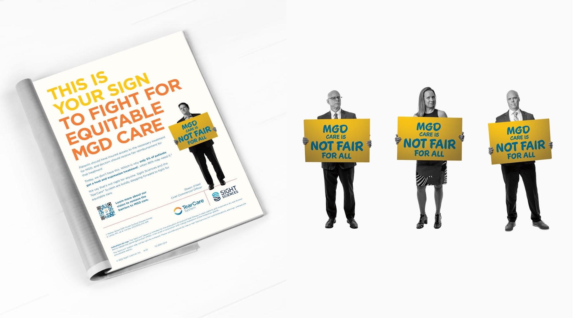
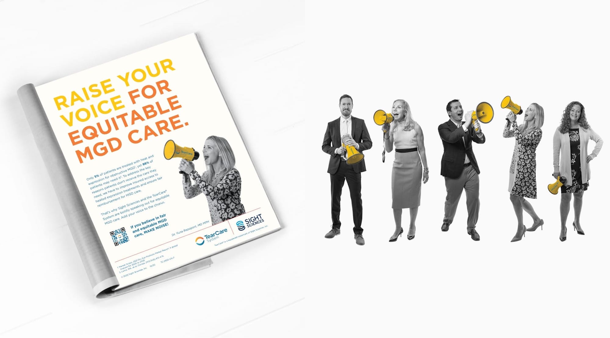
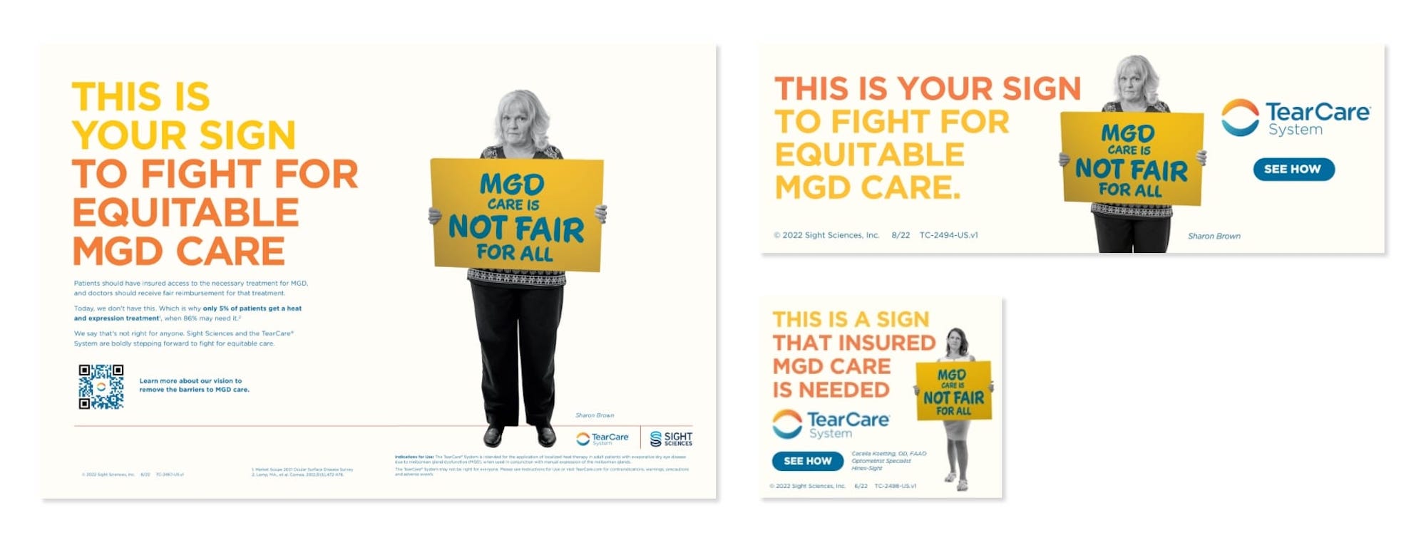
For the TearCare® System, a crucial step in promoting their solution was to become an advocate for change.
Situation
At first glance, dry eye disease (DED) sounds like a mere inconvenience. However, left untreated, this chronic, progressive condition can impact the vision, surgical outcomes and quality of life of millions of patients. Even though meibomian gland dysfunction (MGD) is the most prevalent form of dry eye, in-office procedures to address it are relatively new — and none are reimbursed by insurers. As a result, only patients who can cover the out-of-pocket expense receive treatment.
The TearCare® System is designed to address MGD by evacuating obstructed glands using therapeutic heat and natural blink responses. However, to gain wider adoption, fair reimbursement was needed. The company sought to change reimbursement policies and broaden access to care by raising awareness of the situation. TearCare® tapped Schaefer to lead this effort.
Goals
Reiterate the threats associated with MGD
Raise broad, industry-wide awareness of current compensation and reimbursement limitations
Reach an array of stakeholders with a message of “Fair Access”
Rally the market to support reimbursement and accessibility for the benefit of patients, practices and payors
Increase awareness of the TearCare® System
Strategy
The client was ready to promote the need for change and had allocated resources to do it. However, to truly influence the market, the brand also needed to demonstrate the growing support of this movement from eye care professionals (ECPs), patients, employers and other key constituents.
Solution
To convey this message, Schaefer created a campaign that captured the feel of a public protest or political rally. In each execution, a real ECP, patient or eye care industry figure appeared with a sign that read “MGD Care Is Not Fair For All.”
Using precise targeting, Schaefer reached optometrists, administrators, payors and other audiences with a “protester/spokesperson” relevant to them. Using faces and names that are known throughout the industry helped build momentum over time, and, ultimately, drove awareness over the top.
Results
By cutting through the clutter of standard medical device advertising, the campaign achieved a high degree of visibility and effectiveness. Within the first few months, the brand realized noticeable results, including:
228 new requests for information on the TearCare® System from qualified users
More importantly, the strategy worked.
After years of sustained engagement, phase 4 trials, negotiation and ECP testimonials, TearCare announced MAC coverage to great fanfare. The industry took note and recognized MGD as a reimbursable procedure.
Summary
Not only is this a victory for TearCare, but more importantly it’s a win for patients who need access to an option for their MGD. Through our intentional, strategic approach to planting this message, TearCare was able to connect with a human need and make a meaningful difference in the marketplace.
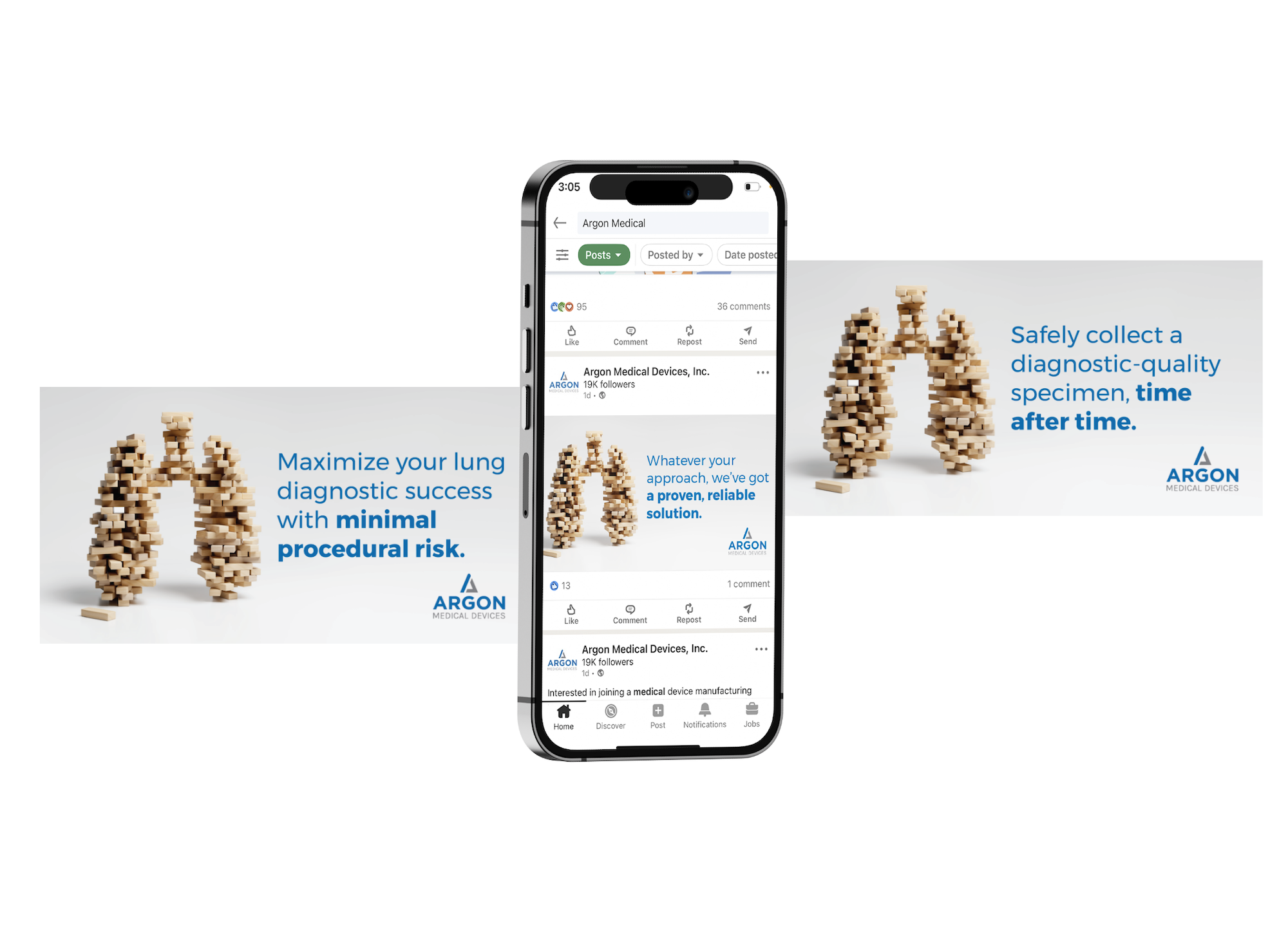
Differentiating products with a consistent messaging platform
Situation
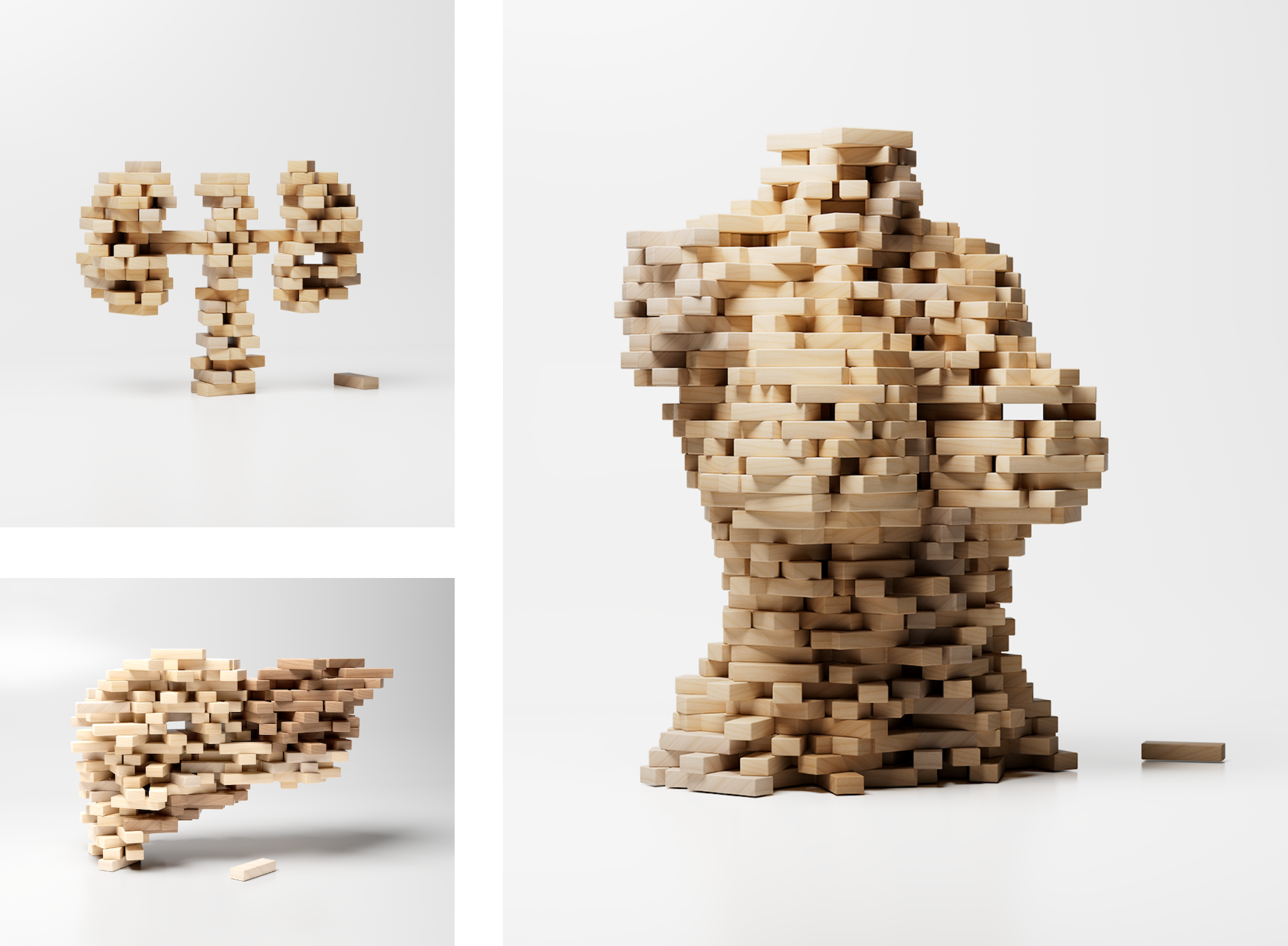
Argon Medical Devices faced a challenge that is not uncommon among large and diverse manufacturers: Their core audience of surgeons and clinical staff knew the names of their more successful product lines (such as Skater™, Option™ and Cleaner™), but had little awareness of their corporate brand. This made expansion and cross-selling across their 2,000-product portfolio more difficult.
This was particularly true of their soft tissue biopsy division which, as their largest U.S. division, accounted for a significant portion of the total soft tissue biopsy market. However, the biopsy market had remained stagnant as a category and Argon and Schaefer saw an opportunity to differentiate the lead product, BioPinceTM, by selling against an emotional benefit for the interventional radiologist. Schaefer leapt at the challenge to set the biopsy division apart from the crowd — while providing a consistent platform that would support the various biopsy products and areas of specialization including lung, kidney, liver and breast.
Goals
Differentiate the Argon biopsy division from competitors
Provide a consistent platform to support the various biopsy products
Create a campaign to allow Argon to demonstrate the versatility of its soft tissue biopsy portfolio across multiple organs
Strategy
The agency developed a breakthrough campaign around a simple insight — interventional radiologists need to get in, out and achieve a clean sample for accurate analysis. Minimal disruption, maximum confidence is the goal.
While a feature-heavy product-selling message was table stakes in this market, no one had really tapped into what a device really delivered — confidence that comes from a better sample.
Solution
Working closely with the soft tissue biopsy team, Schaefer developed a messaging platform that elevated the brand above product attributes, and tied into the corporate Argon tagline, “The Pursuit Of Better.” Using the theme of “Sample Better,” we developed a campaign designed to “cut through the clutter” – in this case, the endless barrage of look-alike devices that exemplified the category’s advertising.
Images drawn from the popular “Jenga” game were used to represent the delicate balance and precise execution required to obtain optimum biopsy samples. The “Sample Better” theme also carried a dual message: It implied the superior quality of the Argon products, but also spoke to the cares and concerns of radiologists, for whom better sampling meant fewer patient call-backs, as well as easier and more accurate diagnosis.
Results
By developing this flexible and relevant platform, the Argon soft tissue biopsy division was able to:
Establish a consistent positioning that will stand the test of time
Strike a balance between a consistent platform and customizable messaging
Cut through the clutter of “product/feature” advertising
Provide an extendable platform that all biopsy product lines can embrace
Leverage all product and division communications to create greater awareness and recognition of the Argon name.
Summary
The messaging for the Argon soft tissue biopsy division is a prime example of Schaefer’s commitment to delivering solutions that work harder and provide extended value. By creating a “better” message, Schaefer was able to establish a foundation for the biopsy division could easily adapt for their own products and audiences. As a result, the various team members were free to operate somewhat autonomously, while still reinforcing the overall Argon brand. This approach also freed them from an endless cycle of product/benefit advertising and enabled them to launch and support products with a campaign that would continue to build brand awareness with each and every future execution.
Northpointe is a new master-planned community by Lennar that offers young families an ideal place to call home. Before opening to homebuyers, we needed to build the Northpointe brand to engage a wide audience and drive home that master-planned communities provide a practical and enriching lifestyle for young families at an unmatched value.
Understanding Northpointe’s Local Competition
Before offering any strategic recommendations, our team performed an in-depth competitive analysis to better understand the local market and isolate any opportunities for competitive differentiation. One specific challenge was that some of Northpointe’s competitors used the word
“North” in their brand name, which required us to offer direction that differentiated the Northpointe brand through visuals and copy.
Finding Brand Differentiation
Since Northpointe was in the pre-construction phase, we had to develop the brand from the ground up, setting the tone for the community to offer potential homebuyers a sense of home and depict a reliable place where friends and family can gather and enjoy each other and the community. Furthermore, we needed to create a flexible set of brand assets that the Northpointe team could leverage internally and in future marketing campaigns.
Our discovery process revealed that Northpointe is incredibly accessible and cost-effective, and an excellent option for young families seeking to buy their first home. More than that, Northpointe offers residents fantastic amenities without compromising on an excellent price point. So, we leaned into creating an attainable, yet elevated brand that appealed to people who are ready to put down roots.
Building a Fluid Creative Platform
The landscape was an important part of how the community was planned, so we tethered the brand story to the scenic views and natural beauty surrounding the area. We positioned Northpointe as the attainable, unique option and highlighted the scenic nature surrounding the community to illustrate its natural beauty and striking topography that envelopes the community.
The brand mark is quiet and subtle and the arrow above the “N” signifies the true North where home lies. The color palette is natural, but vibrant and balances the reserved nature of the brand mark.
Our tagline “When home calls, head North” is emotive, aspirational and strong, which further elevates the subdued nature of the brand mark. It also illustrates the beauty of home and touches on the natural surroundings that make Northpointe such a valuable place to live.
The stylistic complements we developed for the brand helped create a sense of place that can be used throughout the community. These pieces will weave the community together and keep the feel built within the brand alive throughout.
Results
Crafted a brand that will attract and engage new homebuyers
Created a flexible brand that is simple and seamless for Northpointe’s internal team to utilize
Extended the brand through community elements like trail-markers, landmarks and wayfinding solutions
The Gary Patterson Foundation raises thousands of dollars every year to benefit various education and children related entities. After experiencing Mack, Jack & McConaughey in Austin, the Gary Patterson Foundation was inspired by MCM’s efforts to empower kids through 2-days of fundraising and fun. After careful consideration, they decided to shift their traditional Joe T’s annual event into a weekend filled with fundraising activities from golf to galas. With a shift as big as this, they needed to create an impactful brand.
Goals
Develop brand name, narrative and messaging for the non-profit event series
Create a dynamic brand identity system that communicates the values of the non-profit
Finding the Way
We worked closely with the Gary Patterson and his team to better understand the audience and impact of the new events, and create a strategy that would speak to their target audience. The events needed to attract all generations of donors in North Texas, and be accessible to those that would like to donate for the first time. The new initiative also needed to be the core fundraising event for the Gary Patterson Foundation. So, we had to position it as an accessible, diverse non-profit open to those that aren’t passionate about sports, but also welcome those that are – it had to be inclusive and suitable for a diversity of mediums. From black ties to tailgates, the mark needed to be flexible enough to feel at home at any type of fundraising event.
Plenty of Good to Go Around
To communicate the breadth and impact of the fundraising efforts, we knew the brand and mark had to be big. With an emphasis on the good.
The organization landed on the name, “The Big Good,” which is direct, yet powerful. Its strength is in its simplicity. A quick read with enough flexibility to cover more than one specific event or fundraiser. The Big Good indicates the diversity of events and their monumental impact on North Texas families and beyond.
The typographic logo is purposefully simple to communicate the variety of events at the heart of the Big Good. Each of the letterforms is customized and unique which further emphasizes the diverse structure of the Big Good. The crossbars on the “H/E/B/G” are all different and intentionally illustrate the fun and engaging nature of the events that offer something substantial for everybody, and specific need in Dallas Fort Worth.
A subtly simple mark, paired with a direct brand name can make an impactful and memorable impression. The Big Good branding illustrates the power of using simplicity to communicate and represent a brand.