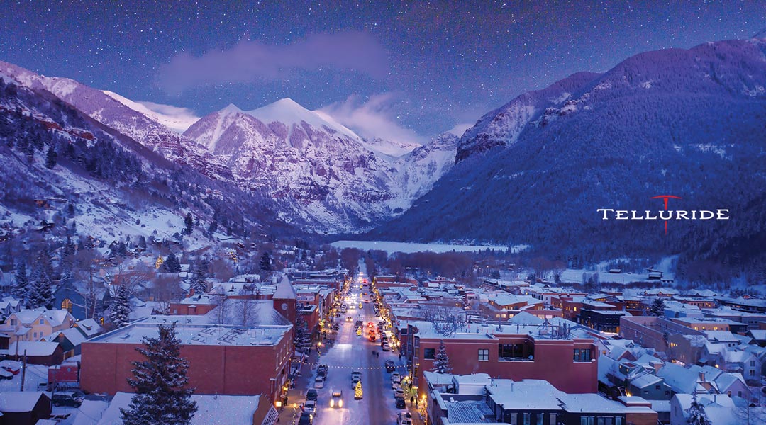
While the spring break season is consistently successful, Telluride Ski and Golf Resort needed ways to entice travelers to visit during off periods leading up to peak season. To do so, they developed a discounted lift ticket and partnered with Schaefer and local retail locations to get the word out. While similar campaigns had experienced previous success in markets within driving distance to the resort, Dallas Fort Worth, a flight-first market, needed a unique strategy and market push to get in front of the right audience and convince them to convert.
A Nimble, Focused Strategic Partnership
With spring break rapidly approaching, we moved quickly and efficiently to launch the campaign in market at the optimal time. Our team offered strategic direction to their in-house creative team to be most cost-effective and focus our efforts on media strategy and getting into market in a very quick time frame. Telluride offered the discounted tickets through ski shops throughout DFW, so our digital strategy focused on driving foot traffic into the retail stores to ultimately sell the lift tickets.
Creating a Digital Strategy Aimed at In-Person Conversions
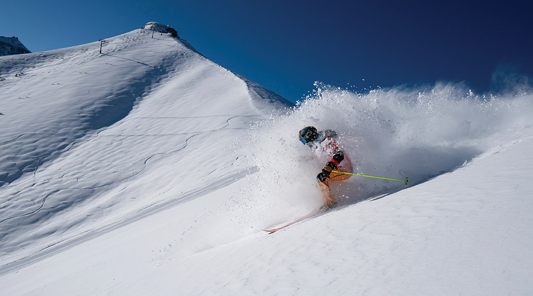
Because there was no online portal for selling discounted lift tickets, our campaign focused on building awareness and driving audiences to local ski shop partners to purchase tickets. With minimal time available before launch, our team created a streamlined media strategy that pushed audiences to a landing page where they could learn more about the retailers offering discounted ski lift tickets. The strategy incorporated paid social and display ads targeted through strategic geofencing, contextual targeting and retargeting with content related to skiing, outdoors and travel. We determined that tourists are the primary market interested in and available to book last minute trips, and targeted users that had a propensity to travel and an interest in skiing and resorts. Ultimately, our team created an effective digital strategy that engaged leads and moved them to brick-and-mortar retailers to purchase their tickets.
Results:
Campaigns contributed to 181 total passes sold in-store and over $85,000 in total revenue for an overall ROI of 13:1.
Sold 181 tickets in 14 days.
Telluride sold 4X the number of ticket sales during our campaign compared to the previous period.
The Telluride “5 Day Special” landing page received over 6.9K pageviews over the course of the campaign.
Almost 11% of landing sessions were “engaged sessions” (691), where users spent more time on the page or bought tickets.
Golf is a timeless sport that brings people together to enjoy camaraderie and pristine, cultivated greens. But, what happens when you add luxury travel and experiences into a premium golf membership? You get Icon Golf – an esteemed golf and travel membership that takes players around the world. Icon needed to revamp their brand to generate more memberships, so they partnered with the Schaefer team to refocus their sales efforts with a full-scale, multichannel digital campaign and a new website.
In 2020, Icon invested in increasing their sales from 250 memberships to 1000. So, they partnered with Schaefer to revamp their brand, generate more memberships, and focus their sales efforts with a full-scale, multichannel digital campaign and a new website to meet their very aggressive goal.
Goals
Grow Icon Golf membership database from 250 to 1,000 in 18 months.
Refresh the brand identity
Develop a content marketing strategy
Build a CRM to streamline lead generation and membership management
Improve online user experience
Prioritize sales efforts
Roles
Strategy
Creative
Digital
Branding
Positioning
Client Services
Partnering to Develop a Structured, Integrated Sales Process
We began our relationship with Icon Golf on the ground level as they were initiating the formal development of a structured sales team. This allowed Schaefer to partner directly with the Icon team to merge sales and marketing efforts. Icon’s previous marketing efforts were primarily functioning by word-of-mouth and leveraging connections with existing club members within their portfolio. While this approach was successful, there was an opportunity to expand their sales efforts through digital automation to reach a wider audience.
We started by evaluating each medium against our overall goals and the need to fill the funnel with awareness initiatives and convert interested prospects into members. We found that paid search and streaming audio and video proved successful for building awareness, and third party publication emails allowed us to hit a very targeted audience that was ready to convert.
A Refreshed Creative Platform
We recognized an opportunity to reinvigorate their creative platform to better communicate the unique benefits that an Icon membership provides. Icon Golf offers members full privileges with an expertly curated collection of private golf clubs as well as luxurious member experiences and fully planned quests to exotic locales. So, Icon Golf is much more than a golf membership – it’s a full-package of golf and travel – and communicating that was the central challenge of updating their creative.
When creating the updated creative platform, we focused on the luxury aesthetic and benefits of an Icon Golf membership. We wanted the design and language to reflect the elevated perks and nature of the membership, all while highlighting the relationship-focused aspect of joining Icon Golf. The camaraderie between Icon members is a key strategic imperative, so we had to make that central in the updated creative deck.
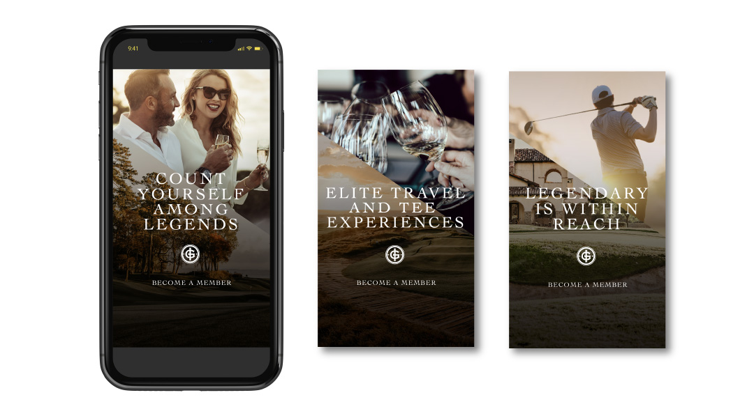
We created the concept “Legendary is Within Reach” as our primary branded language alluding to the potential for legendary moments with legendary people, on and off the course.
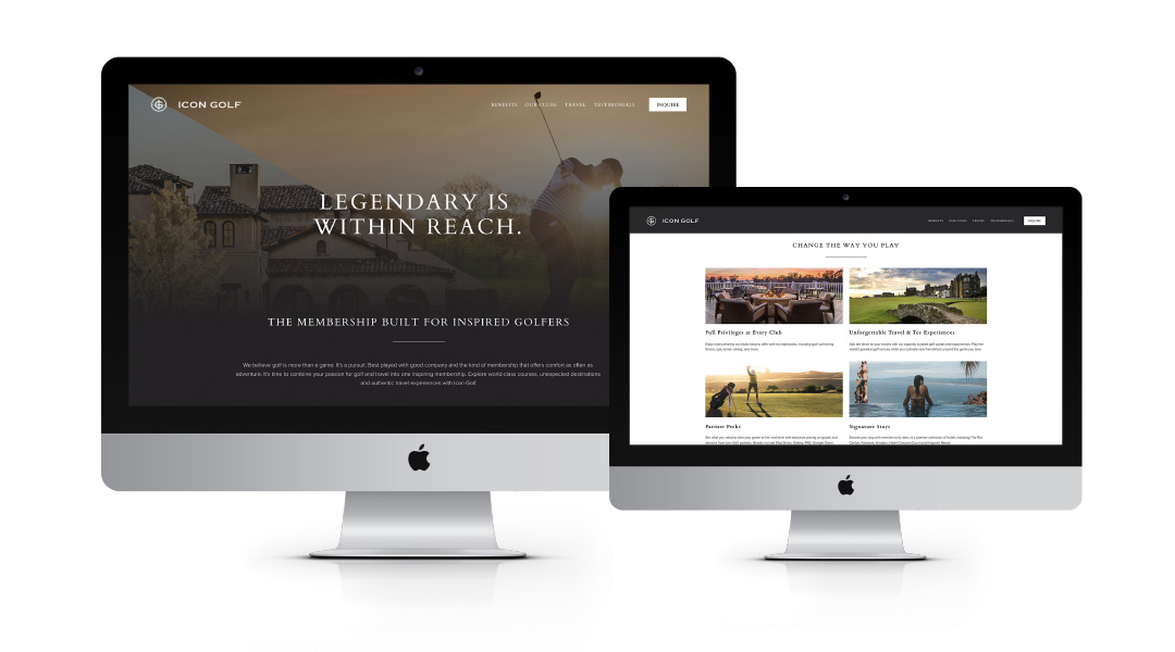
A New, Optimized Website
The central piece of Icon’s rebrand was optimizing their website to generate more qualified leads. Previous to our relationship,the Icon Golf website was split into two different URLs – Icon.Golf and IconGolf.com to satisfy internal marketing objectives. However, this split up their traffic and made consolidating valuable lead information more difficult. So, we combined their properties into one streamlined website. To increase the site’s performance, we implemented key SEO and content updates targeted at their primary audiences.
Our team also redeveloped the site with crucial user experience updates to improve site accessibility and usability aimed at generating form fills from qualified leads. To improve usability, we simply added header and footer navigations to improve the overall user experience. In addition, we employed site tagging to capture key user behavior metrics in order to continue to drive future data-driven site optimization opportunities. Finally, we placed CTAs throughout prominent areas of the website so that users could always and easily make direct contact with the reps at Icon Golf. The final result is a website that supports Icon’s strategic marketing goals by generating more engagement and qualified leads.
Creating a Centralized Lead Strategy
To continue to round out the lead generation strategy, we implemented a CRM strategy to accurately target lists of valuable, interested leads with compelling emails. We connected key data sources – the Icon website, MailChimp, and Salesforce as well as other lead collection points to ensure that our data automatically fed into the sales process and reduced the work the sales team needed to do to generate more memberships.
We created a variety of emails around the central message “Legendary is Within Reach” that ultimately guided leads to complete a form fill and capture valuable data for converting more leads.
To round out the digital strategy for Icon, we created a multi-channel paid media strategy that targeted valuable audiences in paid search, paid social media, display banners and email. In addition, we cultivated strategic partnerships with golf publications and outlets to secure high-value placements in front of the most highly qualified audience.
Results
In 2021, Icon Golf had their best year ever, setting a record month for membership sales in December.
Reached 85% of their new membership goal in under 9 months
Last Click Attribution:
31 new memberships driven directly by campaign paid media
$450k in revenue
Total annual revenue surpassed 1.7 Million, resulting in a strong ROAS of 7:1
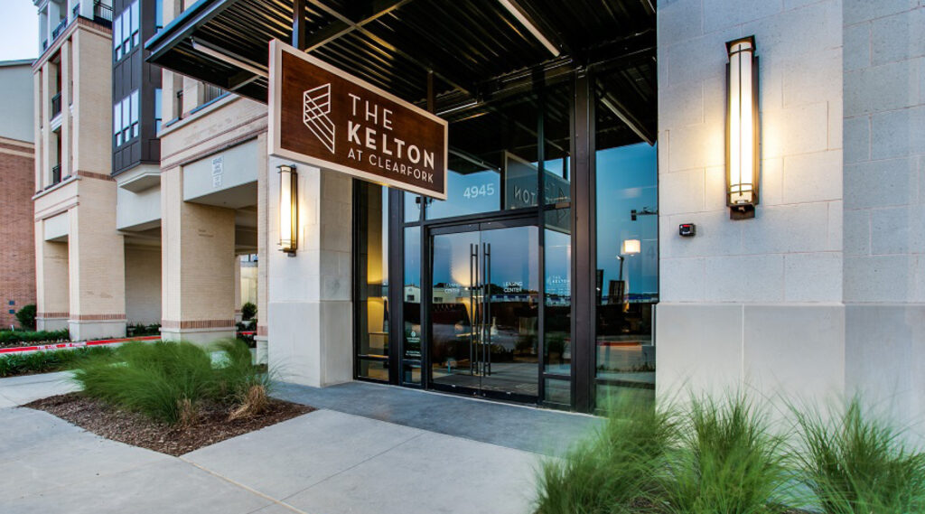
As a high-end, mixed-use development, Clearfork needed a naming structure for the five different multi-family projects. Through the brand positioning process, we uncovered the importance of the land to the Edwards family. Through in-depth interviews with family members, we heard stories that painted a vivid picture of how the family interacted with the ranch land for generations.
A Meaningful Name
One story in particular told how, as a young boy, one of the now elder statesman of the Edwards family would rest in the shade with the ranch hands when they would take a break from working the cattle. The ranch hands were surrogate fathers and big brothers to the Edwards boys and played a large role in shaping their young minds and teaching them a respect for the land. The idea was born to name the multi-family developments after these ranch hands. The first, is The Kelton.
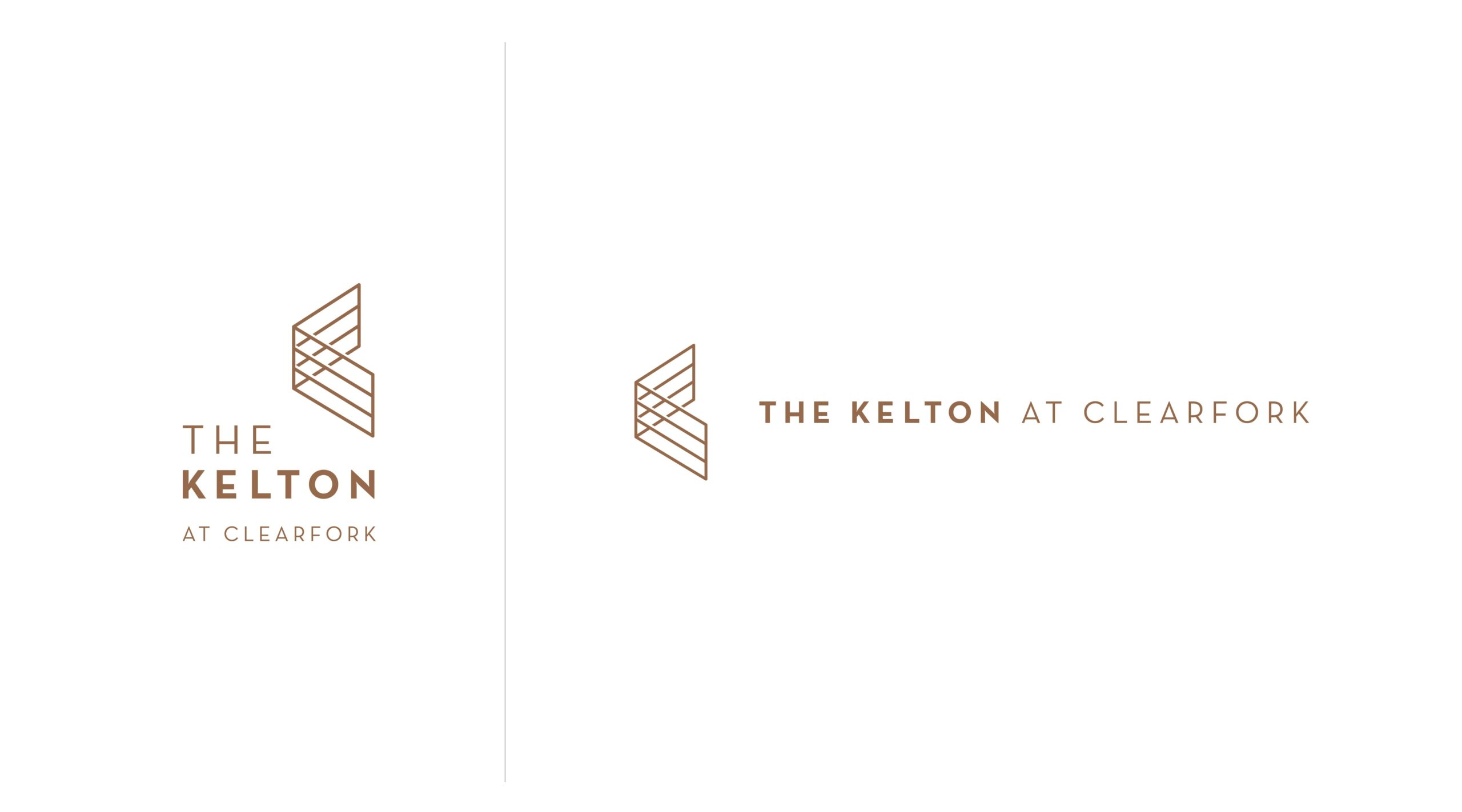
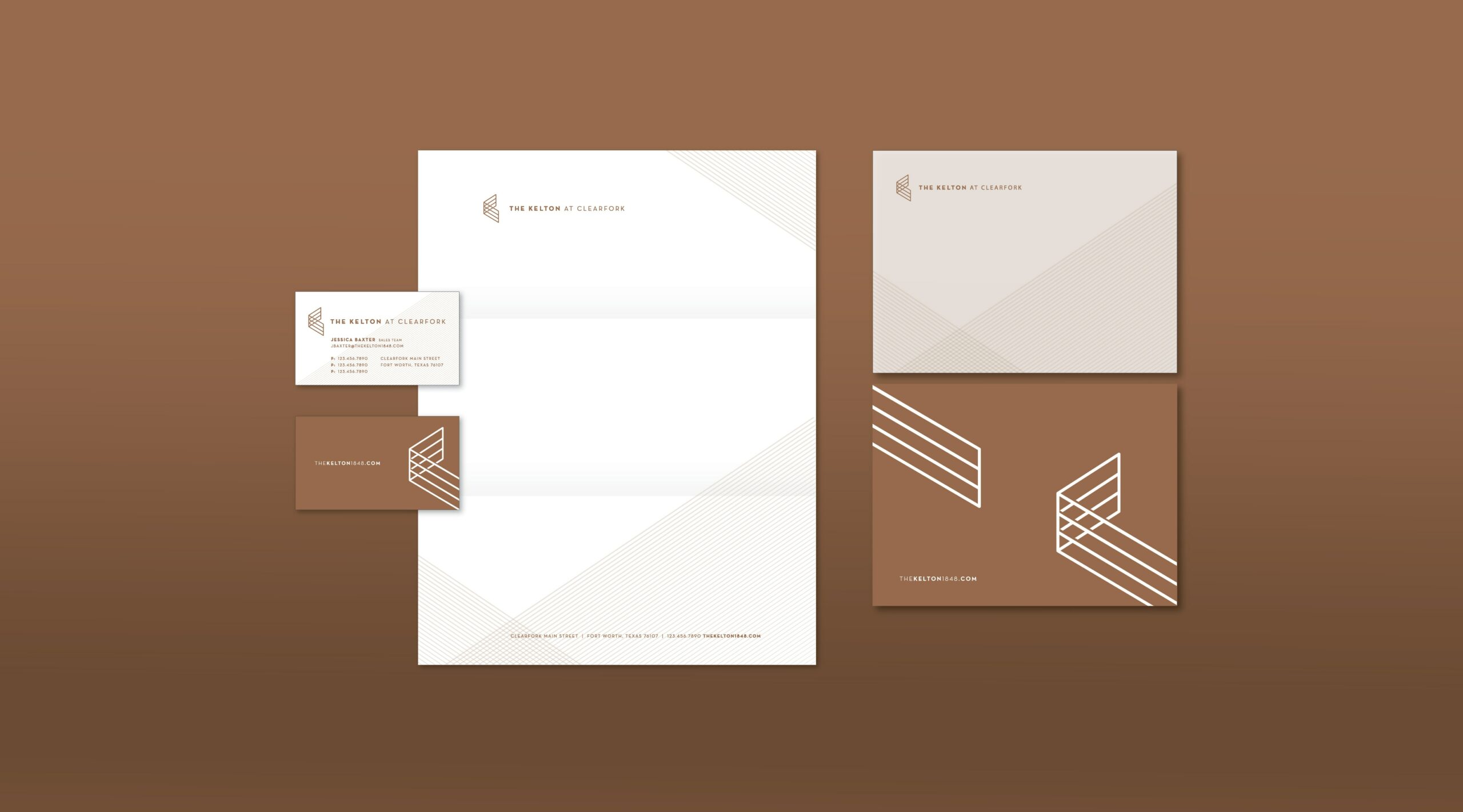
Brand Mark and Creative Suite
The brand mark needed to match the sophistication of the Clearfork area, but remain as approachable and welcoming as the Kelton. We wanted to tie the mark back to the history of the land, and the symbol of an open gate was a universal and welcoming sign of hospitality. The resulting mark feels authentic to the family and their history, but is modern enough to attract the right people to these luxury condos.
Positioning the Kelton in Fort Worth
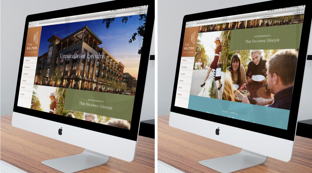
We also designed the website with the goal of giving people an idea of what surrounded this space. Up until its launch this was a largely unknown and unexplored area of Fort Worth, so we needed to connect people to the culture that surrounded it and the vision for what was being built up around it. To illustrate the soul of the Kelton, we photographed key parts of the city that helped paint a picture of the lifestyle they wanted to portray at Clearfork and The Kelton.
A Brand Rooted in Authenticity
Brought the Kelton brand to life with a new creative suite
Marketing in-person events comes with its own set of challenges, but after the pandemic struck, we were presented with a new range of obstacles to activate the community and generate awareness, excitement, and attendance. For the Kimbell Art Museum, we were tasked with creating a community activation campaign that highlighted Queen Nefertari’s Egypt exhibition and encouraged people to safely enjoy the exhibition in person.
Goals
Create community activation and engagement
Connect the exhibition to people and encourage them to enjoy it in person
Encourage community awareness of the new exhibition
Utilize social media to educate the public and generate buzz for the exhibition
Encouraging Engagement During Uncertain Times
Getting in front of your audience physically during the pandemic can be challenging, but there are creative ways to target and engage the community in the digital space that still leads to conversions. The Kimbell needed a big idea that could break the mold of traditional marketing, and we were up for the challenge!
Instead of relying on traditional marketing methods to encourage in-person attendance, we specifically utilized the digital space to accomplish this, examining new trends, tools, and opportunities to engage our audience virtually. While digital analytics are incredibly valuable, this presented another challenge because the ultimate measurement of success is in-person attendance.
Pivoting for Success
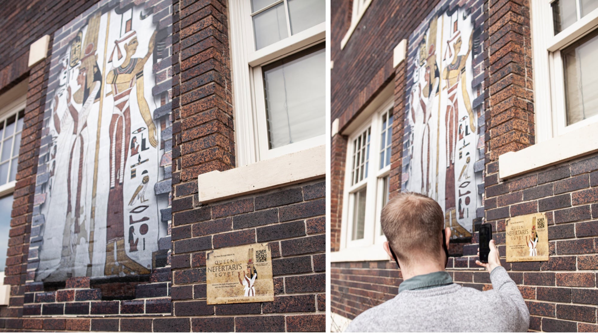
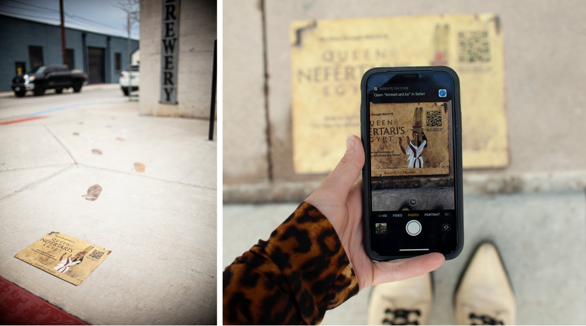
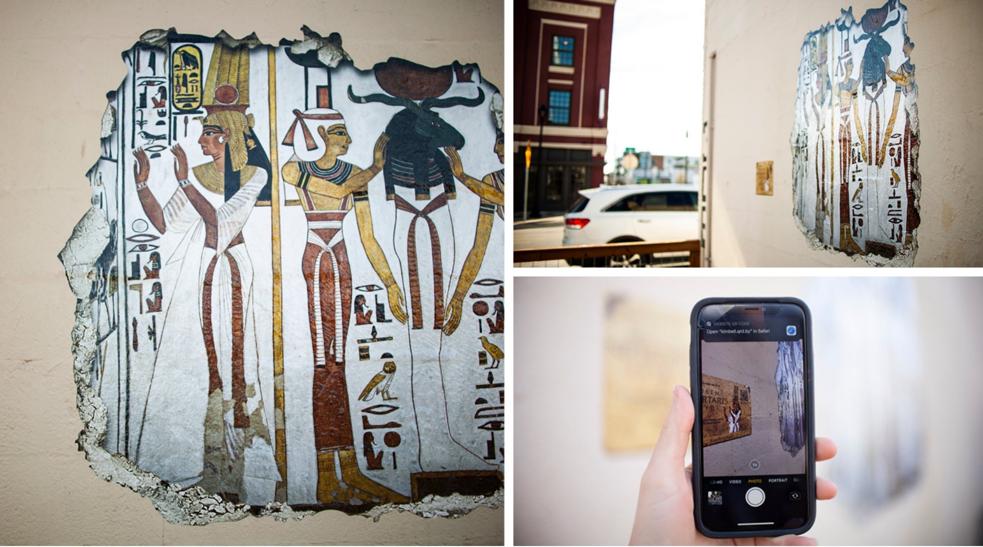
Rather than presenting a hard push to get people to the Nefertari exhibition in person, we decided to bring the exhibition experience to the community in a safe way. We created a series of outdoor installations that teased the exhibition and activated audiences in the safety of outdoor spaces. Our team created 3 different murals and 8 different ground clings that educated people about the Nefertari exhibition and encouraged them to experience it in person. For placement, we leveraged internal relationships to strategically set the murals and ground clings in areas that have high foot traffic and chose locations to help build the Kimbell’s network and local footprint. These installations allowed our audience the chance to walk in Queen Nefertari’s sandals and experience the magic of uncovering a hidden Egyptian ruin.
Leveraging a New Technology
To supplement the installations and ground clings, we sought a way to digitally engage our audience wherever they are and immerse them in Queen Nefertari’s Egypt. We worked with the Kimbell to come up with an engaging digital campaign to shift into the digital space. This was a big step for the Kimbell, since most of their previous campaign activations were created with traditional advertising methods. After careful market observation and extensive digital discovery, we found that more and more destination brands were incorporating augmented reality into their marketing plans.
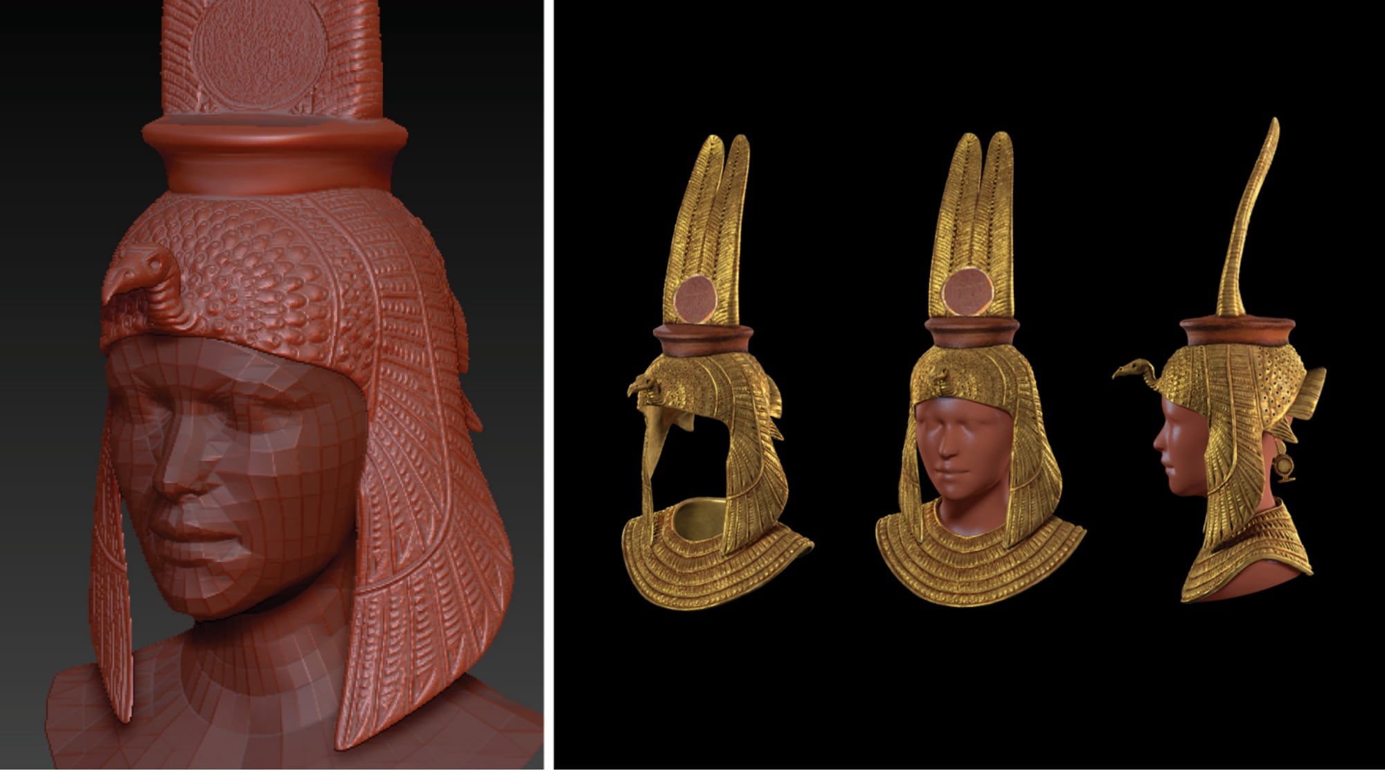
Augmented reality takes many forms, but at the core of AR is the ability to partially immerse a user in an experience through a digital device like a phone or computer. For the Kimbell, we sought to create an AR campaign that brought Queen Nefertari to life and offered our audience a new way to engage with the exhibition. We created two AR filters that gave people two distinct ways to place them in Queen Nefertari’s Egypt.
The first AR filter we created features Queen Nefertari’s crown – a three-dimensional depiction of a flat hieroglyphic crown that people could wear and enjoy on Instagram and Facebook. The second AR filter features a series of hieroglyphs etched into stone laid behind the user to make it appear as if they had just discovered the ruins.
It was a challenge to take a flat hieroglyphic crown and turn it into an accurate three-dimensional rendering. But, after hours of research, testing, and iteration, we were able to take a piece of Art and turn it into a relatable and engaging piece of technology that was accessible and relevant to audiences everywhere.
Results
Helped the Kimbell effectively reach max capacity of the Nefertari exhibition
More than 1.1M paid media impressions
More than 5 thousand tickets sold
The entire campaign resulted in more than $383k in revenue
AR filter earned 5.7K impressions and 3.6K opens
CTR of 1.71%, above the industry standard of .8%
308 shares of the filter ads
Incorporated new technology into our client’s marketing strategy
Produced and installed wall murals and ground clings
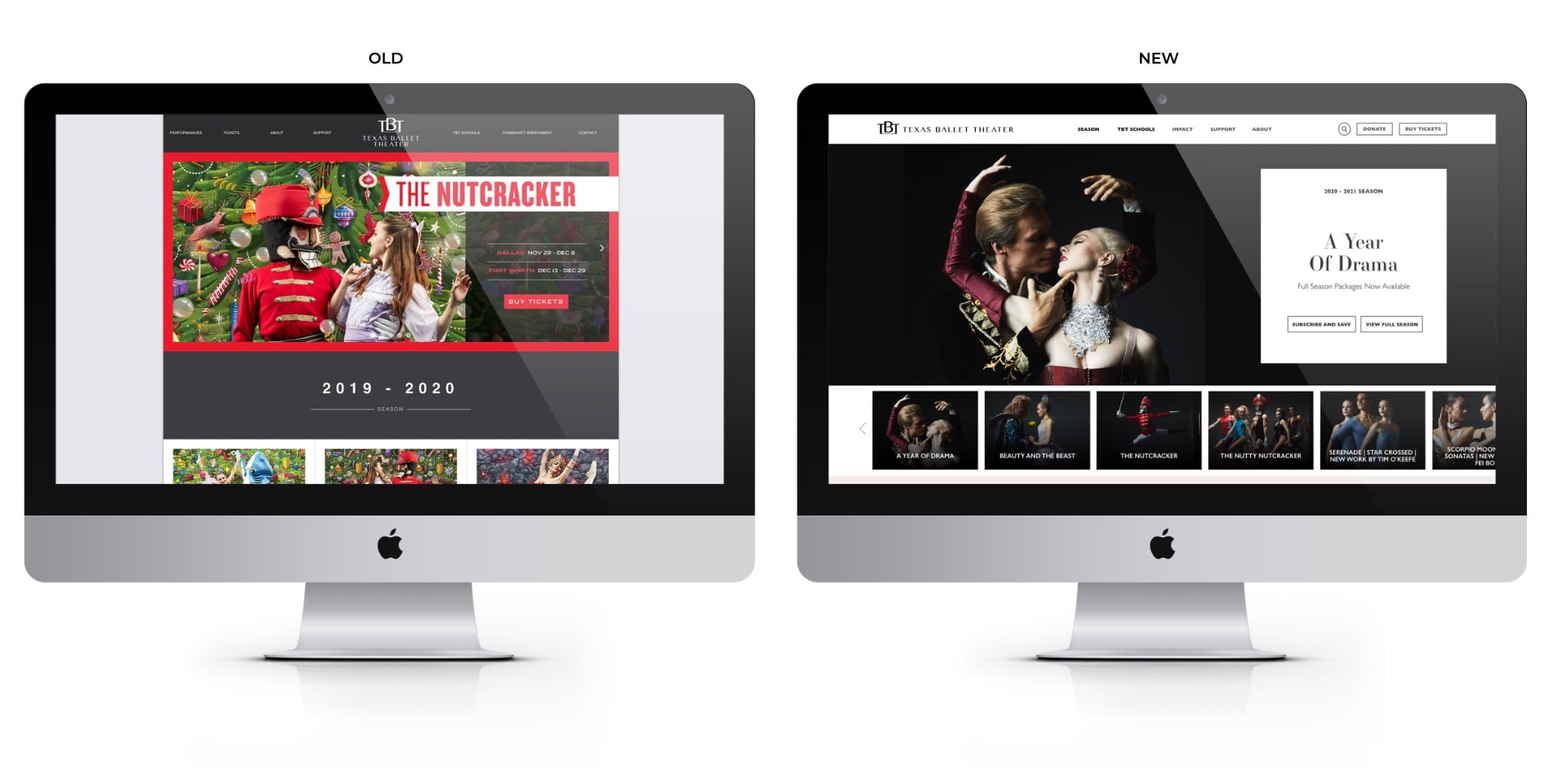
Building a website is an opportunity to hone in on specific marketing objectives and create a powerful digital space to engage consumers. We partnered with the Texas Ballet Theater to build a website focused on improving ticket sales through an improved user experience, and design it to share the exuberant spirit and artistry of ballet in its structure.
Goals
Develop a new website, and shift the focus to ticket sales
Develop content specifically to help visitors relate to the professional dancers
Highlight the ballet company and their role in the community
Create a website that is easy for the organization to update and change season to season through use of internal marketing resources
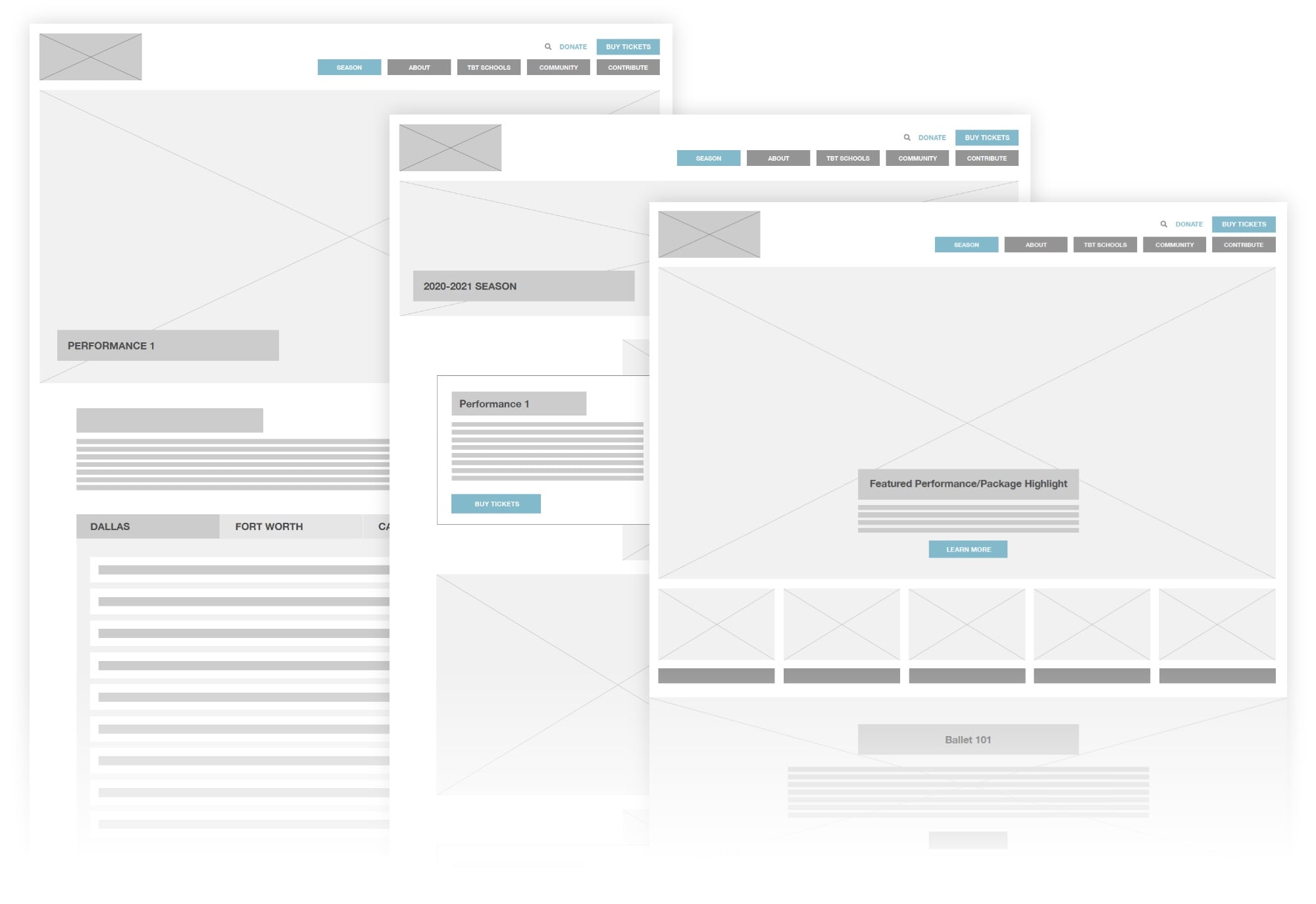
Defining a Clearer User Journey
When building a new website, understanding how people use it is key to pair functionality with supporting key marketing objectives. For Texas Ballet Theater, we took a deep dive into the popular user paths people take to purchase tickets and sought to understand the user experience. One critical point that we discovered was that there were far too many clicks and exit points between users and purchasing tickets. With that in mind, we defined clearer user paths and designed the structure of the new site to make it easier and quicker for users to purchase tickets.
Strategic Content Migration
As we shifted the new website to focus on e-commerce, we reduced the number of actions it takes to purchase a ticket down to two simple clicks and made the ticket sales portal readily available and visible on each page. To minimize the bounce rate and encourage more time on site, we improved the user flow by reducing duplicate pages and dead ends on the site. We also instituted analytics to track revenue data and connect e-commerce data to the ticketing system to monitor our progress.
The result of the strategic content migration is a streamlined site that is focused on guiding users to purchase tickets and learn more about the Texas Ballet Theater.
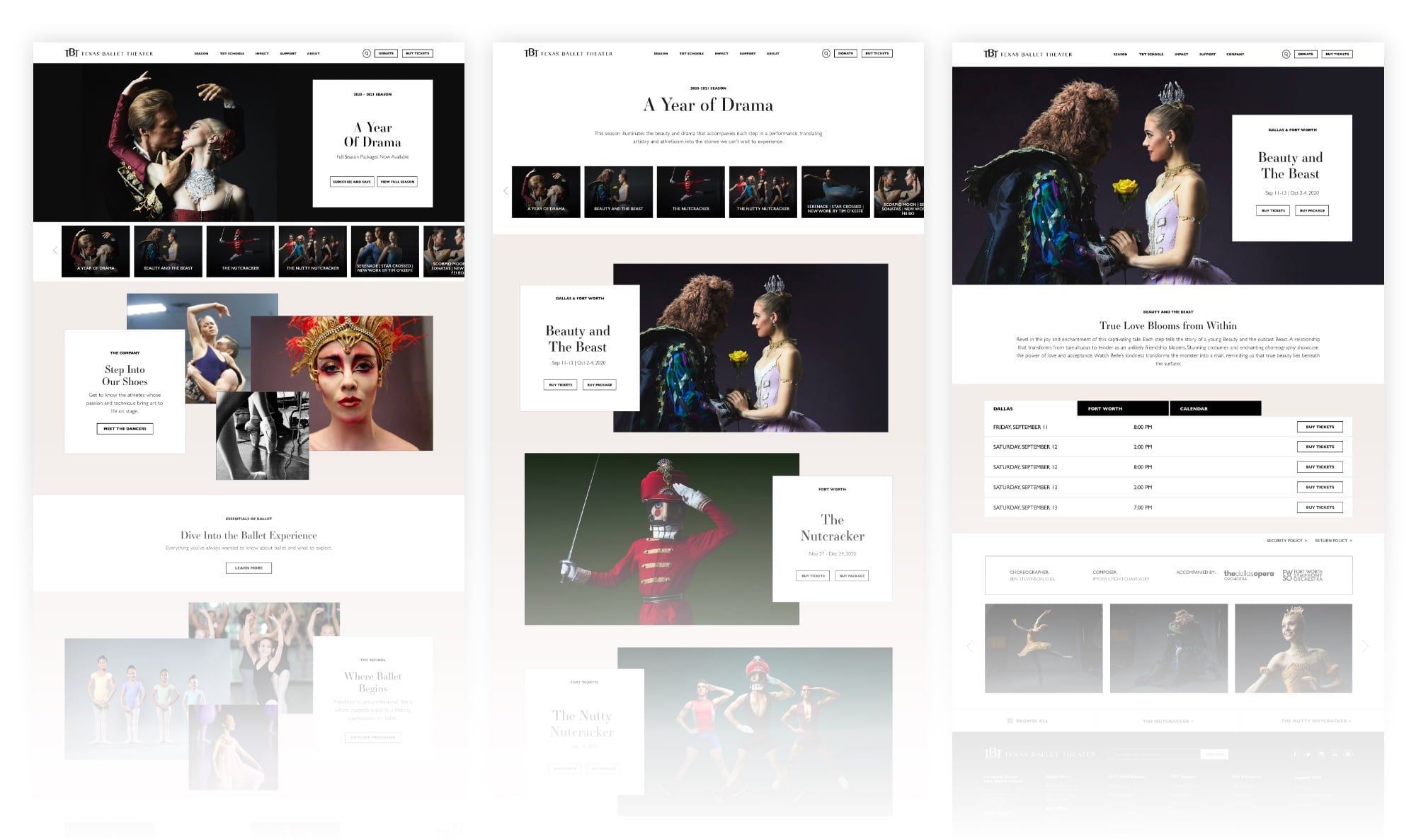
Site Architecture Aimed at e-Commerce
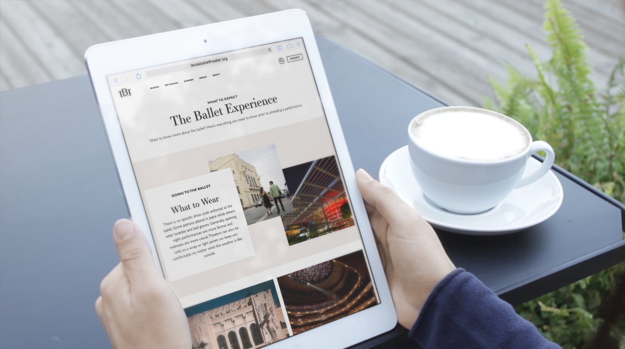
Through discovery and internal research we determined the key objectives were to restructure the site navigation to improve ticket sales, but also educate the public about Texas Ballet Theater beyond their on-stage product. The website needed to promote special events, highlight donation opportunities, and showcase the work that TBT is doing for local schools and young dancer education, as well as their many community outreach initiatives. So, we consolidated the number of pages to make it easier for users to navigate from the homepage to any section they needed and reduced the friction in navigating between pages outside of the homepage.
We carefully considered the different types of people visiting the website and used those personas to help create smoother user paths and a richer user experience for a wider audience.
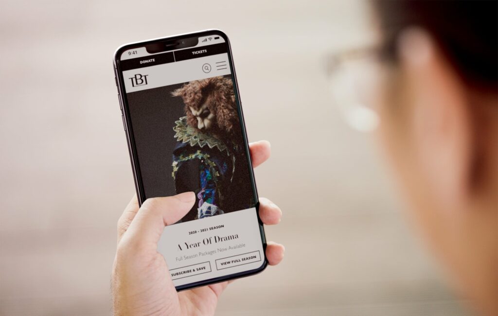
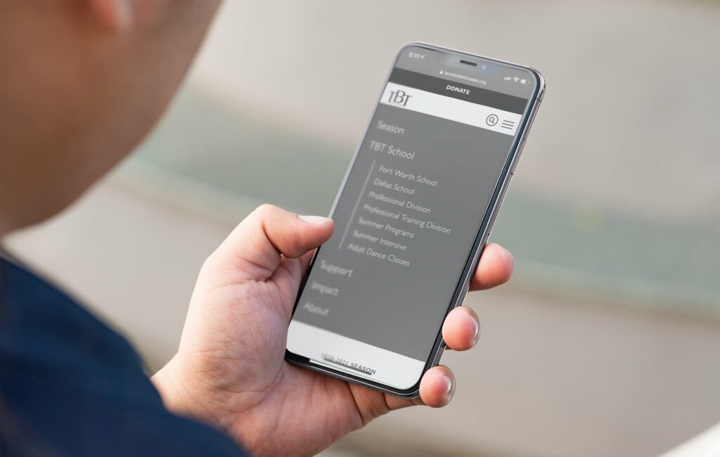
An Improved Mobile Experience
As with any website redesign, a website needs to offer a seamless experience on desktop and mobile devices. When we designed the mobile site, we wanted to ensure that it served the same primary goal as the desktop version: sell tickets. So, we simplified the website to offer users the primary information through shorter users paths. We also improved the navigational elements to make the site easier to click through on mobile devices.
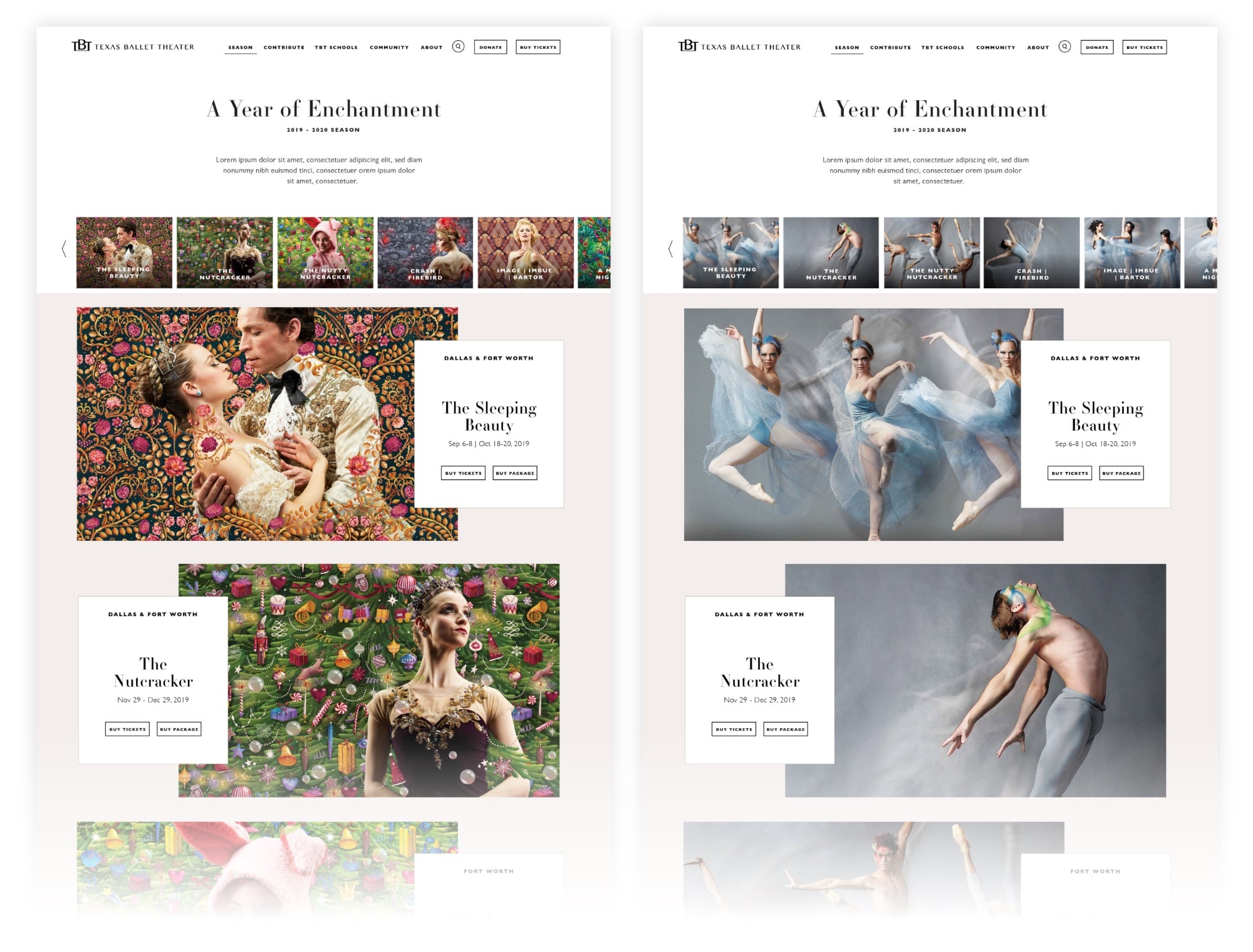
A Website that Communicates the Energy of Ballet
Our team sought to emphasize the spirit of the TBT brand in the final website design so that it was as beautiful as it was functional. Furthermore, we wanted to elevate the performances and dancers so that they took center stage as the visual standouts. We also sought to create a flexible framework for the web design so that each season of ballet felt fresh and exciting without having to undergo significant site construction to update it. The site can easily be updated by the TBT marketing staff, and it’s flexibility allowed for quicker performance updates during the pandemic.
Visually, the new website is driven by photography and highlighting the dancers. We elevated the typography choices and color palette to reflect the modern aspects of TBT so that the pages moved beyond the season and established TBT’s brand. To communicate the dynamic movement and energy of ballet, we used a non-traditional structure that fluidly moves users down the page. The final website design is one that balances form and function while standing as a testament to the fundamental motion of ballet.
Results
The total volume of site traffic was impacted heavily in 2020 as a result of COVID-19, which also led to multiple performance cancellations. However, 2020 metrics still indicate significant increases in overall website performance.
More users clicked to purchase tickets to The Nutcracker 2020 compared to The Nutcracker 2019.
In December 2020, more than double the number of users clicked from The Nutcracker 2020 page to purchase tickets compared to the same page in December 2019.
Behavior flow to purchase tickets improved, with users entering the ticketing platform within just 2 clicks, as compared to 3+ clicks on the previous site.
Improved time efficiencies for updating the website, saving on future and ongoing web development
Incorporated pages where TBT can share about their artistic direction, where they’re going as a company, add their personality
Every year the Texas Parks & Wildlife Foundation (TPWF) hosts an event to honor and induct some of its biggest friends and supporters to the Conservation Hall of Fame. The event is one of the most prestigious conservation award dinners, attracting partners, ambassadors and donors from across the state to benefit the TPWF and amplify its mission.
The 2019 inductees strongly believe in the responsibility every Texan has to maintain our land and the life on it. The primary theme for the event focused on connection, more specifically on the flora and fauna that grow wildly across the Lone Star state, each native species playing a vital role in our ecosystem. To raise awareness and excite attendees, we set out to design an invitation suite befitting Texas’ most precious resource—all the wild things and wild places that make our state great.
The state of Texas is not only vast. It’s diverse. From the panhandle to the pines, every inch is famed for its beauty and defined by the iconic landscapes. And there’s no better way to appreciate those views than from the open road.
Seeking to capture that feeling of nostalgia for long drives and wide-open spaces, we built a conceptual theme centered around the classic American road-trip—Texas-style. A limited-edition postcard series served as the invitation, each featuring a hand-drawn illustration of true Texas moments from five distinct regions.
The event helped raise private dollars for public funding. And the invite provided guests with a tangible piece of Texas they could collect or share with others to inspire conservation. A tribute to the landscape and a call to experience the wild, Texas Road Trip won awards at the local and regional American Advertising Awards in 2019.
In the face of the Covid-19 pandemic, the Fort Worth Zoo needed a way to sell holiday adoptions and memberships. More than that, they needed a campaign that cut through the clutter of holiday advertisements to connect with consumers and convince them that a Zoo membership is the perfect gift for anyone who enjoys a unique and rewarding experience.
Goals
Promote Zoo memberships and holiday adoption packages
Communicate the new delayed activation component of Zoo membership
Boost membership sales by defining the target audience and tailoring messaging to that base
Recapture some of the membership sales lost due to the Covid-19 pandemic
Help the Zoo sell 200 adoptions and boost membership revenue
Identifying the Right Audience
Before launching the campaign, we needed to identify and target the right audiences that were likely to purchase a holiday membership or a holiday adoption package. Before determining audience demographics we isolated Tarrant County as the primary market in which membership conversions would be most attainable
It was a challenge to promote both adoptions and memberships in one campaign, since the target markets aren’t the same. So, we had to carefully design our target audience to maximize exposure and conversion.
To define our audience sets, we identified parents with young children as a primary marketing target, and general audiences as a secondary target likely to buy holiday adoptions. We also incorporated strategic site retargeting to market to users that have visited the Fort Worth Zoo’s website, and targeted additional users searching for terms related to the Zoo and holiday gift ideas. We excluded current Zoo members from all marketing.
Refining a Compelling Message
For the first time ever, the Zoo offered memberships that allow delayed activation for up to nine months, which allows consumers to select when they begin their membership. This was done to help quell fears about the coronavirus pandemic and give Zoo members a chance to begin their membership when they feel safer. We created campaign messaging that reflected the new membership activation and featured it prominently across digital banners and paid social ads. The central campaign line of “Give now, enjoy later” communicates the spirit of giving a gift for the holidays, and indicates that it can be enjoyed at the recipients’ leisure. We featured the additional line of “choose when your membership begins” prominently across mediums to further communicate that a Zoo membership can begin whenever the member is comfortable.
Results
100
of Holiday packages Sold
180000
Profit Generated
318
Return On Investment
41
Total Revenue Increase (December 2019 vs 2020)
Thriving Under Challenging Circumstances
The Covid-19 pandemic has illustrated the need for brands to think outside the box and find new ways to make their products, services or experiences accessible and safe for consumers. For the Fort Worth Zoo, that meant creating a new delayed activation membership and connecting with people that are ready to experience the Zoo under different circumstances.
The Gary Patterson Foundation raises thousands of dollars every year to benefit various education and children related entities. After experiencing Mack, Jack & McConaughey in Austin, the Gary Patterson Foundation was inspired by MCM’s efforts to empower kids through 2-days of fundraising and fun. After careful consideration, they decided to shift their traditional Joe T’s annual event into a weekend filled with fundraising activities from golf to galas. With a shift as big as this, they needed to create an impactful brand.
Goals
Develop brand name, narrative and messaging for the non-profit event series
Create a dynamic brand identity system that communicates the values of the non-profit
Finding the Way
We worked closely with the Gary Patterson and his team to better understand the audience and impact of the new events, and create a strategy that would speak to their target audience. The events needed to attract all generations of donors in North Texas, and be accessible to those that would like to donate for the first time. The new initiative also needed to be the core fundraising event for the Gary Patterson Foundation. So, we had to position it as an accessible, diverse non-profit open to those that aren’t passionate about sports, but also welcome those that are – it had to be inclusive and suitable for a diversity of mediums. From black ties to tailgates, the mark needed to be flexible enough to feel at home at any type of fundraising event.
Plenty of Good to Go Around
To communicate the breadth and impact of the fundraising efforts, we knew the brand and mark had to be big. With an emphasis on the good.
The organization landed on the name, “The Big Good,” which is direct, yet powerful. Its strength is in its simplicity. A quick read with enough flexibility to cover more than one specific event or fundraiser. The Big Good indicates the diversity of events and their monumental impact on North Texas families and beyond.
The typographic logo is purposefully simple to communicate the variety of events at the heart of the Big Good. Each of the letterforms is customized and unique which further emphasizes the diverse structure of the Big Good. The crossbars on the “H/E/B/G” are all different and intentionally illustrate the fun and engaging nature of the events that offer something substantial for everybody, and specific need in Dallas Fort Worth.
A subtly simple mark, paired with a direct brand name can make an impactful and memorable impression. The Big Good branding illustrates the power of using simplicity to communicate and represent a brand.
Places are defined by people, and the Near Southside is among the most vibrant and diverse communities in Fort Worth. So, when they approached Schaefer to help them rebrand their identity, we focused on the neighborhood they create and the people and ideas the Near Southside attracts.
We wanted to present that the Near Southside is first and foremost a community where people and business can thrive in an inclusive and supportive environment. The result is a design balanced in minimalism and boldness that allows the artistic soul of the Near Southside to come through, but also be functional enough to carry the brand across everything from way-finding signage to social. The new color pallet represents the diverse voices that stand up for and continue to create opportunities that cultivate community. The updated identity is malleable enough to work across mediums but enduring enough to be used over decades to come.
It is a pleasure to partner with local organizations that build up our community and help them identify their message and purpose, and carry that through to representing their brand. By creating a flexible mark that more accurately represents the community and culture of the Near Southside, we’re hopeful that their message will resonate more deeply with future community members and contributors. The Near Southside is an excellent ambassador and cultivator of the arts and culture that permeate our neighborhood and creating something that elicits that same level of passion is why we come to work every single day.
River & Blues Fest is a new kind of music festival, featuring a uniquely American lineup of longtime favorites and soulful up-and-comers in country and blues. Launching its inaugural year right here in the heart of Fort Worth, the River & Blues Festival needed a dynamic identity system to engage and attract music lovers and artists alike across a primarily digital landscape.
Launching a New Identity System
Drawing inspiration from the rhythm and the river, we turned up the volume on the ethos and the experience to allow the vision of the festival to come through. The result was a scalable brand identity that represented the heart and soul of the music itself—a perfect balance of grit and a good time. With so many moving pieces, it was important to create a system that easily blended photography, motion and print elements, but most importantly position this instantly legendary weekend as one that can’t be missed.
Connecting with Our Target Audience
Launching any new brand can be a challenge and making noise about a music festival can be especially challenging in Texas. But, a clearly defined vision and a true one-of-a-kind blend of country and blues music is a fantastic experience to position. To connect with a wide audience, we needed to communicate that the River & Blues Festival is not just a blues festival, but also a country music festival, which appeals to a wide range of local music fans spanning demographics. Furthermore, we wanted to bring the river through in our messaging and identity to illustrate that the festival takes place on the Trinity River at Panther Island Pavilion in the heart of Fort Worth.
Concert Going amid Covid-19
“The best-laid plans of mice and men often go awry.” If 2020 has taught us anything, it’s that anything can happen. But, what no one accounted for, or could have foreseen, was the covid-19 pandemic. River & Blues Fest was meant to make its first-ever debut during the summer festival season. As it turns out, that fell right during the height of the coronavirus lockdowns. Like other big-name events, we had to shift from a traditionally communal live music experience to a socially-distant, socially-conscious festival. Which meant more than a new date to ensure the people attending, playing and working not only felt safe but participated responsibly. In addition to new precautions we needed to communicate that, while the experience might look different, the music still sounds the same. And after all this time apart, maybe sweeter.
Results:
Total digital campaign resulted in more than 3.2 million impressions and an above-average CTR
New website generated 82.5K pageviews, 50.2K sessions and 42.4K new users
Brought a new brand to market and established their brand foundation
Created a flexible brand identity system
Partnered with artists to cross-promote on social and traditional radio
Built an email database from no subscribers to just over 1,500
Make Life Better
Artists and the people who support them rely on gigs and performances to make a living. River & Blues Fest is, without a doubt, going to be a good time. But it’s also going to prop up an art form, a nearly forgotten genre that survives with every chord. More so, it supports the artists, especially the grassroots, independent and often local musicians still waiting to be discovered. We are so proud to work with a client that uplifts the local creative community and is flexible enough to adjust their brand-new music festival to be safe and socially distant. Bringing people together safely is important now more than ever.