From legacy to leading-edge
Reinventing VoidForm’s brand for the future
With over 40 years of experience, VoidForm Products is a trusted business specializing in customized, innovative carton void forms that protect structures from the damaging impact of expansive soils. Their extensive range of products is designed to provide added fortification during concrete foundation pouring, offering a cost-effective and reliable solution for both residential and large-scale commercial projects. Though sales were strong, VoidForm faced the challenge of an outdated and disjointed brand ecosystem encompassing the parent brand and over 20 sub-brands. Recognizing the need for a modern, scalable, and cohesive brand strategy to support their increased business goals, VoidForm partnered with Schaefer Advertising to position themselves as an industry thought-leader and support the expansion of their products and services.
Embracing VoidForm’s unique circumstances as a long-standing enterprise, Schaefer recognized the challenge of working with a brand ecosystem that was built over time. VoidForm had yet to take a comprehensive top-down view of their branding and marketing approach and how it could support the future of the business. Schaefer served as a pivotal partner for this rapidly growing company, providing support during leadership changes, aligning their history and success with a modern approach, and creating a future-focused brand strategy and web presence for sustained growth.
Elevating protection and stability: uncovering VoidForm’s key differentiators and core values
Schaefer embarked on a comprehensive brand refresh, starting with an assessment of the brand positioning and hierarchy. This strategic approach began with a deep dive into VoidForm’s brand landscape, including identifying key differentiators for the company and each product, reflecting on the company’s core values, and understanding key target audiences and what compels them.

As a result, the Hero archetype was selected as the perfect fit for VoidForm. This archetype captured VoidForm’s commitment to delivering best-in-class solutions and leading the industry with products that outperformed the competition. To complement this, Schaefer introduced the powerful positioning of “Safeguard” into VoidForm’s brand language, embodying the essence of their products which provide an invaluable measure of protection and stability in expansive or complex soil structures with customizable, easy-to-install, quality forms.
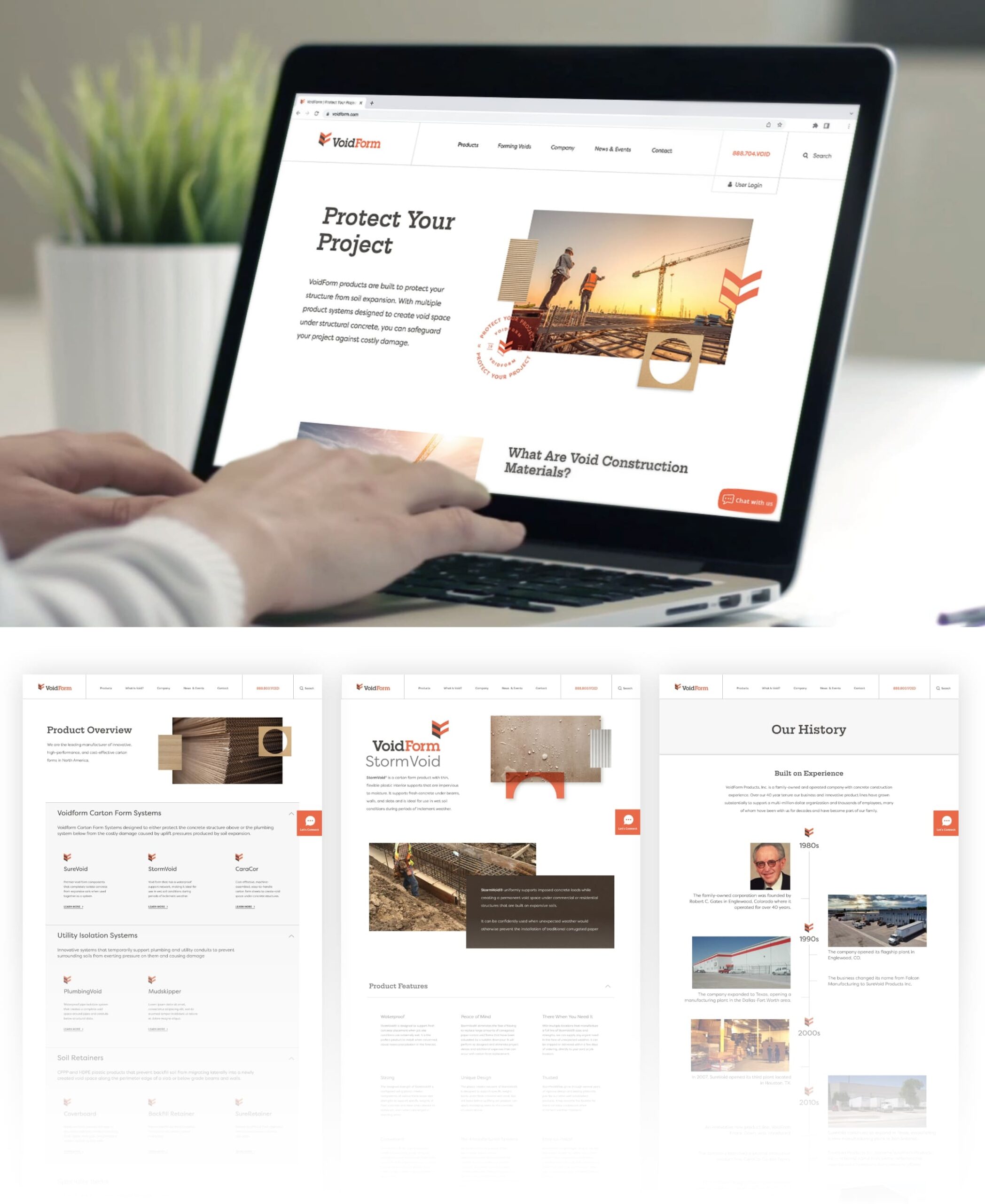
Building upon this foundation, brand language was enhanced to include the main line “Protect Your Project,” which positioned the product appropriately and served as a strong call to action. The brand voice was defined as determined, confident, innovative, dependable, trustworthy and approachable, which served to influence the way the brand is expressed in writing.
Unifying identity and differentiation: the cohesive visual system for VoidForm
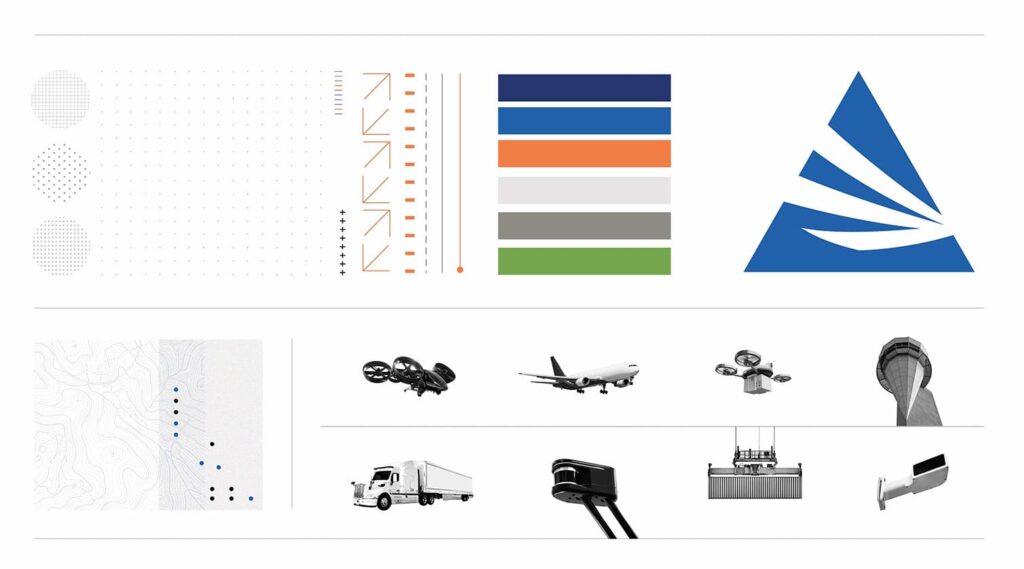
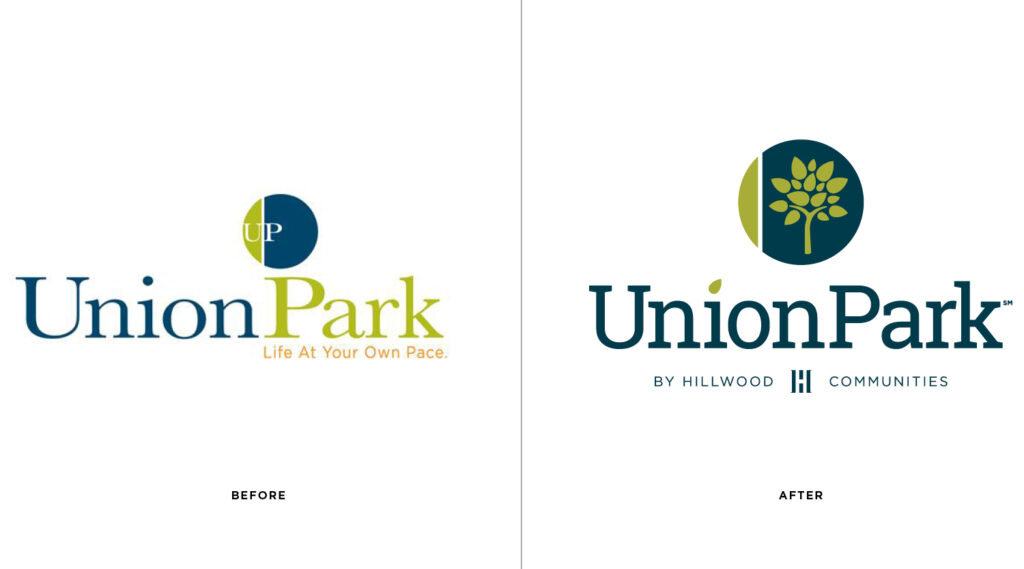
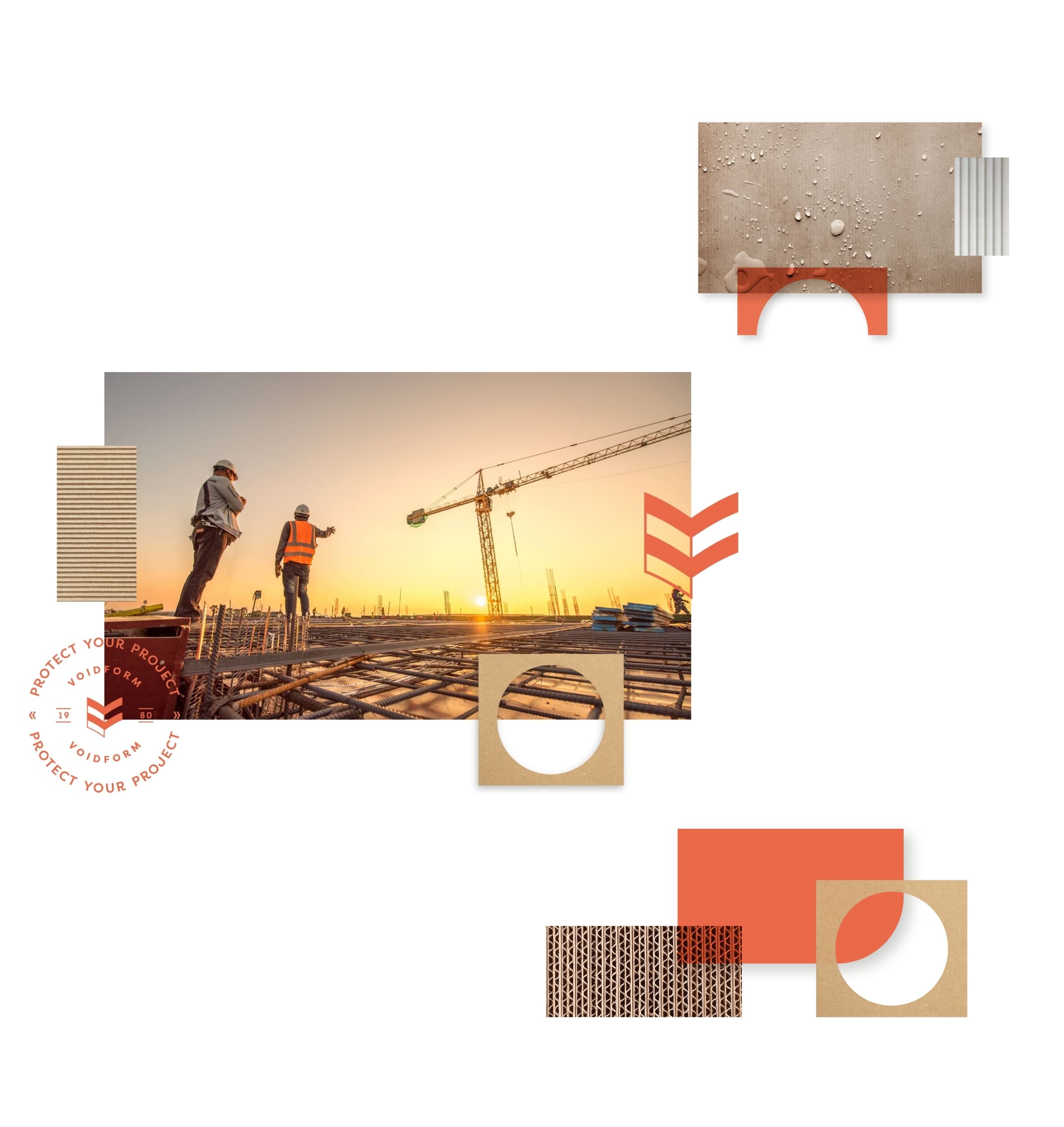
Schaefer implemented a cohesive visual system that combined the branded house and sub-brands strategies, enabling VoidForm to effectively showcase their individual product offerings while maintaining brand recognition. The brand system was built to support the seamless integration of new products, allowing VoidForm the ability to easily launch new, innovative solutions and meet the needs of their customers. The logos were designed to be simple, functional, and easily recognizable, with the updated mark serving as a monogram of their initials where the negative space creates a void – a key feature behind the strength of each product. The vibrant orange color, an integral part of their original palette, honored their history while presenting a modern and impactful identity. A comprehensive guideline was created to ensure long-term internal alignment and consistent brand usage across all products.
Embracing creativity, enhancing user experience: the transformative website redesign
To complete the brand transformation, Schaefer tackled the challenge of creating a visually stunning and user-friendly website for VoidForm. Despite the initial lack of strong image assets, the team embraced creativity and ingenuity by utilizing stock imagery to develop custom brand assets inspired by VoidForm’s products. The website redesign resulted in an appealing and intuitive interface that catered to both laypersons and experienced engineers, effectively conveying information and specifications while providing an engaging user experience. Integration with Google Analytics supported awareness, engagement, and lead generation objectives, while the addition of a gated content section facilitated the seamless migration of existing coursework and offerings. The implementation of a content management system empowered VoidForm’s internal team to easily update and maintain the website for long-term adaptability.
Results
The collaboration between Schaefer and VoidForm during a pivotal time yielded remarkable outcomes. Overall, Schaefer’s partnership with VoidForm Products supported their growth by aligning their history and success with a modernized brand strategy and web presence. The new brand system and website positioned VoidForm as an industry leader, and the comprehensive implementation and widespread adoption of the brand by the internal team demonstrated the empowering strength and impact of the brand refresh initiative.