How to rally an entire industry to support your cause
For the TearCare® System, a crucial step in promoting their solution was to become an advocate for change.
Situation
At first glance, dry eye disease (DED) sounds like a mere inconvenience. However, left untreated, this chronic, progressive condition can impact the vision, surgical outcomes and quality of life of millions of patients. Even though meibomian gland dysfunction (MGD) is the most prevalent form of dry eye, in-office procedures to address it are relatively new — and none are reimbursed by insurers. As a result, only patients who can cover the out-of-pocket expense receive treatment.
The TearCare® System is designed to address MGD by evacuating obstructed glands using therapeutic heat and natural blink responses. However, to gain wider adoption, fair reimbursement was needed. The company sought to change reimbursement policies and broaden access to care by raising awareness of the situation. TearCare® tapped Schaefer to lead this effort.
Goals
- Reiterate the threats associated with MGD
- Raise broad, industry-wide awareness of current compensation and reimbursement limitations
- Reach an array of stakeholders with a message of “Fair Access”
- Rally the market to support reimbursement and accessibility for the benefit of patients, practices and payors
- Increase awareness of the TearCare® System
Strategy
The client was ready to promote the need for change and had allocated resources to do it. However, to truly influence the market, the brand also needed to demonstrate the growing support of this movement from eye care professionals (ECPs), patients, employers and other key constituents.
Solution
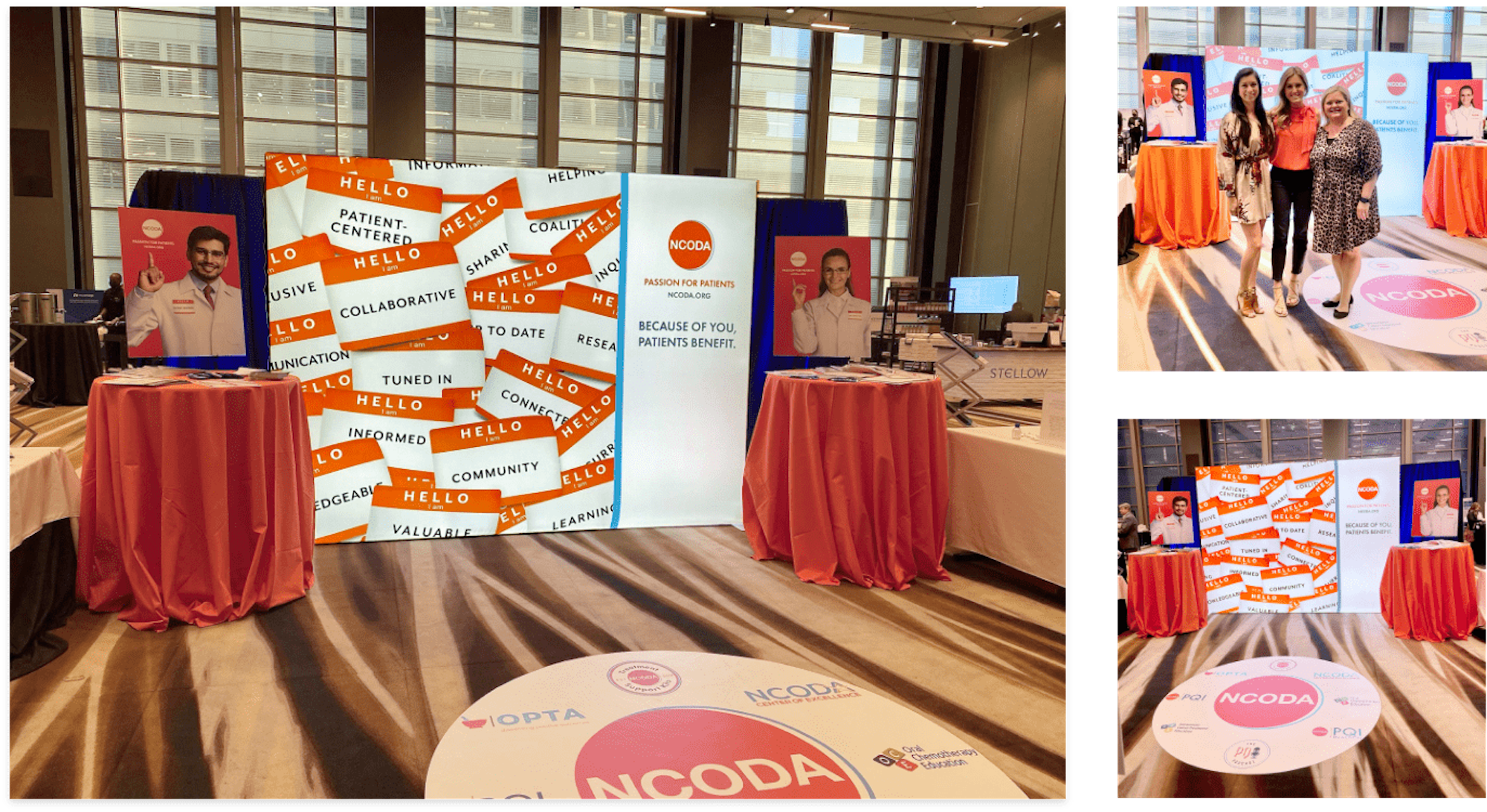
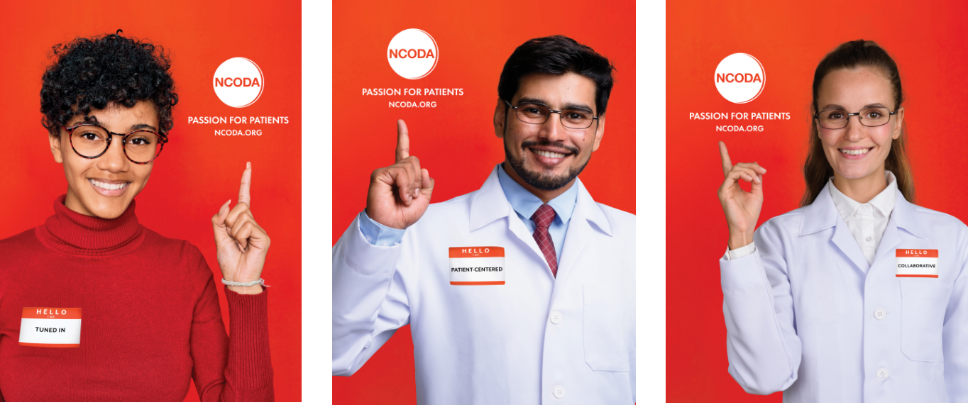
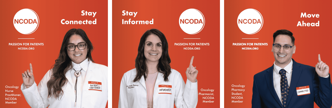
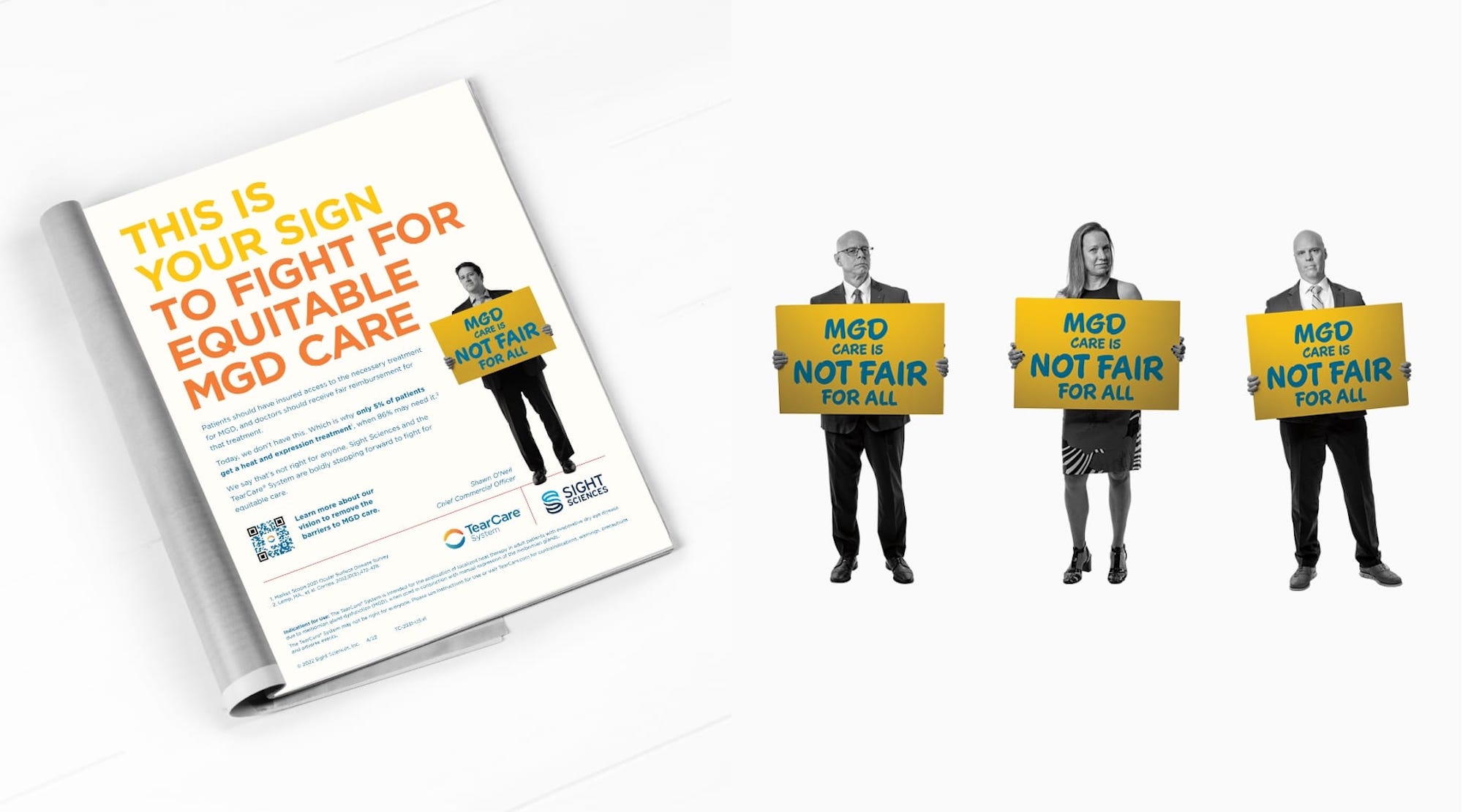
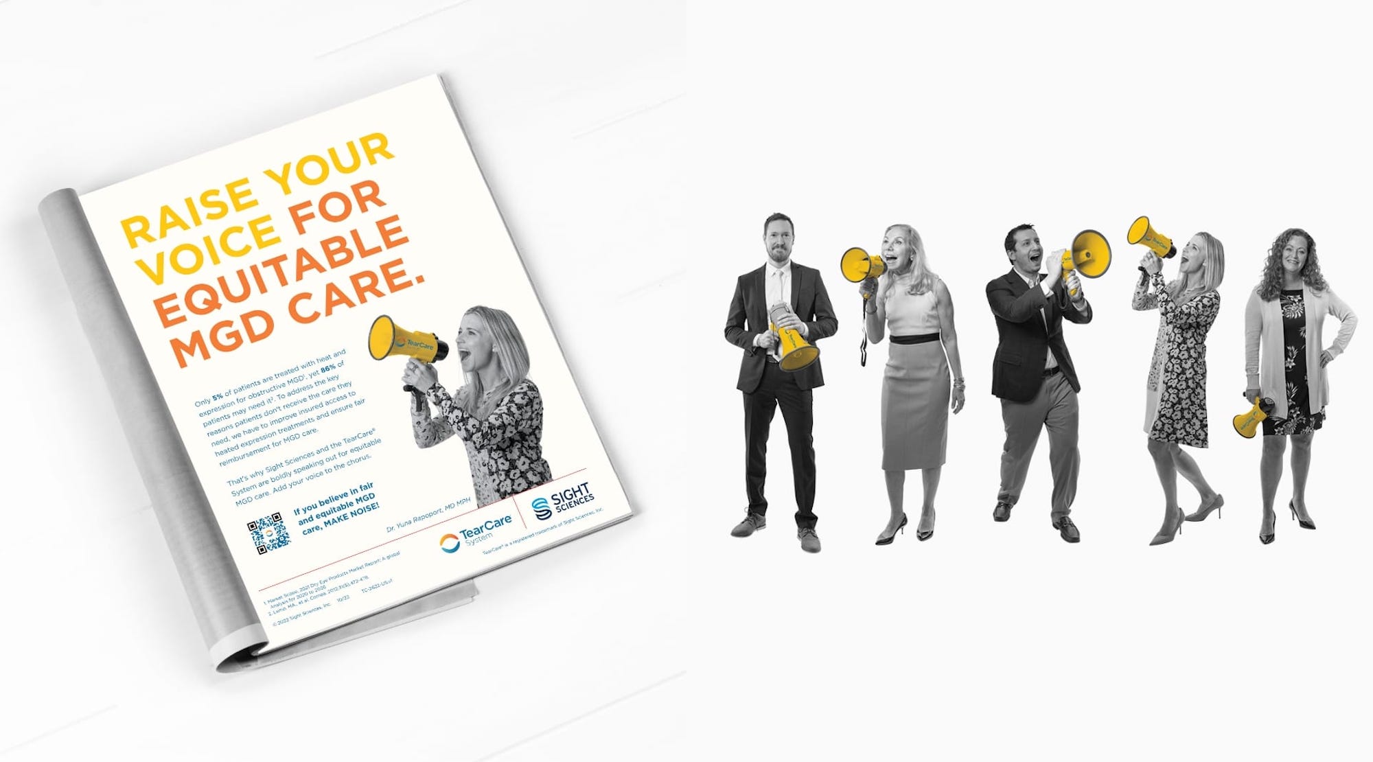
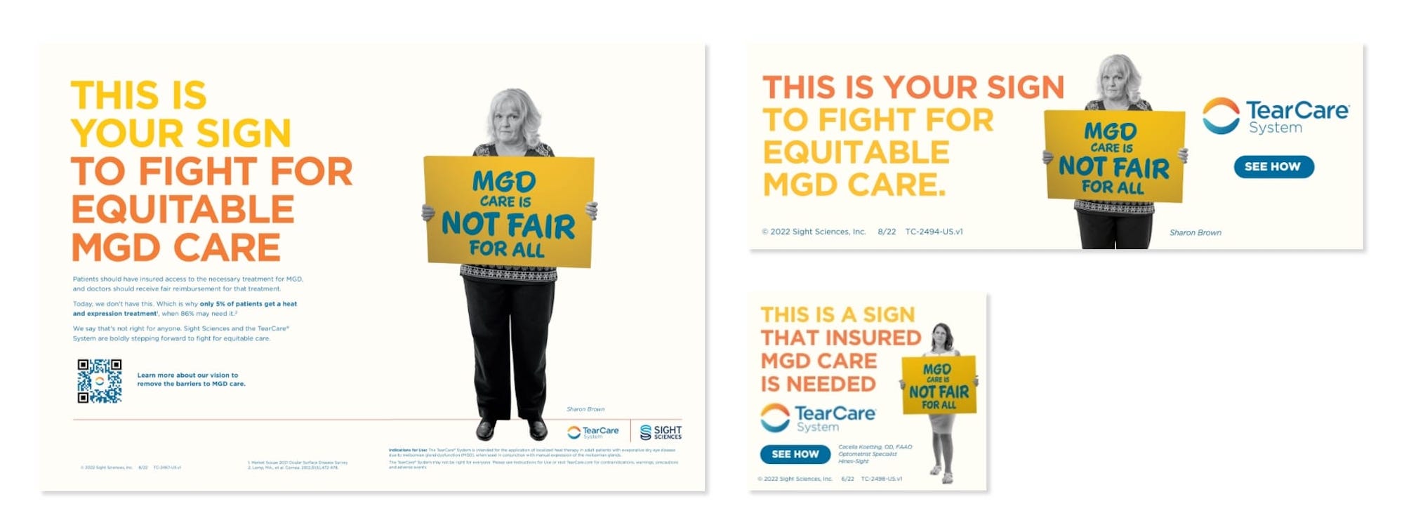
To convey this message, Schaefer created a campaign that captured the feel of a public protest or political rally. In each execution, a real ECP, patient or eye care industry figure appeared with a sign that read “MGD Care Is Not Fair For All.”
Using precise targeting, Schaefer reached optometrists, administrators, payors and other audiences with a “protester/spokesperson” relevant to them. Using faces and names that are known throughout the industry helped build momentum over time, and, ultimately, drove awareness over the top.
Results
By cutting through the clutter of standard medical device advertising, the campaign achieved a high degree of visibility and effectiveness. Within the first few months, the brand realized noticeable results, including:
- 31K new users to the mytearcare.com site
- 228 new requests for information on the TearCare® System from qualified users
More importantly, the strategy worked.
After years of sustained engagement, phase 4 trials, negotiation and ECP testimonials, TearCare announced MAC coverage to great fanfare. The industry took note and recognized MGD as a reimbursable procedure.
Summary
Not only is this a victory for TearCare, but more importantly it’s a win for patients who need access to an option for their MGD. Through our intentional, strategic approach to planting this message, TearCare was able to connect with a human need and make a meaningful difference in the marketplace.