Splash into adventure at Elephant Springs
In Spring 2021, the Fort Worth Zoo was ramping up to unveil their new habitat, Elephant Springs. The habitat, which is home to the Zoo’s Asian elephant herd and a greater one-horned rhino, is part of the Zoo’s Wilder Vision initiative. With opening day on the horizon, the Zoo needed a way to generate excitement and communicate the truly immersive experience to new and returning Zoo goers. After all, Elephant Springs is more than a habitat. It’s a destination worth visiting.
Opportunity
After more than a year at home, people were ready to look forward to something big. And the grand opening of Elephant Springs was the perfect way to delight and excite animal lovers everywhere. Featuring wildlife and environmental details unique to the natural habitat that inspired it, we wanted to highlight this much-awaited encounter as more of an adventure than an exhibit.
Goals
- Increase awareness and excitement for the opening of Elephant Springs
- Boost ticket sales from both new and returning customers
- Develop a campaign that extends beyond opening day
Approach
Some of the best things in life aren’t things at all. They’re places. Filled with the sights, sounds and even splashes that make a place unique. Drawing inspiration from Elephant Springs’ authentic environment and immersive nature, we decided to focus the campaign around capturing the playful and engaging way both people and wildlife experience the habitat.
The only problem? We had to imagine it. To ensure the campaign was ready in time to promote the exhibit as soon as it opened to the public, we had to envision the experience based on renderings and small-scale models. The habitat has no shortage of water features — large pools and waterfalls designed to create new opportunities for animal enrichment and soakers that allow guests to interact with the herd directly. Alongside the Asian elephants that now call this habitat home, we decided to make water a main character in our campaign.
Creative
Working with wildlife is tough. Patience, flexibility and creativity are essential to capturing key frames and moments that can be utilized in the campaign. We partnered with zookeepers to create fun enrichment opportunities that allowed us to photograph organic moments of the elephants getting acclimated and enjoying their new yard. In the end, we were able to provide the Fort Worth Zoo with a full stack of assets that could be used for years to come.
To build excitement for the new exhibit, we created a delightful soundtrack made entirely of the splashes and features of Elephant Springs, composing a soundscape as adventurous as the environment.
Results
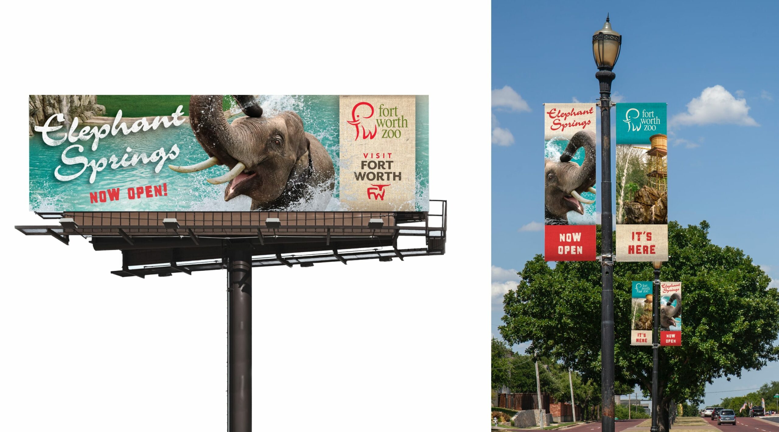
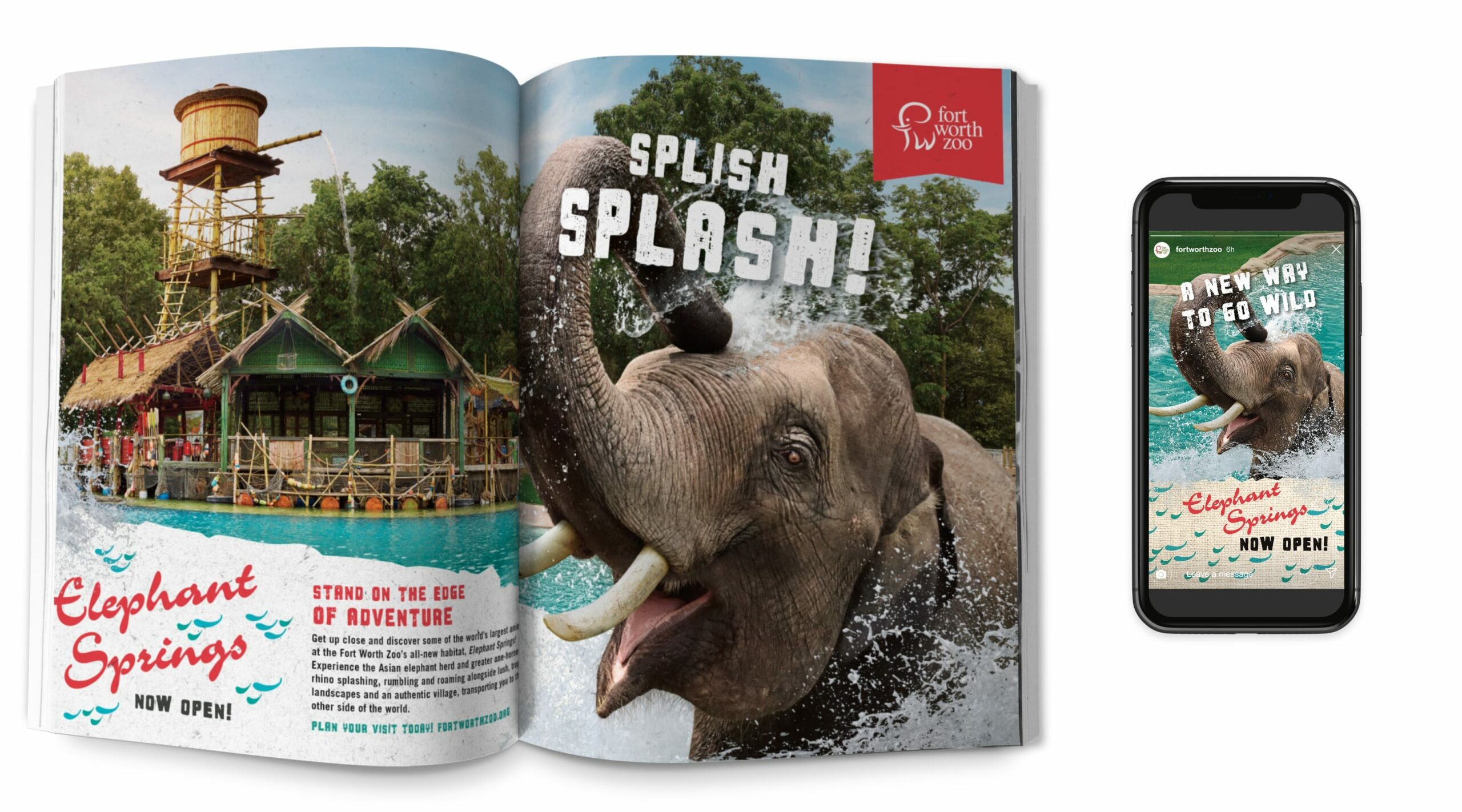
Opening a new exhibit attracts people from all over the state and beyond. To help meet the Zoo’s annual goals, we created a robust omnichannel campaign inclusive of traditional and digital media, including streaming audio, video and TV. Seeing an opportunity to expand awareness, we partnered with Visit Fort Worth to co-brand ads in Texas Monthly and on billboards across Texas. Additionally, we targeted travelers throughout DFW and Love Field. Because this was an awareness campaign, our success was measured in tickets sold (attendance), impressions served and reach across the state.
- 200% increase in website sessions
- 242% increase in new users on the Elephant Springs webpage
- 5.6 million website pageviews
- 1 million website sessions
- 681.3k new users on the website (16% increase in sessions and 22% increase in new users)
- 600K general admission tickets purchased and over 23k memberships/renewals sold during the campaign run (April – July)
- The Fort Worth Zoo met their annual attendance goal in three months early
- 16% increase in organic search and direct channel traffic to the website
- 14.9K YouTube video clicks