Schaefer Advertising Co.

Work

Situation

For the first time in over 20 years, Bank of Texas expanded into a completely new market: San Antonio. With a flagship location opening in an affluent neighborhood, the challenge was clear. How do you introduce an unknown bank to a loyal, established community and inspire them to switch?

Goals 

  • Build brand awareness and establish trust and credibility 
  • Drive consumer growth in checking/savings accounts, youth accounts, mortgage loans, and wealth management
  • Attract small business clients with competitive banking tools and personalized support
  • Win market share from competitors by promoting the benefits of switching to a more personalized, community-focused bank
  • Promote product offers to strengthen launch messaging and encourage customer acquisition 

Strategy

The launch campaign focused on creating local relevance, building trust, and demonstrating the value of personalized banking services to different target segments. Schaefer’s strategy was to highlight Bank of Texas’s personalized approach, offering tailored banking solutions that go beyond transactional services—fostering long-term relationships. An integrated approach was planned with digital and traditional media and community partnerships to saturate the local market and build awareness across different touchpoints.

This strategy ensures Bank of Texas is perceived as both a community-centric and financially robust bank, capable of serving diverse customer needs.

Solution

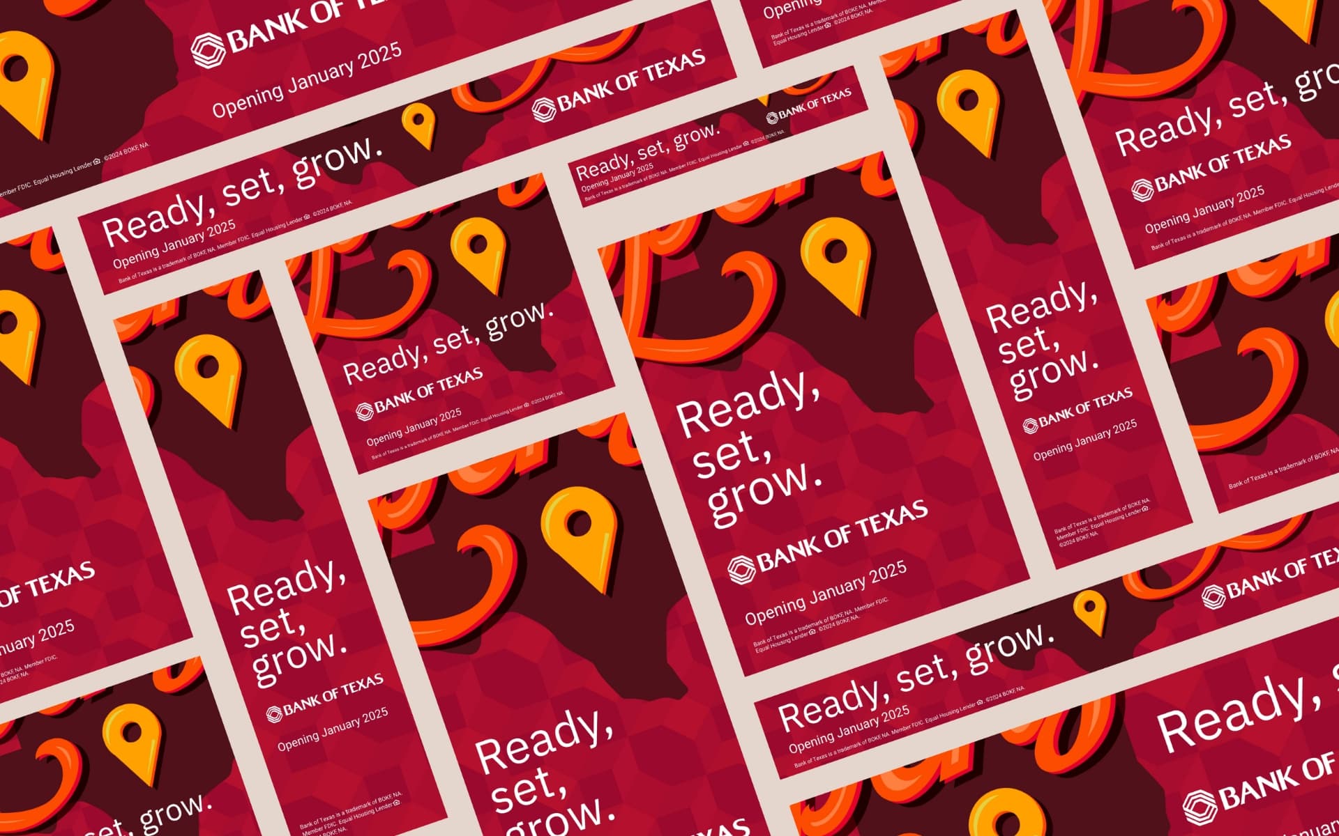
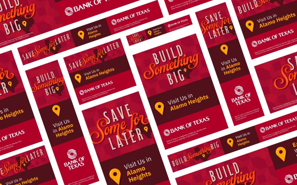
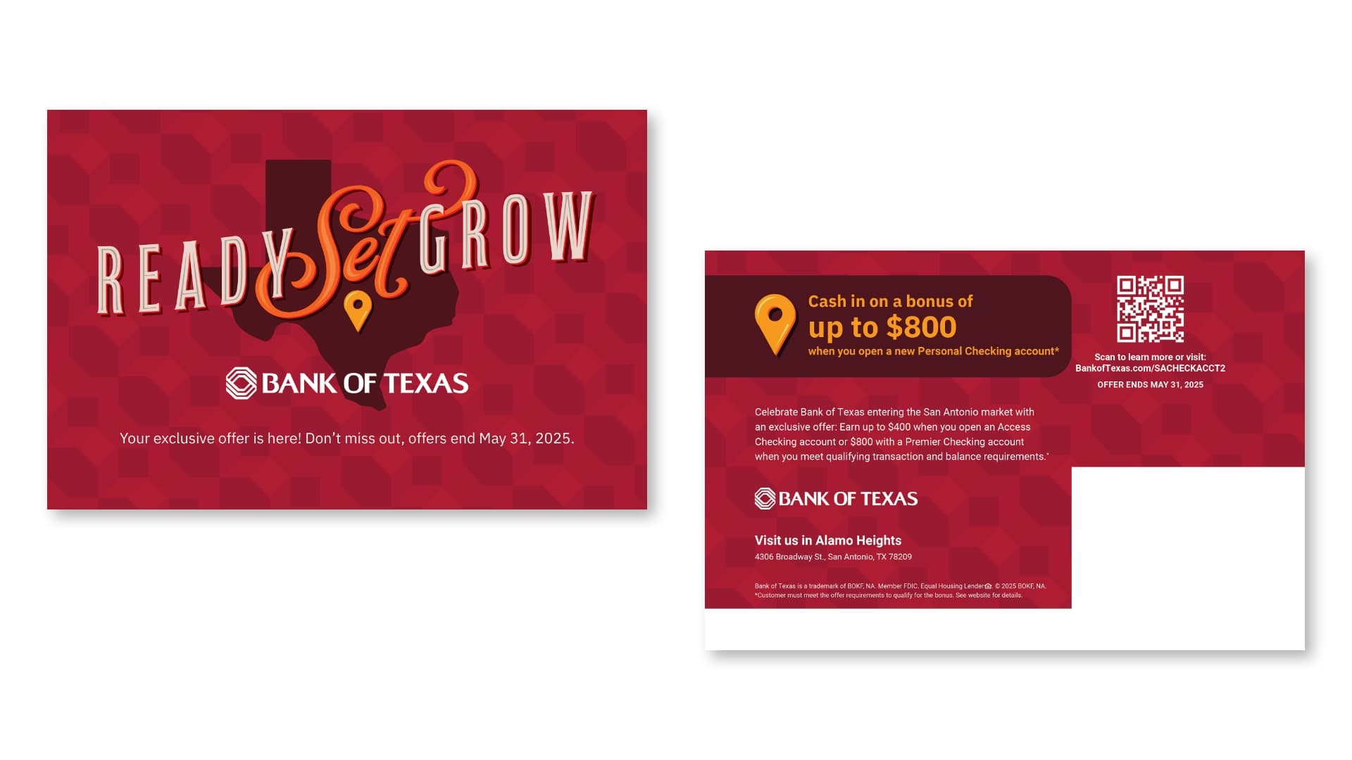
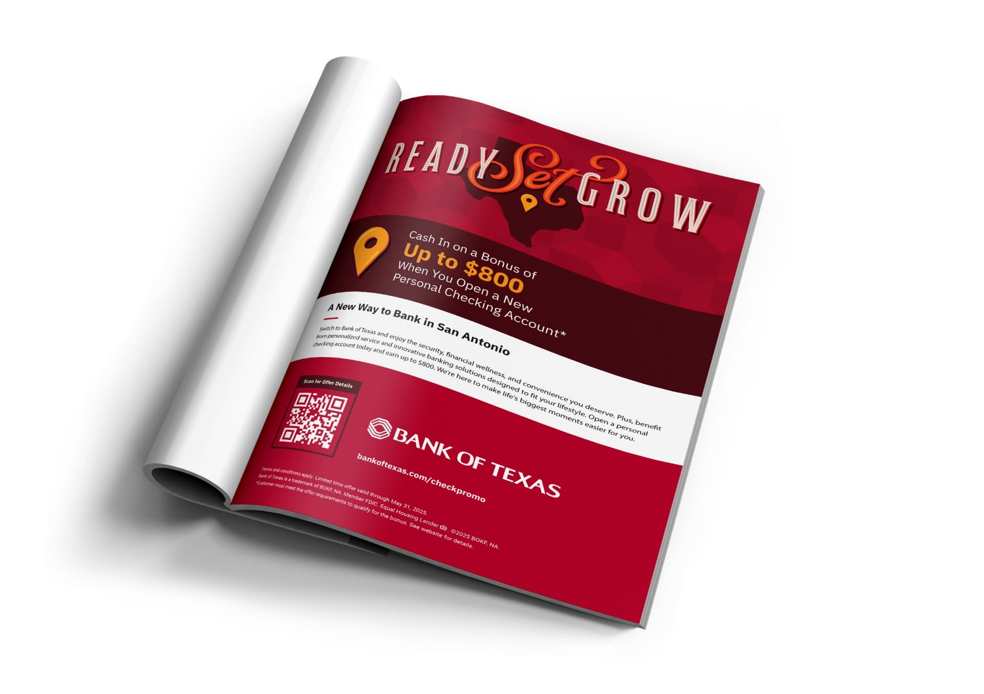
We developed a two-phase campaign strategy, beginning with a teaser phase to build anticipation, followed by a launch phase to drive awareness and encourage action. The campaign featured tailored creative for distinct audience segments, including adult consumers, Hispanic families, youth, and small businesses, highlighting Bank of Texas’s commitment to personalized services, financial stability, and strong community connections. The campaign utilized a diverse mix of media channels—OOH, digital (search, display, paid social), local publications, email, and direct mail—to ensure broad visibility and engagement with key offerings such as checking accounts, business banking, mortgages, and youth & college student accounts, with accompanying San Antonio market welcome offers. Strategic messaging, including slogans like “Ready, Set, Grow” and “Life Happens Here,” was crafted to resonate with varying consumer needs while reinforcing the brand’s commitment to relationship-driven, community-focused banking. This approach aimed to build brand awareness, establish trust, and inspire local consumers to consider Bank of Texas for both personal and business banking solutions.

Bank of Texas San Antonio direct mail
Bank of Texas San Antonio print media

Results:

  • 7.5 million campaign impressions
  • 21.2% engagement rate with 50.8k clicks
  • Over 200 new accounts opened with $4 million in deposits within the first 90 days of the branch opening
Bank of Texas San Antonio out of home

Community Involvement

To celebrate our connection to the San Antonio community, we joined in on one of the city’s most beloved traditions—Fiesta. We designed a custom Bank of Texas Fiesta medal, honoring the colorful spirit of the festival and inviting locals to stop by, say hello, and add to their collection. It was a small token with a big impact, reinforcing the Bank of Texas commitment to showing up for the city in ways that matter—culturally and authentically.

Bank of Texas San Antonio Fiesta pin
Bank of Texas San Antonio Fiesta pin step and repeat

Summary

By crafting a targeted, two-phase campaign, we successfully introduced Bank of Texas to the San Antonio market, building awareness and trust with key local audiences. Through tailored messaging and strategic media placements, the campaign emphasized the bank’s commitment to personalized services, financial stability, and strong community ties. This case study exemplifies Schaefer’s ability to create compelling, audience-centric marketing solutions that drive both brand recognition and consumer action. By engaging diverse segments—adults, Hispanic families, youth, and small businesses—we helped position Bank of Texas as a trusted, community-focused financial partner in San Antonio.

Situation

Cetaphil introduced a groundbreaking new product, SKIN ACTIVATOR Hydrating & Firming Cream, designed to address crepey skin with a proprietary blend of Centella Asiatica and Mandelic Acid. Our challenge was to create an engaging, educational campaign targeting healthcare providers (HCPs) to drive awareness and consideration of the product over alternative treatments like lasers or microneedling.

galderma skin activator ad

Goals

  • Educate HCPs and communicate the scientific benefits and mechanism of action of Cetaphil’s SKIN ACTIVATOR Hydrating & Firming Cream.
  • Position Cetaphil’s SKIN ACTIVATOR Hydrating & Firming Cream as a new technology in the market to emphasize its superiority over alternative treatments like lasers or microneedling.
  • Boost consideration and encourage HCPs to consider Cetaphil’s SKIN ACTIVATOR Hydrating & Firming Cream as a recommended treatment for crepey skin.

Strategy

Create a visually compelling and, where possible, sensory journey to educate HCPs on the benefits of Cetaphil’s new SKIN ACTIVATOR Hydrating & Firming cream for the treatment of crepey skin. This educational campaign was brought to life in a few key materials including a provider video, surprise and delight product drop and supporting in-office / sales materials. We focused on highlighting the science behind this new, innovative productive and its proven efficacy in visibly improving skin firmness and texture.

Solution

HCP Educational Video:

The hero of the campaign was a sleek, two-minute provider education video, incorporating a mix of 2D and 3D animations to visually illustrate the product’s dual-action formula. Through dynamic visuals, we showcased how Centella Asiatica and Mandelic Acid work together to activate the skin’s moisture barrier and stimulate surface cell turnover. A confident, informative voiceover guided HCPs through the product’s mechanism, positioning SKIN ACTIVATOR Technology as the superior differentiator in this topical solution for aging, thinning skin.

galderma skin activator peak box
galderma skin activator peak box open

Surprise & Delight Provider Drop:

First impressions are paramount so to leave a strong impression with HCPs, we developed a surprise-and-delight box that not only introduced Cetaphil’s new product but also brought the disease state to life through texture. Simplicity was key, ensuring alignment with Cetaphil’s refined brand guidelines, which prioritize concise and impactful messaging. Since the box contained two additional educational pieces with ample content, our copy was strategically crafted to spark intrigue and excitement, encouraging deeper engagement.

To guide the user journey, we incorporated a functional yet elegant design element—a pocket on the lid—to house additional materials. Thoughtful prompts like “open pocket to learn more” provided clear navigation while maintaining a clean aesthetic. Most importantly, we embraced a sensorial approach, integrating textures that represented the experience of thinning skin. By inviting touch and interaction, the design reinforced both the product’s purpose and its transformative benefits, making the unboxing experience both educational and immersive.

galderma skin activator hcp elements
galderma skin activator hcp elements cream

HCP Supporting Sales and In-Office Materials:

To complement these visually impactful elements, we designed a product sample card specifically tailored for direct dispense dermatologists, alongside a sales sheet and social graphics to bolster in-office educational efforts by the Cetaphil account team. These materials were crafted with a clear focus on the science behind the product, leveraging robust data and detailed clinical results to build credibility and trust. We showcased striking before-and-after images that highlighted the quick and effective outcomes of the product, helping to communicate its immediate impact on patients’ skin health.

We navigated the complexities of demonstrating product efficacy aligned to regulatory guidelines through a clear, yet creative, messaging strategy. The final materials provided a valuable resource for dermatologists and other healthcare providers, helping them make well-informed decisions about introducing this new product to their patients.

galderma skin activator social media

Results

  • Navigated complex compliance regulations to create a clear & compelling message that would resonate with providers
  • Implemented creative, yet cost efficient ways to demonstrate the product’s efficacy leveraging multiple senses
  • With open lines of communication, developed these launch assets within a short, 4-month time frame to ensure sales team readiness.

Summary

By developing a visually compelling and scientifically grounded narrative, we successfully positioned Cetaphil’s SKIN ACTIVATOR Hydrating & Firming Cream as the innovative choice for treating crepey skin. The campaign serves as a prime example of how creative storytelling can drive awareness and consideration within the healthcare market.

​​This case study highlights Schaefer’s commitment to transforming the healthcare experience by creating thoughtful, human-centered solutions that foster meaningful connections between providers and products. By blending education with engagement, we helped Cetaphil deliver a message that resonated on both a scientific and sensory level, encouraging healthcare professionals to consider the transformative potential of the SKIN ACTIVATOR Hydrating & Firming Cream for their patients.

Transforming Tradition into a New Experience

Zoo Ball is the Fort Worth Zoo’s premier fundraising event, bringing donors together for an unforgettable night in support of wildlife conservation. For over a decade, Schaefer has been entrusted with establishing the theme and creating an invitation suite that sets the tone for the event, which includes a save the date, invitation, and auction guide. Every year, Schaefer embraces the opportunity to push creative and production boundaries—ensuring that each year’s invitation surpasses the last.

For 2024, Zoo Ball embraced the energy of Latin nightlife with the theme ¡Bailemos!, a celebration of rhythm, energy, and movement. The challenge was to craft an invitation that didn’t just inform, but immerse, recipients in the event’s vibrancy before they even arrived. The team set out to create a piece that would surprise, delight, and demand attention.

Bringing the Theme to Life Through Design

Rather than a standard invitation, Schaefer envisioned an interactive piece that unfolded like an experience, building intrigue with each layer—just like stepping into a dimly lit nightclub or walking through a forest at dusk. The design needed to be bold yet elegant, moody yet vibrant, immersive yet refined. The black jaguar—mysterious and powerful—became the focal point, symbolizing the intrigue of the night and connecting back to the Zoo’s animals.

To execute this vision, the team developed a multi-layered, tactile print piece using specialty production techniques, custom illustrations, and premium materials. This wasn’t an invitation to simply open—it was meant to be discovered, revealing hidden details as recipients engaged with each element.

A Bold Vision Brought to Life

The final invitation was an experience in itself. A custom-converted envelope introduced the theme with rich illustrations and a soft-touch laminate finish, inviting engagement from the start. Inside, an intricate laser-cut outer shell framed the invitation, offering glimpses of the vivid red interior beneath.

Opening the gatefold invitation, the jaguar’s piercing eyes appeared first through die-cut typography, creating an air of mystery. As recipients unfolded the piece, the full jaguar emerged, surrounded by lush, hand-illustrated foliage in deep blues and greens. Clear foil detailing on the jaguar’s eyes enhanced the dramatic effect, reflecting light as if the animal itself was watching.

Meticulous attention to production ensured the invitation felt as premium as it looked. Schaefer collaborated with expert print partners to perfect paper stocks, die cuts, and layering techniques, using Neenah Classic Crest linen paper and laser die-cut detailing to create a high-end experience that was as stunning to hold as it was to see.

Beyond an Invitation—An Unforgettable Experience

From the moment recipients received it, the invitation sparked intrigue and excitement, mirroring the energy of ¡Bailemos!. The layered unfolding process and striking red interior left a lasting impact, making the invitation more than just an announcement, it became a keepsake. Schaefer’s dedication to precision, storytelling, and craftsmanship ensures that each year’s invitation is more ambitious than the last. Schaefer continues to push the limits of creativity and execution, proving that an invitation can be an experience in itself.

Challenge:

The American Advertising Federation (AAF) Fort Worth faced declining engagement and participation in their annual ADDY Awards. Agencies and marketers were submitting fewer entries, partly due to perceptions that the competition held less value, while attendees were becoming increasingly apathetic about the gala. These trends threatened AAF Fort Worth’s operational budget and the vitality of the local advertising community. With artificial intelligence (AI) reshaping the industry, AAF Fort Worth also sought to address the growing tension between human creativity and AI, highlighting that both can coexist and thrive together.

Solution:

We worked with Nick Utter of Content Shift and AAF Fort Worth to develop and execute a campaign that embraced the intersection of human creativity and AI. The campaign leaned into the concept of “The Creative Revolution,” presenting a scenario where AI hosted the ADDYs. By using AI both as a subject and a tool, we delivered messaging that was engaging, thought-provoking, and slightly ironic. Headlines such as “It’s time to submit,” “We’ve seen what you’ve done,” and “Victory is Coming” balanced curiosity with a playful acknowledgment of AI’s role in the creative process. The visuals and messaging reinforced that the future isn’t “us vs. them” but “us + them,” highlighting how AI can be a powerful partner rather than a threat.

“This project was an exciting opportunity to address a rapidly evolving topic in our industry—AI—and engage the advertising community in a fresh, unexpected way. By leaning into the irony of using AI to shape a campaign about its own impact, we were able to spark curiosity, start meaningful conversations, and show that embracing new tools doesn’t mean losing the heart of human creativity. I’m incredibly proud of how our team brought this idea to life, blending humor, insight, and artistry to resonate with our audience.


– Charlie Howlett

Outcome:

The campaign sparked renewed interest and conversation within the local creative community. It helped re-establish the ADDYs as a must-attend event and encouraged more entries from agencies, freelancers, and students. By shifting perceptions about both the competition’s value and the evolving relationship between humans and AI, AAF Fort Worth successfully reinvigorated enthusiasm around the event. The campaign demonstrated how creativity and technology can work together, positioning AAF Fort Worth as a forward-thinking organization and cementing the ADDYs as a meaningful celebration of advertising excellence.

This campaign recently earned a Gold ADDY at the 2025 American Advertising Awards, recognized for both its integrated campaign and poster series. This honor highlights the creative team’s thoughtful approach to the concept, their effective execution, and the impact the campaign had within the advertising community.

TCU Football is back! In the 8th year of this project, we wanted to celebrate TCU’s tradition and history in a way that would unite all Frog fans. Last year, fans missed out on the game day experience because of COVID. This year is all about reuniting with the gridiron, tailgating traditions and most importantly, each other.

The theme for this year’s Riff Ram video, Gather, centers around a return to normal as it takes you on a game day journey through campus, tailgating at Amon Carter and into the stadium itself. Game days in the fall look different for each Horned Frog fan. Some fans enjoy the game day experience from their couch, while others spend all week planning for their perfect tailgate. Regardless of how we support the Frogs, we are stronger together. Gather celebrates the triumphant return of the Horned Frog Faithful by bringing us back to the beat of the drum, the rustle of pom-poms and the roar of the crowd.

See you at the Carter!

Credits:

Concept by: Schaefer Advertising Co. 
Produced by: Schaefer Advertising Co. and Make Something Beautiful

Places are defined by people, and the Near Southside is among the most vibrant and diverse communities in Fort Worth. So, when they approached Schaefer to help them rebrand their identity, we focused on the neighborhood they create and the people and ideas the Near Southside attracts.

We wanted to present that the Near Southside is first and foremost a community where people and business can thrive in an inclusive and supportive environment. The result is a design balanced in minimalism and boldness that allows the artistic soul of the Near Southside to come through, but also be functional enough to carry the brand across everything from way-finding signage to social. The new color pallet represents the diverse voices that stand up for and continue to create opportunities that cultivate community.  The updated identity is malleable enough to work across mediums but enduring enough to be used over decades to come.

It is a pleasure to partner with local organizations that build up our community and help them identify their message and purpose, and carry that through to representing their brand. By creating a flexible mark that more accurately represents the community and culture of the Near Southside, we’re hopeful that their message will resonate more deeply with future community members and contributors. The Near Southside is an excellent ambassador and cultivator of the arts and culture that permeate our neighborhood and creating something that elicits that same level of passion is why we come to work every single day.

November 13, 2020

River & Blues

River & Blues Fest is a new kind of music festival, featuring a uniquely American lineup of longtime favorites and soulful up-and-comers in country and blues. Launching its inaugural year right here in the heart of Fort Worth, the River & Blues Festival needed a dynamic identity system to engage and attract music lovers and artists alike across a primarily digital landscape.  

Launching a New Identity System

Drawing inspiration from the rhythm and the river, we turned up the volume on the ethos and the experience to allow the vision of the festival to come through. The result was a scalable brand identity that represented the heart and soul of the music itself—a perfect balance of grit and a good time. With so many moving pieces, it was important to create a system that easily blended photography, motion and print elements, but most importantly position this instantly legendary weekend as one that can’t be missed.

Connecting with Our Target Audience

Launching any new brand can be a challenge and making noise about a music festival can be especially challenging in Texas. But, a clearly defined vision and a true one-of-a-kind blend of country and blues music is a fantastic experience to position. To connect with a wide audience, we needed to communicate that the River & Blues Festival is not just a blues festival, but also a country music festival, which appeals to a wide range of local music fans spanning demographics. Furthermore, we wanted to bring the river through in our messaging and identity to illustrate that the festival takes place on the Trinity River at Panther Island Pavilion in the heart of Fort Worth. 

Concert Going amid Covid-19

“The best-laid plans of mice and men often go awry.” If 2020 has taught us anything, it’s that anything can happen. But, what no one accounted for, or could have foreseen, was the covid-19 pandemic. River & Blues Fest was meant to make its first-ever debut during the summer festival season. As it turns out, that fell right during the height of the coronavirus lockdowns. Like other big-name events, we had to shift from a traditionally communal live music experience to a socially-distant, socially-conscious festival. Which meant more than a new date to ensure the people attending, playing and working not only felt safe but participated responsibly. In addition to new precautions we needed to communicate that, while the experience might look different, the music still sounds the same. And after all this time apart, maybe sweeter. 

Results:

  • Total digital campaign resulted in more than 3.2 million impressions and an above-average CTR
  • New website generated 82.5K pageviews, 50.2K sessions and 42.4K new users
  • Brought a new brand to market and established their brand foundation
  • Created a flexible brand identity system
  • Partnered with artists to cross-promote on social and traditional radio
  • Built an email database from no subscribers to just over 1,500

Make Life Better

Artists and the people who support them rely on gigs and performances to make a living. River & Blues Fest is, without a doubt, going to be a good time. But it’s also going to prop up an art form, a nearly forgotten genre that survives with every chord. More so, it supports the artists, especially the grassroots, independent and often local musicians still waiting to be discovered. We are so proud to work with a client that uplifts the local creative community and is flexible enough to adjust their brand-new music festival to be safe and socially distant. Bringing people together safely is important now more than ever.

November 10, 2020

Shift your perspective

How do you get an entire community to see things differently? Our challenge was to celebrate the Near Southside’s milestone moments at an annual event that invites business leaders, artists, entrepreneurs and friends to gather and give to the organization and district at the single biggest fundraising event of the year. 

Inspired by the very optimism that shaped the Near Southside and continues to move it forward, the event focused on the possibility of perspective. A key part of this community’s identity and a driving force behind its transition from forgotten frontier to one of the city’s most vibrant places to live, work and be. 


Perspective is more than a way of seeing things; it’s a pursuit. And one we wanted to challenge everyone to actively engage in from the moment they opened the invitation. So we applied a visual trick using red and blue ink and an overlay that allowed us to reveal each message by shifting each guest’s perspective, literally. 

October 13, 2020

We create community

Legacy. Capability. Values. Intention. These are big ideas that drive everything Hillwood Communities builds for the communities they create. So, when Hillwood needed a brand refresh and updated messaging, we leaned hard into these core tenets to accurately summarize the massive impact Hillwood has on the communities they build and the people who live there every single day. We needed to communicate these central beliefs in a cohesive and convincing brand brochure that would attract home buyers and investors.

Updated Messaging

When creating updated messaging for Hillwood, we expanded on the word “community” to accurately define the effect that Hillwood has on each of its developments. “We Create Community,” is the direction that we decided upon for the updated brand messaging. From Live Smart amenities to featuring a community garden, Hillwood takes extra steps to make each development a unique place to call home. More than that, Hillwood’s offering of communities, each with their own natural aesthetic and intrinsic values, ensures that there’s a Hillwood Community for every new homebuyer.

A Refreshed Brand Brochure

The Hillwood corporate brochure is where homebuyers and investors can interact with the Hillwood brand on a more extensive level. It needs to convince investors that Hillwood is an excellent investment opportunity and communicate to homebuyers that there is a community waiting for them underneath the Hillwood brand.

Evolved Brand Identity

Hillwood is a pioneer within the community development space. Each community they build focuses on elevating the quality, innovation and sense of community for their homeowner, offering unparalleled conveniences, all while taking subtle and grandiose steps to harbor a real sense of community among the neighborhood. Beyond the amenities that they create for their homeowners, Hillwood emphasizes the natural beauty of the land that they build on and rely on its inherent attraction as a central selling point. Every single step is taken with incredible intention aimed at improving the life of each resident.

The brochure connects all of these points by giving a detailed overview of each Hillwood Community and featuring evocative imagery of the natural aesthetics that define each community. Beyond the physical characteristics that define each community, we used imagery that captured the shared experiences and everyday interactions the amenities and walkways create. Each of these visual stories creates a compelling argument for why new home buyers should call a Hillwood community “home.” 

For potential investors, the legacy of pioneering big ideas and sparking engagement are enticing selling points that illustrate the long term and historical health of Hillwood Communities, which makes it a desirable investment. Sharing the story of Hillwood’s success and legacy right up front, aided by the visuals illustrating where Hillwood operates communicates the strength of the brand and implicitly tells investors that this is a worthy investment.

Covid-19 has changed everything and college football has not been immune to the impact of the pandemic. We partnered with TCU Athletics to expand on the tradition of the Riff Ram Video and create a hype video during the first-ever, socially-distant TCU football season. During normal circumstances, this hype video would run in the stadium to invigorate the audience, but under quarantine protocols, fans cannot attend the games and cheer their Frogs to victory. So, how can you inspire fans at home to leave their seats and chant along to “Riff, Ram, Bah, Zoo?” By connecting them.

The video begins by nodding to the new reality of the fan experience. Football is part of the fabric of American life, Zoom is too now. Showing fans in the Zoom space and having them breaking the grid is a fun way to show that no matter where you Riff Ram, you’re cheering with s fans across ages, places and even a pandemic. Despite the virtual barriers (and real ones presented by pandemic quarantine protocols), we’re always connected as a part of the TCU fandom family.  

The video illustrates to fans that we aren’t really that far from each other. From the athletes and students, to the family watching at home, we’re all living under a new normal. And while we can’t gather in person, we can find solidarity and spirit in the fact that we’re all in this together. 

Director’s Note:

Creating this video during the Covid-19 pandemic was a challenge that required our team to solve problems that we’d never confronted before. The big question was, “how can we keep everyone safe while producing an effective video that serves campaign goals?”

The entire spot was shot on a green screen with all but two shots featuring one person at a time. Every background was added in post and every action and camera move had to be planned out prior to filming. Each crew member wore masks while we were working, and the only unmasked people in the studio were the on-screen talent. We booked each of the actors with their own timeslot to minimize their exposure to others. However, this made each studio session incredibly valuable as we could not invite the actors back for re-shoots later.

The game plan for this shoot was nearly as planned, practiced and choreographed as Gary Patterson’s defense (almost). 

The shoot was difficult, but the team at Red Productions made collaborating on such a meticulous production much easier,  more enjoyable and pretty impactful!

Go Frogs!

Credits:

Concept by: Schaefer Advertising Co. 
Produced by: Schaefer Advertising Co. and Red Productions.