Schaefer Advertising Co.

Work

December 15, 2017

From our tree to yours

Every year, Christmas always seems to arrive quicker than the year before. It can be easy to find ourselves running through the motions of holiday activities that we forget to savor and revel in the holiday spirit like we did when we were young. Even though we grow older and have busy lives, we should always try to find the time to express our appreciation to whomever or whatever is special and dear to us.
Our Christmas card features illustrations that each represent the best parts of our year as an agency. Work, clients, new babies, agency culture and a tribute to Boone. These acornaments are a fun way for us all to reflect on the last 12 months, literally. That copper foil is really shiny!
Life is busy and Christmas can become routine, but this is the time to cherish what means the most to us. Get wrapped up in the little things like spending time with someone who you hold dear, slow down and make a batch of hot chocolate for all your family, or even give an extra-long walk to Fido at his favorite park. It’s the little things that add up and can really make this season special.
Thank you to the clients and vendors for working with us. Thank you to all of the friends and family members who have supported our employees and the agency.
So, from our tree to yours, Merry Christmas. Enjoy this acornament from all the squirrels at Schaefer.


November 1, 2017

A little stronger

One of our clients, Air Comfort, is located at the heart of Southeast Texas, where Hurricane Harvey hit a few months ago. While the area was still reeling, they came to us with an urgent request – help us create a powerful video that embodies how we’ve been part of the community effort in dealing with this natural disaster. Through our partnership with N8 Visuals, we were able to bring that request to life.
Creating this video was a delicate line to walk, showing the damage and rebuild without appearing to capitalize on the situation. It was also an incredibly time sensitive assignment, where we needed to be nimble and move quickly.
Hurricane Harvey Video BTS
With that in mind, the concept we developed relies on storytelling VO and speaks more to the community’s spirit of resilience and heart rather than focusing on Air Comfort. We were inspired by the true stories of a community coming together and helping their neighbors, and it showed. Air Comfort employees opened their homes to our team and let us film during an incredibly sensitive time, laying bare entire neighborhoods that were destroyed.
The results of those efforts show in the final video, and we couldn’t be more proud. #SETXSTRONG

October 23, 2017

Schaefer Schots

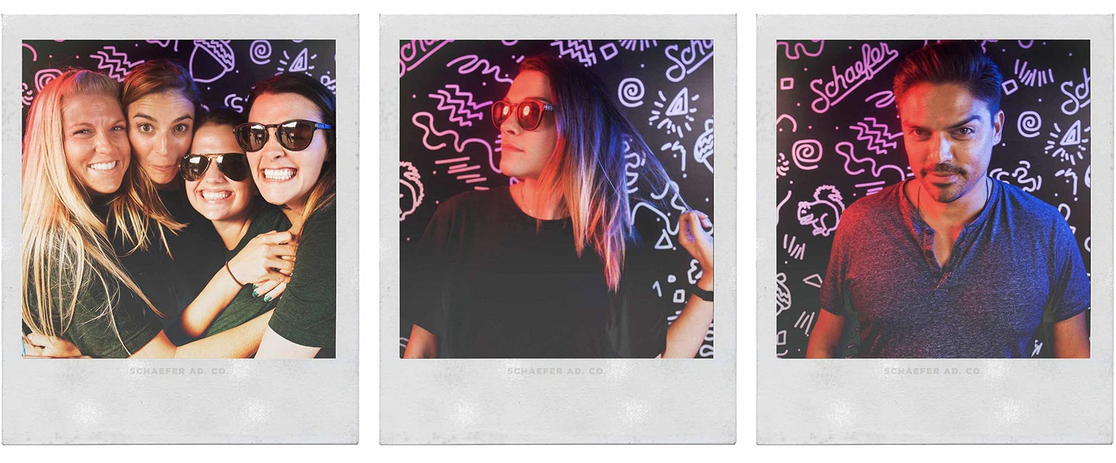
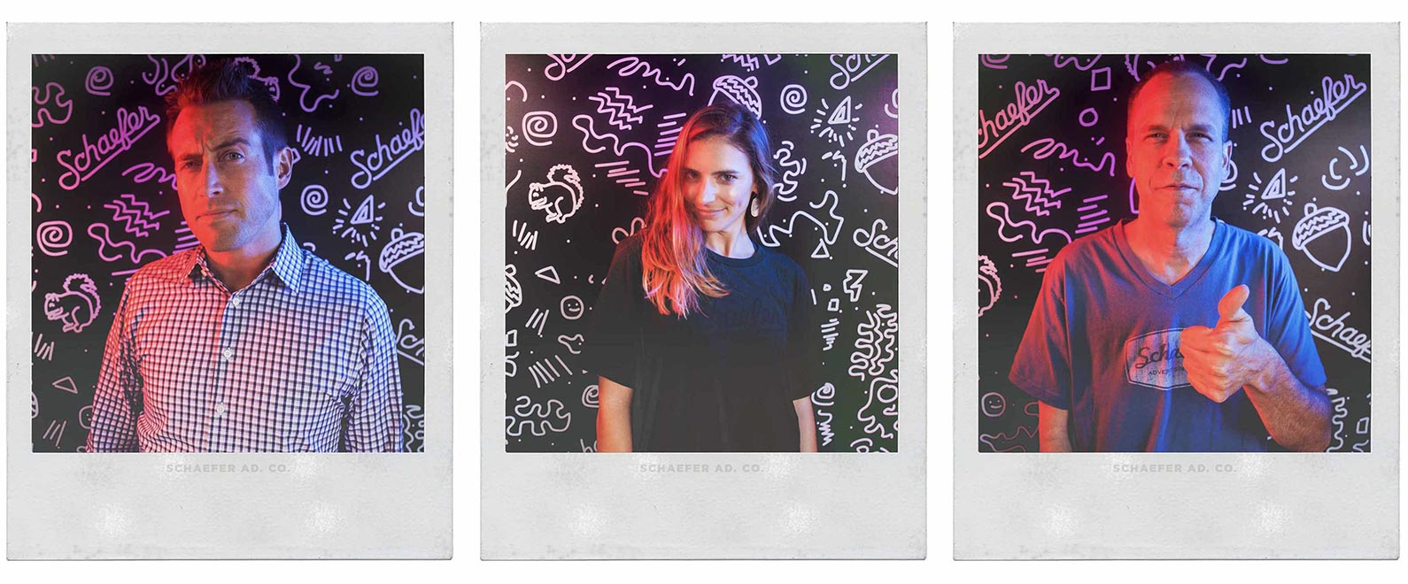
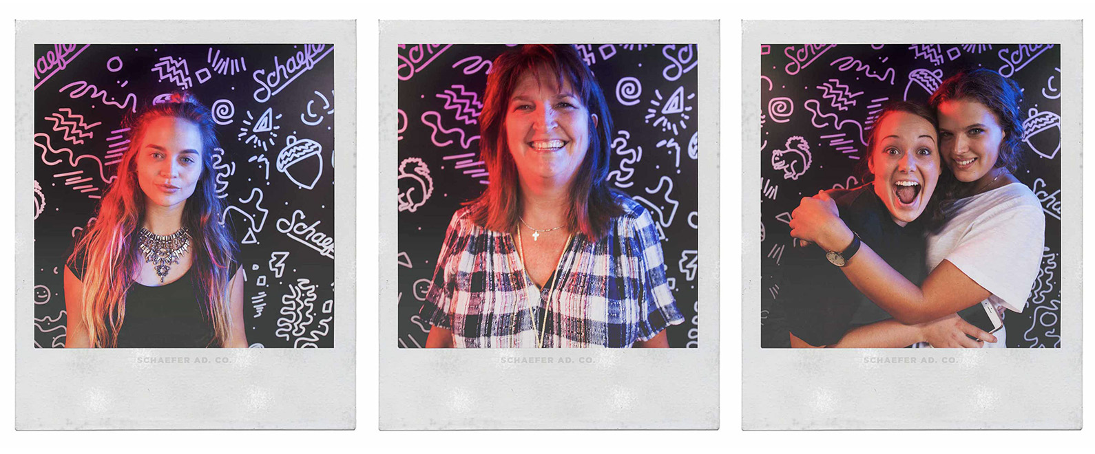
Last weekend was the 15th anniversary of Arts Goggle, our Southside arts festival, and with 800+ local and regional artists, 50 bands and a footprint spreading across 18 blocks of the Near Southside it was the largest one yet! When our neighborhood gathers to celebrate creativity and craft, we can’t help but join in on the fun and take a few schots, Schaefer Shots.


This year we activated a storefront-turned-photo booth and offered free polaroid portraits to the patrons of Arts Goggle. We also captured a digital version and have collected a series of Southside portraits on a site for them to download a copy of the images.
We love being a part of the Near Southside in Fort Worth and this was a chance to engage with the community and give out a few smiles.


The Fourth of July is all about tradition. Fireworks, hotdogs, cold beer, and in Texas, live country music and square-dancing. Beyond baseball and apple pie, there’s nothing more traditionally American than a good old fashioned picnic on Independence Day.
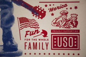
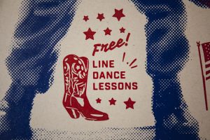
For Billy Bob’s annual 4th of July Picnic, we wanted to celebrate America’s birthday by creating a concert poster steeped in Americana convention. So, with an eye on tradition, and an ear on red-dirt country music, we began exploring the aesthetics of classic rock n’ roll posters for inspiration.


When rock n’ roll hit the scene, musicians needed a way to churn up local attendance to their shows without the help of the Internet, social media, or even a mature broadcast medium. Most musicians relied upon an artist to create concert posters that they could then pin up all over town to get eyes on their showtime. Early concert posters were illustrated by hand in two colors or less, and that’s the well from which we drew a lot of our inspiration. A lot of our influence came from the old Hatch Show Print style, which has been around since the late 19th century.
We chose to screen print the poster to honor the tradition of concert posters from the early 20th century, when screen printing was the most efficient and popular way of creating awareness for a touring rock n’ roll band. The poster was printed by Texas Graphic Resources, and done in two simple colors: red and blue. We printed a half-tone photo in blue on top of the solid red, which gives the poster more depth and dimension. Before photoshop, old-school screen printers used to practice this method to combine existing ideas without having to create completely new pieces of art.
We printed the poster on Neenah Environment Desert Storm 80# C – created by Neenah Paper. The heavier paper gives the poster a more substantial feeling, and the desert-craft color makes it look as if it could’ve been pulled from a collector’s library of classic concert posters, sandwiched somewhere between Buddy Holly and Bob Dylan.
The final result is a vibrant poster that features a blue soldier juxtaposed against a red guitar right in the center. The solider holding the guitar acts as the intersection between two American icons: celebrating Independence Day with music and joyous tradition, while also honoring the soldiers that made the ultimate sacrifice for our American freedoms.
As explorers, we often look forward to find the newest tools to help us accomplish a creative task. But, sometimes the nature of a project urges us to look back in time to find the right solution. For Billy Bob’s 4th of July Picnic, we journeyed back in time to create a memorable poster that celebrates the occasion with a rockin’ salute to the soldiers, music, and American traditions.

June 16, 2017

Work Wins

On June 11, TCU Baseball punched a ticket to their 4th consecutive College World Series. To break it down for you, they have finished their season on the field in Omaha in 2014, 2015, 2016 and now 2017. We are beyond proud of our client’s achievements but also honored to work with such and elite program with tremendous character.

Since 2014 (notice a theme?), we have partnered with TCU Baseball and head coach, Jim Schlossnagle, to create a video that embodies the brand of the program and establishes a tone for the upcoming season. We bring to life the vision that the coaching staff establishes each day, on and off the field.

They started the 2017 campaign with a pre-season No. 1 national ranking and Coach Schloss challenged his team to rise to the ranking. This year’s video, Work Wins, illustrates the truth that working hard is how you set yourself up to win games. Each player must physically and objectively work out a win each day. No superstitions. No momentum. Victory is found in the details, the routine, the compounding choices and the mindset.
Our job doesn’t stop with the finished product. Just like anything we create, we fight to make sure it performs. And this video has really caught hold. Over the course of the season (February – May) here’s a few stats:

689277
Total Views
2458478
Total Impressions
8283
Total Shares

Best of luck to the Horned Frogs! Toad to Omaha!

June 15, 2017

Portraits of Motherhood

Justin’s Place, a local non-profit organization, exists to enhance the life of a child trapped in generational poverty. Unfortunately, statistics show that a child’s life typically can’t be fully restored until the life of the family is restored. Justin’s Place comes alongside families in need, and helps establish balance by restoring hope and building a foundation that will provide the strength and resources needed to move out of generational poverty and toward a crisis free life of self-sufficiency.
Justin’s Place came to us during a point of growth and transition. Having been appointed the lead benefactor of the Women Empowering Women 2017 Inaugural Luncheon, they were in need of a video for the event that articulated their mission and the real people involved. With that in mind, the goal of the video was to secure funding as well as community backing for their cause.
In the spirit of being true explorers, we first had to evaluate the brand and elevate it. Their original logo was very dated and didn’t reflect the level of professionalism and mission behind Justin’s place. It wasn’t part of what they were asking for, but we felt the need to improve it. The client was extremely receptive to the new design and felt it better embodied the look and feel they are wanting to share with others.

Bird Nest
We come alongside families in need and establish balance by restoring hope and building a foundation.
Crown of Thorns
We begin with the heart issues. Our programs are rooted in biblical principles and grounded in the love of God.
Sun
Everything we do is to enhance the life of a child.
With the new logo established, we moved immediately into video development. The concept for the video centered around portraits of motherhood. These moving portraits show the many faces of motherhood and allow for a collective narrative that tells the story of what Justin’s Place does and why it matters. Capturing the significance of the need, while preserving the dignity of those in need was an extremely important balancing act.
We only had three weeks to concept, shoot and edit the video, and we were trying to complete the entire project at no cost to Justin’s Place. To accomplish that, we needed a true partner. So we turned to 1820 Productions. When we shared the story, they immediately agreed to participate and donate their services. 1820 Productions went above and beyond all expectations and shot an amazing video. They only had 2 days to make the edits and they put together the vision perfectly.

The fundraiser the video was developed for raised more than $82,000 with 252 people in attendance. The video was posted on Instagram and Facebook with 3,407 views and 240 views on Youtube. Justin’s Place now has a video they can use at fundraisers, on their website, and on different social media platforms that embodies their values and further conveys their mission to a wider audience. The video turned out remarkable and helped the fundraiser become even more of a success and have a larger impact on the community. We helped spread the word and share the message of what Justin’s Place is doing, and what they will continually do for others.

No matter the season or circumstance, we believe Christmas time should be special. We try to convey this with our Christmas cards. This year’s Christmas card prompt was to share our Christmas experience.
Our first idea was to surprise our recipients inside their home with homemade cookies– but our lawyer advised against it.
The next best thing is to encourage people to prep ovens, and create Christmas magic. We thought: we want people to get excited about making things–especially tasty Christmas things, how do we send that? We arrived at Christmas cookie-cutters. And not just any cookie cutters. Squirrel shaped cookie cutters. (They make tastier cookies.)
A lot of mystery surrounds the Squirrel; We have a squirrel on the building next to Schaefer, squirrel anniversary pins, a squirrel nut-cracker in our entry way. The list goes on. But the squirrel has become the unofficial mascot of our agency. The squirrel is resourceful, cunning and a little quirky. So this year we wanted to share in your Christmas tradition by sharing a little part of us. May your days be merry, and your cookies find dairy!
And if you’d like to try your hand at the official Schaefer Christmas Cookie, the recipe is as follows:

Ingredients

 
3/4 cup unsalted butter, slightly softened to room temperature
3/4 cup granulated sugar
1 large egg, at room temperature
2 teaspoons vanilla extract
1/4 teaspoon almond extract
2 and 1/4 cups all-purpose flour
1/2 teaspoon baking powder
1/4 teaspoon salt

Icing

 
4 cups powdered sugar
6 tbsp unsalted butter
1/4 cup milk
1/4 tsp almond extract
 

Directions


  1. In large bowl, beat butter until creamed and smooth – about 1 minute. Add sugar and beat on high speed until light and fluffy, about 3 or 4 minutes. Scrape sides and bottom of bowl. Add egg, vanilla, and almond extract and beat on high until fully combined, about 2 minutes. Scrape sides and bottom of bowl.
  2. Whisk flour, baking powder, and salt together in medium bowl. Turn mixer to low and add half of flour mixture, beating until just barely combined. Add restof flour and continue mixing until just combined.If dough still seems too soft, add 1 Tbl more flour until it is a better consistency for rolling.
  3. Chill for one hour.
  4. Once chilled, preheat oven to 350°F.  Roll out and using your limited-edition Schaefer Squirrel cookie cutter,cut into shapes. Transfer cut cookie dough to baking sheet. Re-roll remaining dough and continue cutting
  5. Bake for 8-11 minutes, until very lightly coloredon top and around the edges. Allow to cool on bakingsheet for 5 minutes, transfer to wire rack to cool completely before icing.
  6. For icing, combine all ingredients and beat for two minutes. Decorate cooled cookies and share with @schaeferadco!


October 24, 2016

Don't Forget to Write

In an age where everything is digital and your family and friends are a FaceTime away, writing a letter by hand and sending it through the mail is a lost art. There is something very personal about receiving a note that’s both thoughtful and handmade. We wanted to encourage our digital world to slow down and craft a note to their loved ones so we Don’t Forget to Write.
Arts Goggle is an initiative of Near Southside Inc. and is in its 14th year of existence. We have participated for the last 5 years and always enjoyed plugging into the community we spend so much time in. With the size of this year’s festivities and the addition of local businesses, our team aimed at pairing down our involvement without paring down our impact. We have consistently attempted to engage the community through unique encounters with: lemonade, body art and chalk–but this year needed a creative twist. After brainstorming, we resurrected an idea to create a postcard series that both: encouraged the novelty of handwriting while becoming collectible items themselves. There wasn’t a moment of hesitation to recruit Trust Printshop to gauge the feasibility of screen-printing the paper goods. So we designed press sheets that had 5 cards to the page and Trust delivered beautiful duo-tone prints with an unexpected (but welcomed) texture to the ink that really made them feel unique.
untitled-5-08
After the cooperation of multiple agency hands cutting down and tying our card sets with butcher string, our product was ready for the public. At the event, we set up a tent and displayed posters with our simple pricing: ¢25 to send one postcard and $5 for the set. We spoke with hundreds of people and encouraged people to send cards to people they love. We met with illustrators, nihilists, philanthropists and novelists. Some stayed to just write a card, some shared their cards and others politely declined. But whether they sat at our brown craft covered picnic tables or not, Arts Goggle was inspired to cherish and resurrect the art of rhetoric and postage.
relatedimage_template
Save
Save
Save
Save
Save
Save
Save
Save

July 26, 2016

Our Northeast Neighbors

Who doesn’t love a neighbor that turns into a favorite client? That’s how we feel about the City of Hurst, who have been our clients for more than 5 years. In that time we’ve seen Hurst change and grow, and we’re not just talking about 121. The hardworking folks that work in City Hall have been injecting Hurst with a much needed dose of positive energy and ‘let’s do this!’ attitude.
Hurst’s expansion and growth has led to a new transition process for the community. As more DFW-ites move to Hurst, the city needed to engage and inform new residents on local resources, programs and activities. This is where we came in.
The Hurst Welcome Packet features a welcome mat (we thought it was clever) and a pair of red shoes. The diecut shoes serve as the folder’s latch, placing them on top of the welcome mat. Inside, the new resident would find detailed information on all the need-to-knows of Hurst as well as a welcome letter from the mayor.


The city won a first place TAMI Award (Texas Association of Municipal Information Officers) for the packet, and we couldn’t be more proud.
Check out that happy dance!


Within the packet, new residents also find the quarterly “Where We Live” magazine and a trifold Neighborhood Services brochure. Each of these pieces were refreshed during the past few years to more accurately reflect the colorful and light personality of Hurst.
Sealing Hurst’s status as a city ahead of the curve, custom SnapChat geofilters were developed for favorite hot spots and city events. According to SnapChat’s official website, they receive thousands of geofilter submissions daily. Of those, the Heritage Village Park graphic was selected as an outstanding submission!
We’re proud to partner with a client who makes a lasting impact on their communities. And it’s not too shabby that we think they’re great people too.

July 15, 2016

Now Playing

On the heels of our spring campaign launch, that introduced Gus, the baby gorilla to the world, we are proud to showcase our new TV spot for the Fort Worth Zoo. This spot is a 30 second summary highlighting the fun, educational and majestic moments that happen everyday at the zoo. With over 400 different species of animals, 15 different exhibits and attractions, it’s an experience that changes with every visit.
Over two days, we filmed all-new footage throughout the zoo and captured special moments from over 15 different exhibits and attractions including everyone’s favorite, baby Gus.

Projects like this one allow us to immerse ourselves in our client’s world as well as the experience of their customers. We learn as we explore and we look for unique ways to tell a story that people can relate to. Its a challenge that we embrace and let’s be honest, we have a lot of fun with it too.

Explore these interactive 360 videos/photos by clicking on the image and dragging around. Its a unique perspective of what its like on set.

Post from RICOH THETA. – Spherical Image – RICOH THETA

Post from RICOH THETA. – Spherical Image – RICOH THETA

Post from RICOH THETA. – Spherical Image – RICOH THETA

We partnered with N8 Visuals and Sheffield Creative to bring the spot to life and tell this fun story of the Fort Worth Zoo experience.

ZOO_SPRING_RELATED_0001_Zoo-Spring