Celebrating the 2021 ADDY Awards in virtual fashion
The 2021 ADDYs are in the books! It may have looked a bit different this year, but the entire Schaefer team was so grateful to get together outside and celebrate a year of hard work under unique circumstances.
When the final votes were tallied, Schaefer walked away with 19 awards out of our 22 entries, and we earned two Special Judges Awards! We’re proud to say that we won more awards than any other agency in Fort Worth and that each our of verticals brought home the hardware. Our team earned recognition in multiple mediums, including video, branding, illustration, print, social media, website, out of home and integrated campaigns. Of the awards, three of our wins were for Covid-related campaigns.
It’s been an interesting year, to say the least. Celebrating a year of hard work with our team was a breath of fresh air and a reminder of how fortunate we are to work together every single day and compete against such fantastic and talented friends and neighbors in the Fort Worth advertising community.
Congratulations to everyone that competed this year. We can’t wait to see you next year – hopefully in person – for the 2022 ADDYs.
2020 Zoo Membership Campaign
Gold ADDY Award and Special Judges’ Award: Most Popular | Client: Fort Worth Zoo
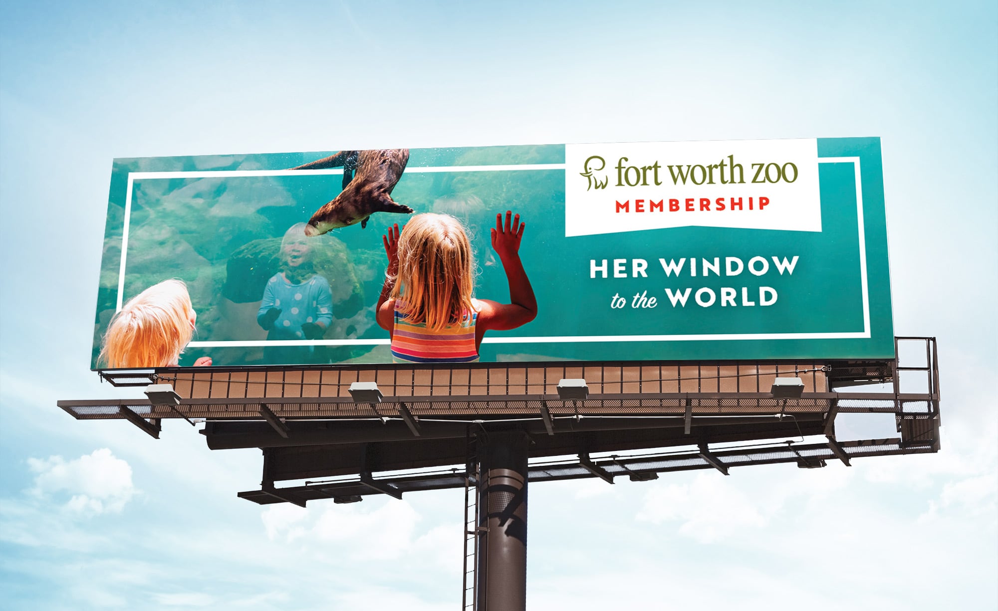
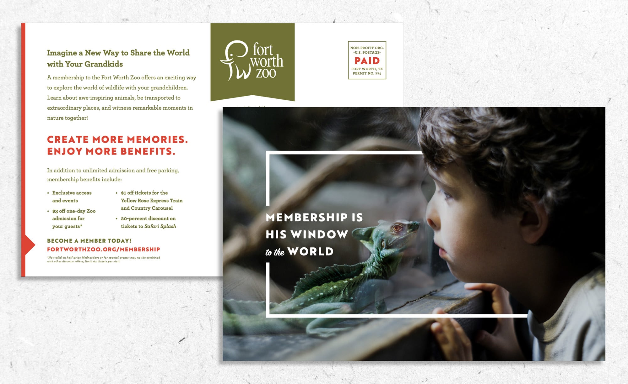
In the face of the Covid-19 pandemic, the Fort Worth Zoo needed a way to sell holiday adoptions and memberships. More than that, they needed a campaign that cut through the clutter of holiday advertisements to connect with consumers.
TCU Baseball Video – Day in. Day out.
Gold ADDY Award | Client: TCU Baseball
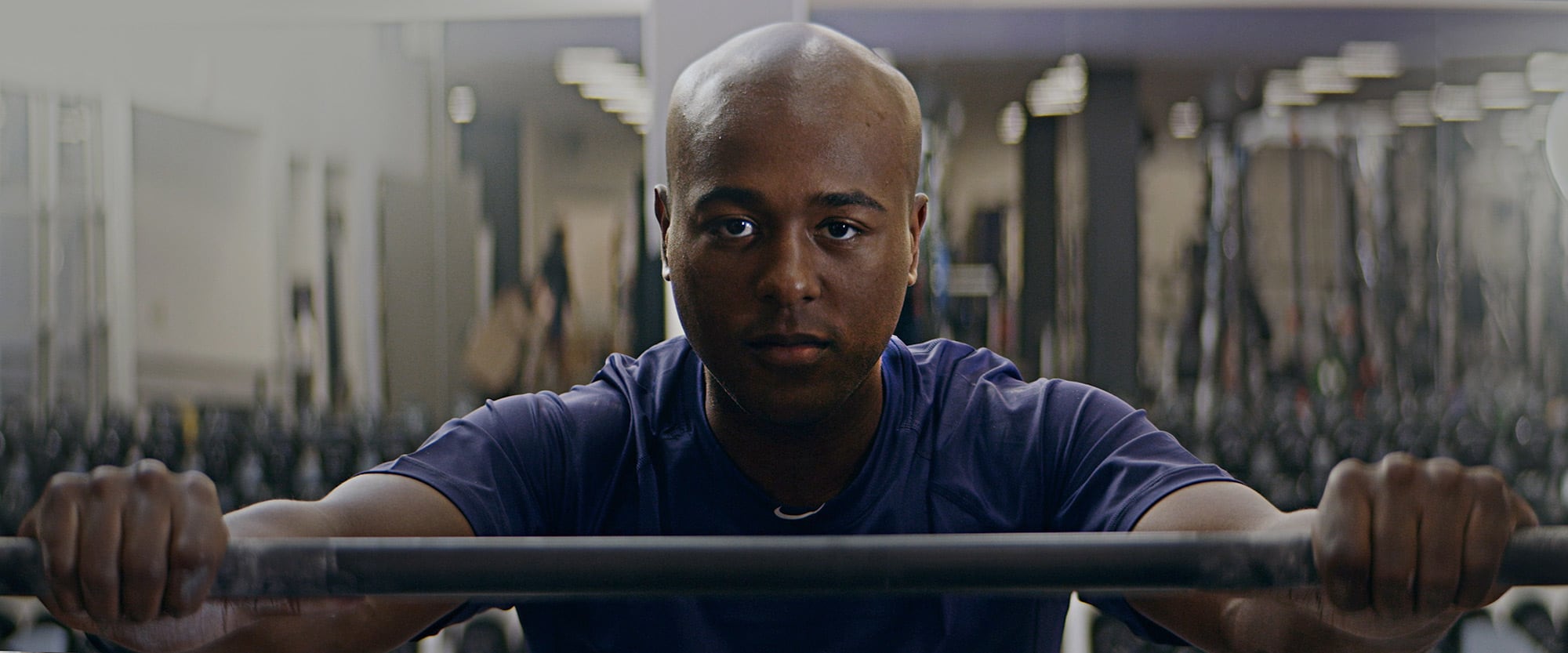
Telling the story of an elite collegiate baseball program is a large task – and it’s one we help TCU Baseball accomplish every year. But, like every task that our team tackles, it’s best to take it one small step at a time, day in, and day out.
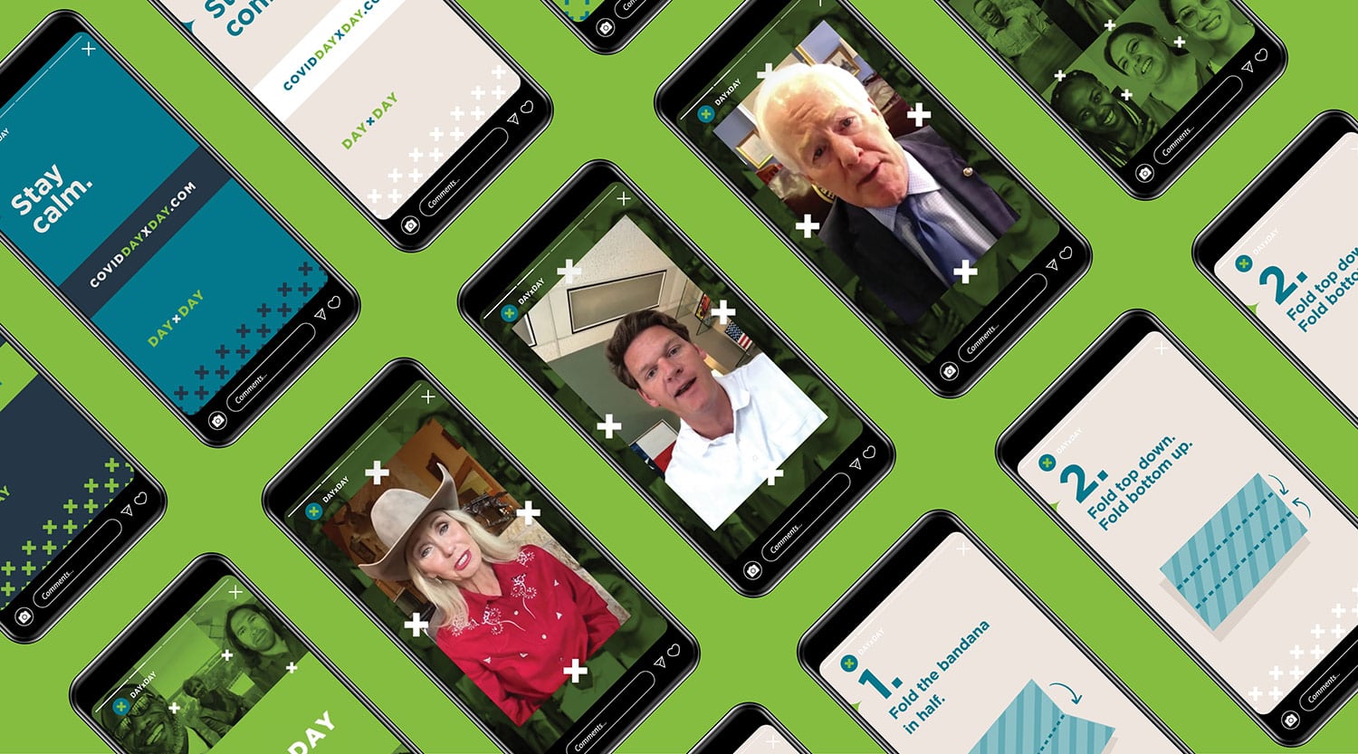
UNTHSC – Day x Day Campaign
Gold ADDY Award | Client: UNTHSC
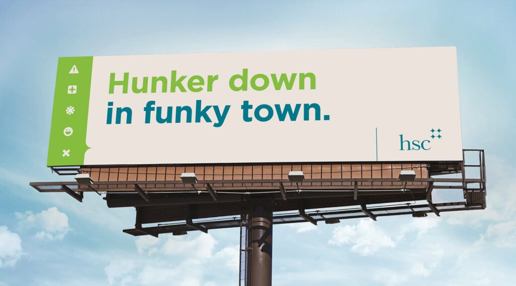
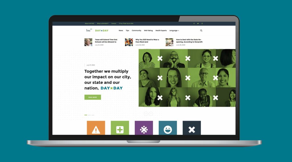
When COVID-19 first struck the United States, people weren’t sure what to think or how to appropriately respond. This left a void of reliable information, and The University of North Texas Health Science Center at Fort Worth – a medical research center and university – saw an opportunity to step forward as a reliable source of scientific information that people could trust.
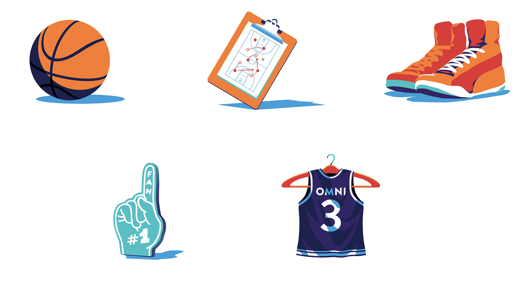
OMNI Go For Three Campaign Illustrations
Gold ADDY Award | Client: OMNI
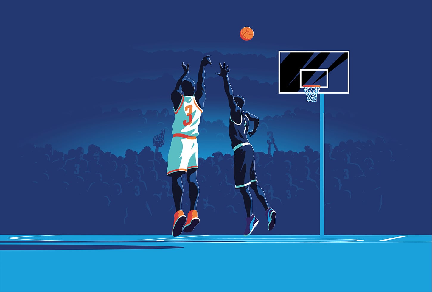
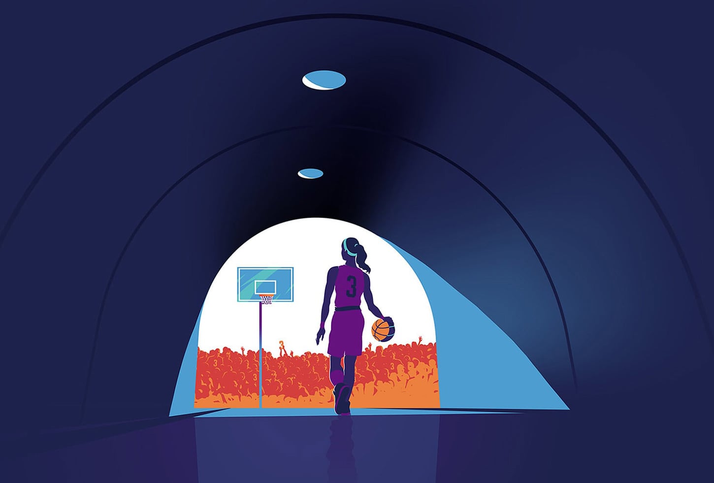
When OMNI® launched their new 2.0 device, which has functional advantages over other similar products on the market, we had to communicate the benefits this new device had over its competition.
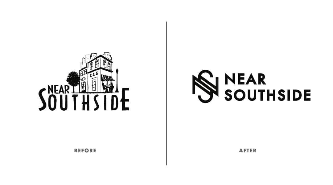
Near Southside Rebrand
Gold ADDY Award | Client: Near Southside
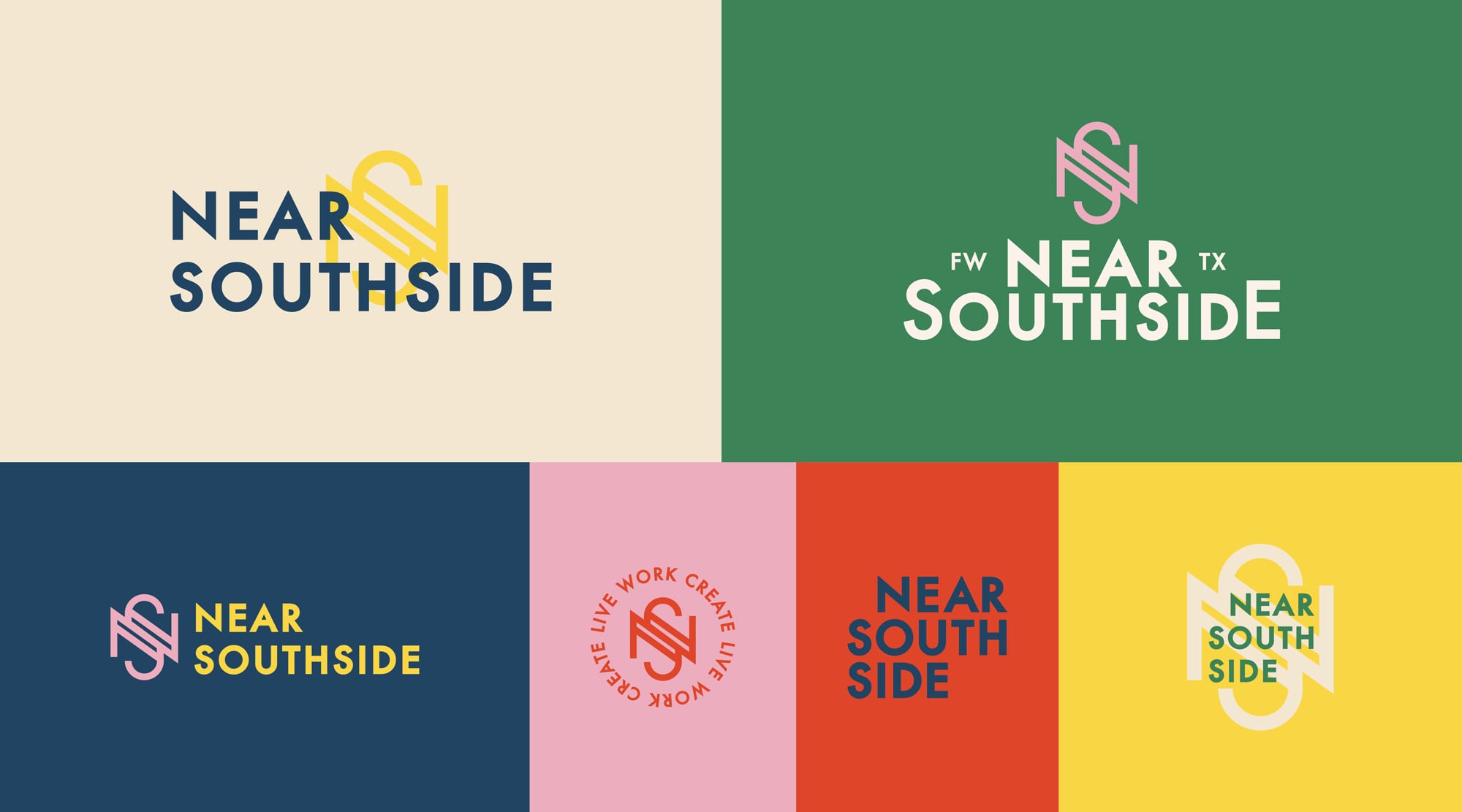
Places are defined by people, and the Near Southside is among the most vibrant and diverse communities in Fort Worth. So, when they approached Schaefer to help them rebrand their identity, we drew inspiration from the neighborhood they create and the people and ideas the Near Southside attracts.
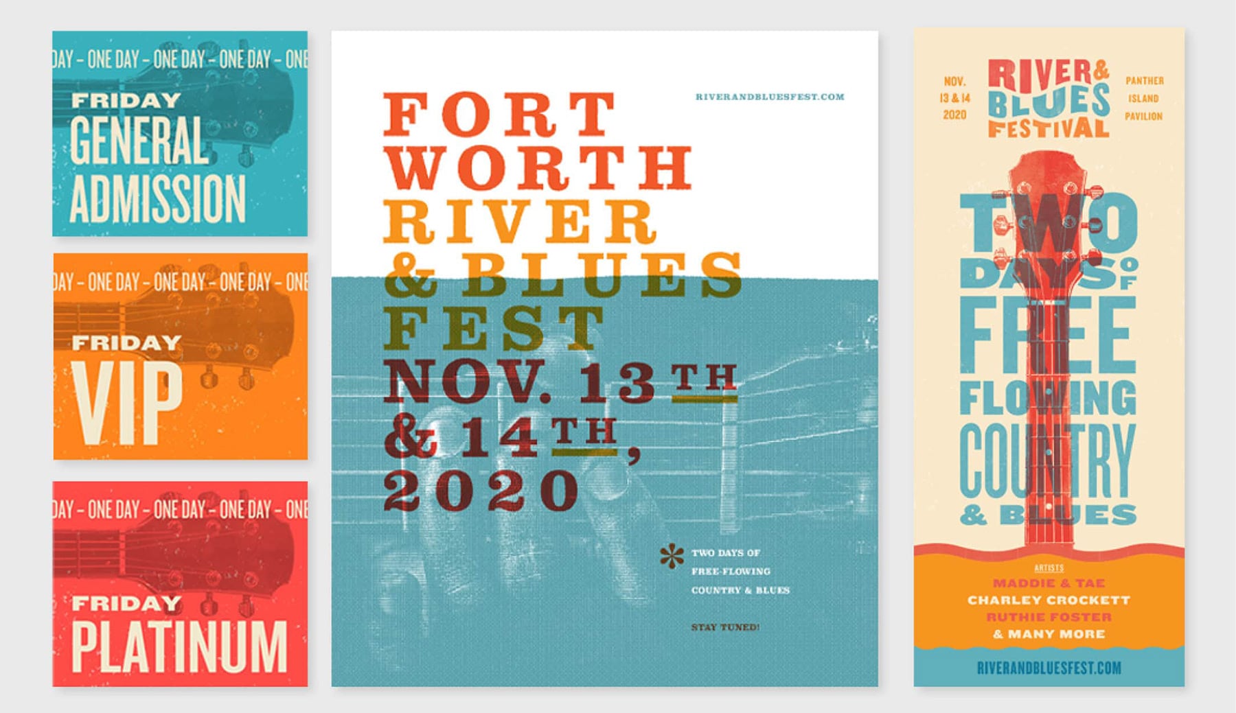
River & Blues Brand Campaign
Gold ADDY Award | Client: River & Blues Festival
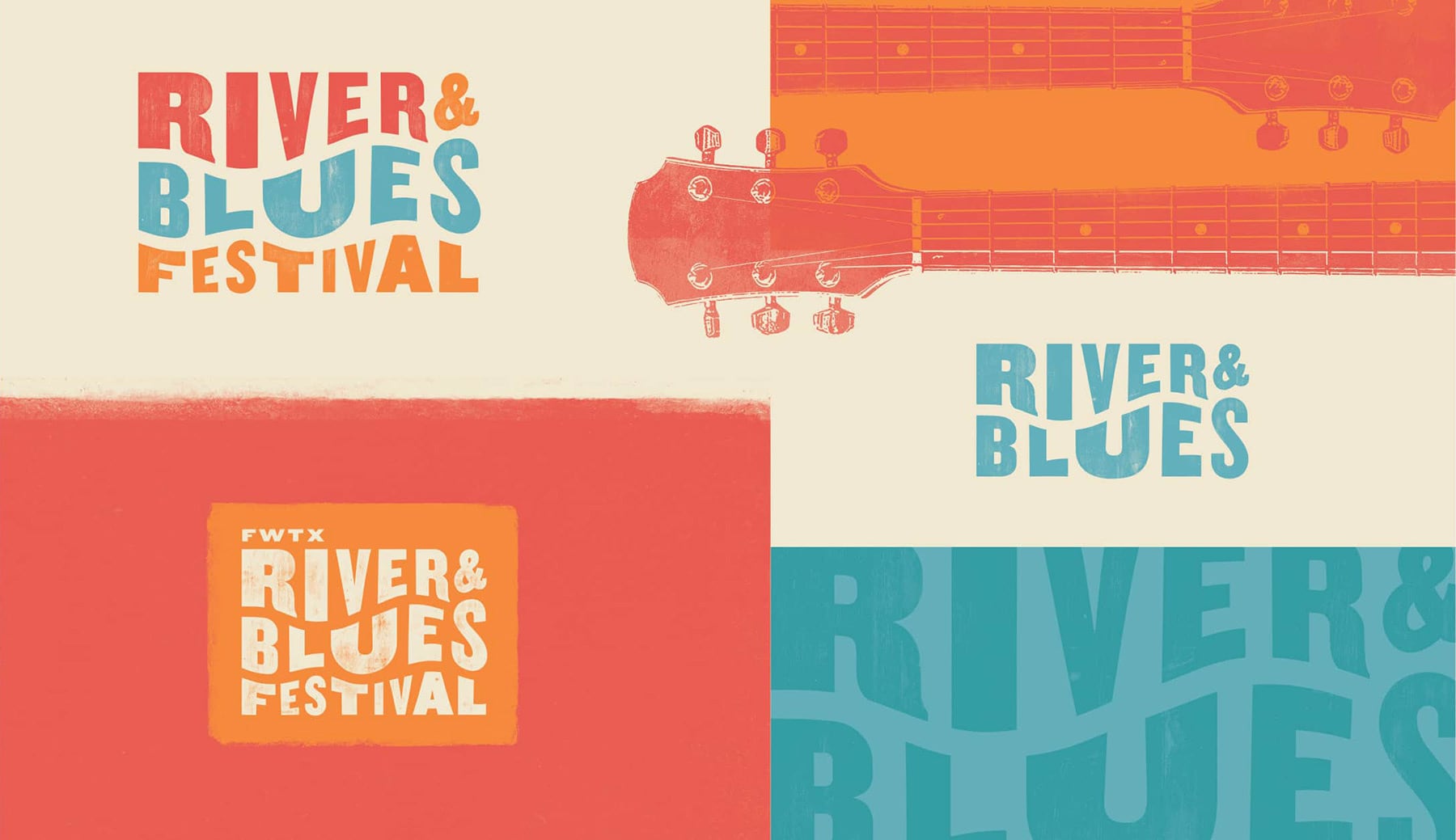
River & Blues Fest is a new kind of music festival, featuring a uniquely American lineup of longtime favorites and soulful up-and-comers in country and blues. Launching its inaugural year right here in the heart of Fort Worth, the River & Blues Festival needed a dynamic identity system to engage and attract music lovers and artists alike across a primarily digital landscape.
Special Judges’ Award: Best of Print
Schaefer Christmas Card