In pursuit of excellence
Nestled in the heart of Fort Worth, Texas, Colonial Country Club stands as an iconic institution with an unwavering commitment to excellence and timeless traditions. Founded in 1936 by Marvin Leonard, the club offers a distinctive private club experience that fosters a strong sense of community. With a rich history in championship golf and a dedication to creating unforgettable moments, Colonial embodies unparalleled luxury and camaraderie.
Revitalizing tradition for Colonial Country Club
In 2023, the club found itself at a pivotal moment, embracing the desire to redefine excellence and embody a new era without forgetting their historic past. This ambitious journey began with an extraordinary renovation project, breathing new life into the esteemed championship course.
The transformation extended beyond the greens as Colonial invested in an array of exciting amenities, embarking on a revitalization journey to align their brand with the club’s updates. Recognizing this opportunity, Schaefer Advertising partnered with Colonial to refine and update their marketing and messaging, ensuring effective communication with a shared commitment to tradition and innovation.
The path to success is empowerment
Working closely with the internal staff at Colonial, we understood the significance of helping the team to define the authentic voice of the brand and building the necessary tools to support business objectives. Colonial’s strategic marketing initiatives focus on three primary goals:
- Increasing awareness and perception among targeted prospective members to generate a consistent waitlist of high-quality prospects,
- Enhancing member engagement to foster loyalty and advocacy, and
- Boosting club revenue through increased event sales.
To achieve these objectives, Schaefer developed a comprehensive marketing strategy that presented findings from a digital platform audit and brand messaging exercise, as well as provided platform-specific optimizations, culminating in a holistic digital ecosystem approach for the internal team to utilize as a road map to support and elevate Colonial’s marketing endeavors.
Uniting past, present, and future
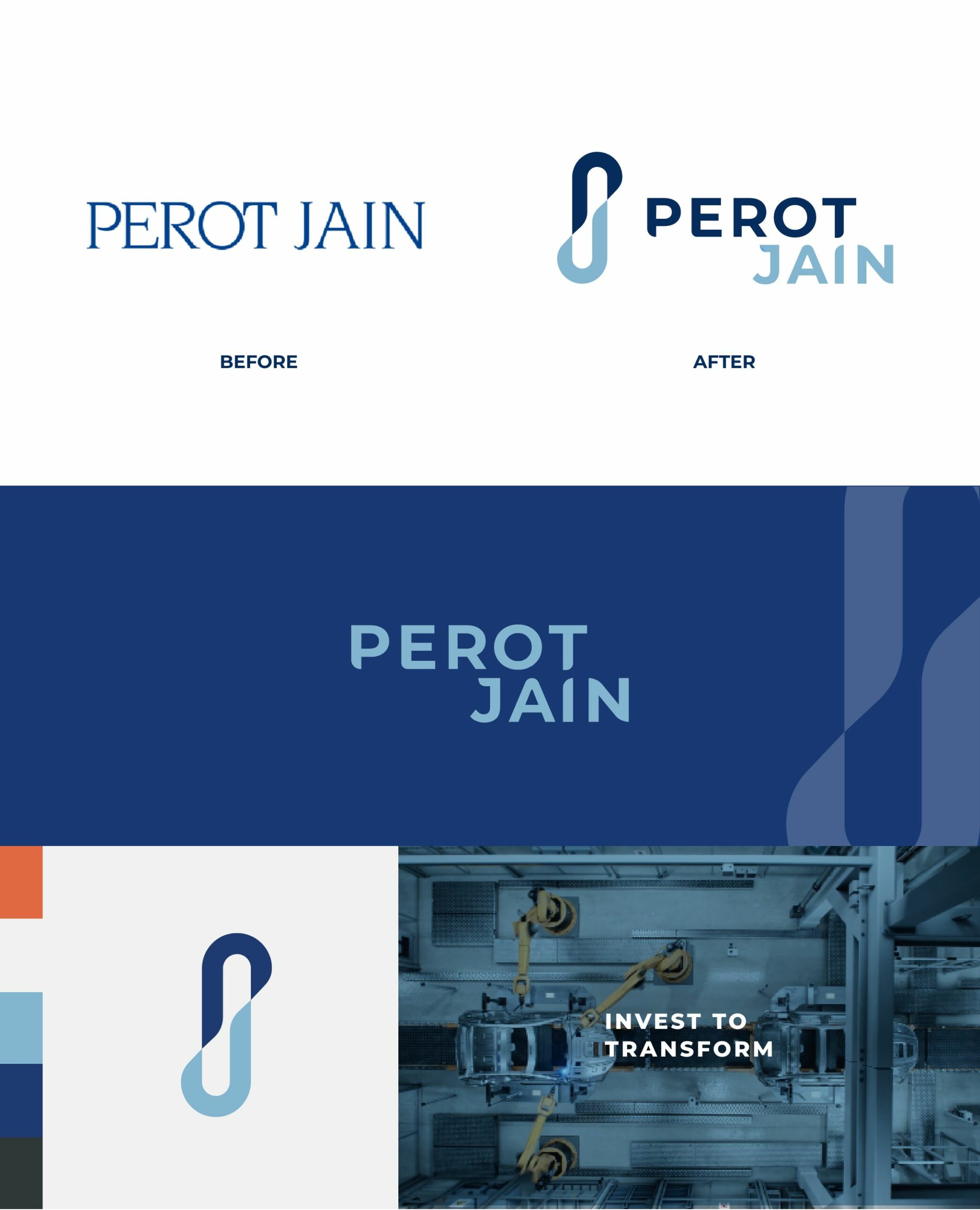
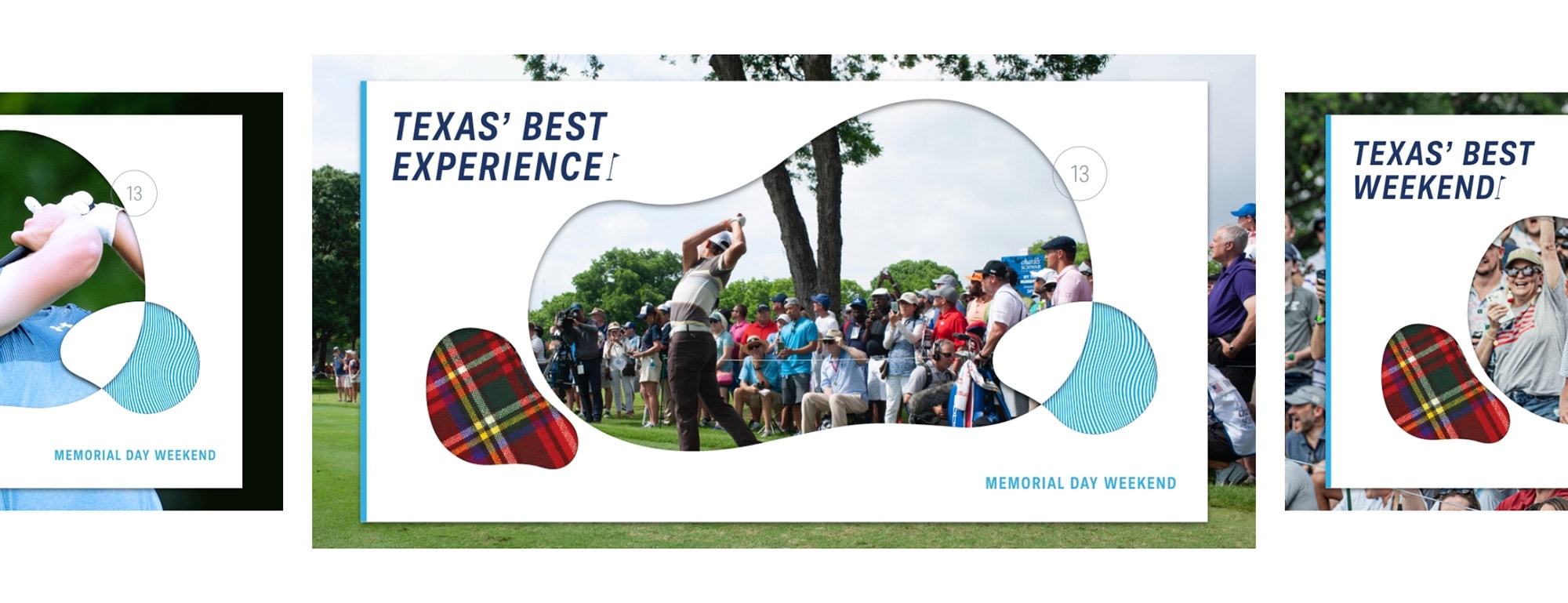
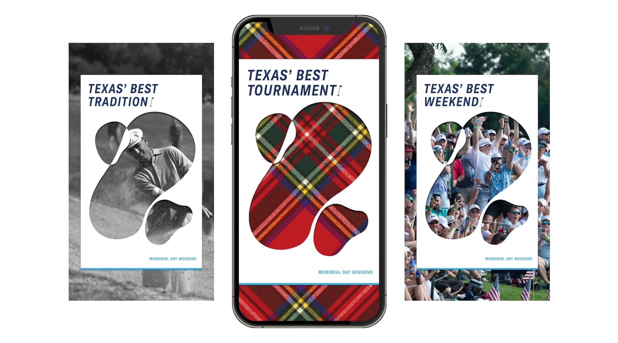
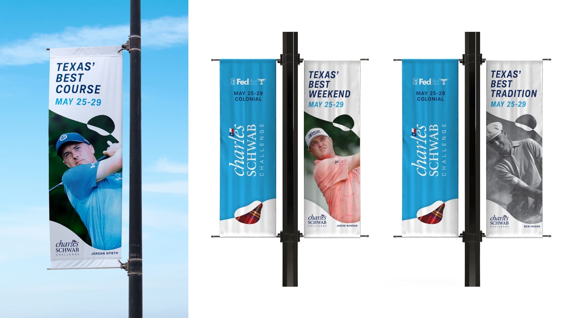
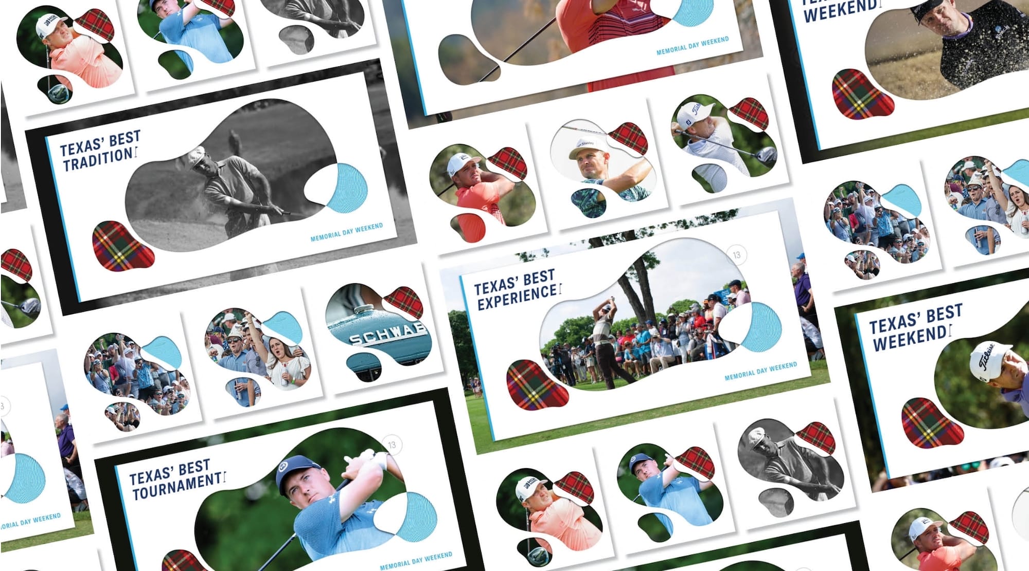
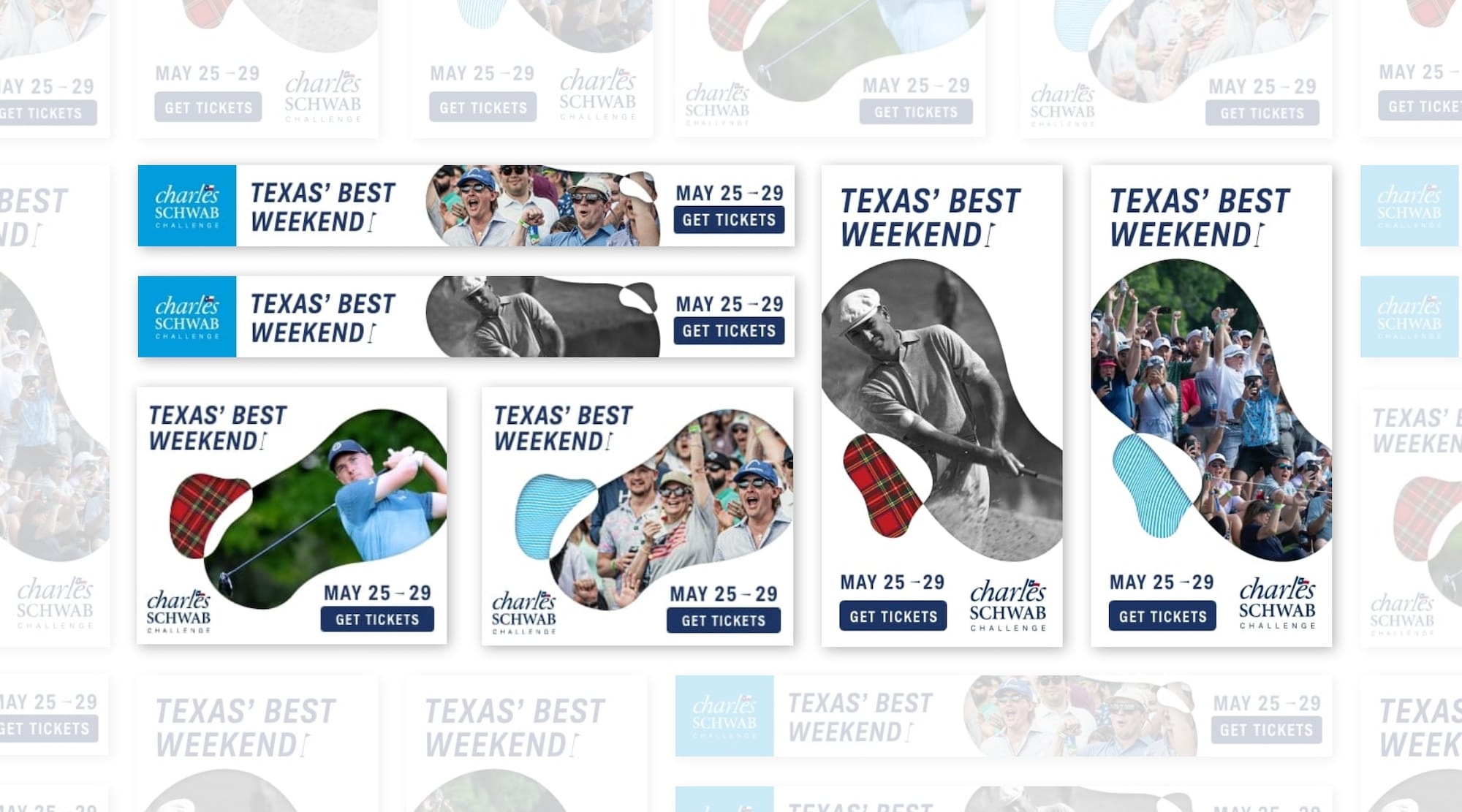
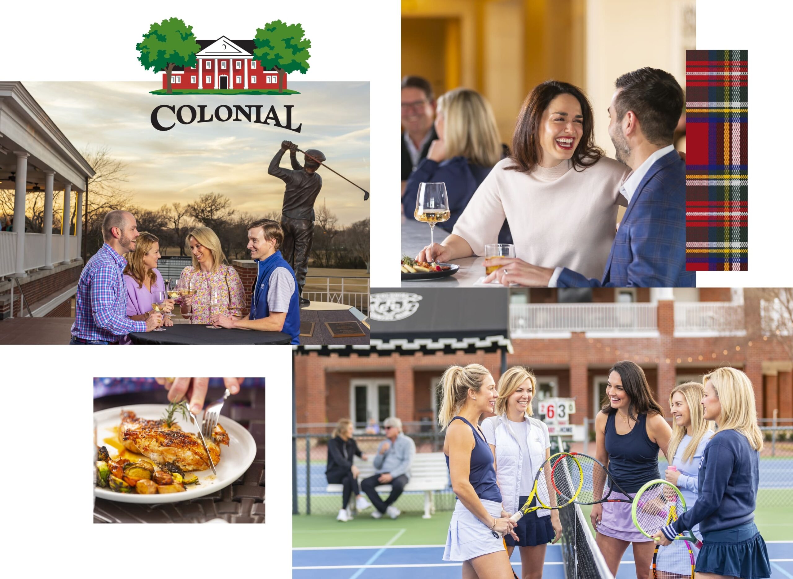
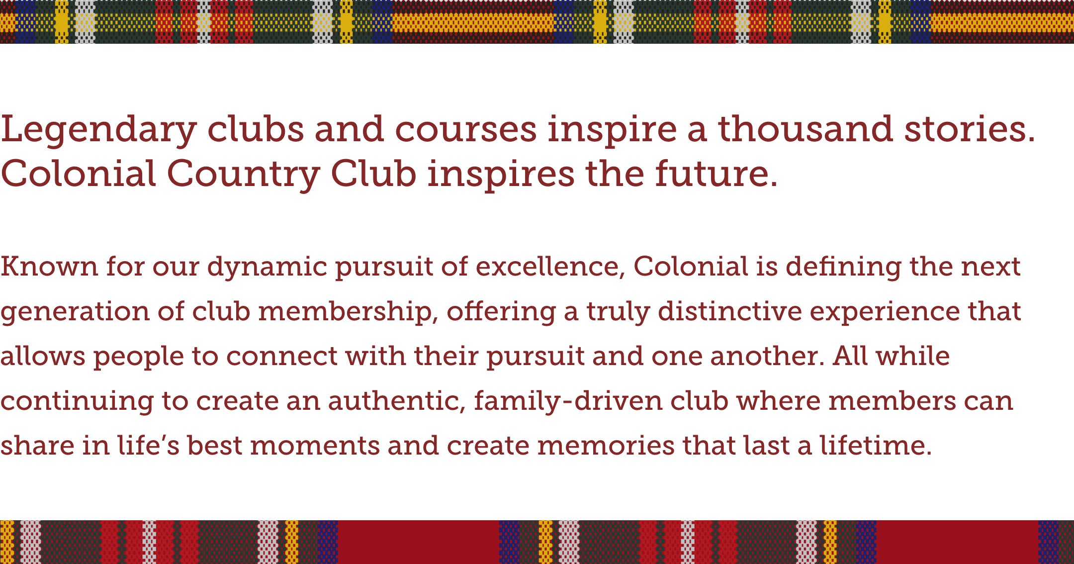
To elevate the essence of Colonial’s brand, we embarked on an extensive brand refresh that began with a meticulous exploration of the club’s unique attributes and a thorough brand landscape assessment. This approach identified key differentiators and core values that set Colonial apart. Establishing the brand archetype and positioning recommendations, Schaefer recognized that Colonial’s messaging should center around the unwavering pursuit of greatness, beautifully capturing the club’s rich history and unyielding commitment to excellence. This masterful process of brand archetyping and positioning culminated in the development of the club’s brand story, a compelling narrative that artfully united the past, present, and future.
Building upon this solid foundation, we crafted a cohesive visual system that seamlessly unified the brand while accommodating flexibility for its evolving identity. A comprehensive brand style guide was introduced, offering clear guidelines to the team and serving as a valuable tool for external communications, ensuring consistent brand alignment across all touchpoints. To capture the true essence of Colonial, Schaefer directed and produced photography and video shoots featuring real club members, thus curating an authentic content library that would enrich the future website and all brand materials, beautifully reflecting the genuine spirit of the club and its cherished traditions.
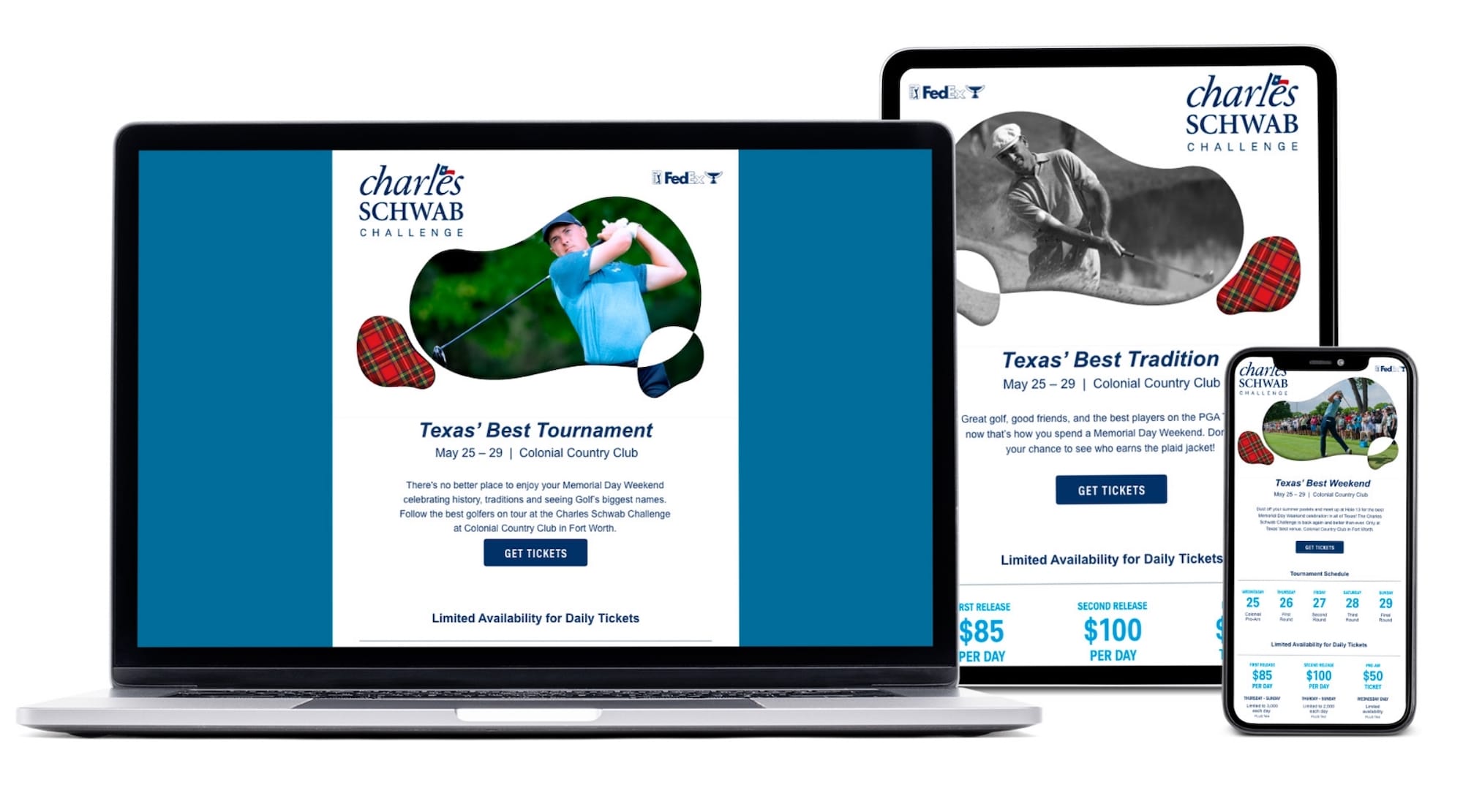
Elevating Colonial’s digital presence
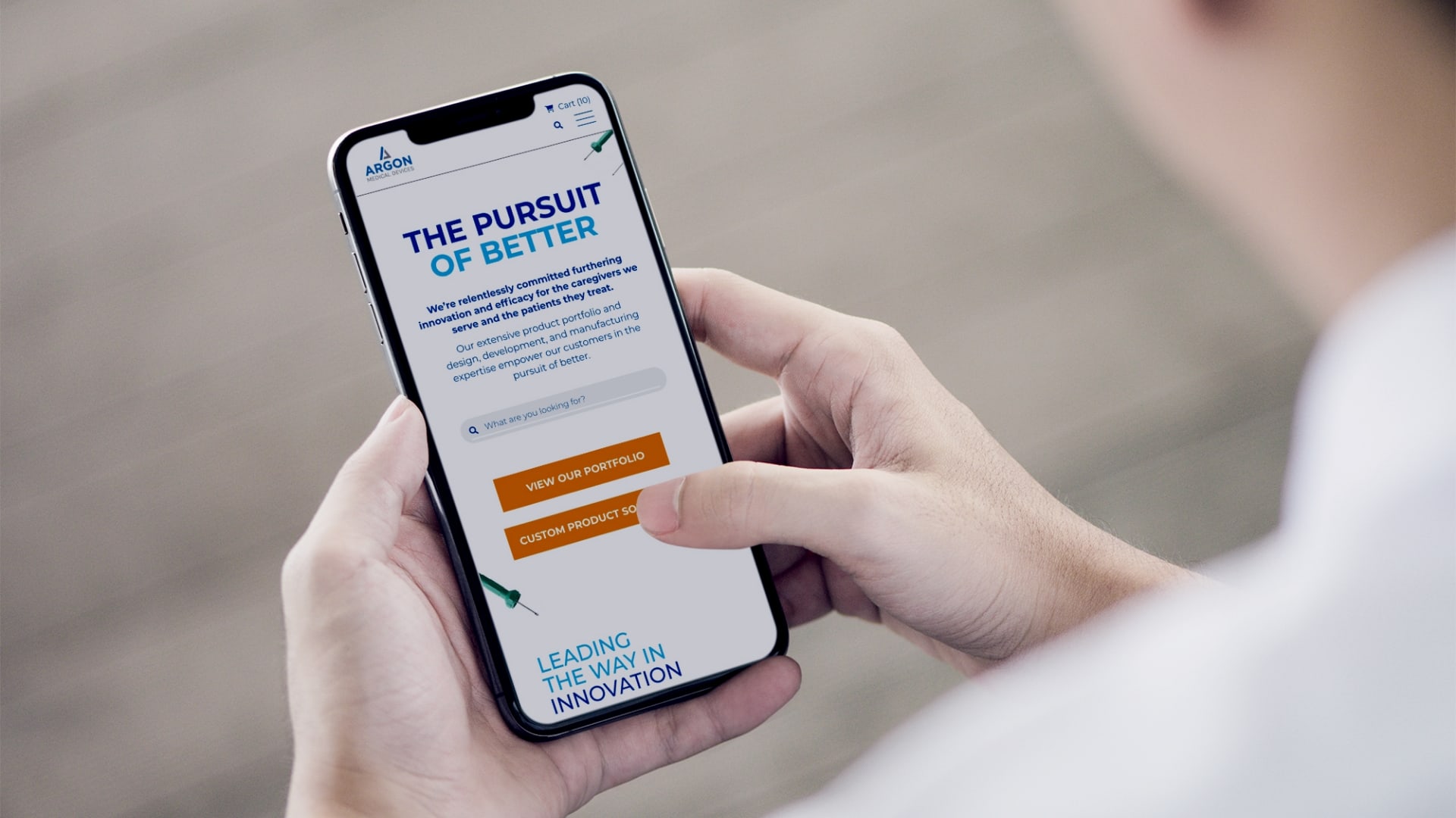
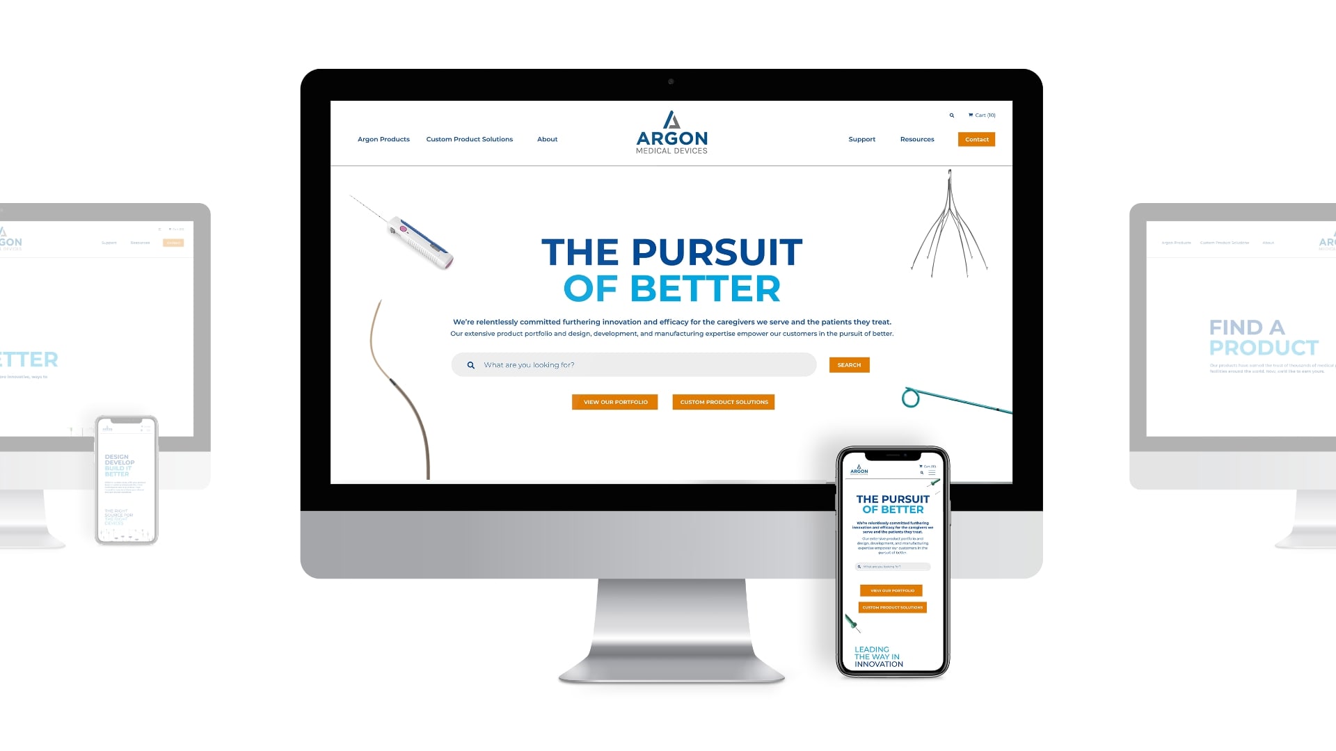
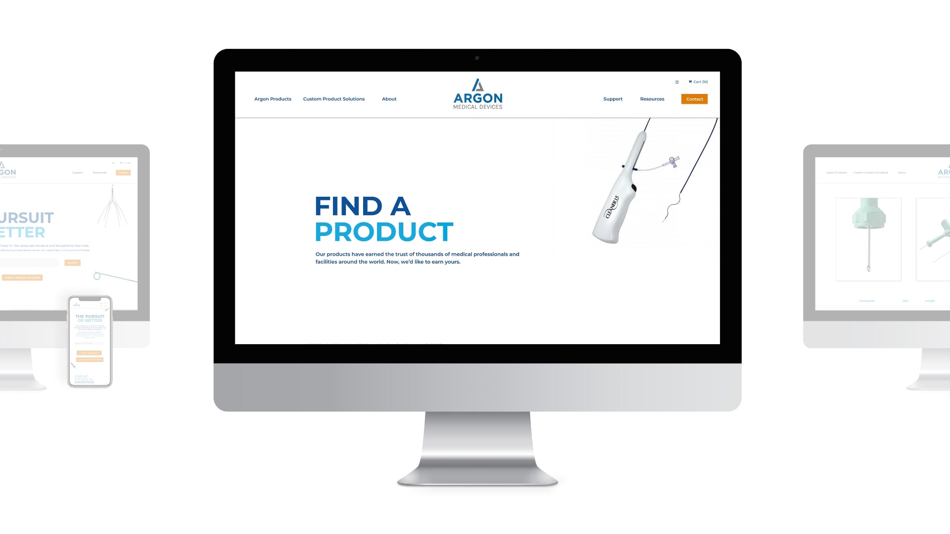
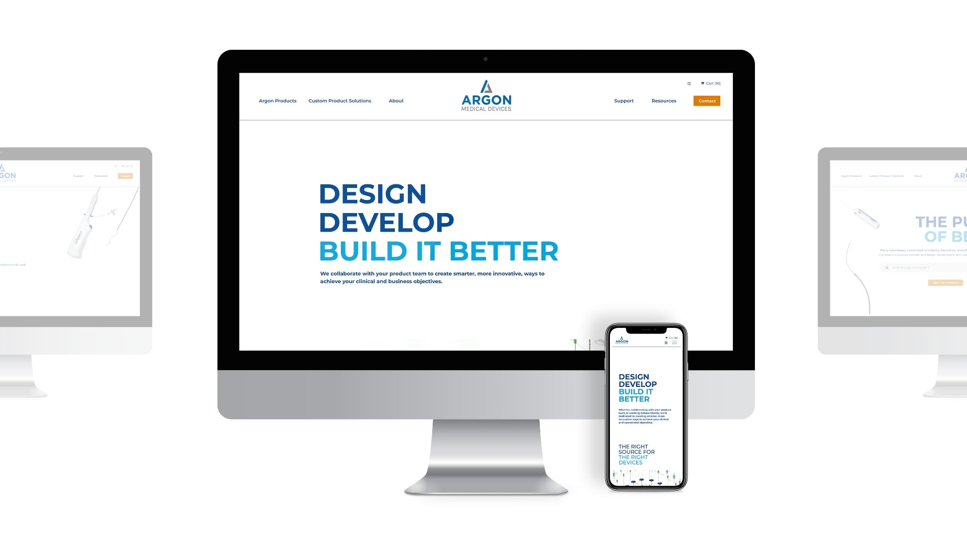
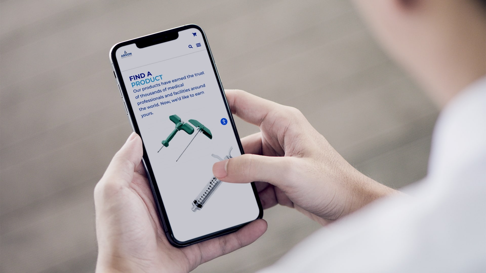
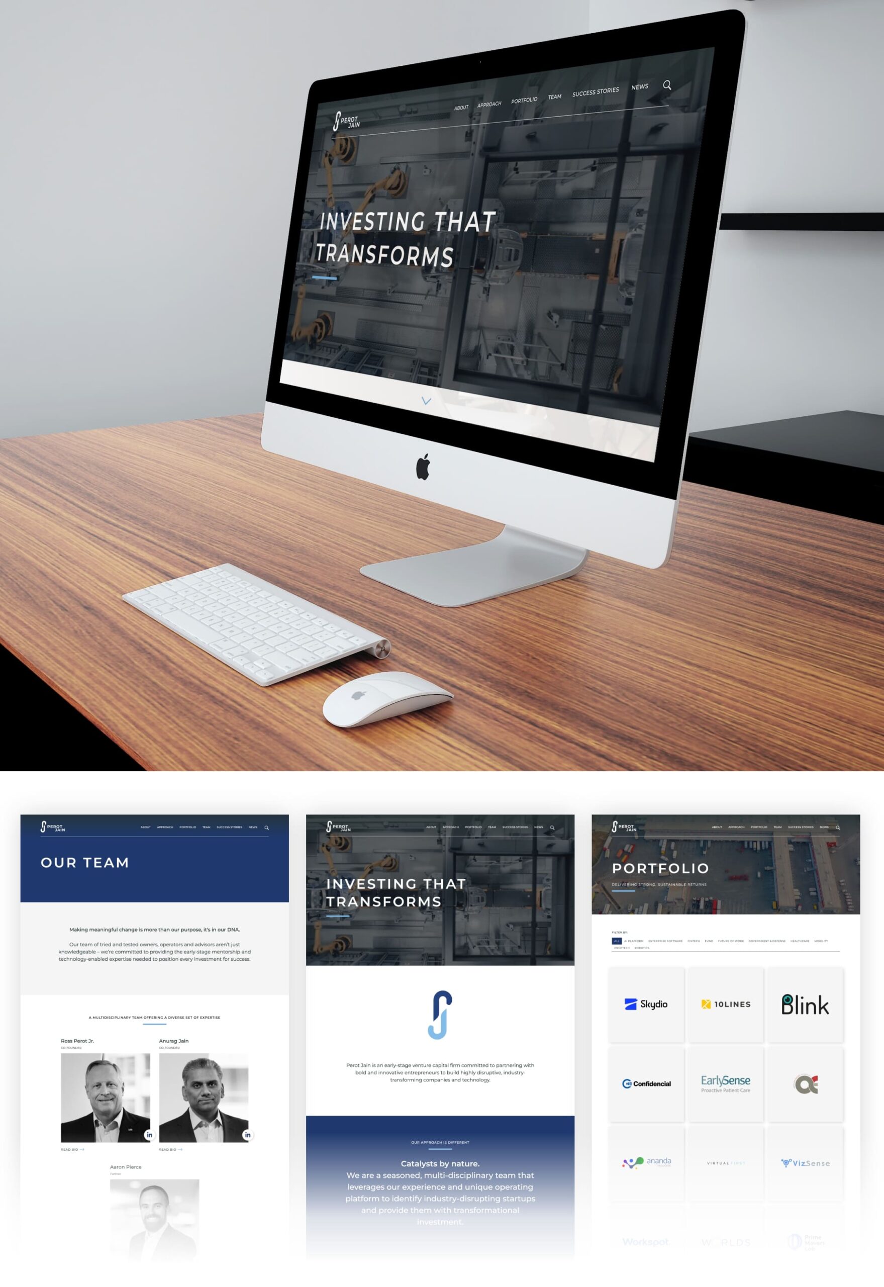
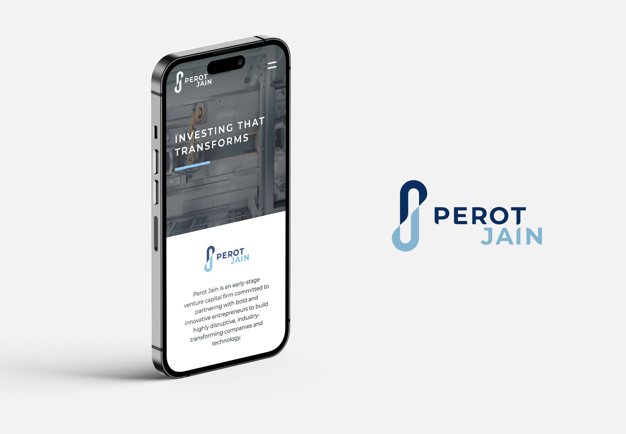
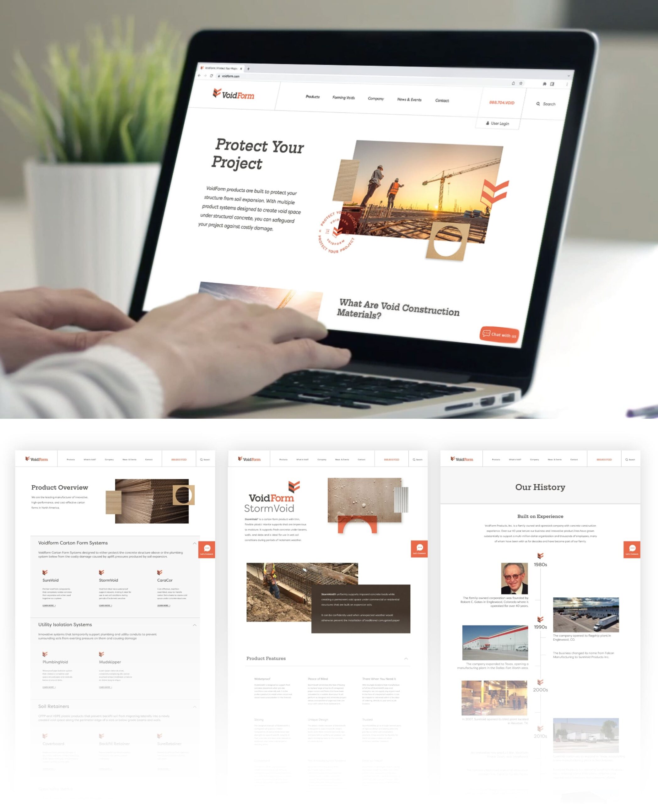
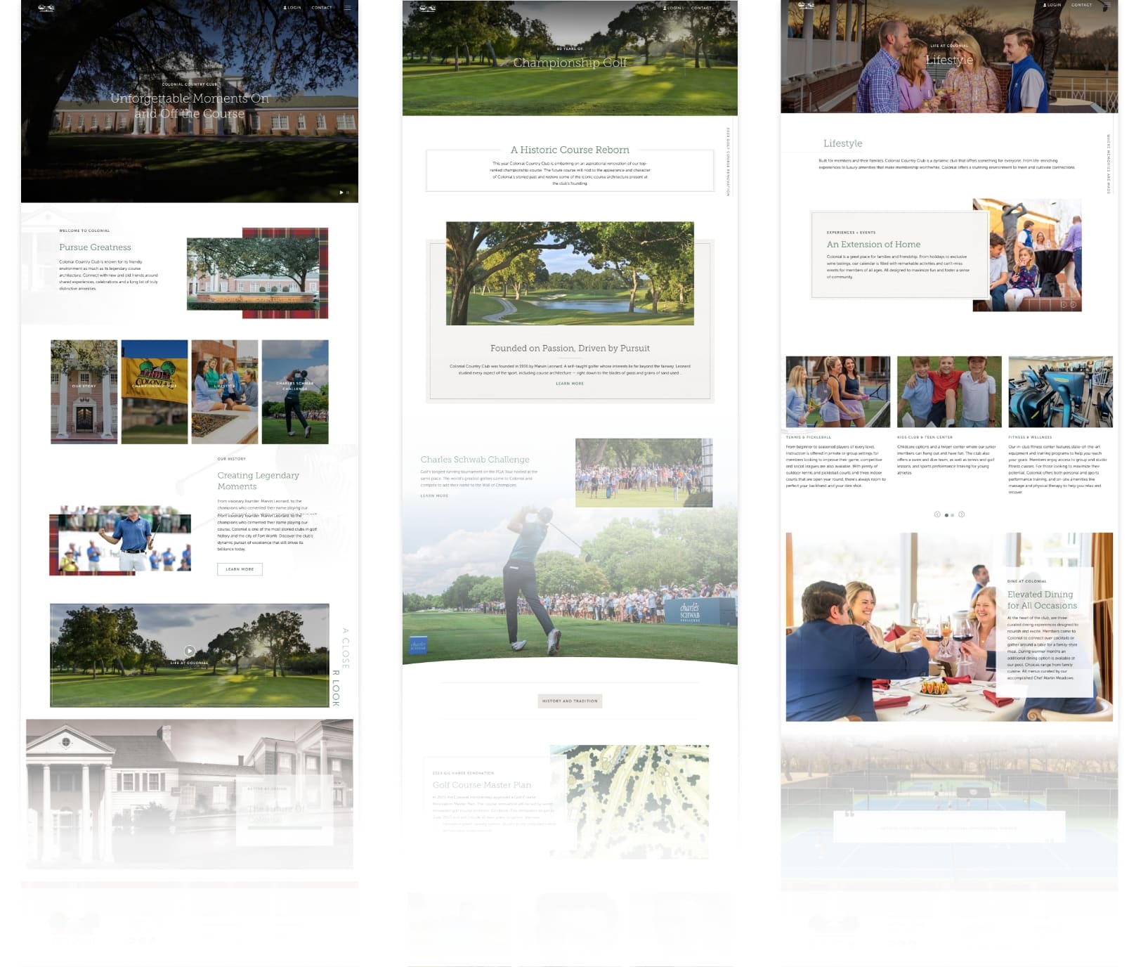
Alongside the visual transformation, Schaefer undertook the crucial task of redesigning Colonial’s website to realign with the club’s prestigious history and standing. Our expertise came to the forefront as we crafted a visually stunning and user-friendly design that successfully communicated vital information while elevating the overall user experience. Through a development partnership with MembersFirst, the website became a powerful tool in supporting awareness, engagement, and lead-generation objectives, providing an app and private portal for members. Schaefer’s thoughtful approach, in tandem with Colonial’s rich heritage, gave rise to a website that now stands as a befitting window into the club.
Outcome
The collaboration between Schaefer and Colonial resulted in a stronger brand presence that honored the club’s legacy as well as their future. The consolidated brand provides a consistent experience for current and potential members, reinforcing Colonial’s position as a pillar in the community. The revitalized brand strategy and web presence articulate the Club’s forward-thinking nature, appealing to both a global audience in search of elite golf experiences and creating a home away from home for local members. By providing the internal team at Colonial with the necessary tools and support, Schaefer empowered them to effectively communicate the brand’s voice and usher in a new era of success.