Premier Trailer Leasing, one of the nation’s leading trailer leasing providers, celebrated its 20th anniversary in 2025 with an internal leadership conference centered around the theme Changing the Game.
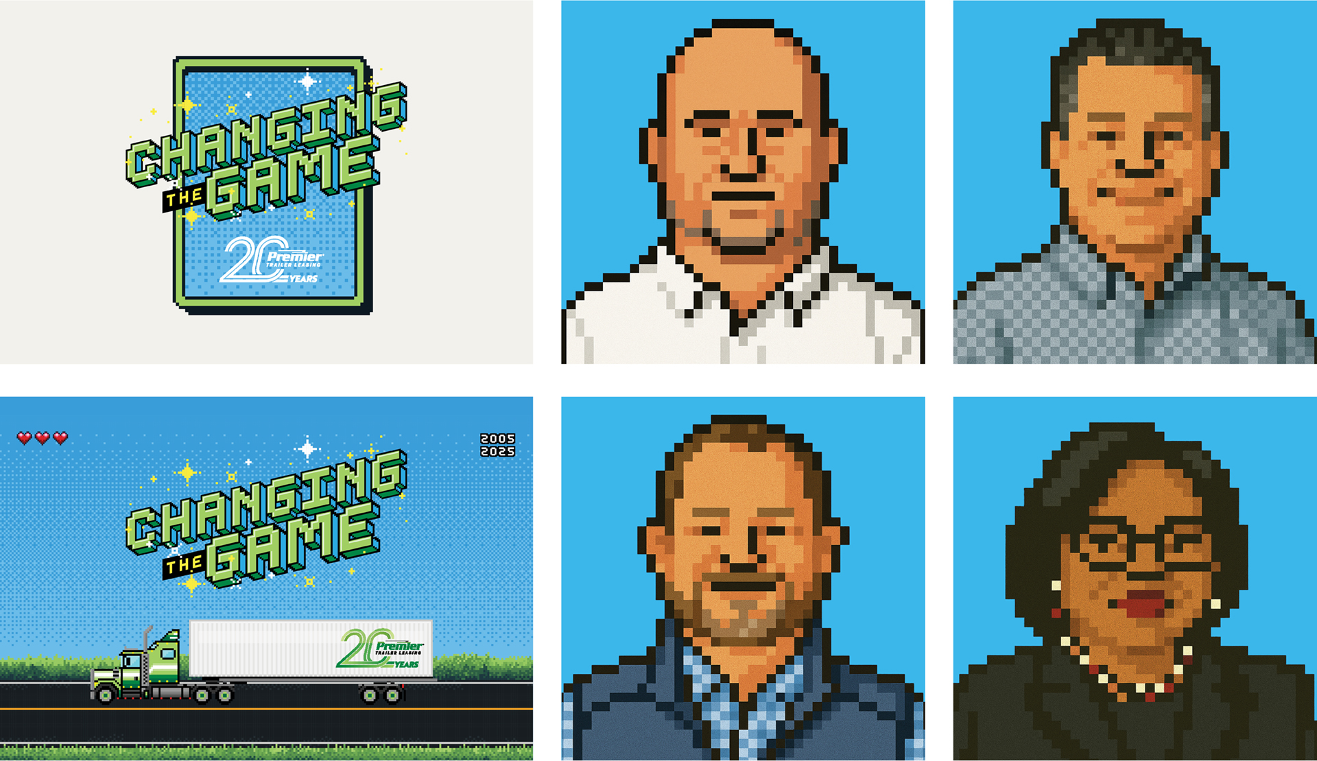
Designed to celebrate two decades of growth, innovation, and service while reinforcing Premier’s culture of integrity and care, the conference became an opportunity to create a more engaging internal brand experience for employees across the organization. Schaefer partnered with Premier to develop the event logo and visual direction, which expanded into a broader creative system used throughout the conference to build excitement, consistency, and participation among attendees.
Bringing the Theme to Life
The objective was to translate the Changing the Game theme into a creative direction that felt memorable, intentional, and unmistakably Premier. The challenge was not simply to make the conference “look like a video game,” but to create an experience that reinforced Premier’s momentum as a company while celebrating the people who helped shape its first 20 years.
Schaefer anchored the creative in a nostalgic ‘90s gaming aesthetic, using pixel-inspired typography, arcade-style visuals, and retro references to communicate energy, leadership, and forward movement. The nostalgic cues created an immediate sense of familiarity and fun, helping employees connect with the conference theme in a way that felt approachable rather than overly corporate.
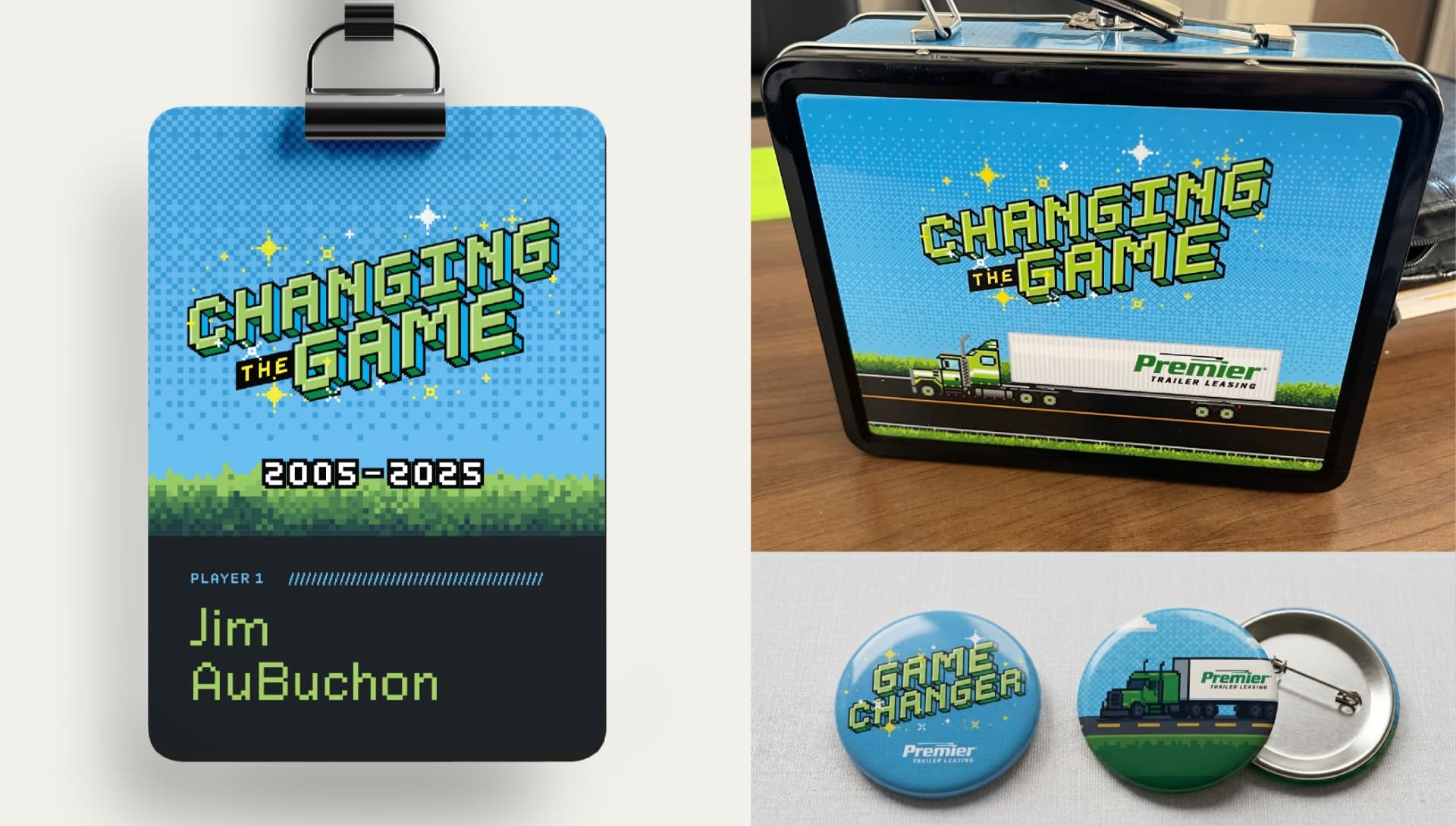
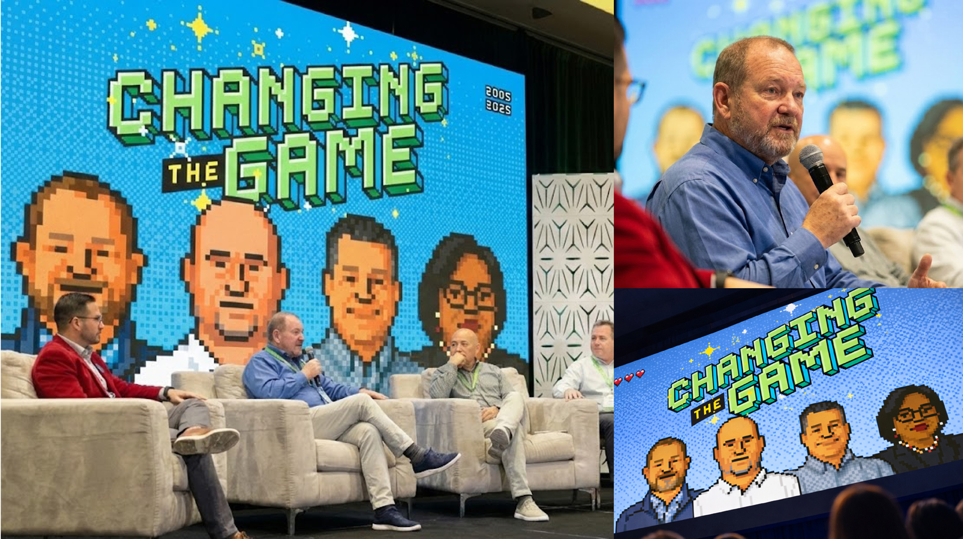
The concept extended beyond the logo into a scalable identity system that included a defined headline typeface, color palette, and flexible design assets for presentations, signage, badges, and event materials. The system also expanded into custom pixel-style speaker portraits and motion-inspired visuals that added personality and consistency across conference touchpoints.
Game-Changing Results
The final conference branding gave Premier a creative system that felt fresh, engaging, and deeply connected to the company’s culture and values. More than a collection of event graphics, the work created a shared visual language that employees could interact with throughout the conference experience.
By combining strategic messaging with a playful but intentional creative approach, Schaefer helped Premier celebrate an important milestone while reinforcing the mindset behind the Changing the Game theme: leadership requires stepping up, making decisions, and continuing to move the organization forward.
The project also demonstrated how thoughtful conference branding can extend beyond decoration to create meaningful moments of engagement — giving brands permission to show up in new ways while still feeling authentic to who they are.
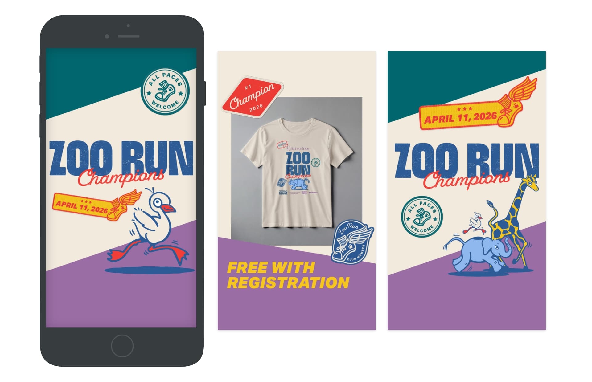
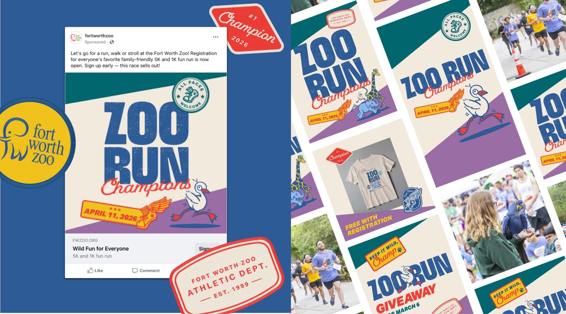
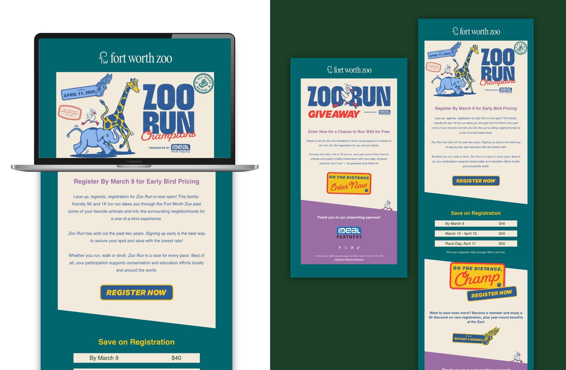
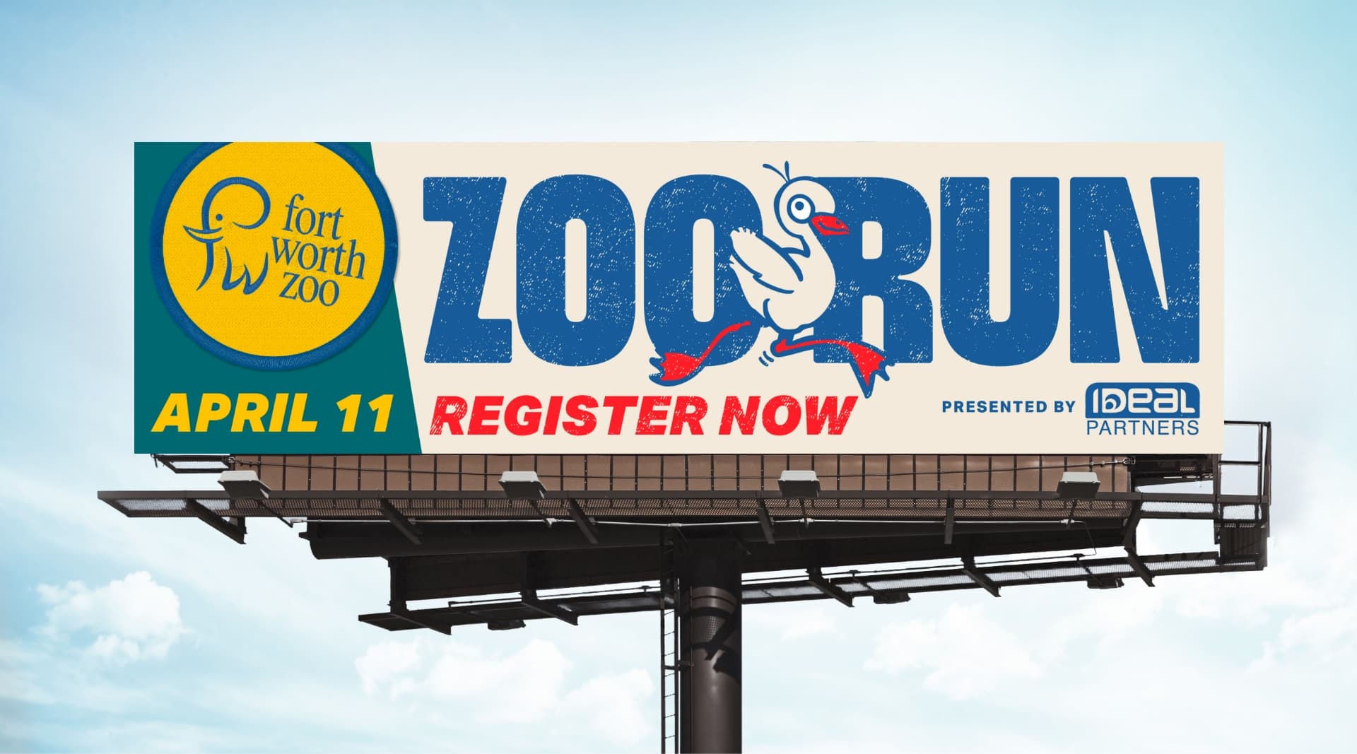
The Fort Worth Zoo partners with Schaefer each year to bring fresh energy to its annual Zoo Run—an event that has consistently sold out the past two years. The challenge this year wasn’t just driving registrations, but pacing demand strategically to ensure the event didn’t sell out too early, while continuing to build excitement and expand its audience. Schaefer developed a campaign that maintained the playful, nostalgic tone participants had come to love – paired with a refined media strategy based on learnings from previous years.
Designed to Evolve
Schaefer led strategic planning, concept development, copywriting, design, and full-funnel media execution across out-of-home, paid search, paid social, email, text, streaming video, and local publications. The goal was to guide audiences seamlessly from awareness to registration while leveraging insights from prior campaigns to refine timing, targeting, and channel strategy. By combining creative development with data-driven media planning, the team ensured various media touchpoints contributed to both engagement and conversion.
Nostalgia Meets New Energy
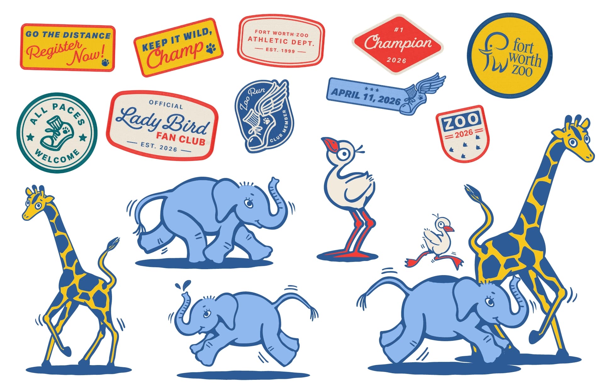
The creative approach built upon the vintage, retro-inspired aesthetic that resonated strongly in 2025, evolving it with brighter colors and a more dynamic visual identity. The campaign highlighted the Zoo’s baby elephant, Lady Bird, alongside other fan-favorite animals, using illustrated elements to create a sense of personality and connection. Playful details such as sticker-style patches featuring phrases like “Lady Bird Fan Club” and “Fort Worth Zoo Athletic Co.” added a layer of charm and collectibility, reinforcing the event’s fun, community-driven spirit while expanding its visual appeal.
From Start Line to Sold Out
The result was a third consecutive sell-out for Zoo Run and a 32% YoY increase in total campaign impressions—demonstrating not only sustained demand but also the effectiveness of a more refined, strategic approach. By combining evolving creative with smarter media execution, Schaefer helped the Fort Worth Zoo maintain momentum while continuing to grow and engage its audience year over year.
Where Creativity and Strategy Converge
By pairing compelling, audience-driven creative with insights drawn from long-term client partnerships, Schaefer consistently delivers campaigns that meet—and often exceed—performance goals. The Zoo Run campaign proves that when creativity and strategy work hand in hand, even a sold-out event can keep getting better.
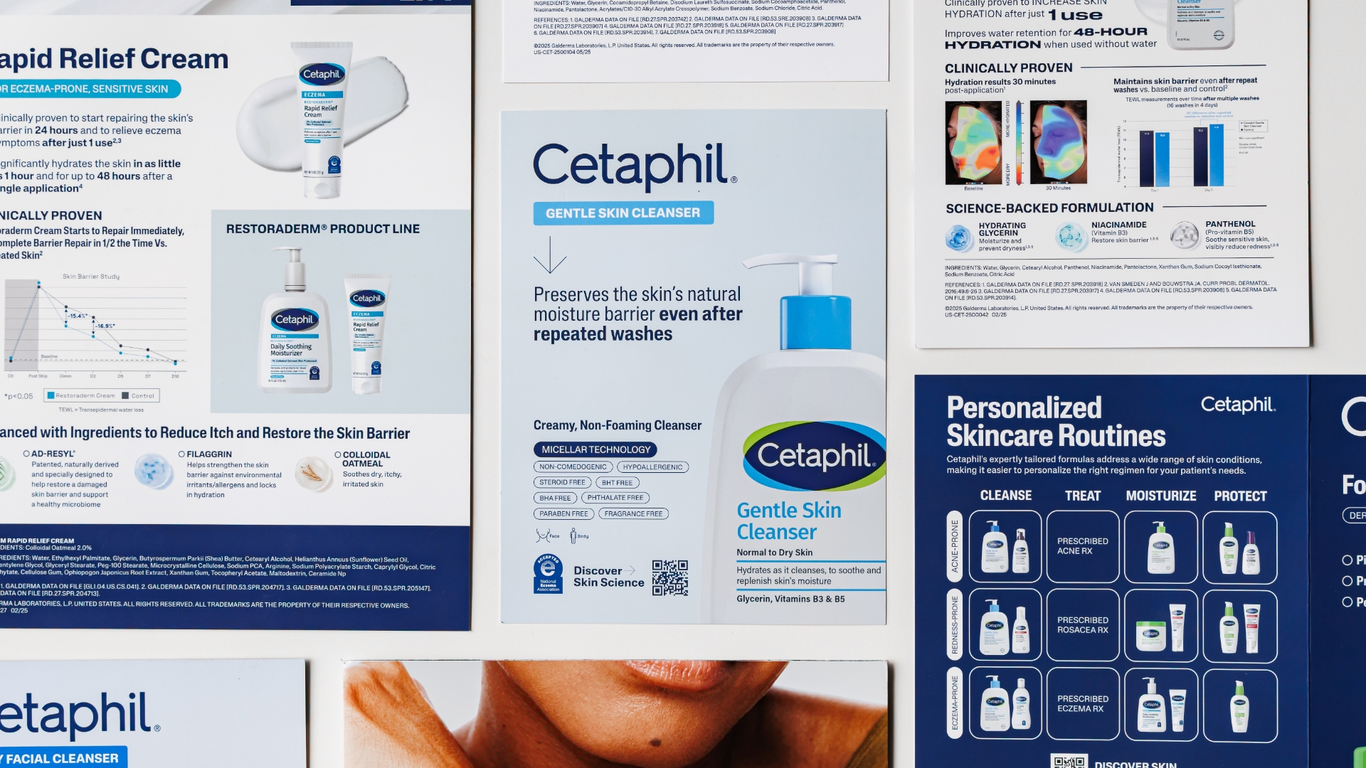
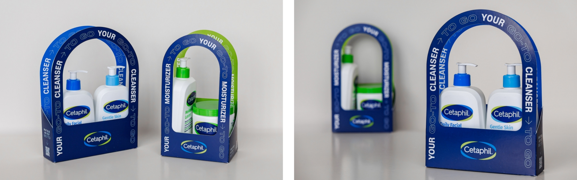
Cetaphil, a globally recognized skincare brand, underwent a major rebrand to modernize its identity and better connect with everyday consumers. However, this visually-driven evolution presented a unique challenge: how to translate a consumer-centric rebrand into meaningful, science-backed messaging for healthcare professionals (HCPs). Schaefer was tasked with bridging this gap—developing tools that maintained the integrity of the refreshed brand while reinforcing clinical credibility and driving engagement with an expert audience.
Goals
Adapt consumer-driven brand elements to resonate with HCP expectations and standards.
Preserve and emphasize Cetaphil’s clinical heritage and scientific validity.
Create impactful sales tools that effectively communicate key claims without overwhelming.
Enhance memorability and in-office usability of leave-behind and sales materials.
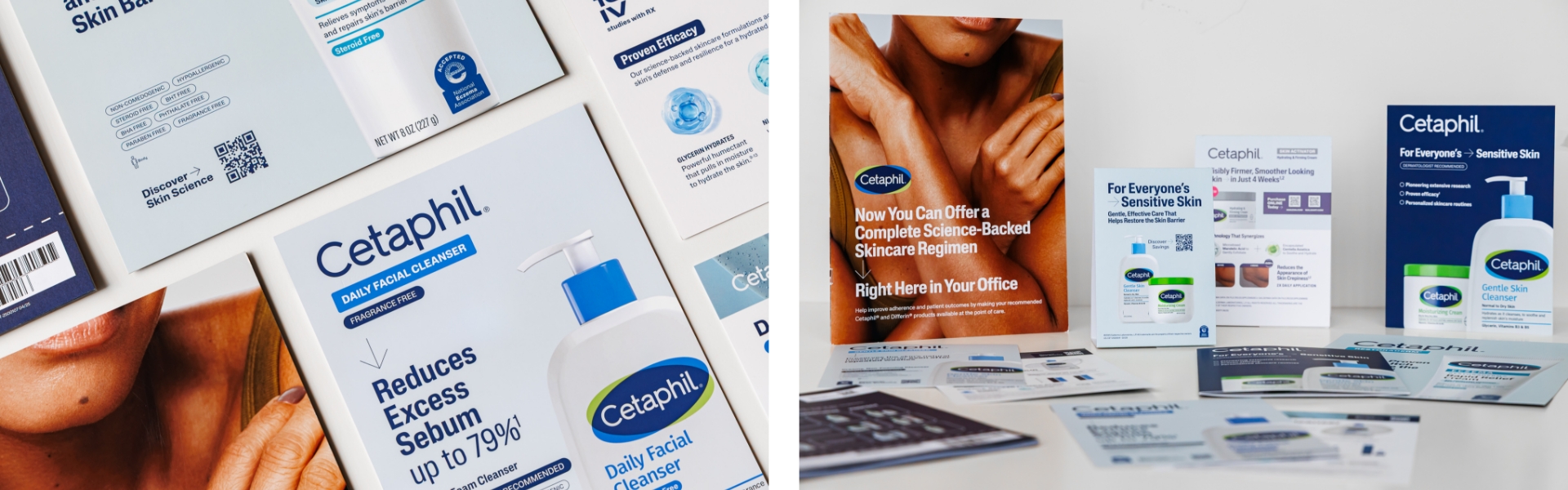
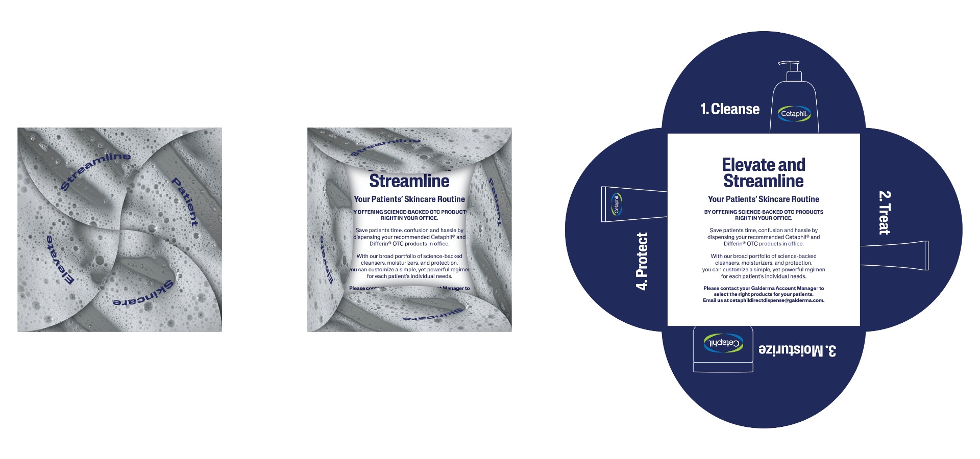
CTMP Provider Leave Behind
To replace a flat and forgettable 5×7 card, our team engineered an innovative fold-out piece modeled after a flower petal. Each fold highlights one element of Cetaphil’s core C-T-M-P regimen—Cleanse, Treat, Moisturize, Protect—offering providers a dynamic and educational interaction. This redesign not only aligned with the new aesthetic but also added dimension and memorability to in-office conversations.
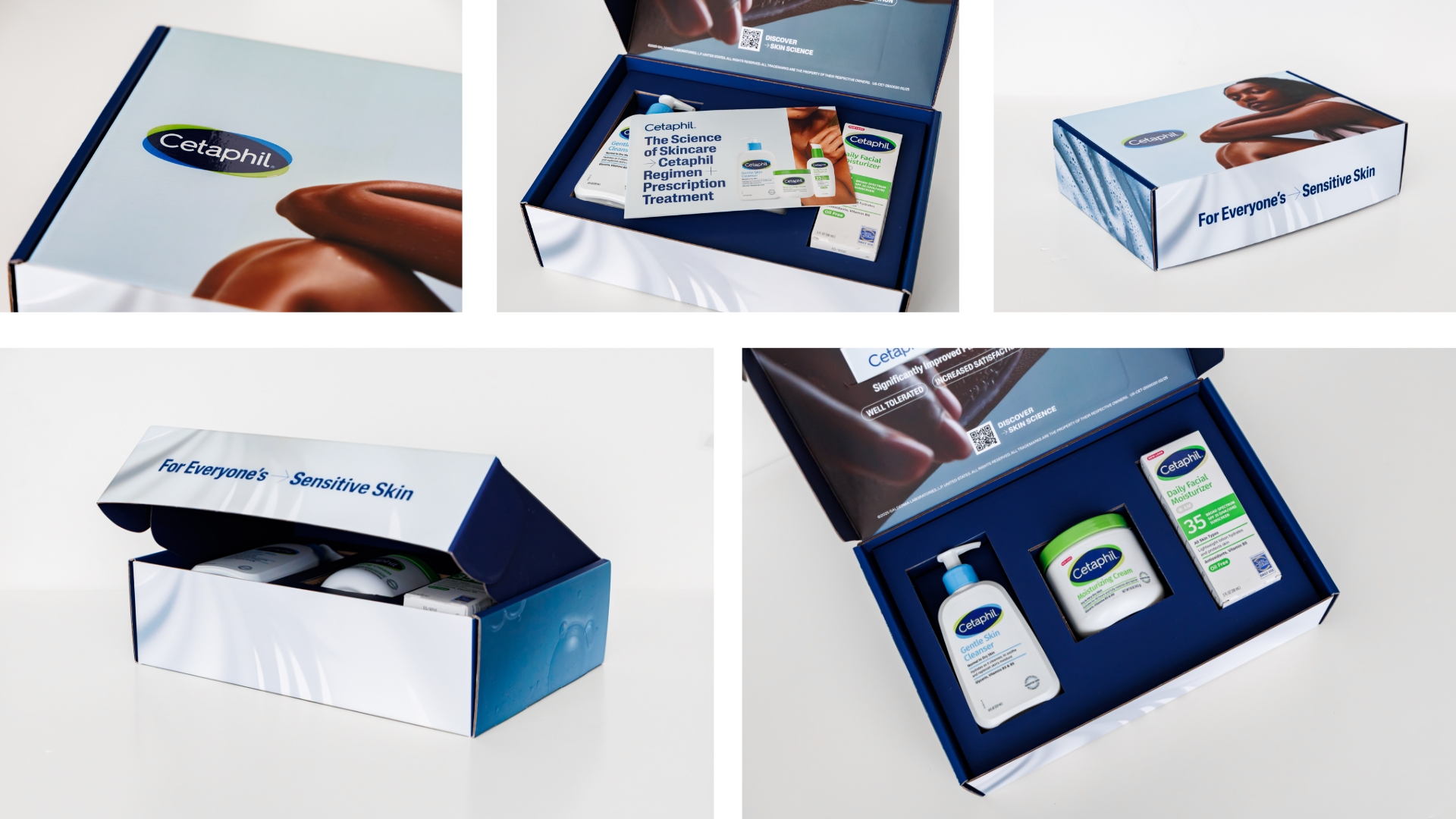
Core Product Line Surprise & Delight Boxes
We curated and distributed 3,500 premium mailers to key HCP influencers, each containing Cetaphil’s three core products. These boxes debuted the new visual identity while spotlighting recent clinical study data that reaffirmed product efficacy. The packaging and accompanying materials were crafted to elicit excitement, reinforce trust, and encourage in-office trials.
In-Field Sales Materials
The team diligently redesigned a full suite of in-field sales materials with a refined, unified visual language aligned to the consumer brand. Every piece was carefully rewritten to sharpen core messaging and elevate key claims—removing clutter while preserving clinical rigor. These tools now empower sales reps to deliver clear, confident, and compelling conversations with HCPs.
Results
Reinvigorated provider brand perceptions through engaging designs, clear claims and impactful packaging.
Successfully extended a consumer-facing rebrand into the professional healthcare space and created a model for client internal teams and partners to model.
Delivered a cohesive HCP toolkit that balanced brand storytelling with clinical depth achieving positive in-field feedback for both clarity and quality.
Equipped sales teams with tools that improved confidence and message retention.
Enhanced HCP engagement with more interactive and visually compelling materials.
Summary
Cetaphil’s global rebrand provided an opportunity to reimagine its presence across all touchpoints—including those targeting healthcare professionals. Schaefer Advertising rose to the challenge by translating the refreshed brand identity into HCP-relevant communications that elevated both perception and performance. Through thoughtful design, clinical storytelling, and strategic delivery, we helped bridge the gap between style and science—ensuring Cetaphil continues to earn trust on both sides of the counter.
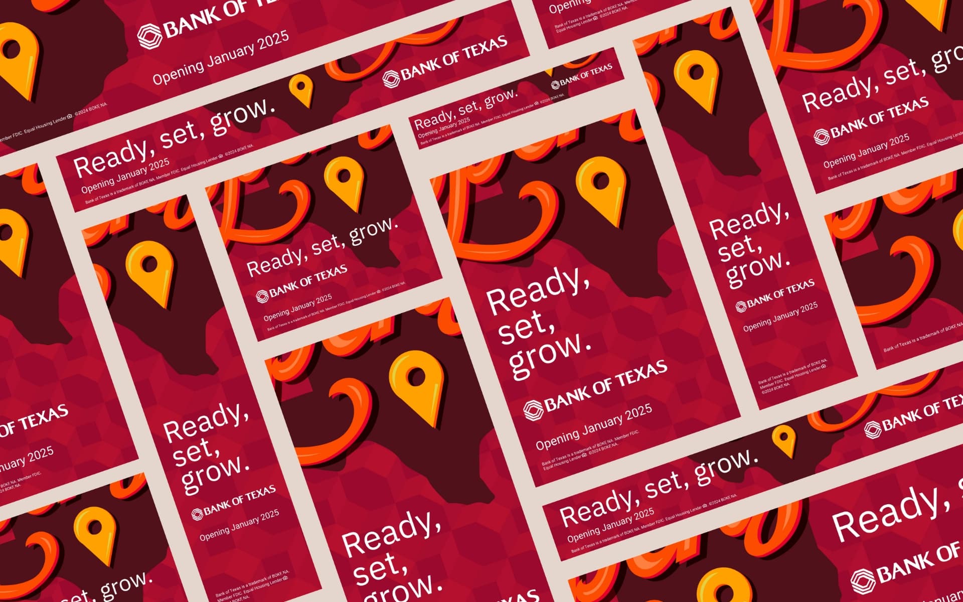
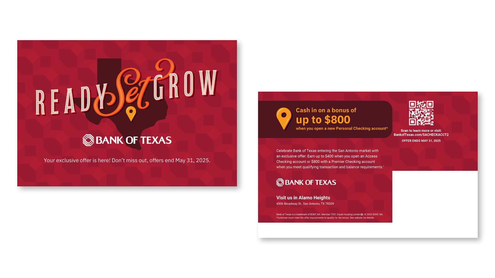
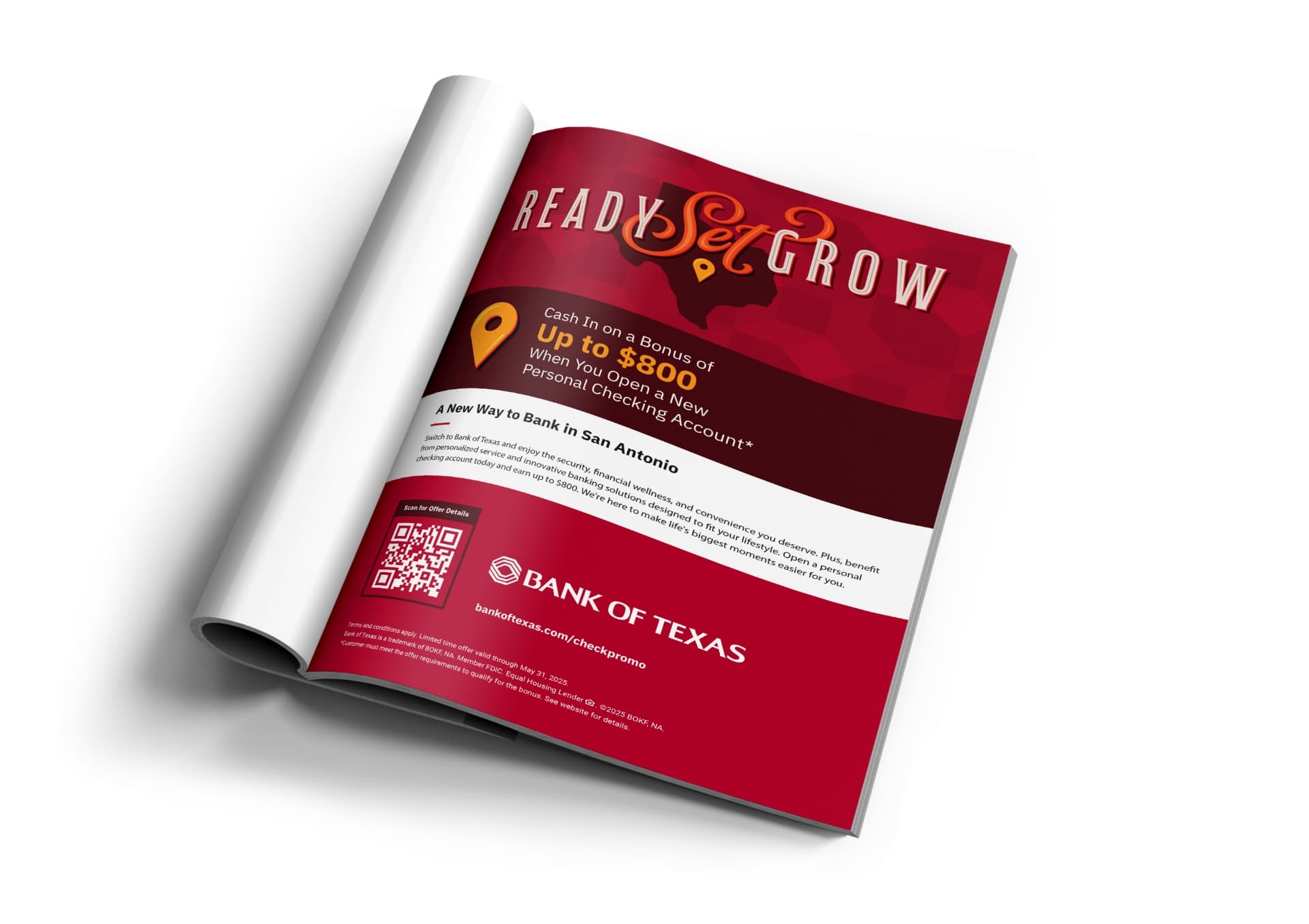
For the first time in over 20 years, Bank of Texas expanded into a completely new market: San Antonio. With a flagship location opening in an affluent neighborhood, the challenge was clear. How do you introduce an unknown bank to a loyal, established community and inspire them to switch?
Goals
Build brand awareness and establish trust and credibility
Drive consumer growth in checking/savings accounts, youth accounts, mortgage loans, and wealth management
Attract small business clients with competitive banking tools and personalized support
Win market share from competitors by promoting the benefits of switching to a more personalized, community-focused bank
Promote product offers to strengthen launch messaging and encourage customer acquisition
Strategy
The launch campaign focused on creating local relevance, building trust, and demonstrating the value of personalized banking services to different target segments. Schaefer’s strategy was to highlight Bank of Texas’s personalized approach, offering tailored banking solutions that go beyond transactional services—fostering long-term relationships. An integrated approach was planned with digital and traditional media and community partnerships to saturate the local market and build awareness across different touchpoints.
This strategy ensures Bank of Texas is perceived as both a community-centric and financially robust bank, capable of serving diverse customer needs.
Solution
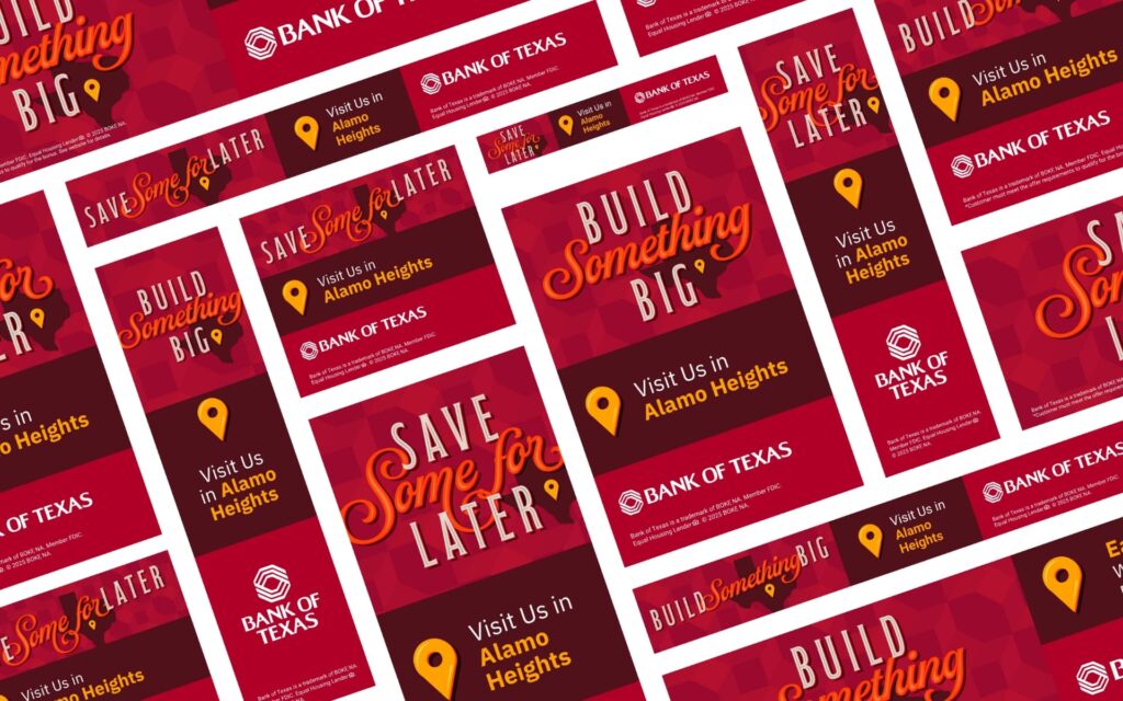
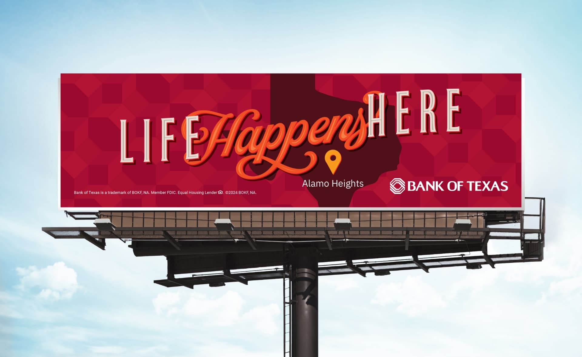
We developed a two-phase campaign strategy, beginning with a teaser phase to build anticipation, followed by a launch phase to drive awareness and encourage action. The campaign featured tailored creative for distinct audience segments, including adult consumers, Hispanic families, youth, and small businesses, highlighting Bank of Texas’s commitment to personalized services, financial stability, and strong community connections. The campaign utilized a diverse mix of media channels—OOH, digital (search, display, paid social), local publications, email, and direct mail—to ensure broad visibility and engagement with key offerings such as checking accounts, business banking, mortgages, and youth & college student accounts, with accompanying San Antonio market welcome offers. Strategic messaging, including slogans like “Ready, Set, Grow” and “Life Happens Here,” was crafted to resonate with varying consumer needs while reinforcing the brand’s commitment to relationship-driven, community-focused banking. This approach aimed to build brand awareness, establish trust, and inspire local consumers to consider Bank of Texas for both personal and business banking solutions.
Results:
$5.5MM in deposits generated within the first six months
281 new accounts opened
7.5 million impressions delivered across digital and print channels
50K+ ad clicks and 40K landing page visits with a 23.18% engagement rate
Paid Search achieved a 78.4% engagement rate and 29.6% CTR on branded keywords
Community Involvement
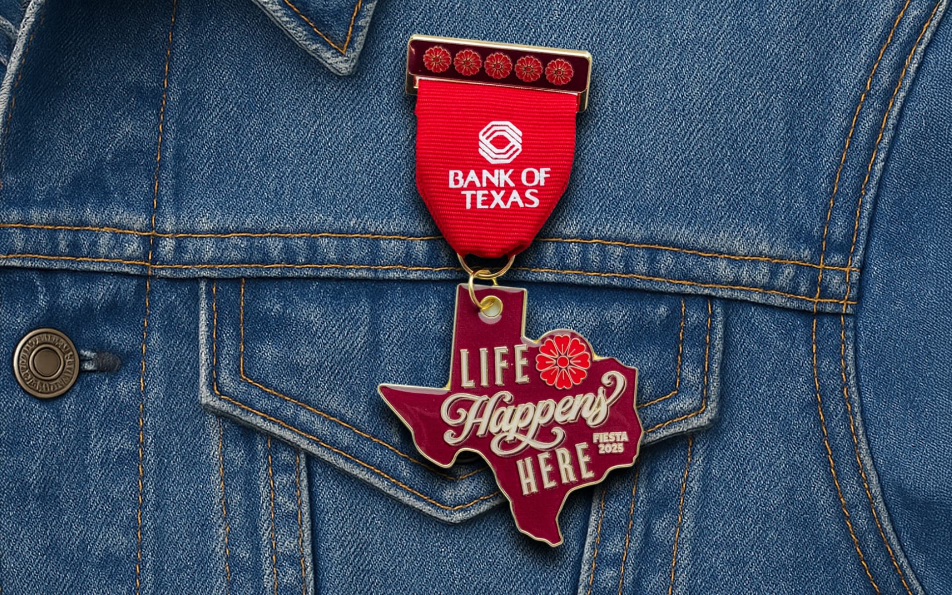
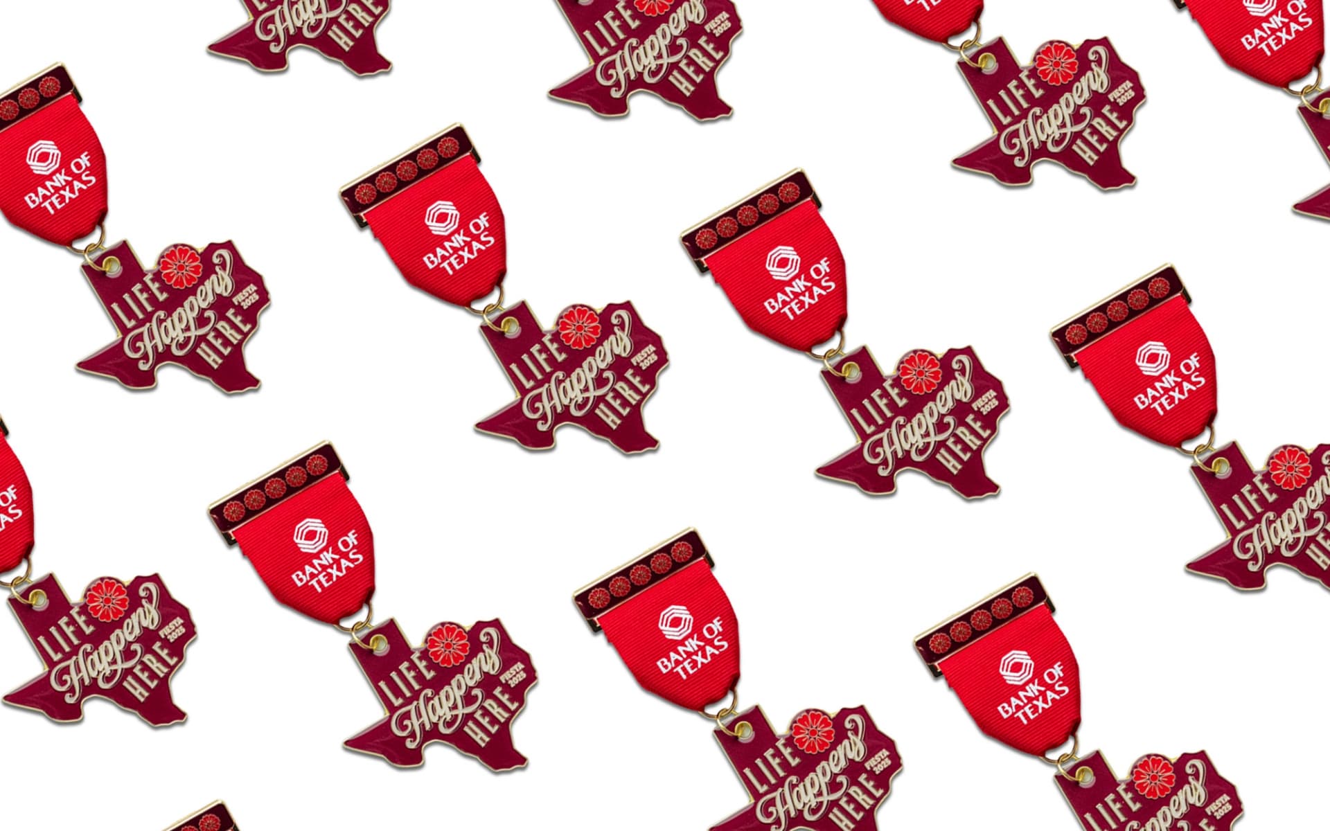
To celebrate our connection to the San Antonio community, we joined in on one of the city’s most beloved traditions—Fiesta. We designed a custom Bank of Texas Fiesta medal, honoring the colorful spirit of the festival and inviting locals to stop by, say hello, and add to their collection. It was a small token with a big impact, reinforcing the Bank of Texas commitment to showing up for the city in ways that matter—culturally and authentically.
Summary
By crafting a targeted, two-phase campaign, we successfully introduced Bank of Texas to the San Antonio market, building awareness and trust with key local audiences. Through tailored messaging and strategic media placements, the campaign emphasized the bank’s commitment to personalized services, financial stability, and strong community ties. This case study exemplifies Schaefer’s ability to create compelling, audience-centric marketing solutions that drive both brand recognition and consumer action. By engaging diverse segments—adults, Hispanic families, youth, and small businesses—we helped position Bank of Texas as a trusted, community-focused financial partner in San Antonio.
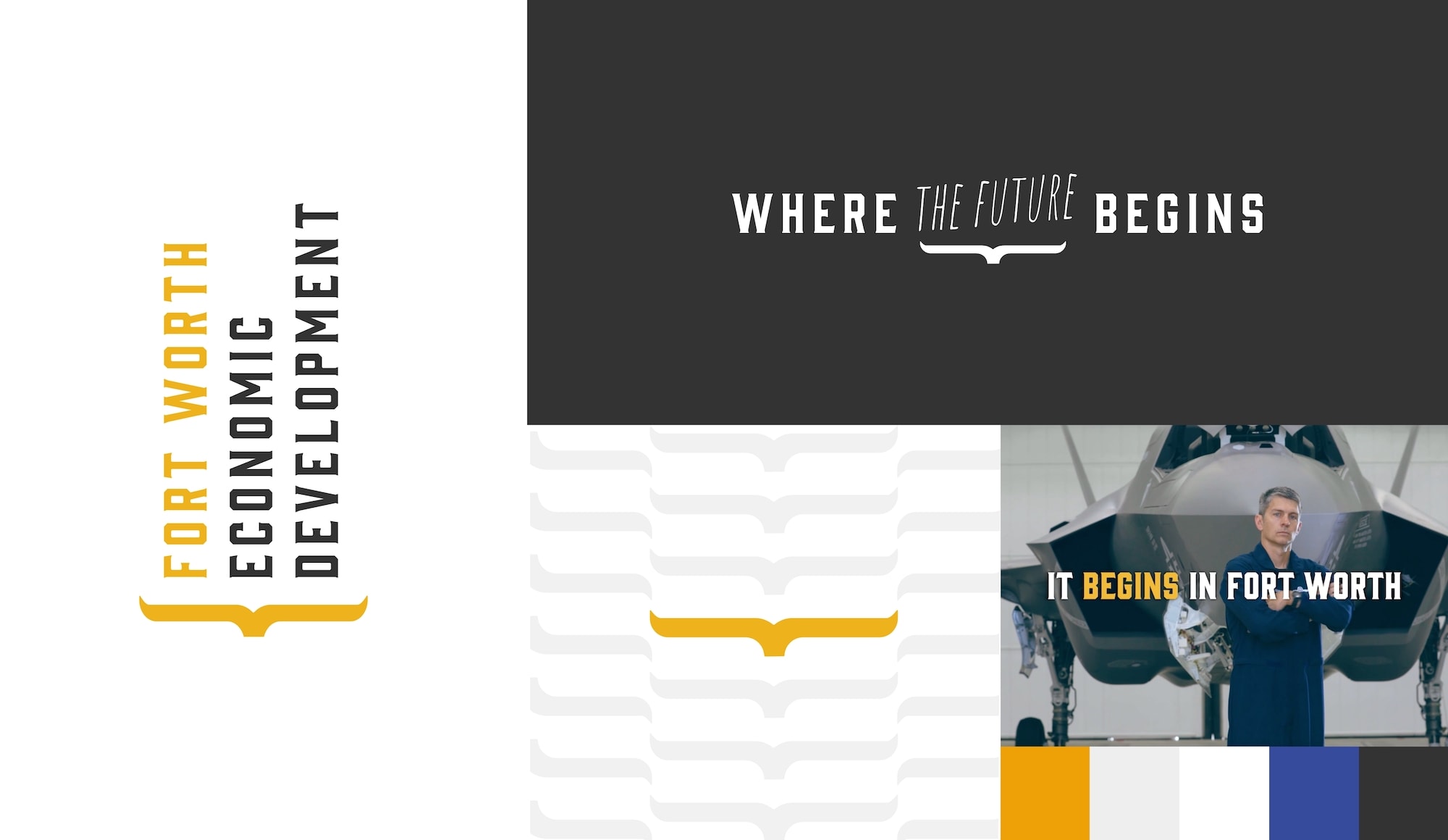
Famous for its trailblazing history, Fort Worth still embraces its reputation as a “City of Opportunity.” Quickly becoming an epicenter of growth and innovation, Fort Worth offers an inviting community, talented workforce, and incredibly low cost of living, attracting people and corporations from all over the world looking to move or expand into one of the nation’s fastest-growing cities.
The goal of every city on the rise is to attract new business and talent while strengthening the industries already established. To accomplish that, the City of Fort Worth Economic Development team selected Schaefer as the agency of record for a three-year partnership to create the city’s first-ever economic development and business attraction initiative. The partnership is part of the city’s five-year strategic plan and plays a key role in positioning Fort Worth as a place of purpose where businesses and people can leverage the city’s incredible potential to create the future they want to see.
Goals:
Establish a story that connects Fort Worth’s heritage with its future
Develop a multi-phase, multi-year campaign to drive awareness and attract new business
Highlight Fort Worth’s economic incentives and competitive edge in business, culture and community
Reach key business decision-makers to advance economic development
Elevate Fort Worth on a national and international stage
Foster collaborative conversations between key stakeholders in the public and private sector
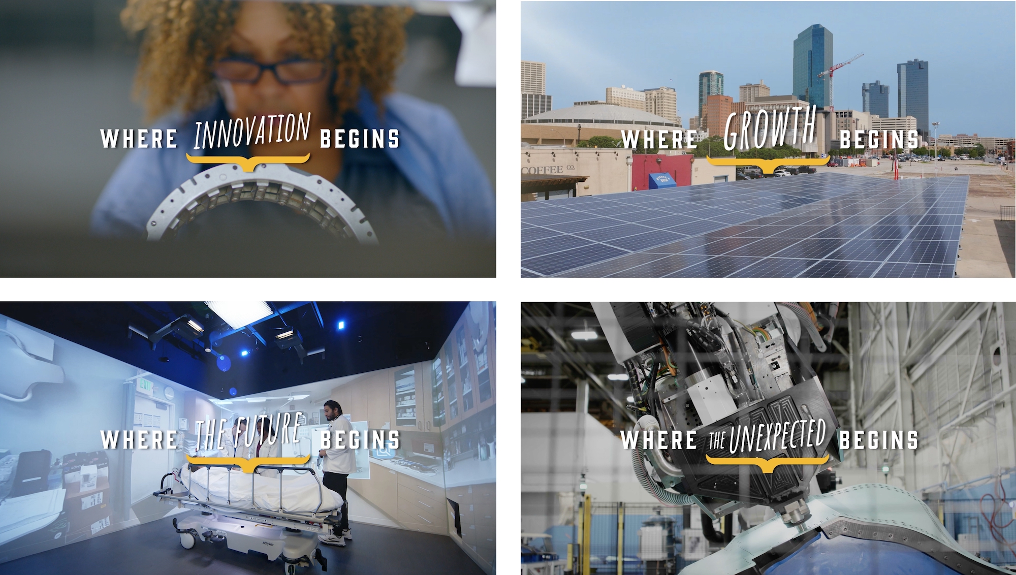
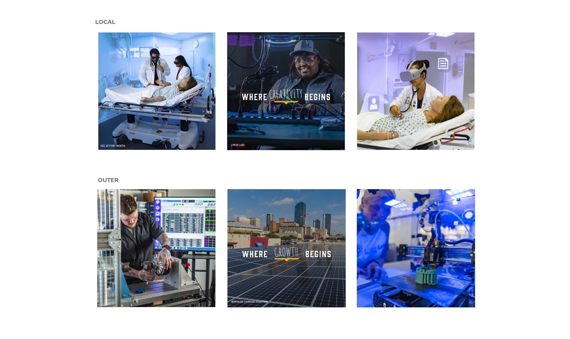
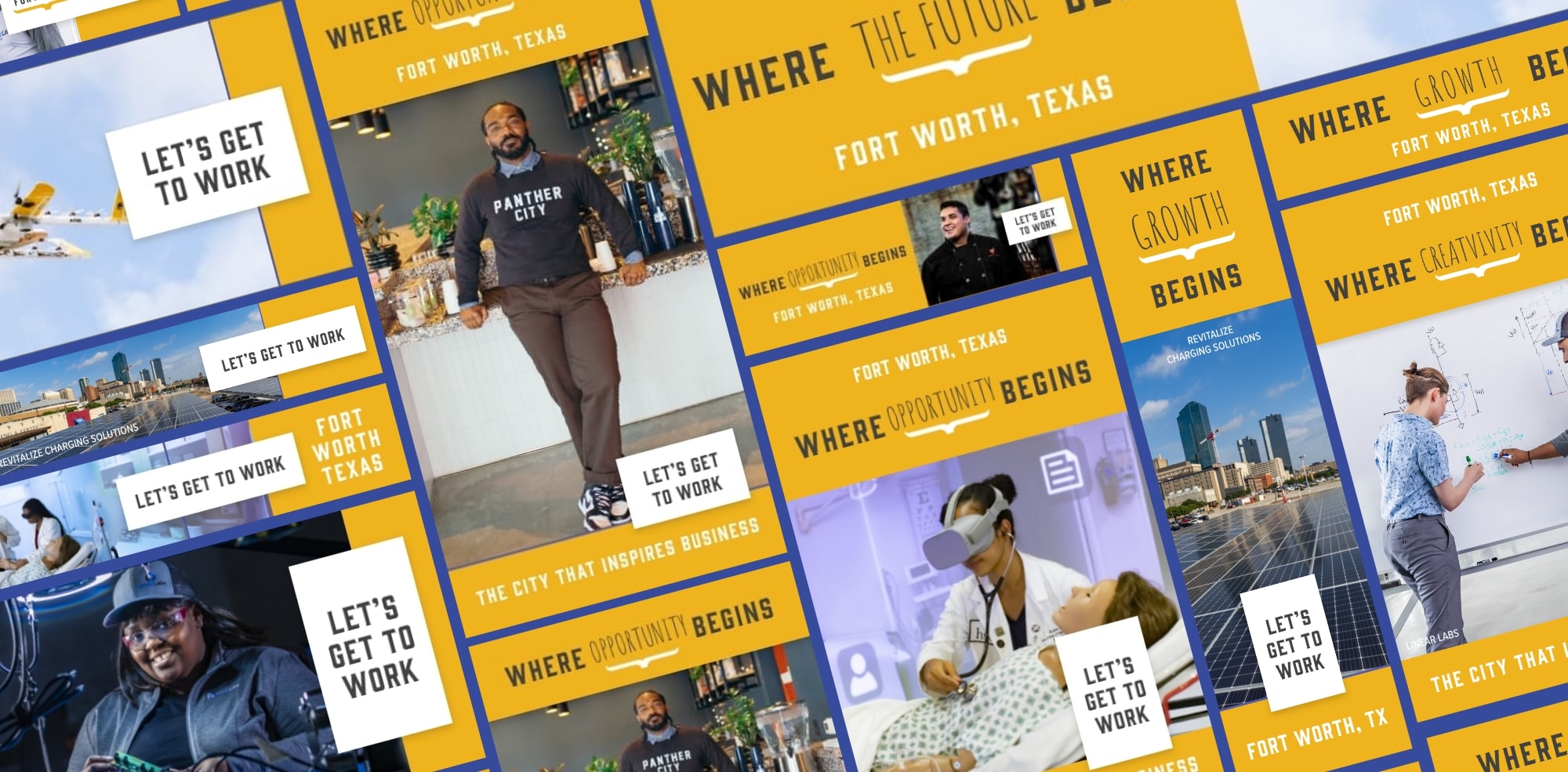
We started with a question: what makes Fort Worth and its people so unique? The answer was simple. A pioneering spirit that dated back to the 1800s and still stood strong today. As the first-ever economic development campaign for the city, Schaefer was in a unique position to lead strategy from inception.
We recognized the importance of storytelling in establishing the city’s position in the eyes of our target audiences. A good story would amplify the message, build credibility, create a strong sense of community and offer nuggets of authenticity and purpose that truly make Fort Worth stand out.
Known as the point where the west begins, Fort Worth has always promised possibility, innovation and prosperity. Unlike some of the larger, competitive cities, opportunity isn’t a new promise, it’s woven into the very fabric of Fort Worth. To communicate that, we built messaging around the idea that no matter what you’re looking for — relocation, expansion, opportunity – it can successfully begin in Fort Worth.
Building equity through identity
In order to build equity, Fort Worth Economic Development first needed an identity. We leveraged their voice, tone and values to create an independent identity that was flexible enough to work alongside the city’s existing branding, and strong enough to communicate the impact of their initiatives.
Schaefer then crafted a multi-faceted campaign that unified strategy, creative and media to promote Fort Worth’s business advantages among corporate decision-makers, site selection consultants and local business owners. The campaign further cemented Fort Worth as a city of growth and opportunity, while highlighting its competitive edge as a leader in innovation who works hard to meet the needs of the businesses who chose Fort Worth.
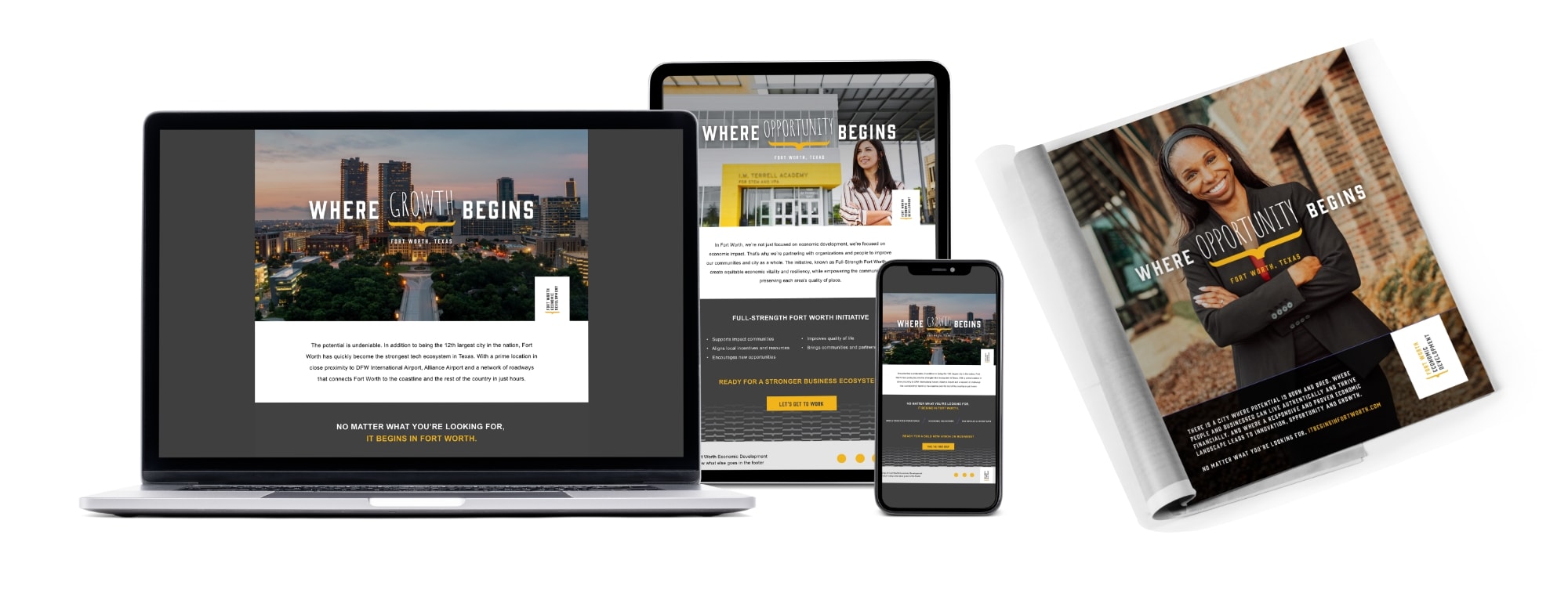
Solution: Fueling growth and connections online
Revamping the website to reflect the new brand campaign was vital to communicate key messaging. As the central platform that business leaders, stakeholders and prospective residents visit to find relevant information about the city, the website confirmed Fort Worth’s proven economic landscape with tangible proof points our audience would find attractive.
With this in mind, we included demographics, workforce statistics and other data points that leverage Fort Worth’s resources against competitor cities. A strategic mix of traditional and digital media, including paid search targeted prospects helped drive traffic back to the website. Knowing our target audience sets and strategically placing ads in places they frequented (in person and online) expanded Fort Worth’s presence on the list of key business destinations in the US.
After 8 months in market, our team identified a list of top engaged companies. The insights we gathered included a list of prospects from target industry sectors with the potential to increase the size of the labor force and generate millions in economic output for the city of Fort Worth. These key insights have helped us to strengthen our marketing approach in more specifically targeting like prospects.
Results
Overall Impact:
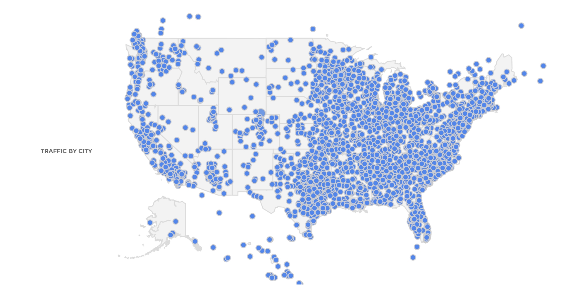
31.5+ million impressions delivered, driving substantial visibility across key target markets, including Los Angeles, Boston, Chicago, and New Jersey, yielding a very strong engagement rate of 38%.
Email Marketing Success:
1.25+ million emails were sent, contributing nearly 40% of total traffic during the campaign’s lifetime.
56% average engagement rate across email campaigns.
31,000 unique clicks generated.
14% Click-to-Open Rate (CTOR), far exceeding the industry average of 2.5%.
Digital Advertising Results:
Paid Search:
Delivered a 7.5% CTR, surpassing industry benchmarks.
Programmatic Display:
Achieved a 0.4% CTR, well above the industry average of 0.05%.
Business Outcome:
Based on these exceptional results, City Leadership approved a 50% year-over-year budget increase for a three-year campaign extension.
Fort Worth continues to receive organic recognition as a top place in the U.S. for starting a business. This is a direct result of the growing widespread awareness of Fort Worth as a great place to live, work, and do business.
Texas ranks as the best workforce in the United States for its highly educated population, high concentration of STEM workers, and robust career education pipeline. – CNBC
DFW ranks as a top U.S. market for new and expanding facilities. – Site Selection
Fort Worth ranks as the #1 Large City in Texas to start a business. It’s also the #7 Best Large City in the United States to start a business based on office-space affordability, labor costs, and five-year business survival rates. – WalletHub
According to Bisnow, Fort Worth has more than $2 billion in projects under development, marking a major milestone in the city’s economic development.
Giving Kyzatrex® renewed energy and vibrance with a new brand campaign.
Situation
More than 20 million men deal with problems related to hypogonadism, or low testosterone. Many patients and HCPs have preconceived notions about diagnosis and treatment, and tend to focus solely on sexual health benefits. But low testosterone can also contribute to health problems ranging from mild issues such as fatigue, to severe problems including obesity, type 2 diabetes, CVD and mental illness.
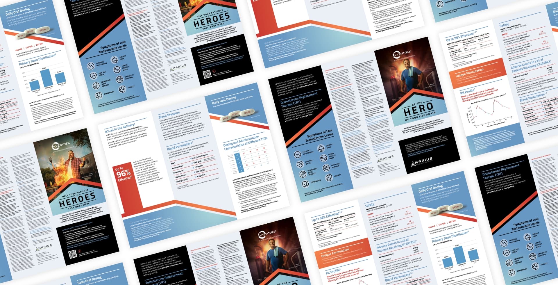
Testosterone replacement therapy (TRT) is an emerging market that still falls to the bottom of the priority list for many HCPs. Despite its prevalence and chronicity, the diagnosis, administration and management of TRT remains a complex journey that, until Kyzatrex®, only came in painful, inconvenient or messy treatment options. Kyzatrex, however, brought an innovative new approach to the market by providing the option of helping patients address this important metabolic issue with a convenient daily oral dose — a difference that HCPs needed to be aware of.
Goals
Create a campaign that “cuts through the clutter” of prescriptive testosterone patches, gels, pills and injections
Develop brand messaging that resonates with both consumers and healthcare providers
Boost brand awareness rapidly
Establish metrics for gauging the success of the campaign
Strategy
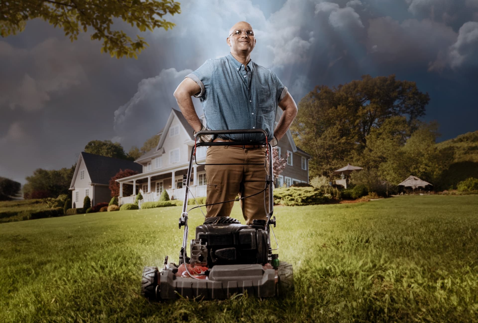
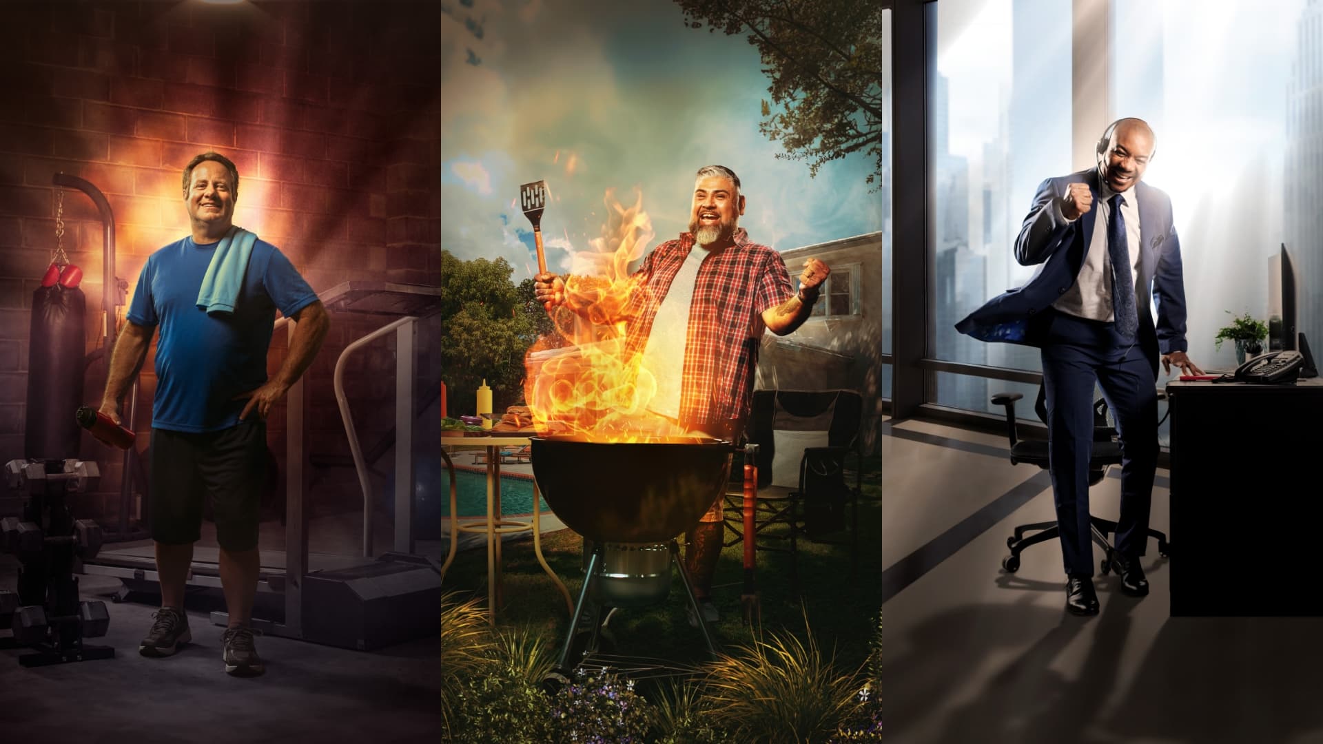
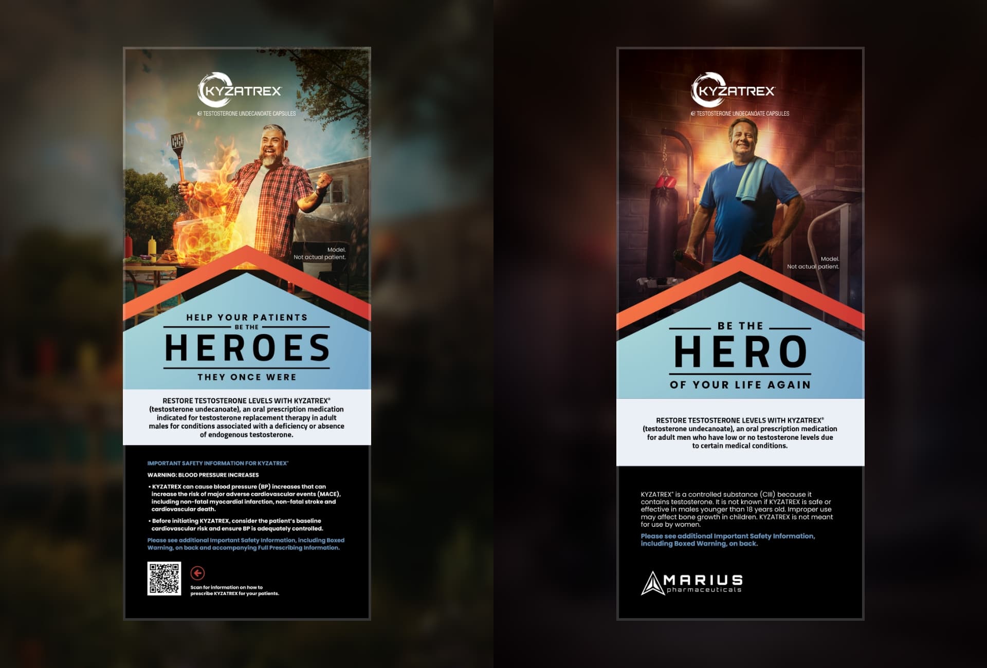
Because HCPs and patients alike primarily equate testosterone primarily with sexual health, Kyzatrex needed to change the conversation. Research provided insights and understanding of the target’s mindset that led to a revelation: Kyzatrex delivers the total package — convenience and a therapeutic option for a critical metabolic health issue. More importantly, Kyzatrex helps HCPs and patients make more of their everyday lives and activities.
We tapped into the truth around this once mysterious condition and chose a path that took the emphasis off of sexual health. Instead, we turned the spotlight on how TRT impacts a patient’s everyday tasks. Through our creative approach, we made men heroes of their lives again, elevating the mundane into heroic feats. We engaged HCPs with images as dynamic as movie posters, glorifying the way the daily grind can actually be heroic when their patients feel like themselves again. And, with meaningful clinical data to back it up, we ensured the HCPs would be heroes, too.
Turning the ordinary into the extraordinary. Making mundane moments memorable. Framing the everyday as heroic. In short: Changing the conversation.
Results
Within a quarter of launching a bold, attention-grabbing campaign that used print, collateral, digital and social channels, the client was able to rapidly grab attention — and secure results. Among them included:
Generating a rapid spike in prescriptions
Inking a number of high-profile clinical agreements
Establishing an important co-marketing relationship with a leading telehealth company
Summary
The more competitive a market or communications space becomes, the more crucial it is to find ways to elevate a brand above the noise and clutter. In this case, a breakthrough shift to a differentiated brand personality embraced bigger, bolder graphics, allowing Kyzatrex to do exactly that. It also effectively engaged patients and HCPs in a highly human-centric way, positioning the client for greater success and to secure a larger share of this growing market.
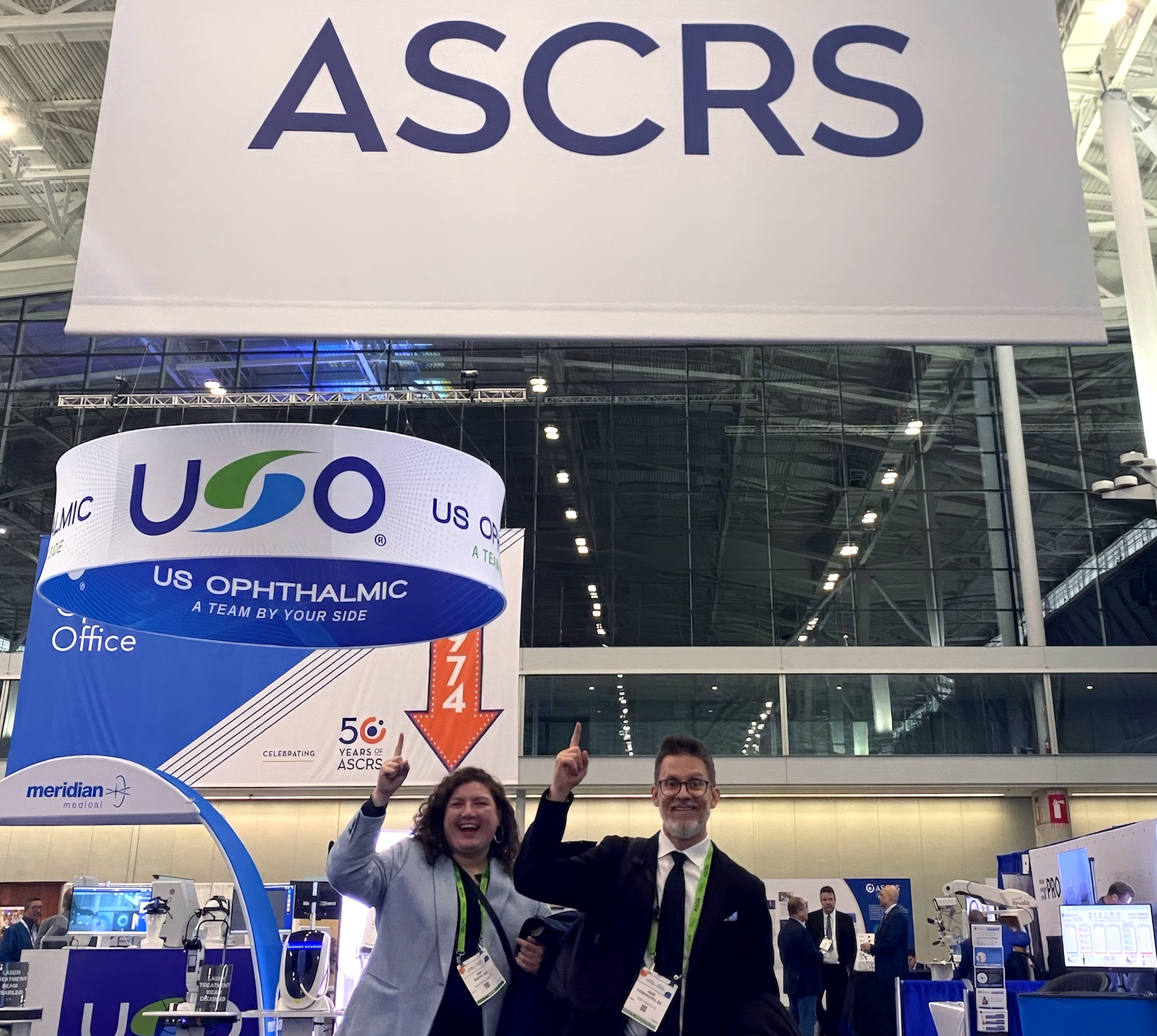
To paraphrase an old advertising slogan, neither rain, nor sleet, nor wind, nor snow would keep the American Society of Cataract and Refractive Surgeons (ASCRS) Annual Congress down.
ASCRS just ended in Boston and despite the cold weather, the meeting itself was as dynamic as ever. Schaefer was there in full-force to support the great relationships we’ve built and to make new connections.
As we walked the show floor, interacted with countless professionals and navigated the all-important ad hoc gatherings after hours, we did what we love to do. We observed, questioned, debated and thought about strategic direction and how it can help our clients succeed.
We wanted to share our top 10 takeaways from 2024 ASCRS for those of you in ophthalmology. (For our non-ophthalmology clients, we’ll suggest ways these observations may impact you):
1. The anterior segment is getting crowded
From the cornea to the cataract, there continues to be an inspiring number of innovations in this space. That comes with a second edge: competition — especially in glaucoma — is more fierce than ever.
If you’re not in eye care, are there areas in your market that are equally crowded? What is your vision for differentiation?
2. PCIOLs are seeking narrower slices of blue sky
Entering the IOL market as a challenger requires defining a thinner slice of uniqueness than ever before. That said, the adjustable lenses being launched are very distinct and it will be interesting to see what effect this has on the market going forward.
3. Posterior segment energy
Where the anterior segment is approaching saturation, judging by the energy of innovation in Eyecelerator and other sidebar conversations, there seems to be a lot of momentum growing in the posterior segment. As the population ages and retinal procedures grow more prevalent, the industry is clearly positioned to deliver meaningful options.
You non-ophthalmology friends, where does your category present blue ocean possibilities?
4. Corneal health concentration
It’s always been important for ophthalmology, but the attention paid to corneal health devices and products seemed greater in 2024. Osmolarity (looking at you trukera-medical), inflammation, dry eye and regenerative products are just scratching the surface (pardon the pun) of what Schaefer saw.
5. Meeting momentum
A purely anecdotal observation, but the exhibit space seemed less extensive than in years past. That being said, the overall energy at ASCRS was extremely healthy! With less outward activity emanating from the show floor this year we can only imagine what was being discussed behind the curtain and in the sidebar meetings. The anticipation of what’s coming has us ready for a wave of innovation and launches in 2025.
6. Inclusion emphasis
With the evolution in the industry’s gender balance continuing to shift (one booth even celebrated “the women of ophthalmology”) and ASOA’s vital diversity workshop, ASCRS is making worthy strides. The journey is still long but the trend is moving in the right direction.
How is your industry evolving if you’re not in ophthalmology? Where can it improve?
7. Goodbye sea of blue
We’re an advertising agency. We have to speak to the design trends we saw. After all, the battle to stand out is won and lost, in part, with good design. We definitely saw the rise of purple. And, there are a lot more companies using gradients in their designs.
8. Surprises in small places
It’s always fascinating to see what the big exhibitors do, but often there is a gravitational pull with the smaller spaces, too.
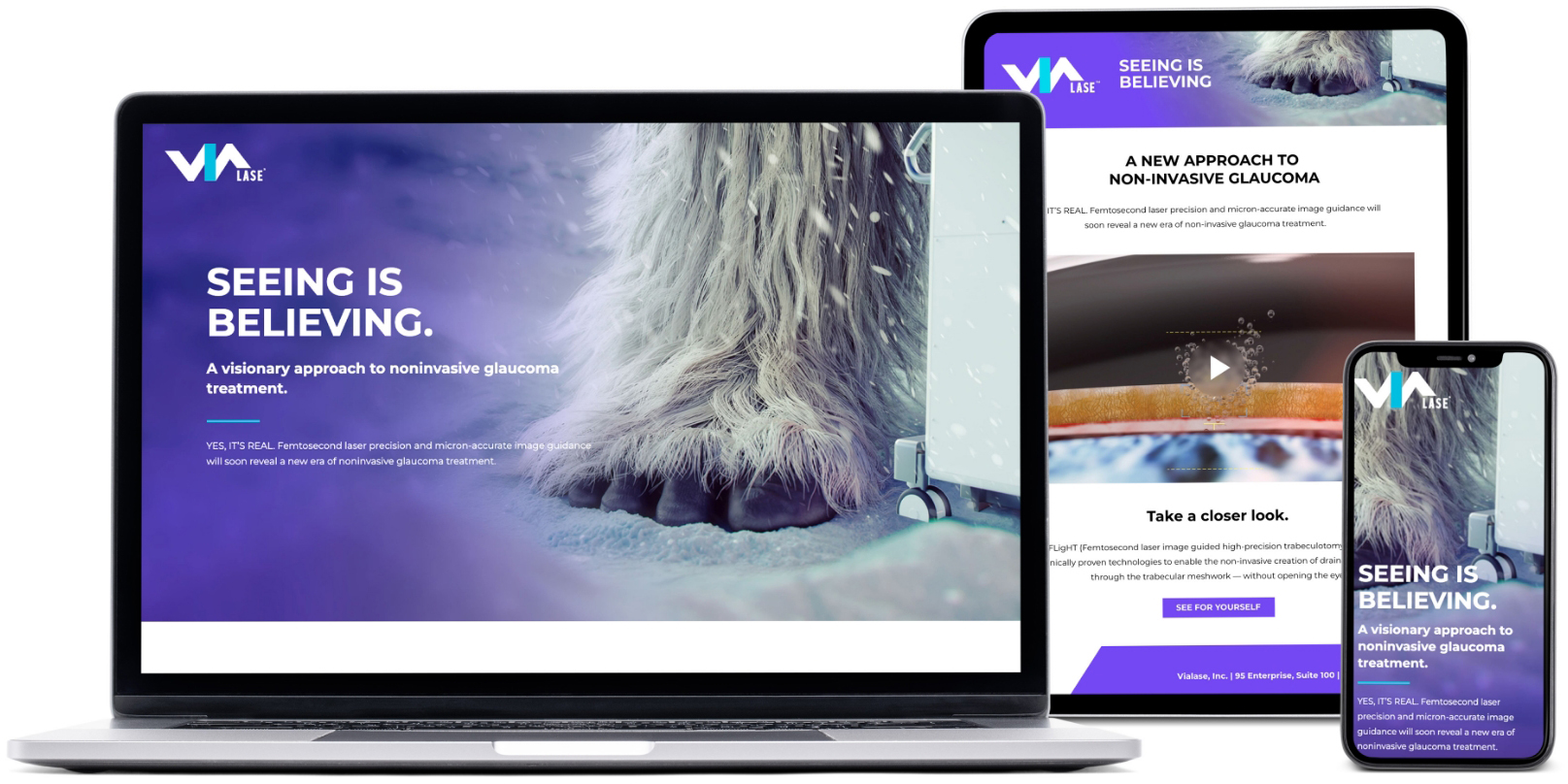
We’re biased, but our friends at ViaLase made a savvy decision to place their booth across from the conference “Tap Room.” The innovation they showcased and the arresting booth design (humble brag) kept that space hopping all weekend long.
Beyond a self-serving ViaLase plug, we also saw inspiration in any number of small spaces like Nordic Pharmaceuticals’ booth the ASCRS 50th anniversary celebration via a booth replicating a practice from 1974 (thanks in part to our friends at Alcon) and the fascinating startup technologies in AI-driven practice management tools.
Are you not an eye-care company but still a challenger brand? How do you use small spaces to make a big impression?
9. Access is no longer an afterthought
Reimbursement is more important than ever. And it showed in both overt and covert ways. The most successful products and product managers will consider strategies around access and the value story in conjunction with all other components of their business plans.
This is undoubtedly true beyond the ophthalmic space. Where is your industry finding success with this vital healthcare commercialization need?
10. Visualization sophistication
If this ASCRS is any indication, the profession is in for some meaningful transformation in the next few years. The adage that you can’t treat what you can’t see may need to be updated. You can see more than ever, now what should you treat?
The thread running through all of this — both the experience of the meeting as well as the takeaways — is that connecting as humans is what matters. The ophthalmic industry is a collection of amazing thinkers making a meaningful difference in patients’ lives. But it doesn’t happen if we don’t connect. At Schaefer, we’re proudly not healthcare specialists, we’re human specialists. We know how to find an emotional resonance that connects people with people, and that’s what makes life better.
If you’d like to put that perspective to work for your brand, drop me a line!
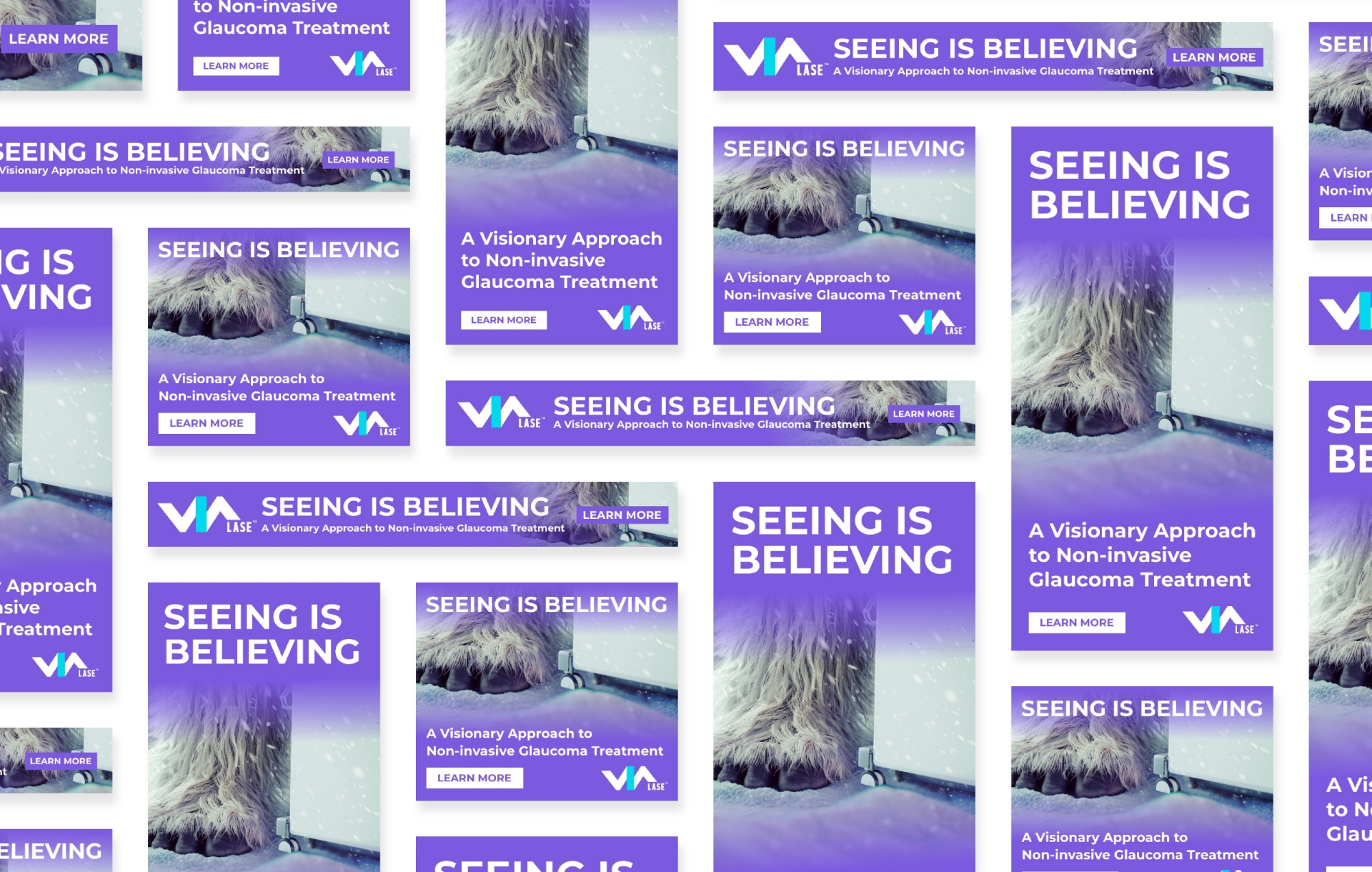
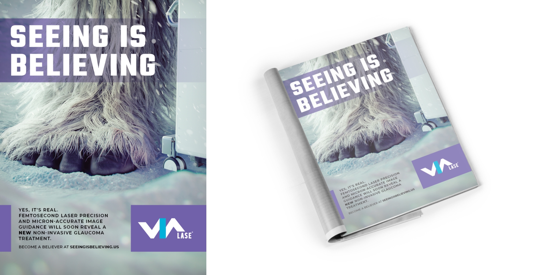
Within the eyecare industry, the idea of interventional glaucoma treatment has been categorized as an elusive myth for years. ViaLase developed a game-changing system designed to leverage two proven technologies to create a new, non-invasive approach to glaucoma. When this new system is approved by regulatory agencies, the myth will finally become a reality. Therefore, our client needed a campaign that would create attention and support a successful launch of the new concept.
Goals
Develop materials needed for a successful brand launch
Develop a highly visible campaign that would cut through the clutter of a crowded market
Rapidly generate brand awareness
Explain the fundamental technology behind the device
Solicit interest and inquiries from qualified leads
Provide meaningful measurements of the campaign results
Strategy
Schaefer Advertising responded with a showstopping, attention-grabbing campaign that used teaser imagery of a Sasquatch, or “BigFoot”, creature to convey that the “mythical creature” was finally here – and real. The sheer uniqueness of the concept was a huge and dramatic departure from the cold, clinical ads embraced by other players in the industry.
Solution
An integrated campaign was launched that included paid search, organic social, email, and digital display on well-known industry publications and websites. Each medium enabled the client to tell its story and document the response rates as viewers clicked through for downloads, demos and landing-page visits.
Results
By leveraging paid search and strategically-chosen publication placements (such as newsletters, e-blasts, ROS banners, and sponsored social posts), the campaign achieved noteworthy results within the first three months of launch.
Website tracking identified 98% new site visits, with an impressive 53% engagement rate
High clickthrough rates
And, most importantly, awareness started with a bang, with healthy responses from an elite and highly-qualified audience of eyecare and glaucoma specialists
Sessions
15,864
New Users
13,771
Pageviews
17,130
Engagement Rate
53.42%
Summary
The launch campaign accomplished its primary goal of driving brand awareness among surgeons for ViaLase and its innovative design. And, in addition to gaining insights into paid search performance, the client began to forge strategic partnerships with leading industry publications. The geographic spread and engagement metrics highlight the campaign’s effectiveness in reaching a qualified audience, setting a strong foundation for future marketing efforts.
Overall, the campaign was another example of Schaefer’s ability to combine solid knowledge of healthcare markets and attention-grabbing creativity to tell a cohesive and relevant brand story.
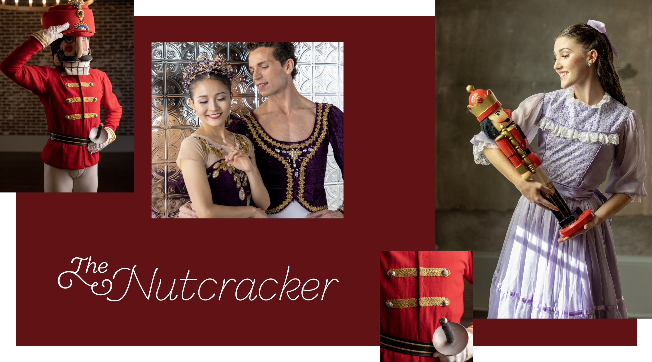
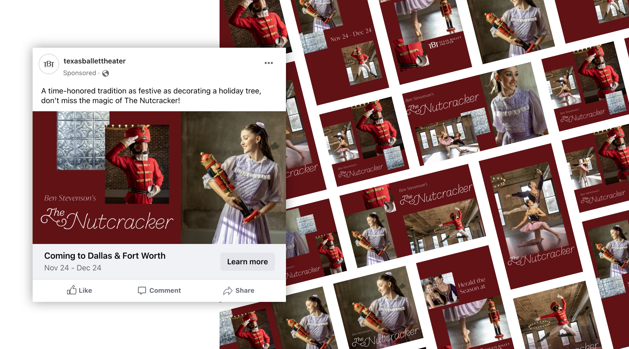
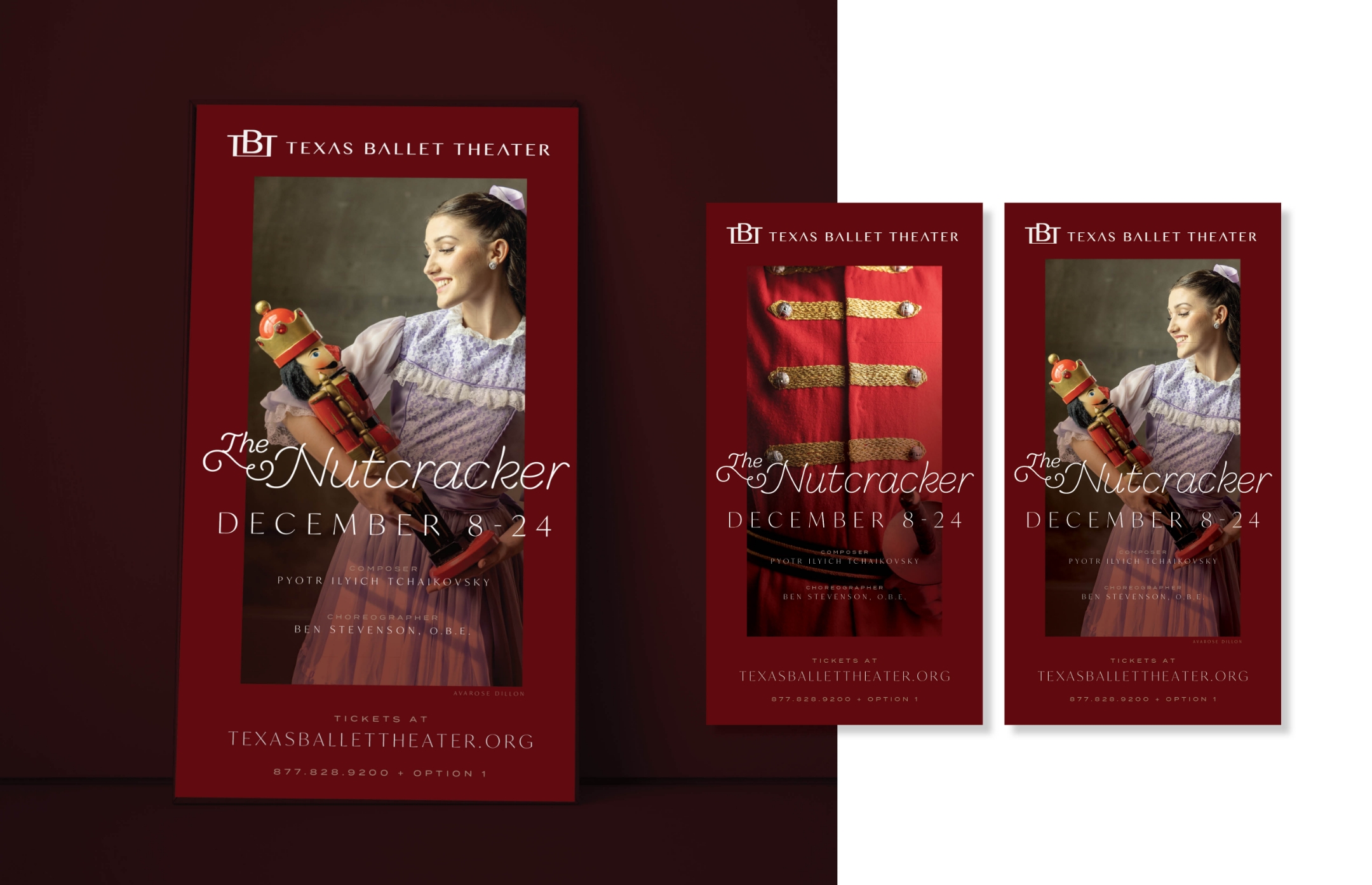
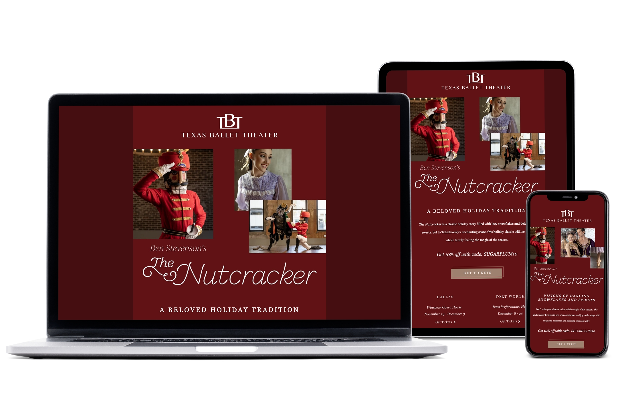
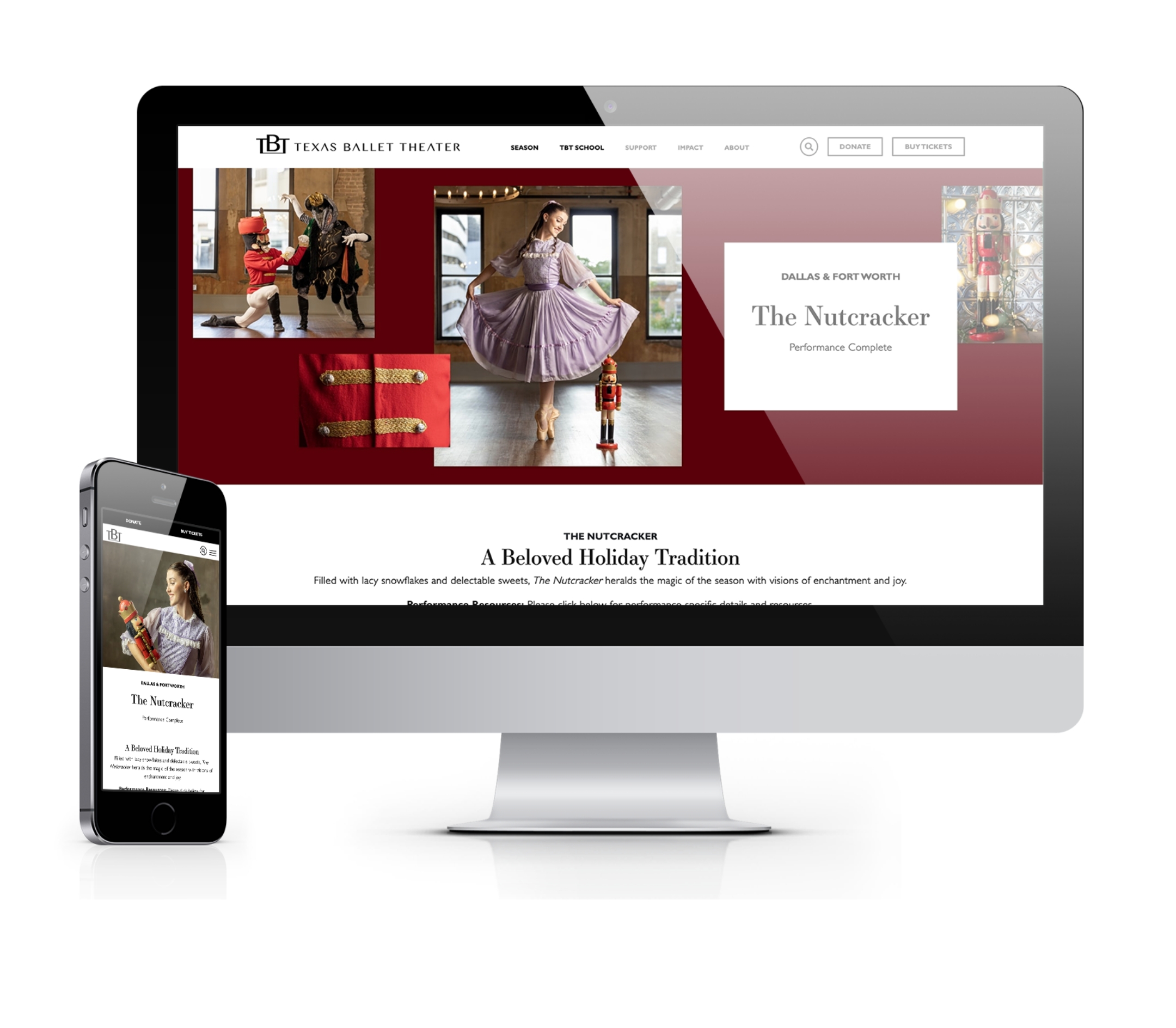
The Nutcracker ballet is a timeless performance that has delighted audiences for more than a century. Over time, it has cemented its place as a beloved holiday tradition and one of the most popular ballets of all time. Each holiday season, Texas Ballet Theater (TBT) stages 35 performances between Dallas and Fort Worth, which sets the tone for ticket sales throughout the season. For some ballet companies, sales from The Nutcracker make up more than 85% of a company’s ticket revenue for the season. While its popularity makes it easy to sell performance tickets, The Nutcracker also creates a unique opportunity to attract a broader audience to experience the art of ballet.
As the agency of record for the past six years, Schaefer Advertising has helped TBT increase ticket sales year-over-year to make The Nutcracker a revenue powerhouse. Fresh off a record-setting year in 2022, TBT increased its goals for 2023.
To meet the new goal, our team acted quickly to implement new optimizations that leveraged our current campaign assets, made strategic recommendations for TBT-owned channels, and proposed a few incremental options to get in front of new attendees. A peak-valley-peak approach to paid search led to higher revenue for lower costs, making paid search a key driver of conversion revenue. The coordinated email marketing campaign launched in late November ranked second in revenue generation.
Results
The Nutcracker campaign concluded its 2023 run with record-breaking revenue and ticket sales, surpassing each previous year’s revenue and 2023 goals for both Dallas and Fort Worth. Total revenue closed at 120% to goal, with online sales specifically growing revenue by over 30% from last year.
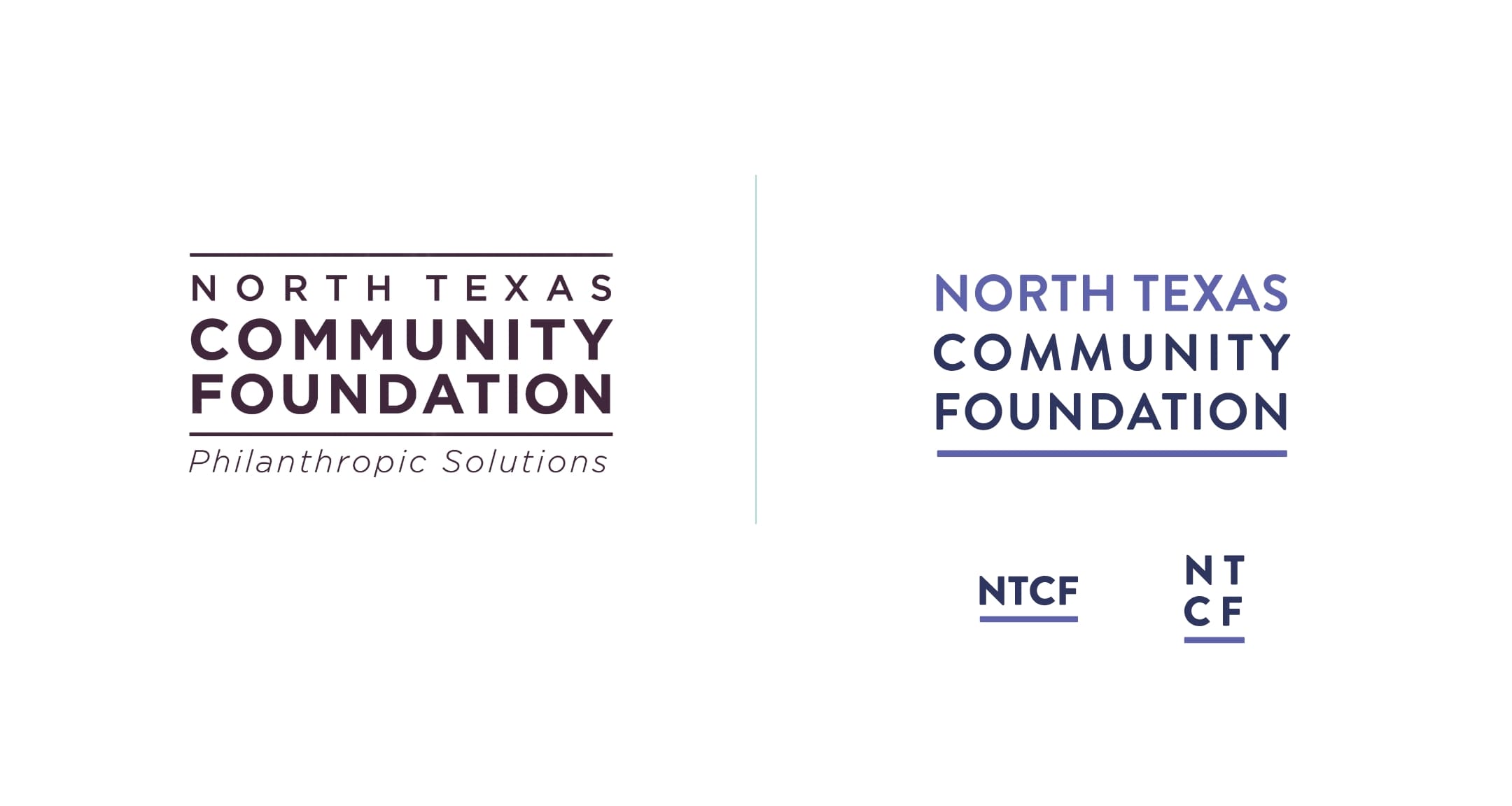
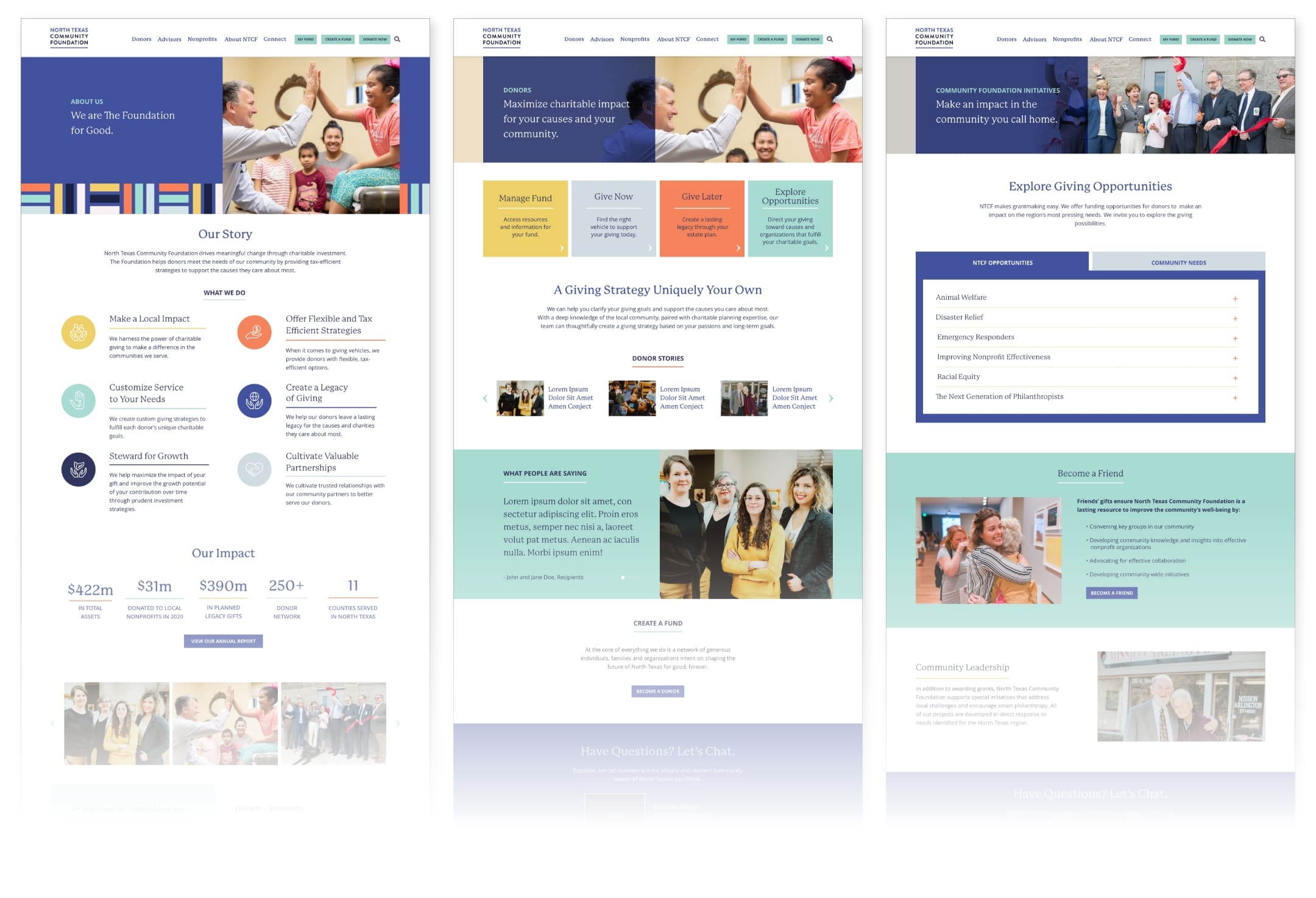
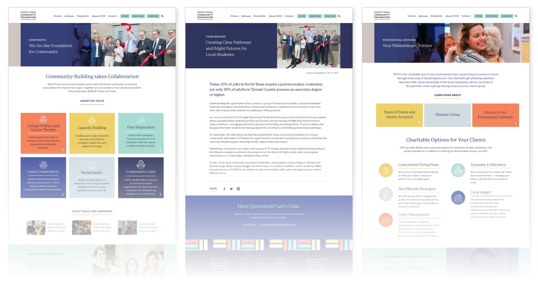
The North Texas Community Foundation (NTCF) is a Fort Worth-based philanthropic organization committed to driving meaningful change through charitable investment in North Texas. With a strong reputation, deep community knowledge, and tailored services, NTCF helps high-net-worth individuals structure their philanthropic giving for immediate impact and long-term legacy.
Challenge
As a central figure in the community with a wide range of audiences and causes, NTCF needed a way to articulate their offerings to specific audience sets with very different wants while positioning their own brand for growth. In addition, they needed to improve their user experience online to better meet the demands of visitors.
Tailoring the message
NTCF is beholden to not one but three separate audiences – fundholders who support charitable giving, professional financial advisors whom NTCF partners with to manage donor funds, and nonprofit leaders who leverage grants and gifts to proactively respond to the needs within the community. While the driving purpose and service offering are the same across all partners and clients, it’s crucial to shape messaging around the intended audience.
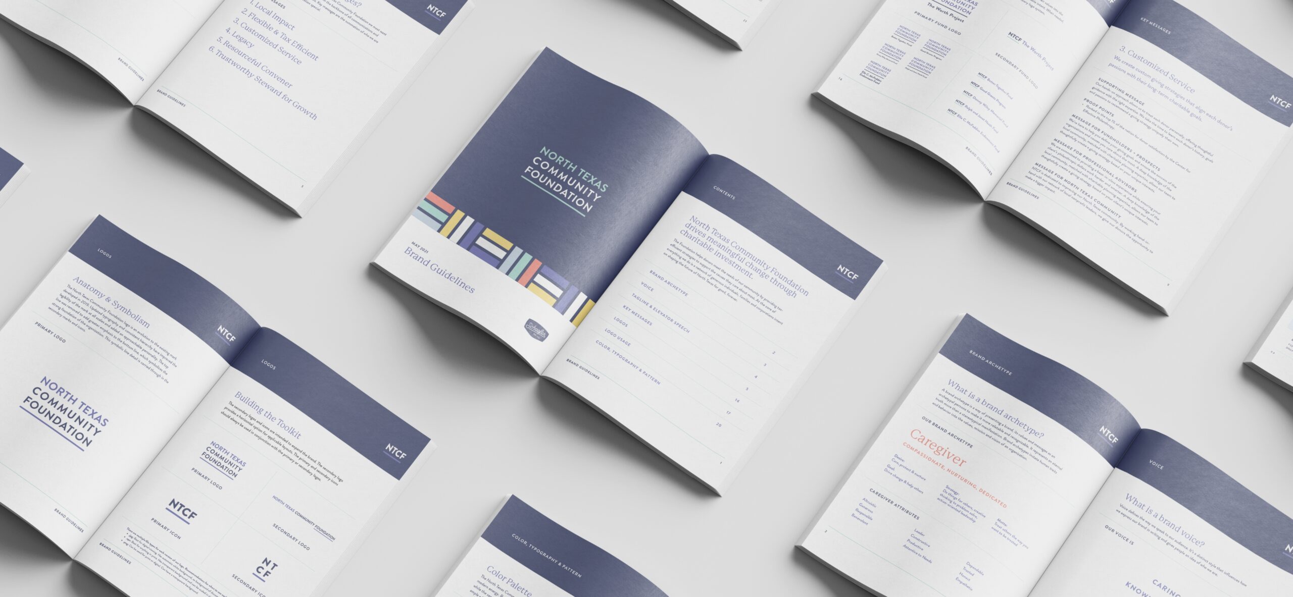
We started the process by first establishing a brand archetype – NTCF is a Caregiver – and letting that lead to a clear and compelling brand position and purpose. This step helped cement NTCF’s mission to drive meaningful change, unify the internal team and motivate all partners to advance toward a shared future. Next, we tailored key messages to resonate with the distinct needs and priorities of each audience. From cross-functional partners to clients and community stakeholders, brand messaging is tailored to the unique perspectives of each audience.
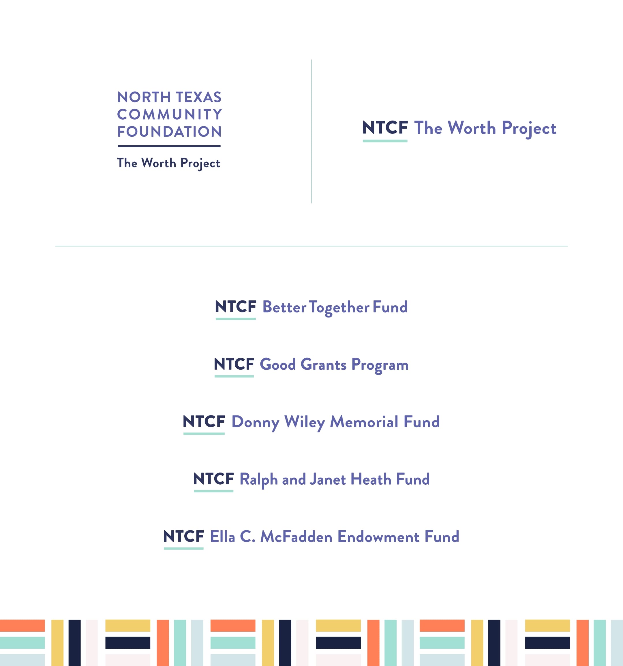
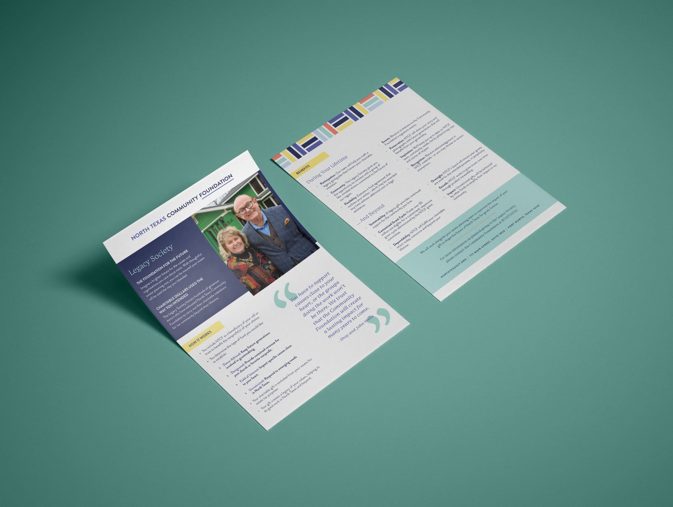
Design with a growth mindset
To further illustrate the Caregiver archetype, we evolved the brand identity to better mirror the trust, support and service NTCF is known to provide. From logo to photographic styling, we created a comprehensive design system that perfectly encapsulates the brand’s dynamic service offering. The vibrant yet strong color palette features navy, periwinkle and complementary shades of yellow, orange and blue to balance optimistic and approachable with the more intuitive and assertive sides of the NTCF brand. In addition, we expanded creative assets to offer more versatility and the ability to grow with the brand.
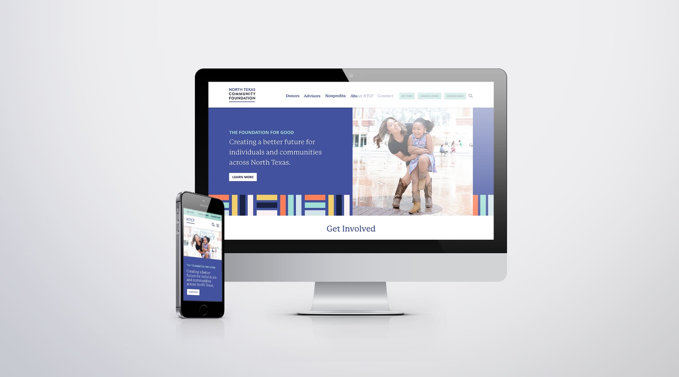
Creating a seamless experience
A website acts as a front door to your organization, and NTCF could benefit from a more inviting user experience. The previous website structure was dense and the navigation was choppy, leading to confusion and cognitive overload for site visitors. On the back end, employees lacked the ability to easily create, modify and publish content.
To provide current and potential fundholders with an enhanced experience, we restructured the new site to reduce page count, minimize clicks and better guide visitors to the information they were seeking. We also developed a custom content management platform, empowering the internal team with the tools needed to edit and manage their site without extensive coding knowledge.
Results
Developing an impactful brand strategy and tailoring every message to suit the intended audience allowed NTCF to better communicate their purpose and address a multifaceted branding challenge from a foundational level. The new brand identity also aligns each audience with the overarching vision of NTCF and positions the brand for success and growth.
A more intuitive website improved the user journey while empowering the internal team with the ability to easily develop and manage brand materials and content. When compared to the previous year, the new website saw outstanding results:
28% increase in visitors
7% reduction in bounce rate, illustrating users found the site more relevant
21.7% increase in page views, indicating stronger user engagement post site launch
Data measured from Feb 2021-Aug 2021 and Feb 2022-Aug 2022.