On the heels of back-to-back Best of Show Awards, the Schaefer Team was honored with 29 awards, including 11 Golds and two Special Judges Awards at the local 2016 American Advertising Awards – proving that great creative and great results for clients is not mutually exclusive. The winning work demonstrates a broad range of creative depth across a wide range of clients including: Fort Worth Zoo, Mouser Electronics, City of Hurst, TTI Electronics, Botanical Research Institute of Texas, Fort Worth Creative Cooperative, TCU Athletics, Cassco Development Company. Additionally, Schaefer was recognized for several self-promotion pieces as well as work done for the 2015 American Advertising Awards. UPDATE: Regional results are in! Schaefer won big taking home 2 Gold, 2 Silver and 2 Bronze. Now on to Nationals, our fingers are crossed for another win. (Remember our National win for Zoo Ball last year?)
Gold ADDY Award &
Regional Gold ADDY Award
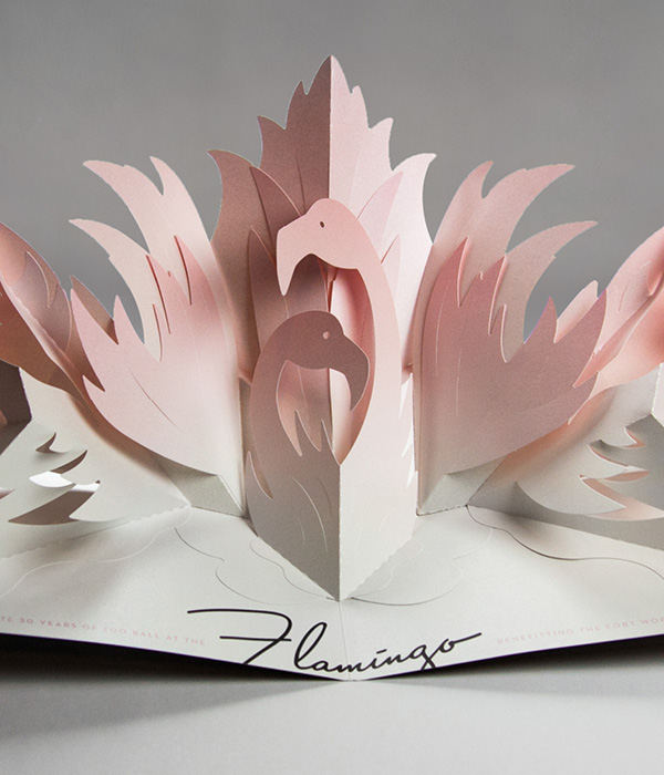
Project: Zoo Ball Client: Fort Worth Zoo
A pop-up invitation for the Fort Worth Zoo’s annual gala event, Zoo Ball, to raise money in support of the zoo’s ongoing mission of conservation. View Work
Gold ADDY Award &
Regional Silver ADDY Award
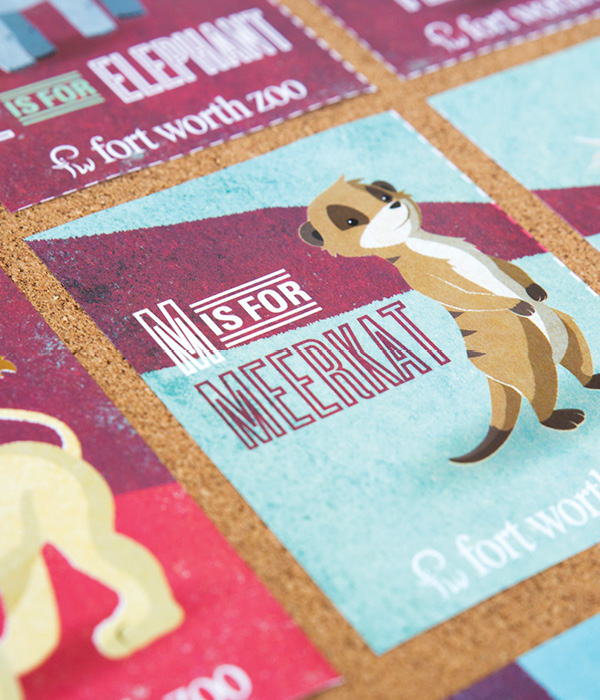
Project: Zoo Preschool Client: Fort Worth Zoo
An illustrated campaign and series of animal flash cards for the preschool program at the Fort Worth Zoo. View Work
Gold ADDY Award &
Regional Bronze ADDY Award
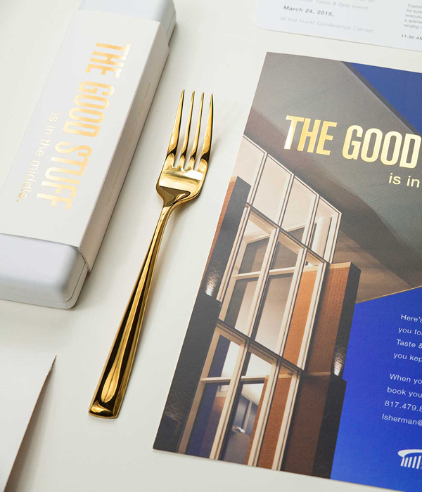
Project: The Good Stuff Client: Hurst Conference Center
A direct mail campaign and invitation to the Hurst Conference Center’s tasting event for local planners. View Work
Gold ADDY Award
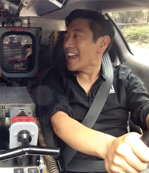
Project: Empowering Innovation Campaign Client: Mouser Electronics
A campaign for Mouser Electronics centered around engineering and ingenuity through a partnership with spokesman Grant Imahara. View Work
Gold ADDY Award
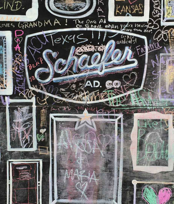
Project: Arts Goggle 2015 Client: Schaefer Advertising Co.
Created a 10ft x 40ft chalkboard and encouraged community participation for the annual Arts Goggle event on Magnolia. View Work
Special Judges’ Award: Design
Zoo Preschool
Gold ADDY Award
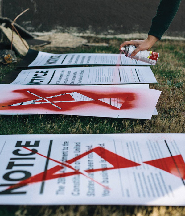
Project: Amendment 28 Campaign Client: AAF Fort Worth
A campaign centered around the passage of Amendment 28, which outlawed advertising and promote entries to the local ADDY Awards. View Work
Gold ADDY Award
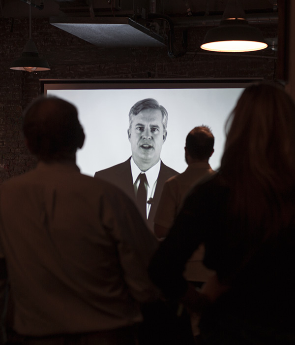
Project: Submission Protocol Video Campaign Client: AAF Fort Worth
Video campaign showing proper protocol for the disposal of advertising and entry into the local ADDY Awards. View Work
Gold ADDY Award
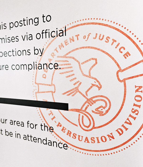
Project: Amendment 28 Logo Client: AAF Fort Worth
Logo for the Department of Justice Anti Persuasion Division, the agency responsible for the enforcement of Amendment 28. View Work
Gold ADDY Award &
Regional Bronze ADDY Award
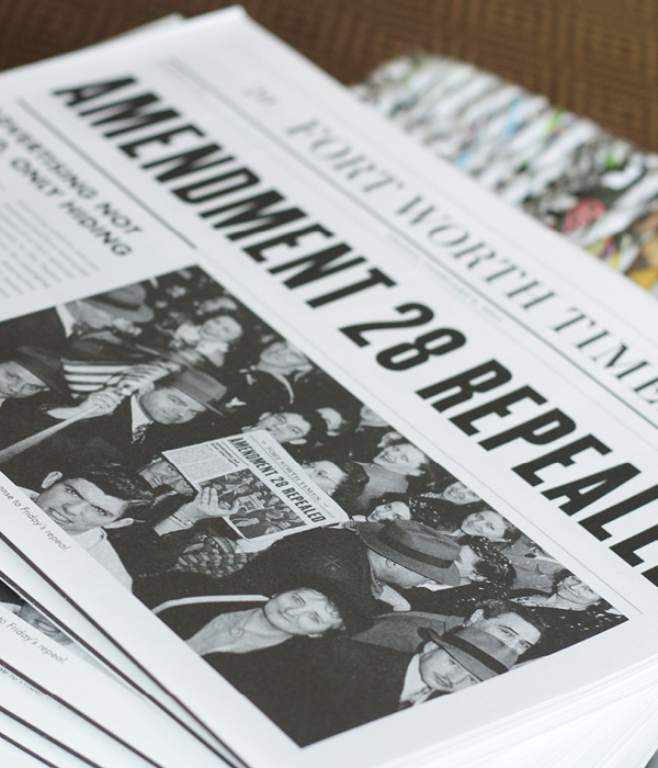
Project: Winners Book Client: AAF Fort Worth
Newspaper style book announcing the repeal of Amendment 28 and showcasing the 2015 Fort Worth ADDY winners. View Work
Gold ADDY Award
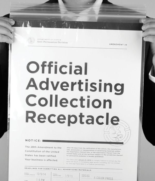
Project: Official Advertising Collection Receptacle Client: AAF Fort Worth
Government packaging for the collection of illegal advertising and ADDY entries. View Work
Gold ADDY Award
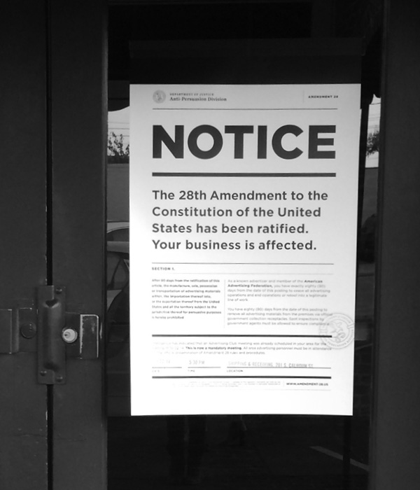
Project: Amendment 28 Poster Client: AAF Fort Worth
Large format poster to announce the outlawing of advertising with the passage of Amendment 28. View Work
Flash Global Logistics was in need of a new logo that more accurately reflected their brand identity – including the company’s global solutions, evolving culture and growing customer base of emerging companies. Considering the scope and implications of a change on this scale, we would like to prepare for a full rebranding initiative, beginning with the development of a new logo and associated identity style guide.
The new logo needed to convey a progressive look and reflect the company’s evolving culture and growing customer base of emerging companies.
Our solution introduced a shortened name, Flash Global and an iconic ‘F’ mark. Speed, efficiency and strength are at the root of what Flash Global promises their customers and the new mark embodies each of those. Moving into this new look has inspired their internal team and helped them elevate their own expectations for the company as a whole. Visually, the brand now matched the quality of the product they have been delivering for years.
Schaefer launched the new Flash Global brand with a new logo, business papers, website, presentation support and all kinds of new swag for the teams at Flash.
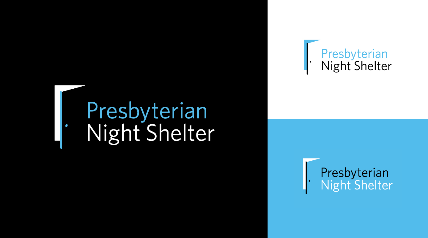
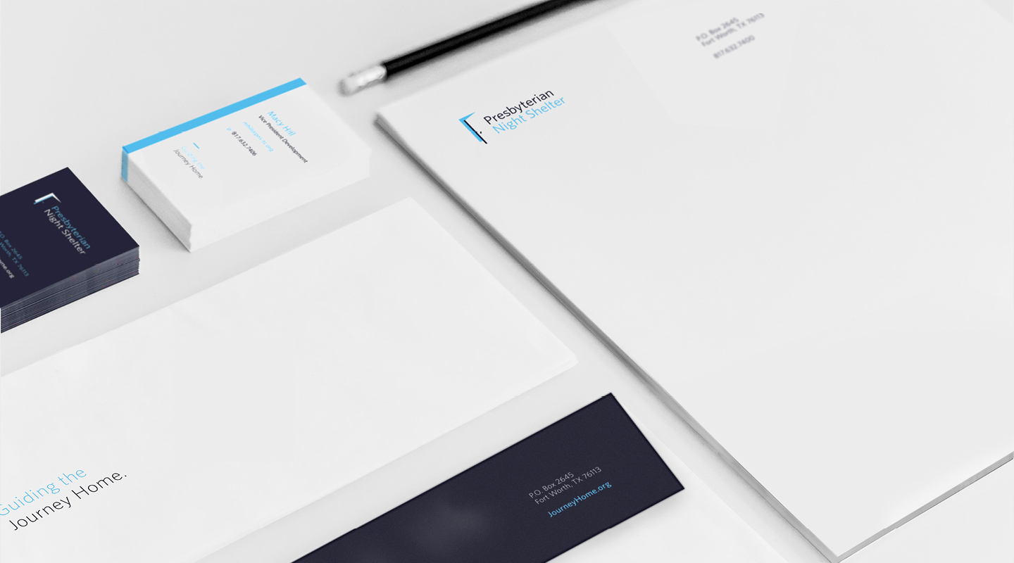
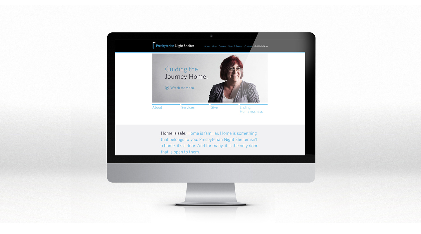
Founded in 1984, Presbyterian Night Shelter is a non-profit organization that does more than just provide a place to sleep. Through a variety of services, they help clients on the journey from homeless to home. With new services being added and new building projects underway, they came to Schaefer for rebranding and fundraising materials.
The open door logo was birthed out of a game of catch in the side yard. That probably had nothing to do with it, but it’s how we got the creative juices flowing. While the door is symbolic of the roof Presbyterian Night Shelter provides to the homeless, it’s also a symbol of permanent housing, which is the goal for everyone who stays there. For many, the Night Shelter is the only door open to them. But there’s hope on the other side.
Another aspect of the project was fundraising materials for a new women and children’s housing project on the Night Shelter property. While the original ask was for printed materials, we looked at the fundraising goals as well as the potential donor base and decided that a video would be the most effective way to go.
Filmed on a shoestring budget by our, at that time, brand-new friends at 1820 Productions, the video sought to convey a single, powerful idea: home isn’t a place, it’s a feeling. As you hear businessmen and women, professionals and even someone who is currently homeless talk about home, the specifics might be different, but the feeling is universal. Punctuating it all is the surprising statistic that 85% of homeless people don’t stay that way.
Homelessness is a curable condition. And we’re proud to help Presbyterian Night Shelter in their mission to end homelessness in Tarrant County.
This year, the Hurst Conference Center came to us with a problem. As always, we came back with a solution. Problem: How can we increase our wedding and reception bookings and overcome the negative perceptions that engaged couples have of a conference center as a wedding venue? Solution: Develop a unique brand and identity for the Hurst Conference Center’s bridal market that sets it apart from competitors.
Our first step was to evaluate the local bridal market, the competitors and the unique attributes of the conference center. We then crafted the venue’s unique positioning, which guided us through the naming and identity development process. Our strategy was to develop an identity that conveyed simple elegance while highlighting the unique attributes of the grand ballroom while giving it a name that would sound good on wedding invitations. We developed several different names and designs and, in partnership with the client, landed on a name that highlighted the iconic fiber optic star-field chandelier located in the grand ballroom – Lumiere Ballroom at the Hurst Conference Center.
With the bridal identity developed, we executed the new brand in several collateral pieces to introduce it into the marketplace. Our goal was to differentiate the bridal marketing elements from the rest of the Hurst corporate/meeting planner marketing pieces. This meant pulling away from the traditional red and orange colors.
The bridal identity is set apart from the corporate HCC brand through the photography style and limited use of colors. De-saturated photography added an element of refined elegance to the space, while the use of black allowed the chandelier to stand out as a focal point within the venue. However, the corporate/meeting HCC brand and the bridal identity are tied together through the use of photography and the type family (Helvetica).
An opthamology practice with five physicians, Nethery Eye Associates tasked the Schaefer team to develop an integrated marketing plan to increase patient traffic in light of a more competitive marketplace. We evaluated and refreshed their current branding to support these marketing efforts and executed the refreshed brand in a website, collateral and other patient education tools, and an online media campaign.
Educational Video Series
for Nethery Eye Associates
Schaefer Advertising recently rebranded Tallulah & Company, a Fort Worth interior design company led by Ally Arlington. She’s the very talented designer who is responsible for the beautiful environment we work in every day. She tasked our team with developing an identity that could exude a timeless style with a flair for the unexpected. It needed to be strong yet comfortable. Beautiful yet functional. Just like her work.
We enlisted the help of calligrapher Lauren Essl, of Blue Eye Brown Eye, to craft the handwritten logo treatment.
WayPoint Healthcare Advisors is a healthcare consulting firm in Fort Worth, Texas led by two senior level executives, each with 20+ years of experience in healthcare consulting. Faced with a rapidly changing healthcare environment, WayPoint Healthcare Advisors needed to evaluate their marketing initiatives. We worked with the WayPoint leadership to develop new branding and marketing materials to support public relation initiatives. This logo was initially launched through email marketing and a new website.
J.L. Matthews Co. is a third generation family-owned business based in Fort Worth that specializes in top-of-the-line safety equipment and apparel for lineman and arborists. They recently came to us with the challenge of updating their brand without losing the history and values that still shape the company today.
Founded in 1946 by Joe L. Matthews, their main focus remains the same: provide top-notch, personal customer service with an emphasis on training and safety. With such a deep family history, it was fun to get to know their business on a more personal level. Old family photos showed what it was like back when Joe Matthews was creating custom leather harnesses in his small, cluttered workshop.
Our goal was to update the brand to make it relevant to their current customers without losing the heritage and family values that continue to set them apart.
Since safety is the most important facet of their business, we began by shifting the brand color from red to a safety orange. For a family of Red Raider fans, this wasn’t an easy decision, but it proved to be the right one.
The logo features the company name with emphasis placed on “Matthews” since that resonated most with existing customers. Date and location were added as secondary elements, and the shield shape conveys strength, which represents the industry and those who work in it.
Now, putting barbecue sauce on the finest beef in the land may seem like sacrilege, but if Nolan Ryan says it’s okay, it is. And if Nolan Ryan puts his name on a barbecue sauce? You know that’s good, too. Okay, technically we put Nolan Ryan’s name on a barbecue sauce, but only because he told us to.