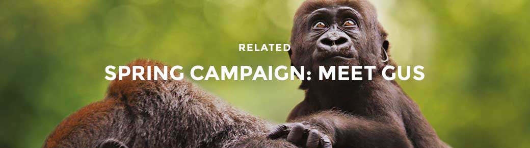
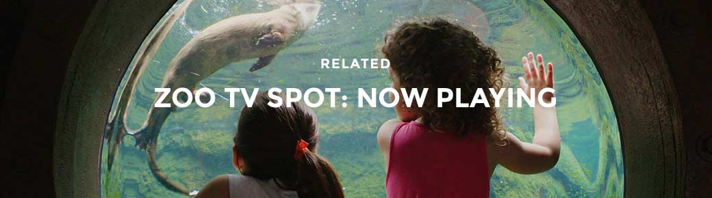
On the heels of our spring campaign launch, that introduced Gus, the baby gorilla to the world, we are proud to showcase our new TV spot for the Fort Worth Zoo. This spot is a 30 second summary highlighting the fun, educational and majestic moments that happen everyday at the zoo. With over 400 different species of animals, 15 different exhibits and attractions, it’s an experience that changes with every visit.
Over two days, we filmed all-new footage throughout the zoo and captured special moments from over 15 different exhibits and attractions including everyone’s favorite, baby Gus.
Projects like this one allow us to immerse ourselves in our client’s world as well as the experience of their customers. We learn as we explore and we look for unique ways to tell a story that people can relate to. Its a challenge that we embrace and let’s be honest, we have a lot of fun with it too.
Explore these interactive 360 videos/photos by clicking on the image and dragging around. Its a unique perspective of what its like on set.
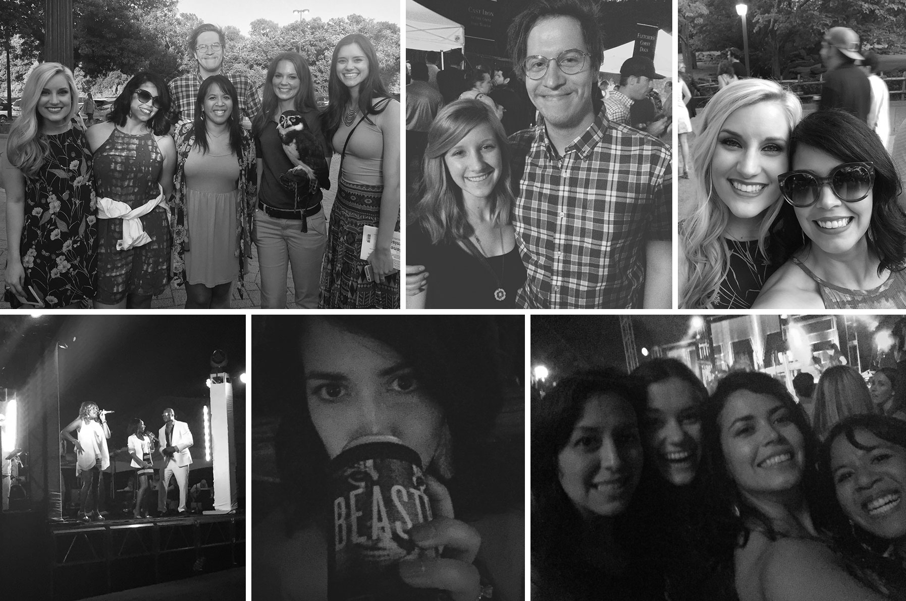
This year marks the 10th anniversary of Beastro, the Fort Worth Zoo’s annual music and tasting event that supports local and international wildlife conservation and education efforts. Within a few weeks of this year’s campaign going live, Fort Worth’s wild side responded with record breaking ticket sales and a fastest ever, sold out VIP offering.
The event features the finest area restaurants stationed throughout the Zoo, serving sample appetizers, entrees and desserts. In addition to the delectable cuisine, the event features open bars throughout the park and live music entertainment. Several animal exhibits remain open until sunset. This year’s entertainment features the local talents of: Emerald City, The Project and Live 80.
The event sold out, for the first time ever, and we had to stop the ad campaign early. The night was a success from ticket sales, but our team also successfully enjoyed the feast with the beasts.
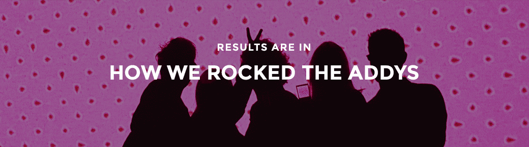
Addy Kryger came to us from the magical land of Kansas, as a budding senior at TCU, eager to get her hands on account coordination, social media and marketing. And we gave her a run for her money. As an intern, she was super driven, extremely resourceful, brought homemade cupcakes to a set (on her off-day), rocked with us at the Battle of the B®ands and ultimately fought her way into our hearts. She just finished her Bachelor of Science in Strategic Communication this May, and we couldn’t be more ready to bring her on. We scored 11 Golds at this year’s AAF awards, but none beat this Addy! And before we lose your attention, here are some questions she answered:
Schaefer: So Addy, you opted out of the gap year right after college? What gives?
AK: Yes. I got back as quick as I could.
Schaefer: What did you do on your vacation?
AK: I had two weeks in-between my internship and starting full time. The first week, I went apartment hunting, found an apartment, signed a lease, moved out of a house and into a two-bedroom apartment… on the fifth floor. I have one roommate who moves in in July. So that was a lot of fun. And the second week I went home to Kansas City.
Schaefer: Other than being from Kansas City and now living on the fifth floor, what should we know about you?
AK: That’s a good question. I like to have fun. I’m a fun person–
Schaefer: Like Spongebob fun?
AK: Like Amanda Bynes fun. [pause for laughter] But I’m also a hard worker– I get my work done and then it’s fun time. Hahahaha!
Schaefer: So a twerker?
AK: Definitely a twerker, hahaha!
Schaefer: Okay, if you could be a food, what food would you be?
AK: If people were going to eat me… My mind immediately jumps to cake.
Schaefer: We talkin’ fun-fetti or…
AK: I’m thinking chocolate…Like decadent..
So there you have it folks! She can’t escape baked goods and she’s certainly not in Kansas anymore. Drop her a line and introduce yourself!
Everyone loves babies. I mean, everyone with a soul loves babies. And that’s why when there is a new baby at the Fort Worth Zoo, we all get a little excited. So when the Fort Worth Zoo told us, months in advance, that they were expecting the birth of a western lowland gorilla, we began developing a launch plan to make the announcement. In our initial phases of planning, we identified key challenges that the campaign would need to overcome in order to be effective. The first was that baby gorillas basically mirror a human child in terms of growth and development. This means that for the first few months, the zoo’s newest star, Gus, was going to spend most of his time sleeping and never be more than a few inches from the arms of his mother, Gracie. And, like most moms, Gracie is a wee bit protective. In spite of the infant gorilla not being mobile or very active at all for that matter, we had to find a way to get people excited about coming to see Gus.
Which leads to the second challenge – how do you photograph a tiny black fur ball held closely in the clutches of his mom? Add in the fact that parents, Gracie and Elmo and new baby Gus, live in a secure designed area, plus wanting to minimize any disruptions to their normal activities, you don’t exactly have an Olan Mills photo studio in which to capture that “perfect” baby picture.
But usually, it’s the challenges that lead you to your solution. And this was no different. Think about it, what does every new parent do? Your Facebook feed is proof, that every new parent posts every single progress update. “Here’s junior sleeping in is blue onesie. Now, here’s junior sleeping in his yellow one that Aunt Marge from Des Moines bought him. Oh, wait, now his eyes are open, oh wait, never mind.” You get the idea. So we decided to build the campaign around the experiences that every parent wants to show their child doing. Eating. Playing. Sleeping. Riding.
Using the zoo’s photography documenting Gus and Gracie’s relationship, we created an “interactive” campaign that gives Zoo goers a reason to come back frequently over the coming months. Visit The Fort Worth Zoo today because as we all know, they only stay babies for just a little while.
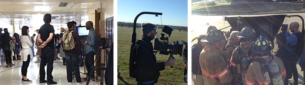
Did you know that right here in Tarrant County we have one of the premier Fire Service Training Facilities in the Southwest, an elite culinary kitchen experience and a world class dance program? We do. Across 7 campus’, Tarrant County College offers these unbelievable programs and facilities to put success within reach for over 50,000 students.
Shot on location, in TCC’s real “classrooms”, we paired actual TCC students with the obstacles they’ve faced on their journey to higher education and showcased how TCC’s diverse and unique programs are putting success within their reach. For the thousands of potential students facing their own obstacles; TCC has a path for you and one question to ask. What’s stopping you?
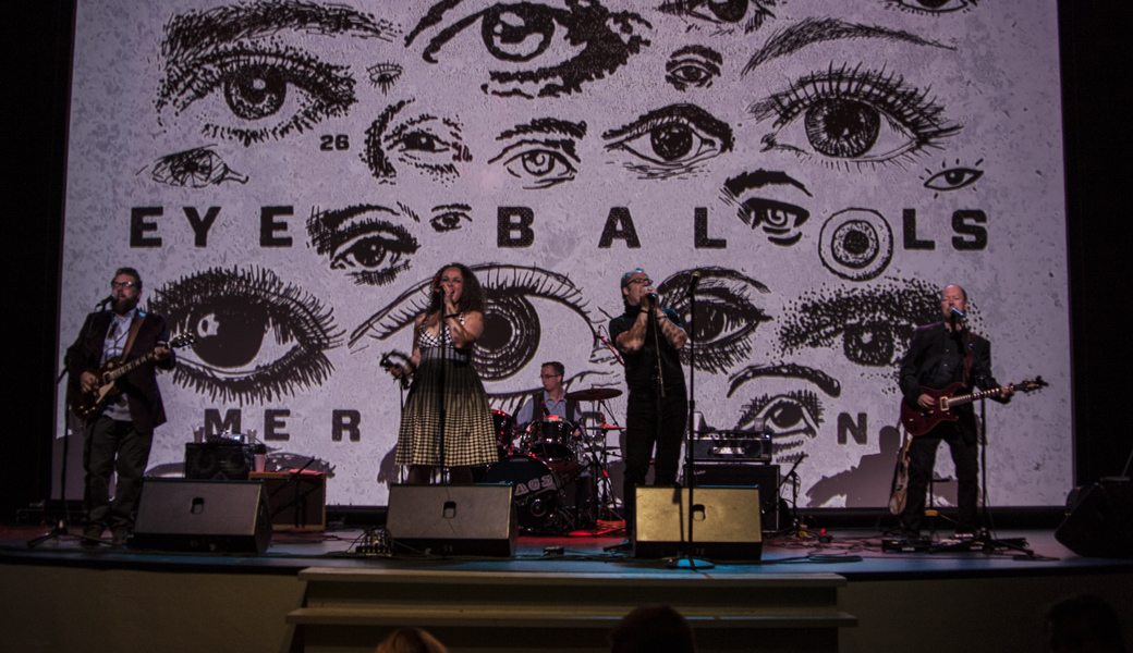
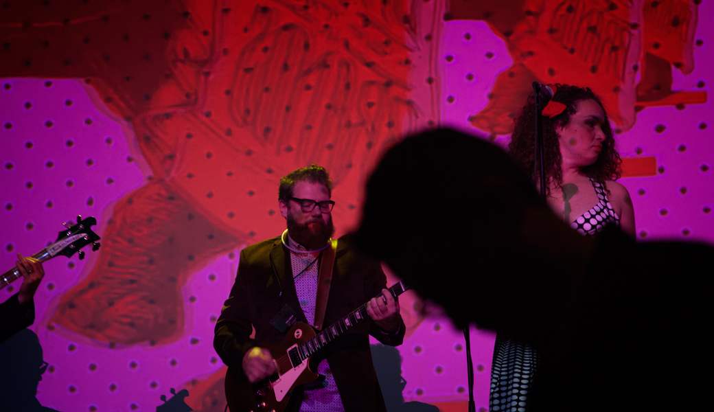
Last year, we changed the Addys with a new venue and format. How’d we top that this year? Rock & Roll.
We launched our “Battle of the B®ands” concept and invited agencies to submit their work to compete on the big stage where the winners advance and the losers stay home.
Gig posters announced this year’s competition, submissions were collected, the historic Ridglea Theater was booked and the rest was advertising rock & roll history. Fans received pre-show invites packed with tickets & stickers and event lanyards were given at the door. Trust Printshop printed merch on-site and The Swags played us through the night, backed by technicolor elephants and eyeballs.
The brands battled, awards were given and everyone left with a CD-sized reminder of what actually happened. For those who couldn’t make it or for those who want to re-live it, here’s the night’s house playlist. Until next year, keep on rockin’ in the free world.
Chippewa Boots is an American legacy that dates back to 1901 and has been worn for generations by hardworking, passionate men and women who helped build and shape this country. Today, Chippewa Loyalists remain steadfast ambassadors for the brand, but a new breed of Chippewa customer – the young urban – is emerging and embracing the lifestyle that Chippewa represents. In 2016 Chippewa, a division of Justin Boots, a Berkshire Hathaway Co., sought Schaefer Advertising to create an elevated brand platform that would continue to reflect the legacy, quality and craftsmanship of their boots, but also bridge the brand’s appeal to this new target audience.
The new brand creative features sweeping imagery that captures the Chippewa lifestyle in its Americana roots. The platform features a custom trade show exhibit that launched at America’s largest outdoor trade show, Outdoor Retailer, along with new catalogs, look books, advertising, web and social elements. Outdoor Retailer was so impressed with the new platform, Chippewa was upgraded to a premier location within the “America” section of the show. Sit back and relax while you take in the new Chippewa.
Our work for the Fort Worth Zoo’s annual fundraising event, Zoo Ball, has landed within the pages of the Graphis Design Annual 2016. We are literally sandwiched between the best of design from all over the world. Its a top honor for our team and a fancy addition to our bookshelf.
Graphis is committed to presenting and promoting the best work from all over the world. They have over 70 years of history behind them and have truly established themselves as the premiere design publication in our industry. They also feature inspiring quotes that make designers feel pretty special:
Designers may be the true intellectuals of the future.
– Paola Antonelli, Curator of the Department of Architecture & Design, MoMA
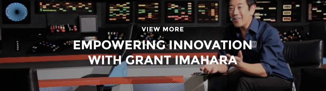
What happens when a billion dollar, Berkshire Hathaway company, a global market leader in the distribution of innovative, technologically advanced semiconductors and electronic component parts, approaches you to create a brand persona? At Schaefer we think big. In 2015 we introduced Grant Imahara, celebrity engineer, robotics expert and Mouser customer for 20 years as the company’s spokesperson. We blended Grant’s appeal to the Mouser audiences with true stories from real-world engineers who are responsible for some of the world’s most cutting edge initiatives. Ultimately, creating the “Empowering Innovation” campaign. Cast across digital, social, event and traditional platforms “Empowering Innovation” reached millions and continues to engage and inspire engineers across the world in 2016.