The Scan—a web video series on technology security—came about just like any other project. A former Schaefer employee who now works for McAfee Security saw some silly videos we made and posted on our Facebook page. She thought, “Hey, that might work for us, too!” Happens all the time, right? She called, we said sure, then we had to figure out how to make it happen.
All we lacked were studio lights, a teleprompter, microphone, sound recorder, editing software and the know-how to use it all. Other than that, we were set. So in true Schaefer form, we got the things we needed, figured out how to use them and created a well-received web series that’s been going strong for a year. Take a look at the episode below, then go watch all the rest on YouTube.
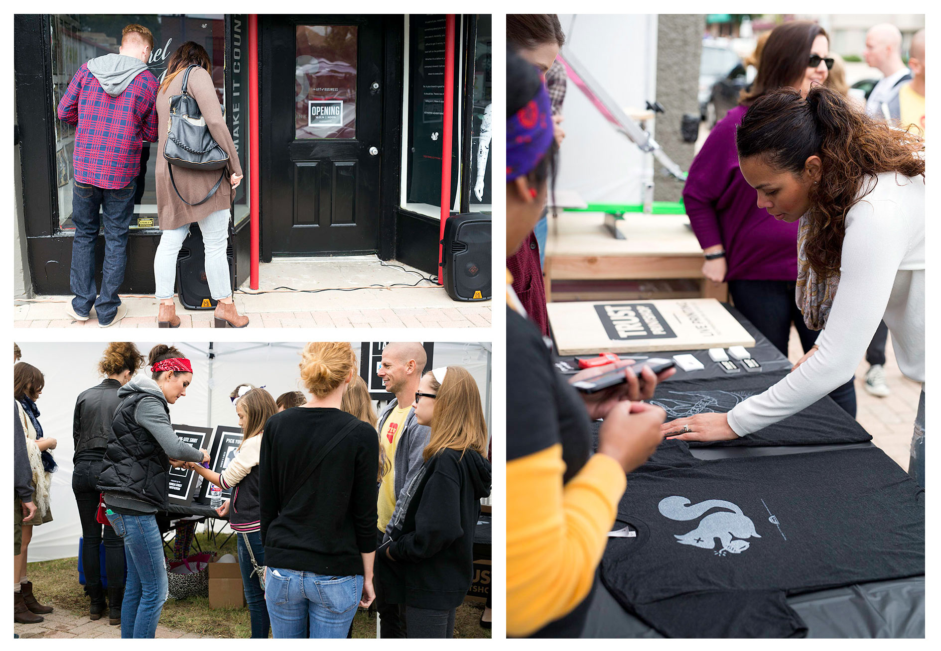
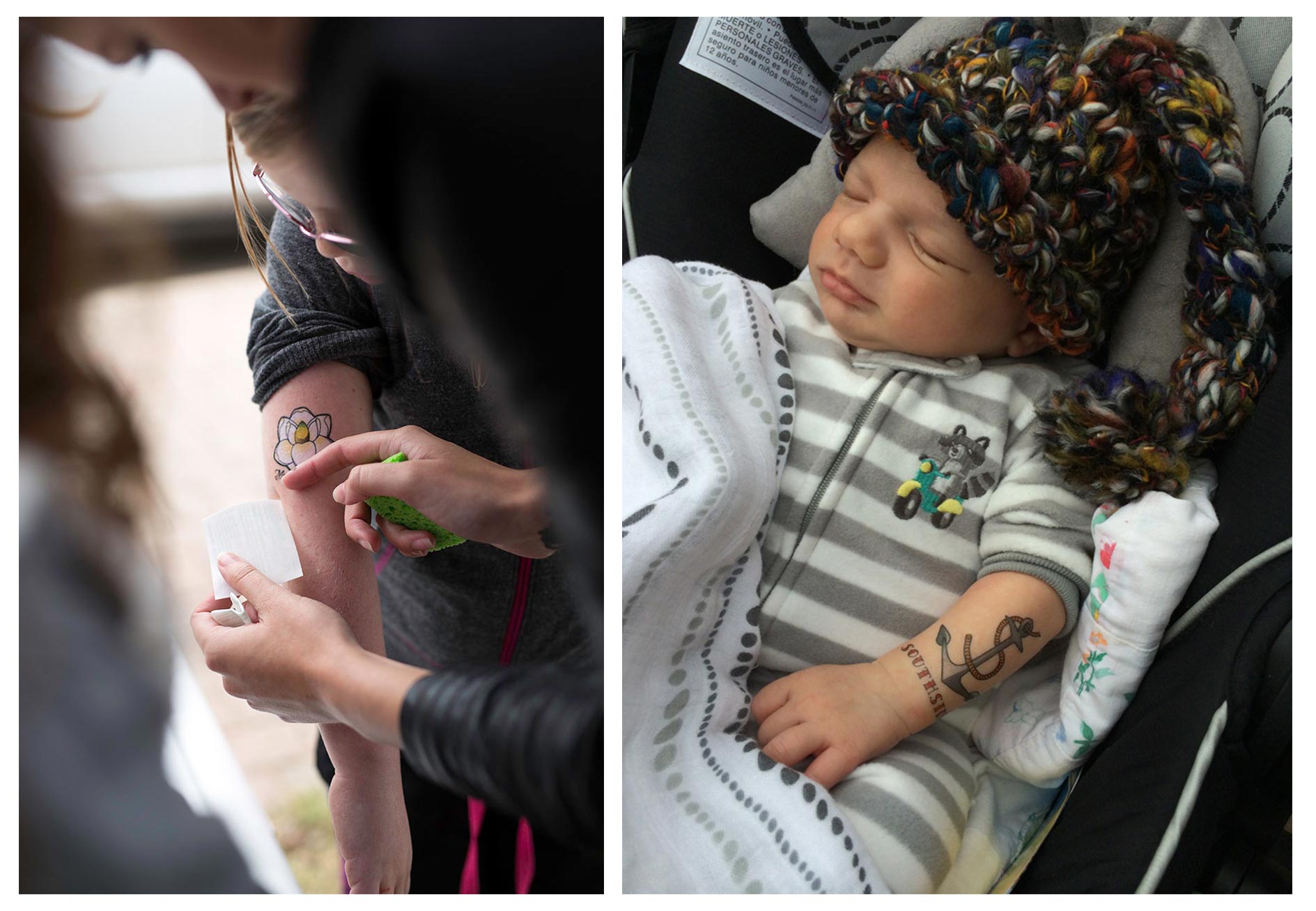
Each year, the street in front of our office shuts down so local artists can put their work on display inside local businesses. Musicians and food vendors are there too to keep the crowds fed and entertained. And we’re there, too.
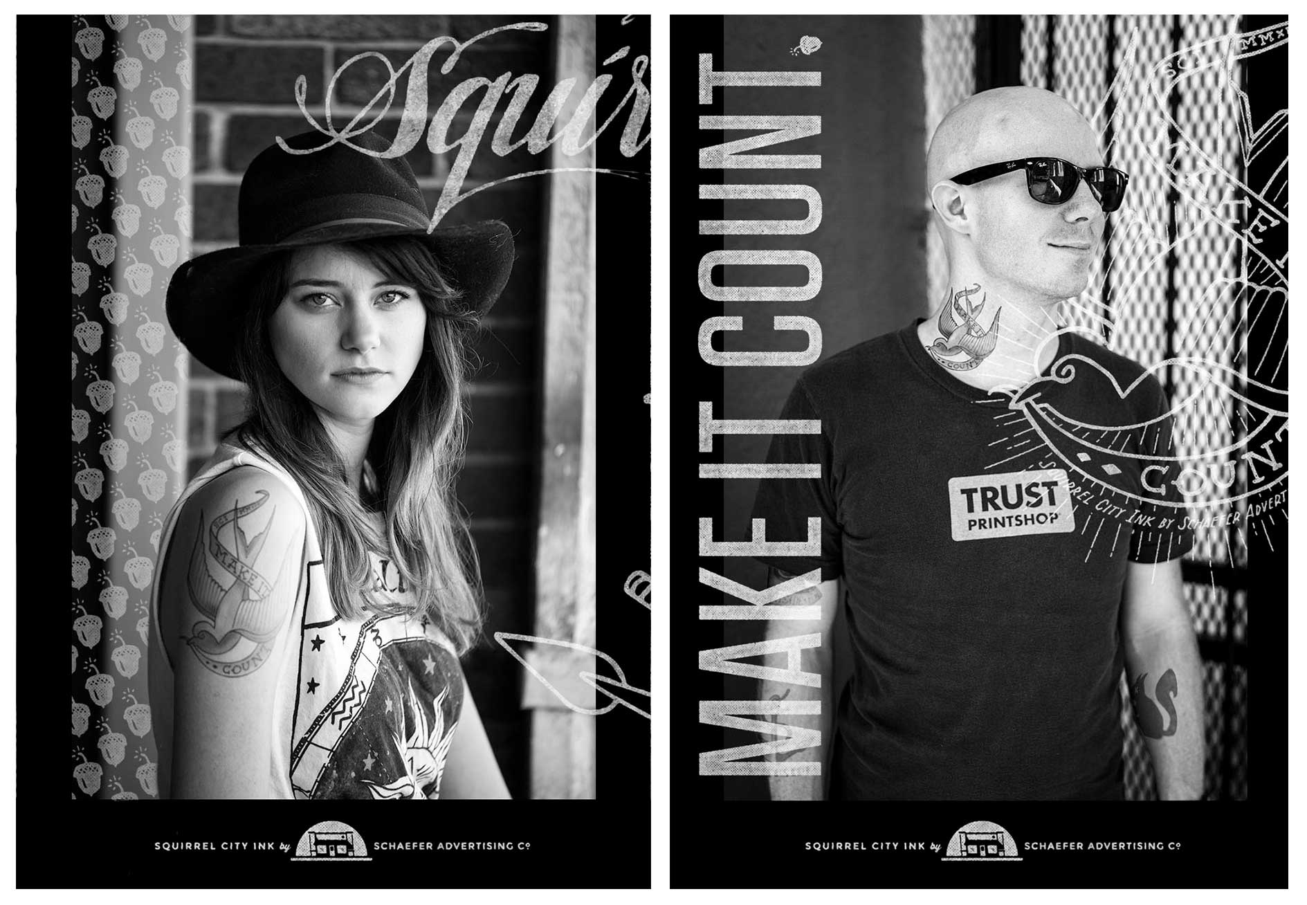
Since we’re proud residents of the Near Southside, we like to do something fun and interactive. And what better way to endear ourselves to our neighbors than open a tattoo shop?
The idea for Squirrel City Ink came about randomly, as these things always do, when art director Charlie Howlett wondered aloud if it would be funny to pretend the little building next to our office was a series of businesses that were “coming soon” but never opened. One of the ideas was a tattoo shop, and it stuck.
The name Squirrel City Ink was derived from Squirrel City Bombers, the name of our fake agency motorcycle gang, which never managed to assemble, let alone rumble. Anyway, with tattoo shop name in mind, we painted the building to match, created signage and even tatted up a mannequin.
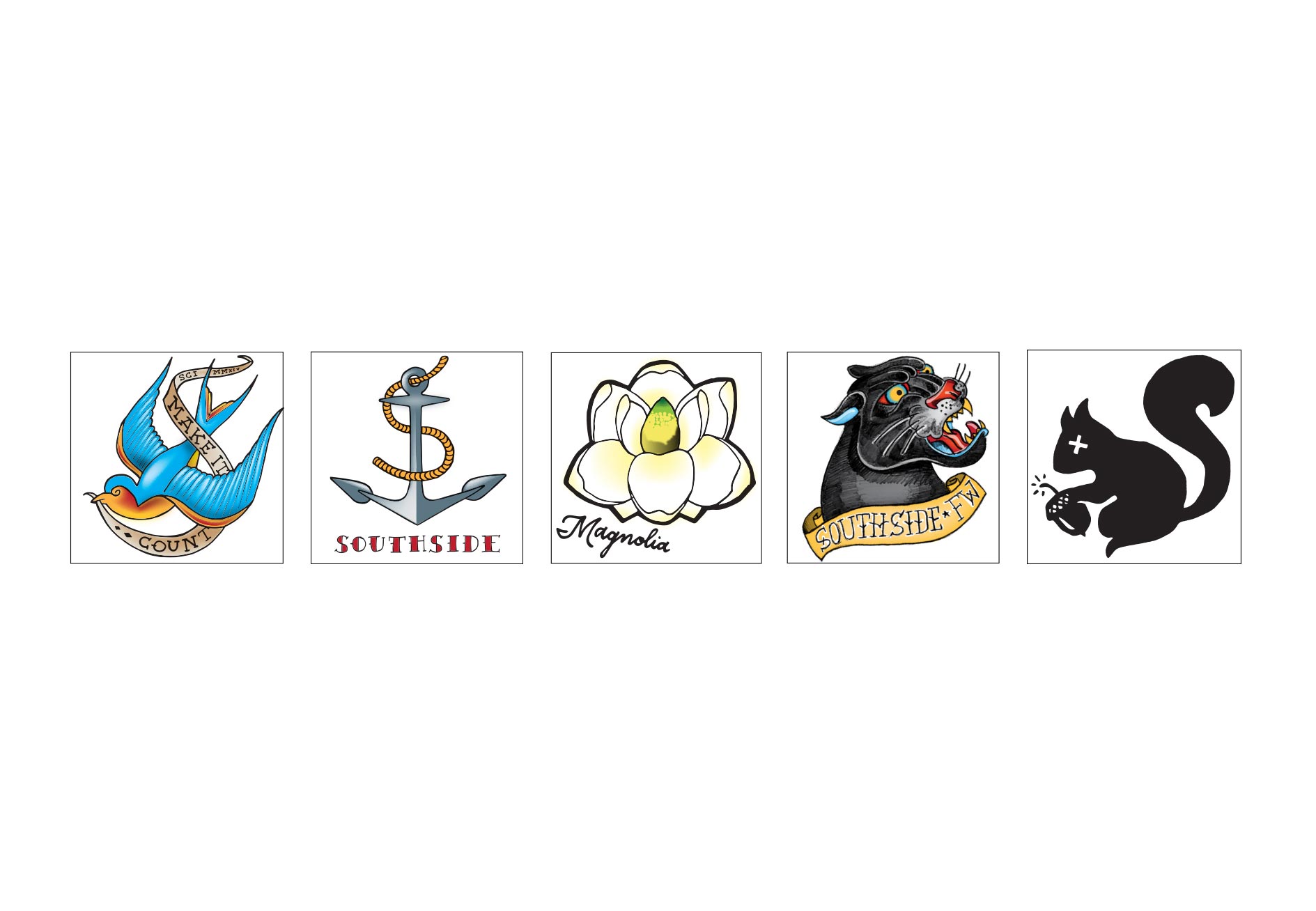
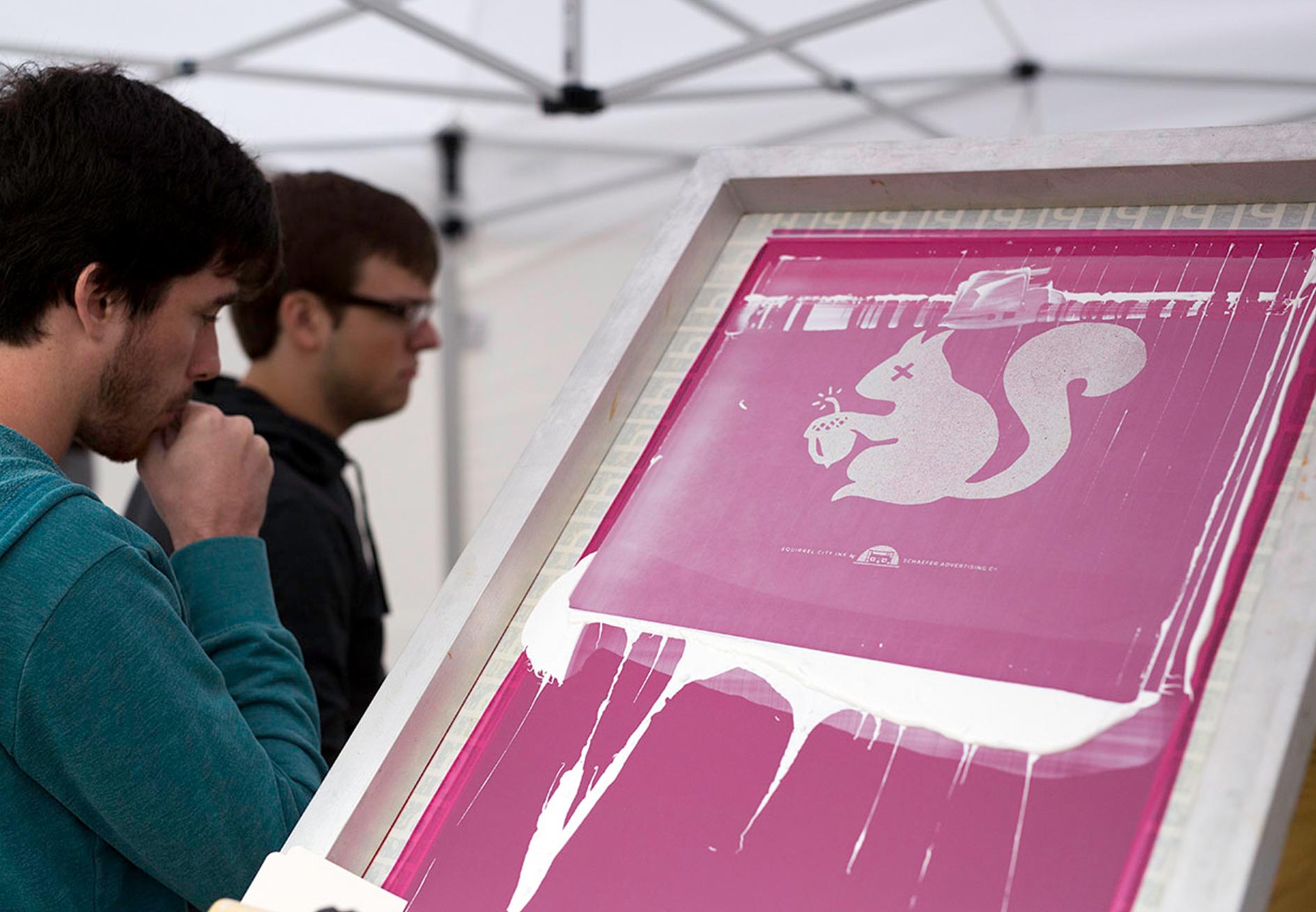
For the event itself, we turned five hand-drawn designs into temporary tattoos, which we passed out for free. We also hand-drew two t-shirt designs that were sold and printed on site by our friends at Trust Printshop. In sourcing the t-shirts with them, owner Matt Lucas let slip that they had portable presses that would allow them to print shirts one at a time as people purchased them. Done and done.
Turnout was great, and everywhere you looked people were sporting our (temporary) ink. But what does all this have to do with advertising? Branding, like a real tattoo, is best left to the professionals.
Otherwise, you’ve got a lifetime of embarrassment ahead of you.
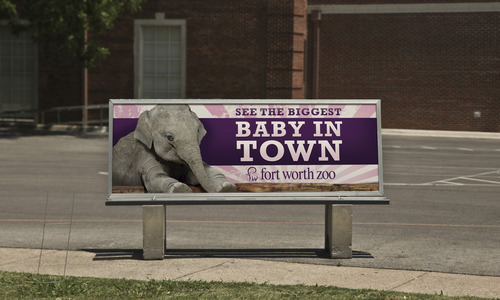
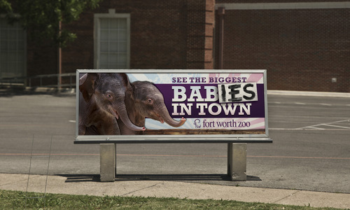
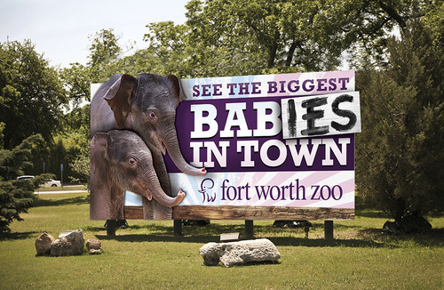
Last year, Schaefer got to be in on the surprise as the Fort Worth Zoo prepared for the births of not one but two baby Asian elephants. It was a lot of fun to get to announce these oversized bundles of joy to all of Fort Worth (and beyond) using a variety of media.
And while we knew about the second baby before you did, it was still quite the surprise! After all, media for the first baby had only been up for a few weeks at that point.
With the baby healthy and ready to meet his new fans, we had a quick-turn situation to revise the still-fresh creative. Our solution conveyed our surprise:
Recently, this campaign earned a Marketing Excellence Award from the Association of Zoos and Aquariums, which put us in the company of agencies like M&C Saatchi, whose work for the San Diego Zoo is routinely recognized as some of the best in the business.
Big things come to those who wait.
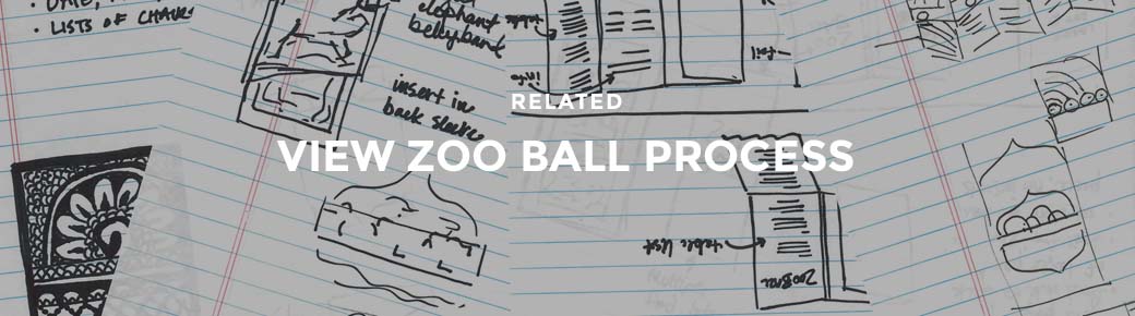
The annual Fort Worth Zoo Ball is their largest fundraising event of the year in support of the nonprofit, privately owned zoo. This is an elite affair put on by a committee of top Zoo donors who rely on Schaefer to help execute the annual theme. For 2014, the theme was inspired by the annual Festival of the Elephants in Jaipur, India. The central piece was to be a high-end invitation that would make Fort Worth’s elite excited about coming to the ball.
The Work
Our first step was immerse ourselves in Indian culture (via Google and World Market rather than the subcontinent itself, sadly). Through colors, textiles, patterns we began to get a good sense of direction for the piece. If only we had a designer who was really into elephants. Maybe one who has an elephant pen and mug and figurines all over her desk. Oh, right. Blair.
This theme was tailor-made for designer Blair Babineaux, whose love of elephants (and good design) made her the obvious one to take the lead. Both of these loves were apparent in the final result.
Describing the details of this piece would take approximately forever, but here are some highlights (or you could just look at the picture, right?). The six-panel invitation is printed on a thick pearlescent paper that was flooded with red on one side. Each unique panel was intricately laser cut by the folks at Artifacture in Dallas. Once folded, the invitation was secured with a die-cut bellyband featuring even more laser-cut elephants. The metallic gold envelopes were beautifully hand addressed by Lauren of Blue Eye Brown Eye calligraphy using a custom-mixed ink.
All told, we partnered with six different vendors to make our vision come to life (each of whom might lock the door when they see us coming next time).
The Results
The event was a big success, and the invitation was unanimously well received. Eight-foot replicas of the invitation panels were used as decorations at the Ball, and the chairwoman of the planning committee said, “This is my favorite invitation yet. I’m not sure how we’ll top it next year.”
We don’t know either, but, as always, we’ll seek what’s possible. Even if it does give us all gray hair.
UPDATE:
Schaefer was awarded a gold national Addy for the 2014 Zoo Ball invitation. This is our first national Addy award, and to give it some context, we were one of only 77 gold winners out of 40,000 entries. Needless to say, we’re proud and excited to represent Fort Worth among some of the top agencies in the country.
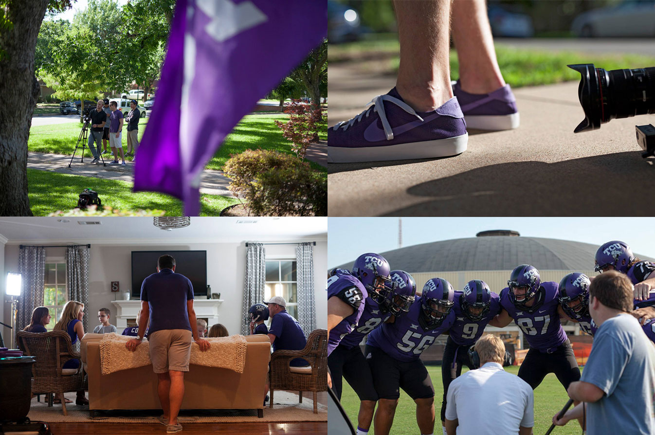
The video was part of a broader initiative to get fans more engaged in the game atmosphere, giving the TCU football team more of a home field advantage. Our approach was to have the TCU faithful renew their pride in the school by drawing on the proud history of the program. We wanted the fans to feel like they were a part of the team.
After developing several concepts, we worked with TCU Athletics to produce a 90-second video that featured TCU’s Riff Ram chant. This chant has been around since the 1920s, and our video builds on that history as well as its universality amongst Horned Frogs of all ages. We’re asking the TCU Horned Frog Faithful to AMP IT UP (TCU Football’s campaign this year) and help make Riff Ram a tradition at home games again. Go Frogs!
John Peter Smith Hospital was founded in the late 1800’s as a place where individuals from all walks of life could have exceptional medical care. In the early 1900’s, the Fort Worth Medical College opened, later finding it’s permanent home at John Peter Smith hospital. As Tarrant County has grown, so has JPS; now with over 500 beds and over 1,000,000 million patient encounters per year. The hospital serves an extremely diverse patient base, as such there is extraordinary diversity in the types of cases that come through the health network – making it an ideal place for residents to do their training. However, competition for top resident candidates is at an all time high – with the nations top teaching hospitals vying for the best and brightest.
Through the years, John Peter Smith Hospital has grown to become the largest hospital-based family medicine residency program in the nation. In 2006 the organization came to Schaefer Advertising with a challenge: it wasn’t satisfied with the fact that it was one of the biggest programs out there – it wanted to be perceived as the very best and attract top performing medical school graduates.
Schaefer got right to work by delving deep into the minds of the future’s best family medicine physicians. We conducted a qualitative research study – interviewing current residents and observing them on their rounds. Through this, we found that the cream of the crop was more than just high IQs with the desire to own a medical practice – we uncovered that there was something deeper at work in the minds, and more importantly in the hearts of these residents. We found that these individuals are passionate about making an impact in their communities. They have a true love of medicine going far beyond “practicing medicine”. They were missional in their cause, believing that they were helping contribute to a greater good. Further, these professionals enjoy a rigorous challenge. JPS offered the ideal package with diverse clinical experience and a heart for serving the medically underserved. Schaefer revamped the entire brand strategy for the residency program, creating an emotional connection with students and painting a picture of their future identity as a top family medicine resident. In nine years, applications have increased nearly 300 percent and test scores show that the program is attracting top students. Best yet, in 2014, U.S. News & World Report and Doximity ranked JPS among the top three family medicine programs in the country. Now JPS is one of the biggest programs, proudly training the best.
I recently found some hand-painted signs that Jeff Canham did for Mollusk Surf Shop. Looking through his work on his site really makes me want to start painting again, whether it’s type or just fun designs. I haven’t yet because I want to do it perfectly on the first try, but I know I won’t because I never practice. It’s much easier to stick to computer design because I do it every day, and it’s easier to execute what’s in my head.
Sometimes, I’ll make little doodles for my four-year-old son. It’s fun to make him smile, but I think I should also spend time doing work that makes me smile. It’s so easy for a designer to look at their portfolio and say, “This is me.” But it isn’t. It’s work that I’ve done, but it’s not me. Jeff’s work is making me want to do more personal projects just for my own enjoyment. Like this “H” I made just because.
Here’s a riddle: What says “You’re important, come to this tasting event and here’s a bribe?” You guessed it, a foil-stamped invitation with a gold fork and mini chocolate cake inside.
Client Hurst Conference Center hosted an event for local event planners to show off all their amenities, including adaptable spaces and a full-service kitchen. Since the event would include a tasting menu prepared by their on-staff chef, we decided to tempt attendees with a taste of what was to come.
“The good stuff is in the middle” relates to Hurst’s prime location in the heart of the metroplex, but of course it always applies to desserts. Of course, we being the thorough and thoughtful partners that we are did diligently sample a range of desserts to pick the one that was most likely to attract a crowd. All in a day’s work.
“If it’s worth doing, it’s worth overdoing.” – Mythbusters, Paul Gilbert, Liberace probably, et al
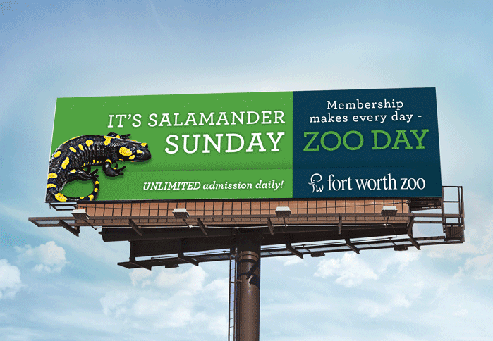
Recently, the Fort Worth Zoo asked us to continue running their long-standing membership campaign. The existing creative had been in-market for almost four years, and the expectation was that we simply reuse the exiting creative for digital and outdoor media.
The concept centered on the headline: Meerkat Monday, Tiger Tuesday – make every day Zoo day. Our intrepid young graphic designer, Blair Babineaux, wondered if we couldn’t expand this creative to not only include additional benefits, but to take full advantage of the digital billboard medium to run multiple creative messages for each day of the week.
Blair got to work creating seven billboards with a different animal for each day of the week. This also opened up space to include additional membership benefits.
And so, with a little thought and a few questions, we were able to push beyond the original idea (without additional cost). “This is how we do it.”– Montell Jordan and Schaefer Advertising Co.
Actually, there are three things that, for some reason, have inspired me throughout my career. I’ve never been one to keep up with industry news or other agencies. I don’t want to be influenced by other people’s take on advertising. I’d rather be inspired by books and movies and music, which can lead to unique advertising concepts.
One thing that’s always inspired me is skateboarding. I was super big into it back when I was a teenager, when the Bones Brigade and all those guys were big. And it’s not really the design surrounding skateboarding so much as the motion of it. It’s hard to explain, but I feel like the fluidity of motion inspires the way I think and design, even now.
Another inspiring thing for me is kind of strange. I love black and white movies, and I watch On the Waterfront pretty much every time it comes on TV. I recently found out that the buffalo plaid jacket Marlon Brando wears throughout most of the movie was actually green and not red. I can’t explain how this inspires me, but I actually found myself thinking about it while I was working through some design concepts the other day.
The third thing that’s been inspiring to me is an interview with Dave Grohl I saw online. One of the things he talked about was resisting the urge to self-edit. You don’t like it when other people mess with your stuff, so why do it to yourself? The imperfections that go along with spontaneity are sometimes the most interesting parts. I try to remember that with design.