Schaefer Advertising Co.

Creative

Situation

When the Fort Worth Zoo enlisted Schaefer Advertising to help drive people to their new African Savanna exhibit, we couldn’t wait to take the bull by the horns and get to work. Our team was able to come up with a rich campaign that encapsulated the spirit of the exciting new exhibit.

The new African Savanna exhibit was built around a central prairie that houses giraffes, springbok, ostriches and many more species all in one exhibit. A winding path gives visitors a 360-degree view of the animals in the prairie and allows people to get closer to the animals than ever before. This creates a truly unique experience for each visitor and ensures that no two visits are alike. The main attractions are the hippo exhibit that includes above-water and underwater viewing, and the giraffe feeding deck. The new Savanna exhibit features shaded viewing spaces and is surrounded by an aviary that houses a variety of bird species.

Goals

  • Generate awareness of the new African Savanna exhibit
  • Send interested web traffic to the Zoo’s website
  • Drive more ticket sales centered around new exhibits

The Approach

The Get Closer campaign was created to highlight the capabilities of the new African Savanna exhibit and emphasize the intimate experience that the space offers visitors. We needed to clearly communicate that the African Savanna allows patrons the opportunity to get closer to the animals than ever before, and illuminate the giraffe feeding platform, and the hippo exhibit.

Before launching the campaign, our team developed a detailed multimedia strategy that would get more people interested in exploring the African Savanna exhibit. To deploy a fully-integrated campaign, we incorporated digital and broadcast ads alongside more traditional out-of-home ads in the form of pole banners, billboards and bus benches that were placed in strategic positions throughout the metroplex.

The Creative

The campaign featured the two stars of the new exhibit: the underwater hippo viewing area, and the elevated giraffe feeding station. Schaefer developed concepts that communicated the intimacy of the space, while also inviting audiences to look adventure in the eye.

We really enjoy using a medium to its full potential and thinking about new ways to use traditional mediums that command consumer attention. For the Get Closer hippo billboard, we used extensions to maximize the real estate on the board and communicate the capability of the new hippo viewing area. By extending the hippo’s head over the top of the board, we were able to mimic the water line and show viewers the capabilities of the exhibit.

Savanna TV Spot

We chose to use the African Savanna TV spot to expand and support the campaign’s core idea of “getting closer” to the animals and take local families on an authentic African safari right in the heart of Fort Worth. The commercial features children and families getting close enough to the animals to play a small game of “monkey-see, monkey-do,” and interacting with the new exhibit’s animal kingdom. Filming animals is unpredictable, but the “talent” decided that they were ready for their closeups and behaved like seasoned professionals.

The Results

  • The weekend after campaign launch saw a 316% increase in ticket sales compared to the weekend before campaign launch.
  • The 60 days after campaign launch sold greater than 35,000 more tickets than the same 60-day segment in 2017, for a 14.3% increase in ticket sales.
  • Standard media display click-thru-rate 216% higher than industry benchmark of .06%.
  • Rich media display click-thru-rate 46% higher than industry average of 2.25%.

Making Life Better

At Schaefer, we strive to make life better with each project that we take on and in every conversation we have. Going to the Fort Worth Zoo is an incredible experience, and it’s an honor to work with an organization that practices such extensive conservation efforts. Feeding a giraffe or standing eye-to-eye with a hippopotamus is such a joy for people of all ages and working to share that experience with a wider audience was the big cat’s pajamas.

The Latin rule of three “omne trium perfectum” is the principle that good, often great things, occur in threes. The Three Amigos, tricycles, and three-piece suits are just a few examples of great trios, but three’s excellence can extend into the advertising world and shape how brands communicate their key messaging.

The Goal – Engage Sales Team Around Core Brand Messaging

Soolantra Cream is a prescription skin care product for the treatment of rosacea. To improve overall sales, it was important for Soolantra’s sales team to understand the three key benefits Soolantra had over its direct competitor.

The Three Benefits:

1 – Soolantra is dual-purpose and can treat both inflammation and symptoms of rosacea.

2 – Soolantra is superior to direct competitor MetroCream, and proven so by multiple studies.

3 – Soolantra is non-irritating, and highly tolerable.

By memorizing these three benefits, the sales team would be able to better communicate with dermatologists and help get Soolantra to more patients.

Fun is Perfectly Acceptable

We set out with a tall task – creating something memorable that swaths of salespeople could use in their everyday sales routine. We wanted to grab their full attention, and reinforce the three benefits Soolantra has over its direct competitors. So, how do you break through the calamity of the day-to-day, and stand out among numerous notifications and piles of paper? By creating something fun.

The Work

We stretched the idea of fun into three distinct ideas and were expecting Soolantra to select one concept. But sometimes life unfolds in surprising ways, and that’s what happened when the client decided to choose all three concepts.

Tr!o Tr!v!a

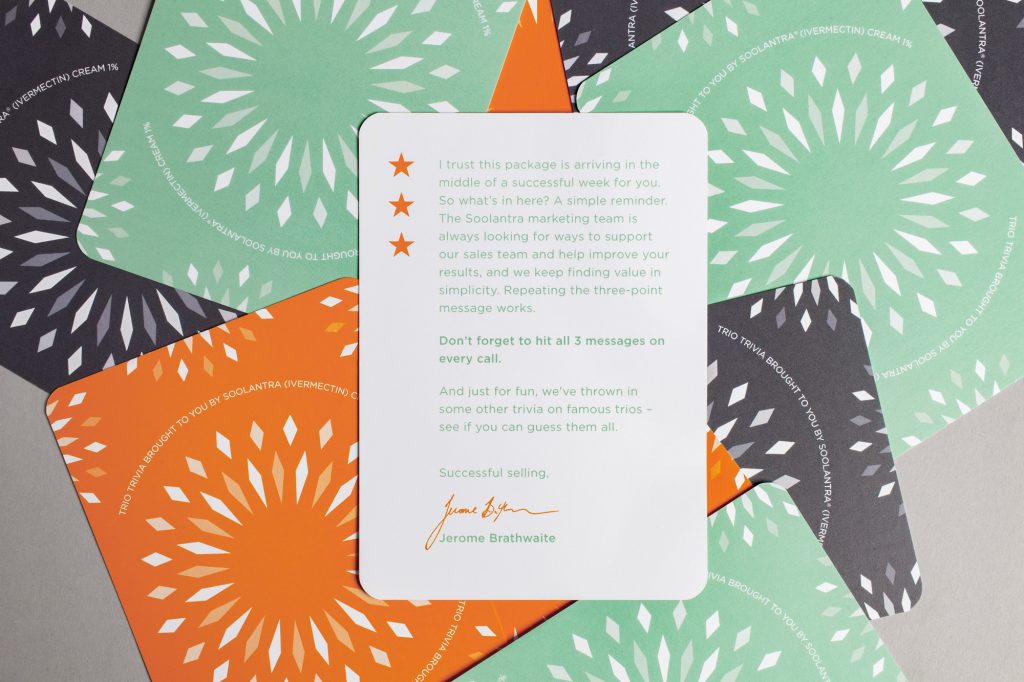
Can you name the three types of ice cream used in a sundae? Can you recall the famous, fictional French trio that stood guard for Paris in the 19th century? Tr!0 Tr!v!a encourages the mailer recipients to play along in a fun trivia game that covers famous trios in pop culture. The card game engages people in a light-hearted manner, and asks them to dig into their cultural grey matter to uncover the right answers.

Go For Three

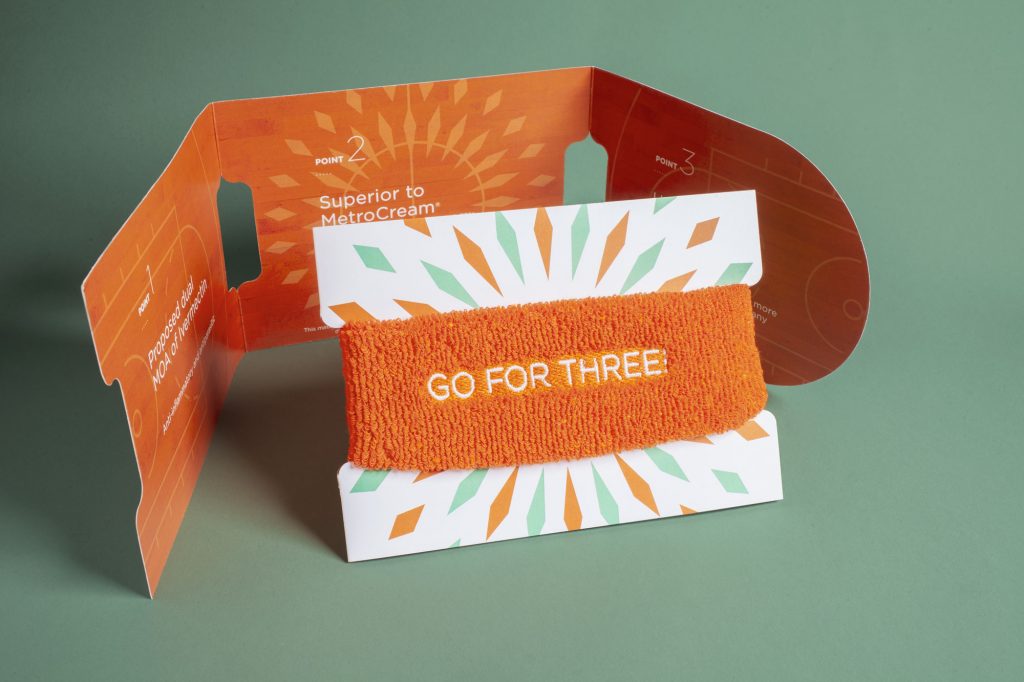
In basketball, there’s no greater glory than hitting a perfect three-point shot from the top of the arc. For the Soolantra sales team, that glory is re-created when they close a sale using the three key sales points in the core messaging. We wanted to play on “going-for-three,” and used the headband as a fun reminder of the core messaging. The tri-fold insert unfolds to display the messages on a paper basketball court. The whole piece is a testament to threes and reminds the team to hit all three sales points.

Soolantra Cream Three-Ring Circus

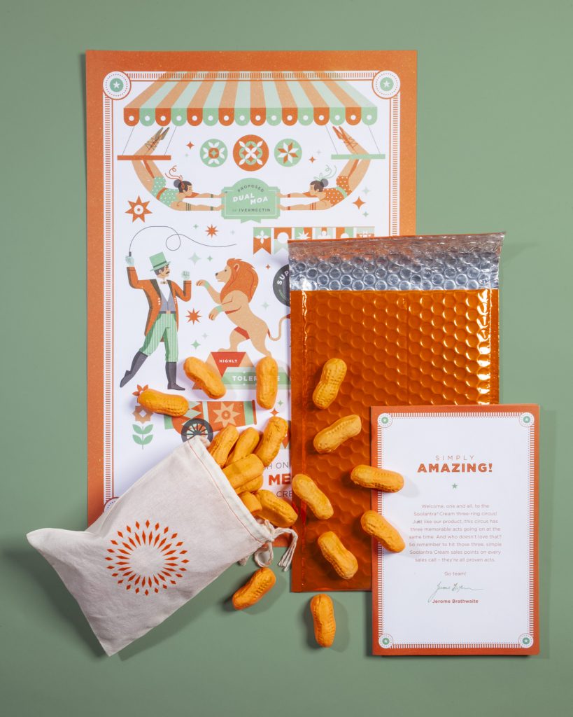
Just as Soolantra has three key sales points, our three-ring circus has three acts to remind the sales team about its benefits. The dual-purpose action of Soolantra is embodied by twin trapeze-artists, and its highly tolerable nature is represented by a tamed lion. The fact that Soolantra is superior to MetroCream is displayed as a strong man easily lifting a barbell, visually pointing to Soolantra’s strength. The poster was accompanied by Circus Peanuts, which just so happen to fall into Soolantra’s brand colors.

The Soolantra Three-Ring Circus mailer is concise and clearly communicates the core messaging in a light, and engaging way. We were proud when it earned a Gold Addy in 2018.

Celebrating the Brand

Since the target of our mailer were employees of Soolantra, we wanted to find pride in the brand.

Each mailer is sealed in a bright orange, padded envelope. This proclaims to each recipient that the enclosed items are anything but ordinary. The contents of the individual mailers are all branded with Soolantra colors, and each piece reaffirms the core messaging with ease. All of this is a reminder to the person opening the mailer that Soolantra is an exciting brand that is willing to have some fun.

Making Life Better

By incorporating some fun into healthcare messaging, we were able to capture the attention of the Soolantra sales team, and helped them improve on communicating key brand messaging. This allowed them to reach more patients by convincing dermatologists that Soolantra was the superior rosacea treatment.

It’s important that those suffering from the symptoms of rosacea can get therapeutic treatment that is pain-free, and helps them combat the chronic skin disease. We were proud to create a mail campaign that could help our client share their products with more patients, and ultimately help more people to feel confident in their own skin.

May 24, 2019

She Is Near Southside

In the Near Southside, we spend every day celebrating women. As a crucial part of the community, women helped define the purpose, culture and growth of the district. From entrepreneurs to artists and advocates, these female visionaries, past and present, had one thing in common—the spirit of the Near Southside. 

Every year the Southside Shindig brings neighbors and friends together to spotlight the people and milestones reached in the past year. It’s also the single biggest fundraising event for the Near Southside organization and district. 

This year’s theme honored all the women whose ambitions and talents nurtured the community, paving the way for life and work in the Near Southside. All the mentors, mothers and friends we came to know as rebels, risk-takers and rainmakers who showed us then and now what it means to cultivate community.

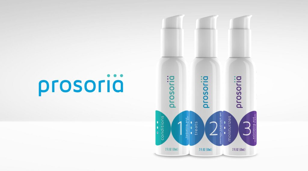
More than 9 million Americans battle psoriasis every year, and many of them aren’t happy with their treatment options. Fort Worth-based biotech company Nuvothera recognized a market opportunity for a more effective over-the-counter (OTC) psoriasis treatment, so they created a powerful three-step solution that patients could purchase without a prescription. Schaefer was charged with branding the new product and encouraging patient adherence. 

Goals:

  • Drive brand awareness, interest and online purchases among the target audience
  • Generate audience interest
  • Establish trust and credibility of Prosoria
  • Motivate consumers to buy Prosoria online
  • Build customer loyalty and drive repeat purchases

The Situation

Most people that suffer from psoriasis share a general dissatisfaction and skepticism with their current treatments and their over-the-counter options. They are constantly seeking something to treat psoriasis effectively and help them stay clear by preventing flare ups. They’ve tried other solutions – both prescriptions and OTC – but they haven’t found the treatment that’s right for them. 

Enter Prosoria. 

Prosoria contains clinical-strength, natural ingredients that work to effectively relieve the symptoms of psoriasis. Prosoria gives people battling psoriasis the confidence they need to stick with their skincare regimen and reinforces their confidence with an effective treatment for managing their psoriasis that is safe to use every day. It is a safe, effective solution and stands out as a trusted OTC medication.

A Message that Reads as Easy as 1-2-3

We wanted to highlight that Prosoria was an easy-to-use, highly effective OTC product with the quality of prescription psoriasis treatment. When creating the brand, we developed a logo and brand that stands out in the OTC space, but still has the reliable look and feel of a prescription-strength brand. Our team also sought to create a package that stood out on the shelves and engaged consumers to pick it up and purchase Prosoria.

We created a logo that includes 3 dots on top of the “i” in “Prosoria” to symbolize the application process and the packaging links together to illustrate a clear sequence of order and use. Like so many products, adherence is key and we wanted consumers to clearly understand how to use this product to get the best results. The gradual, easy gradient of blue to purple nods to the ease of use and the friendly effects of psoriasis treatment by Prosoria. 

Results:

  • Created a compelling, friendly identity system and packaging that communicates the ease and effectiveness of a new product that will stand out in the over-the-counter space.

December 8, 2018

Community Connects Us

Rebranding a city is a challenging and rewarding endeavor, a pairing we thrive in at Schaefer. In order to stand out among the 200+ cities in the Dallas-Fort Worth Metroplex and appeal to various stakeholders, it was critical for the City of Hurst to rebrand with purpose.

The Challenge 

Before Schaefer was hired, the City’s tagline was, “A Quality of Life City” an ordinary and nonspecific descriptor. The City sought to update their logo and messaging to better mirror the great progress the Council had made and align with the City’s updated mission and vision statements. Furthermore, they wanted to highlight their community values of respect, stewardship, positivity and inclusiveness. So, it was key that the new logo, tagline and seal worked together to amplify the city’s progress and position in the community. 

Approach

Schaefer began the discovery process with key stakeholders to discuss branding and messaging feedback and preferences, and to review past research findings. Once we determined the key insights that informed the brand and tone, we began building a brand platform that worked seamlessly across the marketing landscape.

Results

The City of Hurst’s new logo features clean lines and a simplified color palette. The star and the “H” give an updated nod to the original logo and seal, but with a modern and timeless approach.

The new tagline “Community connects us” nods to the dual meaning of connection, as in the physical way in which Hurst connects Dallas and Fort Worth, as well as the relationships formed between community members.

February 3, 2018

Legacy

The legacy of TCU is more than a century in the making. This year, we strive to add something memorable to that story.

The story of TCU Baseball is over a century in the making. New season, new page in the history books. What will be written?

New season, and a new page in the history books. It’s our goal and privilege to try to write something worth remembering in it.

December 15, 2017

From our tree to yours

Every year, Christmas always seems to arrive quicker than the year before. It can be easy to find ourselves running through the motions of holiday activities that we forget to savor and revel in the holiday spirit like we did when we were young. Even though we grow older and have busy lives, we should always try to find the time to express our appreciation to whomever or whatever is special and dear to us.
Our Christmas card features illustrations that each represent the best parts of our year as an agency. Work, clients, new babies, agency culture and a tribute to Boone. These acornaments are a fun way for us all to reflect on the last 12 months, literally. That copper foil is really shiny!
Life is busy and Christmas can become routine, but this is the time to cherish what means the most to us. Get wrapped up in the little things like spending time with someone who you hold dear, slow down and make a batch of hot chocolate for all your family, or even give an extra-long walk to Fido at his favorite park. It’s the little things that add up and can really make this season special.
Thank you to the clients and vendors for working with us. Thank you to all of the friends and family members who have supported our employees and the agency.
So, from our tree to yours, Merry Christmas. Enjoy this acornament from all the squirrels at Schaefer.


November 1, 2017

A little stronger

One of our clients, Air Comfort, is located at the heart of Southeast Texas, where Hurricane Harvey hit a few months ago. While the area was still reeling, they came to us with an urgent request – help us create a powerful video that embodies how we’ve been part of the community effort in dealing with this natural disaster. Through our partnership with N8 Visuals, we were able to bring that request to life.
Creating this video was a delicate line to walk, showing the damage and rebuild without appearing to capitalize on the situation. It was also an incredibly time sensitive assignment, where we needed to be nimble and move quickly.
Hurricane Harvey Video BTS
With that in mind, the concept we developed relies on storytelling VO and speaks more to the community’s spirit of resilience and heart rather than focusing on Air Comfort. We were inspired by the true stories of a community coming together and helping their neighbors, and it showed. Air Comfort employees opened their homes to our team and let us film during an incredibly sensitive time, laying bare entire neighborhoods that were destroyed.
The results of those efforts show in the final video, and we couldn’t be more proud. #SETXSTRONG

June 16, 2017

Work Wins

On June 11, TCU Baseball punched a ticket to their 4th consecutive College World Series. To break it down for you, they have finished their season on the field in Omaha in 2014, 2015, 2016 and now 2017. We are beyond proud of our client’s achievements but also honored to work with such and elite program with tremendous character.

Since 2014 (notice a theme?), we have partnered with TCU Baseball and head coach, Jim Schlossnagle, to create a video that embodies the brand of the program and establishes a tone for the upcoming season. We bring to life the vision that the coaching staff establishes each day, on and off the field.

They started the 2017 campaign with a pre-season No. 1 national ranking and Coach Schloss challenged his team to rise to the ranking. This year’s video, Work Wins, illustrates the truth that working hard is how you set yourself up to win games. Each player must physically and objectively work out a win each day. No superstitions. No momentum. Victory is found in the details, the routine, the compounding choices and the mindset.
Our job doesn’t stop with the finished product. Just like anything we create, we fight to make sure it performs. And this video has really caught hold. Over the course of the season (February – May) here’s a few stats:

689277
Total Views

2458478
Total Impressions

8283
Total Shares

Best of luck to the Horned Frogs! Toad to Omaha!

June 15, 2017

Portraits of Motherhood

Justin’s Place, a local non-profit organization, exists to enhance the life of a child trapped in generational poverty. Unfortunately, statistics show that a child’s life typically can’t be fully restored until the life of the family is restored. Justin’s Place comes alongside families in need, and helps establish balance by restoring hope and building a foundation that will provide the strength and resources needed to move out of generational poverty and toward a crisis free life of self-sufficiency.
Justin’s Place came to us during a point of growth and transition. Having been appointed the lead benefactor of the Women Empowering Women 2017 Inaugural Luncheon, they were in need of a video for the event that articulated their mission and the real people involved. With that in mind, the goal of the video was to secure funding as well as community backing for their cause.
In the spirit of being true explorers, we first had to evaluate the brand and elevate it. Their original logo was very dated and didn’t reflect the level of professionalism and mission behind Justin’s place. It wasn’t part of what they were asking for, but we felt the need to improve it. The client was extremely receptive to the new design and felt it better embodied the look and feel they are wanting to share with others.


Bird Nest
We come alongside families in need and establish balance by restoring hope and building a foundation.
Crown of Thorns
We begin with the heart issues. Our programs are rooted in biblical principles and grounded in the love of God.
Sun
Everything we do is to enhance the life of a child.

With the new logo established, we moved immediately into video development. The concept for the video centered around portraits of motherhood. These moving portraits show the many faces of motherhood and allow for a collective narrative that tells the story of what Justin’s Place does and why it matters. Capturing the significance of the need, while preserving the dignity of those in need was an extremely important balancing act.
We only had three weeks to concept, shoot and edit the video, and we were trying to complete the entire project at no cost to Justin’s Place. To accomplish that, we needed a true partner. So we turned to 1820 Productions. When we shared the story, they immediately agreed to participate and donate their services. 1820 Productions went above and beyond all expectations and shot an amazing video. They only had 2 days to make the edits and they put together the vision perfectly.

The fundraiser the video was developed for raised more than $82,000 with 252 people in attendance. The video was posted on Instagram and Facebook with 3,407 views and 240 views on Youtube. Justin’s Place now has a video they can use at fundraisers, on their website, and on different social media platforms that embodies their values and further conveys their mission to a wider audience. The video turned out remarkable and helped the fundraiser become even more of a success and have a larger impact on the community. We helped spread the word and share the message of what Justin’s Place is doing, and what they will continually do for others.