Schaefer Advertising Co.

Creative

May 24, 2019

She Is Near Southside

In the Near Southside, we spend every day celebrating women. As a crucial part of the community, women helped define the purpose, culture and growth of the district. From entrepreneurs to artists and advocates, these female visionaries, past and present, had one thing in common—the spirit of the Near Southside. 

Every year the Southside Shindig brings neighbors and friends together to spotlight the people and milestones reached in the past year. It’s also the single biggest fundraising event for the Near Southside organization and district. 

This year’s theme honored all the women whose ambitions and talents nurtured the community, paving the way for life and work in the Near Southside. All the mentors, mothers and friends we came to know as rebels, risk-takers and rainmakers who showed us then and now what it means to cultivate community.

More than 9 million Americans battle psoriasis every year, and many of them aren’t happy with their treatment options. Fort Worth-based biotech company Nuvothera recognized a market opportunity for a more effective over-the-counter (OTC) psoriasis treatment, so they created a powerful three-step solution that patients could purchase without a prescription. Schaefer was charged with branding the new product and encouraging patient adherence. 

Goals:

  • Drive brand awareness, interest and online purchases among the target audience
  • Generate audience interest
  • Establish trust and credibility of Prosoria
  • Motivate consumers to buy Prosoria online
  • Build customer loyalty and drive repeat purchases

The Situation

Most people that suffer from psoriasis share a general dissatisfaction and skepticism with their current treatments and their over-the-counter options. They are constantly seeking something to treat psoriasis effectively and help them stay clear by preventing flare ups. They’ve tried other solutions – both prescriptions and OTC – but they haven’t found the treatment that’s right for them. 

Enter Prosoria. 

Prosoria contains clinical-strength, natural ingredients that work to effectively relieve the symptoms of psoriasis. Prosoria gives people battling psoriasis the confidence they need to stick with their skincare regimen and reinforces their confidence with an effective treatment for managing their psoriasis that is safe to use every day. It is a safe, effective solution and stands out as a trusted OTC medication.

A Message that Reads as Easy as 1-2-3

We wanted to highlight that Prosoria was an easy-to-use, highly effective OTC product with the quality of prescription psoriasis treatment. When creating the brand, we developed a logo and brand that stands out in the OTC space, but still has the reliable look and feel of a prescription-strength brand. Our team also sought to create a package that stood out on the shelves and engaged consumers to pick it up and purchase Prosoria.

We created a logo that includes 3 dots on top of the “i” in “Prosoria” to symbolize the application process and the packaging links together to illustrate a clear sequence of order and use. Like so many products, adherence is key and we wanted consumers to clearly understand how to use this product to get the best results. The gradual, easy gradient of blue to purple nods to the ease of use and the friendly effects of psoriasis treatment by Prosoria. 

Results:

  • Created a compelling, friendly identity system and packaging that communicates the ease and effectiveness of a new product that will stand out in the over-the-counter space.

December 8, 2018

Community Connects Us

Rebranding a city is a challenging and rewarding endeavor, a pairing we thrive in at Schaefer. In order to stand out among the 200+ cities in the Dallas-Fort Worth Metroplex and appeal to various stakeholders, it was critical for the City of Hurst to rebrand with purpose.

The Challenge 

Before Schaefer was hired, the City’s tagline was, “A Quality of Life City” an ordinary and nonspecific descriptor. The City sought to update their logo and messaging to better mirror the great progress the Council had made and align with the City’s updated mission and vision statements. Furthermore, they wanted to highlight their community values of respect, stewardship, positivity and inclusiveness. So, it was key that the new logo, tagline and seal worked together to amplify the city’s progress and position in the community. 

Approach

Schaefer began the discovery process with key stakeholders to discuss branding and messaging feedback and preferences, and to review past research findings. Once we determined the key insights that informed the brand and tone, we began building a brand platform that worked seamlessly across the marketing landscape.

Results

The City of Hurst’s new logo features clean lines and a simplified color palette. The star and the “H” give an updated nod to the original logo and seal, but with a modern and timeless approach.

The new tagline “Community connects us” nods to the dual meaning of connection, as in the physical way in which Hurst connects Dallas and Fort Worth, as well as the relationships formed between community members.

February 3, 2018

Legacy

The legacy of TCU is more than a century in the making. This year, we strive to add something memorable to that story.

The story of TCU Baseball is over a century in the making. New season, new page in the history books. What will be written?

New season, and a new page in the history books. It’s our goal and privilege to try to write something worth remembering in it.

December 15, 2017

From our tree to yours

Every year, Christmas always seems to arrive quicker than the year before. It can be easy to find ourselves running through the motions of holiday activities that we forget to savor and revel in the holiday spirit like we did when we were young. Even though we grow older and have busy lives, we should always try to find the time to express our appreciation to whomever or whatever is special and dear to us.
Our Christmas card features illustrations that each represent the best parts of our year as an agency. Work, clients, new babies, agency culture and a tribute to Boone. These acornaments are a fun way for us all to reflect on the last 12 months, literally. That copper foil is really shiny!
Life is busy and Christmas can become routine, but this is the time to cherish what means the most to us. Get wrapped up in the little things like spending time with someone who you hold dear, slow down and make a batch of hot chocolate for all your family, or even give an extra-long walk to Fido at his favorite park. It’s the little things that add up and can really make this season special.
Thank you to the clients and vendors for working with us. Thank you to all of the friends and family members who have supported our employees and the agency.
So, from our tree to yours, Merry Christmas. Enjoy this acornament from all the squirrels at Schaefer.


November 1, 2017

A little stronger

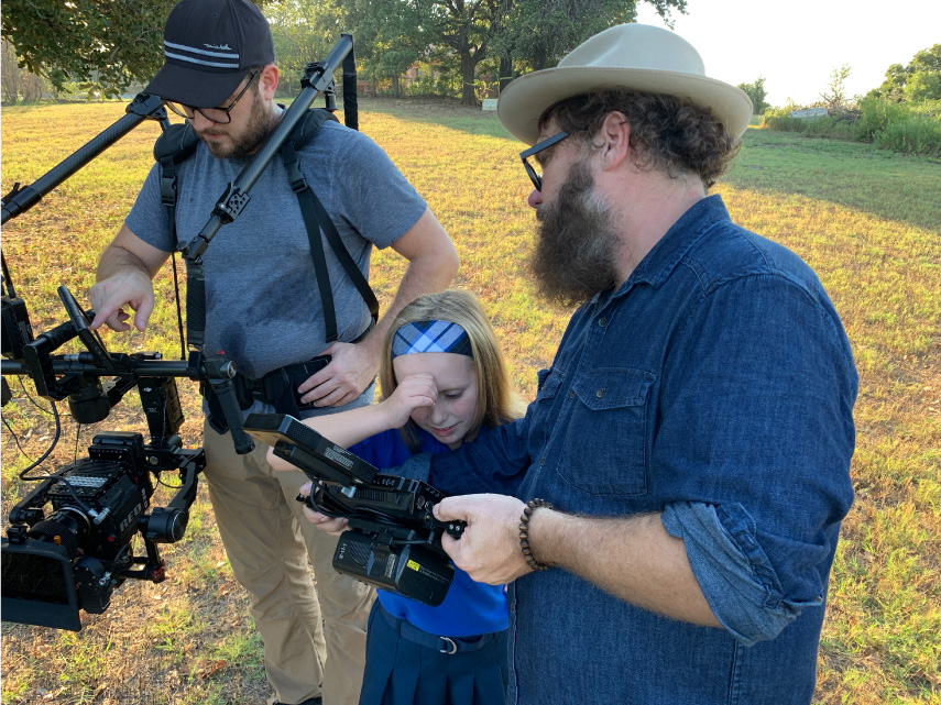
One of our clients, Air Comfort, is located at the heart of Southeast Texas, where Hurricane Harvey hit a few months ago. While the area was still reeling, they came to us with an urgent request – help us create a powerful video that embodies how we’ve been part of the community effort in dealing with this natural disaster. Through our partnership with N8 Visuals, we were able to bring that request to life.
Creating this video was a delicate line to walk, showing the damage and rebuild without appearing to capitalize on the situation. It was also an incredibly time sensitive assignment, where we needed to be nimble and move quickly.
Hurricane Harvey Video BTS
With that in mind, the concept we developed relies on storytelling VO and speaks more to the community’s spirit of resilience and heart rather than focusing on Air Comfort. We were inspired by the true stories of a community coming together and helping their neighbors, and it showed. Air Comfort employees opened their homes to our team and let us film during an incredibly sensitive time, laying bare entire neighborhoods that were destroyed.
The results of those efforts show in the final video, and we couldn’t be more proud. #SETXSTRONG

June 16, 2017

Work Wins

On June 11, TCU Baseball punched a ticket to their 4th consecutive College World Series. To break it down for you, they have finished their season on the field in Omaha in 2014, 2015, 2016 and now 2017. We are beyond proud of our client’s achievements but also honored to work with such and elite program with tremendous character.

Since 2014 (notice a theme?), we have partnered with TCU Baseball and head coach, Jim Schlossnagle, to create a video that embodies the brand of the program and establishes a tone for the upcoming season. We bring to life the vision that the coaching staff establishes each day, on and off the field.

They started the 2017 campaign with a pre-season No. 1 national ranking and Coach Schloss challenged his team to rise to the ranking. This year’s video, Work Wins, illustrates the truth that working hard is how you set yourself up to win games. Each player must physically and objectively work out a win each day. No superstitions. No momentum. Victory is found in the details, the routine, the compounding choices and the mindset.
Our job doesn’t stop with the finished product. Just like anything we create, we fight to make sure it performs. And this video has really caught hold. Over the course of the season (February – May) here’s a few stats:

689277
Total Views

2458478
Total Impressions

8283
Total Shares

Best of luck to the Horned Frogs! Toad to Omaha!

June 15, 2017

Portraits of Motherhood

Justin’s Place, a local non-profit organization, exists to enhance the life of a child trapped in generational poverty. Unfortunately, statistics show that a child’s life typically can’t be fully restored until the life of the family is restored. Justin’s Place comes alongside families in need, and helps establish balance by restoring hope and building a foundation that will provide the strength and resources needed to move out of generational poverty and toward a crisis free life of self-sufficiency.
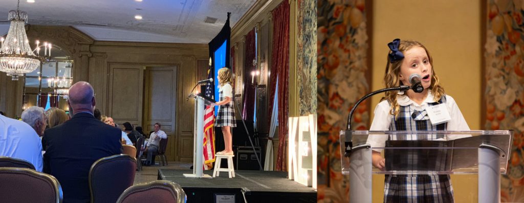
Justin’s Place came to us during a point of growth and transition. Having been appointed the lead benefactor of the Women Empowering Women 2017 Inaugural Luncheon, they were in need of a video for the event that articulated their mission and the real people involved. With that in mind, the goal of the video was to secure funding as well as community backing for their cause.
In the spirit of being true explorers, we first had to evaluate the brand and elevate it. Their original logo was very dated and didn’t reflect the level of professionalism and mission behind Justin’s place. It wasn’t part of what they were asking for, but we felt the need to improve it. The client was extremely receptive to the new design and felt it better embodied the look and feel they are wanting to share with others.


Bird Nest
We come alongside families in need and establish balance by restoring hope and building a foundation.
Crown of Thorns
We begin with the heart issues. Our programs are rooted in biblical principles and grounded in the love of God.
Sun
Everything we do is to enhance the life of a child.

With the new logo established, we moved immediately into video development. The concept for the video centered around portraits of motherhood. These moving portraits show the many faces of motherhood and allow for a collective narrative that tells the story of what Justin’s Place does and why it matters. Capturing the significance of the need, while preserving the dignity of those in need was an extremely important balancing act.
We only had three weeks to concept, shoot and edit the video, and we were trying to complete the entire project at no cost to Justin’s Place. To accomplish that, we needed a true partner. So we turned to 1820 Productions. When we shared the story, they immediately agreed to participate and donate their services. 1820 Productions went above and beyond all expectations and shot an amazing video. They only had 2 days to make the edits and they put together the vision perfectly.

The fundraiser the video was developed for raised more than $82,000 with 252 people in attendance. The video was posted on Instagram and Facebook with 3,407 views and 240 views on Youtube. Justin’s Place now has a video they can use at fundraisers, on their website, and on different social media platforms that embodies their values and further conveys their mission to a wider audience. The video turned out remarkable and helped the fundraiser become even more of a success and have a larger impact on the community. We helped spread the word and share the message of what Justin’s Place is doing, and what they will continually do for others.

The Story
Beastro has a way of bringing out your wild side. The Fort Worth Zoo continues to give adults (over the age of 21) the chance to experiment with different flavors from various food and beverage booths, and live music entertainment for the 11th year in a row.
The Work
Last year, Beastro sold out for the first time ever. The goal this year was to draw newcomers into the excitement the event has to offer, and also encourage those who have attended before to come back!
This year, the event tailored itself to a Rock and Roll theme. The team used a black and white image of a roaring lion as the event icon and paired a tagline of “Sink your teeth into…Beastro!” The intensity between the loud, bold colors of the script and tagline set over the black and white image, lended itself to an intense, high-energy environment.

April 7, 2017

A lasting impression

The Hurst Conference Center website redesign brings an air of elegance to the venue. Currently catering to corporate meeting planners, social event coordinators and brides-to-be, the website needed to provide specific information that was relevant to each target audience. This was achieved through intuitive navigation and individualized content.

The website leads with beautiful photography of the venue and, most notably, their fiber-optic chandelier. The refreshed design reflects high-end clientele and more aptly represents the quality of service the Hurst Conference Center offers.

Utilizing grid structures for organizational clarity, every aspect of the redesign provides a hassle-free planning process for potential clients. Each interior page has responsive menus that display room capacities, technical offerings and floor plans. With all the details carefully thought out, the quality of online service now mirrors the level of customer service the Hurst Conference Center provides.